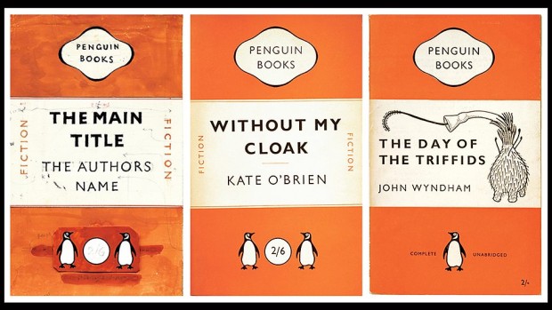
The ubiquity of Penguin books in modern British publishing conceals a paradox best expressed by founder Allen Lane’s colleague and biographer Jack Morpurgo, who said that even in Allen Lane’s lifetime, Penguin became “the least typical member of the genus it was said to have created”.
There had been paperbacks before Penguin – all French books were paperback for instance and Woolworth’s, soon to be a key outlet for the new imprint, sold their own cheap editions – but few ranged so eclectically and wide.
No other house had quite Penguin’s confidence in design. Pan Books, which began publication a decade after, in the mid 40s, were defined by a Mervyn Peake colophon of the god playing his pipes, a hint perhaps that here was a house that wasn’t going to trouble you with books on microeconomics or English churches… but with something more sensuous and possibly sensual…
…At the opposite extreme, but no less successful in their way, were the Fontana Modern Masters which began publication under Frank Kermode’s editorship in the 1970s, combining seriousness, a quick-crib approach to major thinkers and a stunning simple visual device, which was that each group of books featured a tessellating cut-up of an abstract painting by Oliver Bevan.
Buy them all, lay them out on your table and you had a bit of modern art. Painterly abstraction and san-serif typeface seemed to go together and seemed to fit as well as Bevan’s angles…
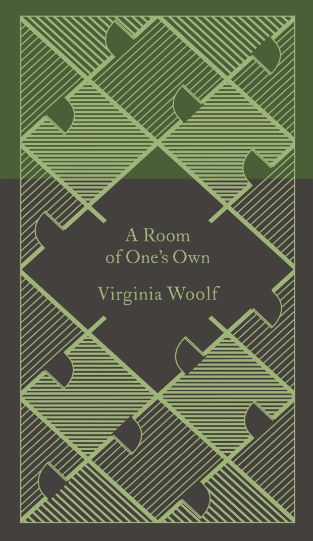
…But it was Penguin which continued to perfect the idea of cheap books as items that might be collected and displayed.
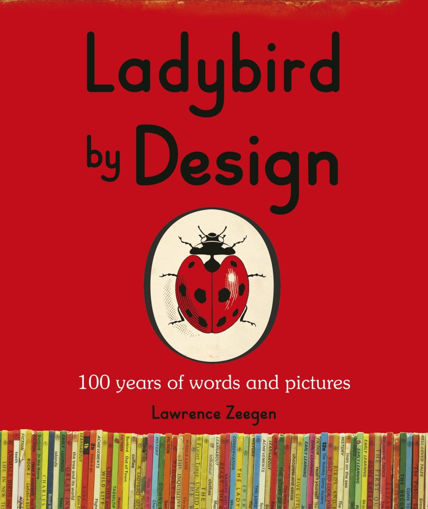
The Guardian‘s Kathryn Hughes visits Ladybird By Design, an exhibition of over 200 original illustrations from the golden age of Ladybird Books:
To enter Ladybird’s world again is to relearn a universe that is both strange yet uncannily familiar. Inevitably the books express the values of their times. In the Peter and Jane series (aka Key Words Reading Scheme), Peter tends to hang out with Daddy in the garage, while Jane helps Mummy get the tea. Fair-haired and blue-eyed, every one in the children’s world looks exactly like them, apart from Pat the dog.
Still, if Ladybird books were conservative on gender and race, they were positively brisk on class. The world of Peter and Jane – and all the other children who appear in the Ladybird universe doing magic tricks, going to the shops, taking batteries apart or learning to swim – is both modern and modest. As illustrated by Berry, Wingfield and Martin Aitchison, the children appear to live in one of the postwar new towns. Their home is probably privately owned but it could conceivably be a newly built council house. Their adventures involve going on a train or to the beach with Mummy and Daddy. There are no prep-school japes here, no solving of improbable mysteries or clifftop rescues.
Perhaps this achievable utopia was a compensatory fantasy for the illustrators who, born around 1920, had mostly known childhoods far harder than this. Busy providing a safe, stable environment for their own little Peters and Janes, men such as Berry and Wingfield showed a world where things were, on the whole, getting better. Modernity increasingly presses into the frame: Jane and Peter eat off a table that looks like knock-off Habitat, Mummy wears slacks and Daddy even starts to help with the washing-up. More disruptive changes, though, are kept at a safe distance. Carnaby Street, with all its troubling freedoms, has no place in the Ladybird world, nor does the cold war or Vietnam.
For those of you who didn’t grow up in the UK, Ladybird Books were slim illustrated hardcover books for children. They were educational, or at least ‘improving’, and so creepy that I think they’ve actually scarred the national psyche. If you are of certain age, the books trigger a shiver of queasy nostalgia — without Ladybird Books the horrifying weird of The League of Gentleman or Scarfolk is just inconceivable — and yet I still think of them fondly. Sort of.
The exhibition, which opens later this week, takes its title from a forthcoming Penguin book called Ladybird by Design. Writtenby Lawrence Zeegen, Professor of Illustration and Dean of the School of Design at the London College of Communication, the book celebrates 100 years of Ladybird, and examines the social and design history of the publisher. It is sure to be smashing.
In the past, I’ve often included a few series designs in with my favourite covers of the year. This year, I saw so many great covers that were part of a series, I thought a they deserved a post of their own…
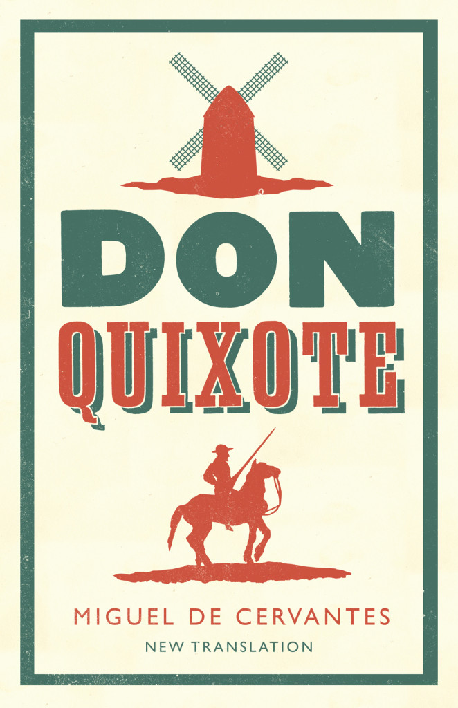
Don Quixote by Miguel de Cervantes; design by Nathan Burton (Alma / 2014)
The Gambler by Fydor Dostoevsky; design by Nathan Burton (Alma / 2014)
Notes from the Underground by Fydor Dostoevsky; design by Nathan Burton (Alma / 2014)
Alma Classics; design by Nathan Burton (Alma / 2014)
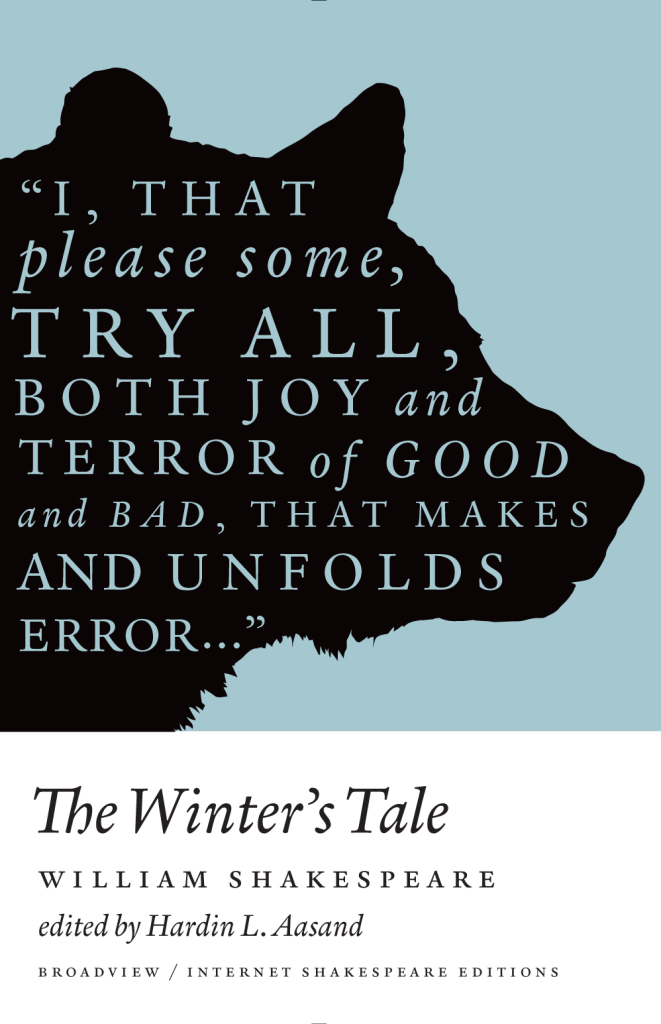
A Winter’s Tale by William Shakespeare; design by Michel Vrana (Broadview / 2014)
As You Like It by William Shakespeare; design by Michel Vrana (Broadview / 2014)
Henry V by William Shakespeare; design by Michel Vrana (Broadview / 2014)
Broadview Shakespeare; design by Michel Vrana (Broadview / 2014)
Nova Express by William Burroughs; cover art by Julian House (Penguin Classics 2014)
The Son Machine by William Burroughs; cover art by Julian House (Penguin Classics 2014)
The Ticket That Exploded by William Burroughs; cover art by Julian House (Penguin Classics 2014)
The Cut-Up Trilogy by William Burroughs; cover art by Julian House (Penguin Classics 2014)
Snapshots–Nouvelles voix du Caine Prize; design by David Pearson (Éditions Zulma / 2014)
Le Complex d’Eden Bellweather by Benjamin Wood; design by David Pearson (Éditions Zulma / 2014)
L’Exception by Auður Ava Ólafsdóttir ; design by David Pearson (Éditions Zulma / 2014)
Éditions Zulma; design by David Pearson (Éditions Zulma / 2014)
Come, Sweet Death by Wolf Haas; design by Christopher Brian King (Melville House / 2014)
Resurrection by Wolf Haas; design by Christopher Brian King (Melville House / 2014)
Wolf Haas; design by Christopher Brian King (Melville House / 2014)
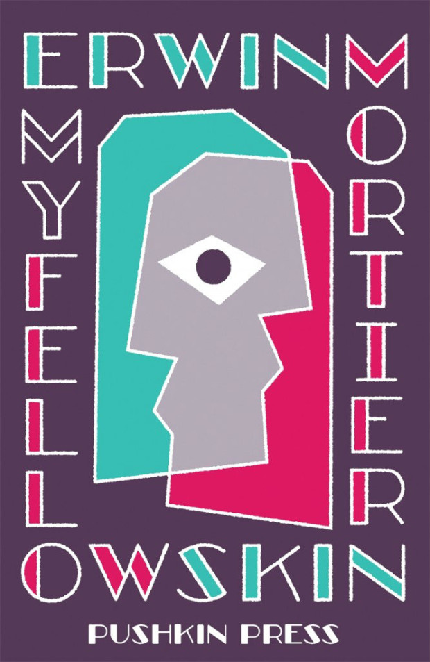
My Fellow Skin by Erwin Mortier; design by David Pearson (Pushkin Press / 2014)
Shutterspeed by Erwin Mortier; design by David Pearson (Pushkin Press / 2014)
Marcel by Erwin Mortier; design by David Pearson (Pushkin Press / 2014)
Erwin Mortier; design by David Pearson (Pushkin Press / 2014)
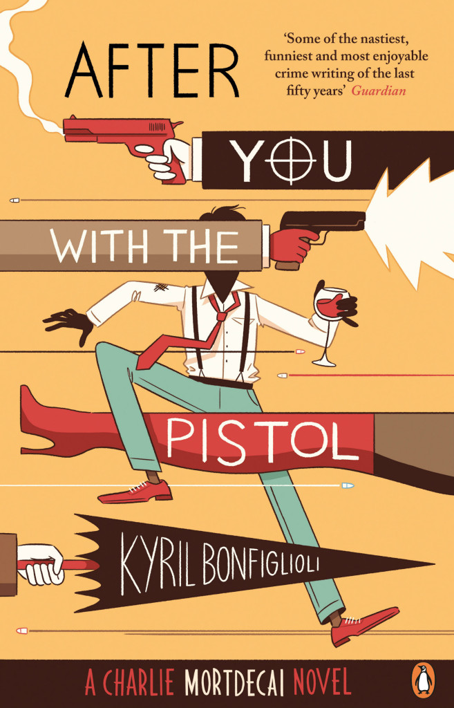
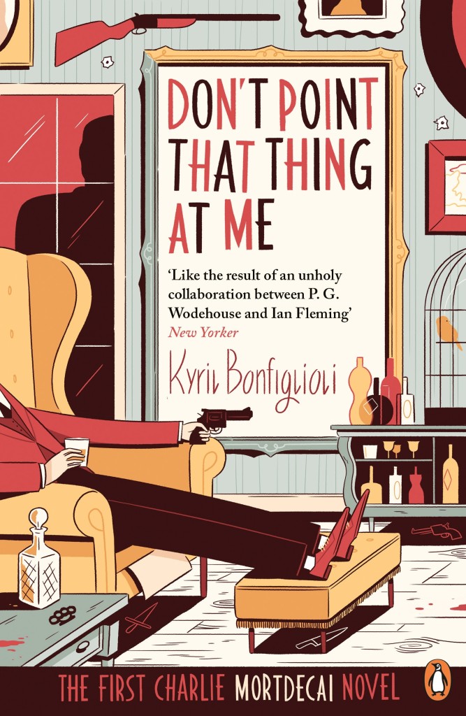
After You with the Pistol by Kyril Bonfiglioli; design by Richard Green; illustration by Luke Pearson (Penguin / 2014)
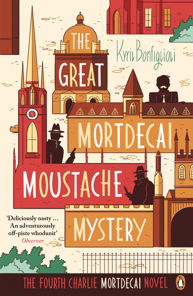
The Great Mordecai Moustache Mystery by Kyril Bonfiglioli; design by Richard Green; illustration by Luke Pearson (Penguin / 2014)
Something Nasty in the Woodshed by Kyril Bonfiglioli; design by Richard Green; illustration by Luke Pearson (Penguin / 2014)
Charlie Mortdecai by Kyril Bonfiglioli; design by Richard Bravery illustration by Luke Pearson (Penguin / 2014)
If I Die in a Combat Zone by Tim O’Brien; design by Cardon Webb (Broadway / 2014)
Tomcat in Love by Tim O’Brien; design by Cardon Webb (Broadway / 2014)
Northern Lights by Tim O’Brien; design by Cardon Webb (Broadway / 2014)
Tim O’Brien; design by Cardon Webb (Broadway / 2014)
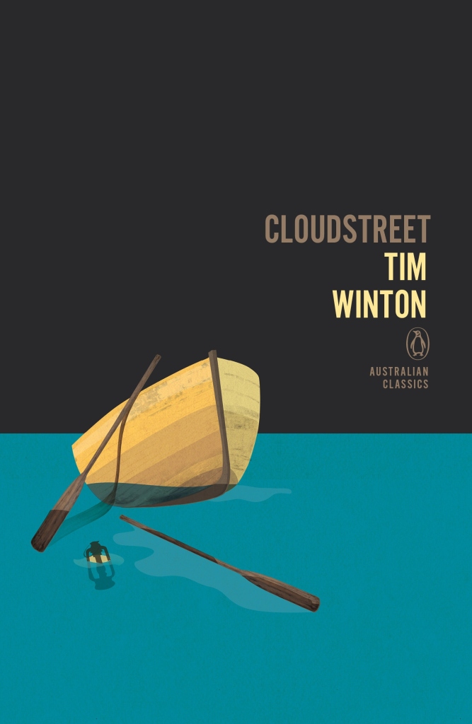
Cloudstreet by Tim Winton; design by Adam Laszczuk; illustration by Josh Durham (Penguin Australia / 2014)
A Fortunate Life by A. B. Facey; design by Adam Laszczuk; illustration by Josh Durham (Penguin Australia / 2014)
The Tall Man by Chloe Hooper; design by Adam Laszczuk; illustration by Josh Durham (Penguin Australia / 2014)
Penguin Australian Classics; design by Adam Laszczuk; illustration by Josh Durham (Penguin Australia / 2014)
Greek and Roman Political Ideas by Melissa Lane; cover design by Matthew Young; logo design by Richard Green (Pelican 2014)
Economics: The User’s Guide by Ha-Joon Chang; cover design by Matthew Young; logo design by Richard Green (Pelican 2014)
Revolutionary Russia, 1891-1991 by Orlando Figes; cover design by Matthew Young; logo design by Richard Green (Pelican 2014)
Pelican relaunch; cover design by Matthew Young; logo design by Richard Green (Pelican 2014)
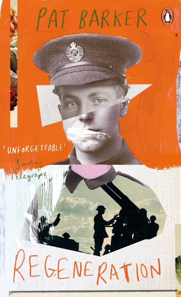
Regeneration by Pat Barker; design by Mr Foxx (Penguin / 2014)
An Ice Cream War by William Boyd; design by Joe Cruz (Penguin / 2014)
Invisible Man by Ralph Ellison; design by JP King (Penguin / 2014)
Penguin Essentials; design various (Penguin / 2014)
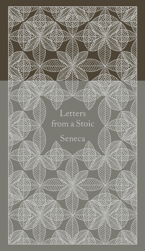
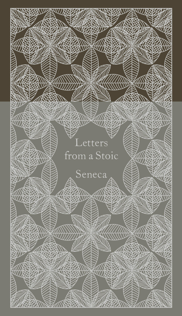
Letters from a Stoic by Seneca; design by Coralie Bickford-Smith (Penguin Classics 2014)
Essays and Aphorisms by Arthur Schopenhauer; design by Coralie Bickford-Smith (Penguin Classics 2014)
The Art of War by Sun-Tzu; design by Coralie Bickford-Smith (Penguin Classics 2014)
Penguin Pocket Hardbacks; design by Coralie Bickford-Smith (Penguin Classics 2014)
Les fantômes fument en cachette by Miléna Babin; design by David Drummond (Les Éditions XYZ / 2014)
Notre Duplex by Éléonore Létourneau; design by David Drummond (Éditions XYZ / 2014)
Quand j’étais l’Amérique by Elsa Pépin; design by David Drummond (Les Éditions XYZ / 2014)
Quai No. 5; design by David Drummond (Les Éditions XYZ / 2014)
Sicilian Uncles by Leonardo Sciascia; design by Dan Mogford (Granta / 2014)
The Moro Affair by Leonardo Sciascia; design by Dan Mogford (Granta / 2014)
The Wine-Dark Sea by Leonardo Sciascia; design by Dan Mogford (Granta / 2014)
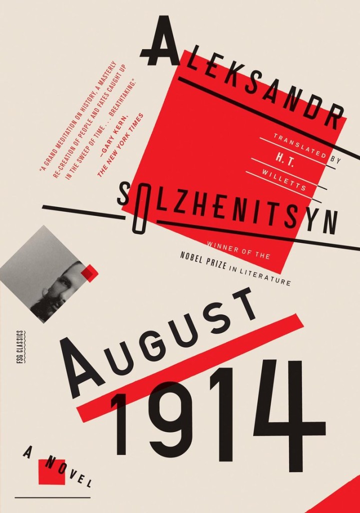
Leonardo Sciascia; design by Dan Mogford (Granta / 2014)1August 1914 by Aleksandr Solzhenitsyn; design by Oliver Munday (FSG / 2014)
November 1916 by Aleksandr Solzhenitsyn; design by Oliver Munday (FSG / 2014)
One Day in the Life of Ivan Denisovich by Aleksandr Solzhenitsyn; design by Oliver Munday (FSG / 2014)
Aleksandr Solzhenitsyn; design by Oliver Munday (FSG / 2014)
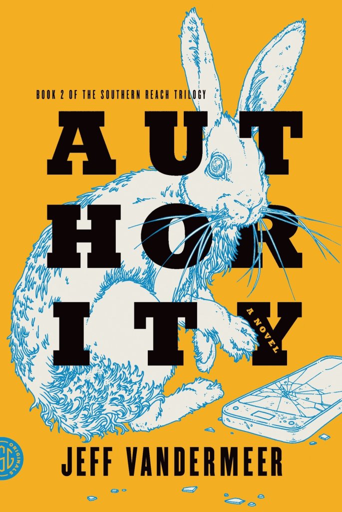
Authority by Jeff VanderMeer (US); design by Charlotte Strick; Illustration by Eric Nyquist (FSG / 2014)
Annihilation by Jeff VanderMeer (US); design by Charlotte Strick; Illustration by Eric Nyquist (FSG / 2014)
Acceptance by Jeff VanderMeer (US); design by Charlotte Strick; Illustration by Eric Nyquist (FSG / 2014)
The Southern Reach Trilogy by Jeff VanderMeer (US); design by Charlotte Strick; Illustration by Eric Nyquist (FSG / 2014)
Annihilation by Jeff VanderMeer (UK); design by Jo Walker; illustration by Kai and Sunny (Fourth Estate / 2014)
Authority by by Jeff VanderMeer (UK); design by Jo Walker; illustration by Kai and Sunny (Fourth Estate / 2014)
Acceptance by Jeff VanderMeer (UK); design by Jo Walker; illustration by Kai and Sunny (Fourth Estate / 2014)
The Southern Reach Trilogy by Jeff VanderMeer (UK); design by Jo Walker; illustration by Kai and Sunny (Fourth Estate / 2014)
Ukojenie by Jeff VanderMeer (Poland); cover art by Patryk Mogilnicki (Otwarte / 2014)
Unicestwienie by Jeff VanderMeer (Poland); cover art by Patryk Mogilnicki (Otwarte / 2014)
Ujarzmienie by Jeff VanderMeer (Poland); cover art by Patryk Mogilnicki (Otwarte / 2014)
The Southern Reach Trilogy by Jeff VanderMeer (Poland); cover art by Patryk Mogilnicki (Otwarte / 2014)
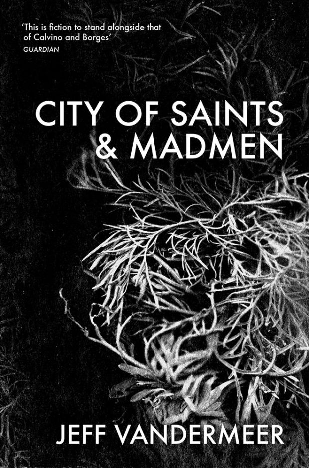
City of Saints & Madmen by Jeff VanderMeer backlist; design by Crush Creative (Tor / 2014)
Shriek: An Afterword by Jeff VanderMeer backlist; design by Crush Creative (Tor / 2014)
Veniss Underground by Jeff VanderMeer backlist; design by Crush Creative (Tor / 2014)
Jeff VanderMeer backlist; design by Crush Creative (Tor / 2014)
The Ego and His Own by Max Stirner; design by Rumors (Verso / 2014)
Freud and the Non-European by Edward Said; design by Rumors (Verso / 2014)
Verso Radical Thinkers; design by Rumors (Verso / 2014)
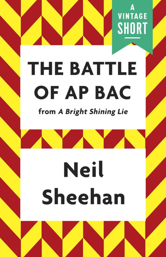
The Battle of AP Bac by Neil Sheehan; design by Joan Wong (Vintage / 2014)
How War Begins by John Keegan; design by Joan Wong (Vintage / 2014)
Moral Disorder by Margaret Atwood; design by Joan Wong (Vintage / 2014)
Vintage Shorts; design by Joan Wong (Vintage / 2014)
Fleur de Cerisier by Aline Apostolska; design by David Drummond (VLB éditeur / 2014)
Elle Etait si Jolie by Pierre Szalowski; design by David Drummond (VLB éditeur / 2014)
Les Iles Canaries by Claudia Larochelle; design by David Drummond (VLB éditeur / 2014)
The Art of War by Sun-Tzu; design by Coralie Bickford-Smith (Penguin Classics 2014)
Essays and Aphorisms by Arthur Schopenhauer; design by Coralie Bickford-Smith (Penguin Classics 2014)
A beautiful set of ‘Pocket Hardbacks’ designed by Coralie Bickford-Smith will be available from Penguin Classics next month. The trim size is 104mm x 168mm (or about 4″ x 6½”):
While looking for something else entirely, I recently stumbled across this video of British book designer Derek Birdsall discussing the work of influential graphic designer Hans ‘Zero’ Schleger:
Coincidently, Birdsall turned 80 early this month and Mike Dempsey reposted a link to his 2002 interview with the designer. If you’re interested in post-war British design, it’s essential reading:
Despite this astonishing attention to detail, Birdsall’s work is disarmingly simple. Like great screen actors, it is what is left out that makes the performance compelling. He is not a showy designer interested in trends. His passion lies in the details: the typeface, naturally and, with books, the feel of the paper; the quality of the binding; the cut of the font; the evenness of line endings; the perfect balance of image to space. These are the things that elevate his work to the ranks of typography. These and an incredibly inventive mind responsible for producing a consistently high standard of work for over 40 years: he designed the first Pirelli calendar in 1964… as well as book jackets for Penguin and Monty Python, and art-directed magazines including Town, Nova and The Independent’s colour magazine. Birdsall’s own view of his work is very pragmatic. ‘As designers we are here to please the client,’ he says. He doesn’t believe in forcing things down their throats. What he does do is weigh up all the possible questions and objections that a client might voice and have his answers ready.
Working with art director Richard Bravery, illustrator Luke Pearson has created new covers for Kyril Bonfiglioli’s Charlie Mortdecai novels published by Penguin. You can read more about the process at Creative Review.
Something Nasty in the Woodshed by Kyril Bonfiglioli; design by Richard Green; illustration by Luke Pearson (Penguin / 2014)
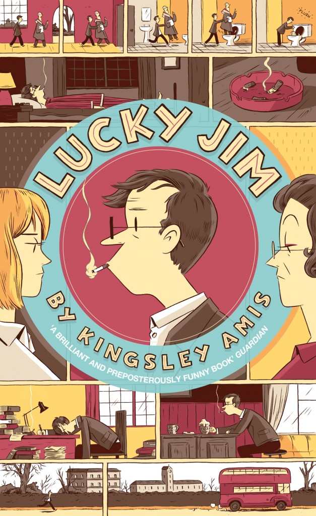
This is not Luke’s first cover for Penguin. He also provided artwork for their recent reissue of Lucky Jim by Kingsley Amis (also AD’ed by Richard Bravery):
You can read my 2013 Q & A with Luke here. (And if you haven’t picked up a copy of Luke’s new Hilda book, you really should you know!)
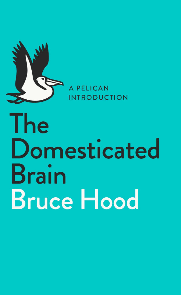
Penguin UK is relaunching its nonfiction line Pelican in May with a redesigned logo and design. This short new video from the publisher takes a flying look at the imprint’s history and some of its more memorable covers:
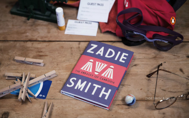
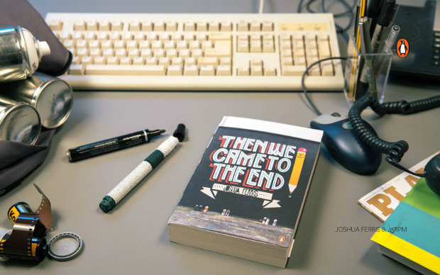
In a partnership with file-transfer service WeTransfer, Penguin Books (UK) has made a series of rather nice desktop wallpapers available. The photographs feature book covers from their Street Art series, as well as recent designs by Jon Gray and Nathan Burton. Click on the images for the hi-res versions:
How is that I’ve not seen Herzog and the Monsters before now? Lesley Barnes‘ lovely 2006 short animated film, made at the Glasgow School of Arts, has just about all you could wish for: “a small boy who steals words, a forest full of monsters and lots of vintage penguin books.”
Helen Yentus, the art director of Riverhead Books, designed two covers for the recently published On Such a Full Sea by Chang-rae Lee. The regular hardcover — which is beautiful in itself (see below) — has a hand-lettered jacket. The second, for a limited edition of the novel, comes in a white slipcase made on a 3D printer. In this video, Helen talks about the 3D printed slipcase, designed in collaboration with the MakerBot Studio:
This isn’t the first time Helen’s worked with MakerBot. In 2011 she used the 3D printer to create the letters on the cover of The Innovator’s Cookbook by Steven Johnson:
Born in Boston in 1930, Cinamon moved to England in 1960, eventually becoming chief designer at Penguin Books. Strongly influenced by Swiss design, Cinamon utilized a combination of bold colour, clean lines and sans serif typography that was unique in British book design at the time. Now an influence on a new generation of type-inspired designers, the film includes a conversation between Cinamon and David Pearson: