At the New York Times, Edmund White examines our enduring fascination with the New York of the 1970s:
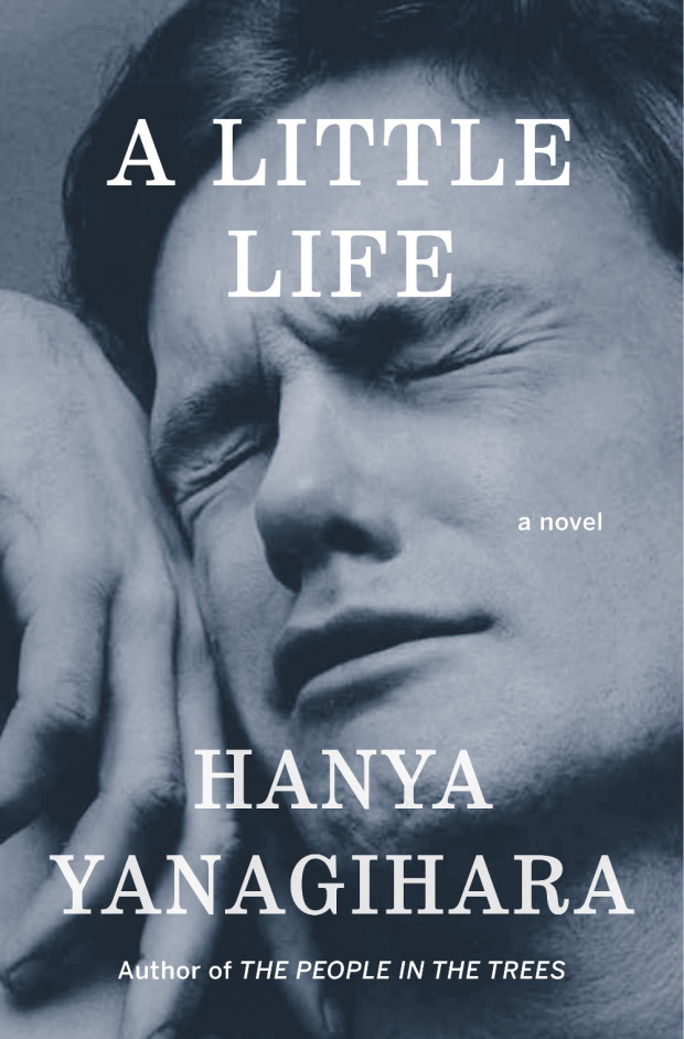
Recently there’s been, in TV and film and certainly in books, an intense yearning for a specific five-year period in New York City, those years between the blackout in 1977, and 1982, when AIDS was finally named by the Centers for Disease Control. First was Rachel Kushner’s 2013 novel ‘‘The Flamethrowers,’’ whose heroine is a sharp-eyed bystander in the SoHo art scene, and now… ‘‘City on Fire’’ by Garth Risk Hallberg, which also concerns itself with the same time period. There are two television series in development that take place in the late 1970s as well, one directed by Martin Scorsese and co-written with Mick Jagger; the other by Baz Luhrmann. Next year, the Whitney will mount the first retrospective of David Wojnarowicz, the ultimate East Village grunge artist, in over 15 years; the work of his lover, the photographer Peter Hujar — which has recently been used both for an advertising campaign for the men’s wear designer Patrik Ervell and on the cover of… Hanya Yanagihara’s novel ‘‘A Little Life’’ — will be the subject of a forthcoming retrospective at New York’s Morgan Library.
COLLECTIVELY, THESE WORKS express a craving for the city that, while at its worst, was also more democratic: a place and a time in which, rich or poor, you were stuck together in the misery (and the freedom) of the place, where not even money could insulate you. They are a reaction to what feels like a safer, more burnished and efficient (but cornerless and predictable) city. Even those of us who claim not to miss those years don’t quite sound convinced. ‘‘Well, I sure don’t have nostalgia about being mugged,’’ John Waters told me. Though then he continued: ‘‘But I do get a little weary when I realize that if anybody could find one dangerous block left in the city, there’d be a stampede of restaurant owners fighting each other off to open there first. It seems almost impossible to remember that just going out in New York was once dangerous. Do any artistic troublemakers want to feel that their city may be the safest in America? Who’s going to write a book about walking the safe streets of Manhattan? It’s always right before a storm that the air is filled with dangerous possibilities.’’
Similiarly, at the Guardian, Glenn Kenny looks at our obsession with the New York of Lou Reed and Patti Smith:
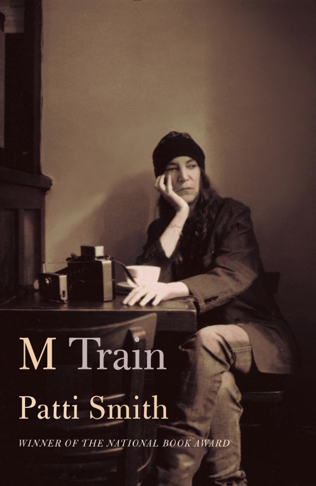
Comments closedThe New York we aspired to was Lou [Reed]’s, not Liza Minnelli’s, or a little later, Frank Sinatra’s. (The New York we aspired to was also Martin Scorsese’s, too, as it happened, and it’s almost entirely forgotten that it’s in his movie of the same name that the future anthem New York, New York made its first bow.) And these days, “wild side” New York is gazed at in rearview with fervent affection, in works by Edmund White, Patti Smith, Brad Gooch and others. (Not to mention those, like Garth Risk Hallberg or Rachel Kushner, who are too young to have their own memories to work with.) Smith’s books, in particular, seem to have hit a nerve. Her new book M Train is a more impressionistic sequel to her National Book award winning memoir of 2011, Just Kids, which is currently being developed as – weirdly enough, for me and perhaps for her – a Showtime TV miniseries.
The place these books conjure is both very scary, and very exhilarating. Not a place where some kind of arty misfit or wannabe arty necessarily wanted to live, but rather a place where one such creature could live. And hence, a place where one such young creature had to live.