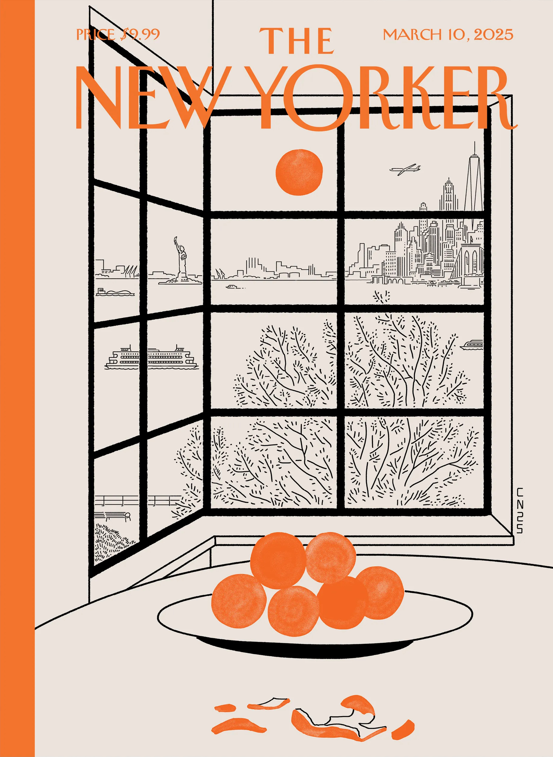
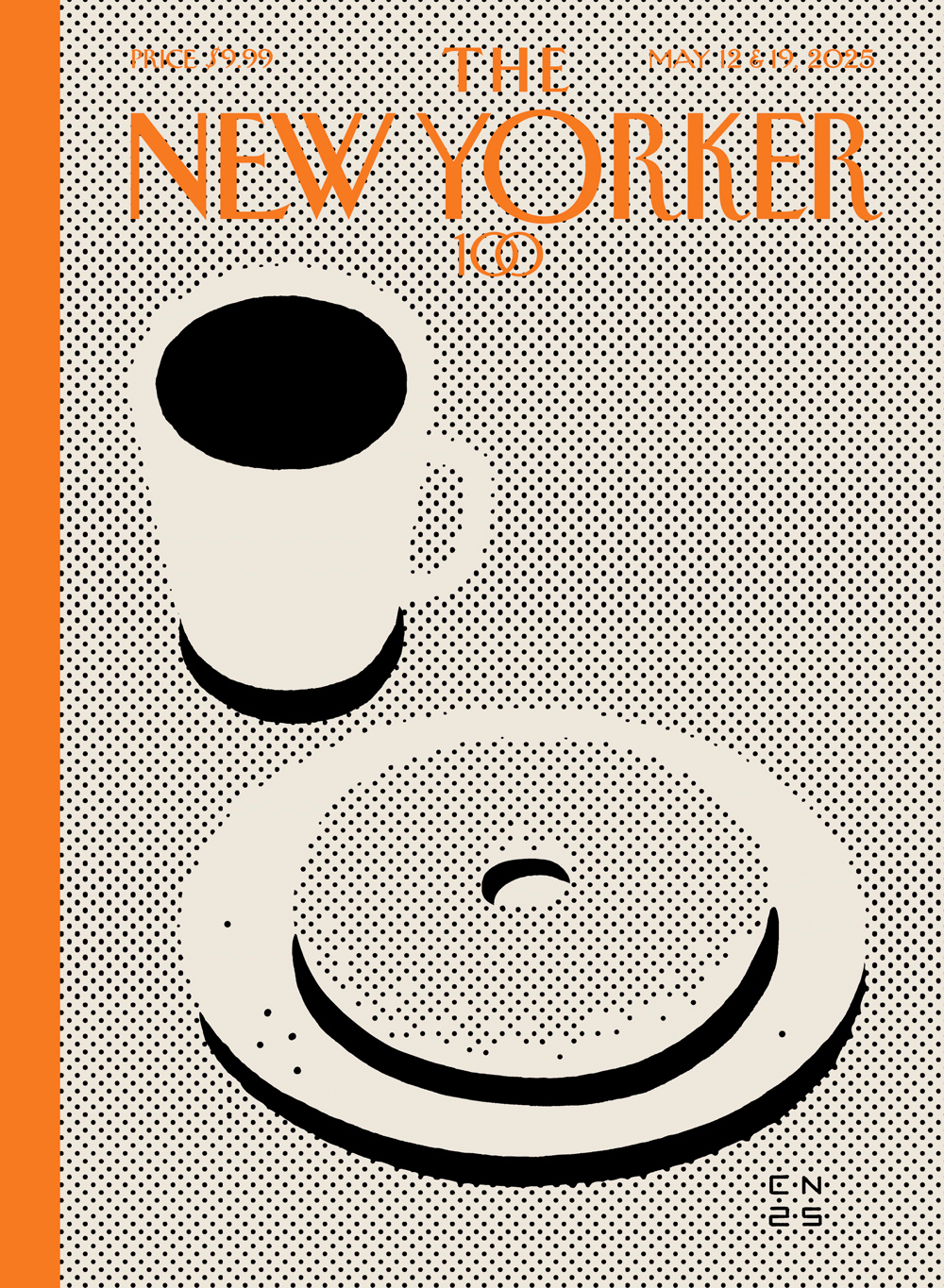
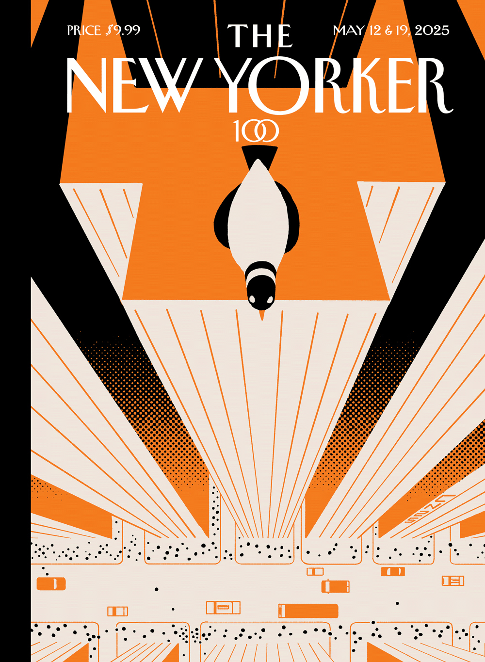
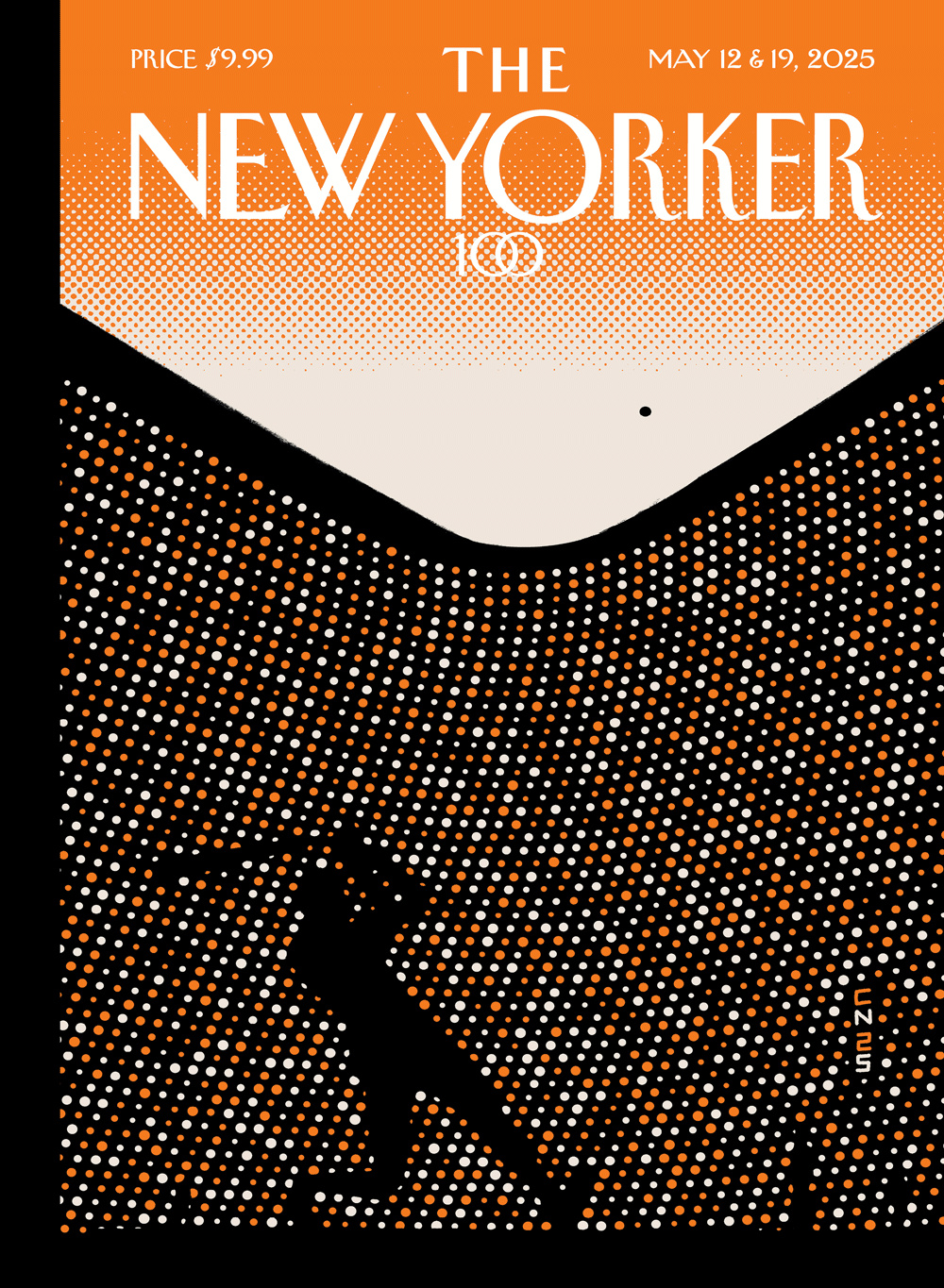
I love the halftone dots and spots in Christoph Niemann’s four different cover illustrations for the recent centennial issue of The New Yorker.

Books, Design and Culture
I love the halftone dots and spots in Christoph Niemann’s four different cover illustrations for the recent centennial issue of The New Yorker.

I love Tom Gauld‘s latest cover for the New Yorker so much. We just had sleet and freezing rain in Toronto so that part is accurate. But it’s not just the weather. Everything feels pretty bleak at the moment and, like many others, I have found myself seeking solace in art too.
(I also have a dog. I should post more dog cartoons)
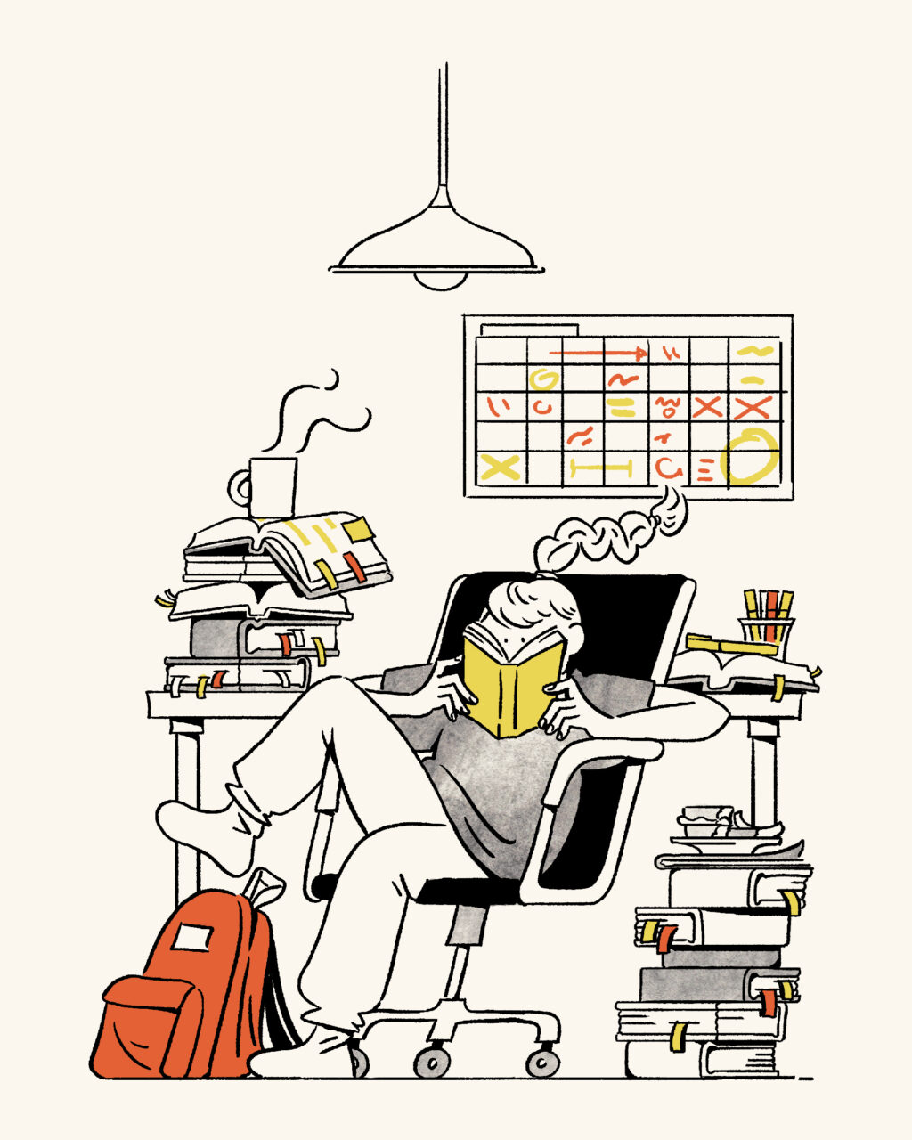
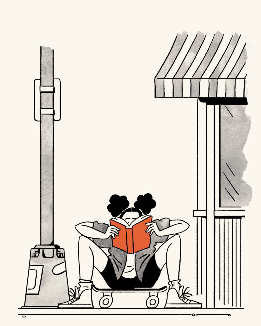
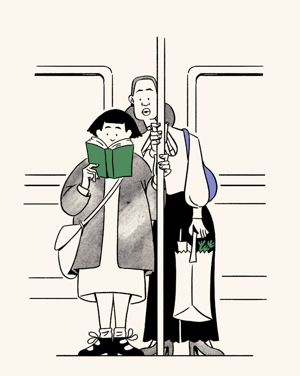
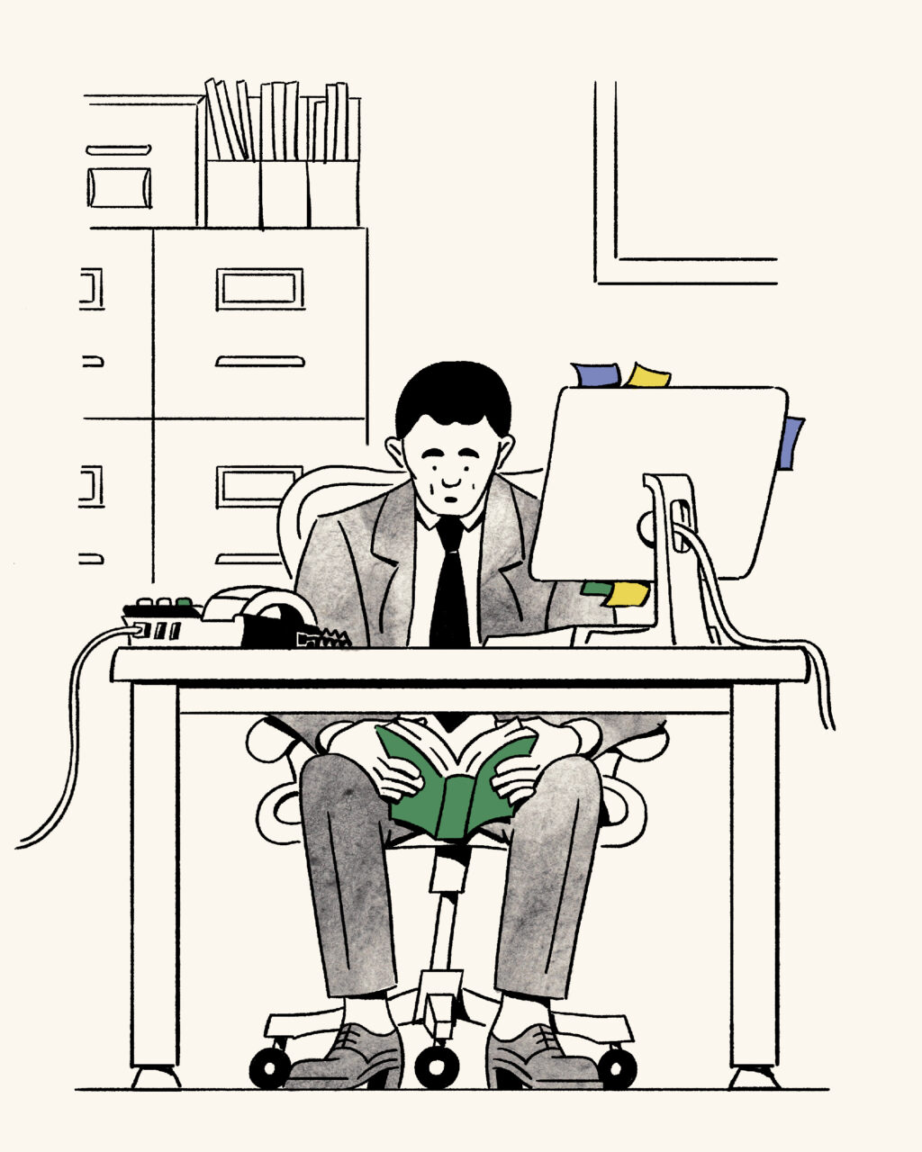
Comments closedThe Cari Vander Yacht illustrations of people distracted by reading that accompany the New Yorker‘s announcement of the 2024 National Book Awards longlists are really lovely. The animated versions on the site are really nice too.

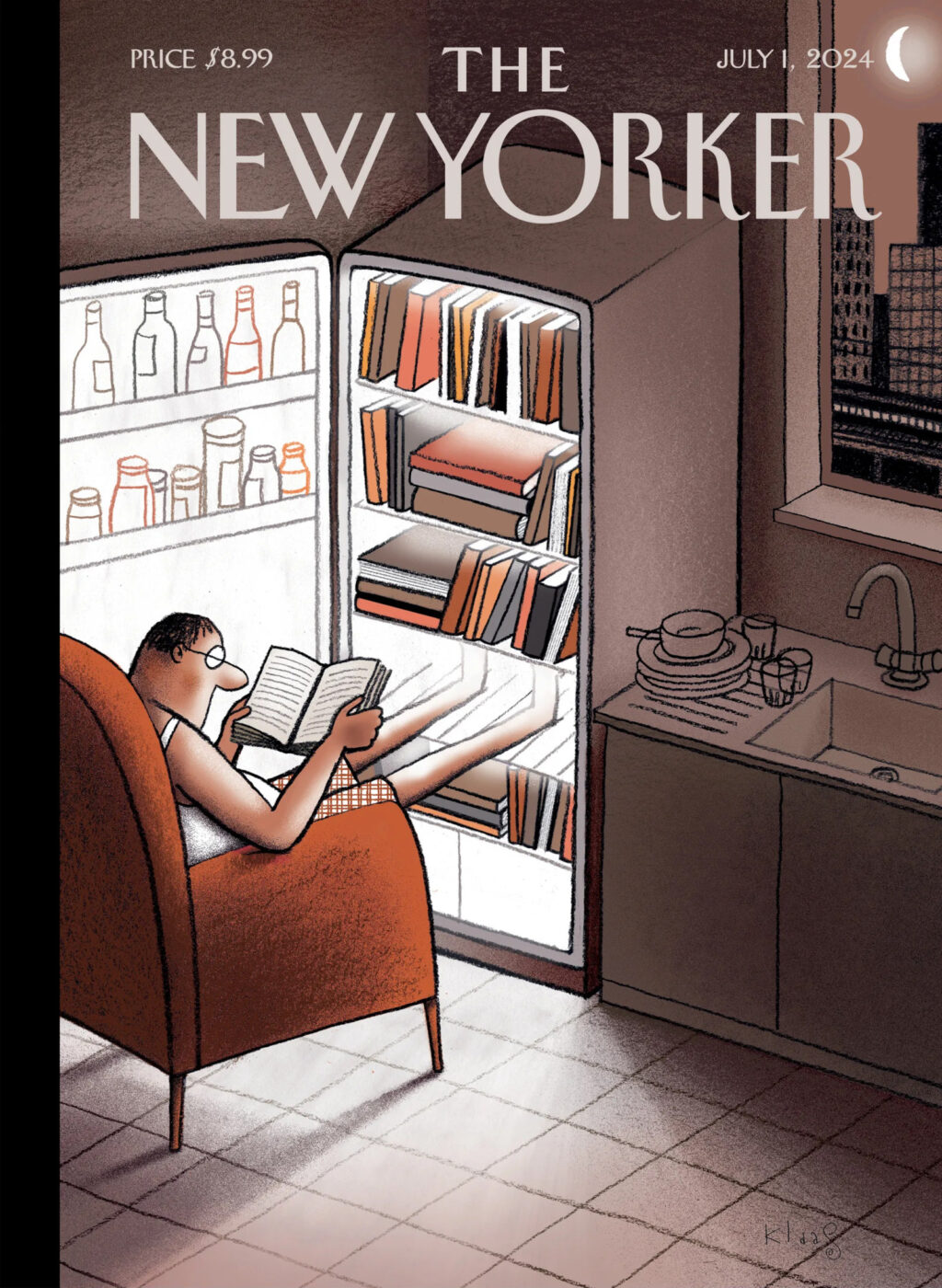
Another lovely illustration by cartoonist Klaas Verplancke for the cover of the latest New Yorker. It has been an unseasonably hot June in Toronto!
Comments closed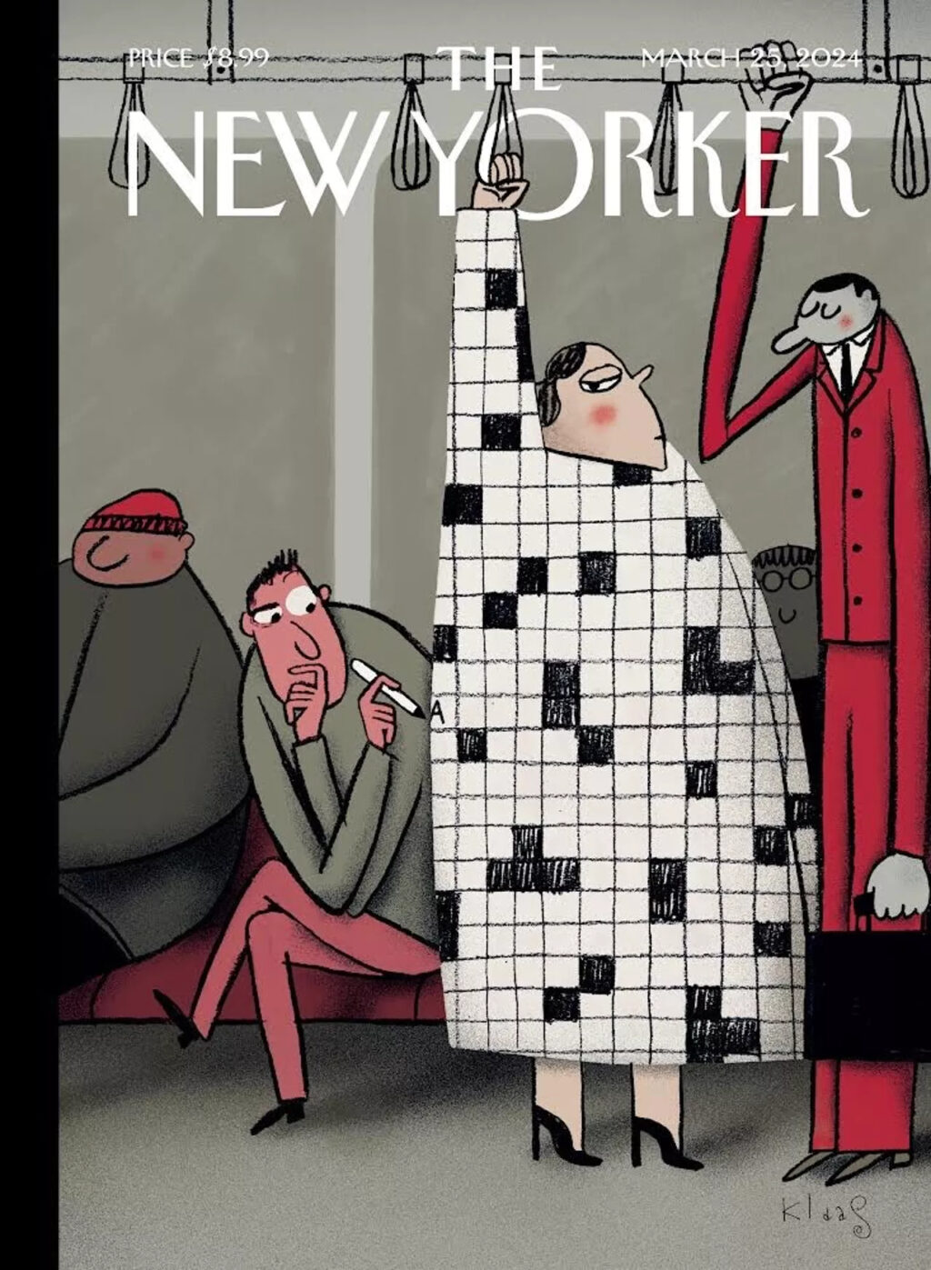
I love this illustration by Klaas Verplancke for the recent ‘Style Issue’ of the New Yorker (which has a fun animated version of the cover on its website).
It works on lots of levels, but it also feels like a bit of nostalgic throwback. People look at their phones these days (although I did see someone with a word search book on the Toronto subway this morning, so some people are keeping it old school at least).
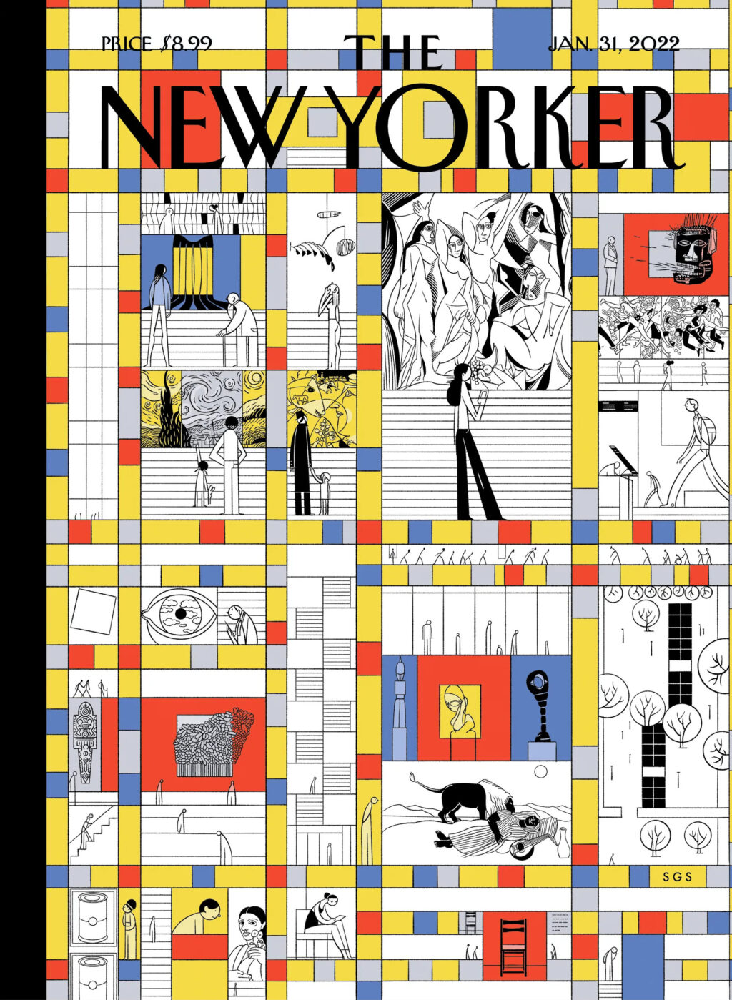
Grid patterns suit the cover of the New Yorker so well though. They work as a representation of Manhattan’s city grid and its skyline, as well as magazine layouts and puzzles. I was reminded me of Sergio García Sánchez’s “Modern Life” cover from a couple of years ago (itself a riff on Piet Mondrian’s New York-inspired painting “Broadway Boogie Woogie“). Chris Ware divided the cover into a comic book (ish) grid during the pandemic too. I’m sure there are more examples. (Grids are good!)
Alex Abramovich has a nice piece at London Review of Books on the late Tom Verlaine and the sale of his massive book collection:
Verlaine, who formed and fronted the band Television, died on 28 January 2023. Over the years he had acquired fifty thousand books – twenty tons or more – on any number of subjects: art, acoustics, astrological signs, UFOs. The sale of those books – a two-day affair in August, run out of adjacent garages in Brooklyn – was a serious draw. Arto Lindsay, the avant-pop musician, walked by. Tony Oursler made a short video and posted it on Instagram. Old friends, some of whom looked as if they hadn’t seen daylight in decades, found each other in the long line.
Dealing with that many books was quite an undertaking:
Verlaine had been a regular at the Strand, where he’d once worked in the shipping department – you’d see him on the sidewalk in front, where the dollar carts were. On tour, he used the space between soundcheck and showtime to visit local booksellers. In Brooklyn, he had packed his storage units so tightly that Patrick Derivaz, the friend charged with handling his estate, had to rent another unit just to have space to move boxes around. Jimmy Rip, a guitarist in Television’s most recent incarnation, had flown in from Argentina in January; seven months later he was still in New York, helping out. Dave Morse and Matty D’Angelo, of the Bushwick bookstore Better Read than Dead, had come aboard too.
‘Usually,’ Morse told me, ‘people call and say: “We have fifty thousand books.” You get there and it’s more like five hundred. In this case, we counted the boxes.
My books are not in storage units but having also helped some relatives downsize recently, this is a reminder that I need to take a long hard look at what I want to keep.
Comments closed
Sergio García Sánchez‘s cover illustration, coloured by his partner Lola Moral, for the recent fiction issue of The New Yorker is lovely.
Comments closed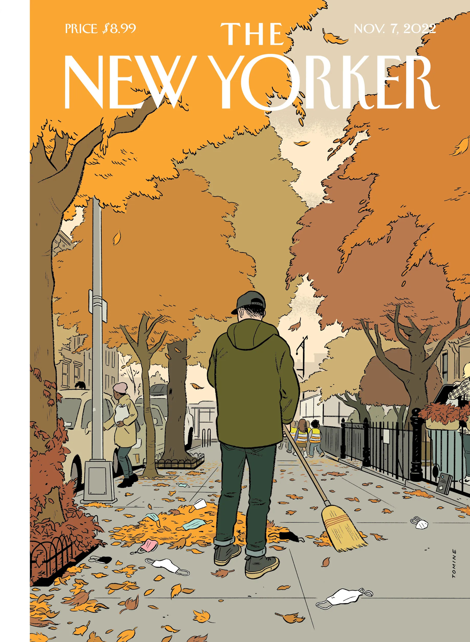
I was raking leaves in Toronto last night where it also feels like a lot of folks have discarded masks, so Adrian Tomine‘s latest cover for The New Yorker resonated with me.
The copy of The Loneliness of a Long-Distance Cartoonist propped up against the railing is also a nice touch.
1 Comment
I’ve already posted a couple of magazine covers about the current crisis, and yet another one has caught my eye. The cover of the April 13-26 edition of New York magazine features an extraordinary photograph by Alexei Hay of all but deserted Times Square on the morning of Monday, March 30.
You can see more of Alexei Hay’s photographs of an eerily empty New York here.
(via Robert Newman)
1 Comment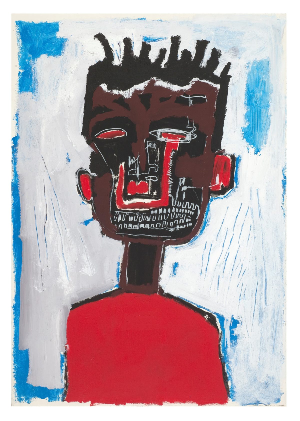
At The Guardian, Olivia Laing, the eminently readable author of To the River, The Trip to Echo Spring, and The Lonely City, on artist Jean-Michel Basquiat:
Comments closedThere is a graphomaniac quality to almost all of Basquiat’s work. He liked to scribble, to amend, to footnote, to second-guess and to correct himself. Words jumped out at him, from the back of cereal boxes or subway ads, and he stayed alert to their subversive properties, their double and hidden meaning. His notebooks, recently published in an exquisite facsimile by Princeton, are full of stray phrases, odd combinations. When he began painting, working up to it by way of hand-coloured collaged postcards, it was objects he went for first, drawing and writing on refrigerators, clothes, cabinets and doors, regardless of whether they belonged to him or not…
…A Basquiat alphabet: alchemy, an evil cat, black soap, corpus, cotton, crime, crimée, crown, famous, hotel, king, left paw, liberty, loin, milk, negro, nothing to be gained here, Olympics, Parker, police, PRKR, sangre, soap, sugar, teeth.
These were words he used often, names he returned to turning language into a spell to repel ghosts. The evident use of codes and symbols inspires a sort of interpretation-mania on the part of curators. But surely part of the point of the crossed-out lines and erasing hurricanes of colour is that Basquiat is attesting to the mutability of language, the way it twists and turns according to the power status of the speaker. Crimée is not the same as criminal, negro alters in different mouths, cotton might stand literally for slavery but also for fixed hierarchies of meaning and the way people get caged inside them.