Storytelling, at least from my experience of it… I think it’s a stand-in for day to day life. So, when you come to a story with this attitude we’ve been talking about, which is kind of hopeful, generous, not to pushy. It’s like ‘well, what are you? I don’t know.’ You know, when you try to leave your ideas about the story at the door… those things are so much like what you do with the person in your life that you love. You come back to them again and again and try to intuit their real expansiveness, and you try to keep them close to you, you try to give them the benefit of the doubt. So in that sense you could see revision as a form of active love. It’s actually love in progress, I guess.
Author George Saunders on story:
These unadorned outtakes of Saunders just talking direct to camera about his writing process are even better:
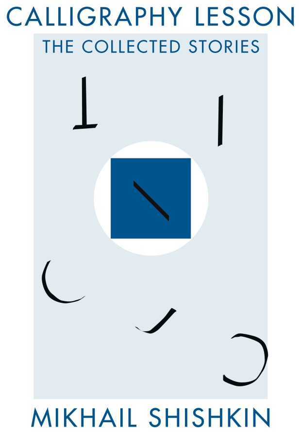
And, if you’re curious, the rather splendid covers for the actual twovolumes of The Penguin Book of the British Short Story were designed by Matthew Young:
The Penguin Book of the British Short Story; design Matthew Young
The Penguin Book of the British Short Story; design Matthew Young
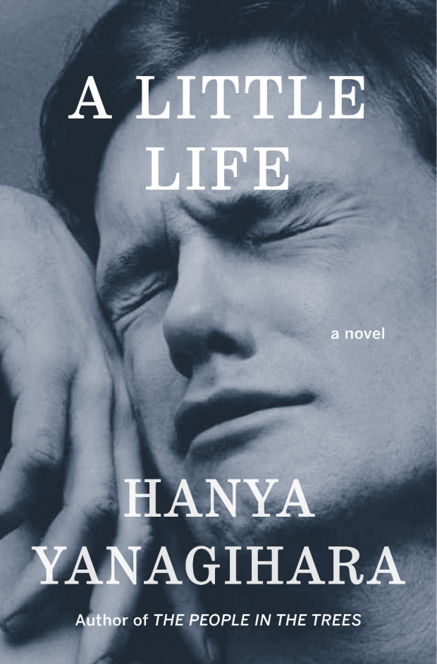
Jacket design by Cardon Webb; jacket photograph Orgasmic Man by Peter Hujar 1987
At the New York Times, Edmund White examines our enduring fascination with the New York of the 1970s:
Recently there’s been, in TV and film and certainly in books, an intense yearning for a specific five-year period in New York City, those years between the blackout in 1977, and 1982, when AIDS was finally named by the Centers for Disease Control. First was Rachel Kushner’s 2013 novel ‘‘The Flamethrowers,’’ whose heroine is a sharp-eyed bystander in the SoHo art scene, and now… ‘‘City on Fire’’ by Garth Risk Hallberg, which also concerns itself with the same time period. There are two television series in development that take place in the late 1970s as well, one directed by Martin Scorsese and co-written with Mick Jagger; the other by Baz Luhrmann. Next year, the Whitney will mount the first retrospective of David Wojnarowicz, the ultimate East Village grunge artist, in over 15 years; the work of his lover, the photographer Peter Hujar — which has recently been used both for an advertising campaign for the men’s wear designer Patrik Ervell and on the cover of… Hanya Yanagihara’s novel ‘‘A Little Life’’ — will be the subject of a forthcoming retrospective at New York’s Morgan Library.
COLLECTIVELY, THESE WORKS express a craving for the city that, while at its worst, was also more democratic: a place and a time in which, rich or poor, you were stuck together in the misery (and the freedom) of the place, where not even money could insulate you. They are a reaction to what feels like a safer, more burnished and efficient (but cornerless and predictable) city. Even those of us who claim not to miss those years don’t quite sound convinced. ‘‘Well, I sure don’t have nostalgia about being mugged,’’ John Waters told me. Though then he continued: ‘‘But I do get a little weary when I realize that if anybody could find one dangerous block left in the city, there’d be a stampede of restaurant owners fighting each other off to open there first. It seems almost impossible to remember that just going out in New York was once dangerous. Do any artistic troublemakers want to feel that their city may be the safest in America? Who’s going to write a book about walking the safe streets of Manhattan? It’s always right before a storm that the air is filled with dangerous possibilities.’’
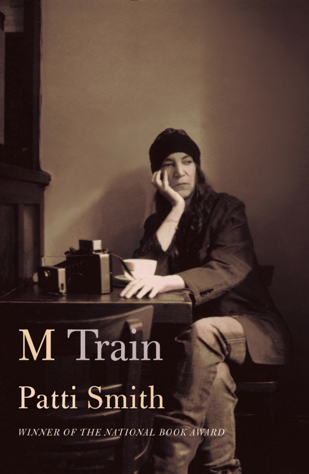
Jacket design by Carol Devine Carson; jacket photograph by Claire Alexandra Hatfield
Similiarly, at the Guardian, Glenn Kenny looks at our obsession with the New York of Lou Reed and Patti Smith:
The New York we aspired to was Lou [Reed]’s, not Liza Minnelli’s, or a little later, Frank Sinatra’s. (The New York we aspired to was also Martin Scorsese’s, too, as it happened, and it’s almost entirely forgotten that it’s in his movie of the same name that the future anthem New York, New York made its first bow.) And these days, “wild side” New York is gazed at in rearview with fervent affection, in works by Edmund White, Patti Smith, Brad Gooch and others. (Not to mention those, like Garth Risk Hallberg or Rachel Kushner, who are too young to have their own memories to work with.) Smith’s books, in particular, seem to have hit a nerve. Her new book M Train is a more impressionistic sequel to her National Book award winning memoir of 2011, Just Kids, which is currently being developed as – weirdly enough, for me and perhaps for her – a Showtime TV miniseries.
The place these books conjure is both very scary, and very exhilarating. Not a place where some kind of arty misfit or wannabe arty necessarily wanted to live, but rather a place where one such creature could live. And hence, a place where one such young creature had to live.
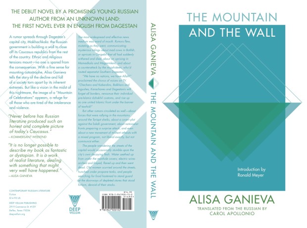
At the Toronto launch of John Freeman’s new anthologylast night — encouragingly called ’10 Reasons to Not Shoot Yourself in the Face Over the State of Literature’ — Literary Hub‘s Jonny Diamond mentioned design as a reason to be optimistic about current state of publishing. In particular, Jonny called out the book covers of Deep Vellum, a Dallas-based literary non-profit that publishes literature in translation.1 The covers, designed by Anna Zylicz, are strange, minimal, and instantly recognizable. There’s something of a hard-edged Peter Saville feel to them. I especially like the cover for Sphinx by Anne Garréta. Anna Zylicz is clearly a designer to watch.
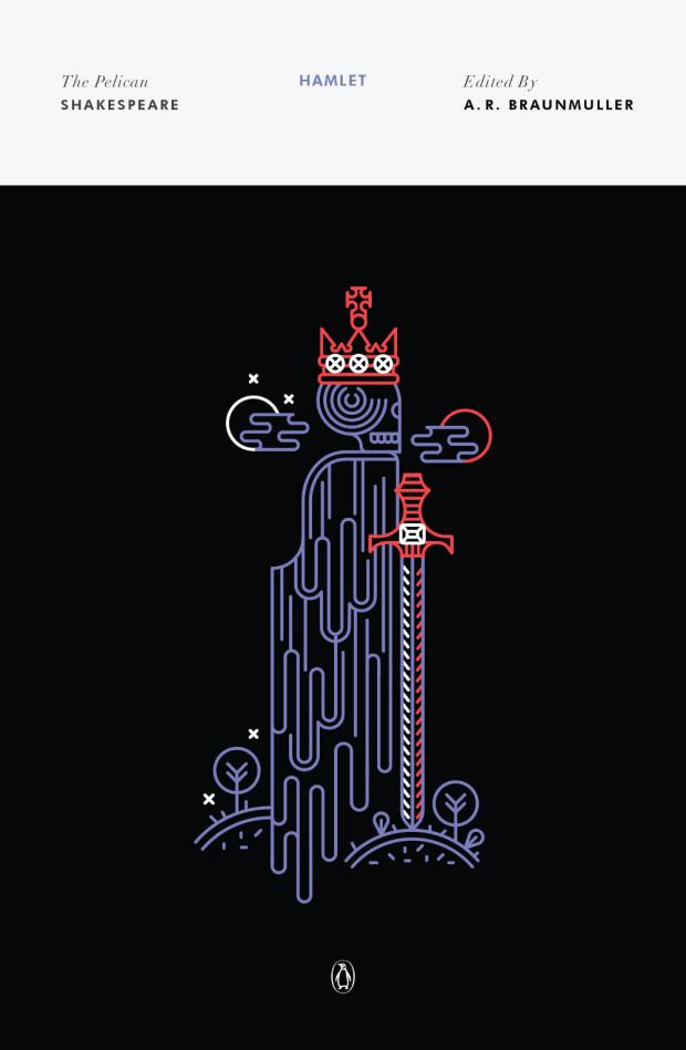
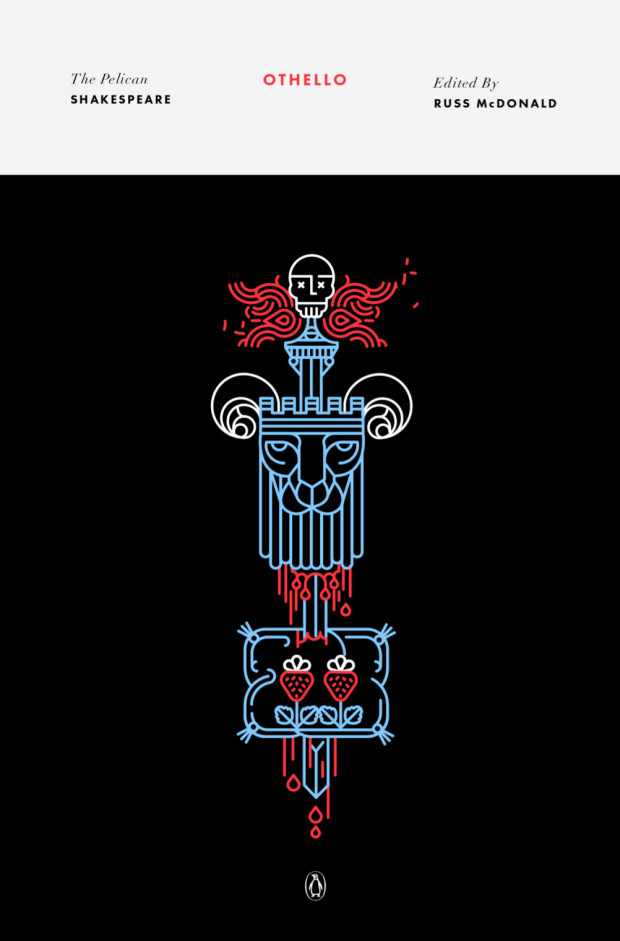
Continuing with the recent series design theme here on The Casual Optimist, creative director Paul Buckley let me know about new set of covers for the Pelican editions of Shakespeare. The covers were designed by newcomer Manuja Waldia, who studied Graphic Design at NIFT, New Delhi and the Milwaukee Institute of Art & Design. Waldia has been commissioned to design the entire series (which is a lot of book covers!), and as a Paul said, “she gives the last two male icon artists to do that (Milton Glaser and Riccardo Vecchio) a run for their money.”
Writing at NY Magazine’s Vulture, Boris Kachka, whose book Hothouseon Farrar, Straus & Giroux was published in paperback last year, profiles nonprofit literary publisher Graywolf Press:
Publishing just over 30 books a year, Graywolf has had authors win four NBCC awards, a National Book Award, two Pulitzers, and a Nobel Prize — all in the last six years. This year, it will exceed $2 million in sales for the first time. No other independent press, never mind a 41-year-old nonprofit, has come so far so fast. It didn’t happen by accident.
“I think of success as being able to say yes to something that doesn’t necessarily look like a commercial winner,” says Fiona McCrae, Graywolf’s publisher since 1994, over yogurt and decaf on one of her monthly visits to New York. “Knowing something is good and having to say no, that seems to me the bigger failure.” An affably owlish Brit, McCrae started out in London’s legendary literary Faber & Faber before transferring to its small American spinoff in Boston. Three years later, she heard that Graywolf’s founder was resigning.
Scott Walker began hand-sewing poetry chapbooks in Port Townsend, Washington, in 1974. While picking up poets like Tess Gallagher and Jane Kenyon, Walker turned Graywolf Press into a nonprofit and relocated to the Twin Cities, home to a thriving philanthropic base (which also supports nonprofit presses Milkweed and Coffee House). But in the ’90s, a publishing slump hit Graywolf particularly hard; Walker resigned and his board eventually hired McCrae. At the time, she had zero experience in nonprofits — possibly to Graywolf’s benefit, because she chafed at the complacency to which nonprofits are prone. “There’s got to be a way in which you absolutely value Graywolf,” she says, “but like, come on, everybody! Other small presses are not the measure. Do you say, ‘For our size, we get more attention, so that’s it,’ or do you say, ‘Where can we go?’
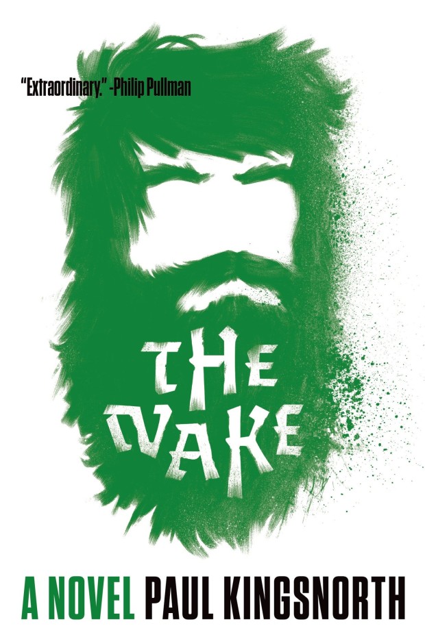
And speaking of Graywolf, I am looking forward to picking up a copy The Wake by Paul Kingsnorth, which they are publishing in North America this month (can anyone tell me who designed the cover?)
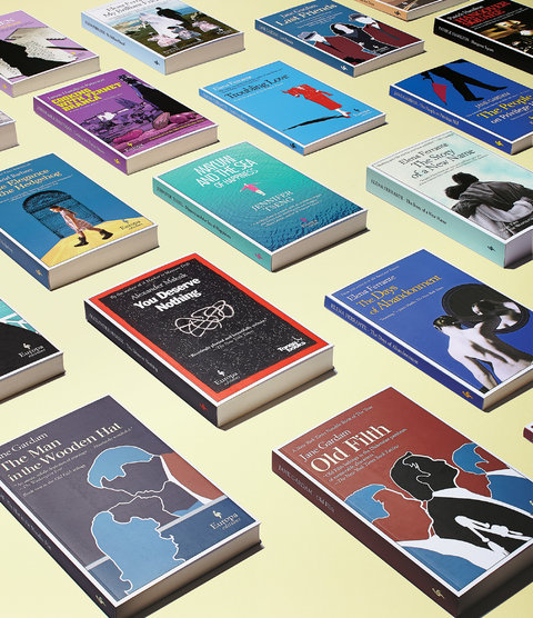
Even if you haven’t heard of Europa Editions, you’ve probably heard of some of its hits. There’s Muriel Barbery’s “The Elegance of the Hedgehog” (more than a million copies sold); Jane Gardam’s “Old Filth” (now in its 20th printing); and Alexander Maksik’s “You Deserve Nothing” (so far, the biggest title by an American). Like any good branded product, the books have an instantly recognizable visual stamp: stiff paper covers edged with white borders that frame color-drenched matte backgrounds. According to Europa’s Australian-born editor in chief, Michael Reynolds, “When you see them all together, they draw you in like a bowl of candy.”
That effect is completely deliberate. Europa books are the invention of the Italian husband-and-wife publishing team Sandro Ferri and Sandra Ozzola Ferri, founders of the independent Roman house Edizioni E/O, who have been bringing the likes of Christa Wolf and Ryszard Kapuscinski to Italian readers since 1979. Because their countrymen are notoriously unenthusiastic book readers, the Ferris designed alluring covers to tempt reluctant Italian eyes.
Interestingly, Motoko Rich already profiled Europa Edition in the Times in 2009, so I guess they must be doing something right…
Larry Rohter profiles the New York Review Books, the publishing offshoot of the literary magazine The New York Review of Books, for the New York Times:
“From the beginning, it was our intention to be resolutely eclectic, and build our classics series as different voices build a fugue,” said Edwin Frank, the house’s editorial director. “We set out to do the whole mix of things that a curious person might be interested in, which would take you back and forth from fiction to certain kinds of history.”
New York Review Books was founded in 1999, when the mainstream American publishing houses were shifting their focus to big frontlist titles and paying less attention to their back catalogs, sometimes allowing the rights to books that weren’t selling well to lapse, and also cutting back on literature in translation.
“We were picking low-hanging fruit, only no one knew the fruit was out there, hanging from the branches,” Mr. Frank said.
Over the years, the publishing house has revived work by English-language authors including Henry Adams, Kingsley Amis, Edith Wharton and Angus Wilson. In translation, it has issued works by authors like Adolfo Bioy Casares, Cesare Pavese, Raymond Queneau, Robert Walser and Stefan Zweig.
The writer and critic Ian Buruma, a frequent contributor to The New York Review of Books, which was founded in 1963 and is published online and every two weeks in print, said the publishing arm fills an important niche.
“Because they are smaller and more nimble, they can do things that larger houses would be less inclined to do,” he said. “They pick up books that maybe 30 years ago, the big publishers would have done but now have to be careful about.”
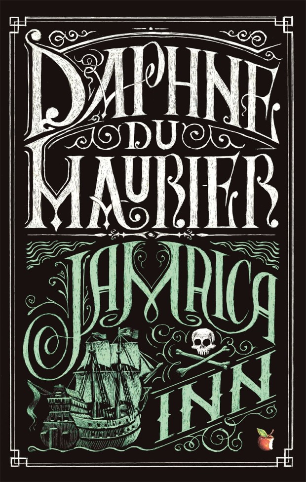
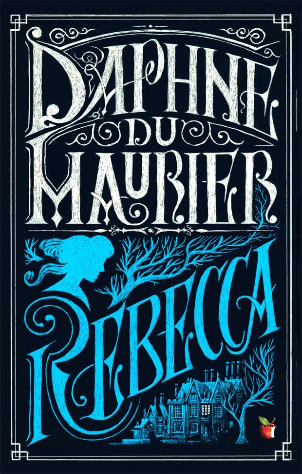
This summer UK publisher Virago is publishing two sets of Daphne du Maurier’s most famous titles with new and beautifully illustrated covers.
According to editorial director Donna Coonan, du Maurier’s reputation has flourished in recent years. She is also an author with cross-generational appeal. “The heroines of her best-known novels are young women at a turning point in their lives,” says Coonan. “These are beautifully written books that are exciting, suspenseful and brilliantly atmospheric. There is passion, danger, romance . . . and pirates!”
For over a decade Virago published du Maurier’s backlist with a uniform style. “They sat nicely together in a set, but were starting to look a little dated and lacked individuality,” says art director Nico Taylor. “I had never read du Maurier before, but once I got stuck in I realised just how diverse her writing is which led me to the idea that presenting each novel with a distinctive, individual look would be the best way to ensure du Maurier’s work continues to look fresh.”
For the first three titles in series (there are a staggering 17 or so more to come!), Taylor worked with illustrators Neil Gower (Jamaica Inn, Frenchman’s Creek) and Jordan Metcalf (Rebecca). “It became clear that it would be hard to avoid some of the obvious reference points from each title, but I was keen that they were used in an integrated or suggestive way… all credit has to go to the illustrators for imagining their respective covers in such distinctive ways.”
Alongside this refreshed backlist, Virago is also planning to introduce these same three classics — French Man’s Creek, Jamaica Inn, and Rebecca, — to young adults with new covers by Iacopo Bruno. “This was a great opportunity to show that du Maurier is a big contribution to the gothic novels popular with this age group of readers,” says art director Sophie Burdess. “I wanted to create a set of covers primarily composed of evocative gothic typography that gave du Maurier the authority and appeal she deserves as well as giving a feel for the individual themes of each novel,” she continues. “[Iacopo] is a rare and exceptionally beautiful illustrator and hand lettering artist who knows just how to pitch the work for a younger audience… the task of creating a set of beautiful compositions of elegant hand lettering and vignette illustrations was very safe in his hands.”


")
