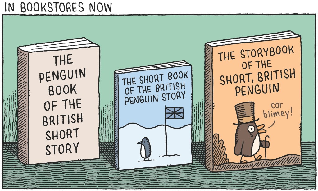
Cor Blimey! Tom Gauld for The Guardian.
And, if you’re curious, the rather splendid covers for the actual two volumes of The Penguin Book of the British Short Story were designed by Matthew Young:

The Penguin Book of the British Short Story; design Matthew Young

The Penguin Book of the British Short Story; design Matthew Young
Albertus = The Prisoner. At least for me. Depending on what they were going for, maybe not an inappropriate design solution.
I’m going to give you the benefit of the doubt Bram and assume that you’re at least kind of joking. A modified version of Albertus was used in the TV series The Prisoner. That is, however, hardly all is known for. It was designed by Berthold Wolpe, and although he was a German émigre, Albertus has, along with Gill Sans, become a quintessentially English typeface.
It is, as I’m sure you know, rather famously used on streets signs in the City of London, and Wolpe himself would go on to design many book covers at Faber and Faber using Albertus. Penguin has, I believe, made use of the typeface since the late 1930s. Albertus was also used for the original logo of English publisher Picador, launched in 1972. Peter Saville would later use it in his designs for Factory Records, and it was used on the cover The Smiths’ live album Rank. More recently, it has been widely used by Coldplay for their cover art, and Barnbrook used it extensively for the book David Bowie Is, published by the V & A in 2013. It seems pretty perfect for these covers to me.