Skip to content

Tag: john gall

Book Covers of Note May 2014

Another month, another selection of beautiful book covers…

9781447258896


The Axeman’s Jazz by Ray Celestin; design by Jo Thomson (Mantle May 2014)


The Bees by Laline Paull; design by Steve Attardo (Ecco May 2014)

DorothyMustDie
Dorothy Must Die by Danielle Paige; design by Ray Shapell (HarperCollins April 2014)

enlightenment

Enlightenment 2.0 by Joseph Heath; design by David A. Gee (HarperCollins April 2014)

goodbye-to-all-that

Goodbye To All That by Robert Graves; design by Matthew Young (Penguin May 2014)

Karate-Chop
Karate Chop by Dorthe Nors; design by Carol Hayes (Graywolf February 2014)

lunch-at-the-shop

Lunch at the Shop: The Art and Practice of the Midday Meal by Peter Miller; design by John Gall (Abrams April 2014)

one-and-only
The One and Only by Emily Giffin; design by Jennifer Heuer (Ballantine May 2014)

other-language

The Other Language by Francesca Marciano; design by Ben Wiseman (Pantheon April 2014)

raising-hell

Raising Expectations (and Raising Hell) by Jane McAlevey; design by Gray318 (Verso Books May 2014)

9781447229759

Vanishing by Gerard Woodward; design by Jamie Keenan (Picador UK March 2014)

young-skins

Young Skins: Stories by Colin Barrett; design by James Paul Jones (Jonathan Cape March 2014)

2 Comments

50 Covers for 2013

I decided to go in a slightly different direction with my covers list this year (see my lists for 2012, 2011, and 2010). It’s just a straight up list of the fifty covers designs with a few annotations and links a long the way. I’m sorry for woeful under-representation of Australian and NZ designers, and for completely ignoring the entire non-English-speaking world. I will try and do better in 2014. But until then, here, in alphabetical order, are my fifty covers of 2013:

33 Comments

Favourite Covers of 2012

For the past couple of years now (since Joseph Sullivan put the Book Design Review on ice in fact), I’ve been posting a short list of my favourite covers for books for the year. Now that thing for the New York Times is out of the way, I’m free to post my list for 2012.

To make a couple of very general observations about book design this year, the cover that probably made the greatest impact was Fifty Shades of Gray. It was a design that made it OK to read erotica in public, something which surely contributed to the book’s breakout success — a point not lost on other publishers who rushed to re-package their own erotica titles in a similar fashion. The results inevitably lacked the finesse of the original, but imitation is the sincerest form of flattery, as they say…

But while the cover of Fifty Shades of Gray smartly defied the conventions of its genre, it wasn’t an exciting cover and some publishers seemed to be more conservative in their design choices, playing it safe or relying on formulas. The jacket for The Casual Vacancy could hardly have been more forgettable, and it was not alone. A bland sameness crept in. Perhaps that could be said every year. I suspect, however, that smaller budgets, tighter deadlines, and readers browsing thumbnails rather than shelves had an effect.

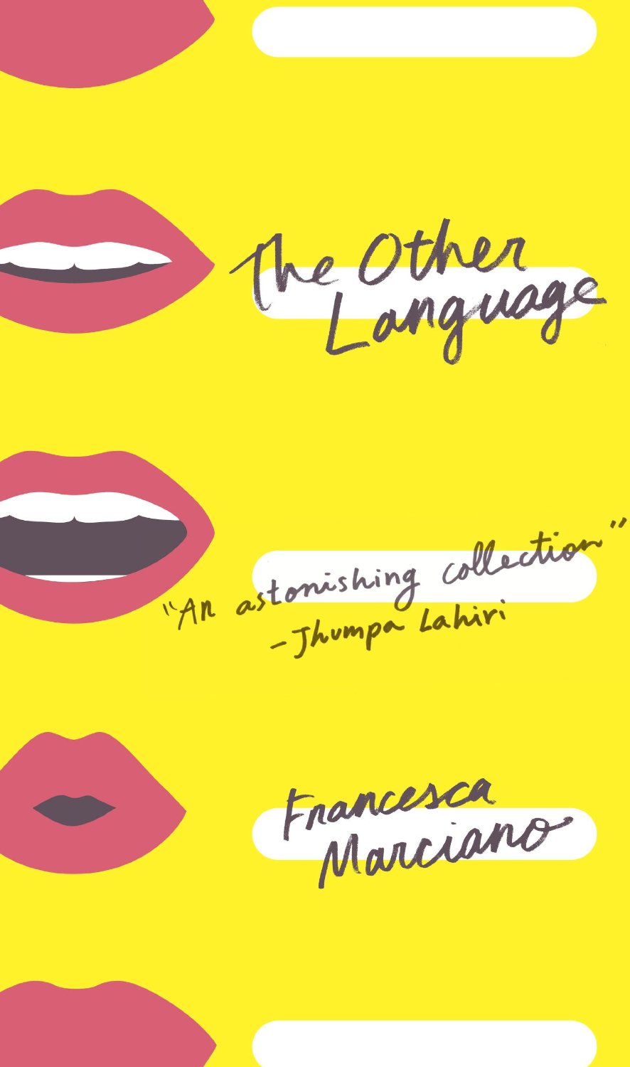
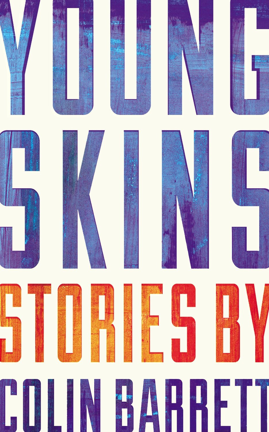
Nevertheless, some publishers were willing to trust their art directors and designers, and publish interesting and challenging covers. If I was to identify a common theme to my choices this year, it would be hand-drawn lettering and illustrated designs. With the ubiquity of stock photos and uninspired type-choices, that seems to be where the interesting things are happening, at least to my mind. Perhaps photographs will make a come back next year?

After Freud Left edited by John Burnham; designed by Isaac Tobin
University of Chicago Press

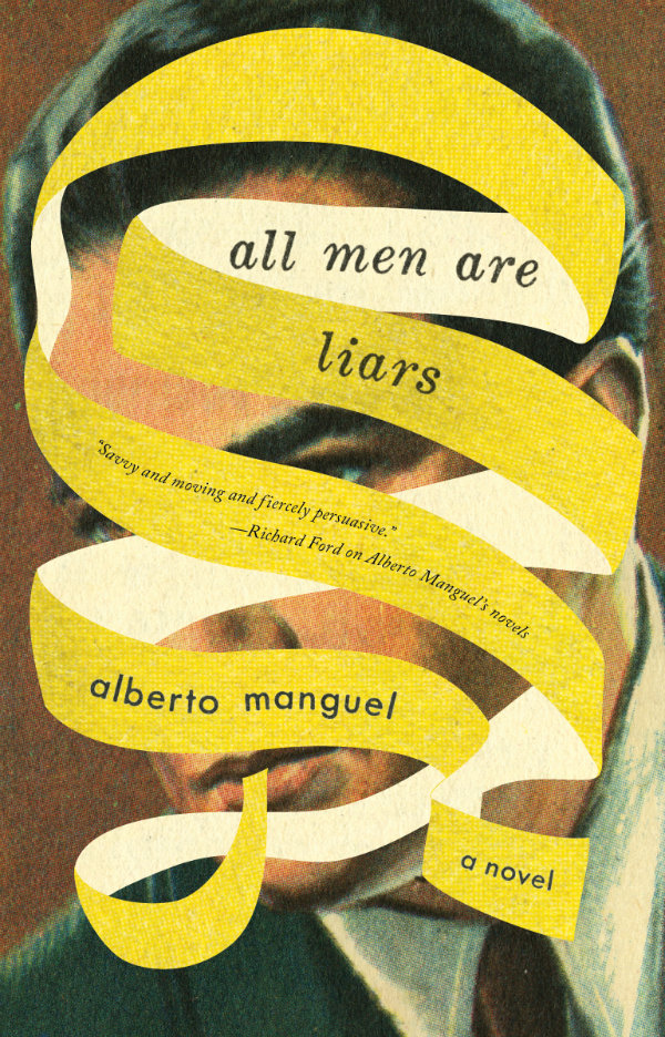
All Men Are Liars by Alberto Manguel; design by Jason Booher
Riverhead

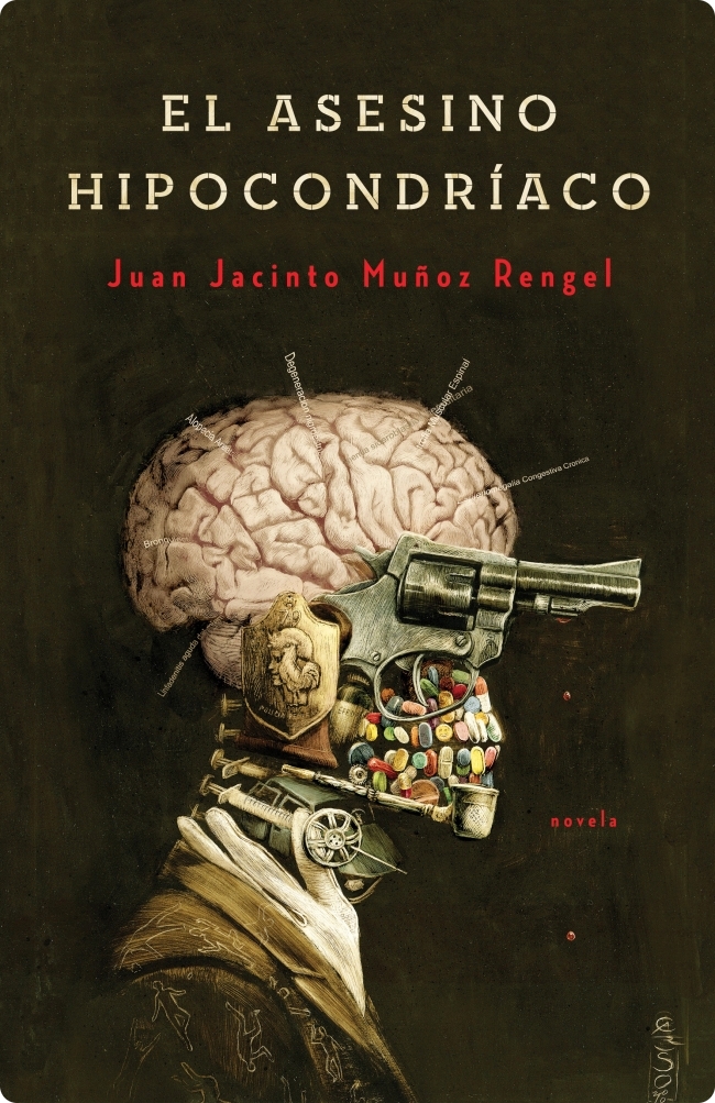
El asenino hipocondríaco by Juan Jacinto Muñoz Rengel; design by Ferran López, illustration Santiago Caruso
Plaza & Janés


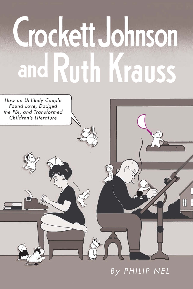
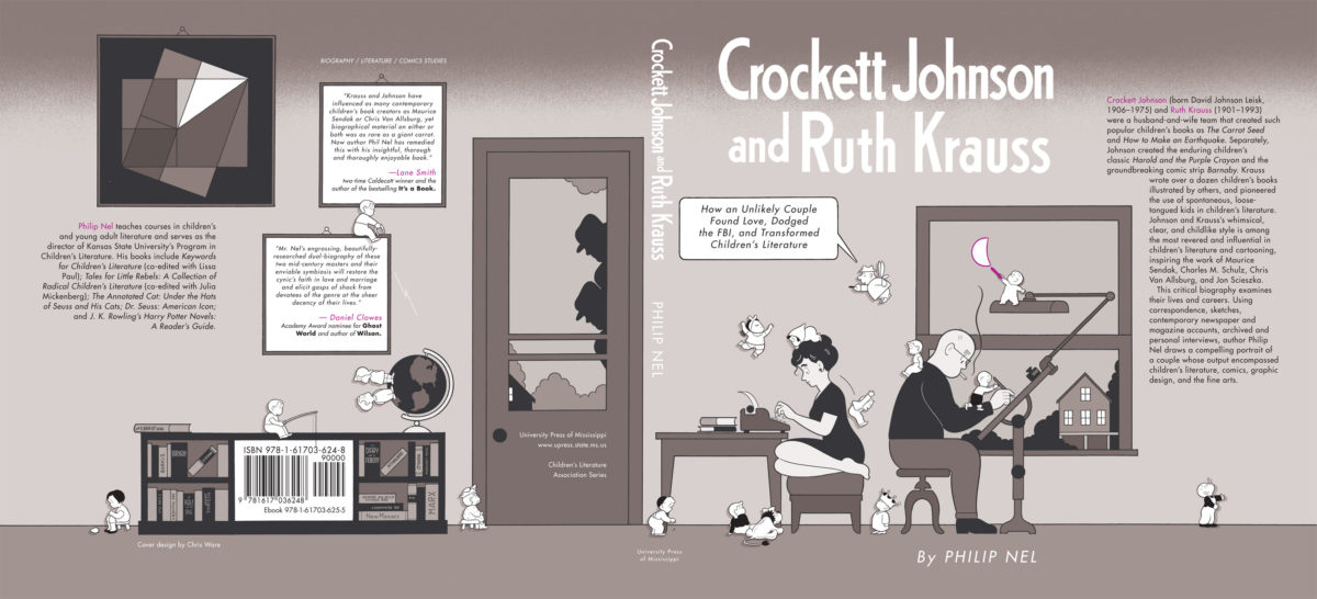
Crockett Johnson and Ruth Krauss by Philip Nel; design by Chris Ware
University Press of Mississippi

Cruel Britannia by Ian Cobain; design by FUEL
Portobello Books

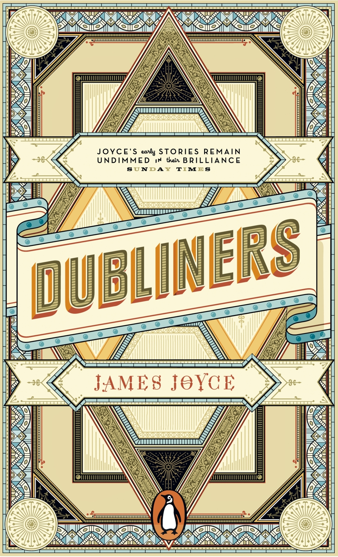
The Dubliners by James Joyce; design by Apfel Zet / Richard Bravery
Penguin Essentials, Penguin (UK)

The Flame Alphabet by Ben Marcus; design by Peter Mendelsund
Knopf

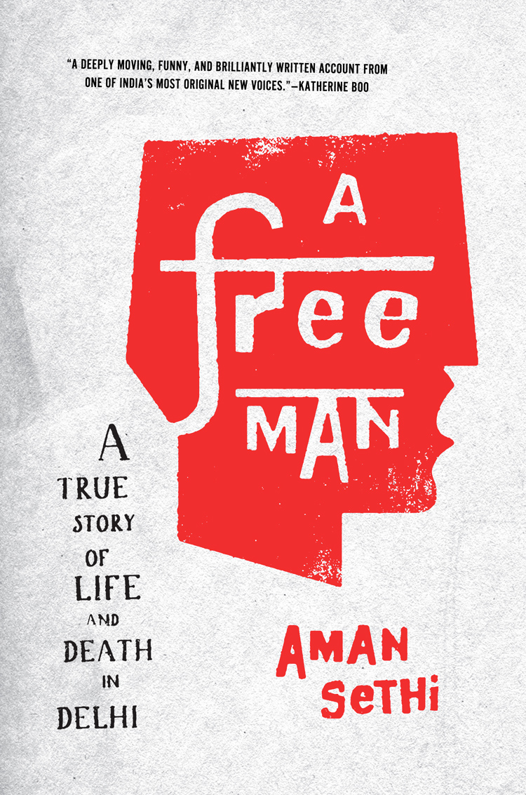
A Free Man by Aman Sethi; design by Ben Wiseman
W.W. Norton

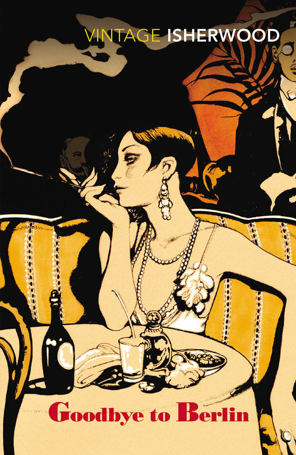
Goodbye to Berlin by Christopher Isherwood; illustration by Vania Zouravliov

Vintage Isherwood, Vintage (UK)

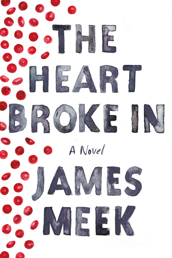
The Heart Broke In by James Meek; design by Jennifer Carrow; illustration by Michele Banks
Farrar, Straus & Giroux

Hope: A Tragedy: A Novel by Shalom Auslander; design by John Gall
Riverhead

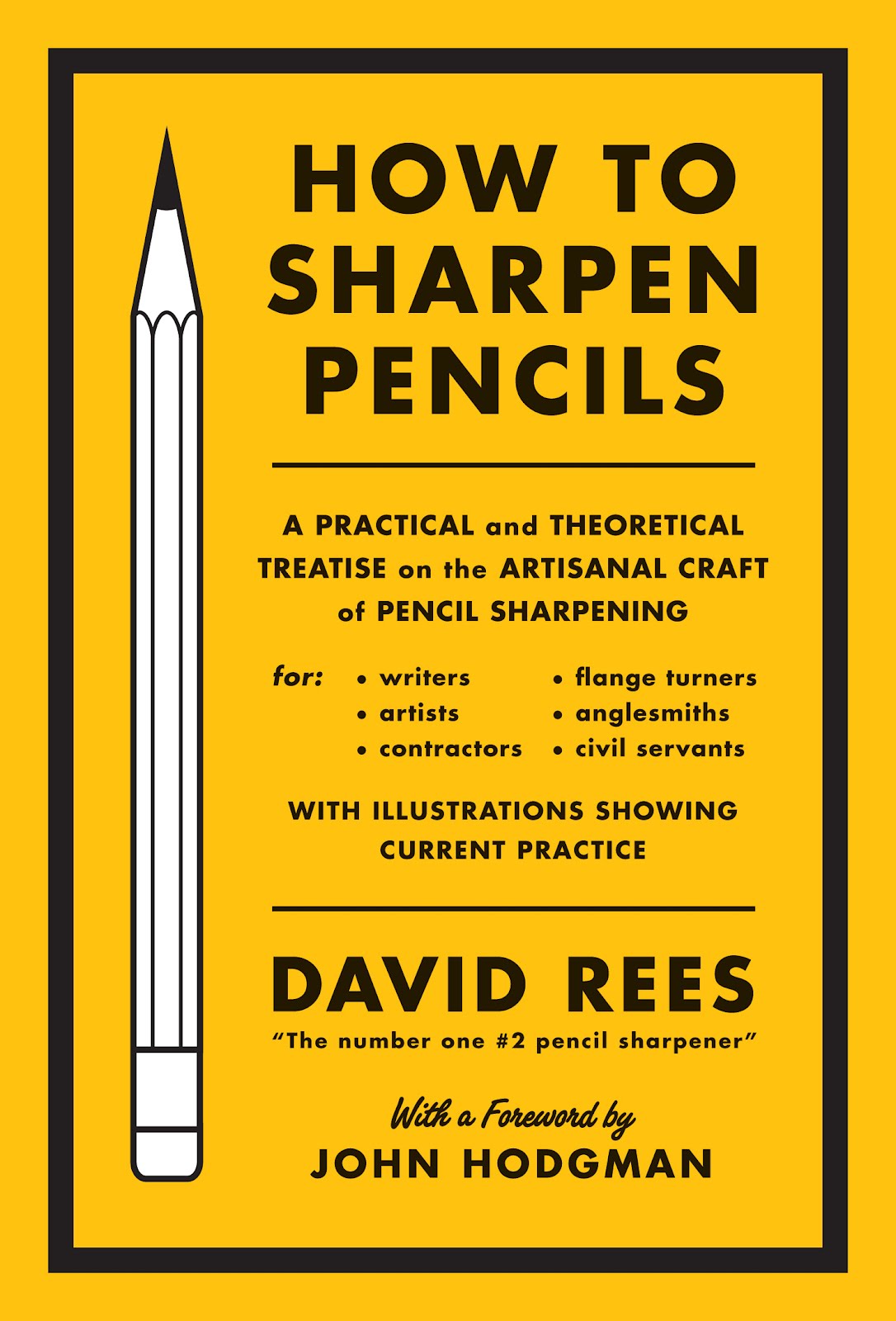
How to Sharpen Pencils by David Rees; design by Christopher Brian King
Melville House

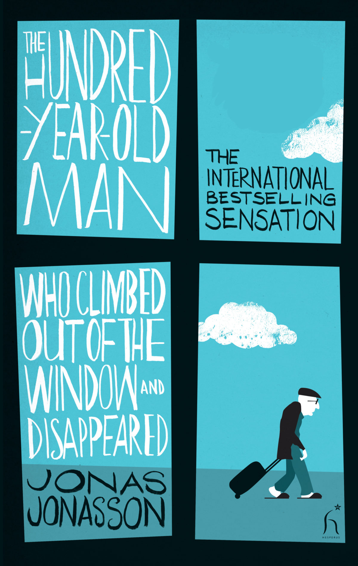
The Hundred-Year-Old Man Who Climbed Out of the Window and Disappeared by Jonas Jonasson; design by Jonny Pelham
Hesperus Press

Husk: A Novel by Corey Redekop; design by David A. Gee

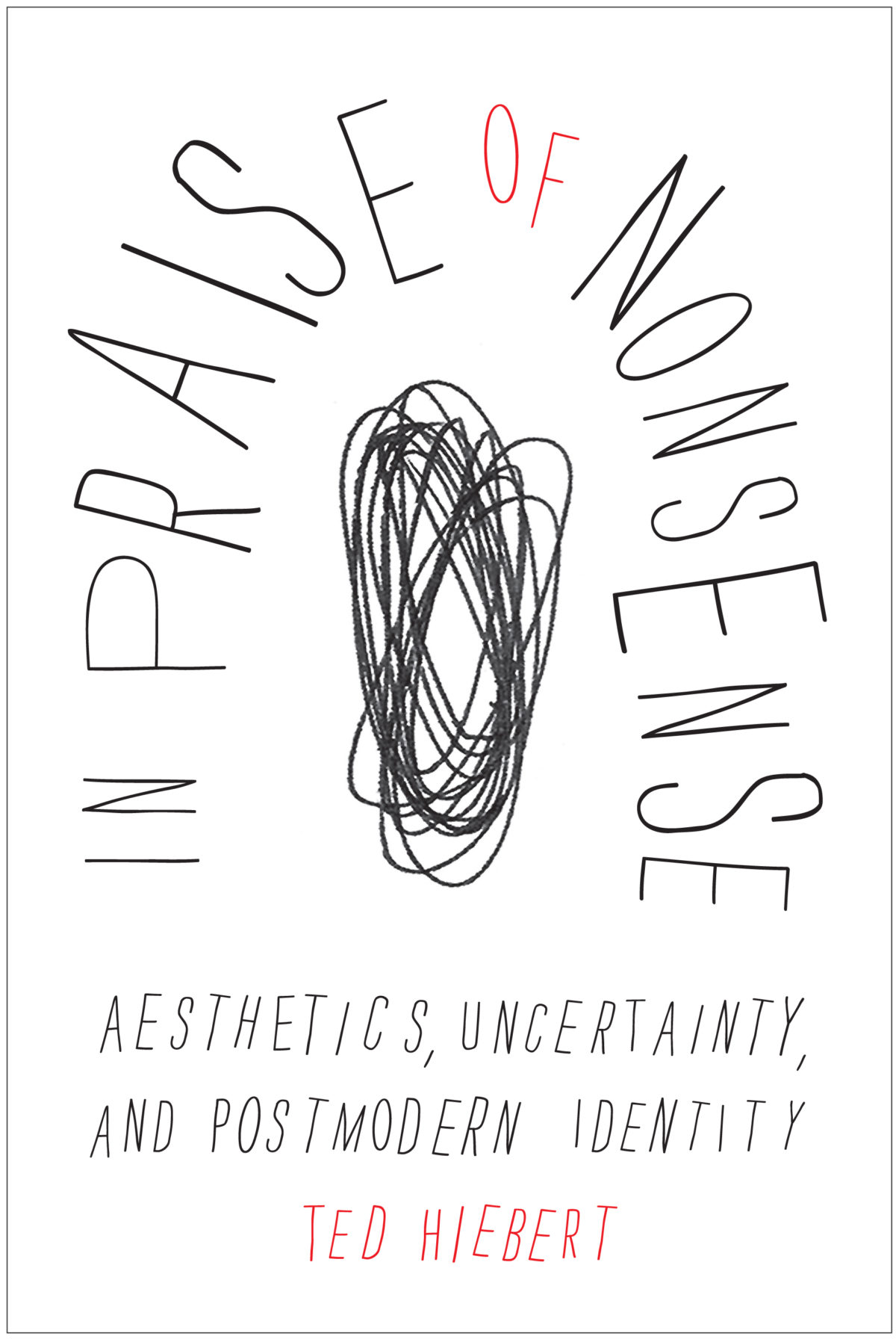
In Praise of Nonsense by Ted Hiebert; design by David Drummond
McGill-Queens University Press

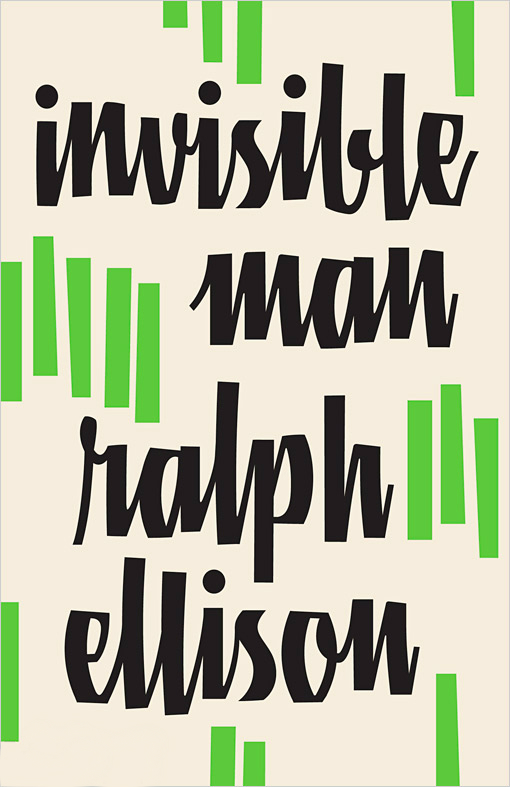
Invisible Man by Ralph Ellison; design by Cardon Webb

Vintage (US)

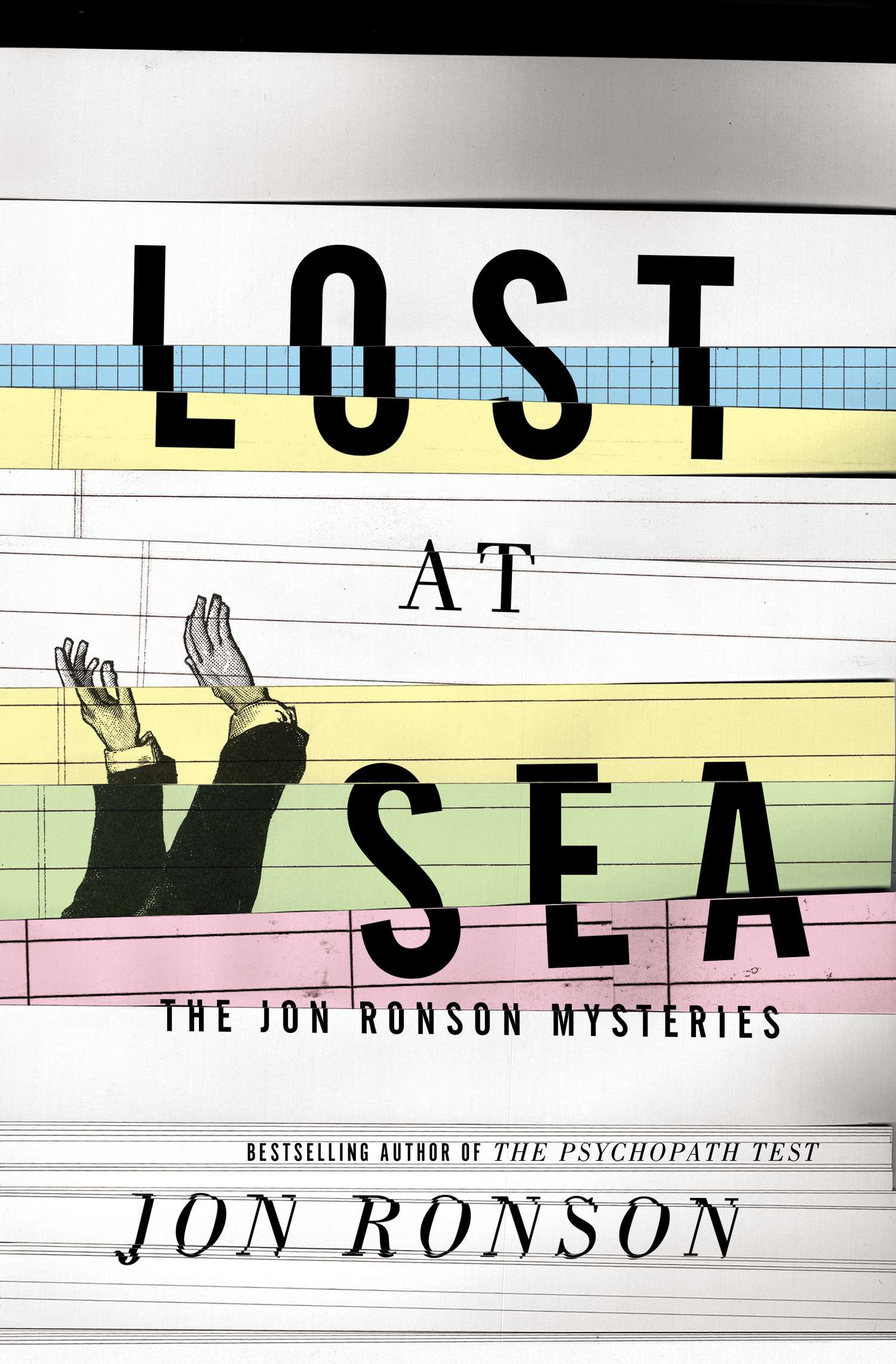
Lost at Sea by Jon Ronson; design by Matt Dorfman
Riverhead

May We Be Forgiven by A. M. Homes; designed by Alison Forner
Viking

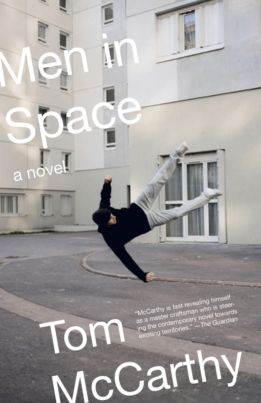
Men in Space by Tom McCarthy; design by John Gall
Vintage (US)

NW by Zadie Smith; designed by Gray318
Hamish Hamilton

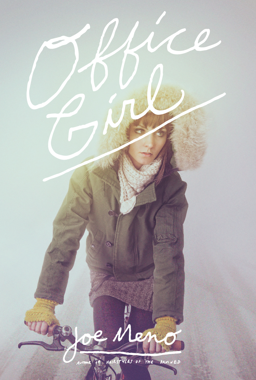
Office Girl by Joe Meno; design by Cody Hudson, photograph by Todd Baxter
Akashic

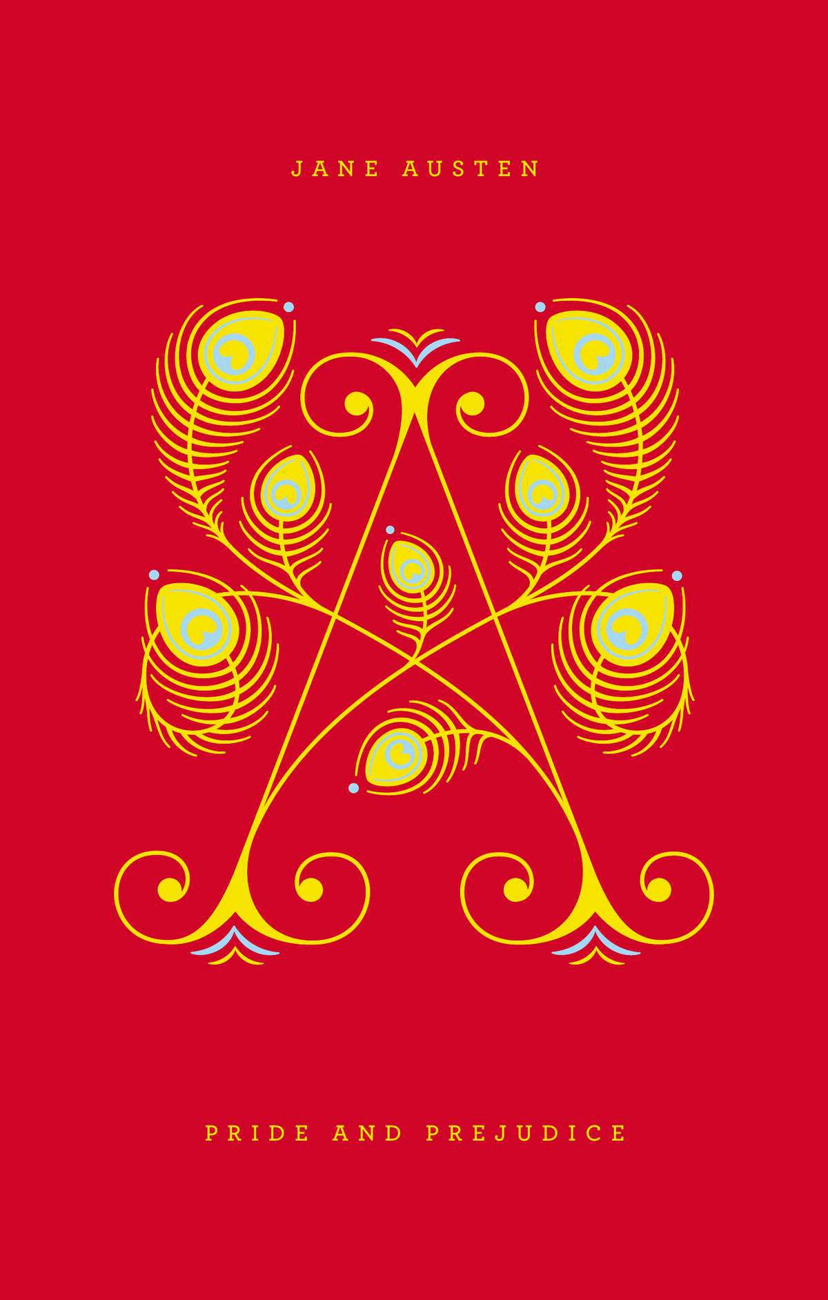
Pride and Prejudice by Jane Austen; design by Jessica Hische / Paul Buckley

Penguin Drop Cap, Penguin (US)

Swimming Studies by Leanne Shapton; design Leanne Shapton / Matthew Young
Particular Books

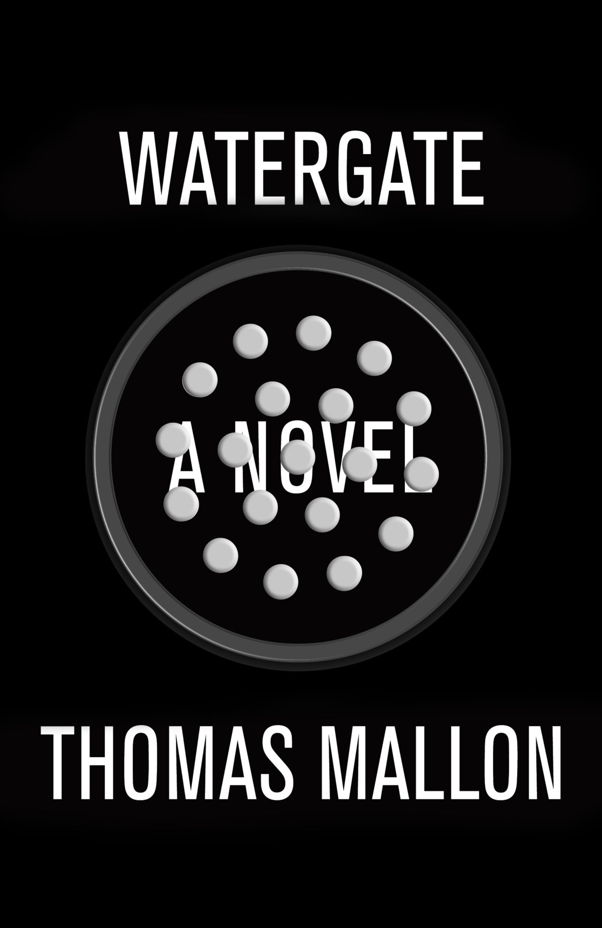
Watergate: A Novel by Thomas Mallon; design by Paul Sahre

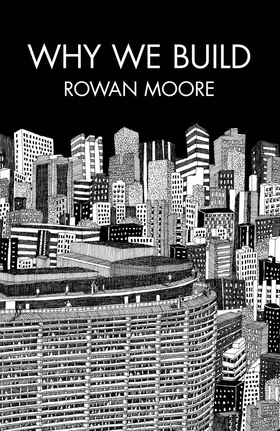
Why We Build by Rowan Moore; illustration by Diane Berg
Picador (UK)

Honourable Mentions:

;

You can find my lists for 2010 and 2011 here and here, and if you haven’t seen my 50 covers post from earlier this year, you can find that here. Happy Holidays!

16 Comments

Lip Service

The most recent cover of Playboy is, as some have been quick to point out, reminiscent of John Gall’s original cover design for the Vintage edition of Lolita by Vladimir Nabokov, reissued in 2005. John’s design is more subtle than the Playboy cover and more effective for it (but then Lolita is not Playboy after all):

Were Playboy inspired by the book cover? It seems unlikely. The image in John’s design was actually rotated for the final cover and looks quite different:

If I remember correctly the change was made because original orientation was too suggestive. For Lolita. (Just think about that for a minute.)

Is it also seems unlikely that they were inspired by Georgia O’Keeffe (Black Iris III pictured above) although there are some obvious similarities. Has anyone used O’Keeffe for the cover of Lolita?

Interestingly, the cover for the current Penguin edition of Lolita uses a similar colour palette to the Vintage edition and (to a lesser extent Playboy). The head is upright in this version as well. The vertical line of the nose is broken the horizontal features of the eyes and mouth, as well as by the title. Disconcertingly, the photograph and the round sans-serif font are suggestive of a YA novel. Perhaps that unsettling thought is the desired effect?

John’s design for Vintage replaced an earlier photographic cover by Megan Wilson which took an altogether different approach,  placing the book firmly in a historical context. It’s interesting, however, that John’s unused design echoes the crooked vertical line created by the legs in Wilson’s image:

While maintaining a vertical line, David Gee’s unpublished cover cuts to the chase in a far more clinical fashion…*

Inadvertently referencing spatialist painter Lucio Fontana

And one cannot talk about vertical lines and vaginas without mentioning Barnett Newman and his infamous “zip”. Or at least I can’t. But surely Mr Newman wasn’t thinking smutty thoughts was he?

Somehow I doubt Playboy was influenced by either Fontana or Newman. However, here is a 2003 poster for the Vagina Monologues designed by Chermayeff & Geismar that pre-dates both Playboy and Gall. The message is different, I think, but the photograph is clearly being used in a similar way. I’m sorry I don’t have a better image:

And finally, here is the cover of Nova 1965-1975, which utilizes an original cover from the innovative women’s magazine where Harry Peccinotti was art director. Is this the design that started it all?

*You can see many (many) more Lolita book covers here, and read Print magazine’s article ‘Recovering Lolita’ about John Bertram’s cover competition, here. The mighty Peter Mendelsund also weighs in on covering Nabokov here.

Comments closed

50 Memorable Covers From the Last Four Years

The Casual Optimist turned 4 years old at the end of last week. While not exactly a historic achievement, the blog has lasted the length of a presidency and exactly 3 years, 11 months longer than I thought it would. In order to celebrate this minor triumph, I thought I would post some memorable book covers from the last 4 years. It was going to be 10 covers, then it was 20… It quickly became 25, then it was 30… by 30 I figured I might as well do 40… I missed 40 and had to cap it at 50. It was just for fun and not meant to be a definitive survey — it’s just 50 covers that have stuck in my mind. Let me know what you would’ve included in the comments. Leave a comment or send me an email if I am missing details or have incorrectly attributed something.

The keen-eyed among you will also notice that there are no covers from 2012. I’m keeping my powder dry. You can expect a post of my favourite covers of the year in the not too distant future. You can let me know your picks for 2012 in the comments as well. In the meantime, I’m going on vacation so this will be my last post for a while.

So here you go — 50 great covers with some occasional notes. Enjoy…

13 Comments

Midweek Miscellany

A design collaboration between Paul Buckley and Jessica Hische, Penguin Drop Caps is  a 26-book series of hardcover classics. The first six books go on sale November 27th. See the covers at Imprint.

Plumbing — An interview with book designer John Gall at The Believer:

A cover is a structural part of the book. It protects the pages. It provide the first impression of the content. It’s an eye-catching device – maybe the book’s only means of advertising. It can even add to the editorial content of the book; you can kill bugs with it.  Then, after you buy the book, the cover takes on another function. It’s your visual connection to the book as you develop a relationship with the material. It can also communicate to others who you are. I’m one of those people, who when I visit someone, I snoop around and see what’s on their bookshelves. I’m not doing this to judge them, but to find some common interest, a connection to that person.

There is also this great anecdote about Tom McCarthy and the cover for Remainder:

We did a photo shoot for his cover so it appeared that the book was being slowly immersed into blue liquid. We had to create a somewhat elaborate setup to get it just right. We sent the author a photo of the studio setup as a souvenir, showing the tripods and lights and water tanks. A year later he wrote back saying he had an argument with some artist friends of his over dinner. They were looking at the studio-set photo and were insisting that it was all a fake setup and that the cover was executed in Photoshop; that the photo shoot was all staged to provide “proof,” like a fake moon landing!

My Q & A with John is here.

Graveyard Stillness — Andrew Beckett reviews Unknown Pleasures by Joy Division bassist Peter Hook for The Guardian:

Joy Division, for all the graveyard stillness of their record sleeves, were participants in a frenetic golden age for British pop, which had begun with punk in 1976 and would peak, commercially at least, with the British dominance of the American charts in 1983. Groups grew up fast and seized their moment, or disappeared. Yet Joy Division did not earn enough from their feverish touring and recording to give up their day jobs. Hook worked in the offices of the Manchester Ship Canal Company, Curtis at an employment exchange, and Sumner for a film company where his “job was to colour in Danger Mouse”.

And finally…

The Fight Against Loss — A lovely essay by Simon Schama on why he writes:

Orwell’s four motives for writing still seem to me the most honest account of why long-form non-fiction writers do what they do, with “sheer egoism” at the top; next, “aesthetic enthusiasm” – the pleasure principle or sheer relish of sonority (“pleasure in the impact of one sound on another”); third, the “historical impulse” (the “desire to see things as they are”), and, finally, “political purpose”: the urge to persuade, a communiqué from our convictions.

To that list I would add that writing has always seemed to me a fight against loss, an instinct for replay; a resistance to the attrition of memory.


Comments closed

Something for the Weekend

A busy week for John Gall, Art Director at Anchor/Vintage: he unveiled a beautiful new website, and his design for the paperback boxed set of 1Q84 by Haruki Murakami (pictured above). My Q & A with John is here.

Los Angeles Review of Books also has a swanky new website.

Let’s Not Get Carried Away — Harvard professor Ann Blair, author of Too Much To Know, on the history of information at The Browser:

“Reading” covers a wide range of practices. Medieval scholasticism, for example, favoured a ponderous kind of reading of difficult Latin texts done by a few qualified scholars with pen in hand to comment on them. This kind of reading typically took place in a library or study with access to many other learned books. Novel reading was very different when it developed, especially in the 18th century – novels were viewed as engrossing and escapist entertainment, which was typically enjoyed in a nice comfy chair. Interestingly, this kind of reading, which we try to encourage in our children today, worried people in the 18th century. Wouldn’t girls especially get carried away by flights of fancy? People thought it important to control reading. For instance, it was considered better to have girls read in a circulating library since a public setting imposed limits on how far they could get carried away. So some of the fears parents have today about kids playing video games used to apply to reading.

And finally…

Howard Jacobson on Wisden’s Cricketer’s Almanack for the Independent:

What a wonderful thing is Wisden, that lovely, lozengy, yellow-jacketed, Bible-shaped and Bible-weighted cricketers’ almanack, 1,500 pages deep, in which the averages of batsmen and bowlers and wicketkeepers, English and not-English, male and female, living and dead, are collated with a mystic punctiliousness that proves beyond argument the existence of God. You want to see the Divine Watchmaker at work on the mathematics of life? Then read Wisden.

Comments closed

Midweek Miscellany

The Forger — Tom McCarthy (whose novel Men in Space has finally been published by Vintage in the US) at Interview Magazine.

People in Business — An interview with Dennis Johnson, publisher of Melville House, at The Economist:

I think it’s very obvious to people that we care about the packaging of our books. I think people know that if we care about the outside of our books then we probably care about the inside of them, too. I recently read a survey that said 39% or 40% of people who bought books on Amazon looked at them in a bookstore first. They could know everything about the book online short of having seen it, but still the physical object had enough meaning to them to want to see it first. That resonates, happily, with the fact that Valerie [Merians] and I came into this not as publishers but as artists. The object means a lot to us.

Parallels — Authors Geoff Dyer (Zona) and John Jeremiah Sullivan (Pulphead) in conversation at Work in Progress.

And finally…

Britain’s Original Information Revolution — Adam Nicolson, author of The Gentry, on a collection of English books dating back to the 17th century:

 We may think we are in the middle of a communications revolution: Flickr, Twitter, Facebook, YouTube, Hulu, iTunes… But all of them are, in their ways, secondary phenomena. Some of them are image-based, post-literate, but none would work without the foundations of a much deeper communications revolution which swept across Europe 400 years ago.

The 17th century is when the Europeans started to write: letters, diaries, journals, notebooks, account books, commonplace books, business correspondence, pamphlets, posters, chapbooks, newspapers. It was the first communications revolution, which both spawned and reflected the most revolutionary century we have ever had.

Comments closed

Midweek Miscellany

The cover for Hope: A Tragedy by Shalom Auslander designed by John Gall.

The Invisible Man — Lee Konstantinou, author of Pop Apocalypse, reviews Art Spiegelman’s MetaMaus for the LA Review of Books:

[T]here is something obsessive about MetaMaus, which says as much about the price of success in the contemporary literary marketplace — and its attendant culture of celebrity authorship — as it does about its subject. When a book like Maus makes a big impact, we often condemn its creator never to move on to new projects. MetaMaus give evidence that Spiegelman has endured a fate not unlike that of Ralph Ellison after he published Invisible Man in 1952. Like Ellison, Spiegelman has rightly earned enormous praise, and, also like Ellison, he has become his own best interpreter. But just as Ellison produced no major work after Invisible Man other than the unfinished, posthumously published Juneteenth…, Spiegelman has yet to produce a work of comparable depth and sophistication to Maus.

The Road — Julie Bosman on the future of Barnes & Noble for The New York Times:

If something were to happen to Barnes & Noble, if it were merely to scale back its ambitions, Amazon could become even more powerful and — well, the very thought makes publishers queasy.

“It would be like ‘The Road,’ ” one publishing executive in New York said, half-jokingly, referring to the Cormac McCarthy novel. “The post-apocalyptic world of publishing, with publishers pushing shopping carts down Broadway.”

…Without Barnes & Noble, the publishers’ marketing proposition crumbles. The idea that publishers can spot, mold and publicize new talent, then get someone to buy books at prices that actually makes economic sense, suddenly seems a reach. Marketing books via Twitter, and relying on reviews, advertising and perhaps an appearance on the “Today” show doesn’t sound like a winning plan.

See also: B & N won’t sell books from Amazon Publishing and Amazon’s Revenue Slumps.

And finally…

The fascinating first article in a year-long series on the inner-workings of Canadian publisher House of Anansi Press by Mark Medley for the National Post:

A significant amount of time is spent discussing paperback editions of books that recently came out in hardcover. “Right now, we’re seeing the market is really and truly paperback and e-book,” [publisher] MacLachlan says. “So, we have some hardcovers that we thought would [sell] in the fall that haven’t gone as well as they should. And so, rather than wait a whole year to reintroduce the book into the marketplace, let’s do a paperback edition sooner than later.”

Comments closed

All That Remains

From its abstract roots in Cubism to the political and counter culture movements of Dada and Punk, collage has always been a product of its environment. With the rise of 24 hour media cycles, social networks and search engines, contemporary culture has effectively rendered print media obsolete, creating a virtual boom in discarded paper ephemera for collage artists to examine and reinvent. Through these discarded remnants collage artists have become the archivists and activists of this post modern age, paralleling the frenetic pace in which we live while exposing the voyeuristic and often disjointed nature of popular culture.

If you’re going to be in New York at the end of this month, you might want to check out All That Remains, an exhibition of international collage at the Ugly Art Room in Brooklyn. Among the exhibitors is one John Gall, art director at Vintage/Anchor Books. You can read my interview with John about his collage here.

UGLY ART ROOM PRESENTS: ALL THAT REMAINS

October 21st – November 19th, 2011
Ugly Art Room (via Picture Farm)
338 Wythe Ave, Brooklyn, NY 11211

Opening Reception: 7-9pm, Friday, October 21st, 2011

Comments closed

Something for the Weekend

John Gall’s new cover for the paperback edition of C by Tom McCarthy. It can’t have been easy following this monster of cover.

NPR listeners pick their 100 favourite science fiction and fantasy books. On first glance, it looks like a diverse and wide-ranging selection.

Downloadable issues of De Stijl from 1917 to 1920. They’re in Dutch of course, but still! (via Coudal).

And finally…

Eye Magazine has a nice feature on Frederic W. Goudy’s 1918 book The Alphabet: Fifteen Interpretative Designs.

Comments closed

Midweek Miscellany

Kelly Thompson chooses her favourite 52 comic book covers from the past year on her blog 1979 Semifinalist. The cover above is by Dave Johnson for Unknown Soldier #22. Other personal favourites of mine on the list include the very retro Deadpool Pulp #4 by Jae Lee, and Hellboy: The Fury # 1 by Mike Mignola (you just can’t go wrong with a big axe really…)

And if you don’t read Kelly’s regular three sentence or less drunken demolitions of Marvel and DC covers you really are missing out. “Motherfucking gangbusters.”

Comics Dwindling Gene Pool — Alan Moore talks about the latest instalment of The League of Extraordinary Gentlemen, Century: 1969, and more with The Guardian:

These days, the majority of the comic book audience is 40-somethings who are not necessarily interested in comic books as a medium or panel progression or sequential narrative. They are probably interested in Wolverine. There is a large nostalgic component in there and there’s nothing wrong with it. But if those people then begin to influence the books themselves or increasingly the movies or the television series then they will want their story to refer to stories that they remember. It becomes very incestuous and over a few decades you get a very limited dwindling gene pool. And you get stories that have become weak through inbreeding.

And sticking with comics for a moment… Eric Reynolds talks about comics and Fantagraphics’ Mome Anthology in a four-part interview The Daily Cross Hatch:

Putting comics online is definitely of interest to myself and all of us at Fantagraphics, for sure. We know that that’s only going to continue to grow. It has certain advantages and disadvantages. But I don’t know if I necessarily want to edit an online anthology, per se. I don’t know why… I know if it’s just that I enjoy the tactile pleasures of print, or what, but—and this is my own personal preference—it doesn’t seem to quite exist when it’s on the Internet, which is quite paradoxical. The Internet has the potential to reach a lot more people that print, in this day and age, and yet, you don’t have that physical object to hold as proof that you did what you did.

Meanwhile, if you are looking for some ‘serious’ books for your vacation, the indefatigable Largehearted Boy is doggedly aggregating online summer reading lists for the year.

While at Slate Robert Pinsky explains  how not to write a book review (whether you’ve read the book in question or not).

And finally (in the likely instance you haven’t seen these yet)…

Cardon Webb’s clever designs for a new series of Oliver Sacks paperbacks from Vintage (via John Gall).


Comments closed