Skip to content

Tag: john gall

Q & A with John Gall

John Gall is Vice President and Art Director for Vintage/Anchor Books, an instructor at the School of Visual Arts, and the author Sayonara Home Run! The Art of the Japanese Baseball Card.

Previously Art Director at Grove/Atlantic, Gall has been interviewed about his work by Step Inside Design, Design Bureau, and Barnes & Noble (video). He garnered even wider attention in 2009 when he commissioned a roster of high-profile designers — including Rodrigo Corral, Carin Goldberg, Chip Kidd, Paul Sahre, Megan Wilson and Duncan Hannah —  to redesign twenty-one Vladimir Nabokov book covers within the confines of specimen boxes (read more about the designs at Print Magazine).

I have wanted to interview John for a long time, but as he talked about book design extensively elsewhere and regular readers are more than likely familiar with his work already, I was waiting for the right subject. It was his colleague Peter Mendelsund, who suggested that rather than discuss his book covers, I should ask  John about his collages. John Gall makes collages? Yes, indeed he does. And, needless to say, they are very good.

I met John in Toronto in December last year, and we corresponded by email.

When did you first start making collages?

It’s something that I’ve been doing sporadically since forever. And when I say sporadic I mean, years or decades between doing anything.

Do you create them digitally or by hand?

All hand done. One of the reasons I do this is to get away from the computer, drop the design think and work with the hands. Its kind of liberating to not have the ability to resize things on the fly. I sometimes use a digital camera to keep track of the permutations since my brain no longer can.

Can you give me a sense of their size?

8 x 10 on up to 18 x 24

How do you chose your titles?

The titles come from things I may be thinking about, or reading, or songs I may be listening to at the time I am making them. Then I make an anagram. It now takes me a lot of time to decipher the original source and many times I cannot. Strangely, when I posted “Hot Elves,” I got a ton of hits, which made me briefly consider naming everything after comic-nerd fetishes.

Who are your artistic influences and where do you look for inspiration?

I like the same old dead people as everyone else: Kurt Schwitters, Marianne Brandt, Georges Hugnet, Rauschenberg, John Chamberlain (not dead yet!), etc. People working today who make me incredibly jealous: Fred Free, Mark Lazenby, John Stezaker, James Gallagher, Lou Beach and family, Wangechi Mutu, Clara Mata, Robert Pollard, Nicole Natri, Paul Butler, Charles Wilkin and a bunch of people I’ve met on Flickr who’s real names I do not know.

Not sure how influential any of these folks are but they do inspire me to get off my ass and get to work.

Is creating a collage a similar process to designing a cover?

Yes and no. In both cases you are moving things around on a page until they look “right”. For me, when I am doing the collage work I am eliminating the concept (and most of the time the typography) so it is reduced to forms on a page.

Graphic design is a total left brain/right brain thing. A combination of logical carefully considered thinking and intuitive personal expression. For the collage work I try to put the logical aside and exercise the intuitive muscle.

Has making collages informed your designs?

When I am stuck, I sometimes find myself thinking “What can’t I do on a book cover”? Its chance to make the wrong path and see where that leads. Force myself to make the wrong decisions. Trying to leave thoughts of what looks “good” out of the equation. Nearly impossible, but that is the goal. The hope was that these notebooks could fuel design ideas. Not so sure if that is still the case. They’ve become a thing unto their own.

Have you ever used one of your pieces in a cover?

I used them on a poster once. Attempted to use them on a skateboard design. A couple of people have tried to use them on book covers, to no avail.

Was creating a series of collages from recombined book covers cathartic?

Not really. More like, “hmmm…its 12:30 AM, I’ve spent all day working on book covers and now I’m tearing apart old covers to make new covers. Lo-ser”.

That said I’ve since started up this series again and will be posting them shortly. But I can only do these when I am away from work for a spell. Generally its like, “enough with the book covers already, is Food Jammers on yet?”.

Where do you gather your source materials from?

Most of what I work with comes in the daily mail: catalogs, magazines, etc. I intentionally try not to work with anything that is too vintage or too inherently beautiful—though I do break this rule all the time. My thinking is that all the great collage artists of the past used source material that was lying around in the trash or purchased at the local five and dime. Today we look at a Cornell piece or a Schwitters piece and marvel at the incredible printed material they had to work with. They were working with the Foodtown circulars and Bass Pro Shop catalogs of their day except, well, OK, more beautiful.

Do you still collect Japanese baseball cards?

The collecting has tapered of quite a bit since the book was published. I’m much more selective now. but if I see something particularly beautiful up for auction I’ll probably go for it. I’m not a super smart collector though. I tend to buy what I like and not what will be valuable.

Do you collect anything else?

I’m trying not to acquire to much stuff anymore and am getting ready to purge. I collect old snapshots, the occasional flashlight and I’ve recently acquired a hankering for old high school yearbooks. I’ve also been trading and collecting collage work.

Your collages are included in the recently released Graphic: Inside the Sketchbooks of the World’s Great Graphic Designers. How did that come about?

The author Steven Heller, asked me if I had anything that I’d want to contribute. I told him I keep two kinds of notebooks, one that is basically a to do list and idea book. The others are the collage notebooks. They were much more interested in those. By the way, its a beautiful book.

Untitled, James Gall (2008); Untitled, Owen Gall (2008)

You’ve collaborated with your kids on some collages. Can you tell me about ‘Dad’s Drawing Class’?

Kids are the best. The great thing about collage is that anybody can do it, but its hard to do well. Kids are naturals. They have no preconceived notions as to what looks good, just do what they like. So they are free to do whatever they want—that is, until they get old enough to become self conscious..

Dad’s Drawing Class is something I like to do with my kids while we are hanging out on vacation without cellphones and video games. We’ve done collage, some drawing exercises. I even had them drawing typographic forms one morning. My wife is also very creative and influential in this regard. She teaches a nature drawing program for children.

Where can we see your work next?

I had a couple pieces in a group show last year and some of my work will be in a book coming out next spring called “Cutters”. Showing this work is not something that I am actively pursuing. I’m not so convinced of its worthiness. I have a flickr stream, a typepad blog and if you find yourself wandering around in my attic any time soon, you will probably see some work.

Thanks John!

Images:

  1. The Eye by Vladimir Nabokov, designed by John Gall
  2. The Enchanter by Vladimir Nabokov, designed by Megan Wilson and Duncan Hannah
  3. The Gift by Vladimir Nabokov, designed by Rodrigo Corral
  4. Paper Souls, John Gall (2008)
  5. Less Bravos, John Gall (2008)
  6. Shack Wine, John Gall (2010)
  7. Yeast Grippe, John Gall (2009)
  8. Limeade Fans, John Gall (2009)
  9. Cover Combine #13, John Gall (2011)
  10. Cover Combine #8, John Gall (2011)
  11. Cover Combine #4, John Gall (2009)
  12. Amendable Boy, John Gall (2010)
  13. Spray Degree, John Gall (2010)
  14. Untitled, James Gall (2008)
  15. Untitled, Owen Gall (2008)
  16. Gas Diode Zoom, John Gall (2008)
3 Comments

Midweek Miscellany

The typographical cover for Oscar Guardiola-Rivera’s What If Latin America Ruled the World designed by Sarah Greeno at Bloomsbury UK.

The Gall — The inimitable  John Gall, VP and Art Director of Vintage / Anchor Books, interviewed for a rather super looking new magazine called Design Bureau:

[O]nce you have a nice solid concept, the rest of the process can almost seem effortless; enjoyable, even. And these, of course, are usually the best ones.” Gall describes his creative process as threefold: research, concept and execute. “Read the books, come up with some ideas, flesh them out, see what is sticking,” he says. However, it’s the process of getting a book’s cover approved that poses the greatest challenge for Gall and his team. “If the publisher comes back and says, well, ‘This needs really big type with a chicken on it’, that obviously means they think this is kind of important,” he says. “The re-working, dealing with all the feedback (some warranted, some moronic) ‘make this bigger’, ‘make this smaller’, ‘my psychic thinks it should be blue’—that is what separates the men from the boys,” he says.

John Gall by Noah Kalina

The article is accompanied by photographs by Noah Kalina, and includes John’s tips for lunch in New York. What more could you ask for? An interview with designer Abbott Miller you say? Well, Design Bureau have one of those as well.

Exit Interview — Former New York Times Design Director Khoi Vinh on designing the newspaper’s paywall, and his decision to walk away, in the New York Observer:

One way of trying to make logical design decisions is through research. Mr. Vinh’s team has been studying traffic patterns on the site and watching test subjects, real readers, in a lab to see how their eyes move across the page when they are reading The Times online.

“I take it all with a grain of salt,” he said. “Everything is so measurable now, theoretically. But the truth of the matter is, there’s never enough data to substitute for raw decision-making abilities. At the end of the day, you still need to make the decision.”

Designing Madison Avenue The New York Review of Books blog on the look of TV show Mad Men:

Among many things that make Mad Men so intriguing is its broad definition of what constitutes design. For example, its cunningly detailed, not-quite-couture female costuming—the B.H. Wragge-style coat-and-dress ensembles, the Koret handbags, the Coro costume jewelry—makes the female characters … seem as if they have stepped straight out of the Sunday New York Times during the twilight of Lester Markel… Equally fanatical attention is paid to interior design. The offices of Sterling Cooper were done up in the spacious, late International Style corporate mode epitomized by the boxy glass-and-steel skyscrapers that rose along Park Avenue after World War II.

And on a somwhat related note, Eleanor Wachtel interviews legendary designer Milton Glaser for CBC Radio. Good stuff.

1 Comment

The Pleasures and Sorrows of Work

Jamie Keenan’s inspired cover for The Pleasures and Sorrows of Work by Alain de Botton, published by Vintage:

Image courtesy of Vintage and Anchor Books Art Director John Gall.

(Via @Pieratt and Book Cover Archive)

Comments closed

Midweek Miscellany

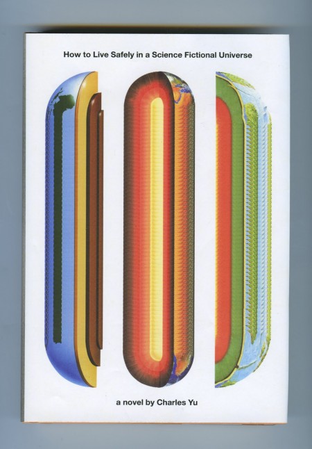
How To Live Safely in a Science Fictional Universe

A new cover from John Gall, seen at Peter Mendelsund’s JACKET MECHANICAL. Am I the only one who wants to hear these two in conversation? Dear NPR, could you get on that please?

Soft in the Middle — James Surowiecki looks at how midrange companies are being pressured by both high-end products at one end and ‘just good enough’ products at the other in the New Yorker (via Kottke):

The products made by midrange companies are neither exceptional enough to justify premium prices nor cheap enough to win over value-conscious consumers. Furthermore, the squeeze is getting tighter every day… This doesn’t mean that companies are going to abandon the idea of being all things to all people. If you’re already in the middle of the market, it’s hard to shift focus—as G.M. has discovered. And the allure of a big market share is often hard to resist, even if it doesn’t translate into profits.

I think we going to see this more in publishing with the midlist losing out to quick, cheap and ‘just good enough’ e-books and expensive, beautifully packaged hardcovers.

Somewhere Between Skeptic and Proselytizer — John Williams founder of The Second Pass interviewed at The Virginia Quarterly Review blog:

I think the way books are written about has been opened up in healthy ways. I like that there are more amateur (and semi-pro and pro) voices on the Internet, in the sense that it’s not just the unimaginative circle wherein writers of a certain kind of book review another example of that kind of book written by someone else. I’m not the first (or even the hundredth) to think that can lead to a lot of back-scratching or dry summation rather than forcefully argued opinion. It’s also true that the Internet has been great for, say, literature in translation, where entire sites (like Three Percent) can be devoted to a subject that gets less attention than it should in mainstream outlets. But as for how literary careers are made, I don’t think that’s changed as much as the tech apostles would like to believe.

The Incredible Book-Making Boy — Super talented author and illustrator Oliver Jeffers, whose new book The Heart and the Bottle was published earlier this month, interviewed at Seven Impossible Things Before Breakfast:

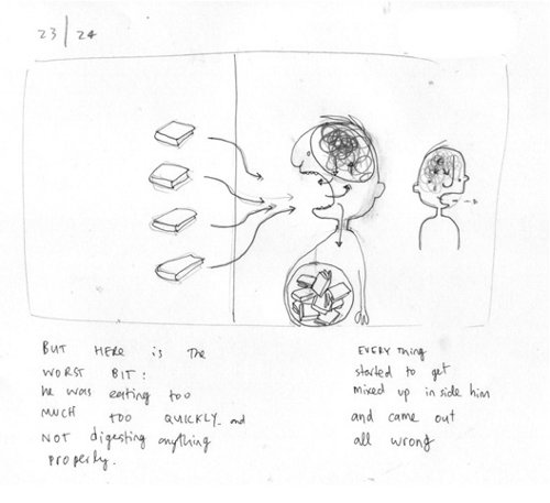
I begin with a single idea… and then tease that out in my sketchbook with hundreds of other drawings and pieces of writing that explore how the narrative can grow and extend into something that is satisfying. Once I’ve got a basic plot, I work with my editor in streamlining everything down to fit the thirty-two-page format…  Getting the story to flow between those thirty-two pages is probably the most difficult part. It’s like directing a film, where the pace needs to be set and decisions made of what goes where. It’s at this point that many of the compositions get cut. There is a careful balance between what the pictures are showing and what the words are saying, and if something is shown, it often doesn’t need to be said.

And finally…

Contemporaries, He Yanming

Chinese Book Covers seen at the excellent Ephemera Assemblyman.

5 Comments

Midweek Miscellany

Eye, Eye! — The Creative Review looks at the vibrant work of printing studio/small press Nobrow.

It’s an Anagram! — Indigo’s e-book initiative Shortcovers has become ‘Kobo’. Much fuss has been made about the name (and the slightly iffy redesign), but what’s more interesting is that Kobo is being spun-off from its parent company in an attempt to expand its global reach… The intrepid Mark Bertils and PW have more on the international angle; Wired think Amazon should be worried; and The National Post have a good Q&A with Kobo CEO Michael Serbinis…

Collector’s Items — Vote for your favourite Nabokov cover from John Gall‘s set of individually commissioned redesigns for Vintage.

The Decade of Dirty DesignSteven Heller, author of Handwritten and New Vintage Type (to name just a couple) on the “anti-digital” Oughts (via Charles Brock):

With the increase of the D.I.Y. sensibility, with renewed emphasis on “making things from scratch,” designers were feeling a need to make physical (not virtual) contact with their materials and outcomes…

[Perhaps less “anti-digital” than “post-digital“? Any thoughts designers?]

And finally…

ryan-tym

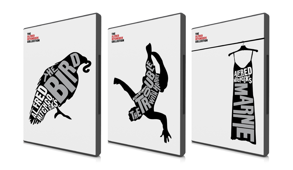
The Hitchcock Collection — a self-initiated project by London-based graphic designer Ryan Tym (via FormFiftyFive):

After recently purchasing a badly designed Alfred Hitchcock
DVD box set, I set to work on creating my own collection of
original covers. Each design features an iconic image related
to the film it represents and includes a bold typographic
title.

I would love to see Ryan design some book covers… Wouldn’t you?

3 Comments

Midweek Miscellany, November 11th 2009

The Nabokov Collection — Art Director John Gall on the Vintage Nabokov redesign at Design Observer:

Nabokov was a passionate butterfly collector, a theme that has cropped up on some of his past covers. My idea was also a play on this concept. Each cover consists of a photograph of a specimen box, the kind used by collectors like Nabokov to display insects. Each box would be filled with paper, ephemera, and insect pins, selected to somehow evoke the book’s content. And to make it more interesting… I thought it would be fun to ask a group of talented designers to help create the boxes.

John’s short essay is accompanied by a great slide show of the specimen boxes (above: The Luzhin Defense by Paul Sahre; below Speak, Memory by Michael Bierut).

And Joseph at The BDR has a nice follow up post, with a couple of nice vintage Nabokov covers.

So, do the specimen boxes (lovely as they are) work as covers? You tell me…

Amazon releases a Kindle app for PCs. But who cares? Hmm… I don’t know if I ‘care’ as such, but I do think it’s significant. Is it one more nail in the plastic coffin of single use devices? There’s more on the app at the Washington Post

And while we’re on the subject of e-books…

The Internet Isn’t Killing Anything — From Russell Davies:

Something That’s Growing Is Not The Same As Something That’s Big.

Something That’s Declining Is Not The Same As Something That’s Small.

…Worth remembering I think.

Best Illustrated Children’s Books of 2009 — The New York Times choose their favourites (accompanied with a lovely slide show). The New Yorker‘s Adam Gopnik talks about the selection process with Sam Tanenhaus on the Book Review Podcast (pictured above: Tales From Outer Surburbia written and illustrated by the awesome Shaun Tan).

And finally…

A sneak peak at the new Krazy & Ignatz cover by Chris Ware for Fantagraphics.

1 Comment

Midweek Miscellany, November 4th, 2009

Fluid — John Gall discusses his brilliant cover design for the Vintage edition of Tom McCarthy’s Remainder, which is still one of my favourite novels of the last few years.

Hamilton Wood Type Catalog No.14 (1899-1900) at Unicorn Graphics’ Wood Type Museum. I quietly obsessed with slab-serifs right now so this is like crack (via Draplin Design Co.).

And The Beat Goes On — Sarah Weinman (much missed at GalleyCat) is writing about publishing for AOL’s money and finance news blog DailyFinance.

Gigantic Robot — Awesome cartoonist and illustrator Tom Gauld has a new website (to accompany his excellent Flickr photostream).

BOOM! — PW talks to Mark Waid, Editor-In-Chief of independent comics publisher BOOM! Studios:

We’re great at getting a focused message out. Because we don’t publish eighty comics a month, our inestimable marketing department does a great job of making every title important in the marketplace and every launch an event. We’re also better than the big guys at taking risks because we don’t have stockholders to answer to, or lenders who would call us crazy… We’re very much a writer-driven, idea-driven company. We start with the story first (with a talented writer) and focus on getting that right.

30 Conversations on Design — Designers, including luminaries such as Massimo Vignelli, Erik Spiekermann, Ellen Lupton and Paula Scher, answer two questions: “What single example of design inspires you most?” and “What problem should design solve next?”

Unheimlich — Sam Leith argues for scary kids books in The Guardian (confession: I’m mostly linking to this story so I could type “unheimlich” which — rather disappointingly — means “unhomely” rather than “the act of undoing the heimlich manoeuver”).

And finally…

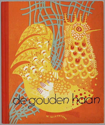
Dutch Picture Books 1810 – 1950 at BibliOdyssey (above: ‘De Gouden Haan’ by Marietje Witteveen, 1940).

‘De Gouden Haan’ by Marietje Witteveen, 1940
Comments closed

Midweek Miscellany, September 9th, 2009

Getting Paid by the Joke — Roy Hattersley on Keith Waterhouse, author of Billy Liar, who died last week aged 80:

One of the great lines, spoken in the subsequent film version by Wilfred Pickles playing Billy’s father, combined fury and bewilderment. Why, he demanded to know, had his son told the neighbours that he had only one leg. Billy worked in a dismal office – an ironic tribute to Waterhouse’s first job as clerk to an undertaker. It seemed a step up for the son of a door-to-door vegetable salesmen and a cleaner who had left Osmondthorpe Council School at 15 with an interest in books but no qualifications and few prospects.

When’s That Book Coming Out? — A nice breakdown of the production process by Shelby Peak which explains why it seems to take a long time for books to be released after an author has turned in their final manuscript. Every time I read something like this, I wonder why we don’t hear from publishing professionals more often. It would be great to see publishers explain this kind of thing on their own blogs. (via blog.rightreading)

Spine Out — John Gall has started a blog. Holy fuck.

And — on a related note — there is a nice conversation on Vintage’s The Sun & Anchor blog between designer Peter Buchanan-Smith and photographer Todd Hido about the new Raymond Carver covers (commissioned by John Gall).

Doing the Work — A fascinating interview with Australian book designer Tony Palmer at Caustic Cover Critic:

Sometimes you hear the bigger book publishers described as being like factories – where the work is churned out in a mechanical and unthinking way. It’s never been like that for me at Penguin. The editors, production staff and designers all love their work. But love can be wild and unpredictable. So I’ve dreamt of being a plumber. I like the way water moves on surfaces. I like the fact that there are only four different ways to plumb a house. But book design? Gawd, maybe there’s about 120 right ways to do a good book cover, and there are probably millions of ways to make a bad one.

And finally…

A Master of ReinventionBrad Mackay, director and co-founder of the Doug Wright Awards, reviews David Mazzucchelli’s remarkable Asterios Polyp for The Globe & Mail. The Comics Reporter has a critical reading guide.

6 Comments