Skip to content

Tag: Comics

Missed Things: Friday

Floating — Toronto illustrator Michael Cho on his cover art and interior illustrations for The Amazing Absorbing Boy by Rabindranath Maharaj (published by Random House Canada).

The Ideal Studio Library — It’s Nice That interviews designer Jason Godfrey about his beautiful new book Bibiographic: 100 Classic Graphic Design Books, published by Laurence King,  (and yes, full disclosure, LK are distributed in Canada by my employer Raincoast Books):

My aim was to create the ideal studio library of graphic design books and put this into a book format. I had always felt that there was a need for a visual reference to that could give flesh to many reading lists that have been published… The really tricky choices were the more recent books as it is difficult to know whether they will become classic points of reference, time will tell if I made the right choices on these books.

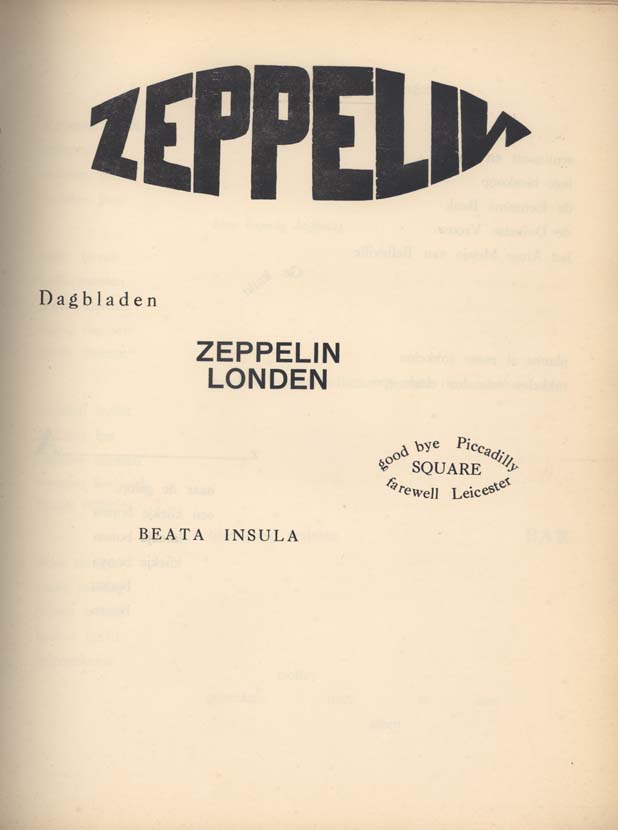
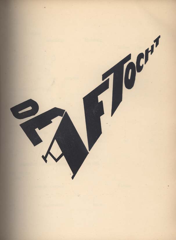
Bezette Stad —  A book of poems by Paul van Ostaijen, illustrated with woodcuts by Oskar Jespers, available in full at the University of Iowa Libraries’ astonishing International Dada Archive (via the lovely Aqua-Velvet).

And finally…

ENOUGH! — The hilariously on the money Editorial Anonymous:

I REALLY NEED A FRICKING BREAK FROM THE “FUTURE OF PUBLISHING” TALK… I don’t need to read any more of these articles, and neither do you.

A quick overview:

1. Publishing is a somewhat crappy business. Which makes it PRETTY MUCH LIKE EVERY OTHER BUSINESS.
2. Publishing has a future. NO ONE KNOWS WHAT IT WILL BE.

So everyone can stop
a. COMPLAINING
and
b. COMPLAINING.

Thank you.

No, no, Thank YOU.

3 Comments

Missed Things: Thursday

Covers for The Invincible Iron Man No. 20 and 21 by Salvador Larroca and Frank D’Armata, with design by Rian Hughes (seen at the website of the author Matt Fraction). Is it just me, or do these have a whiff of Marber’s Penguin Crime series about them? Or is it more like Olly Moss?

Grey Overcoat Music —  3:AM Magazine‘s Lee Rourke talks to photographer Kevin Cummins about his new book Manchester: Looking for the Light through the Pouring Rain (published by Faber & Faber), which documents 30 years of the Manchester’s music scene. 

The Guardian also has a slide show of  photographs by Cummins (above: Ian Curtis, 1979).

And if you’re interested in Factory Records and the Manchester music scene you might also be interested in The Haçienda: How Not to Run a Club by New Order bassist Peter Hook (published by Simon & Schuster) also reviewed in The Guardian.

The Lost Pleasure of Browsing — Charles Rosen for the New York Review Blog:

I realize that mail order shopping has been going on for a long time, but have always thought that this destroys one of the pleasures of civilized life. I do not understand how one can buy clothes without trying them on, and as for books, the individual book should seduce and inspire you to buy it.

Spelling “Theatre” the British Way — Andy Ross talks to New Yorker page OK’er Mary Norris about copy editing “America’s most prestigious literary magazine” at The Red Room:

The main thing here is to respect the writer. The writers don’t have to do everything we want them to—we make suggestions. The ideal would be to give an editor a proof and have all your suggestions meet with approval. Sometimes you notice that your suggestions have not been taken, so if something bothers you, you try again. Sometimes you wear them down, sometimes you cave.

I have been on both sides of the process, as a writer and as a query proofreader. Being edited sometimes felt like having my bones reset on a torture rack. I don’t ever want to do that to a writer, but I probably have from time to time.

And bless The New Yorker for using double consonants before suffixes — “traveled” is barbaric.

And finally…

Illusive: Contemporary Illustration Part 3 published by Gestalten looks rather fine.

http://blogs.nybooks.com/post/212201723/the-lost-pleasure-of-browsing
Comments closed

Missed Things: Wednesday

Henry Sene Yee, Creative Director of Picador, discusses the elegantly understated cover design for Time by Eva Hoffman, the latest addition to Picador’s BIG IDEAS // small books series.

And I’ve mentioned this before but it bears repeating: Picador are putting their catalogues — and, therefore, their outstanding cover designs — on their Facebook page.

Logicomix by Apostolos Doxiadis and Christos H. Papadimitriou reviewed in The New York TimesThe Guardian, and FT. It sounds kind of awesome. The book also has a nice website with lots of content.

The Inevitable Frontier — Jennifer de Guzman, editor-in-chief at the independent comics publisher SLG Publishing, on digital comics in PW:

Right now, sales from digital comics aren’t going to mean we can pack up print publishing. Not even close. But despite being in the midst of it rather than a wide-eyed observer, I can see that in the near future digital comics are going to be playing a bigger role for all publishers than they do now. And it’s better to be so integrated in the change that you don’t notice that it’s happening than to find yourself left behind and marveling at “the things they can do now.”

“Issues” — A less than warm reception for the Kindle in Australia:

Jeremy Fisher, executive director of the Australian Society of Authors, said he was advising his 3000 members to resist publishing through the Kindle.

“As I understand at this point in time, Amazon asks for a very, very big discount from publishers for their works to be included in Kindle so that the return coming back to the publisher is smaller and the return coming back to the author is smaller,” he said.

“The person making the most money is Amazon.”

Hmm… Yes, well, moving swiftly on…

Jacket Whys — A really nice blog about children’s and YA book covers.

And on the subject of kids books…

Who The Wild Things Are –Artist Roger White looks at the inspiration Maurice Sendak’s Wild Things for the Boston Globe:

The Wild Things looked like nothing ever seen in a children’s book. Rendered in simple ink-hatch over watercolor sketches, they evoked a perfect mixture of proto-adult dread and anarchic, childlike glee – an eternal, platonic form of the kindly monster. From the moment they appeared in 1964, they seemed bracingly and completely original. But in fact Sendak’s monsters had a long series of ancestors and descendants…

But according to Bruce Handy, deputy editor at Vanity Fair, (and his children) kids don’t actually like Where the Wild Things Are… Umm… What?

Comments closed

Q & A with Paul Buckley, Penguin US

Photo by Erika Larsen. Design by Paul Buckley

It is not every day that I get an email from the Vice President Executive Creative Director of Penguin US, so it was something of a surprise when Paul Buckley sent me a note a few weeks ago about a book cover design mentioned in my interview with his wife Ingsu Liu.

I had been conspicuously unable to locate the image online and Paul was able to help. But it seemed like too good an opportunity to miss, so I asked the Brooklyn-based designer if he would be willing to do a Q & A about his work as well. Again, much to my surprise, not only did Paul say yes, he managed get his answers back to me in record time (with annotations and links included!)…

Of Mice and Men

How did you come to book design?

I went to SVA on an illustration scholarship, and was very intent on becoming an illustrator. While other parents were giving their kids children’s books, my father was giving me illustration annuals. But I supported myself during my college years working for various NYC design studios as a designer, learning through those around me… and at the same time pursuing freelance illustration assignments as well – basically learning both crafts simultaneously through different venues. Right after graduation I took a 3 month road trip spending my savings, and thus came home to Greenpoint needing an income. A studio manager at one of the studios I worked in during my early college years suggested me to her sister who was working at NAL/Plume/Dutton, as they needed a Junior Designer… I landed the position with a portfolio that was equal parts design and illustration. Though in the beginning I was very hardcore about becoming the best painter I could be, I quickly fell in love with designing book covers and never looked back… within two years we merged with Penguin. Though I’ve become far too busy (and lazy!) to pull out the oils and actually paint something, I did manage to get a few simple ink drawings in the Society of Illustrators this year. I realize these will pale in comparison to 99% of everything else done by the true working pros in the annual, but it was still a kick and an honor to have my work chosen for inclusion.
The World According to Garp

Can you describe your role at Penguin?

I act as a Creative Director overseeing a sizeable staff and many many projects. My Penguin publishing team is very open to me and my guys pitching ideas and we nicely act as an overall creative team, in a way that editorial and art together collaborate to create nice projects — most recently I’m directing a cover design book where we have the authors commenting on their covers, and a new series named Penguin Ink, where the world’s leading tattoo artist’s do covers for me. Recently in the stores is the gorgeous collaboration of Roseanne Serra with Ruben Toledo… this was all Roseanne’s brilliant art direction, and I had nothing to do with it — but it is gorgeous Penguin project that is very much worth checking out.

Art by Duke Riley
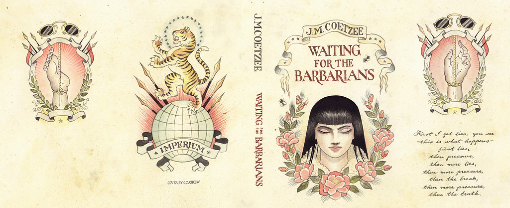
Waiting for the BarbariansArt by Chris Conn

How many imprints do you oversee?

Six

Does each imprint have a particular design style?

Yes, each imprint is very unique unto itself, as each Publisher/Editorial team brings their own style, as does each Art Director. In my group, Roseanne Serra and I collaborate on Penguin paperbacks, and to a lesser degree, with the Viking imprint as well. Roseanne art directs Pam Dorman books. Joe Perez smartly art directs Portfolio and Sentinel, which are brilliant business and political imprints. Darren Haggar art directs Penguin Press overseeing the packaging for literary giants like Thomas Pynchon and Zadie Smith… and while not it’s own imprint per se, Maggie Payette Art Directs our gorgeous poetry series.

The Jan Tschichold Penguin paperbacks are design icons in the UK. Is there a sense of that legacy within Penguin Group USA?

Very much so. We all have quite a few Tschichold books on our shelves. The UK Penguin art department, under the Art Direction of Jim Stoddart and John Hamilton, does an incredibly beautiful job of keeping that legacy alive.

How is American book cover design different from the UK?

I don’t know that it is all that different. In fact, Art Directors over here, and Art Directors over there, are hiring the same art and design talents on each side of the Atlantic.

Do you discern any current trends in American book cover design? Yes… very nicely a resurgence of designers and illustrators who do both the design and illustration; the whole package. Jaya Miceli, Chris Brand, Jon Gray, Gregg Kulick, Jamie Keenan, Rodrigo Corral, Ben Wiseman, Jennifer Wang, Tal Goretsky, etc – these are the folks creating the personally unique covers of today that will be the design icons of tomorrow.
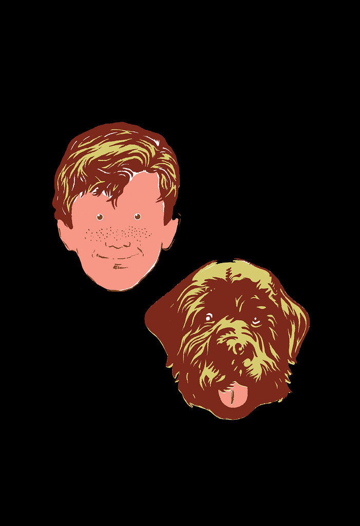
Art by Chris Ware

How did the Penguin Graphic Classics come about?

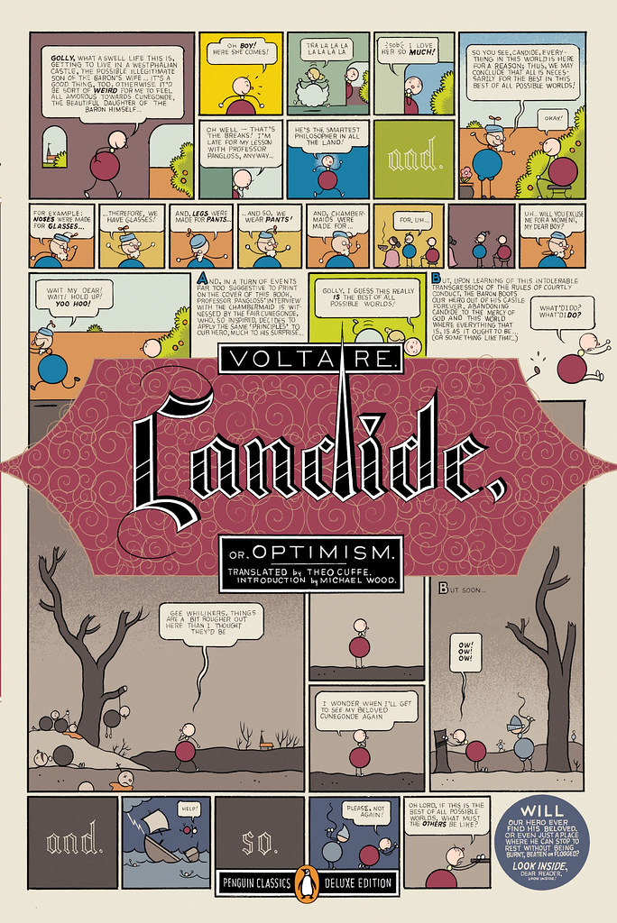
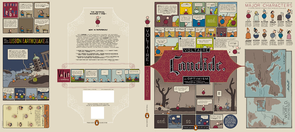
We do a handful of what we call Penguin Graphic Classics Deluxe packages every list, and when it was time do one for Voltaire’s Candide, I handed it off to Helen Yentus who was in my group at the time. Helen wanted to work with Chris Ware on it, and off it went with us all happy that he accepted the assignment. When Chris’s sketch came in, it just sort of blew everyone away… Up to that point we’d never had anyone grab editorial control of a cover that way… Chris had gone hog wild and wrote all his own copy and illustrated and designed the living hell out of every square inch of this cover from flap to flap. It took forever to make its way around the packaging meeting table with everyone grabbing hold of it, reading it and laughing out loud. A short time later, our Penguin Publisher Kathryn Court declared that we needed to do more of these. Kathryn really nurtures good art and design and is one of the reasons I’ve been here so long.
Cover by Tomer Hanuka with design by Paul Buckley and Tomer Hanuka

Art by Anders Nilsen
Art by Charles Burns
Art by Roz Chast

How did you match the artists with the titles?

The titles were given to us by the Penguin Classics editorial team, and Helen and I would sit in my office surrounded by comic books and simply have fun matching this artist with that title.
Art by Michael Cho. Design by Paul Buckley

Are their plans to expand the series? What new covers can we look forward to in the future?

We do about 6 a year and I think we are all comfortable with that number at the moment. I just finished White Noise with Michael ChoMoby Dick by Tony Millionaire just came out, as did Huck Finn by Lilli Carré, and Ethan Frome by Jeffrey Brown. In the near future, I’d really love to do something with Jim Rugg, Jeff Lemire, Mike Mignola, David Small, and I still hold out hope that one day Crumb will actually say to me “damnit you pesky bastard… ok, ok, I’ll do it”.
Art by Tony Millionaire


Art by Lilli Carre. Design by Paul Buckley

Do you still design yourself?

All the time… mostly in the evenings after everyone has gone home and I can focus without the constant distractions of the work day. My greatest hits are posted on my website.

 
Art by David Byrne. Design by Paul Buckley. 
Pigmented foil stamped on linen cloth
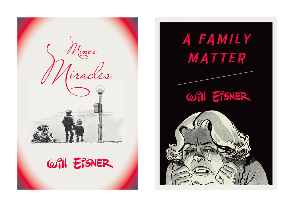
Art by Will Eisner. Design by Paul Buckley. 
Art direction by Ingsu Liu & Albert Tang
 Photo by Fredrik Broden. Design by Paul Buckley

Could you describe your design process?

I start each project with the hope that I’m going to do something unusual; and then I try my best to do just that — read the material and find a visually unique way to interpret it. I tend to go either very loud, or very subdued and moody. I do a ton of comps for every cover I work on — sometimes, 20 or more to explore what I’m thinking and all the tangents that come along during the process — I get nuts when freelancers send me two or three comps. I’ll show 3-5 of what I think are the best and receive comments and direction on those from editorial… when discussing why a designer did this or that, I think what people commenting on book covers seem to gloss over is that the publishers and editors have far more at stake than the cover designer — they have committed sums of money and must answer to the house and the author to make this book a success — so they are very strong about what they think the cover should be and nothing is being printed without their full consent.

Here are a few rejects from the pile… I’m not saying these covers are better for the individual book, than what got printed… maybe the books would have tanked with these covers… but they do illustrate how in-house visions do not always sync:
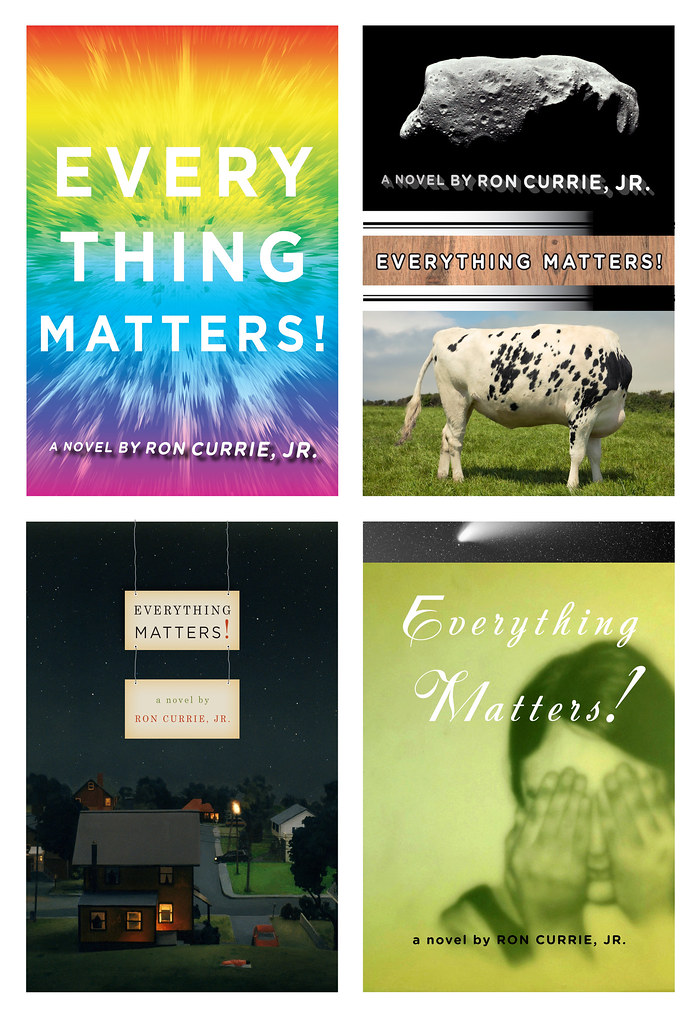
Upper left: art by Paul Buckley. Upper right: various stock.
Lower Left: art by Amy Bennett with descending placards by Paul Buckley.
Lower Right: painting by Keniche Hoshine with added stock image.
(see final cover here)
Various antique endpapers combined with altered ebay images
and antique portrait of feral child.
(see final cover here)

Do you approach fiction and non-fiction differently?

Often, yes. Fiction needs a more peripheral approach where I’m looking to capture a mood to reflect the book’s tone, whereas non-fiction often needs you to stare it directly face on and state precisely what the topic is.

What are your favourite books to work on?

Any title where the Editor and Publisher are open.

What are the most challenging?

Any title where the Editor and Publisher are nervous.

Where do you look for inspiration?

Everywhere. My staff blows me away daily. My wife shows me beautiful work constantly. Editors show me stuff. Blogs like yours so nicely showcase how much great work is out there. Friends deluge my inbox with artist links. Illustrators. Photographers. Fine Artists. Music. Furniture. All talent is inspiring. Cruising Flickr and the web in general has me bookmarking new people daily, and I can spend hours google imaging the most absurd things that always tangent me to the greatest places. I found and purchased an image for a difficult book cover project recently just because I decided to google “leucistic squirrel” after I noticed a few in Prospect Park. I have no idea how we all existed before the internet.

What do you look for in a designer’s portfolio?

A unique talent. Distinction.

Front cover art by Frank Miller. Design by Paul Buckley

What does the future hold for book cover design?

There will be a market that just wants/needs to download the material for reading purposes, and there will be a market that is looking for an object. What Penguin does with the Graphic Classics is a great example– some student will download Gravity’s Rainbow cheaply, while an older Thomas Pynchon or Frank Miller fan with a little more cash in their pocket will want the beautiful book/object. So I believe the cover design market will shrink in that way. Textbooks and travel guides will go digital first as there is no real reason to carry all that in your backpack or pay for all that book production. For digital readers, big budget fiction and non fiction titles will have moving covers, more like mini movie trailers. If Grisham were still with us, his future digital reader cover would be something akin to us looking at a murky black screen… the reader would hear running footsteps and ragged breathing… then a loud shot rings out, and a big red splotch hits your screen and drips to form the title type. Then one blurb after another flies across the screen and after a moment Grisham himself pops up in the corner thanking you for purchasing his new book and asking if you’d like to peruse his backlist titles… and click this link if you’d like to pay an extra dollar to help our troops in North Korea, Iran, Afghanistan or Iraq. Interior-wise, there will be tons of product placement… not necessarily for gratuitous reasons; but because people, places and things are mentioned on every page in every book be it fiction or non fiction; and if folks desire a more interactive read that really helps them get into the book in a different way, then it’s possible there will be quick jump links to everything – for instance… if in this book, the character is having lunch in Balthazar and then running off to the Standard Hotel for an ongoing affair… then why not have Balthazar and The Standard pay a small fee to the publisher to provide these links; this seemingly free advertising? Big money to had there. I reserve judgement as to whether any of this is a good thing or a bad thing… but as publishing goes more digital, I think it’s naive to think these things wont happen to books just as they happen everywhere else.

Thank you very much!

You bet.

9 Comments

Something for the Weekend, September 18th, 2009


Bring the Noise — Toronto illustrator Michael Cho (known locally for his much-loved signage for the now defunct Pages Books & Magazines on Queen Street) discusses his jacket art for the Penguin Graphic Classics edition of Don Delillo’s White Noise.

I ‘m very happy to hear that D+Q are publishing a ‘petit livre’, Backalley Drawings, by Michael next year.

And watch this space for an awesome Q & A with Paul Buckley, the art director of the Penguin Graphic Classics series (coming soon!)…

But Is It Type? — Design educator Ellen Lupton on the difference between lettering and typography for Print Magazine:

I subscribe to the rather rigid theory that typography is about readymade, reproducible families of letterforms. Vernacular hot-dog signs, handwritten wedding invitations, and space-age logos aren’t typography…

Perhaps my quibble is an old one: you just can’t view real typography online. Beautifully printed books and magazines are still the best resource for designers who want to know what’s happening in their field. Yet the design discourse is unfolding in real time on the web, and this is where students and young designers go to participate and be inspired.

And while were on the subject of typography, I thought — as a bungling amateur — that Brian Hoff’s post 10 Common Typography Mistakes was useful. Although I like to think I was surprising good at Cheese or Font (for what it’s worth).

Publish Local — An interesting list from The Task Newsletter (via REFERENCE LIBRARY). Would this work for book publishing?:

  1. Find what’s missing
  2. Work in the gaps
  3. Figure it out together
  4. Make it visible
  5. Make it viable
  6. Research and plan
  7. Expand existing systems
  8. Plan transparently
  9. Start small
  10. Commit to it
  11. Learn about your local flora
  12. Don’t get permission
  13. Print what you’ve got
  14. Make positive spaces.
  15. Find funding

And lastly, I just had to post this…

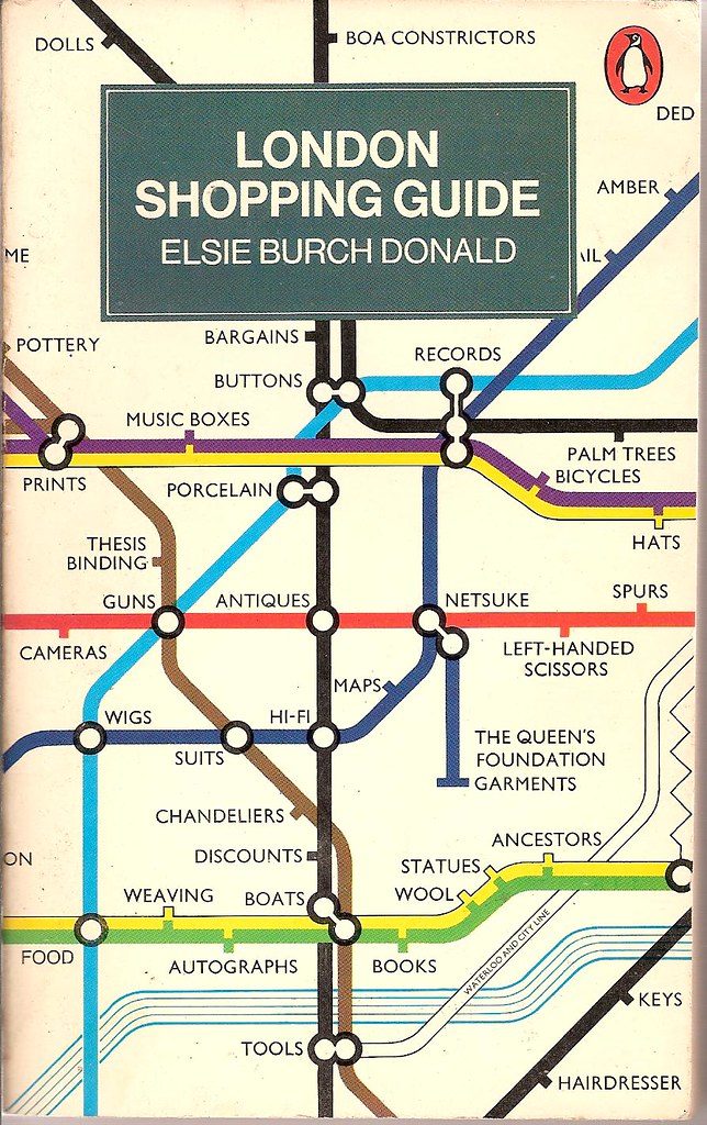
London Shopping Guide — Revised second edition from 1977, cover design by John Carrod, seen at Covers etc on Flickr.

Two design classics in one: Penguin paperbacks and Harry Beck’s tube map. What more could you ask for?

Comments closed

Chris Ware’s Cover for Granta 108

Chris Ware’s cover design for Granta 108: Chicago:

Comments closed

Midweek Miscellany, August 26th, 2009

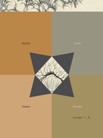
Black Jackets — The mighty Peter Mendelsund is giving away all of Osamu Tezuka’s Black Jack manga series in return for some assistance designing the next cover.

Take That! And That! And That! — Sony, having recently announced a pocket-sized reader and their switch to the ePub format, have now unveiled a new wireless electronic book reader with a 7-inch touch screen.

And on a related note, E-Reads tries to unpack some of the complex issues around Sony, ePub, and DRM.

Typedia — much linked to elsewhere (causing a severe strain on their servers earlier this week), Typedia is “a community website to classify typefaces and educate people about them.” I have no idea what I might use it for, but it looks pretty neat. You can also follow them on Twitter.

On the subject of typography, check out The Alphabetography Project, a photography blog cataloging found letters of the alphabet.

And hell, why not take a look June Corley’s charming typographic sculptures while you’re at it (via The Daily Heller and pictured below)…

Board — Also much linked to elsewhere, the New York Observer‘s Leon Neyfakh looks at three new hardcover books designed without dust jackets. It’s not exactly “the new thing” — more a case of the mainstream catching up with indies perhaps (and a light news day) — but there are still some interesting comments about book design:

Most of the publishers experimenting with jacketless hardcovers, including Viking, FSG, and Graywolf, are consciously taking their cues from the folks at McSweeney’s, who have been putting out beautiful books designed in this style for years. For Eli Horowitz, the managing editor at McSweeney’s, the method is a means of restoring some of the permanence and singularity to the book as object.

From the Design Desk — Designer Suzanne LaGasa talks about the cover design process at Chronicle Books.  (Full disclosure: Chronicle are distributed in Canada by Raincoast Books, my employer).

Big Comics — reviewsnthings asks notable comic artists, writers, publishers, editors and the like “what’s your opinion of the term ‘Graphic Novel’?” stirring up some interesting reactions. Here’s Leigh Walton, comics editor, and Top Shelf’s marketing coordinator, for example:

I find it intensely frustrating, in the sense that I can’t fully support it and I can’t fully dismiss it. Great minds have worked for ages to invent a better term, and they’ve failed. Its shortcomings are obvious — it’s based on a term, ‘novel,’ which has specific requirements of length and content, and it can never replace ‘comics’ as a general term for the medium… Yet ‘comic book’ was reserved ages ago for a format that isn’t really very booklike at all.

Mixtape — Robin McConnell is compiling cartoonists’ playlists for Inkstuds (the radio show about comic books), including Love and Rockets legend Jaime Hernandez.

And lastly, something for the fanboys to argue over: The Top 70 Most Iconic Marvel Comic Panels. (via LinkMachineGo)

1 Comment

Something for the Weekend, August 21st, 2009

Picador Paperback have posted their fall catalogue to Facebook. Apparently they also did this with their spring list too . Needless to say, I think this is  a great idea. Is any one else doing it? (via Arthur’s Design)

Control — An interview with Alan Rapp, former senior editor of art, design, and photography at Chronicle Books and the new Associate Director of Hey, Hot Shot!:

for all the possible flaws in the trade publishing model, one thing I always liked about it is the collaborative process. It defies the auteur model; the author is almost never the sole creator. I suppose that this could sound like the ex-editor making a case for the value of his role in an industry that is really undergoing massive and fundamental changes, but I stand by the principle: all content benefits from editing. The author, whether a verbal or visual one, is almost always too involved with the material to see how it can be best adapted to another form. And the design and production processes are also critical to making the best book possible; one thing [that] I think is in danger of getting lost in self-publishing is the production potential. The physical aspects of books make important, and often subliminal, effects on the reader, but we are getting a much more homogenized offering through the current self-publishing models.

Final Crisis — A short Q & A with Chip Kidd about designing comic book covers at the NY TImes‘ ‘The Moment’ blog.

And finally, thinking of comics, Will Kane (The World of Kane) recently posted some mind-blowing pop-art pages from French comic “La Vie Privée de Dyane” drawn by Michel Quarez, published in 1968 (pictured below). Also check out Will’s post on Quarez’s 1967 Mod Love.

Comments closed

Midweek Miscellany, August 19th, 2009

‘The 100 Best Comic Book Covers’ Part 1, Part 2, Part 3, and Part 4 at Kelly Thompson’s 1979 Semi-Finalist blog. I am not a comics nerd (believe that if you will), but there’s some great stuff (new and old) in this epic list…

Open to QuestionThe New York Times reports on Sony’s decision adopt the “open standard” ePub format for all their digital books. This means that “books bought from Sony’s online store will be readable not just on its own device but on the growing constellation of other readers that support ePub”. Progress of sorts I would say, but before you break out the bunting, David Rothman questions how “open” this format actually is at TeleRead.

Book Design on Twitter — Ben at the Book Cover Archive has posted a list of book designers who Tweet.

Ben’s list was also a nice reminder to mention  Jennifer Tribe‘s amazing directory of book industry people on Twitter.

Book Worship —  Shawn Hazen’s blog cataloging “graphically interesting, but otherwise uncollectible, books that entered and exited bookstores quietly in the 50s, 60s, and 70s.” Lovely (via Book Cover Archive blog).

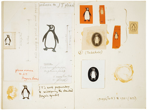
Penguin Symbols — I know I just mentioned designer David Pearson’s Flickr the other day, but how fantastic is this? “An investigation by Production Manager Hans Schmoller into the origins and usage of Penguin devices”

And speaking of Penguin…

Covers And That — Jim Stoddart, Art Director of Penguin Press, discusses their book cover process and looks at some of the new covers for book released this month:

Each cover may face a wide range of hurdles and conflicting opinions, this is the very nature of book covers. Good designers tend to be very focussed and resiliant, and the value of a good sense of humour cannot be underestimated. As with most design jobs there is a balance of concept, craftsmanship and time dexterity required. Any number of changes to the brief may occur even once the design is finished. But in Penguin Press it is widely appreciated that the more a cover is ‘tweaked’ by a committee the less chance there is of retaining that original spark that we all know helps a book stand out in a world where thousands of books are vying for attention.

Comments closed

Midweek Miscellany, August 12th, 2009

Typographic book covers by Ed Cornish for the 2009 D&AD student award brief for typography (via We Made This).

Tools of the TradeThe Montreal Gazette talks to Hugh McGuire about Book Oven and the new self-publishing landscape:

Call it Self-publishing 2.0. And it’s one of the fastest-growing sectors of the book world, which is itself enjoying a nice growth period despite the recession and the glut of competing media choices.

“Like in any other media, when you the make tools of publishing easy, people will take advantage of it,” said Hugh McGuire, founder of Montreal self-publishing start-up Book Oven. “It’s just now coming into public consciousness.”

It is troubling however that the photograph accompanying the article suggests that Hugh only rents the top-half of his office space!

Richard Green’s redesigns for ten of Penguin’s classic romance thrillers seen at Noisy Decent Graphics.

Dirty Stories — Eric Reynolds, Marketing Director for the Seattle-based art comics publisher Fantagraphics, interviewed in PW:

The book industry has been in a state of flux for at least a year or two years. I think that’s going to continue as everyone adapts to the larger challenges that print media is facing, and that’s going to affect anybody that publishes in print. It comes down to electronic delivery and the shrinking book market in general and just how you navigate these sorts of things… Without making it sounds like we’re totally awesome, we face the same problems that any understaffed, under-funded company does, but we’re streamlined, and there’s not a lot of fat to be cut.

Ornament — Doug Clouse and Angela Voulangas, authors of The Handy Book of Artistic Printing (published by Princeton Architectural Press), have created a nice website and blog for their book about letterpress type.

(I do love this book, but for the sake of full disclosure I should stress that PAPress are distributed in Canada by my employer Raincoast Books).

1 Comment

Monday Miscellany, July 20th, 2009

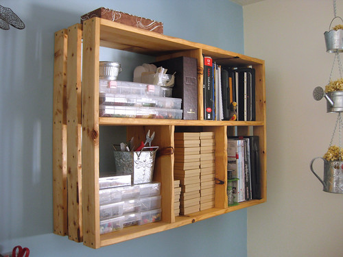
Shelf LifeEMPRNT‘s Bookshelves Flickr Pool. I could look at other people’s bookshelves all day…

You Don’t Belong — Lee Bermejo and John Arcudi’s Superman story for DC’s Wednesday Comics is also running in US Today. Two episodes in and it looks great (even if the Flash interface is not not ideal) — there are some nice moments, especially in episode 2 (Batman as psychiatrist anyone?) and Bermejo’s art kills it (via The Ephemerist).

PW Comics Week also ran an interesting interview with DC Comics editor Mark Chiarello about Wednesday Comics a couple of weeks of back.

And thinking of comics, LA Times’ Geoff Boucher reports on the forthcoming Darwyn Cooke adaptation of Richard Stark’s The Hunter.

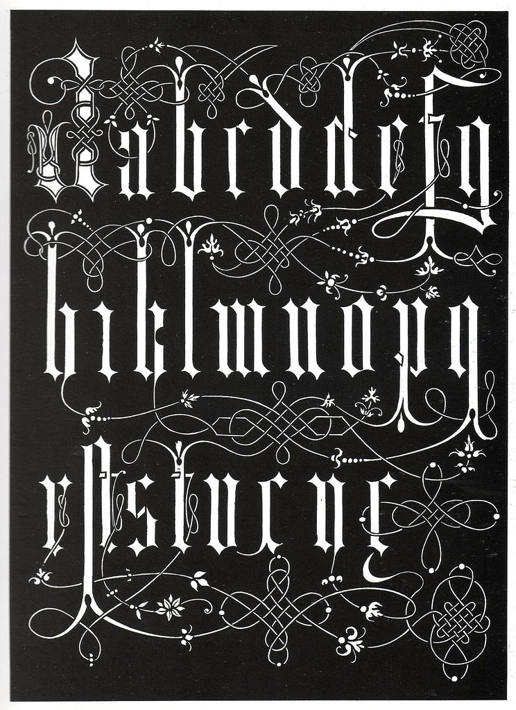
Fancy — BibliOydssey has posted some lovely samples of ornamental type.

Comments closed

Something for the Weekend, July 17th, 2009

BookCamp Vancouver — Registration is now open and places are going fast so sign up while you still can.

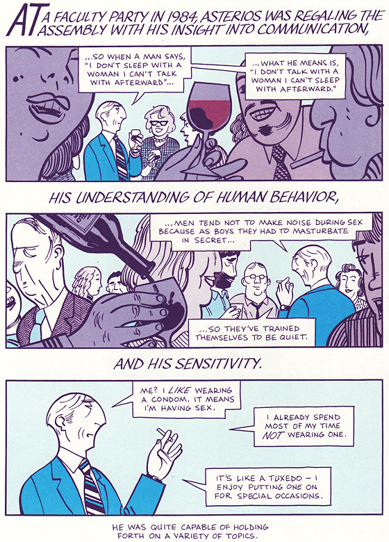
Holding Forth New York Magazine has an 8-page preview  Asterios Polyp the  new graphic novel by David Mazzucchelli, who also illustrated the graphic novel adaptation of  Paul Auster’s City of Glass, and Pantheon editorial director Dan Frank and Knopf/Pantheon designer/senior editor Chip Kidd talk about the book at Publishers Weekly.

Paul Eats Chocolate — Drawn +Quarterly’s 211 bookstore in Montreal is selling chocolate bars designed Michel Rabagliati, creator of the semi-autobiographical ‘Paul’ comics (full disclosure: D+Q’s books are distributed by Raincoast in Canada).

Comments closed