Skip to content

Tag: Comics

Something for the Weekend

David Drummond’s Parker Series for University of Chicago Press.

“a little bit Warhol, a little bit Factory Records” —  Christian Schwartz explains why he started type foundry Commercial Type at I Love Typography:

It’s much easier to be an “armchair quarterback,” second-guessing everyone else’s seemingly questionable decisions regarding everything… than it is to deal with the actual reality of budgets, technology, and timelines. Theorizing about how and why things work is all well and good, but putting our ideas into practice is of course the real test…

Typography and JudaicaSteven Heller interviews book designer and typographer Scott-Martin Kosofsky. Fascinating stuff:

It’s the best of times and the worst of times, but I have a feeling that people have always said that… In regard to print, I think we’re at a great moment, with access to mature technology and aesthetics… There’s no excuse for anything looking less than great. But books (and print in general) have lost their pride of place. Book publishers, a group nearly always behind the curve, have failed to grasp that their online counterparts spend a lot of time and money concentrating on User Experience, while they remain unfamiliar with the concept. It wasn’t always that way, but when the professionalism and discipline that was demanded by metal type fell away, things got worse and worse, especially typographically.

Punk — An interview with Jaime Hernandez about Love and Rockets and the recently published The Art of Jaime Hernandez at NYC Graphic:

“That’s how Love and Rockets started: we were just cocky and didn’t know we could fail. We went ahead and published the first one ourselves and didn’t care what the outcome would be, we just wanted to be printed. Hopefully we could sell it and make money, but there was no one to tell us not to. That was the punk part of it. The more we got good response, the more we kept doing it.”

And finally…

The Pollak Coffee Table Book seen at UnderConsideration’s FPO. Breathtakingly beautiful.

Comments closed

Midweek Miscellany

Michael Cho‘s cover for the Best American Comics annual 2010 published by Houghton Mifflin Harcourt. Fantastic.

Undefined — The Caustic Cover Critic interviews illustrator and designer Alice Smith:

After sketching ideas, I make compositions using inks and pens to bring collages together, the pen marks might have disappeared in the finished composition, but it’s the pen marks and the rough sketch that helps bring it together. I use old imagery for ethereal effect, playing with visual alchemy and nostalgia. And the quality of printing pre 1950s, photoengravre and proper litho is so much nicer than the pixel fuzz and dots of newer digital printing.

Alice’s portfolio is here.

Scraps of Paper — An interview with superstar designer Rodrigo Corral in Metropolis magazine:

[T]he parts of the process that are unique and special really come from the individual designer’s experience. I think about the people who might read this article, and assuming some will be design students or younger people just getting into book design, I have to say that in order to come up with ideas—which, aside from a solid understanding of typography and typographical context is the most important part of all of this—you have to have an understanding of what has come before and what is current. I’ve spent years in used bookstores and magazine shops looking, admiring, and collecting, and this is all a part of the “design process.” The things I have stored in my brain and all that is still out there to see and learn are all part of the process.

Bought and Discarded — Simon Akam explores the sidewalk booksellers of New York for More Intelligent Life:

What wasn’t clear was what it meant to have a big presence on secondhand stalls. Was it an honour for a book, or a slur on its author’s reputation? Which was more significant—the fact that so many copies had been bought by someone, or the fact that they had since been offloaded again? To add insult to injury, were the titles I encountered in droves lying on the stalls because today’s reading public chose not to pick them up, even at a much reduced price? I needed to find out whether the champions of my survey were much loved, or doubly scorned.

And finally…

The Road: Scenes From the Post-Print Apocalypse by Peter Kuper for the New York Times (via The Ephemerist).

2 Comments

The Real Jay Gatsby

Kate Beaton takes on The Great Gatsby:

More, oh, so much more, at the wonderful Hark! A Vagrant.

(Thanks Siobhan!)

Comments closed

Something for the Weekend

A couple of quick links…

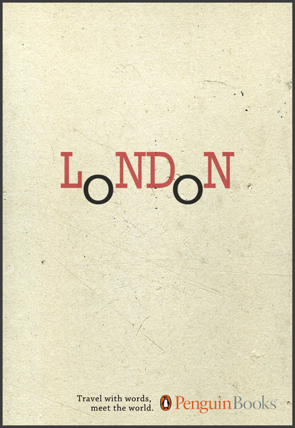
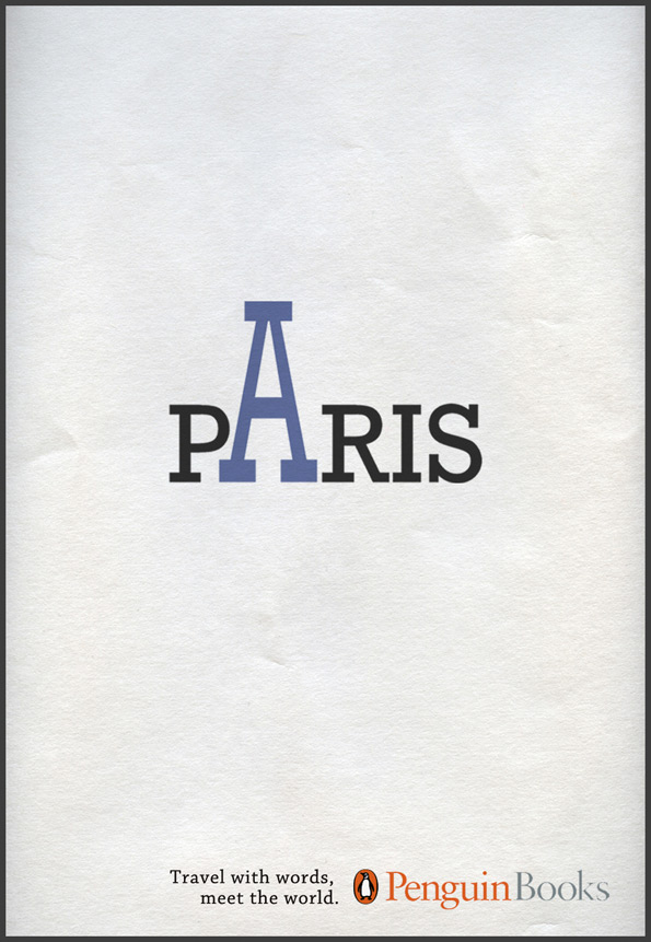
‘Travel with words, meet the world’ — A nice typographic ad campaign from Penguin Books seen at Ads of the World (via This Isn’t Happiness).

No-Fi — Cartoonist James Sturm, founder of the Center for Cartoon Studies, is giving up the internet and documenting for Slate:

Over the last several years, the Internet has evolved from being a distraction to something that feels more sinister. Even when I am away from the computer I am aware that I AM AWAY FROM MY COMPUTER and am scheming about how to GET BACK ON THE COMPUTER. I’ve tried various strategies to limit my time online: leaving my laptop at my studio when I go home, leaving it at home when I go to my studio, a Saturday moratorium on usage. But nothing has worked for long. More and more hours of my life evaporate in front of YouTube. Supposedly addiction isn’t a moral failing, but it feels as if it is.

(For the sake of full disclosure, James Sturm’s new book Market Day is published by D+Q who are distributed in Canada by my employer Raincoast)

Jonathan Turner (AKA Insect54) has posted a few photos of Herbert Spencer’s book Pioneers of Modern Typography on his (amazing) Flickr photostream (via Inspire Me).

2 Comments

Something for the Weekend

[A quick note about the poll: thanks to everyone who voted, left a comment or sent me note this week — I really appreciate it. The feedback has been great. I’m going to shut the poll down at midnight tonight, but please let me know if you have any further thoughts about the direction of The Casual Optimist.]

Lauren Kaiser’s Little Red Riding Hood seen at Type Theory (pictured above).

liza-pro-underwareThe Oscars of Type — Ellen Lupton’s list of the year’s top typefaces at Print magazine. “Best Actress” was awarded to Underware’s Liza Pro (pictured above). My interview with Ellen Lupton is here.

Happiness as By-product — Jessa Crispin founder of Bookslut interviewed by Jeff VanderMeer, author of Booklife (which Crispin was critical of interestingly):

I was having a conversation with a writer the other day, and he stated that the best things are always by-products. Happiness is a by-product, and I loved that he said that. You can plot your journey to success or happiness or wealth or whatever it is you’re looking for, but if you’re too focused on the end result, you’re going to miss anything good going on around you… Not that we should all sing songs around the campfire and braid each other’s hair, but there has to be a combination of the two, forward motion and goal planning, but while taking a look at the people around you.

Comics Studies Reader — Jeet Heer on comics and comic scholarship at Books@Torontoist:

I think there’s a wide variety of things that can be done with comics, and I think we’ve only scratched the surface… One of the interesting things about manga is that kids are reading translated manga that reads right to left. Part of the reason that’s possible is because comics are both words and pictures – half of the translation work is already done. So you can look at a comic book in a language you don’t know and you won’t get everything but you can still get a fair bit of what it’s about. And so they have this sort of function as cultural ambassadors. You can actually learn a lot about a culture just by looking at the comics.

The New Yorker 85th anniversary covers by Chris Ware, Adrian Tomine, Dan Clowes, and Ivan Brunetti seen at the Creative Review blog (Adaptation by Tomine pictured below).

Art Spiegelman and Francoise Mouly (art editor at the aforementioned New Yorker) discuss The Toon Treasury of Classic Children’s Comics with (a particularly gushy) Michael Silverblatt for KCRW’s BookWorm :

Comments closed

Something for the Weekend

The Pox and the Covenant — A nice new entry in the “metacover” category from DWG‘s midfield general Jason Gabbert.

Book Publishers Have Reason to Resist Amazon — Columnist John Gapper in the Financial Times (via MobyLives):

The idea that book publishers are failing to act in their own interests because they somehow do not want to serve their customers, or because they do not “get” electronic distribution ignores the business reality they face… In any case, why is it illogical for publishers to defend their own business interests against those of Amazon, which is a public company trying to extend leverage over them to benefit its own shareholders?

Not Saving The Newspaper Business Any Time SoonThe Awl does the math on McSweeney’s gorgeous newspaper project The San Francisco Panorama. Hint: it doesn’t quite add up. Although that’s probably wasn’t the point. (via Sarah Weinman. Who else?).

The 50 Best Comic Book Covers of 2009 at Complex — Something for everyone here, including the wonderful Gorey-esque cover pictured above by Skottie Young (via Veer).

The Tempest Wakens — a short web comic for Tor’s Cthulhu Christmas, by the awesome Teetering Bulb team Kurt Huggins and Zelda Devon.

Comments closed

Something for the Weekend

Gosh! — Limited edition Footnotes in Gaza bookplate by Joe Sacco for Gosh! Comics in London (seen at The Ephemerist).

There is also an interesting interview with Joe Sacco about his new book on the BBC World Service’s The Strand.

How To Be An Artist — Criterion designer Eric Skillman discusses his design process for Eddie Campbell‘s Alec: The Years Have Pants published by TopShelf.

And Eddie Campbell is interviewed by USA Today about the book.

Imaginary Worlds — PW Comics Week talks to Helen McCarthy, author of The Art of Osamu Tezuka: God of Manga:

I don’t know if it’s his themes that make his work timeless, so much as his breadth of interest. He was interested in everything and everyone that lives. He gives every character in his works the respect of allowing them to exist as real individuals; whether they’re likeable or not, they’re real. I think that’s the quality that makes animation director Hayao Miyazaki resemble him most strongly, that insistence that nobody is a stereotype or a cipher, that everybody has equal validity whether they’re a ‘nice’ person or not. Personally, I love his approach to women. He treats them exactly like normal human beings, and so few writers really do that, even in these allegedly liberated times.

There is also a short interview with the author in the WSJ.

Is Publishing Dead? (PDF) — An good interview with Sarah Nelson, former editor-in-chief at PW and now book director for O, The Oprah Magazine, from the 2009 PubWest Conference (via GalleyCat):

I don’t think that digital, per se, is the culprit. I don’t even think that Google, per se, is the culprit. I think that there are a lot of people in publishing who look to those things, to Google, to eBooks, to Amazon and say that they are the devil, and they are killing our business. I think it’s not that simple. I think that publishers need to think about the business model in which they operate and to give advances – and… it’s less true of the small and medium sized publishers, and for that reason, they’re in better shape than some of the big guys – but when you’re giving several million dollar advances on books, you are destined to lose money. And that is only going to become more true if more books are read digitally, because the amount of money you’re going to make on a digital book is a lot less than the amount of money you’re going to make on hardcover.

Judging 2009 by its Cover — Amazon (somewhat ripping our friend at The BDR) have started a Best Book Cover of the Year poll. Please vote for something worthy.

And, as you’ve no doubt seen, Ben has chosen his top 10 covers of the decade at the Book Cover Archive Blog.

And last (but by no means least)…

Advent Books — Crazy Sean Cranbury of Books on the Radio, and Book Madam Julie Wilson have a Christmas book project:

The idea behind it is simple: authors, publishing professionals, bloggers, and booksellers will write short enthusiastic recommendations of their favorite books that have been published in the last year.  We’ll publish a few of these every day, including pics and links for the books… It’s what we’re calling the Digital Handsell 3.0.  Just in time for the Holiday Season.

I don’t think my selection will come as surprise to anyone who reads this blog regularly, but apparently it’s controversial.

2 Comments

Q & A with Jacob Covey, Art Director Fantagraphics Books

I get excited just about every time I post an interview on The Casual Optimist (I am officially a cheap date), but it is a special thrill to post a Q & A with Jacob Covey, designer and Art Director at Fantagraphics.

Partly this is because I’m grateful that in defiance of all reason, publishing wisdom, cold, hard financial facts, bitter law suits, common sense and ‘good taste’, pioneering Seattle-based comics publisher Fantagraphics even exists.

Partly it’s an excuse (not that I really need one) to post Love + Rockets cover art.

And partly it’s because I thought there was a very real chance the interview wouldn’t happen.

But mostly it is because there is something about Jacob’s work — which combines the Chantry-esque DIY design aesthetic of skate art, gig posters, record sleeves, underground comix, zines and punk, with a Ware-like preoccupation with detail and precision — that resonates with me and fits so perfectly with Fantagraphics.

Needless to say, Jacob’s award-winning work has been featured in Print, Communication Arts and How.

We caught up over email…

How did you get into book design?

The germ of the thing started with working at the public library where I was a conspicuously slow page. I would look at every cover I was shelving, setting aside certain ones to check out and carry a few blocks away to a color photocopier. I liked having the inspiration around and I couldn’t afford to buy design books. This was around 1999, when I was beginning to study graphic design and at night was staying out late shooting photos of bands for record labels, local monthlies, and things like that. As for getting into book design professionally, in late 2003 I had just moved back to the Northwest after leaving a job in Los Angeles at a skate company. I was interviewing for a job to churn out ads at the local alternative weekly, The Stranger, and the Art Director, Joe Newton, kindly suggested that I instead talk to Gary Groth at Fantagraphics. They were looking for a new designer but apparently they were in no hurry to actually hire someone as I basically called relentlessly for six months. I think I was just the last man standing at the other end of the phone line so they hired me.

 Briefly, could you tell me about working at Fantagraphics?

If the publishing industry is a zoo, then Fantagraphics is the monkey house. It’s not a conventional workplace and you could get tetanus from walking barefoot but it’s a place where everyone is laboring out of love and there’s a lot of receptivity to trying new things and having your ideas heard. Much more so than I think is possible at most publishers. I have immense respect for the history of the company as an archivist of great work and I have the opportunity to deal with our publishing decisions on a regular basis. It’s satisfying in that way– but the office itself is a neglected three story house with 30 years of dusty artwork, ancient paste-ups, and discarded razor blades strewn about. So it’s not for everyone.

As for the work, Fantagraphics publishes the great cartoonists from Charles Schulz to R. Crumb, but as often as not I’m designing a book of paintings or a collection of pop culture artifacts or even the occasional prose novel.

You’re also a freelance designer. How is that different from your role as art director at Fanta

For one thing I’ve established myself with Fantagraphics enough that I know the material well and have to explain my decisions less. They’re very supportive and because of that I am mostly pushing myself to do better work. With my freelance clients there’s a lot more to learn from their needs and the process involves more time spent on researching and exploring ideas. The freelance work is also much more varied subject matter. For example, as I type this I’m working on the branding for a 2011 museum exhibition focusing on the band Nirvana, a non-fiction book cover for HarperCollins, a band t-shirt design, an AIGA event poster, and a book layout for a start-up imprint in the UK. There are a lot of other publishers I’d like to work with but I’m a pretty shoddy self-promoter.


Could you describe your design process?

In the case of Fantagraphics, I hate to say that most of the time there are so many projects on my plate that I’m just cranking the books out, trying to trust my instincts and learning from any mistakes. We have a list of about 50 books a year with only me and one other designer, Adam Grano, along with our works-through-the-night production guy, Paul Baresh, scanning and laying out everything from the books to the ads and supplying media requests — if we get behind schedule we rarely hire out for another designer, the book simply gets published late. So there’s a lot of pressure to just keep moving. The job requires a lot of discipline to approach books with an eye on getting them approved by the editor/artist without delays and yet still make them interesting. There is process but it’s very accelerated and it’s not unusual that I have to go with my first impulse for a book design and wish I had time to do a dozen more comps.


Is designing for reprint collections different than designing for new material?

Notably, the job description of a cartoonist and a graphic designer are similar in that they both work with text and images but the truth is very few cartoonists have a very developed design sense (just as my cartooning skills are sub par). Working with individual artists on original material can be a really rewarding collaboration or a Sisyphean attempt to improve an idea that the artist is married to. So, in truth, the deader the artist, the easier my job — reprint collections have a more dispassionate approval process.

What are your favourite books to work on?

I’m not sure that there’s any type of book that’s my favorite to work on but I’ve become very comfortable with the process that goes into art books in general. I just finished working on a very collaborative book of VHS box art with the collector/editor Jacques Boyreau and I enjoyed that. The subject matter itself isn’t necessarily what’s interesting to me but there was a long process of sitting with Jacques early on and determining the best way to showcase the work, which ended up being very austere, spotlighting the actual physical history of the boxes and conjuring the experience of seeing them in their element by retaining the old, beaten up boxes, plastered in rental stickers. Some of these boxes we had to prop back together from having been chopped up for those large plastic cases that were used in videostores. In the end, there was more of an anthropological story to looking at the boxes themselves rather than just the art that was on them.

This doesn’t work for every project but it’s great for receptive, collaborative editors. It’s fun to step into someone else’s fixation and figure out how to present the material more evocatively, in a way that will pull other people into what the editor loves about the subject. To design in a way other than plop-plop-plop, here are the images and some nice captions. Then I finish that book and it’s my job to find out and communicate what’s exciting about the next one.

How much say do the artists involved have in the design of their books?

Assuming the artists are involved in a given project, they generally have all the say they want. Fantagraphics publishes The Best and we have to respect the artists’ wishes and peccadilloes. They’re visual people so we usually end up with a good package, if not always a great one.

How are final cover decisions made at Fanta?

On a lot of projects I get more say than is customary for the Art Director but it ultimately rests on the in-house editor of the project and the outside artist or editor whose book it is. We all hash out our opinions about what works for the material and the market but we don’t really have scheduled meetings to sit down and scrutinize. Again, it’s all pretty swift moving.

Who else do you think is doing interesting work right now?

Honestly I can’t seem to go on the web without being intimidated by all the talent that’s out there. I couldn’t list all the people. By far, the designer who most consistently floors me is Peter Mendelsund. The man works brilliantly in every genre thrown at him. I also have to say how happy I am that the Design Works Group guys are in nearby Oregon. I don’t know any other book designers here in Seattle so it’s great to have them around, making a good name for the Northwest.

Where do you look for inspiration and who are some of your design heroes?

I’m a cliché: Inspiration is wherever it turns up.

Art Chantry has been really important throughout my development and is someone whose talent and vision I admire a great deal. I think his influence shows up the most in my work, though not necessarily in the most obvious ways. Chantry, Lester Beall and the Constructivists were my heroes when I used to proclaim design heroes. I would definitely add Mendelsund and Paul Sahre to my contemporary list.

Of course you can’t work in comic book design without acknowledging the significance of two of the world’s most important contemporary designers, Chip Kidd and Chris Ware. They made it possible for me to do a lot of what I do with Fantagraphics.

Could you tell me a little about your personal project Beasts! ?

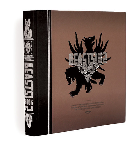
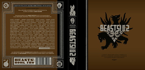
Beasts! is a classical bestiary of mythological creatures as depicted by some of my favorite contemporary artists from the worlds of comics, skate graphics, rock posters, children’s book illustration, the fine art world, et cetera. The first book is now in its fourth printing and the second and final volume came out in early 2009. Each book has ninety artists and four writers involved. I call myself the curator of the project as it’s more like an art exhibit than a standard art book. I wrote up brief descriptions based on my research of creatures, then the artists chose the creature that was most interesting to them and the writers would pen proper text based on historical references to the creatures. It’s a lot more serious than people seem to expect. I like these stories, I like that these creatures existed to someone who told the original story, and it was great to see them given form — a lot of the beasts are very obscure and before I got art from an artist there usually wasn’t any depiction to be found for a beast. There are also interviews with respectable experts like the marine biologist, artist, and writer Richard Ellis as well as contemporary eyewitnesses to some mysterious beasts.

Did you design the Beast! books as well as edit them?

Yes, except the Chinese edition that just came out. The publisher translated and totally repackaged it for that market. It was part of my intent with Beasts! to see what could come of a close working relationship between the editor and the designer on a book project. (Obviously I took that to the extreme by performing both roles.) Books are generally fairly linear, straight-forward affairs or sometimes they’re eccentric art books that end up feeling like design masturbation. I’m interested in what can happen somewhere in between these things that will engage the reader to enjoy multiple readings or even to just feel like more of a participant in the whole experience. There are a lot of interesting details that never make it into books simply because the designer isn’t involved with the editorial side or is otherwise not involved on a collaborative level.
What does the future hold for book cover design?

Everyone’s got an opinion on that and my voice would just be din. It’s hard to say if it’s like the film world facing VCRs or the music world facing MP3s but it’s not bleak to me.

Thanks Jacob!

You can find more of Jacob’s work on his website.

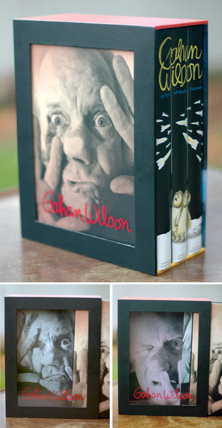
UPDATE: Jacob was kind enough to send me a few more images to accompany the interview and these have now been added to the original post.
8 Comments

Midweek Miscellany (Paul Auster Edition), November 25th, 2009

The award-winning Folio Society edition of The New York Trilogy by Paul Auster and illustrated by Tom Burns has just about blown my mind. MUST. HAVE.

James Wood on the novels of Paul Auster in the The New Yorker:

Auster is a compelling storyteller, but his stories are assertions rather than persuasions. They declare themselves; they hound the next revelation. Because nothing is persuasively assembled, the inevitable postmodern disassembly leaves one largely untouched. (The disassembly is also grindingly explicit, spelled out in billboard-size type.) Presence fails to turn into significant absence, because presence was not present enough. This is the crevasse that divides Auster from novelists like José Saramago, or the Philip Roth of “The Ghost Writer.”

(Personally speaking I think I prefer Auster’s interesting awkward failures over the portentous bludgeon prose of Philip Roth, but that’s just me…)

And, if you haven’t had enough Auster for one post, he’s also interviewed in New York Magazine.

The Making of Fantastic Mr. Fox designed by Angus Hyland — New work from Pentagram for Rizzoli.

Covers from Cleethorpes — A brief, but funny, interview with designer David Pearson at It’s Nice That.

“We Like Lists Because We Don’t Want to Die” — Umberto Eco interviewed in Der Spiegel:

The list is the origin of culture. It’s part of the history of art and literature. What does culture want? To make infinity comprehensible. It also wants to create order — not always, but often. And how, as a human being, does one face infinity? How does one attempt to grasp the incomprehensible? Through lists, through catalogs, through collections in museums and through encyclopedias and dictionaries.

An Innocent Abroad — Journalist and cartoonist Joe Sacco (Palestine, Safe Area Gorazde) interviewed about his new book Footnotes in Gaza in The Observer:

I’m a nondescript figure; on some level, I’m a cipher. The thing is: I don’t want to emote too much when I draw myself. The stories are about other people, not me. I’d rather emphasise their feelings. If I do show mine – let’s say I’m shaking [with fear] more than the people I’m with – it’s only ever to throw their situation into starker relief.

And on the speaking of comics…

Paul Gravett, author of multiple books on the art form, interviewed by Dazed & Confused:

I like the control I have when reading a comic. I’ve grown impatient and disenchanted with the tropes of a lot of movies and TV, their conventional angles and cuts, their manipulation through music, lighting, special effects and above all, the efforts of acting to make me emote. Comics struggle to make us feel anything at all… They often don’t work that brilliantly, but when they do, the impact of fixed, unephemeral, often hand-drawn images can really surprise me. It’s a primal, even primitive medium, as old as our first cave paintings, and it is still being invented and discovered.

2 Comments

Midweek Miscellany, November 11th 2009

The Nabokov Collection — Art Director John Gall on the Vintage Nabokov redesign at Design Observer:

Nabokov was a passionate butterfly collector, a theme that has cropped up on some of his past covers. My idea was also a play on this concept. Each cover consists of a photograph of a specimen box, the kind used by collectors like Nabokov to display insects. Each box would be filled with paper, ephemera, and insect pins, selected to somehow evoke the book’s content. And to make it more interesting… I thought it would be fun to ask a group of talented designers to help create the boxes.

John’s short essay is accompanied by a great slide show of the specimen boxes (above: The Luzhin Defense by Paul Sahre; below Speak, Memory by Michael Bierut).

And Joseph at The BDR has a nice follow up post, with a couple of nice vintage Nabokov covers.

So, do the specimen boxes (lovely as they are) work as covers? You tell me…

Amazon releases a Kindle app for PCs. But who cares? Hmm… I don’t know if I ‘care’ as such, but I do think it’s significant. Is it one more nail in the plastic coffin of single use devices? There’s more on the app at the Washington Post

And while we’re on the subject of e-books…

The Internet Isn’t Killing Anything — From Russell Davies:

Something That’s Growing Is Not The Same As Something That’s Big.

Something That’s Declining Is Not The Same As Something That’s Small.

…Worth remembering I think.

Best Illustrated Children’s Books of 2009 — The New York Times choose their favourites (accompanied with a lovely slide show). The New Yorker‘s Adam Gopnik talks about the selection process with Sam Tanenhaus on the Book Review Podcast (pictured above: Tales From Outer Surburbia written and illustrated by the awesome Shaun Tan).

And finally…

A sneak peak at the new Krazy & Ignatz cover by Chris Ware for Fantagraphics.

1 Comment

Something for the Weekend, November 6th, 2009

Wild WoodbinesThe Creative Review profiles illustrator Tony Meeuwissen who designed the brilliant cover — based on a pack of cigarettes — for Keith Waterhouse’s Billy Liar pictured above (NB: David the Designer has more on this wonderful cover if you’re interested).

There is an exhibition, Tony Meeuwissen: 50 Years in Illustration and Graphic Art at the Subscriptions Rooms, George Street, Stroud (UK) from December 5th – 19th if you’re in the neighbourhood.

The Wonderful Wizards of Lodz — Vintage Polish kid’s books at A Journey Round My Skull.

In Praise of Chapbooks — Bryce Milligan, publisher/editor of Wings Press, at Publishing Perspectives:

I do not think that the average reader—no matter how happy he or she is with their voluminous digital libraries on their diminutive screens—will be satisfied to never have access to a true literary artifact, something tangible that connects them to a favorite author. It makes perfect sense that larger printed works violate both our economic and our evolving green sensibilities, but small artifacts of the author may remain a necessity, if only a psychological one.

He’s Just Like Me But >choke< EVIL! — Comics Alliance list their favorite comic book clichés.

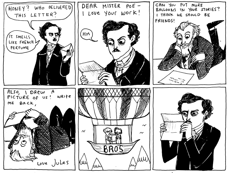
Can you put more balloons in your stories?Hark! A Vagrant: comics by K. Beaton (thx Sio):

And also in comics news… 70 Things You Didn’t Know About Marvel in The Times (via largehearted boy‘s Twitter).

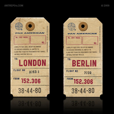
Public Gothic — Having already ‘fessed up to slab-serif obsession earlier this week, I might as well tell you that I’m also slightly obsessed with vintage ephemera — especially luggage tags — so I’m very intrigued by this new typeface from Antrepo even though I’ve no idea how I’d use it or been able to download it!

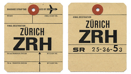
And speaking of typography, ephemera, and luggage tags, take a look at Alistair Hall’s (We Made This) Flickr Set while you’re at it:

And finally…

Barack Obama Names Alan Moore Official White House Biographer:

“As evidenced by his epic run on Swamp Thing #21–64, Moore’s deft hand with both sociopolitical commentary and metaphysical violence makes him an ideal choice to chronicle my time in office”

Oh come on…. It would be awesome.

2 Comments

Monday Miscellany, November 2nd, 2009

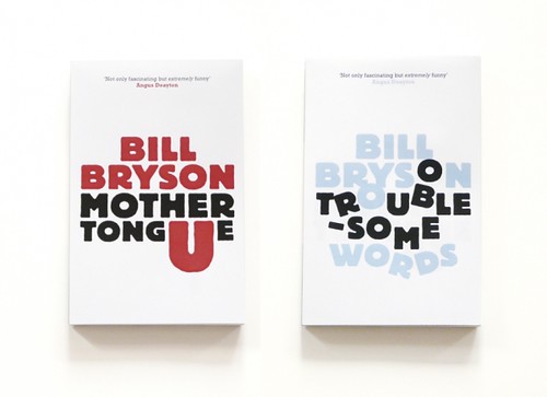
Unpublished concept jacket designs by London-based print designer Allan Sommerville for the Penguin’s Bill Bryson books (via Cosas Visuales).

Fonts — This is AWESOME: Wisconsin Public Radio’s To The Best of Our Knowledge talk fonts with Jonathan Hoefler and Tobias Frere-Jones, designers of Gotham, Matthew Carter, designer of Verdana, author Nicholson Baker, Tracy Honn, director of the Silver Buckle Press, and Kitty Burns Florey, author of Script and Scribble: The Rise and Fall of Handwriting. Listen NOW.

Many Happy Returns — Author, academic and newspaper columnist John Sutherland (The Boy Who Loved Books) on 30 years of The London Review of Books for The Financial Times:

The LRB front cover logo was “THE LONDON REVIEW of Books” – the last two words being smaller. As the typography signalled, it was the review that mattered as much as the book under review. Articles in the LRB were, and are, long: anything between 2,000 and 5,000 words. On special occasions they can run into the tens of thousands. Rates of pay seemed to me startlingly high: three or four times, in the early years at least, what the TLS paid. Miller personally appeared austerely indifferent to money. I suspect he worked for little or nothing. Nor did rises or falls in circulation appear to trouble him overmuch. Quality was all.

(There’s also a rather lovely addendum about the LRB’s personal columns, so read to the end!).

Somewhere Towards The End — A wonderful essay on editor and author Diana Athill by Ian Jack,former editor of Granta, in The Guardian:

[W]hat held me about the writing was its candour. The quality has since become an Athill trademark, though in itself candour is no guarantee of literary pleasure or interest: frank books aren’t always good books and can often be tedious by boasting of their frankness. Athill’s way of being candid is more subtle and its effect more persuasive… Part of this comes from her considerable gift as a maker of sentences, which are so lucid and direct; some of it is owed to the breaking of taboos that then surrounded female sexual behaviour; most of it, though, stems from her triumphant struggle to “get it right”, a lesson she learned from two of the writers she edited. Rhys told her that the trick of good writing was “to get it as it was, as it really was”. Naipaul said that “provided you really get it right, the reader will understand”.

The Internationalist — An all too short interview with Penguin Canada’s David Davidar, who was recently appointed CEO of Penguin’s new division Penguin International, in the Globe and Mail.

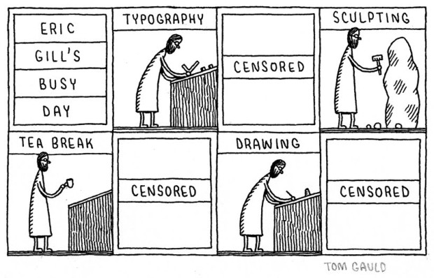
And finally… I do love Tom Gauld:

eric gills busy day

(More on Eric Gill)

Comments closed