Skip to content

Tag: Comics

Something for the Weekend

Today is Penguin’s 75th Birthday! Happy Birthday Penguin.

Tony Lacey, Publishing Director of Penguin, discusses the Penguin Decades series:

And The Guardian interviews Penguin Chief Executive John Makinson, who sounds pretty pleased with himself (Penguin just announced record-breaking half year results):

“[E-books] redefine what we do as publishers and I feel, compared with most of my counterparts, more optimistic about what this means for us,” he says. “Of course there are issues around copyright protection and there are worries around pricing and around piracy, royalty rates and so on, but there is also this huge opportunity to do more as publishers.” Publishing, he says, must embrace innovation: “I am keen on the idea that every book that we put on to an iPad has an author interview, a video interview, at the beginning. I have no idea whether this is a good idea or not. There has to be a culture of experimentation, which doesn’t come naturally to book publishers.

In other news…

Copy Writer from the Dark Side — Author Will Self (Liver) discusses advertising with Gordon Comstock for an interview the Creative Review:

I straighten my dog collar and point out some of the things we might have in common, the novelist and the adman. The love of epigrams, the twisting of cliché, the use of animals behaving uncannily – all Self tropes, all things that a copywriter might well have in his book.

It’s a notion I can imagine certain writers would bridle at, but Self only nods philosophically, “Well, maybe I am a copywriter that’s gone to the dark side, I don’t know.”

Wonder Woman Returns — Kate Beaton goes all superhero and shit at Hark! A Vagrant. Kate is now also selling prints directly from her site and from TopatoCo.

And finally, on a related note and because it’s Friday,…

Lady Gaga Kidnaps Commissioner Gordon:

Supervillain Lady Gaga brazenly abducted Commissioner James Gordon from a charity fundraiser Tuesday, leaving police baffled and the citizens of Gotham fearing for their safety. Known for her outlandish costumes and geometric polygon hair, the criminal madwoman made a daring escape from Arkham Asylum last week and has been taunting authorities by interrupting television broadcasts ever since… While the kidnapping occurred at stately Wayne Manor, home of playboy jet-setter Bruce Wayne, the eccentric billionaire was not available for comment.

Comments closed

Something for the Weekend

The cover for The Disappearing Spoon designed by the amazing Will Staehle. To quote Tal Goretsky at Book Covers Anonymous:  “Holy Mother God!”. Apparently it’s printed on uncoated paper.

You can see some of Tal’s own rather nice design work here.

And speaking of designer’s blogs… Designer Joanna Rieke has started a new blog called UnCovered about book and magazine covers. She recently interviewed illustrator (and Casual Op. hero) Tom Gauld:

I think most literature works perfectly well without illustrations and I have seen some truly awful images put on the cover (used as illustrations) of great books. As for comics, I’m more often frustrated by comics which are too wordy than too visual. I think the balance between words and pictures is very important in a comic and though the ratio doesn’t always have to be the same, my heart sinks when I see a page which is filled with writing.

Taking a summer break from his regular illustration gig at The Guardian, Tom is currently producing a weekly comic and posting it to Flickr:

Real Editors Ship — I linked this on Twitter already, but it’s kind of great so what the hell… Paul Ford on getting stuff out the door and the value of editors (and I would suggest Production Managers):

People often think that editors are there to read things and tell people “no.” Saying “no” is a tiny part of the job. Editors are first and foremost there to ship the product without getting sued… This is not to imply that you hit every sub-deadline, that certain projects don’t fail, that things don’t suck. I failed plenty, myself. It just means that you ship…

Editors are really valuable, and, the way things are going, undervalued. These are people who are good at process. They think about calendars, schedules, checklists, and get freaked out when schedules slip. Their jobs are to aggregate information, parse it, restructure it, and make sure it meets standards. They are basically QA for language and meaning.

The Fine art of Recommending Books — Laura Miller at Salon:

Amazon and other online merchants have harnessed mighty algorithms to run their “If you enjoyed that, you might like this…” suggestion engines, but these are still crude instruments. Practically any novel you plug into Amazon’s search engines at the moment returns the robotic announcement that people who bought it also bought one of Stieg Larsson’s “Girl” thrillers — because seemingly everybody in America is buying those books. It’s not like you need the world’s most sophisticate e-commerce servers to tell you that.

And finally…

Steranko! — Jonathan Ross interviews comics legend Jim Steranko, inspiration for Josef Kavalier in Michael Chabon’s The Amazing Adventures of Kavalier and Clay,  for The Guardian:

Spend an hour with Jim Steranko and, if he’s in the mood, he’ll regale you with the most extraordinary tales. Are they true, I have asked myself more than once, or is he a fantasist? Has his love of storytelling and the creation of modern myths bled into his own life story until he can no longer tell the two apart? Well, now that I’ve met him, I believe them all to be true, just as I believe it when he tells me he still runs miles every day, pumps iron, and fornicates blissfully like a man a third his age. He is unique. He is Steranko. He is the greatest.

A slideshow of Steranko’s work is here.

Have a good weekend…

1 Comment

Midweek Miscellany

Finding a Cover for The Girl With the Dragon Tattoo — A WSJ article and slideshow on the cover design process for the bestselling novel by Steig Larsson:

For three months, Peter Mendelsund, a senior designer at Knopf, prepared nearly 50 distinct designs…  Mr. [Sonny] Mehta ultimately endorsed the vivid yellow jacket with the swirling dragon design: “It was striking and it was different.”

Peter Mendelsund has some further thoughts about the cover, Wittgenstein, David Foster Wallace, and design in a great post on his blog JACKET MECHANICAL:

Due to many factors (the mechanisms of the approval process; design’s fundamentally commercial aspects…) when one examines the field of design, one cannot help but come to the conclusion that good design must be, above all, likeable.

Design is too intimately entangled with matters of taste (to use Wittgenstein’s word) to be demanding enough to be Art. I have to say that in my years in the field, I’ve yet to be made to cry by a work of design. I’ve yet to be forced to view the world differently due to a work of design. I’ve yet to be really, truly gripped by a work of design. I know it’s deeply self-defeating to say this, yet, the best design has only ever evoked in me the feeling of “that’s cool.”

And on the subject of book cover design…

Creative Problem Solving — Macmillan Designers and art directors Susan Mitchell, Charlotte Strick, and Henry Sene Yee discuss the state of book cover design at FSG‘s new Work in Progress blog:

We’re interpreting or packaging other people’s ideas. If someone gives me a manuscript, I interpret it. That’s problem solving… I’m not just here to create something beautiful. Sometimes I’m here to be a plumber. I love that aspect—I can fix things. I’ll make it balance, whatever it is.

Still Reading? — Patrick Kingsley on the art of slow reading for The Guardian:

Still reading? You’re probably in a dwindling minority. But no matter: a literary revolution is at hand. First we had slow food, then slow travel. Now, those campaigns are joined by a slow-reading movement – a disparate bunch of academics and intellectuals who want us to take our time while reading, and re-reading. They ask us to switch off our computers every so often and rediscover both the joy of personal engagement with physical texts, and the ability to process them fully.

Also in The Guardian

Unwanted — A 12-page comic strip tale of unwanted immigrants by Joe Sacco, author of Safe Area Gorazde, Footnotes in Gaza, and Palestine

…And on a not unrelated note: Publishing Perspectives looks at comics and graphic novels in the Middle East and how they are pushing at cultural boundaries.

And finally…

Bob Stein of The Institute for the Future of the Book interviewed by On The Media:

The western version of the printing press is invented in 1454. It takes 50 years for page numbers to emerge. It took humans that long to figure out that it might be useful to put numbers onto the pages.

What is slightly curious about this interview is that Stein acknowledges the essentially unpredictable messiness of the future, and yet it doesn’t seem to stop him…

Comments closed

Midweek Miscellany

The Good, The Bad…design:related‘s Karen Horton (also Art Director at Little, Brown and Co.) interviews Paul Buckley, Creative Director of Penguin US, about his new book Penguin 75: Designers, Authors, Commentary (The Good, The Bad…):

Everyone was asked to keep their comments to 100 words or less, and though there are a few exceptions that I let run long, my own included, most contributors stuck to my request. As to the sarcasm, there are plenty of good natured jabs throughout the book as I was very clear with the participants that this was a true opportunity to let it all out – if you hate your cover, please by all means tell us about it; that is the point of this book.

You can read my interview with Paul from September last year here, and I’m hoping to chat with him and designer Christopher Brand about Penguin 75 soon. Fingers crossed.

Rewound and Remixed — Tom McCarthy, author of Remainder and C, interviewed in The Times:

If McCarthy… presents a radically fresh prospect for the future of the novel, it is probably, paradoxically, because he has instinctively ignored contemporary literature almost completely. He would argue, in fact, that it is only by immersing oneself in all that has gone before that any contemporary novelist has even the faintest chance of coming up with something new. “I don’t think most writers, most commercial middlebrow writers, are doing that,” he says. “I think they’ve become too aligned with mainstream media culture and its underlying aesthetic of ‘self-expression’. I see what I’m doing as simply plugging literature into other literature. For me, that’s what literature’s always done. If Shakespeare finds a good speech in an older version of Macbeth or Pliny, he just rips it and mixes it.”

See also: My Q & A with Peter Mendelsund and Tom McCarthy about the cover design of C.

Paywalls vs. Potential — Clay Shirky interviewed in The Guardian. This has been much linked to elsewhere because of Shirky’s comments about the online “paywall” at the aforementioned The Times, but I actually Michael Wolff’s Vanity Fair article on Rupert Murdoch from October last year is more interesting on this point. See also: John Gapper’s op-ed “Murdoch must become an elitist” in the Financial Times (registration required).

Necessary Agent — Jofie Ferrari-Adler, senior editor at Grove/Atlantic, on literary agents and their relationship with book editors in Poets & Writers Magazine. It’s an interesting article, although — just for the record — not everything that goes pear-shaped in the publishing process is the fault of the Sales & Marketing department…

And finally…

Cats Without Dogs — At some point I will shut up about Jason… Until then, you might be interested to know he has just started a blog…

Comments closed

Jason, The Dharma Bums

As you may have noticed, I’m on something of Jason kick right now. I’m also preparing to interview Paul Buckley, Creative Director at Penguin US, about his new book Penguin 75, so I thought I would take the opportunity to post Jason’s beautiful contribution the Penguin Graphic Classics series that Paul art directed:

4 Comments

Something for the Weekend

Dieter Rams book by graphic design graduate Daniel Bartha:

This project was a book I created around the ten most important principles for what Dieter Rams considered was good design. Taking on board these elements myself, I took away as much as I could from his unique designs but to still leave them instantly recognisable.

And since I seem to be on a German theme this week…

Nabokov in Berlin — An essay by Lesley Chamberlain in Standpoint magazine:

As consumerism and Hitler rose together so Nabokov treated totalitarian politics principally as aesthetically repugnant. It was “another beastliness starting to megaphone” in Germany which in 1937 drove him and his half-Jewish wife Vera to leave Berlin for France and the US. It was almost too late. Berlin suited him. The anti-totalitarian novels Bend Sinister (1947) and Invitation to a Beheading (1938) which followed were remarkable, particularly the latter, for not insisting that totalitarianism’s victims were moral heroes, only men of taste. Nabokov, who saw in art the possibility of redemption, was tempted to think taste ruled out evil.

And from Germany, to France (via Norway)…

Master of Understatement — Douglas Wolk, author of Reading Comics, on Jason’s Werewolves of Montpellier:

[I]t’s possible to describe [Werewolves of Montpellier] by saying it’s a low-key domestic drama, with a Harold Pinter play’s worth of portentous silences, about a bored, disenchanted young man who’s in hopelessly in love with his lesbian best friend. Or you can say it’s about a jewel thief who discovers a secret cabal of werewolves. It’s true that you have to pay attention to catch the details: the fact that Jason draws everyone with animal heads makes it a little bit harder to read some of the characters’ interactions. But maybe Jason’s central joke is that you have to take extreme measures to create certain kinds of drama when a lot of the time people aren’t feeling anything in particular.

Techland also have  an exclusive preview of the book.

See also: The Beat’s review of Werewolves of Montpellier

Werewolves of Montpellier is about an art student/thief who dresses up as a werewolf before he goes out to break into people’s homes at night, which a society of actual werewolves is not amused about.

What that boils down to on the page, though, are scenes of people sitting next to each other at the laundromat, looking at each other in silence or talking about French actresses while playing chess—and each time, it’s utterly fascinating, and the scene draws you in almost immediately and you don’t want to stop.

Jason tells stories with comics in ways that never occur to a lot of people who make comics.

From Europe to Asia…

An Obsolete Practice — idsgn considers the end of movable type in China. Fascinating stuff:

The invention of movable type in China developed with Gutenberg’s mechanical press and hot type-metal, proved to have widespread and lasting success in Europe. But in practice, it was not suitable for Chinese—a language with over 45,000 unique characters. Typesetting in Chinese took “minding p’s and q’s” to a whole new level, and accuracy was challenging when characters were essentially compounds of many radicals and ideograms. Running a Chinese letterpress shop required an enormous storage space and basic literacy of at least 4,000 commonly used characters.

And on a strangely similar note…

Rudy Lehman’s Incredible Linotype Letterpress (via Coudal).

Have a great weekend!

Rudy Lehman’s Incredible Linotype LetterpressRudy Lehman’s Incredible Linotype Letterpress

Comments closed

Jason, Mon Amore

A few years ago when I still worked at Pages, one of the creative/media executives who frequented the bookstore sent his assistant to exchange a copy of comic book by award-winning Norwegian cartoonist Jason that he’d bought from us earlier that day. The book, she said, was faulty. Apparently there were pages missing so the story didn’t make sense and her boss wanted a new copy. She had a receipt so I swapped the book without much thought. It wasn’t until after she’d left and I looked through the returned book that I realised there was nothing wrong with it. The pages were all there, her boss just hadn’t got it. She would be back later for a refund.

In a sense, the confusion was understandable: Jason’s anthropomorphic comics are surreal and require concentration to follow.

In another sense, the dude was simply an idiot because Jason is awesome.

Jason is perhaps the most unique visual stylists working in comics today. Each individual panel is a work of ligne claire pop art: flat, beautifully coloured and amplified for effect.

The deceptively simple stories — often thrillers and off-beat romances — feature anti-heroes, guns, girls, historical figures, b-movie monsters, robots, and aliens. They’re a brilliant mix of silent pictures, film noir, La Nouvelle Vague, classic literature, crime fiction, sci-fi and pulp magazines. There are obvious elements of Hergé, but strange, deadpan, and imbued with ennui and loneliness, Jason’s comics also evoke Hitchcock, Godard, Jarmusch, and Lynch.

In I Killed Adolf Hitler a hit man goes back in time to assassinate Adolf Hitler with unexpected personal consequences. In The Left Bank Gang Fitzgerald, Hemingway, Pound, and Joyce are graphic novelists planning a heist in 1920’s Paris. In Why Are You Doing This? Alex is framed for the murder of his best-friend.

Published in North America by Fantagraphics, Jason’s most recent book, Werewolves of Montpellier, features a thief who disguises himself as a werewolf. A 6 page preview is available on the Fantagraphics blog. If you haven’t checked out Jason’s work already, now’s a great time…

More of Jason’s artwork can be seen on the Fantagraphics’ on Flickr photostream.

6 Comments

Something for the Weekend

An Ethics of Interrogation — Another stunning cover design by Isaac Tobin (via This Isn’t Happiness). My Q & A with Isaac here, if you missed it.

Isaac also has at least two covers in AIGA’s 2009 selections for 50 Books/50 Covers.

Reader Despair Syndrome — An unintentionally Onion-esque post about RSS anxiety (something we can all relate to I’m sure) by Leon Neyfakh for the New York Observer (via Sarah Weinman):

Legions of jittery, media-conscious New Yorkers are eating themselves alive signing up for feeds they never end up reading  in hopes of becoming better people—more knowledgeable, more fun to talk to, more in control of their Internet consumption. They subscribe to dozens, sometimes hundreds of news sources, each of them added to the list with the best of intentions…

Hark! — Dave Howard interviews artist Kate Beaton about her comic Hark! A Vagrant for The Torontoist:

It’s very calculated, it takes me a long time to write a strip, but when you read it, part of the delivery is that timing, that kind of bouncyness of flow, getting a punch-line in without being obvious about it. Or getting the slip on someone, to make them laugh.To make somebody laugh is a difficult thing, it takes a lot of precise steps.

And speaking of comic strips…More Chris Ware posters seen at OMG Posters!

And finally…

The Superhero/Villain Name Generator

Comments closed

Midweek Miscellany

Jimmy Corrigan Japanese Edition Poster from PRESSPOP (via Flog!).

Zingers — Film critic and blogger Roger Ebert, who has lost the ability to speak unaided, on Twitter:

Twitter for me performs the function of a running conversation. For someone who cannot speak, it allows a way to unload my zingers and one-liners… This has become addictive. I tweet too often. I actually go looking for stuff to tweet. I have good friends who suggest things… I was doing this daily, but have scaled back because it was keeping me up too late.

I’ve made a change recently. After writing my blog, “The quest for frisson” and reading two recent articles about internet addiction, I have looked hard at my own behavior. For some days now I have physically left the room with the computer in it, and settled down somewhere to read. All the old joy came back, and I realized the internet was stealing the reading of books away from me. Reading is calming, absorbing, and refreshing for the mind after hectic surfing… I like the internet, but I don’t want to become its love slave.

Landscapes from a Dream — James Pardey (The Art of Penguin Science Fiction) on JG Ballard’s early novels and the Penguin cover art of David Pelham at The Ballardian:

Pelham’s covers featured a crepuscular sky above a barren expanse of water, sand or sunbaked earth as the backdrop for an artefact of twentieth-century industrial or military technology. According to the September 1974 issue of Science Fiction Monthly, these machines depict ‘the debris of our society’. Pelham, the article explained, ‘finds romance in seeing the future as if it were already the past – in visualizing ruins created from the artifacts we are manufacturing now’. But the paradox of Pelham’s artifacts is that they are not in ruins. His are pristine machines at odds with their apocalyptic settings. Half buried or submerged, they stand as tombstones to ostentation and brutality. They are icons, but only of man’s arrogance.

JG Ballard’s archive was recently acquired by the British Library. The Guardian has an fascinating slide show of the archive, including pictures of Ballard’s annotated manuscript pages.

And finally…

4CP | Four Color Process — A blog of comic panels enlarged Lichtenstein-like to reveal the CMYK halftone dots.

2 Comments

Time & Again

Time & Again is a melancholy short film by Jacques Khouri about a man’s repetitive daily life. It is beautifully done with animated Chris Ware-like sequential panels:

(via Drawn!)

3 Comments

Work with a Publisher!

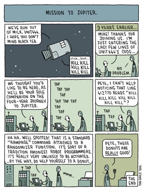
I love Tom Gauld:

Comments closed

Midweek Miscellany

90 Covers — David McCandless talks about the protracted cover design process for his new book Information is Beautiful (via This Isn’t Happiness):

Engage — Online literary magazine and short fiction hub Joyland — founded by authors Brian Joseph Davis and Emily Schultz — is launching an e-book imprint.

Graphic Novels for Booksellers — A core list compiled by Graphic Novel Reporter.

And if that’s not nerdcore enough for you, take a look at The Periodic Table Of Super-Powers.  “Orphan” is atomic number 1.

Absurdity and Tragedy — Author Jonathan Lethem on Philip K. Dick and his own novel Chronic City at 21C Magazine (via Maud Newton):

I’ve always agreed with the view that – with science fiction – its predictive powers were the least important or least relevant aspect of its public profile. I always loved stuff like Orwell’s 1984, where he explicitly said “It’s 1948, reversed.” I liked writers that were doing allegorical, satirical, fantastical versions of everyday life.

That suggests that Dick’s work is dated to the ’60s and ’70s. And I thought of him very much in this framework, and not as an extrapolative writer… But I think that Dick saw the makings of the contemporary reality we experience so profoundly.

As I’ve mentioned previously, I wanted to like Chronic City more than I did. Dan Green has a comprehensive critique of the book (and Lethem’s post-modernism) at his blog The Reading Experience. Dan is, perhaps, less forgiving than I would be, but definitely smarter…

[W]hile Lethem’s work is consistent with much postmodern fiction in that it is essentially comic, the comedy of a novel like Chronic City is indeed much too gentle, too shy of the more corrosive humor of much postmodern comedy. It isn’t so much that the novel is short on “satiric bite” as that ultimately it is merely satire, a relatively mild critique of post-9/11 New York under Bloomberg, which has become inhospitable to its misfits and nonconformists.

Lethem reads from Chronic City and discusses the book in this video interview with The Guardian.

2 Comments