Skip to content

Tag: Comics

Midweek Miscellany

Comics critic Paul Gravett profiles cartoonist and illustrator Luke Pearson. Coincidently, Pearson has created an amazing cover for a new Penguin edition of Lucky Jim by Kingsley Amis (pictured above).

Desirable Comparisons — Part three of Mark Medley’s series on House of Anansi for The National Post:

“We want it to appear as a very serious, big, ambitious book,” Bland says. “Which is hard to do in a way that doesn’t look like other big books.”

He shows [Pasha] Malla some text-heavy covers that bring to mind the likes of David Foster Wallace, Jonathan Franzen and Jonathan Lethem.

“For Pasha, for various reasons that aren’t mine to say, these are not desirable comparisons,” Bland says. “For us, they’re very desirable comparisons.”

Thousands of folk songs and interviews recorded by Alan Lomax are now available for free online.

See also: NPR ‘Alan Lomax’s Massive Archive Goes Online

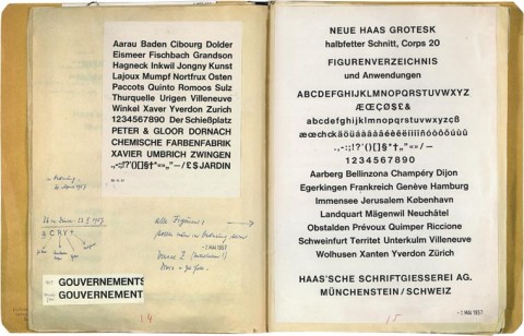
Neue Haas Grotesk — Christian Schwartz has restored the classic Swiss sans serif typeface for the digital era. There’s a history of Neue Haas Grotesk / Helvetica here.

The Books in My Head — The Quill and Quire profile Canadian independent comics publisher Drawn & Quarterly:

Part of what sets D&Q apart is its focus on high-quality design, incorporating elements like glossy embossing on covers. “We want to treat the comic as the nicest object possible,” says [creative director Tom] Devlin.

While Devlin says he collaborates with authors on design, D&Q’s willingness to cede creative control has given the company a reputation as something of an artist’s haven. Seth says he prefers to work independently, providing the publisher with camera-ready artwork for computer production. “They almost never interfere with my design plans,” he says. “I would not be the designer I am today without D&Q allowing me to make the books I see in my head.”

(Full disclosure: As mentioned in the story, D+Q are distributed in Canada by my employer Raincoast Books)

And finally…

With a retrospective at the Oakland Museum of California and the publication of The Art of Daniel Clowes: Modern Cartoonist, Carol Kino profiles Daniel Clowes for The New York Times:

“I never thought of myself as a museum artist who’s doing work for the wall,” he said. “For me the book is the final result.” He assumes that most people who see his work at the museum won’t know who he is. “But if they have some connection to something they see,” he added, “and then they read the book, the more I’ll feel like the show was a success.”
1 Comment

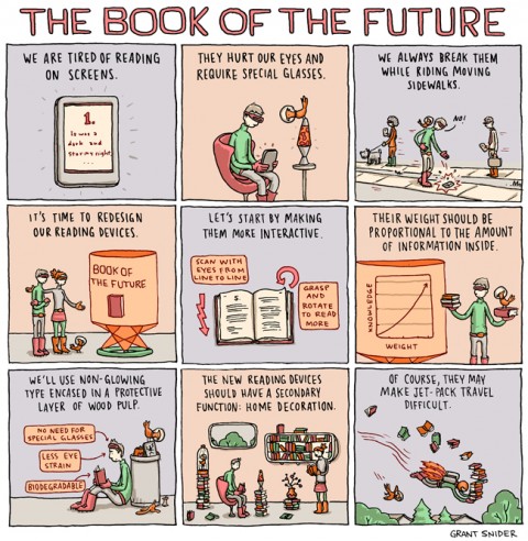
The Book of the Future by Grant Snider

Lava lamps, egg chairs, and “and outfits that would look great in a B-52s music video”… Grant Snider’s vision of the book of the future for The New York Times Sunday Book Review!


Comments closed

Something for the Weekend

The Art of Daniel Clowes: Modern Cartoonist is out next week.

Ware’s World — Seth Kushner’s photos of cartoonist Chris Ware in his Chicago home.  Leaping Tall Buildings: The Origins of American Comics by Christopher Irving and Seth Kushner is published by Powerhouse Books in May.

Redefining ‘Contrarian’ — Armond White on film critic Pauline Kael, and her reputation as a ‘contrarian’, in the CJR (via Bookslut):

Since the advent of the Internet and the rise of review aggregators like Rotten Tomatoes, the illusion of consensus opinion now dominates the culture’s perception of criticism. Individual critics’ voices matter less than the roar of the crowd, which judges films as “fresh” or “rotten” and drowns out anyone who begs to differ. Outlying critics are isolated and deprecated, their deviations from the consensus seen as proof of their eccentricity or ineptitude. As an icon of mainstream critical influence, and as someone who had little use for group hugs, Kael’s independent stance presents a real challenge to the current critical order.

Addressing this change is more urgent than simply championing Kael; it’s a matter of defending the endangered voice of independent criticism that Kael represented so well. Now is a good time to redefine “contrarian” as autonomous, uncoerced journalism. Kael’s writing—and the new, ongoing controversy she engenders—makes this absolutely necessary.

(I’m not at all sure White accurately reflects readers’ expectations of critics, but it makes for a fun article).

And finally…

Nobody’s Perfect — Noah Isenberg reviews Masters of Cinema: Billy Wilder by Noël Simsolo for the LA Review of Books:

A writer by nature, Wilder was a man of uncommon wit and unforgiving sarcasm who made his martinis with the same verve as he made his movies… His was a raconteur’s cinema, long on smart, snappy dialogue, short on visual acrobatics. And though his dizzyingly prolific, half-century-long career brought us everything from romantic comedy masterpieces Some Like it Hot (1959) and Sabrina (1954) to such acerbic gems as Double Indemnity (1944), Sunset Boulevard (1950), Ace in the Hole (1951) and The Apartment (1960), Wilder remained forever reluctant to embrace the notion of director as artist; he saw himself merely as a trafficker in mass entertainment.

Comments closed

Something for the Weekend

Tim Maughan on the influence of  the Jean Giraud on science fiction for Tor.com:

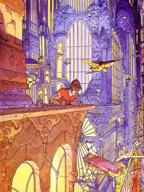
[The] combination of neon-lit noir streets, cramped towering city blocks, airborne traffic jams and scruffy characters seems almost a cliche today. But this was the first time anything like this had been drawn; and the first time science fiction had embraced the visual chaos of realistic urban environments. And the groundbreaking work is not just there in the architecture and mechanical designs; it’s apparent in the fashions and clothes of the city’s inhabitants. Although fantastic, exaggerated and other-worldy the city of The Long Tomorrow comes alive from the page because it feels so real, so layered and built — it is the urban paradise and nightmare of every industrial city from Tokyo to London.

The Catharsis of Exhaustion — Tim Parks on when to finish a book for the NYRB:

Other writers deploy what I would call a catharsis of exhaustion: their books present themselves as rich and extremely taxing experiences that simply come to an end at some point where writer, reader and indeed characters, all feel they’ve had enough… [These] writers it seems to me, by suggesting that beyond a certain point a book might end anywhere, legitimize the notion that the reader may choose for him or herself, without detracting anything from the experience, where to bow out.

Detachment — Edward St. Aubyn, Patrick Melrose Novels and At Last, profiled in the New York Times:

 “[There] is something morally condescending about forgiveness… Detachment is what interests me, seeing how people couldn’t have been any other way, how they were the product of forces that they had no control over… I was in the downstream of my father’s unhappiness, but it must have been hell to be him.”

And finally…

The Beat Hotel — A new documentary about the cheap no-name hotel at 9 rue Git le Coeur in Paris that harboured the likes of Allen Ginsberg and William Burroughs:

1 Comment

Midweek Miscellany

Obituary for artist Jean Giraud, AKA Moebius, in The Guardian:
Giraud… had an impact on the visual arts that went beyond comics. He was seen as a figurehead linking bandes dessinées with modernism and nouveau réalisme. As the co-creator of Métal Hurlant magazine, he took comics to an older, more literate audience. In cinema, his fans ranged from Federico Fellini to Hayao Miyazaki and his style influenced dozens of others, including Ridley Scott, George Lucas, James Cameron and Luc Besson.

Tom Spurgeon also has an in-depth obituary at The Comics Reporter:

Giraud would… describe the revolution driven by his work and others as one of creative choice rather than content, that the feeling of the artist inhabiting the work was more important than the kind of work being done. He drew a connection to the undergrounds and cartoonists like Robert Crumb, although he felt that the work of he and his peers existed in an entirely different cultural context.

See also: The comics industry remembers Moebius at Robot 6.

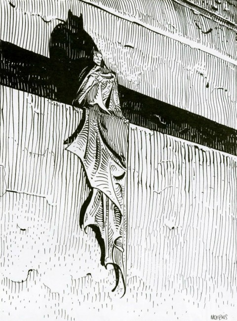
(I remember being very disappointed when I discovered that the drawing above was a standalone piece, and not a panel from a complete Batman story illustrated by Moebius. Heartbreak.)

Material Conversations — An interview with Jonathan Ive, Apple’s Senior Vice President of Industrial Design, in The Evening Standard:

What I love about the creative process, and this may sound naive, but it is this idea that one day there is no idea, and no solution, but then the next day there is an idea. I find that incredibly exciting and conceptually actually remarkable. The nature of having ideas and creativity is incredibly inspiring. There is an idea which is solitary, fragile and tentative and doesn’t have form. What we’ve found here is that it then becomes a conversation, although remains very fragile. When you see the most dramatic shift is when you transition from an abstract idea to a slightly more material conversation. But when you made a 3D model, however crude, you bring form to a nebulous idea, and everything changes – the entire process shifts. It galvanises and brings focus from a broad group of people. It’s a remarkable process.

And finally…

Boredom — Geoff Dyer, author Zona: A Book About a Film About a Journey to a Room, in conversation with Ethan Nosowsky at The Believer:

Boredom is often a side effect of something else. The apparent boredom inflicted by Stalker is actually the friction between the pace of the film and one’s expectations of how a film should proceed, so you just need to give yourself over to it. But then I think some so-called art films are irredeemably and inherently boring. As soon as I say that, though, I realize that the most boring films are the big, moronic action-blockbusters. They really bore the crap out of me. There’s an essential relationship between boring art films and moronic blockbusters because, as Ernst Fischer pointed out, any art form that glories in being understood only by a few—that worships at the altar of its own tedium, as it were—opens the floodgates for trash for the masses. At a certain point, as filmmakers got serious, they willingly took on a slowness that could easily become boring. But there was a long period before that when boredom was just inconceivable, not part of the equation.

Comments closed

Midweek Miscellany

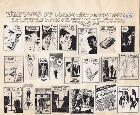
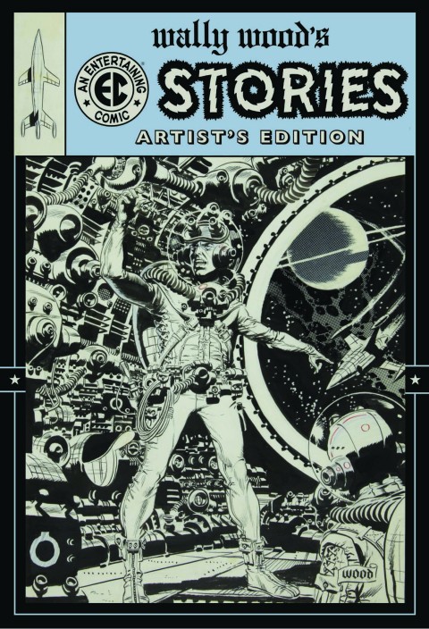
J. David Spurlock on the great Wally Wood at Imprint:

In nearly all of his work – no matter how overworked he was – even when he did risque material, there was always a charm, and he imbued the work with a purity of love for the medium.

And he was a master of every genre. That is one of the things that make him unique. Whether horror for EC, humor for Mad or Plop, war comics for DC or Gold Key, science fiction magazine illustrations, his Wizard King trilogy of fantasy graphic novels, superheroes for Marvel, cheesecake, romance, or westerns, whatever genre one picks, Wood’s contribution is among the finest ever.

Meditations — Dana Stevens on reading Zona, Geoff Dyer’s book about Andrei Tarkovsky’s 1979 film Stalker, while watching the movie:

[If] Zona goes off in a few too many directions, most of them are fascinating enough that we’re happy to zigzag along in the author’s wake. In addition to being a real-time explication of a single movie, Zona is a meditation on movies and time: the way movies change us, and change for us, as we return to them through our lives. Dyer reminisces about seeing Stalker in different decades, in different cities, with different girlfriends, as a young and then a middle-aged man… As he makes his way through Stalker scene by scene, Dyer’s account of what’s happening on screen is constantly being interrupted and informed by associations with the past as well as the present.

See also: Zona reviewed in the New York Times.

Also in the New York Times, author China Miéville on “Apocalyptic London“:

It used to be startling to see a fox in London — impossible not to feel that the city had slipped into a fable. Now you spot them on any late-night jog. In 2011, one of these agents of animal chaos infiltrated the Shard — at 32 London Bridge, the city’s unfinished tallest building — and climbed a thousand feet above the streets to live on builders’ scraps.

At dusk and dawn, green bolts shoot low, as flocks of feral parakeets set about bird business. Walking at dawn in the mud of Wormwood Scrubs, a rough, wild common next to the prison of the same name, we approach a screaming copse. Incredible flocks of these nonnatives preen and screechingly bicker, overlooking the glow of waking London.

And finally… A lovely piece the in The Daily Telegraph on Word on the Water, a Dutch barge selling second-hand books in London:

“We live in times where young people have Debussy moustaches, and listen to Sixties and Seventies music. They are interested in the past. I don’t remember there being a youth cult before where the past was so fascinating. There’s a hunger for authenticity … Younger people are becoming interested in things that machines can’t do: talent.”

1 Comment

Midweek Miscellany

Elegant Simplicity — A nice profile of book designer David Pearson at Spitalfields Life:

On the basis of “Penguin By Design,” David was given the job to design the covers for Penguin Great Ideas, an experimental series of low-budget books with two-colour covers. “I’m not an illustrator and I can’t take photographs, so I decided to do all the covers with type,” explained David, almost apologetically. Yet David’s famous landmark designs for these books, derived from his knowledge of the history of Penguin covers, were a model of elegant simplicity that stood out in bookshops and sold over three million copies. “I saw people picking them up and they didn’t want to put them down!” he confided to me, rolling his eyes in delight, “They were a phenomenon.” Then he placed a hand affectionately upon a stack of copies of this series for which he has now designed one hundred covers.

My interview with David is here.

Books MatteredDavid L. Ulin on the late Barney Rosset for The LA Times:

For Rosset, the mission was simple: Books mattered, they could be dangerous, they could change your life. Writers were heroes, “cosmonauts of inner space,” to borrow a phrase from “Cain’s Book” author Alexander Trocchi, their function less to reassure than to destabilize, to challenge the assumptions by which society was made.

This could happen in all sorts of ways — Beckett’s unflinching absurdism (“Ever tried. Ever failed. No matter. Try Again. Fail again. Fail better”), Burroughs’ scabrous cynicism (“A functioning police state needs no police”), Miller’s sense of living at the end of history, when all the so-called verities had collapsed beneath their own sanctimonious lies.

See also: Barney Rosset obituary in The Guardian.

Sprawling Tentacles — Alexandra Manglis reviews Alan Moore: Storyteller by Gary Spencer Millidge for the Oxonian:

The work and the man have morphed together resulting in a giant Moore myth that fans and comic creators alike have difficulty surmounting, its tentacles sprawled out far beyond his small Northamptonshire home. The infamous Guy Fawkes mask, for one, created in Moore’s anarchist comic V for Vendetta, has been worn by protesters from Tahrir Square to Occupy Wall Street, and Moore is indubitably proud of the anarchist symbol’s use in real civil unrest. Yet the symbol’s popularisation is largely due to the comic’s adaptation into a Hollywood blockbuster, from which Moore removed his name and refused to take royalties. Moore’s stories have become bigger than the man himself; the images he has authored have grown beyond him and often, as in the case of V for Vendetta, in spite of him.

See also: Paul Gravett’s review for The IndependentThe Guardian celebrates 35 years of British comic 2000AD

And finally…

Geoff Dyer, author of Zona, interviewed at Bookforum:

Failure is quite interesting, and it’s something I have a certain amount of experience with. I wasn’t a failure in the way lots of people are failures—I could always get published, that was pretty straightforward. Literary failure is funny because it’s not like you get this massive slap in the face and become a figure of ridicule. It’s more that you do this thing, you write this book, and then this big thing is poised to happen on publication. And nothing happens. It’s just a weird non-event. The literary Richter scale doesn’t register any kind of tremor. That was happening to me for a very long while, and then I managed to persuade myself that these serial failures were perhaps a kind of liberation in that it meant I was free from any kind of pressure from publishers. The stakes were so low that it didn’t really make any kind of difference to anybody that I went from writing a novel to writing a book about the First World War. So I’ve certainly known what it’s like for a book to simply, well, disappear.

Comments closed

Midweek Miscellany

Tracing History — Alice Rawsthorn on the beauty of printed books for the New York Times:

Some things seem to designed to do their jobs perfectly, and the old-fashioned book is one. What else could be quite as efficient at packaging so many thousands of words in a form, which is sufficiently sturdy to protect them, yet so small and light that it can be carried around to be read whenever its owner wishes? The pages, type, binding and jacket of a traditional printed book do all of the above, as well as giving its designer just enough scope to make the result look beautiful, witty or intriguing.

(pictured above: Blaise Cendrars’s 1919 book ‘‘La fin du monde, filmée par l’ange,’’ designed and illustrated by Fernand Léger.)

Down bpNichol Lane — Founder and publisher of Coach House Books Stan Bevington talks to  The Varsity about the history of the storied indie press:

Coach House purchased a photo-offset lithography machine, which allowed images to be transferred photographically to aluminum printing plates. Oil-based ink adhered to the images on the plates, which were then used to print the pages of a book… In the 1960s, this was cutting-edge technology. According to Stan, offset lithography was a tremendous step forward in the publishing industry because it “drastically liberated” the process of creating printing plates. But the text of a book still had to be typeset by hand, which left publishers relatively restricted in other areas of design. As Stan thumbs through additional books that were printed using offset lithography, he laughs and points out that they are all set in the Helvetica typeface.

Captain Crunch — Alan Moore on DC Comics planned Watchmen prequels at Fast Company:

“There’s been a growing dissatisfaction and distrust with the conventional publishing industry, in that you tend to have a lot of formerly reputable imprints now owned by big conglomerates… As a result, there’s a growing number of professional writers now going to small presses, self-publishing, or trying other kinds of [distribution] strategies.

“The same is true of music and cinema… It seems that every movie is a remake of something that was better when it was first released in a foreign language, as a 1960s TV show, or even as a comic book. Now you’ve got theme park rides as the source material of movies. The only things left are breakfast cereal mascots.”

See also: Tom Spurgeon’s ‘21 Not Exactly Original Notes On More Watchmen, Written At A Slight Remove‘:

Watchmen is something of a perfect Internet-era story, and as such serves as a reminder of how much we’re driven by and limited to the nature and form of the way news stories develop now. You couldn’t build a story like this in a laboratory. The… Watchmen story is about a product; people like products. It’s about the hype for a product, which in many ways and for many fans has become the best part of any arts-product experience. Because the work itself doesn’t exist yet, arguments can be made on its behalf positing an ideal outcome or a disastrous one — your choice.

Comments closed

Midweek Miscellany

The cover for Hope: A Tragedy by Shalom Auslander designed by John Gall.

The Invisible Man — Lee Konstantinou, author of Pop Apocalypse, reviews Art Spiegelman’s MetaMaus for the LA Review of Books:

[T]here is something obsessive about MetaMaus, which says as much about the price of success in the contemporary literary marketplace — and its attendant culture of celebrity authorship — as it does about its subject. When a book like Maus makes a big impact, we often condemn its creator never to move on to new projects. MetaMaus give evidence that Spiegelman has endured a fate not unlike that of Ralph Ellison after he published Invisible Man in 1952. Like Ellison, Spiegelman has rightly earned enormous praise, and, also like Ellison, he has become his own best interpreter. But just as Ellison produced no major work after Invisible Man other than the unfinished, posthumously published Juneteenth…, Spiegelman has yet to produce a work of comparable depth and sophistication to Maus.

The Road — Julie Bosman on the future of Barnes & Noble for The New York Times:

If something were to happen to Barnes & Noble, if it were merely to scale back its ambitions, Amazon could become even more powerful and — well, the very thought makes publishers queasy.

“It would be like ‘The Road,’ ” one publishing executive in New York said, half-jokingly, referring to the Cormac McCarthy novel. “The post-apocalyptic world of publishing, with publishers pushing shopping carts down Broadway.”

…Without Barnes & Noble, the publishers’ marketing proposition crumbles. The idea that publishers can spot, mold and publicize new talent, then get someone to buy books at prices that actually makes economic sense, suddenly seems a reach. Marketing books via Twitter, and relying on reviews, advertising and perhaps an appearance on the “Today” show doesn’t sound like a winning plan.

See also: B & N won’t sell books from Amazon Publishing and Amazon’s Revenue Slumps.

And finally…

The fascinating first article in a year-long series on the inner-workings of Canadian publisher House of Anansi Press by Mark Medley for the National Post:

A significant amount of time is spent discussing paperback editions of books that recently came out in hardcover. “Right now, we’re seeing the market is really and truly paperback and e-book,” [publisher] MacLachlan says. “So, we have some hardcovers that we thought would [sell] in the fall that haven’t gone as well as they should. And so, rather than wait a whole year to reintroduce the book into the marketplace, let’s do a paperback edition sooner than later.”

Comments closed

Midweek Miscellany


Everyday Epic — Tom Spurgeon interviews Tom Gauld at The Comics Reporter:

I find that when I’m drawing I’m quite happy to come up with larger than life, epic things but when I write things tend to be more down to earth. The contrast between greatness and everyday reality is something which interests me.

You can find my interview with Tom here. His new book Goliath is out in March.

I Am Lousy Copywriter — A list by legendary adman David Ogilvy, author of Confessions of an Advertising Man, at Letter of Note:

If all else fails, I drink half a bottle of rum and play a Handel oratorio on the gramophone. This generally produces an uncontrollable gush of copy.

My Name is Tyranny — Mike Doherty interviews William Gibson about his new book, Distrust That Particular Flavor, for Salon:

I very seldom compose anything in my head which later finds its way into text, except character names sometimes – I’m often very much inspired by things that I misunderstand. Have you ever seen Brian Eno’s deck of Oblique Strategies? One of them is “Honor thy error as a hidden intention.” That’s my favorite. [At a] hotel in New York a couple of days ago, the young woman who checked me in said what sounded to me like, “Thank you, sir; my name is Tyranny. If there’s anything you need …” For the rest of the day, I was thinking of young, benevolent female characters with the first name “Tyranny.”

And finally…

Tiptoeing Through a Sickroom — Luc Sante on Patti Smith for The New York Review of Books:

Her memoir Just Kids (2010), the account of her friendship with the photographer Robert Mapplethorpe, has been justly celebrated. It is delicate and affectionate as it tells of their adventures in a New York City bohemia that now seems a century removed, of the endurance of their relationship despite his realization that he was gay, of their separate pursuits of fame, of his illness and death. It is almost too literary for its own good, since her choices of word and phrase always come down on the genteel side of the ledger: “perhaps” rather than “maybe,” “rise” rather than “stand,” “yet” rather than “but,” “one” rather than “you.” There’s hardly a contraction, outside the dialogue, in the entire book. But despite the fact that this sort of talk is patently not the way she expressed herself at the time, and that it sounds more effortful than natural on the page, it does cover the book with an appropriate hush—it sounds like someone tiptoeing through a sickroom.


Comments closed

Something for the Weekend

Adrift in the World — Tim Parks on fiction and place for the NYRB Blog:

If there is a problem with the novel, and I’m agreed with [David] Shields that there is, it is not because it doesn’t participate in modern technology, can’t talk about it or isn’t involved with it; I can download in seconds on my Kindle a novel made up entirely of emails or text messages. Perhaps the problem is rather a slow weakening of our sense of being inside a society with related and competing visions of the world to which we make our own urgent narrative contributions; this being replaced by the author who takes courses to learn how to create a product with universal appeal, something that can float in the world mix, rather than feed into the immediate experience of people in his own culture.

The Degree-Zero of Typeage — The “un-Google-able” Jenny Hendrix on Tintin for LA Review of Books:

Hergé himself described Tintin as the “degree-zero of typeage — a typographic vanishing point.” The formulation suggests Samuel Beckett, and there is indeed something Beckettian about Tintin. In French, appropriately, the phrase “faire tintin” means something approximating “to go without” or “to be frustrated.” Tintin may be a reporter, motivated, like any good journalist, by the hint of a good story, but only in his very first of his 24 adventures does he actually file copy. He was born 15, and supposedly stays that way, though it is hard to imagine he’s any age at all. He has no last name, no parentage and no past, no desires and no sexual identity. Even his appearance has little to say about him: his face is just a circle, with two black dots for eyes and a black, semi-circular wedge of mouth. He could be anyone, and frequently is…

Super-Punch — The New York Times reviews ‘Printing for Kingdom, Empire & Republic: Treasures From the Archives of the Imprimerie Nationale’, an exhibition of historical steel punches, copper matrices, and typefonts at the Grolier Club in New York:

[T]hese exquisite artifacts… offer a reminder, in the ethereal era of bitmapping, that type was once the tangible province of engravers and metal casters who labored in unforgiving but enduring media. To make a C with a cedilla, for example, involved a lot more effort and thought than holding down the Option key on your Mac. A comma-shaped steel appendage had to be lashed with string to the bottom of the C punch to produce a new matrix.

“People are practically printing books with their smartphones,” Mr. Fletcher said, in a tone suggesting that he did not think this was such a good idea. “It’s much more gratifying to be able to touch something and find out it’s real, rather than a matter of bits and bytes.”

Comments closed

Something for the Weekend

Fabulous Fury — Evie Nagy reviews Tarpé Mills & Miss Fury: Sensational Sundays 1944–1949 for The LA Review of Books:

Though Mills ostensibly hid her gender and wrote a high-adventure comic rife with guy stuff like smuggling, espionage, mad science, and gruesome murders, Miss Fury has much in it that seems designed to appeal to women as well. For one thing, the outfits are fabulous. As Robbins suggests, Mills clearly took great pleasure in dressing Marla, scheming villainess Erica Von Kampf, and other characters in elaborate gowns, lingerie, and smart but finely detailed sportswear. Modern superhero comics tend to focus on the intricacies of high-tech costumes at the expense of civilian clothes; Miss Fury, by contrast, is midcentury clothes porn.

Fucking Great — British film director Beeban Kidron remembers Magnum photographer Eve Arnold who died recently aged 99:

She was an early adopter of colour – favouring a thick negative with rich hues and simple compositions – and she ruthlessly edited her own work with a wicked sense of humour. “It’s not that we’re so great, it’s that the others are so fucking mediocre.”

See also:

A slide show of Eve Arnold’s work at The Guardian.

Eve Arnold remembered in The Guardian, The Telegraph, The Financial Times, The New York Times and The Economist.

The best Typefaces of 2011 from FontShop and the most popular fonts of the year from MyFonts.

Forward! — Stephen Page, chief executive of Faber & Faber, writing for The Guardian on the way ahead in publishing:

[T]he men and women engaged in publishing need to be bold and exuberant. This is an extraordinary age for writing and reading, and it seems to me that this endeavour will go better if it’s done with a sense of purpose and pleasure, rather than defensively. It won’t turn out well for everyone currently in the business, but so what? If publishing is useful and creates value then it will be of value, whoever is doing it.

And finally…

A lovely profile of  Peter Hardwicke, one of the last traditional signwriters in London’s East End, in Spitalfields Life:

I am an old school signwriter that likes to talk directly to the client to select the fonts and the colours. I’ve found it a rewarding way to work, dealing with independent shopkeepers. I like to look at the built environment and choose fonts that are sympathetic to the architecture and the surrounding cityscape. I look at the other shops and I do research…I think people are bored with computer generated artwork…even my younger clients, they’d rather have it  done professionally than use stick on letters – it shows they’ve got taste.

You can find an earlier profile of Peter here and see an archive of his work on Flickr. (Thx Monique)


Comments closed