I am very, very late to this, but Penguin are in the process of reissuing Len Deighton’s thrillers as Modern Classics with new covers by Jim Stoddart inspired by Raymond Hawkey’s original paperback designs.
There are a lot more titles available now (Len Deighton wrote a lot of books!), but you can read more about the first wave of reissues in this Creative Review article from last year, and I’ve posted a few of my favourite covers below.
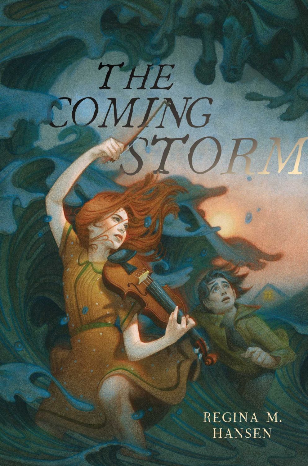
These posts are such a last minute scramble I don’t usually offer much in the way of commentary. It is hard to ignore, however, how many of my selections this year are illustrated. This may be a reflection of my personal preferences. Certainly, it isn’t new. As I mentioned in my look back at the year’s adult covers, the trends in 2021 felt very much like a continuation of the previous couple of years. Even so, I was struck by the sophistication and the range of YA illustrations this year. There are some illustrators whose work appears here more than once, but I don’t get the sense that there is a dominant style across category. It seems to depend very much on the specifics of the genre and the age range of the readership. That said, there is, perhaps, a common theme of ornate detail and decoration.
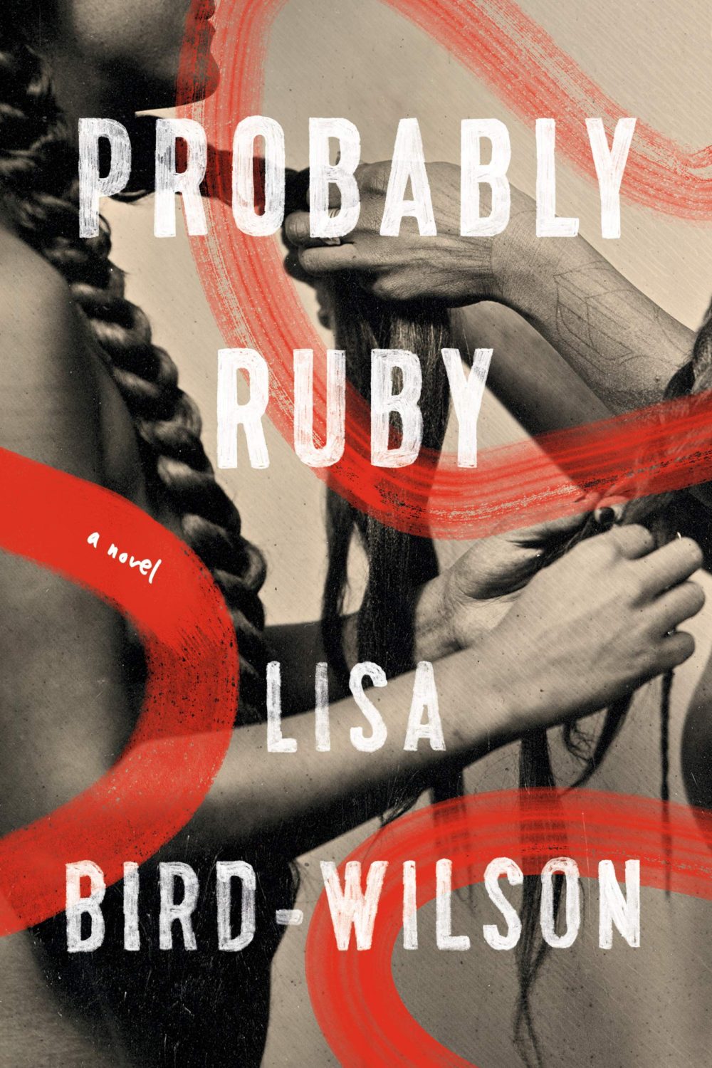
I am also finding it harder to differentiate between covers for more mature YA readers and adult covers of the same genre these days. If the cover blurbs and other identifiers (“A Novel”) didn’t give it away, the combination of the typography, colour palette, and the apparent age of the protagonist depicted used to give me a clue. Now it seems to me that there is a blurring of the lines, and I’ve had to check a couple of times recently to be sure of the intended readership age. I’d be curious to know if this is intentional on the part of publishers.
Anyway, there are some fantastic covers this year. Buzzfeed has a really decent list with design and illustration credits too if you’re looking for a second opinion (not that they need any clicks from me!). You can find my 2020 list here if you are interested.
Drawn That Wayby Elissa Sussman; design by Sarah Creech; lettering and illustration by art lettering Francesca Protopapa (Simon & Schuster Books for Young Readers / September 2021)
Aside from generally being a terrific SFF illustrator, I believe Matt Griffin illustrated the cover of Ace Books’ deluxe hardcover edition of Dune by Frank Herbert a couple of years ago, so he seems like an inspired choice here.
Love is for Losers by Wibke Brueggemann; design by Rachel Vale (Macmillan Children’s Books / January 2021)
The cover of the US edition, published by Farrar, Straus and Giroux (BYR) in February, was designed by Aurora Parlagreco with an illustration by Sally Nixon. I like it a lot too. It’s interesting to see the contrast between the UK and US markets.
Me (Moth) by Amber McBride; design and illustration by Richard Deas (Feiwel & Friends / August 2021)
(Another cover image with a roundel. Apologies. At least it is somewhat less obtrusive here.)
Yolk by Mary H. K. Choi; design Lizzy Bromley; cover art by gg (Simon & Schuster Books for Young Readers / March 2021)
The covers of Emergency Contact and Permanent Record by Mary H.K. Choi designed by Lizzy Bromley with art by gg have featured in previous year’s lists.
This will be the last of the monthly cover round-ups for 2021 because I have to turn my attention to the year as a whole, but there are some really top-notch covers in this month’s post so it feels like a good place leave off…
The cover of the UK edition, publishing next year I believe, was designed by Jack Smyth:
Jacket Weather by Mike DeCapite; design by Michael Salu (Soft Skull / October 2021)
I was reminded of the cover of The Empty Chair by Bruce Wagner designed by Gregg Kulick from what seems like an age ago (2013 I think?) . It’s very possible I have been doing this for too long…
A big, messy post this month as I catch up on the new releases and some of the covers I missed over the summer. I expect the next couple of month’s might be a bit like this as I work towards my round-up of the year, so feel free to let me know about stuff that you think I’ve overlooked in 2021.
For some reason, I was reminded of this saucy Jacob Covey cover, which I thought was killed in favour of something more (ahem) traditional, but it still exists on Amazon, so who knows? (Jacob probably knows; I do not).
Irish designer Jack Smyth, whose work has featured here more than a few times, talked to Totally Dublin about his process for designing book covers:
The best briefs are the ones that give you everything you need but prescribe nothing, and are genuinely trying to achieve something new… When I’m working on fiction, tone is the thing that really interests me. I think trying to capture the tone of the author’s writing can be a really powerful way of communicating with the viewer and, as a result, I often try to avoid leaning too much specific imagery. Of course, this isn’t always the case, but I do always try to keep tone/the author’s voice as the main directive element. I think this is what makes or breaks a book for a reader, not necessarily the location, any element or makeup of characters… I try not to rely on figurative elements too much in the hope that I can draw people in in more subtle ways.
The cover is quite simple – it’s type and colours and textures, but hopefully it captures the tone of John’s voice and the character of the stories. I think these are my favourite types of covers, the ones where there’s almost no figurative elements, but they feel right.
Alana Pockros talked to designers and others in the publishing community about trends in book cover design for the AIGA blog Eye on Design:
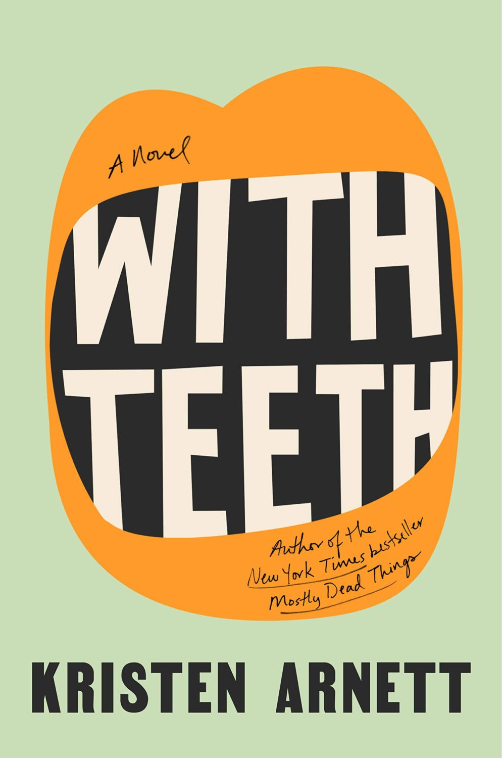
The guiding principle of “like that book but different” cover design has existed for decades. In the 1960s, the late book designer Paul Bacon pioneered the “Big Book Look,” which we might associate with Philip Roth’s Portnoy’s Complaint or Joan Didion’s The White Album: type-driven covers with large author names and ample negative space that rely more on hue and font than imagery. Philip DiBello and Devin Washburn, founders of the design studio No Ideas, believe we’re currently seeing an evolution of the Big Book Look. “[There’s] a wave of similar covers that play with type intertwined with a key visual in a striking way,” they suggested. In The Look of the Book, Peter Mendelsund and David Alworth’s 2020 monograph, the authors call this mutative style “the interchangeable, big-type, colorful cover.” It’s a look Mendelsund and Alworth first noticed on the 2015 novel, Fates and Furies, and the style they see as the progenitor of the tired “it will work well as a thumbnail on Amazon” rationale.
It is always interesting to hear designers talk about how they view the process and why we get certain trends. But the post itself, entitled “The Endless Life Cycle of Book Cover Trends”, is a variation on the well-worn, trend-focused ‘why do book covers look the same?’ article that has appeared in various guises over the years. Pokros herself references a New York Times article from 1974(!) that explains that jackets must be identifiable on television, and a Vulture piece from 2019 that postulates that book covers are now being designed for Amazon and Instagram. You could also read this post on Eye on Design from 2019 about the ubiquity of stock images, or this The New Yorker piece on design by committee from 2013, or this story in The Atlantic from 2012 (it’s e-readers fault!) among others.
It’s not that they’re necessarily wrong. There are clearly trends and tropes in book cover design as there are in any other kind of design (and pointing them out is fun — I do it frequently!). And there are lots of designs that aren’t great. That’s true of everything. It’s just that on the whole, book covers (like movie posters) don’t all look the same. Not really. Sure, books in the same genre frequently do. Covers sharing similar traits helps readers identify what kind of books they are buying. It doesn’t mean they are B-A-D. Perhaps part of what gets people so twitchy about high-profile literary fiction covers looking familiar is that they don’t like to think of certain kinds of literary fiction as genres?
I don’t know… I’m one of the marketing people whose fault this usually is.
I guess if you really want to get into it, trends in book covers often reflect trends in publishing itself. When similar books intended to appeal to similar readers are published by similar people at similar imprints that are part of similar, very large publishing conglomerates, maybe the issue isn’t really that they have similar covers?
Anyway TL: DR, if you’re seeing a lot of covers that look the same maybe it says more about the kind of books we are exposed to in our daily lives than about the range of covers that are actually out there?
They look very different, but I was reminded of another sunset sky cover designed by Lauren from earlier this year. It’s interesting to see the (presumably) coincidental themes in a designers work.
I quite enjoy seeing contemporary painting being used on book covers. A couple of other recent examples that come to mind are Jennifer Carrow’s recent cover for Lorna Mott Comes Home with art by Barbara Hoogeweegen, and Stephen Brayda’s cover for last year’s The End of the Ocean by Maja Lunde with art by Scott Naismith (another sunset sky cover! I guess After the Sun could also be included in this trend broadly speaking. It is not quite the kind of painterly art I am thinking of though…).
I’m drawing lots of unnecessary comparisons today, but I was reminded of this Oliver Munday cover from a while back if only for the similar-ish colour combinations (I was going to say palette, but… ). It reminds me of something else too, I just can’t quite put my finger on it…
If I didn’t already know who the publisher was, I would not have been able to tell you if this was an American or British cover despite the subtitle and very American imagery. I don’t think it would like out of place on the Allen Lane list for example.
Tom Gauld’s first picture book for children, The Little Wooden Robot and the Log Princess, is out this month! According to the publisher blurb, the book is inspired by a bedtime story he made up for his daughters:
“I was trying to make a book inspired by three different sets of books: The books that I remember enjoying as a child, the books that I watched my daughters enjoying, and the books I enjoy now as an adult. I wanted the book to have its own quirky feeling but also to function like a classic bedtime story.”
Pure Flame by Michelle Orange; design by Na Kim (Farrar, Straus and Giroux / June 2021)
In the ongoing game of books I think look alike but actually don’t when you put them side by side, the cover of Pure Flame brought to mind Peter Mendelsund‘s design for Civil Wars by David Armitage from a few years ago. Of course they don’t really look anything alike, but that’s how this game works…
Civil Wars by David Armitage; design by Peter Mendelsund (Yale University Press / February 2017)
A read an ARC of A Shock earlier this month and thought it was extraordinary. A recent review in the Observer described it a collection voyeuristic vignettes, which I suppose is accurate. The book is made up of interconnected and intimate stories, often about loneliness and confinement of one kind or another (particularly resonant during the pandemic). They are prying and unsettling… stories about seeing and been seen (or not). But in a wider sense, A Shock is about the telling and retelling stories (myths even!), and the way that is revealed in the novel itself is what elevates it above and beyond the usual fare. Anyway… I liked it. It won’t be for everyone.
The cover of the US edition, available from New Directions next month, was designed by the one and only Mr. Keenan: