A documentary on the Hernandez Brother’s groundbreaking alternative comic Love & Rockets will launch the new season of KCET’s art and culture series Artbound, streaming on the PBS app October 5, 2022.
Love & Rockets turns 40 this year, and if you have $400 USD burning a hole in your pocket, Fantagraphics are collecting together bound facsimiles of the original fifty issues in a special eight-volume boxed set. (Although I would settle for a slightly more affordable Love and Rockets #24 t-shirt myself!)
It’s been a while since I posted about author, illustrator and designer Coralie Bickford-Smith. In a new video for Penguin Books she talks about her creative process, her work on the original Clothbound Classics, and Penguin’s new Little Clothbound editions.
I’m doing my best to catch up a little bit this month, but there’s no such thing as a quiet month in publishing any more. Just rest assured nobody knows what they’re doing — we’re just here for the chaos and romance…
I’m even later than usual this month and everyoneelse posted their selections days ago, so you must really like book covers if you’re still jonesing for more! (And just a reminder: if you are in fact addicted to book covers and don’t want to miss any new posts, you can get them automatically sent to your inbox now. It’s not a newsletter, just magical RSS. But subscribing will confirm that you have a problem and should seek help!)
A bit of a Saul Bass / Hitchcock thing happening at the moment…? (The cover of the Faber edition of The Premonitions Bureau by Sam Knight was designed by Jack Smyth)
“Today is wretched and plain. And it is not the bottom, as many people may feel it is. It will get worse; we will go lower. As the Court’s dissent insists, correctly, ‘Closing our eyes to the suffering today’s decision will impose will not make that suffering disappear.‘
And so, with all this laid out, ugly and incontrovertible, the task for those who are stunned by the baldness of the horror, paralyzed by the bleakness of the view, is to figure out how to move forward anyway.
Because while it is incumbent on us to digest the scope and breadth of the badness, it is equally our responsibility not to despair.
These two tasks are not at odds. They are irrevocably twined. As Dahlia Lithwick wondered just a few weeks ago, after the massacre in Uvalde, another clear and awful day: ‘What does it mean, the opposing imperative of honoring the feeling of being shattered, while gathering up whatever is left to work harder?’
It means doing the thing that people have always done on the arduous path to greater justice: Find the way to hope, not as feel-good anesthetic but as tactical necessity.“
Rebecca Traister, ‘The Necessity of Hope’, The Cut
For my art history friends, I believe the painting is “Agnus Dei” by Spanish Baroque artist Francisco de Zurbarán.
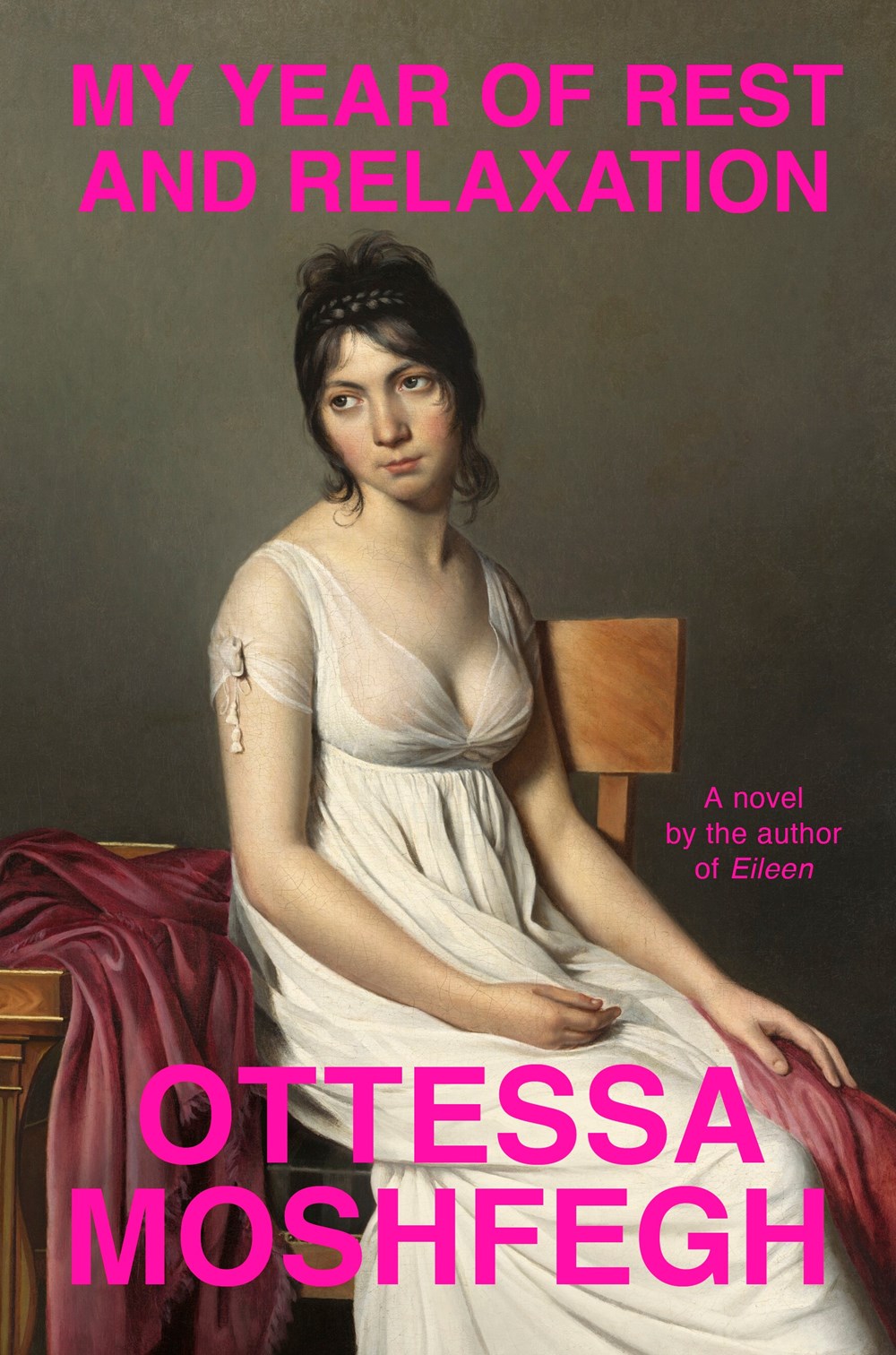
IIRC the cover of Moshfegh’s novel My Year of Rest and Relaxation was designed by Darren Haggar. The painting is by French Neoclassical artist Jacques-Louis David.
I compile these posts over the month and then write this bit at the end if I have anything to say. I really don’t have the words at the moment. Posting about the most superficial of subjects feels faintly ridiculous at the end of yet another awful week. But here we are. I am just going to refer you to Wednesday’s Today in Tabs and say that there a lot of really nice covers this month if you are need of distraction…
Appliance by J. O. Morgan; design by the author (Jonathan Cape / May 2022)
I was reminded of Jon Gray‘s cover for Ilustrado by Miguel Syjuco from what seems like ages ago (2010)… Of course they look nothing alike. I had completely forgotten the pen was at jaunty angle.
The cover of the US edition was designed by Rachel Ake Kuech using a illustration by Grant Haffner. The difference between how Canada represents Canada and how the US represents Canada is…. interesting.
Big vertical light leaks might also be a thing… (Freedomland designed by Henry Sene Yee for Cornell University Press)
We’ve almost made it to the end of April, so that’s something. Thanks to Daniel Benneworth-Gray for the mention earlier this month. It surely means I’m about to disappoint a large number of people — if I have not, in fact, already done so — but I hope you find something you like here…
I believe the Elizabeth Finch cover also comes in yellow, but I wasn’t able to find a hi-res image. If anyone wants to send it over, I’ll be happy to add it.
The jacket also comes in yellow, which feels very on trend to me and the blue and yellow look lovely side by side. Thank you to Suzanne for taking the time to send over the image of the yellow version.
Suzanne also sent over an image of the boards for those of you curious to see what is under the jacket, peeking through the die-cuts. The gorgeous photograph is from René Groebli’s photoessay The Eye of Love.
This is the problem with seeing covers/jackets primarily online. You rarely get to appreciate these finer details. This must be a beautiful book to hold and unwrap.
And I have been trying to recall what both these covers remind me of. Possibly ‘Composition of Circles and Semicircles‘ by abstract artist Sophie Taeuber-Arp?
The black and white illustration and pink type reminded me of the US cover for Fight Night by Mirian Toews, designed by Patti Ratchford with an illustration by Christina Zimpel, from last year.
Boothby Karen Joy Fowler; design by Tal Goretsky (G.P. Putnam’s Sons / March 2022)
If you’d asked me to guess sight-unseen, I would’ve 100% said this was designed by someone else. It just goes to show that designers are talented, versatile people and I know nothing (NOTHING).
Malika Favre also designed and illustrated the cover of Playing with Matches by Michael Faudet, published by Andrews McMeel at the end of last year, and featured in this month’s ‘Book Covers We Love‘ post at Spine Magazine.
Moon Witch, Spider King cover design by Helen Yentus; illustration by Pablo Gerardo Camacho
The New York Times takes a look at how books are made, following Moon Witch, Spider King, the second novel in the Dark Star trilogy by Marlon James, through its printing process:
The book jacket was manufactured first. The cover of “Moon Witch, Spider King,” printed at Coral Graphics Services in Hicksville, N.Y., was unusually complicated, with a vivid mix of bright colors. James, who used to be a graphic designer, joked that his previous profession — and accompanying opinions — made him “the worst type of person” to consult on the cover.
Most covers are printed using black, cyan, magenta and yellow ink, but two additional colors were used to print this one: Day-Glo green and a special blue. The machine above is loaded with 8,000 sheets of paper at a time, which are then fed through the press. Each section of the machine contains a separate tank of ink, one for each color.
There are some lovely behind the scenes images if that is your kind of thing.
You know, I started 2022 with such good intentions and yet here we are again at the end of January on a paved road to hell. At least there are some lovely book covers to look at this month. Sigh.
Print Magazine did a piece last year on Amistad Books’ repackaging of Zora Neale Hurston’s work. I’ve featured a couple of the covers here in the past too.