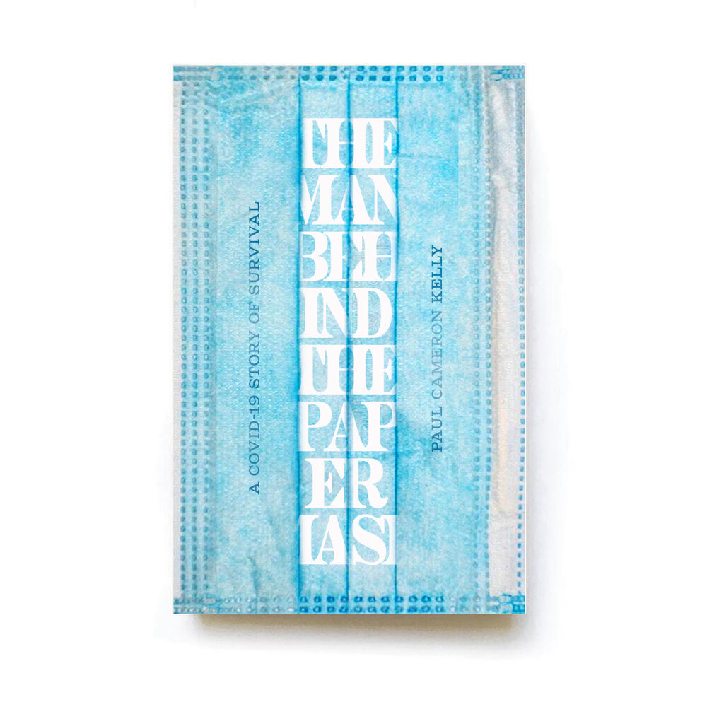
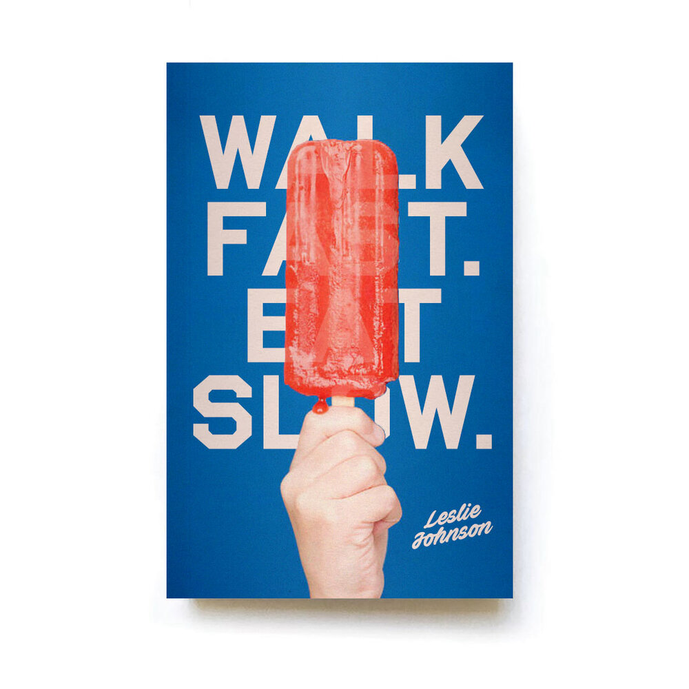
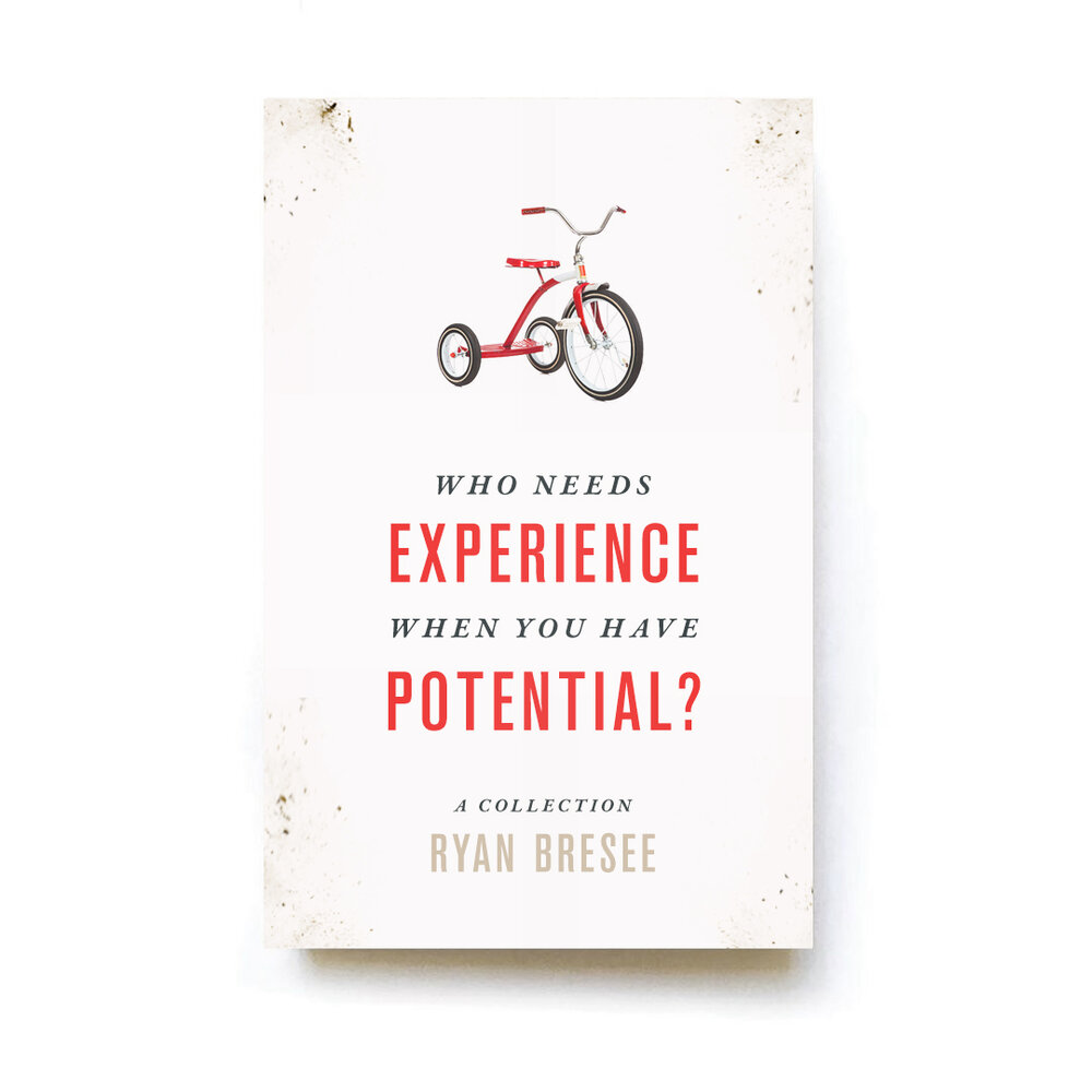
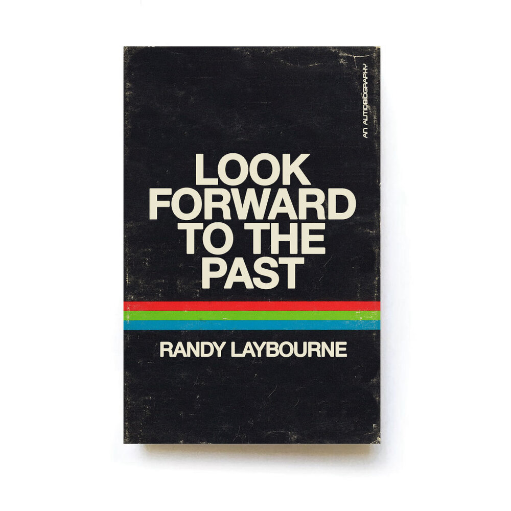
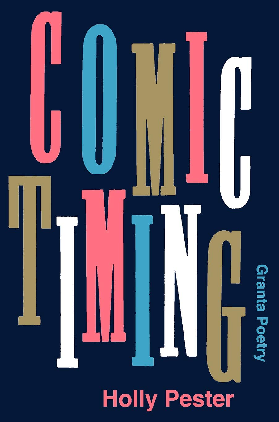
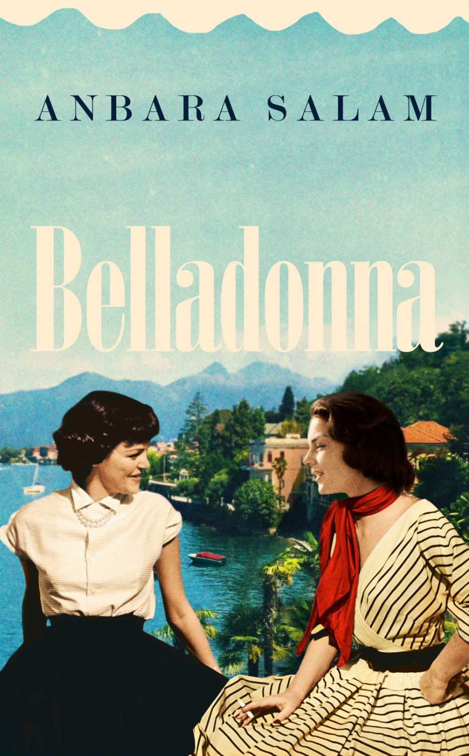
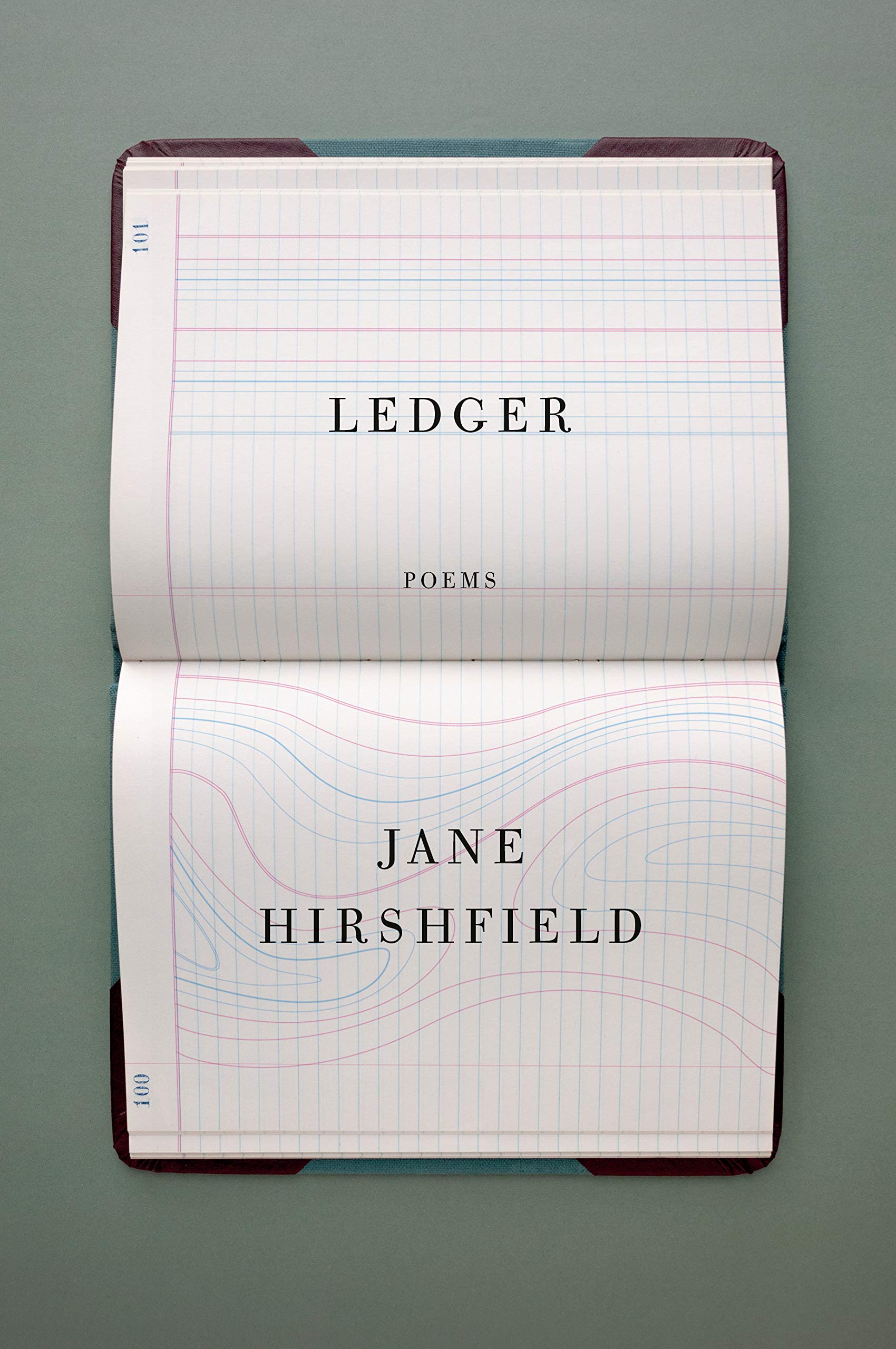
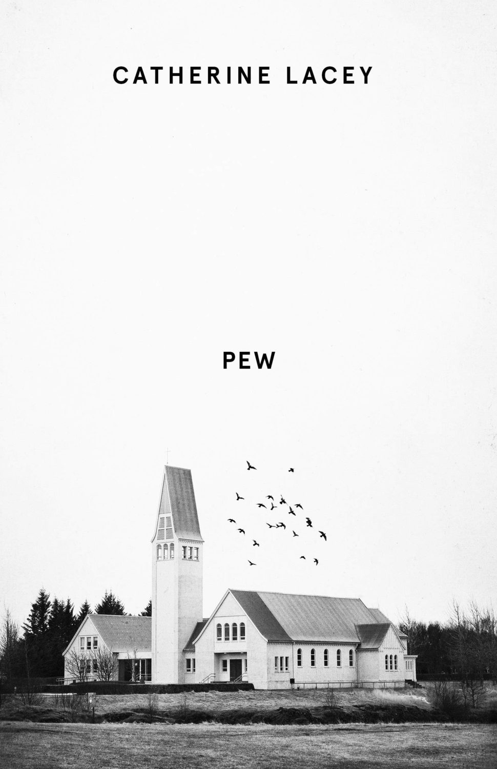
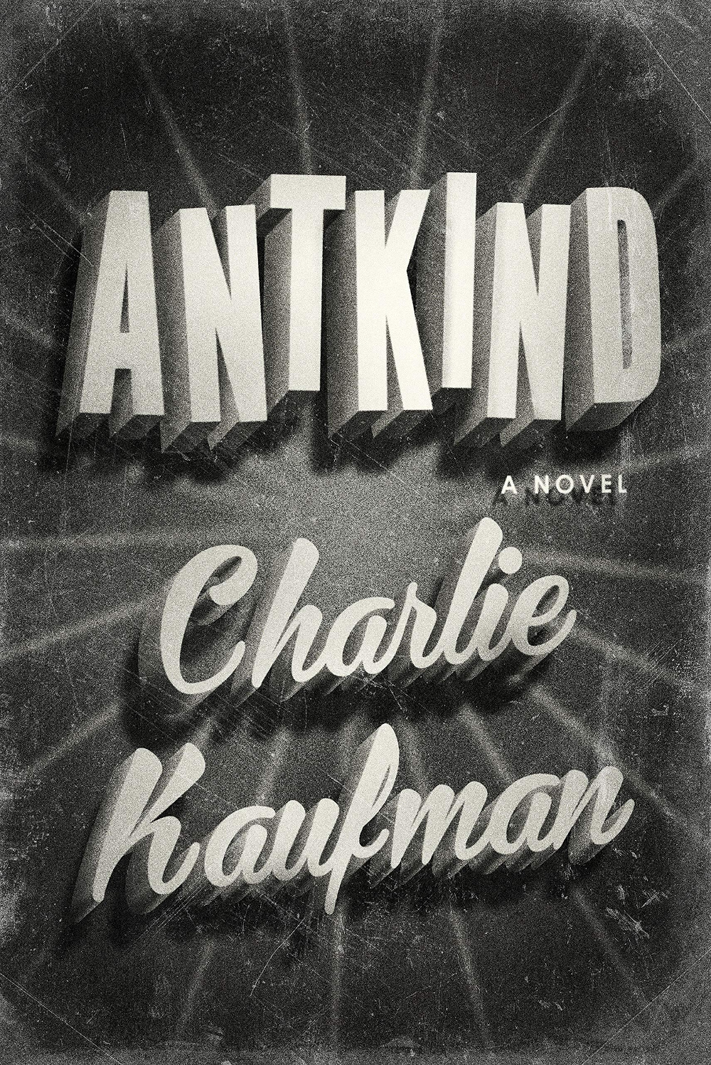
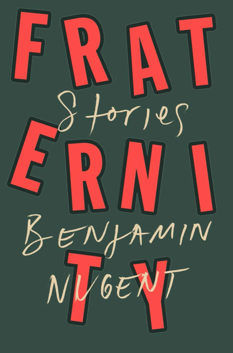
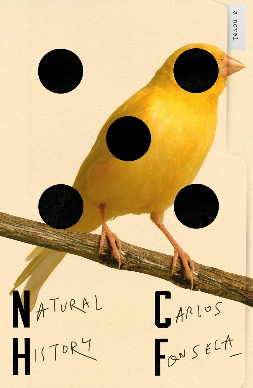
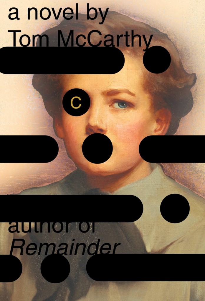
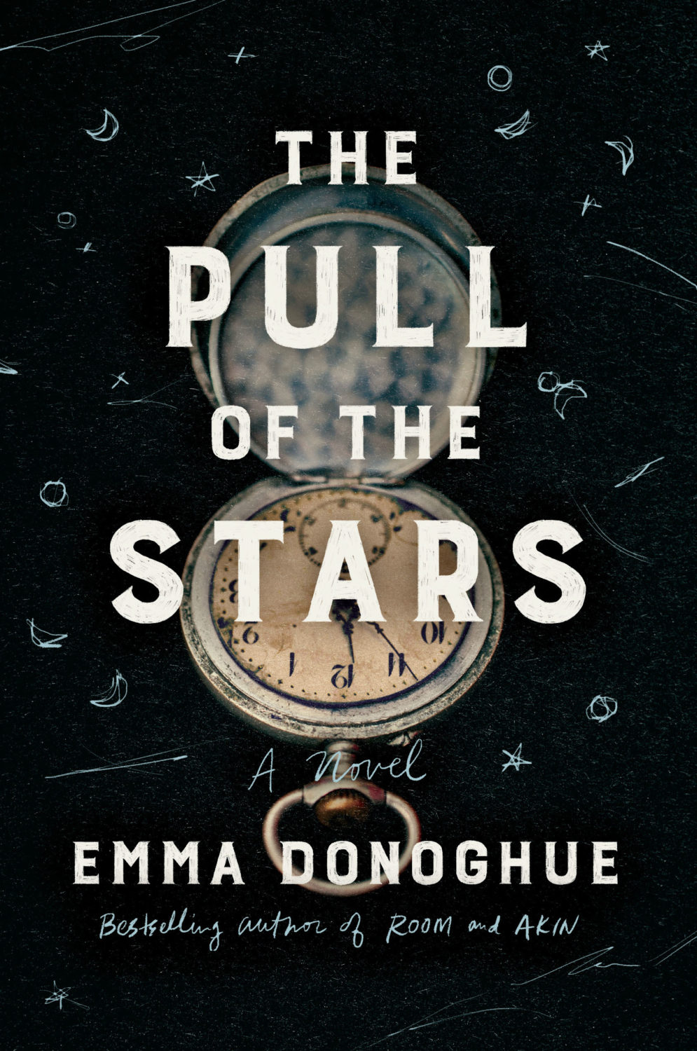
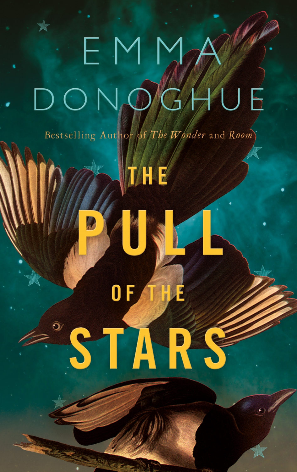
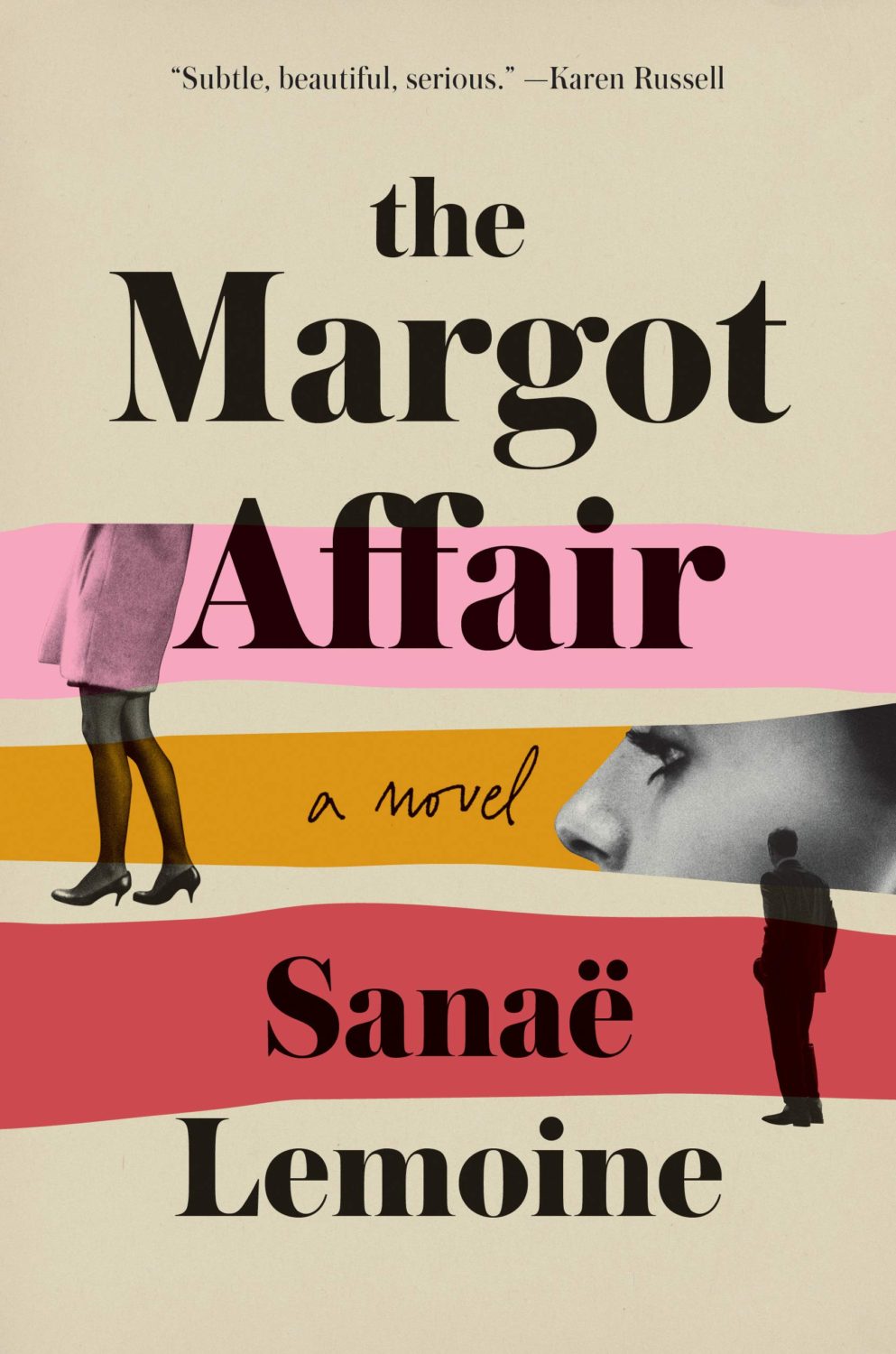
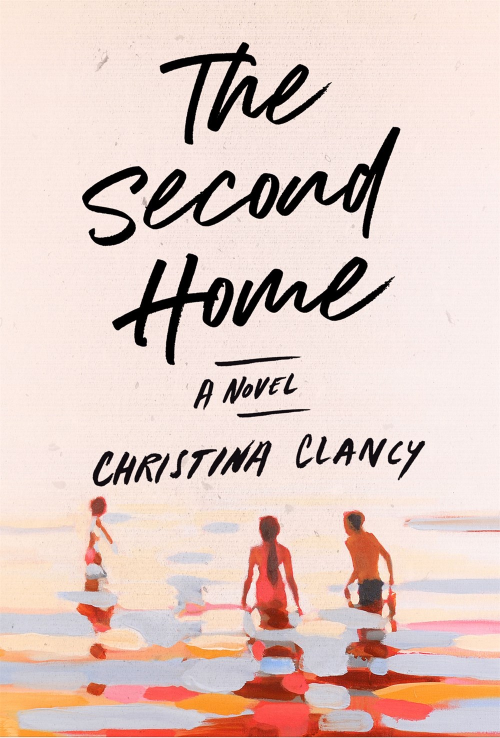
These illustrations by Gino Bud Hoiting for the cover story of the June 5 edition of Volkskrant Magazine about (if I’ve understood correctly!) an attempt to steal a writer’s manuscript are fabulous. The stripes bring Paul Rand to mind (via Cover Junkie).
The don’t look that similar side by side, by I was reminded of Will Staehle‘s 2018 cover for Circe by Madeline Miller, and the UK cover of the more recent Sistersong by Lucy Holland, designed by Melissa Four (I’m fairly sure I’ve seen an orange/red version of the Sistersong cover. Perhaps it was an ARC?).
Circe by Madeline Miller; design by Will Staehle (Little Brown & Co / April 2018)
When I first saw this cover I immediately thought there was some kind of link to Josef Albers ‘Homage a Square’ series, but nobody else seems to have mentioned it, so perhaps it is coincidental? Is that possible? I should probably pick up the book!
A bit of a bumper post this month with a ton great covers, lots of old friends, a couple of designers that are new to me, and maybe an early contender (or two) for the ‘best of the year’ list.
I haven’t posted enough of David’s covers lately. They are always fun. I was struggling to think what this one reminded me of. I’m wondering if it’s maybe Raymond Hawkey’s black and white cover designs for Len Deighton? Or something from Pelican / Penguin in the 1970s?
Come On Up by Jordi Nopca; design by Roman Muradov (Bellevue Literary Press / February 2021)
The cover of the UK edition, published this month by Bloomsbury, was designed by Greg Heinimann.
Rachel Willey’s design for Patricia Lockwood’s memoir Priestdaddy is still one of my favourite covers of recent years (hard to believe it is from 2017!).
O by Steven Carroll; design by Gray318 (HarperCollins Australia / February 2021)
What would you call this background colour? Light brown? Dark beige? Anyway, it seems to be a thing. We could probably include As You Were cover here too, although it doesn’t have the red-orange accent colour.
The Witch’s Heart by Genevieve Gornichec; design by Adam Auerbach (Ace Books / February 2021)
I didn’t blog much this year. It felt strange to be posting about something as trivial as book covers during a deadly pandemic. 2020 has been a tough year. I feel lucky that my family are safe and well, and I have kept my job and my health. I know others have not been so fortunate.
It has been hard.
I haven’t read much and I’ve struggled to keep track of new work. Toronto has been in lockdown for most of 2020. Browsing bookstores hasn’t been possible, and I didn’t spend as much time as usual trawling for covers online. Perhaps unsurprisingly, a lot of covers in this year’s post are featured here for the first time.
Looking back at last year’s post, I was apparently feeling gloomy about the state of things in 2019 too.1 If I remember correctly, I was — in the midst of everything — trying to get through sales conference, wrap up a big project before the holidays, and feeling more than a little stressed. Somehow I still managed to write a little bit about the trends I was seeing. A few things — painterly covers for example — seem to have continued into 2020. Lydian certainly hasn’t gone away. It felt so common, in fact, I stopped keeping track of individual examples. On the other hand, I did see less Avant Garde for which I am quietly grateful (although I’m not sure that’s a popular sentiment).
At The Literary Hub, Emily Temple declared 2020 to be “the year of enormous pink lady faces on book covers.” While at Spine Magazine, Viki Hendy collected together examples of covers with type around the edges. I don’t know that I have a lot to add that. There were a few new meta, books on book covers this year, which is always a delight. And I think perhaps collage might be having a moment too, which is fun. Although we may be overdoing the half-face compositions.
Suppose A Sentence by Brian Dillon; design by Katy Homans; art by John Stezaker (NYRB / September 2020)
The Lightness by Emily Temple; design by Ploy Siripant; art by Beth Hoeckel (William Morrow / June 2020)
There is, of course, a lag. Trends always bleed over from one year to the next. One of this year’s “big books”, Such a Fun Age by Kiley Reid, which featured a bright and bold cover designed by Vi-An Nguyen, was published in the US on December 31, 2019. A lot of 2020 books have been delayed until 2021. But I wonder how the changes in the way we work and consume brought on by the pandemic — designing in isolation for an audience that is now browsing predominantly online — will change things in the next couple of years. Will we see more experimentation or less? Will there be demand for beautiful tactile objects, or will we more fully embrace digital reading experiences? There’s a lot to ponder…
Anyway, thanks to all the folks who have supported the Casual Op this year and encouraged me to keep it going. I’m sorry that I have not responded to all the emails I have received. I’m going to try to be a bit better with that in future. Hopefully there have been some silver linings for you in 2020, and you can still find some joy in a few good book covers…
Afterland by Lauren Beukes; design by Lauren Wakefield (Penguin / July 2020)
Also designed by Lauren Wakefield:
The Driftwood Girls by Mark Douglas-Home; design by Lauren Wakefield (Penguin / April 2020)
The Honey and the Sting by E. C. Freemantle; design by Lauren Wakefield (Penguin / September 2020)
We Are All the Same in the Dark by Julia Heaberlin; design by Lauren Wakefield (Penguin / August 2020)
Sadly, Adalis unexpectedly passed away in July 2020. I only knew Adalis through her work, but she is such a huge a loss to our community. There is a GoFundMe page if you wish to donate to her family.
Also designed by Adalis Martinez:
losi by Molly Ball; design by Adalis Martinez (Henry Holt & Co / May 2020)
Dominicana by Angie Cruz’ design by Adalis Martinez (Flatiron / August 2020)
Love is an Ex-Country by Randa Jarrar; design by Adalis Martinez (Catapult / February 2021)
You can find a short interview with John in which he discusses his cover for Red Pill at Bear Books, and you can read about his design process for Weather by Jenny Offill at Spine Magazine.
Sisters by Daisy Johnson; design by Suzanne Dean; photograph Simon Kerola (Jonathan Cape / August 2020)
The cover of the US edition of Sisters, published by Riverhead this month, was designed by Jaya Miceli. The painting is by Jeremy Olson. (Thank you to the folks on Twitter who helped me with this!)
David Pearson has designed three new covers for the Penguin editions of Albert Camus’ novels The Plague, The Outsider, and The Fall. The typeface is apparently Portrait, designed by Berton Hasebe for Commercial Type, and the covers are printed on Colorplan Dapple embossed paper from G. F. Smith. The new editions were published July 30, 2020.
Maybe someone has done this before and I didn’t notice (or, more likely forgotten), but it’s great to see a photograph from the EPA’s remarkable DOCUMERICA Project — available through the US National Archives on Flickr — on a book cover.
Rodham by Curtis Sittenfeld; design by Jo Thomson (Doubleday / July 2020)
It’s interesting that the US cover of Rodham is essentially the same as the UK one. I would’ve thought for sure that they would take different approaches.
Artist Stanley Donwood talks about his artwork for Radiohead, his collaboration with author Robert MacFarlane on Ness, and his own book Bad Island, published earlier this year by Hamish Hamilton (and slated to be published in the US by W.W. Norton this fall).
The cover of the UK edition, which will not be published until 2021(!), was designed by Craig Fraser. It has a very vintage Faber feel… maybe it’s just the type?
This reminded me of the cover of the similarly themed American Manifesto by Bob Garfield, designed by Richard Ljoenes and published earlier this year by Counterpoint….