Well, this seems to have become a regular thing doesn’t it? I have to confess that I still haven’t quite figured out exactly what covers to include in these monthly posts, only that they’re recent and I like them. It’s even harder to decide what to leave out. Anyway, I hope you enjoy this month’s selection. Leave your thoughts in the comments…

Abroad by Katie Crouch; design by Rodrigo Corral (FSG June 2014)

Archetype by M. D. Waters; design by Jaya Miceli (Plume June 2014)

The Empathy Exams by Leslie Jamison; design by Tom Darracott (Granta June 2014)

Foxes on the Trampoline by Charlotte Boulay; design Steve Attardo (HarperCollins April 2014)
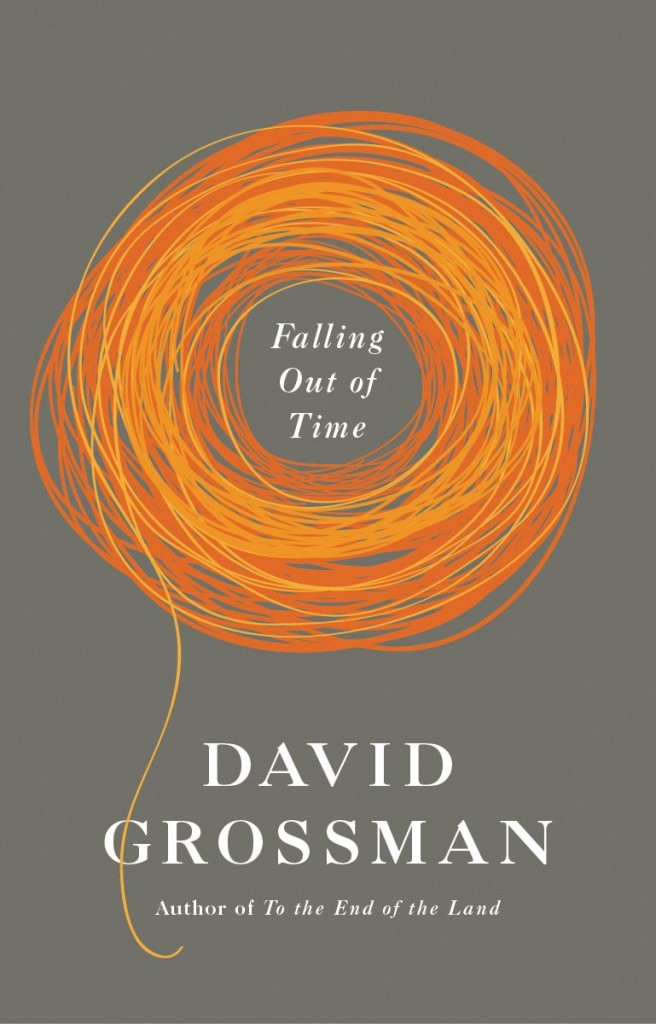
Falling Out of Time by David Grossman; design by Kelly Blair (Jonathan Cape February 2014)
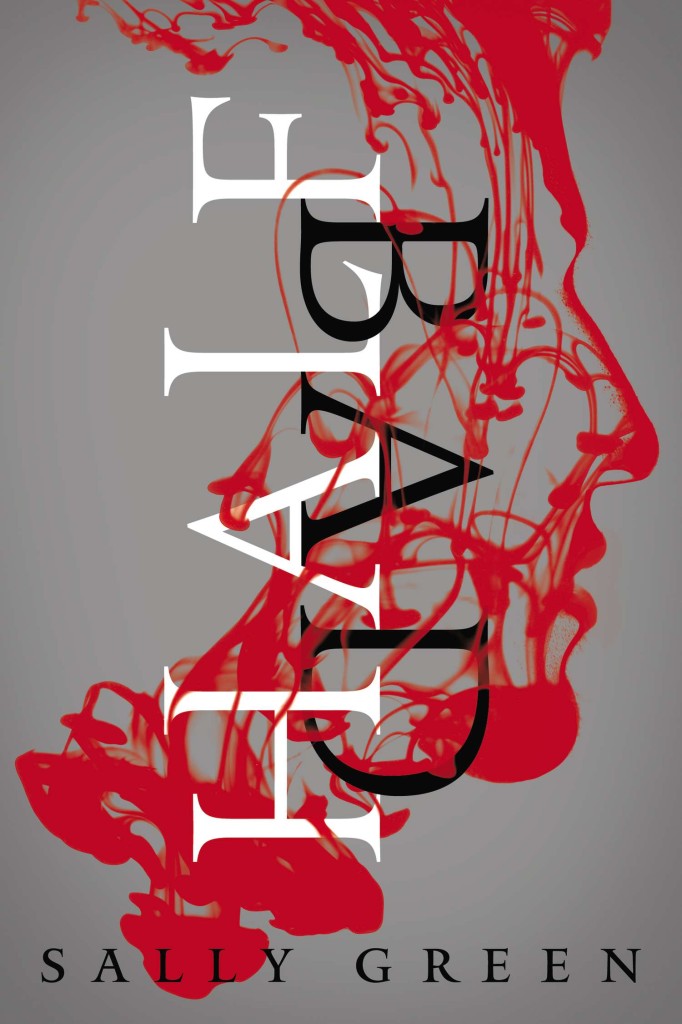
Half Bad by Sally Green; design by Tim Green / Faceout Studio (Viking March 2014)

The Iceland by Sakutaro Hagiwara; design by Paul Sahre (New Directions June 2014)

The Lullaby of Polish Girls by Dagmara Dominczyk; design by Alex Merto, photograph Eleanor Hardwick (Spiegel & Grau February 2014)

Mount London by Tom Chivers & Martin Kratz; design by Ben Anslow (Penned in the Margins May 2014)

Outlaws by Javier Cercas; design by David Mann (Bloomsbury June 2014)
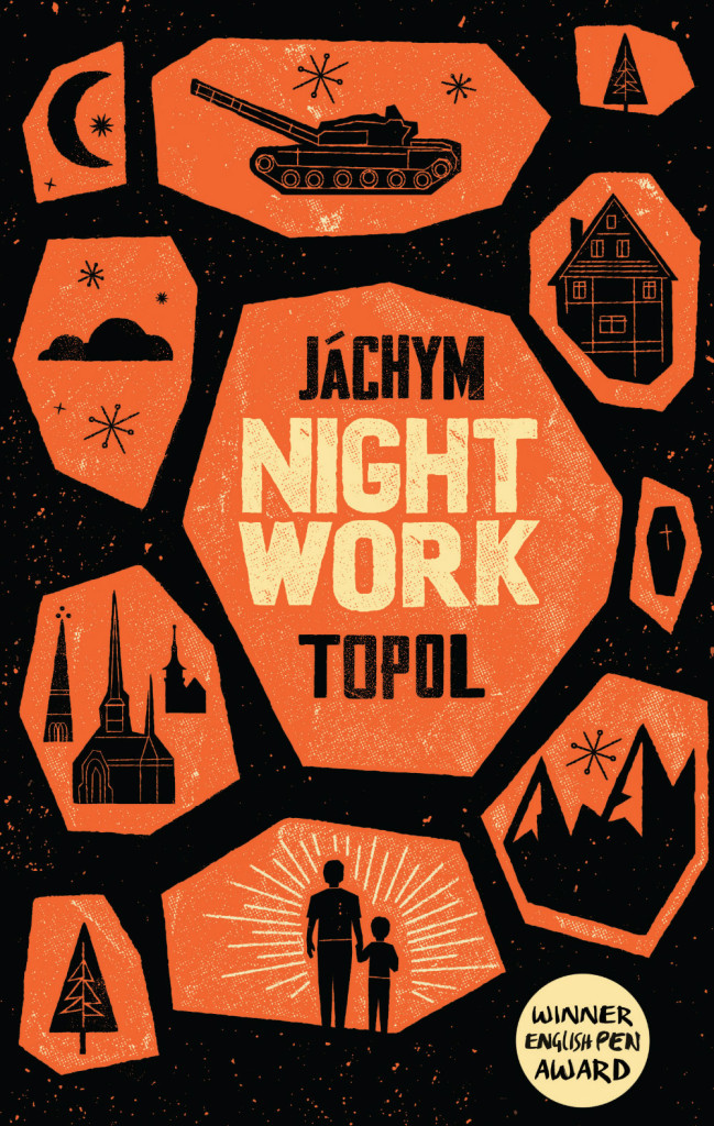
Night Work by Jáchym Topol; design by Bobby Evans / Telegramme Studio (Portobello Books May 2014)

The Secret World of Oil by Ken Silverstein; design by Matt Dorfman (Verso May 2014)
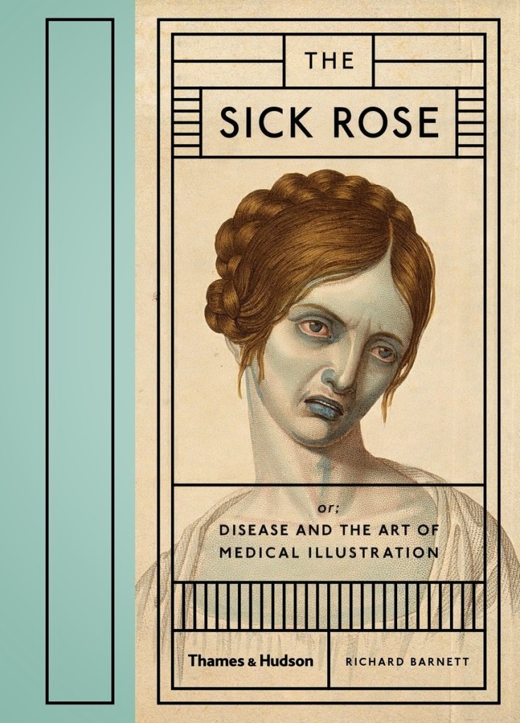
The Sick Rose or; Disease and the Art of Medical Illustration by Richard Barnett; design by Daniel Streat / Barnbrook Studios (Thames & Hudson June 2014)
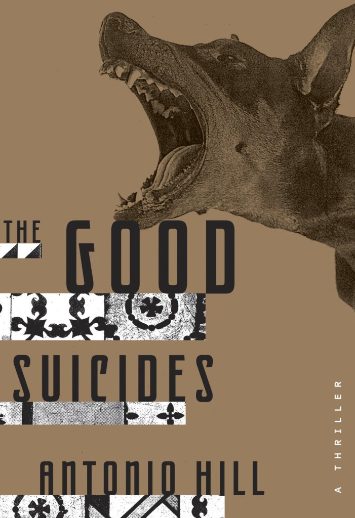
The Good Suicides by Antonio Hill; design by Christopher Brand (Crown June 2014)
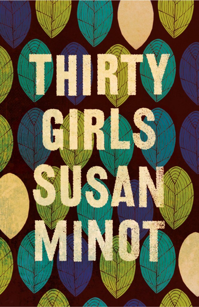
Thirty Girls by Susan Minot; design by Kate Gaughran (4th Estate February 2014)

The Vacationers by Emma Straub; design by Janet Hansen (Riverhead May 2014)
Very much enjoy this new regular thing. Thank you for posting.
I always enjoy seeing the book covers you chose, especially since I often give my Design students a book cover assignment. However, I was stumped when I set myself the task of trying to chose a single winner from this bunch. Nothing really jumped out at me. As I scrolled through them several times, I realized that many of them have a very retro feel. Mount London evokes English travel posters from the 1930s. The Iceland uses two color images similar to the separate color plates used by Bradbury Thompson in the 1950s. The Empathy Exams exploits the torn photograph tromp-l’oeil effect favored by the Surrealists. Typographically, text is either sans serif and stacked symmetrically or hand-drawn. There aren’t a lot of innovative graphic design strategies in this particular batch of covers. Previous selections have had more originality. I guess things come and go.
Thanks for your comment, Robert. I really appreciate your thoughts, although (needless to say) I don’t entirely agree. I can see what you’re saying about many of the covers being ‘retro’ — I think that’s just a reflection of my personal taste. But I don’t think ‘retro’ in itself is a bad thing — it’s how it’s used. Take the cover to Archetype might be described ‘retro’, but it’s still a bold design choice for a mainstream science fiction adventure novel. Compare it to the hardcover treatment. Or how about Mount London? It’s a collection of literary essays about the history and geography of London. The decision to invoke vintage travel posters, particularly those of the Underground seems to me to be entirely appropriate, and it makes the familiar seem exotic, which I assume the book attempts to do too.
And then take The Empathy Exams. I thought of it more as punk than Surrealist, but then the Xerox-aesthetic of punk is retro now too! Nevertheless, critic John Self recently described this cover as “TERRIBLE“, while many of the designers I know think it’s fantastic. I agree with the designers, but I like that it’s contentious. It should be. I think it’s original and striking, and I like how it seems to reference sterile medical packaging — not only was the author a medical actor, but the design’s impersonal coldness is a strong contrast to the idea of empathy. I also think it’s an interesting contrast to the cover of the US edition designed by Kimberly Glyder for Graywolf.
Anyway, I could go on, but I’ll spare you… I am (truly) sorry that my choices left you cold, but the constructive criticism is welcome (I’m sure the designers appreciate it too). Thanks again ~ Dan
Surprised to see that they already redid Kimberly Glyder’s The Empathy Exams cover (http://www.kimberlyglyder.com/The-Empathy-Exams); wonder if they decided the second run should be packaged differently.
Hi Jenna. The cover for The Empathy Exams in this post is for the UK edition published by Granta. Kimberly’s cover (which I posted in April) as for the US/Canadian edition published by Graywolf. I thought the contrast was interesting.
[…] Via: The Casual Optimist […]
[…] of these Book Covers of Note June 2014 is your […]