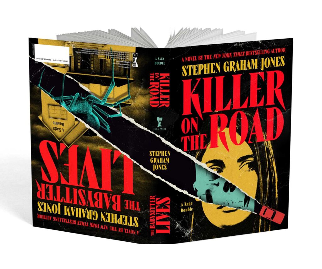
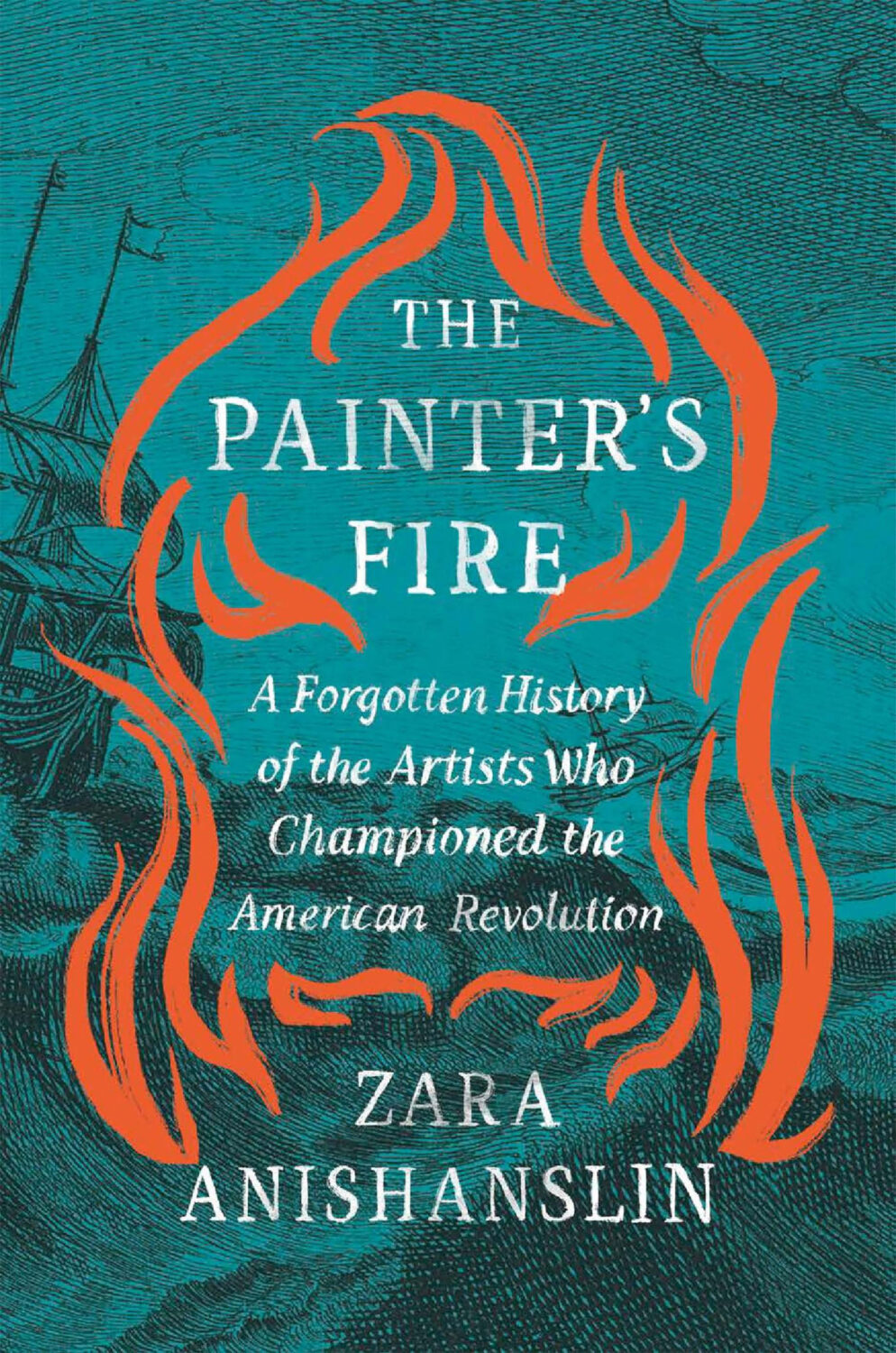
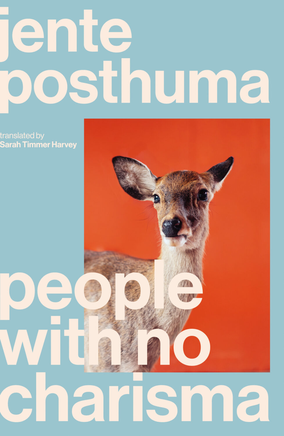
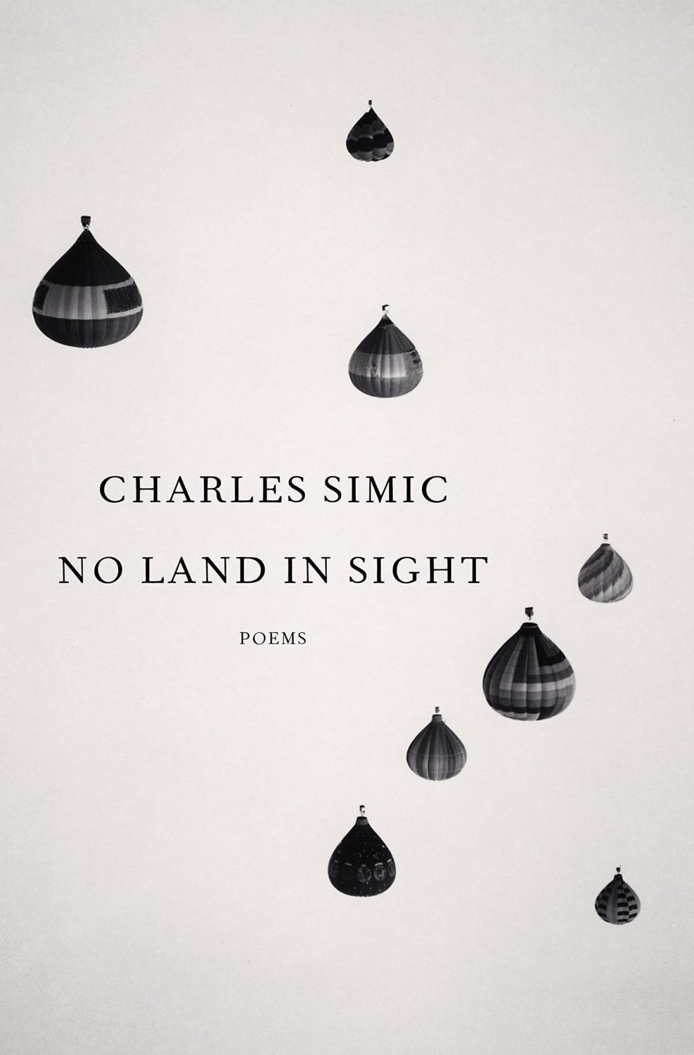
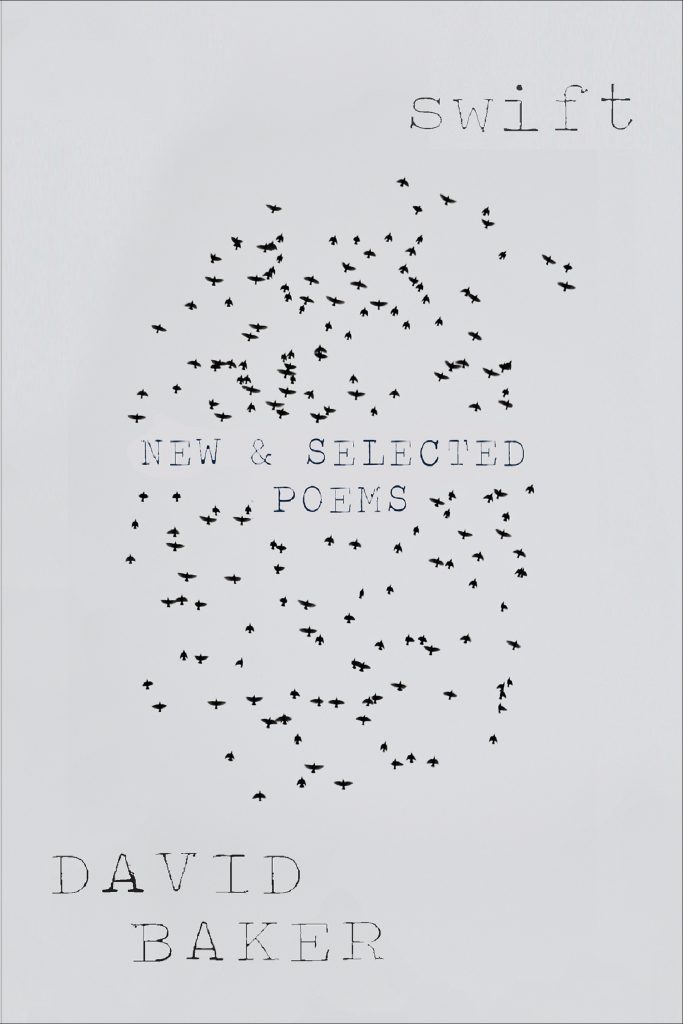
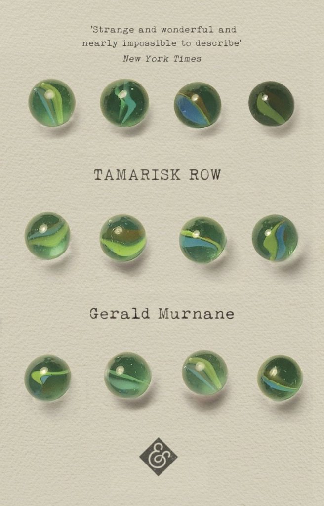
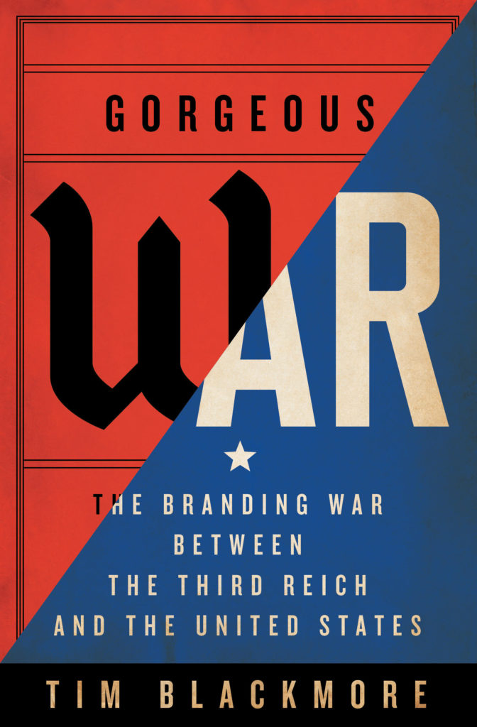
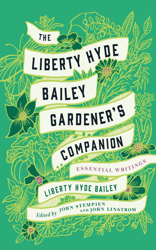
Hi. Hello. I hope you’re keeping safe and well. I’m getting this month’s post out at little earlier than usual (i.e. not the 11th hour), and on a Monday no less, because I’m going to be in NYC the rest of this week for work. Even though this is a little bit of a quick and dirty post, there are still lots of covers for you to peruse and admire. Apologies if I’ve missed anything obvious and/or spectacular. I will try to catch up next month.
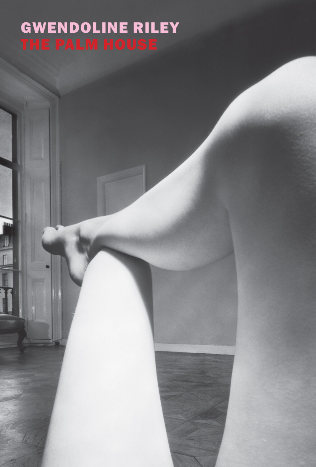
The Palm House by Gwendoline Riley; design by Katy Homans; photo by Bill Brandt (NYRB Books / April 2026)Famesick by Lean Dunham; design by Teddy Blanks (I think?); photo by Anna Gaskell (Random House / April 2026)
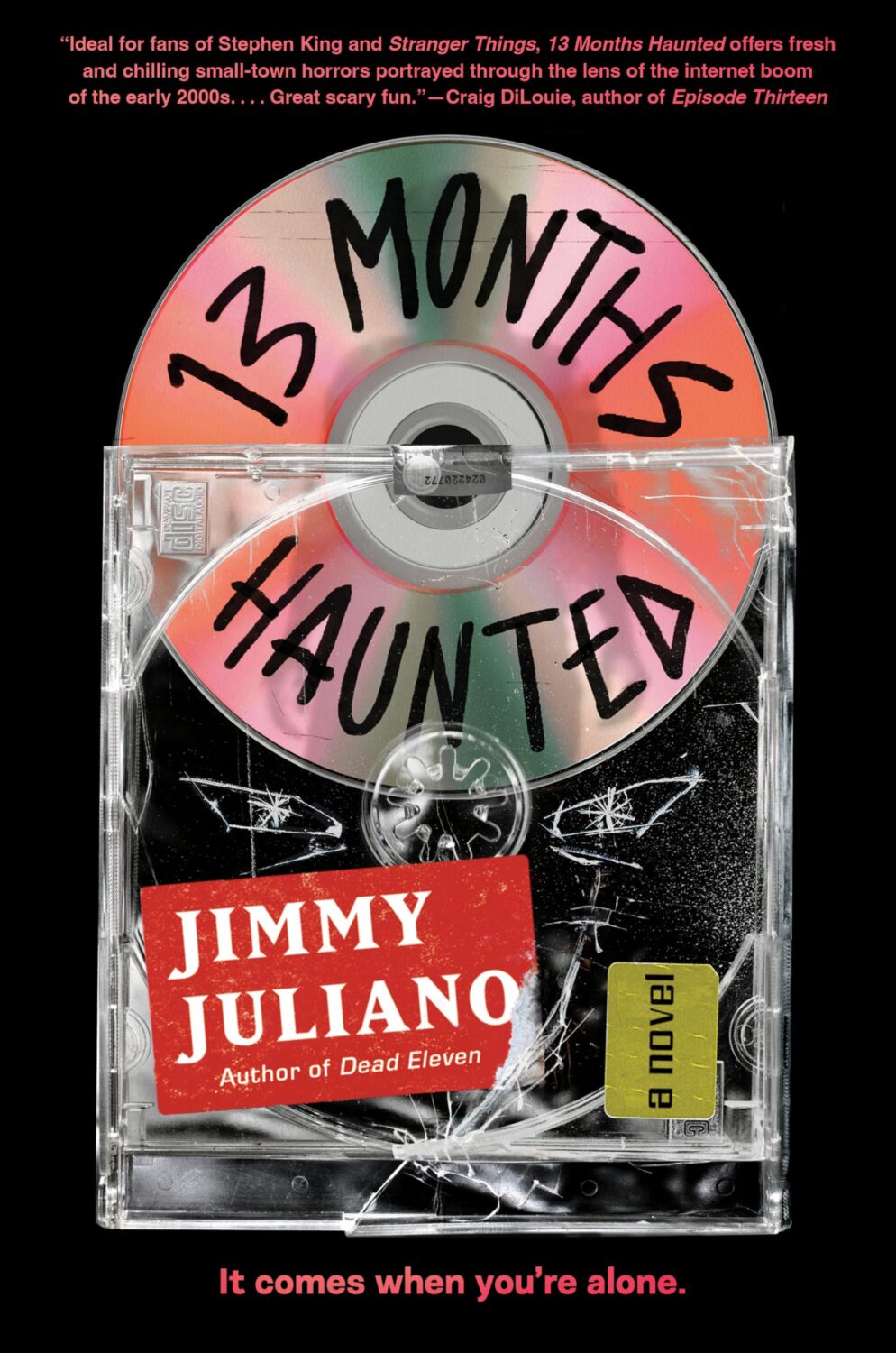
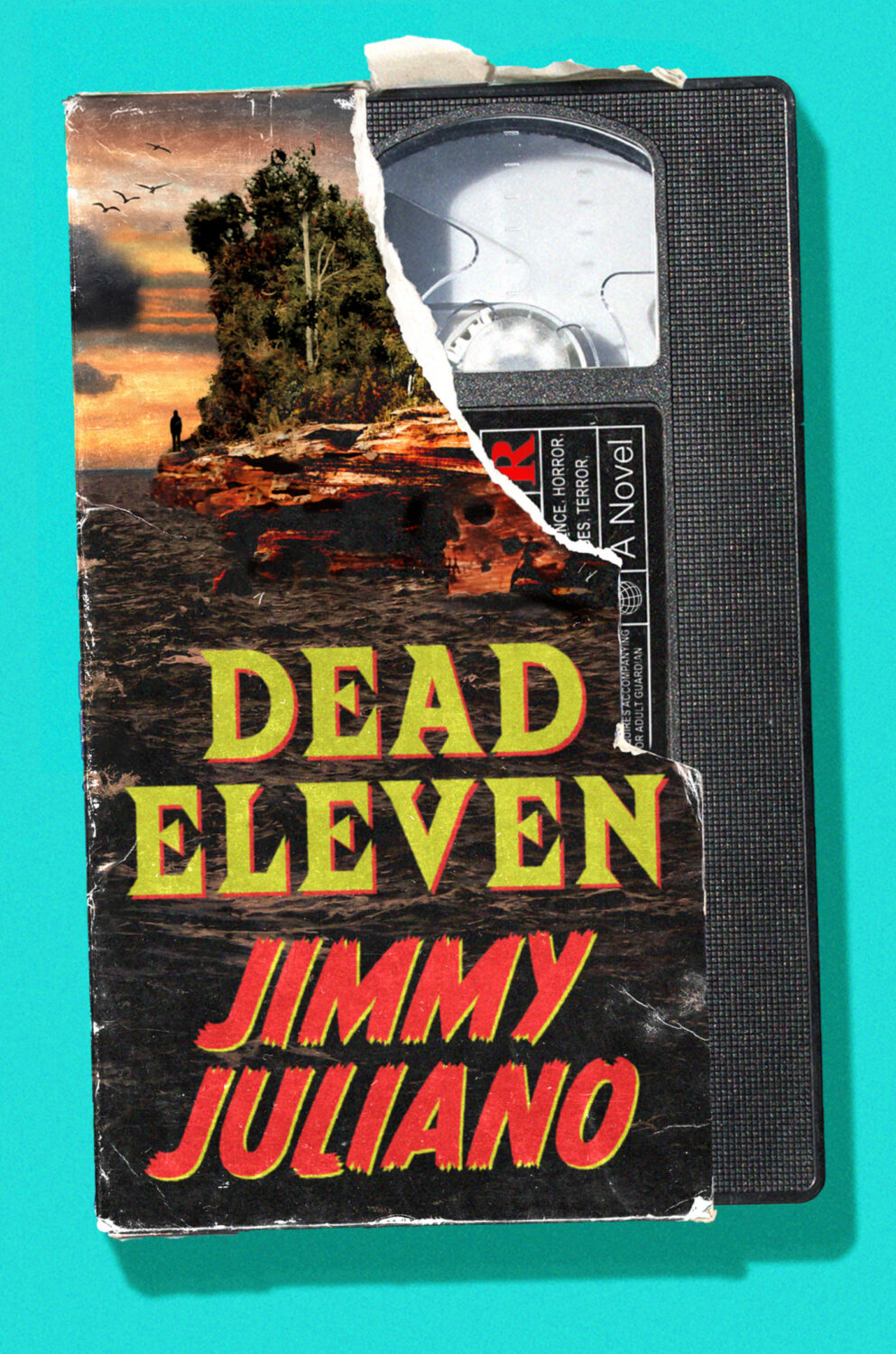
Alex also designed the cover of Jimmy Juliano’s previous book Dead Eleven. I confess I have mixed feelings about the current nostalgia for all things 1980s/90s…
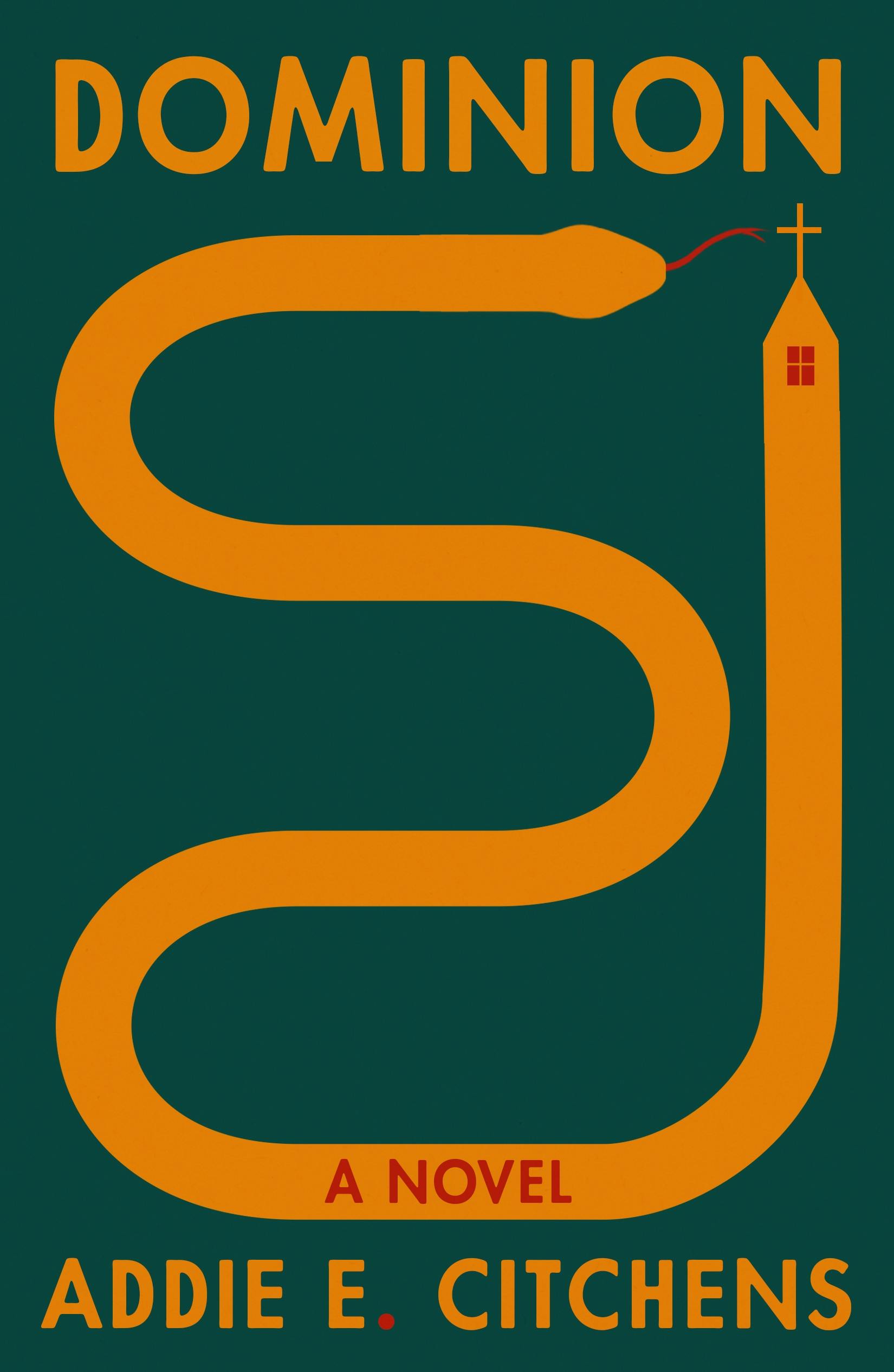
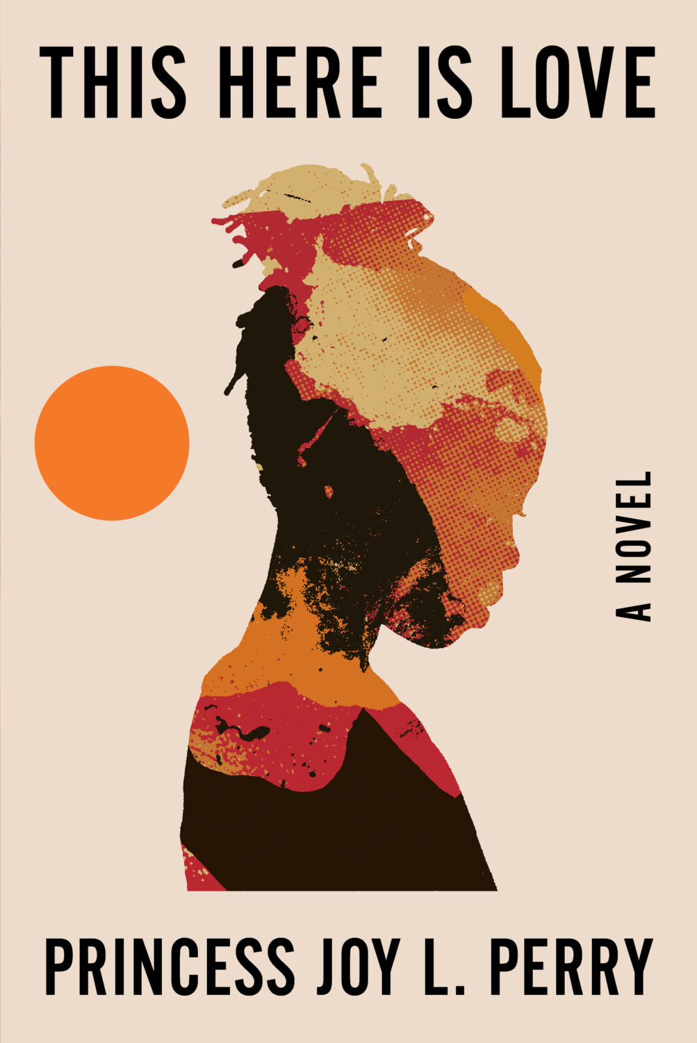
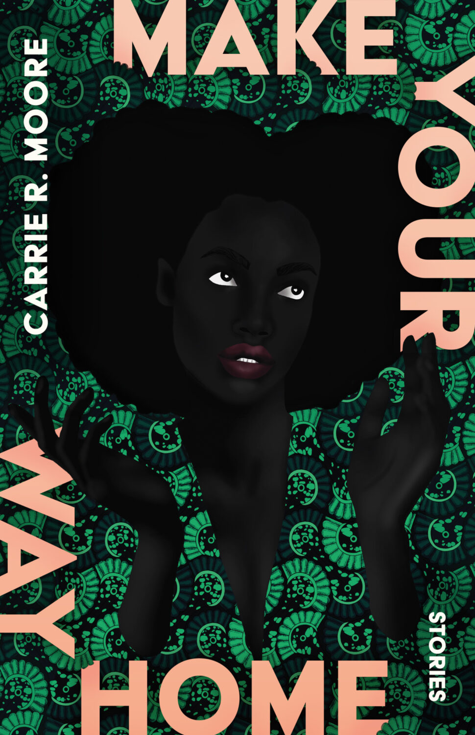
This Here is Love by Princess Joy L. Perry; design by Keith Hayes (W.W. Norton / August 2025)
I was reminded, looking back at the posts from 2018, that someone really should collect Keith’s photos into a book…
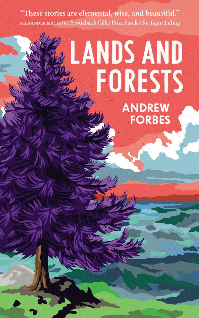
Somehow it is the end of July, and I am once again rushing to get this done. I think it’s a decent mix of covers this month though, with some big books, some indies, a few type-only covers, some nice art, and a couple of trends to watch out for. I’m glad it’s all come together, even if it is last minute!
Thanks to everyone who took time to help me with cover images and design credits over the past couple of weeks (days!) — it’s really, really appreciated! I hope everyone is having a good summer.
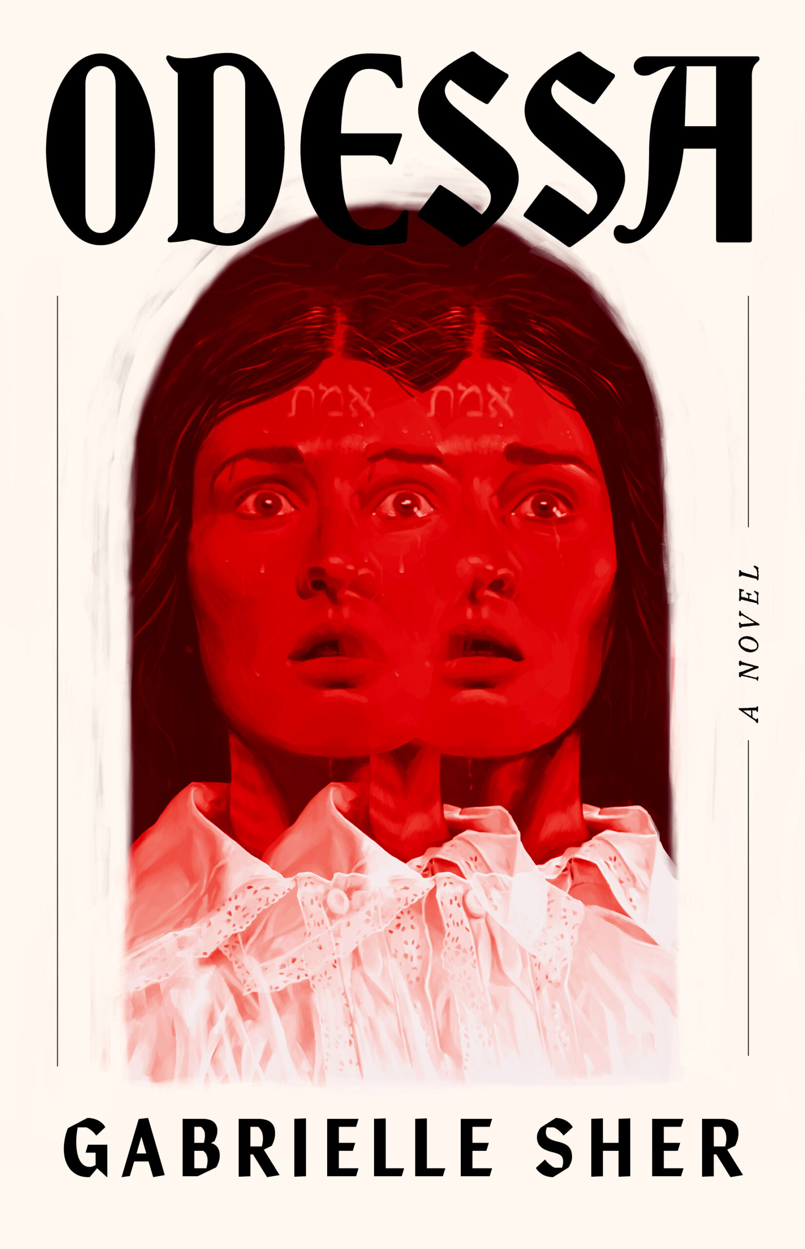
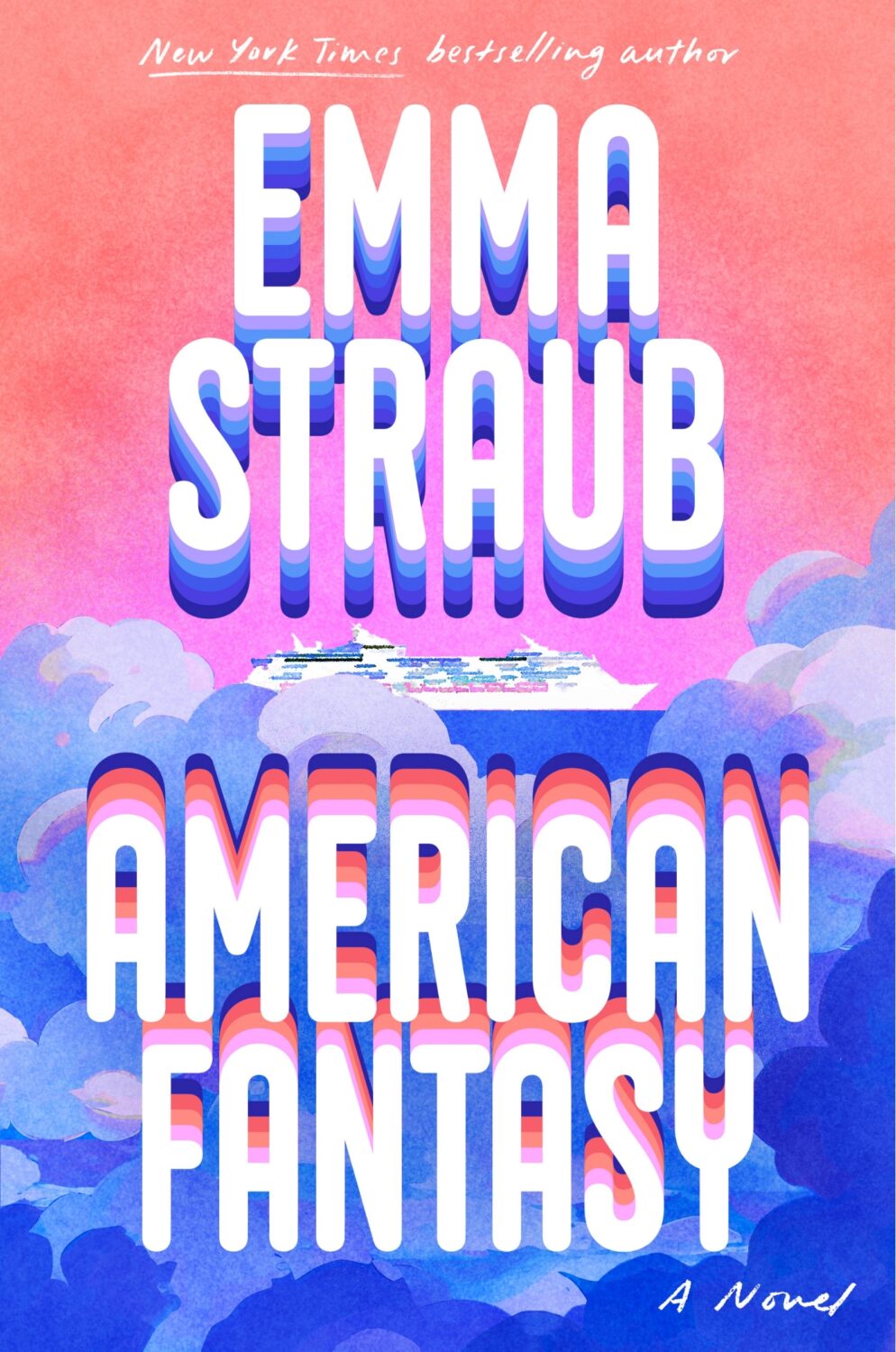
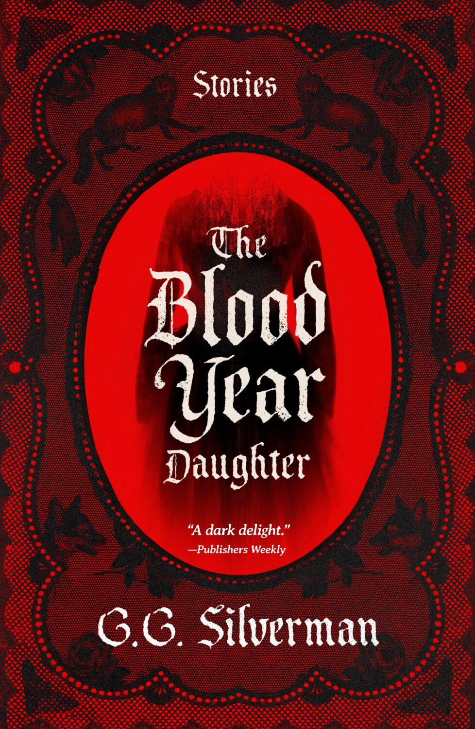
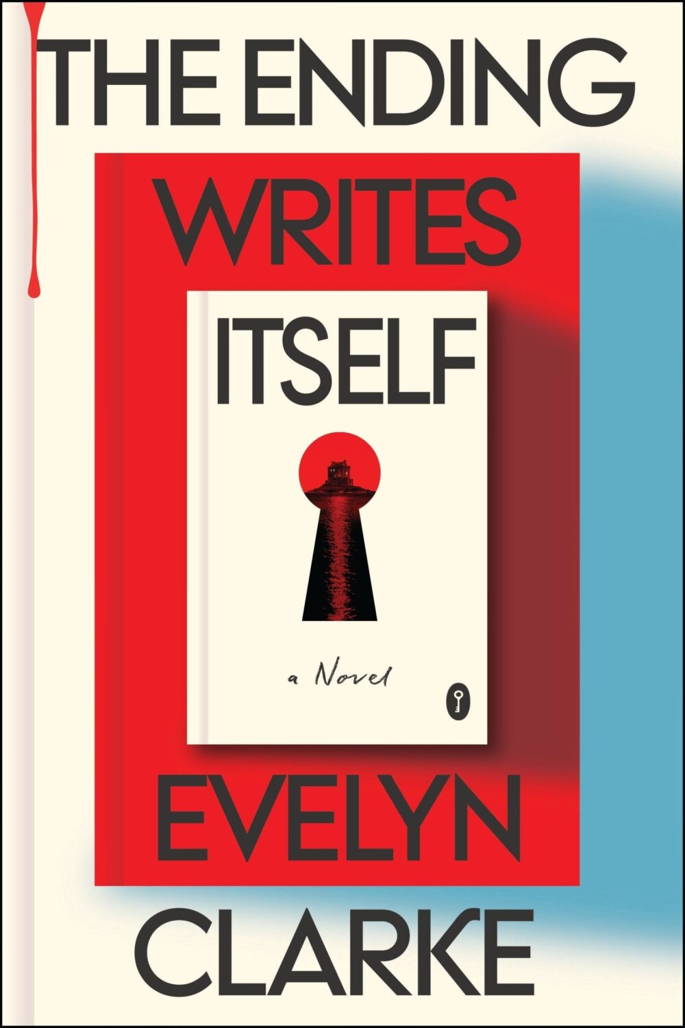
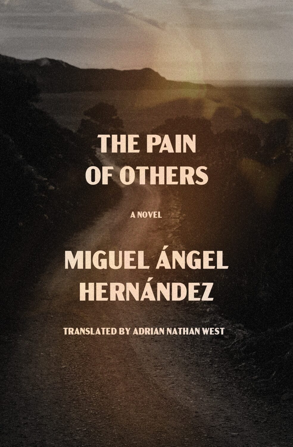
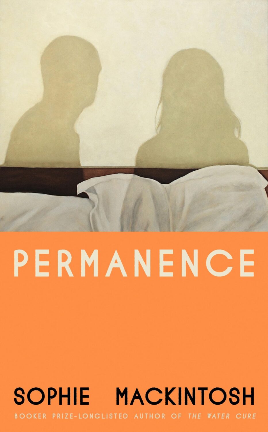
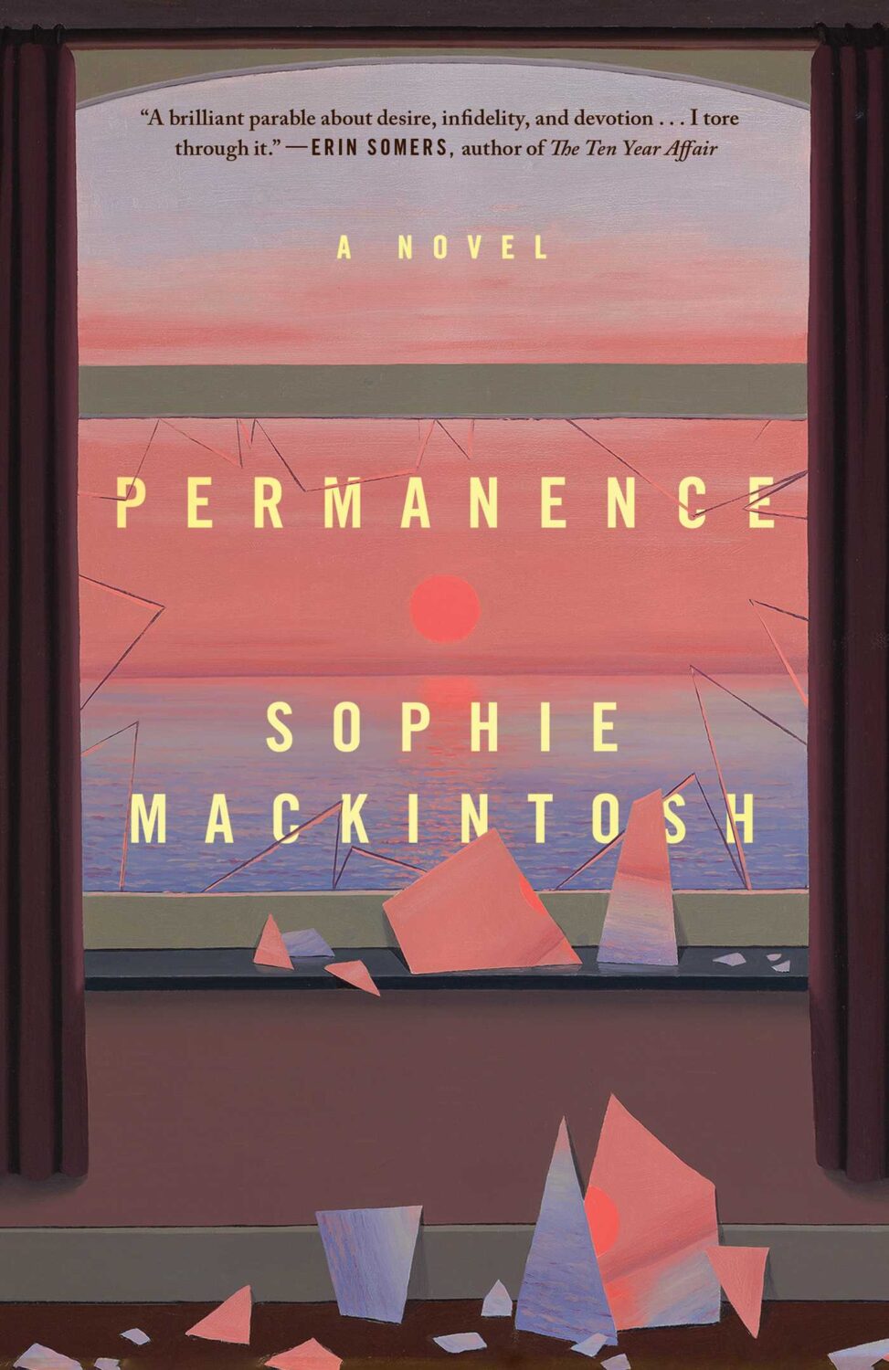
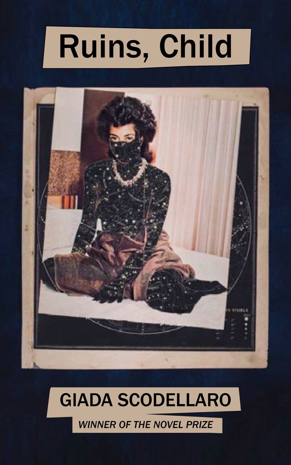
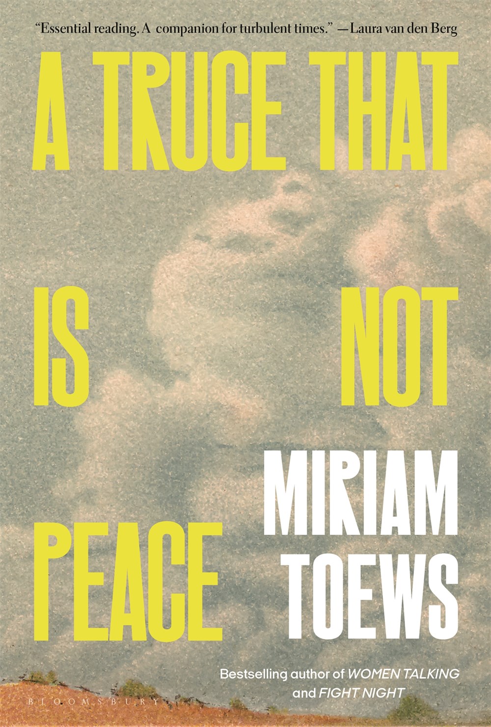
Hey, I hope you are good. It’s a stressful time and everyone is super busy trying to hold it together, but here we are at the end of October with another post that is both rushed and yet wordier than ever! As usual, I won’t be doing a covers round-up in November. I have to start working on the massive end of year post so I can get it done in something resembling a timely and relevant manner. I am open to last minute submissions if you think I have missed a cover, or you have something coming out between now and December. I can’t promise to include everything, but it would be especially great to hear from you if you’ve done something cool for a university press or an independent publisher this year. The only requirement is that the book was published and on shelves in 2024. If it was published in a non-English speaking part of the world, be sure to include a link to where people can find out more about the book (and ideally buy it) that isn’t Amazon.
On a related note, I have compiled an annual post of YA covers for, I don’t know, years now (10 maybe?). I don’t read a lot of YA, and it’s not a category I am very involved in professionally, so the posts take quite a long time to compile and I usually end up publishing them early in the New Year, which is less than ideal. So I guess my question is: do you still want a YA round-up? Folks used to ask for them, and now they don’t, which just be general fatigue and the fragmented nature of things at the moment, but the posts don’t attract submissions or much feedback, and interest seems to be waning. Obviously I don’t think I do a great job (if that wasn’t abundantly clear already!), but I haven’t really seen anyone else do one either, so I’ve kept doing it. I don’t know… I’m not a big a believer in clicks or engagement metrics as a measurement of anything useful, so I happy to do it if even just a couple of you say it’s still valuable. Or maybe it is just time to call it quits? Let me know what you think…
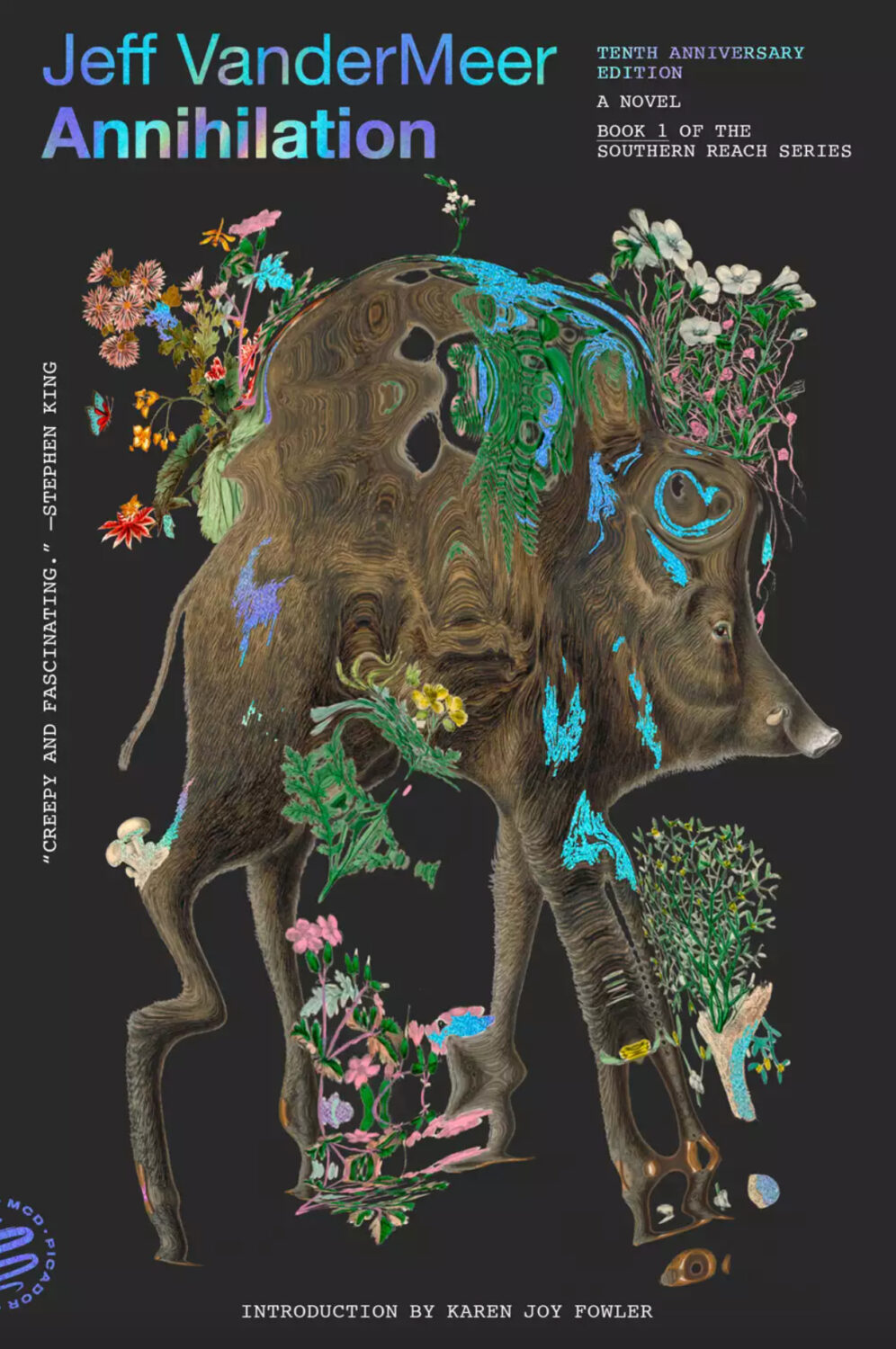
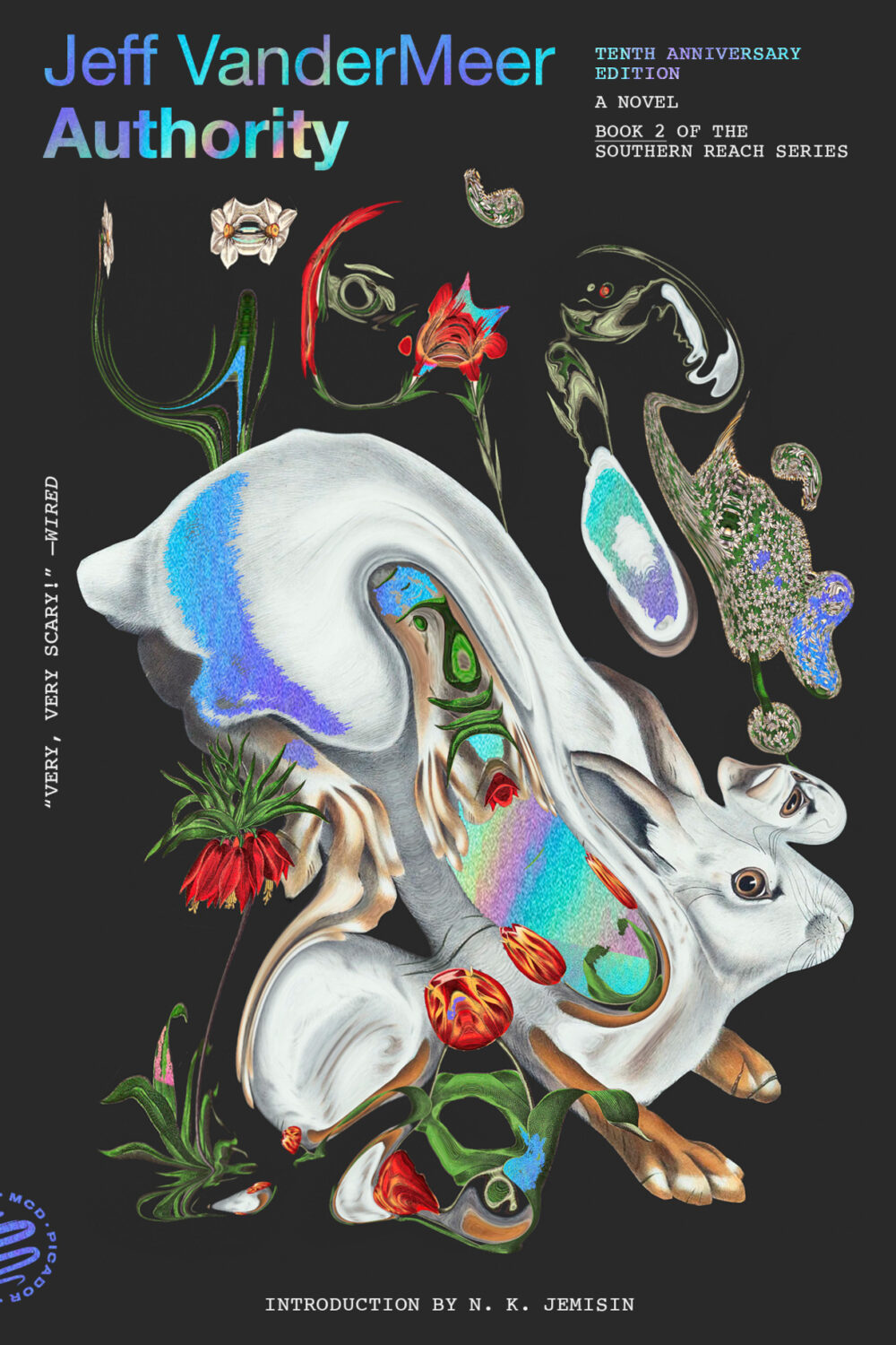
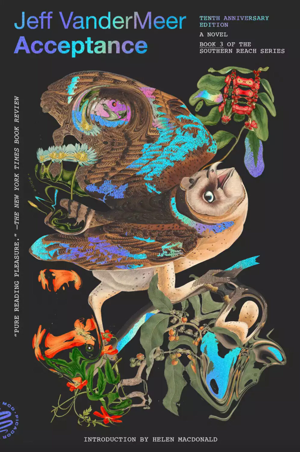
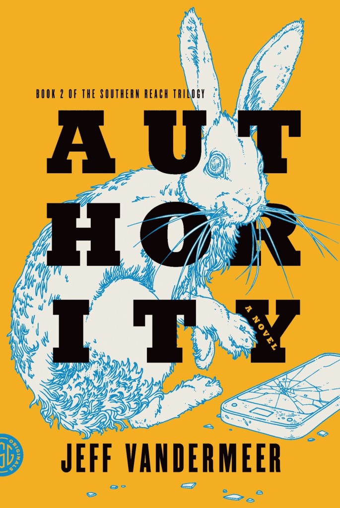
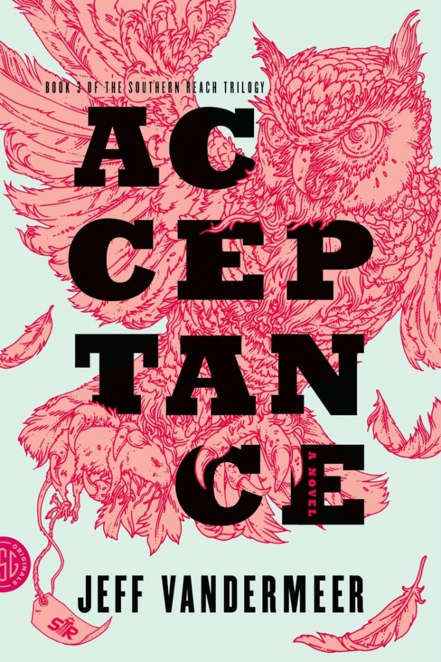
Pablo Delcan also designed the covers of the 10th anniversary editions of the previous books in the Southern Reach series, Annihilation, Authority, and Acceptance, published by Picador earlier this year.
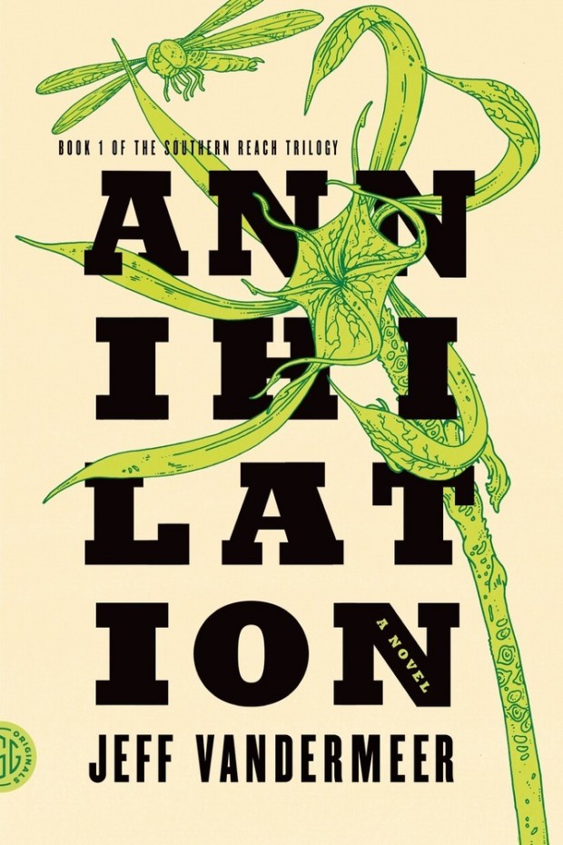
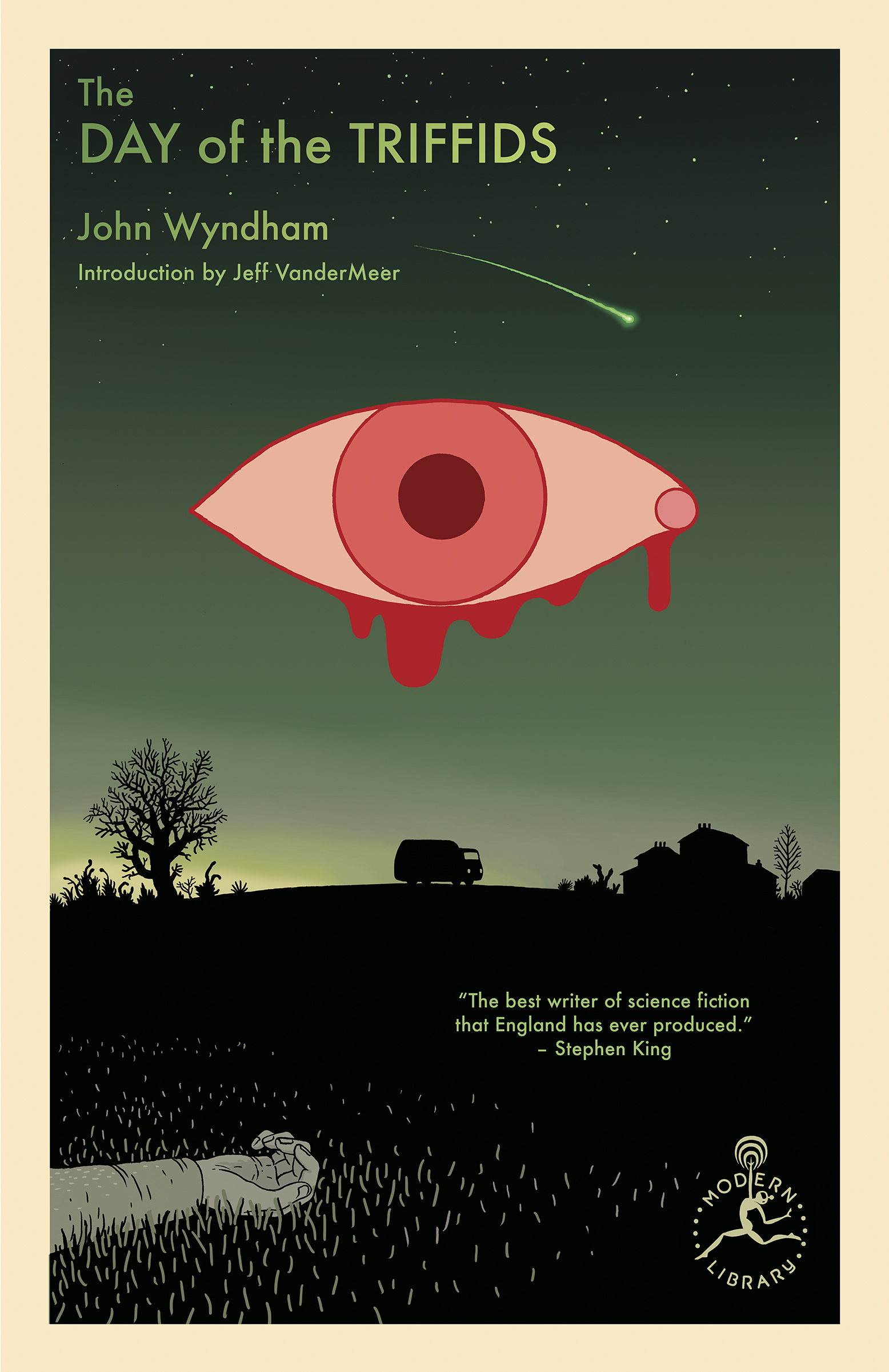
I’m still quite partial to the original US covers the trilogy (as was) designed by Charlotte Strick with illustrations by Eric Nyquist. The cover of Annihilation reminds me of The Day of the Triffids, which coincidentally has has an introduction by Jeff VanderMeer if you have the Modern Library edition. (The slightly bonkers cover of the Modern Library edition was designed by Cassie Gonzales with an illustration by comic book artist and illustrator Anders Nilson). Anyway, I’m a little sad that I can’t get the prequel to match the rest of my existing set.
Annihilation by Jeff VanderMeer (US); design by Charlotte Strick; Illustration by Eric Nyquist (FSG / 2014)Acceptance by Jeff VanderMeer (US); design by Charlotte Strick; Illustration by Eric Nyquist (FSG / 2014)
This feels very familiar, but I can’t put my finger on why. The best I’ve got is that it looks like a poster for a theatre production. It feels very European. The austerity of it gives late 1980s-90s vibes. I don’t know. I think it’s great.
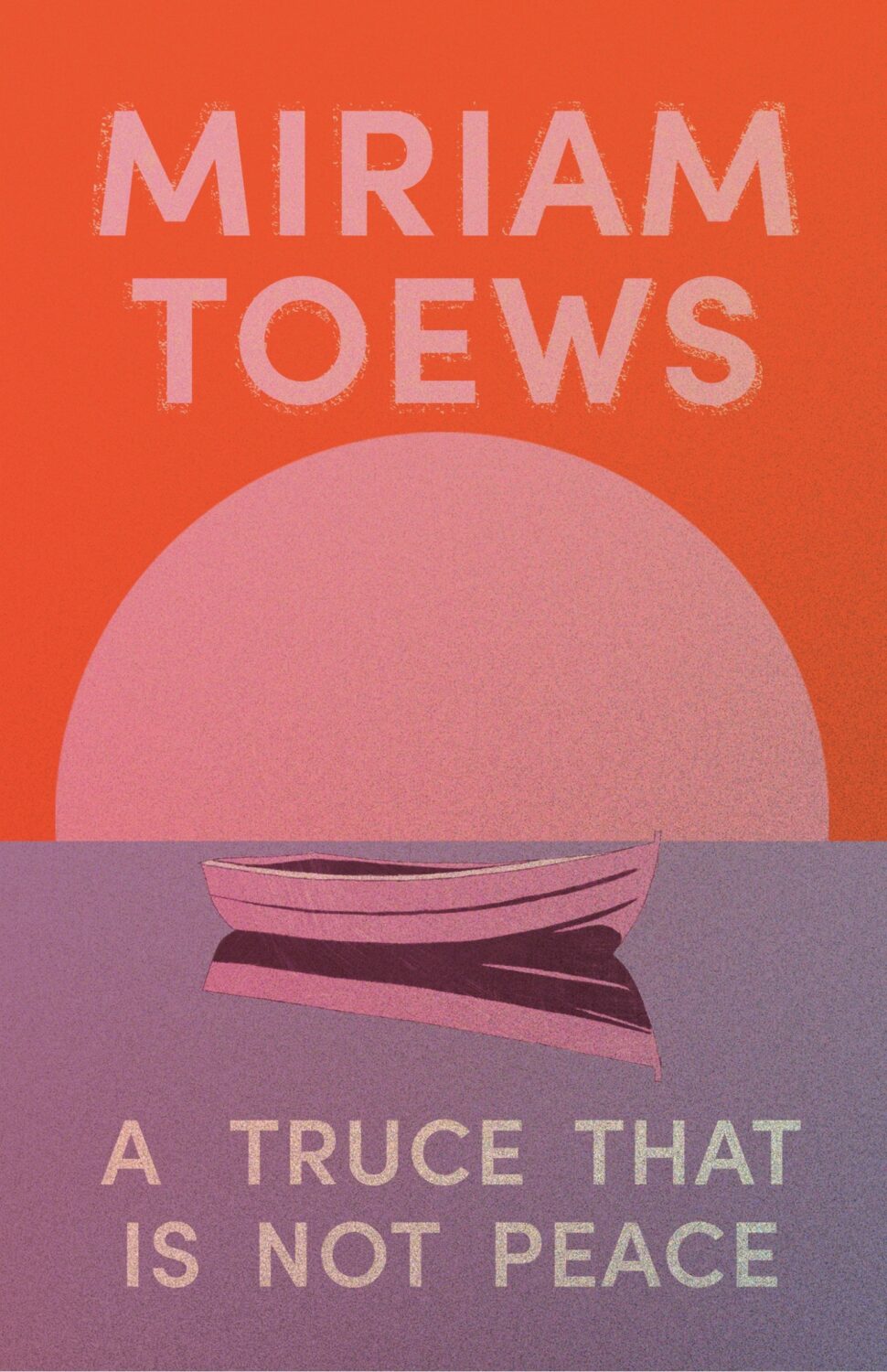
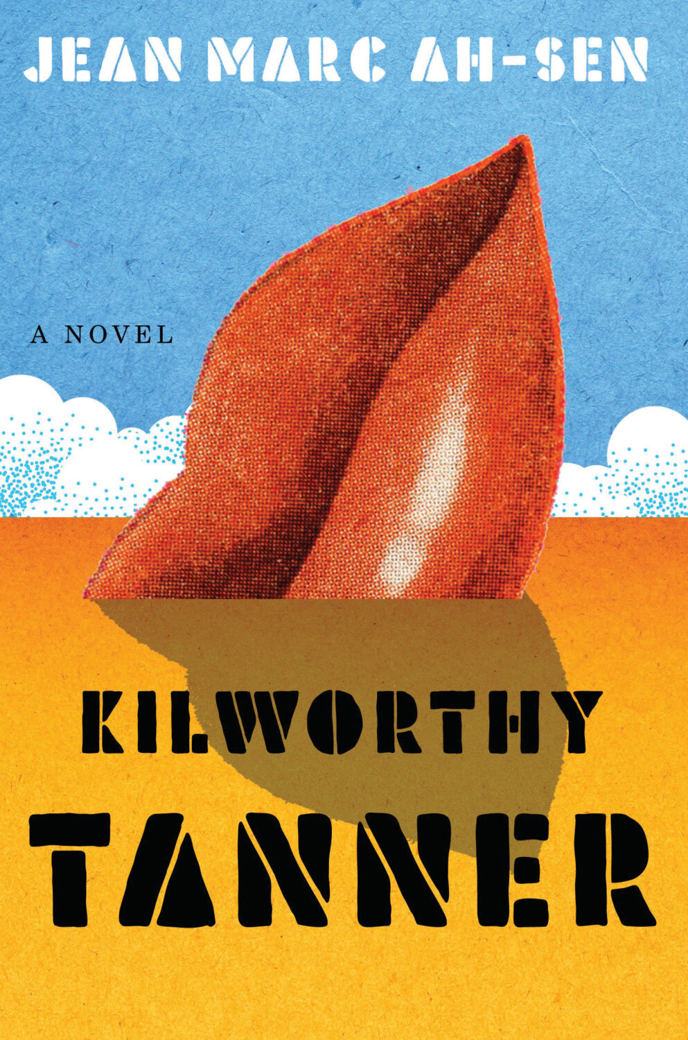
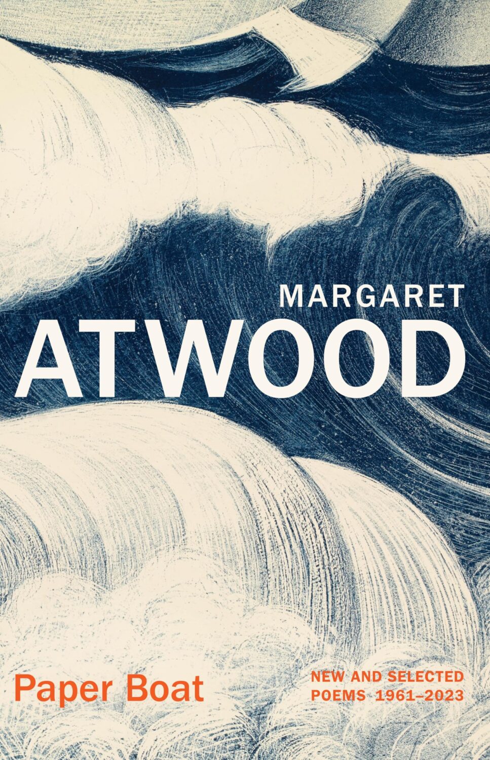
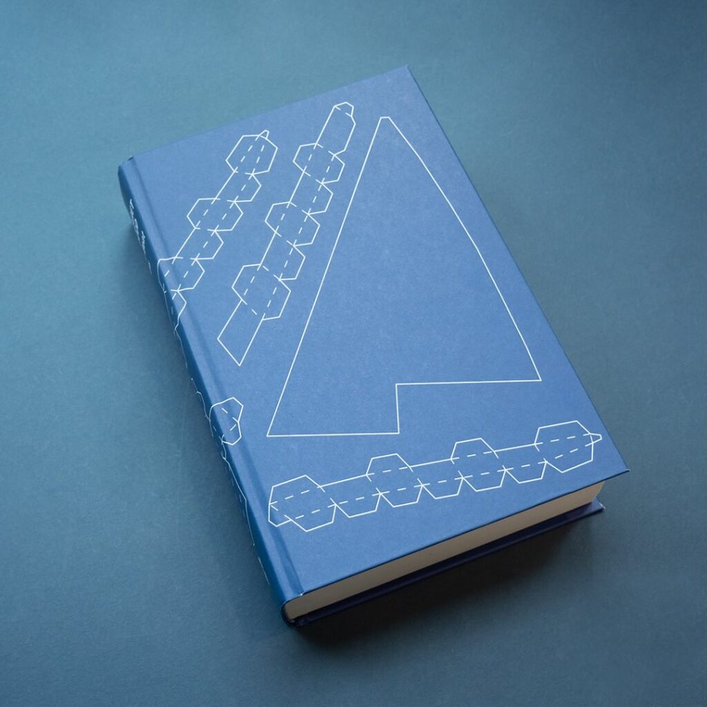
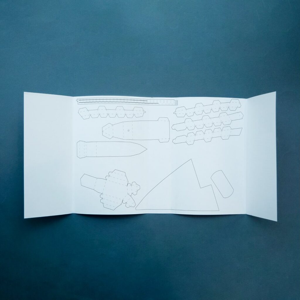
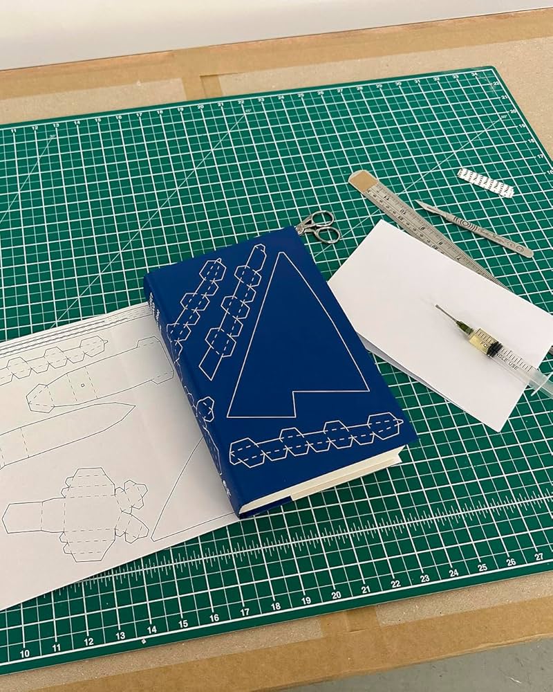
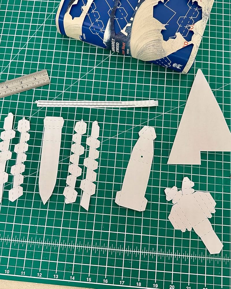
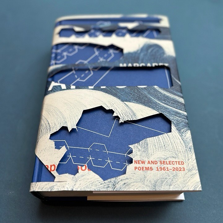
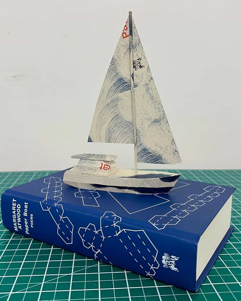
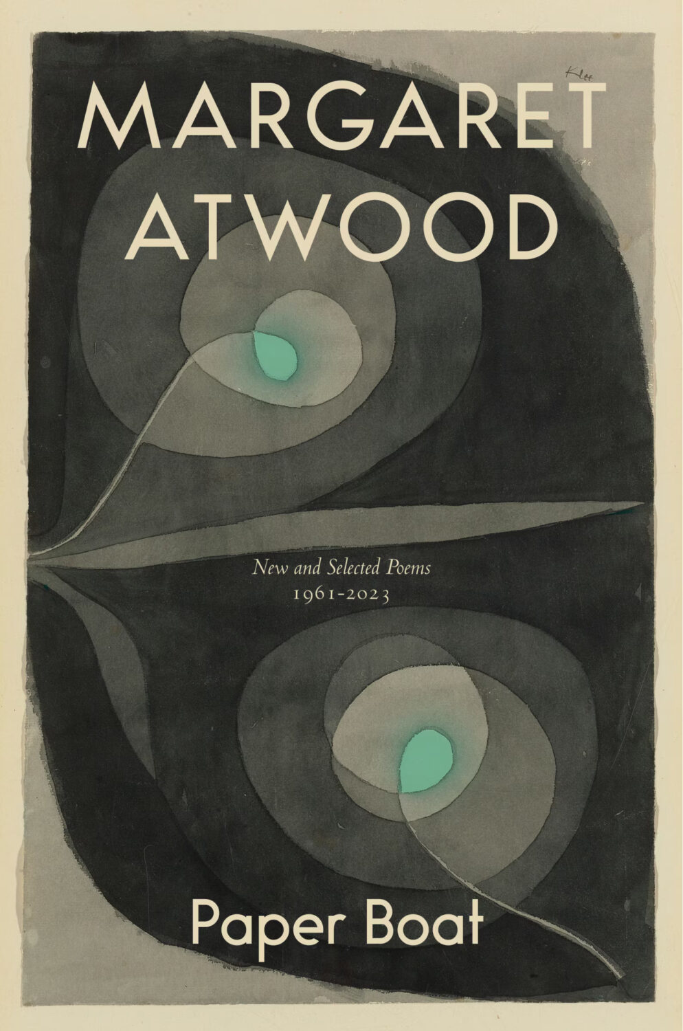
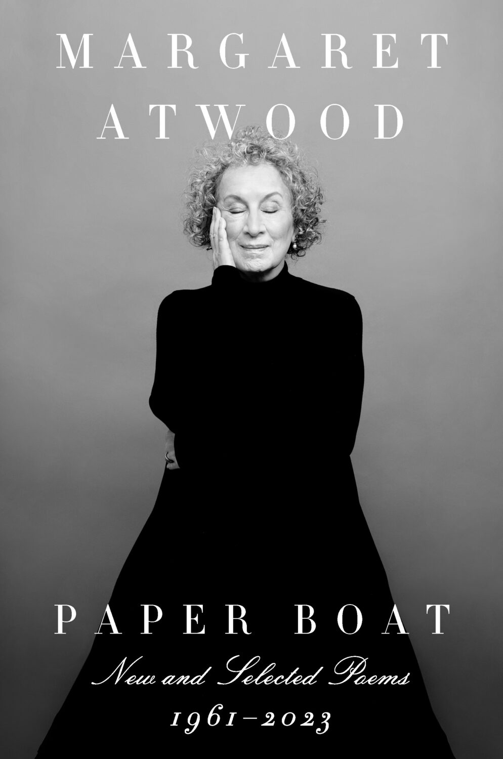
Remarkably, the design incorporates a template for paper boat that can be cut from the dust jacket and stuck together.
The cover of the Canadian edition of Paper Boat, published by McClelland & Stewart, was designed by Kelly Hill using art by Paul Klee. The cover for the US edition published by Knopf was designed by Janet Hansen. The photograph is by Ruven Afanador. It’s interesting to me that it was the US decided to use a portrait on the cover. I mean it’s a beautiful photograph and Margaret Atwood is very distinctive looking, but I would imagine she would be more recognizable to Canadians than to Americans? Anyway, it’s not often you see three entirely different approaches in the UK, US and Canada for a poetry collection.
I hope you’re staying healthy and optimistic about the new year. As this is the post about new 2024 covers, it inevitably includes a few from 2023 that I missed at the time. There are also a couple of indie covers, one from a university press, and, continuing a theme from last year, one from a Canadian publisher. Keep warm, friends.
Filterworld by Kyle Chayka; design by Oliver Munday (Doubleday / January 2024)
I mentioned Kyle Chayka in the introduction to my post looking back at 2023. I didn’t realize that he had book coming out. I guess I will have to read it now!
Font wizards correct me if I am wrong, but I *think* both of these covers use Manofa from Inhouse Type? (And I think saw it on the cover of a forthcoming book too recently. Maybe a typeface inspired by Lydian is becoming the new Lydian?)
This made me think of the opening credits to a movie from the 1960s. I think it’s partly the type, but the colours also reminded me of Maurice Binder’s title sequence of Charade. Maybe it’s more of the overall vibe than anything else?
The New Life by Tom Crewe; design by Jaya Miceli (Scribner / January 2023)
Interestingly, the cover of the UK edition published by Chatto & Windus uses the same photograph but it’s flipped the other way and printed on one of those fancy half dust jackets (forgive me for not remembering their technical name). I believe the design is by Kris Potter.
The cover of the UK edition published by Fourth Estate was designed by Jo Thomson. It’s interesting to see the same basic concept executed in two very different styles.
The cover of Granta edition The Devil’s Workshop by Jáchym Topol designed by Telegramme Studios was on my list of favourite covers back in 2013 (there were some great covers published that year!). Interesting that the colour palettes are similar.
This month’s post includes a few covers that I missed earlier in the year along side the new and recent releases. I’m starting to think about my annual recap so please let me know if you think I’ve overlooked any other particularly notable covers that stood out for you and/or seemed emblematic of wider trends in 2022.
And just a reminder with all the stuff going on with social media that if you’d prefer to get new posts auto-magically emailed to you, you can subscribe here. I have also re-opened comments on new posts after closing them for a few months if you want to politely share your thoughts below.
“Fuuuuuuuuuck….!” is the only way I can describe the mixture of awe and annoyance that I hadn’t thought of it I felt when I saw this cover. So simple and so clever.
This has a very similar ‘obscured face collage’ feel to Tristan Offit’s cover for Briefly, A Delicious Life by Nell Stevens, which I thought I had posted here earlier in the year but apparently did not (probably because I didn’t — and still don’t! — know who designed the cover of the UK edition (it was designed by Mel Four, photograph by Marta Bevacqua) and I wanted to post them together?).
Pacifique by Sarah L. Taggart; design by Natalie Olsen (Coach House Books / October 2022)
People Person by Candice Carty-Williams; design by Emma A. Van Deun (Scout Press / September 2022)
Mr. Keenan also designed the cover for the Liveright edition of The Waste Land itself a few years ago.
(The US edition of Matthew Hollis’s book, forthcoming from W. W. Norton, also has an interesting cover. If anyone from Norton would like to send me a hi-res image with the design credit, I’ll be happy to add it in!)
The cover of the UK edition, which will not be published until 2021(!), was designed by Craig Fraser. It has a very vintage Faber feel… maybe it’s just the type?
This reminded me of the cover of the similarly themed American Manifesto by Bob Garfield, designed by Richard Ljoenes and published earlier this year by Counterpoint….
2019 has felt interminable. It has also felt like there are never enough hours in the day to keep up. You can’t talk to me about TV shows or movies. I haven’t seen any.
When it comes to books, I’m fortunate enough to work in the industry. But what hope do casual readers have of finding the good stuff when the same few titles dominate the conversation and there is so much else competing for their attention?
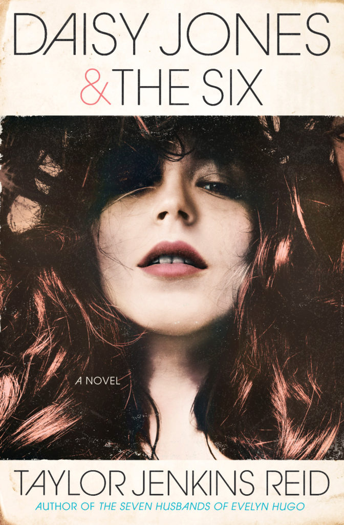
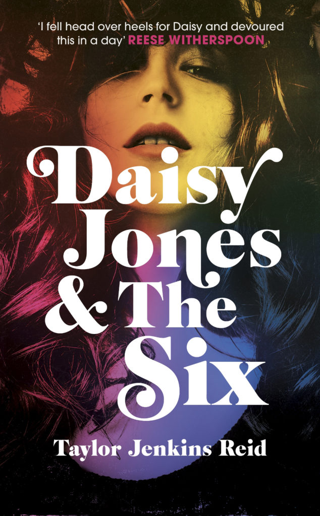
Daisy Jones and The Six by Taylor Jenkins Reid; design by Caroline Teagle Johnson (Ballantine / March 2019) Daisy Jones and The Six by Taylor Jenkins Reid; design by Lauren Wakefield (Hutchinson / March 2019)
Daisy Jones and the Six had a glamorous, louche 1970s look. The US and UK editions, designed by Caroline Teagle Johnson and Lauren Wakefield respectively, took slightly different directions with the type, but the photograph (a stock image apparently) felt ideally suited to social media.
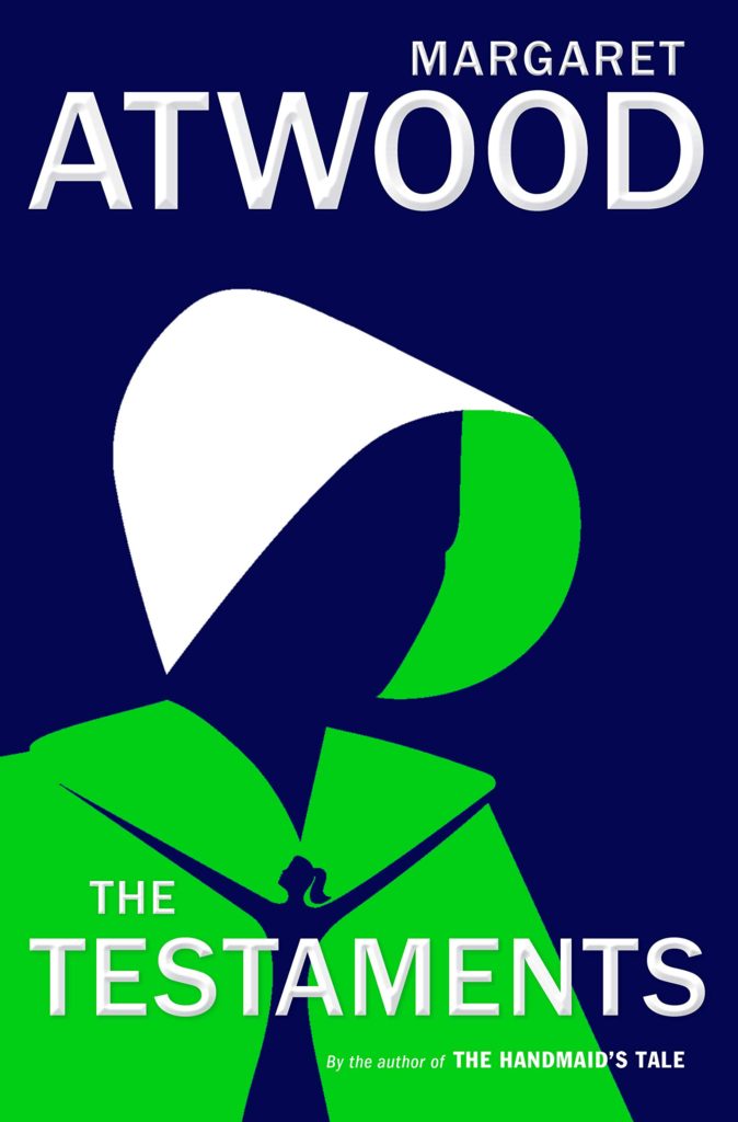
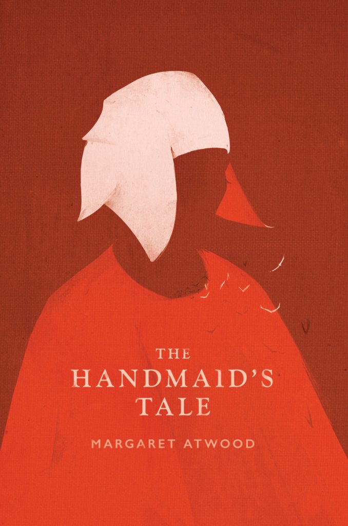
The Testaments by Margaret Atwood; design by Noma Bar (Chatto & Windus / September 2019)The Handmaid’s Tale by Margaret Atwood; art direction by Christopher Moisan; illustration by Patrik Svensson (Houghton Mifflin Harcourt / April 2017)
The Testaments was everywhere and, like the recent Vintage Classics reissue of The Handmaid’s Tale, the cover illustration was unmistakably by Noma Bar. We live in an age where every cult movie and TV show gets a ‘minimalist’ poster now, and I found that The Testaments looked too familiar for me to find it engaging. It didn’t help that the cover of the 2017 US reissue of the The Handmaid’s Tale by Swedish illustrator by Patrik Svenson had already featured a similar 3/4s silhouette. Nevertheless, it was perhaps a bolder cover choice than I’m giving it credit for. If nothing else, it showed that bright green on book covers — once cursed and reviled — is suddenly all the rage!
In terms of trends, 2019 felt more like a continuation of previous years rather than a break with the past. There was a kind of conservatism to a lot of the covers I saw. My sense was that highly polished designs that looked comfortingly familiar were being approved over riskier ones that stood out from the crowd. The most interesting covers often came from small publishers, especially New Directions who seem to be giving a bit more creative license to the designers they work with (some of whom have 9-5s at much bigger publishers!).
Big centred blocks of utilitarian white type over elaborate backgrounds continued to be a mainstay. It’s the book cover as poster, and it works at any size, so I don’t think it’s going away any time soon.
Handwriting and hand-lettering remained popular too, although my sense is that enthusiasm is starting to wane as publishers are opting for greater legibility and designers are turning back to vintage type styles to give a sense of authenticity and craft. (I’m willing to admit the evidence might not back me up on this, however!)
Fun, swishy 1970s-inspired serifs like Benguiat Caslon revival Cabernet are back. People keep trying to make ITC Avant Garde — another iconic 1970s typeface — happen again too. I don’t think it works for the most part, but I can see why designers think it’s cool in a coked-up New York way. Warren Chappell’s earnest calligraphic sans serif Lydian, originally released in 1938, continued its unlikely rise as a go-to literary typeface. It even got an explainer at Vox.
Black and white portrait photography has been the staple of biographies and classics for years, so it was interesting to see closely cropped black and white photographs used on the covers of a couple of new literary novels this year. This isn’t entirely new obviously. Black and white photography has long been used to signify that something is “art” (as opposed to, say, “pornography”). But I think the latest iteration of trend was started by Cardon Webb‘s 2015 cover for A Little Life by Hanya Yanagihara which used a black and white photograph by the late Peter Hujar.
Coincidentally the cover of the US edition of Garth Greenwell’s new novel Cleanness, publishing early 2020, was designed by Thomas Colligan and uses contemporary black and white photograph by Jack Davison. (The UK edition, designed by Ami Smithson fits this trend a little less neatly, but features black and white photograph by Mark McKnight)
Something that I didn’t anticipate was the use of contemporary landscape and figure painting on the covers of some the big literary releases of the year. Like black and white photography, it felt almost pre-digital — a grasp at traditional values of craft. I don’t know if I would go as far as to say it is a rejection of post-modernism. But maybe it is? I don’t know. Discuss amongst yourselves.
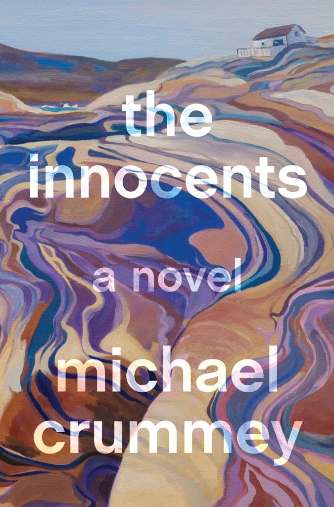
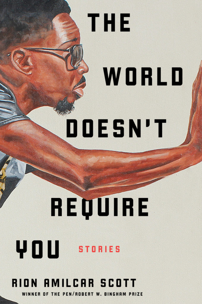
The Innocents by Michael Crummey; design by Emily Mahon; art by Diana Dabinett (Doubleday / August 2019)The World Doesn’t Require You by Rion Amilcar Scott; design by Laywan Kwan; art by Fahamu Pecou (Liveright / August 2019)Inland by Téa Obrecht; design by Jaya Miceli; art by Tamara Ruiz (Random House / August 2019)
Thank you to all the designers and art directors who’ve been in touch and helped me identify covers for my posts. I’m sorry if I haven’t replied to your message. It’s been a year.
Aug 9 — Fog by Kathryn Scanlan; design by Na Kim (Farrar Straus & Giroux MCD / June 2019)
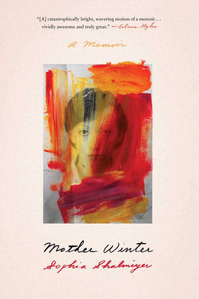
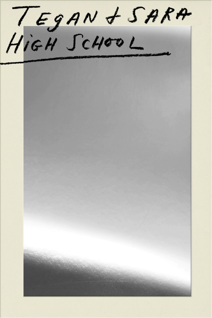
Also designed by Na Kim:
Lie With Me by Philippe Besson; design by Na Kim (Scribner / April 2019)Mother Winter by Sophia Shalmiyev; design by Na Kim (Simon & Schuster / February 2019) High School by Tegan & Sara; design by Na Kim (MCD / September 2019)
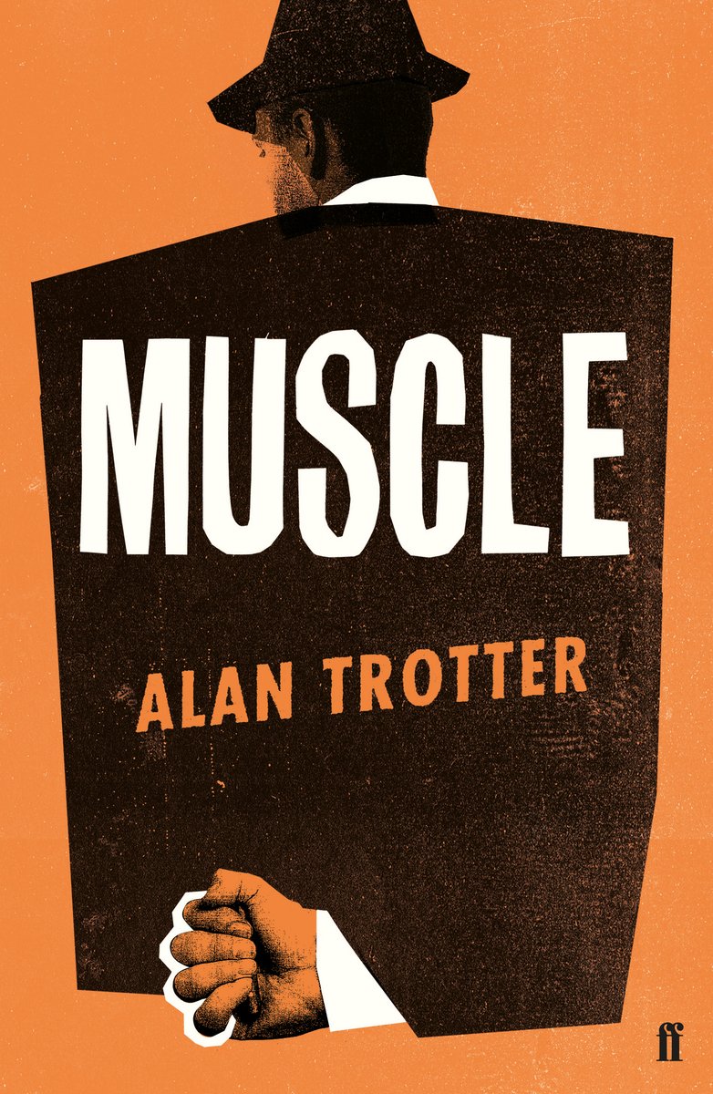
Muscle by Alan Trotter; design by Gray318 (Faber & Faber / February 2019)
Also designed by Gray318:
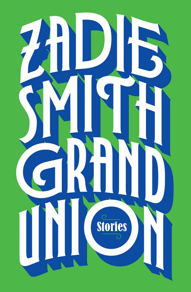
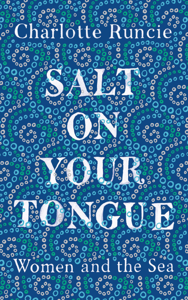
Quichotte by Salman Rushdie; design by Gray318 (Jonathan Cape / August 2019) Grand Union by Zadie Smith; design by Gray318 (Hamish Hamilton / October 2019)Salt On Your Tongue by Charlotte Runcie; design by Gray318 (Canongate / January 2019)
What We Really Do All Day by Jonathan Gershuny and Oriel Sullivan; design Matthew Young (Pelican / September 2019)Artificial Intelligence by Melanie Mithcell; design by Matthew Young (Pelican / October 2019)
One Day by Gene Weingarten; design by David Litman (Blue Rider / October 2019)
Oliver Munday wrote about designing the cover for New Directions at Literary Hub earlier this year.
He also designed a lot my favourite covers this year…
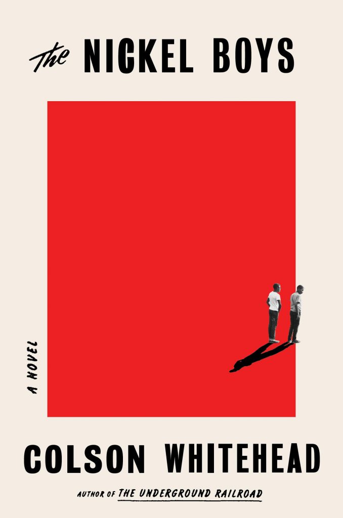
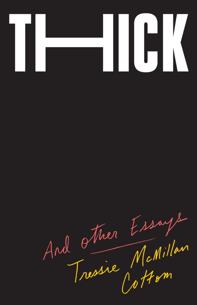
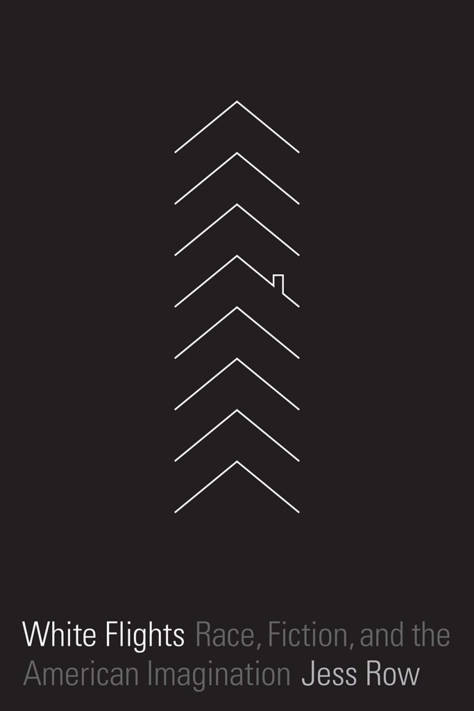
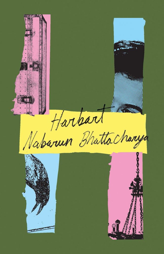
Riots I Have Known by Ryan Chapman; design by Oliver Munday (Simon & Schuster / May 2019)The Nickel Boys by Colson Whitehead; design by Oliver Munday (Doubleday / July 2019)Thick by Tressie McMillan Cotton; design by Oliver Munday (The New Press / January 2019)White Flights by Jess Row; design by Oliver Munday (Graywolf / August 2019) Harbart by Nabarun Bhattacharya; design by Oliver Munday (New Directions / June 2019)
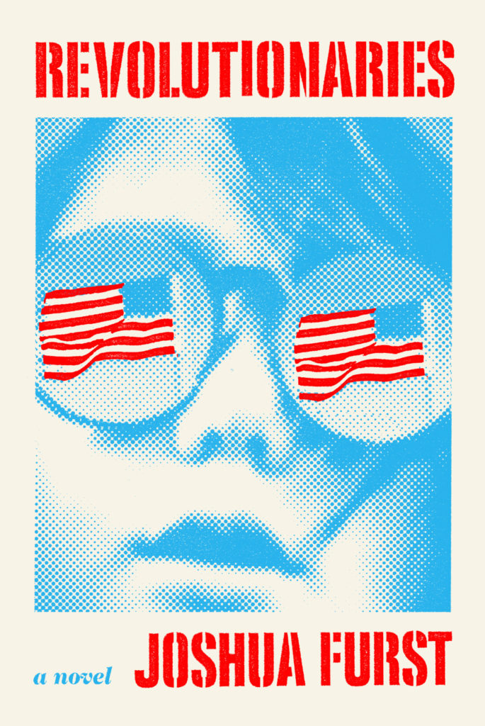
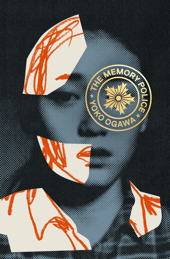
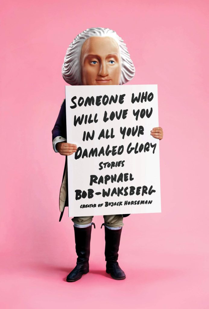
The Revolutionaries by Joshua Furst; design by Tyler Comrie (Knopf / April 2019)The Memory Police by Yoko Ogawa; design by Tyler Comrie (Pantheon / August 2019)Someone Who Will Love You in All Your Damaged Glory by Raphael Bob-Waksberg; design by Tyler Comrie; illustration Justin Metz (Knopf / June)
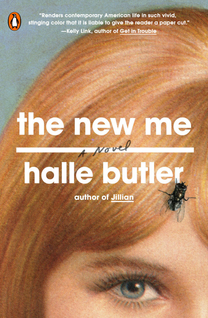
The Volunteer by Salvatore Scibona; design by Rachel Willey (Penguin / March 2019)
Also designed by Rachel Willey:
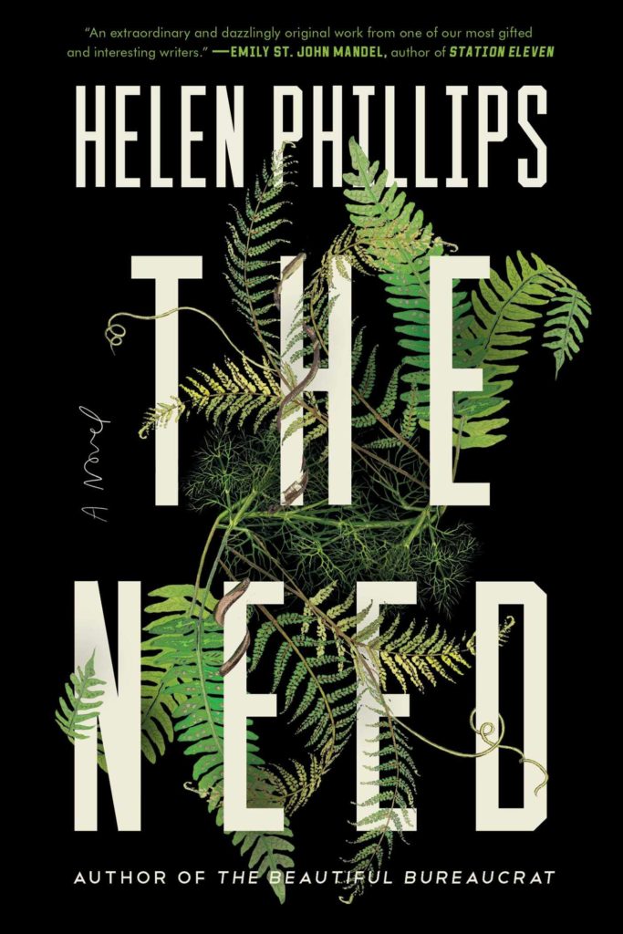
The New Me by Halle Butler; design by Rachel Willey (Penguin / March 2019) The Need by Helen Phillips; design Rachel Willey (Simon & Schuster / July 2019)
Before we move on to new books for 2019, here are some of the better end-of-year lists that looked back at book cover design in 2018…
Paste were out of the gate early with a list of the 18 best book covers of 2018.
The Pisces by Melissa Broder; design by Rachel Willey (Bloomsbury / May 2018)
Impossible Owls by Brian Phillips; design Jamie Keenan (FSG / October 2018)
The folks at Spine left it until right before Christmas to post their 2018 Book Covers We Loved, but they did do a nice video with designer Holly Dunn, highlighting a few of their favourites from the list:
In the most eagerly awaited list, Matt Dorfman chose his 12 covers of the year for the New York Times (although whoever wrote the “We think you can judge a year by its book covers” subhed owes Matt an apology).
My Year of Rest and Relaxation by Ottessa Moshfegh; design Darren Haggar (Penguin Press)
Playing Changes by by Nate Chinen; design by Kelly Blair (Pantheon)
The Literary Hub asked 27 designers to share their favorite book covers of the year and came up with a list of 75 “covers of note” (where have I heard that before?), including a couple of covers I didn’t see anywhere else, which is always a pleasant surprise.
The Blue Flowers by Raymond Queneau; design by Peter Mendelsund (New Directions)
Sexographies by Gabriela Weiner; design by Na Kim (Restless Books)
Vulture posted a list of their 10 favourite covers with commentary from the designers.
The Friend by Sigrid Nunez; design by Nicolas Ortega (Riverhead)
My Sister the Serial Killer by Oyinkan Braithwaite ; design by Michael Windsor (Doubleday)
And, drawing on the lists from LitHub and Paste (and some other guy), Jason Kottke posted a short but sweet list of book covers for the year that included a couple of my favourites, Cherry designed by Janet Hansen and Circe designed by Will Staehle.
Cherry by Nico Walker; design by Janet Hansen (Knopf / August 2018)
Circe by Madeline Miller; design by Will Staehle (Little Brown & Co / April 2018)
Fear by Bob Woodward; design by David Litman (Simon & Schuster / September 2018)
White text on a red background is not new, and I suspect it has never gone out of fashion for mass-market thrillers, but it’s interesting to see it reemerge as a “serious book” cover trend. The Real Lolita cover was designed by Sara Wood:
The Real Lolita by Sarah Weinman; design by Sara Wood
Heartbreaker by Claudia Dey; design by Rachel Willey (Random House / August 2018)
Apparently we can’t get enough of the 1980s. This is essentially ‘The Night Begins to Shine’ rendered into a book cover (and if you don’t get that reference, I’m guessing you don’t have kids. And yes, I’m going to make you Google it)
Rachel also designed the retro cover for The Comedown by Rebekah Frumkin for Henry Holt earlier this year:
Heartbreaker by Claudia Dey; design by Rachel Willey (Random House / August 2018)
Night Moves by Jessica Hopper; design by Amanda Weiss (University of Texas Press / September 2018)
This reminds me of Kyle G. Hunter’s cover for A Lucky Man by Jamel Brinkley which I featured earlier this year. Apparently I like blurry urban nightscapes!


