Then again, it could be said that historical fiction, like science fiction, is really always about the present. Llewyn Davis is a creature of the here and now, not of 1961. He has none of the communitarian goodwill, the erudite passion, or the optimistic idealism that marked the period. He is a confused, irascible striver who isn’t sure what he is striving for, apparently seeking a career when folk music was about the last place you’d look for one. It is suggested that he has been flopping on friends’ floors for months, when, at the time, people generally only did that when they first hit town, since it wasn’t hard to scratch up the twenty or thirty bucks a month it took to rent a tenement flat fifty years ago.
But if you excise the period details, he makes sense. Whereas in a better time he would spend five or ten years woodshedding and developing a soul, he has no choice but to enter some kind of race right away or die on the vine. He is consistently crass because he feels threatened by people and ideas he can’t dominate—and he can’t dominate very much because he feels threatened. (How else to explain his heckling an Appalachian singer, complete with autoharp and authentically awkward?) Somehow he has made a connection to something that is genuine and profound—the haunting music—but circumstances force him to treat it as a card to play rather than as a path to explore.
As Sante notes in the review, while the film is based on musician Dave Van Ronk’s memoir The Mayor of MacDougal Street, it isn’t really about Van Ronk at all:
The impression is that of a young man who has a great many more mistakes to make in life before he wises up, if indeed such a thing is ever to happen, but who channels the accrued wisdom of the ages when he enters the folk-lyric continuum, becoming an entirely different person. This suggests a description not so much of Van Ronk—or Paxton, or Ochs, or Elliott—as of the man who upset the apple cart: Bob Dylan.
The little book that abounds in much: It’s a goal widely aspired to these days. The wish is that a short book can navigate both print and digital with buoyant grace, where a bigger one might capsize. “Somewhere between a long magazine article and a book” is the sweet spot that many publishers describe. They picture customers polishing off a volume on a short plane ride or a round-trip transit commute, on a tablet or in an easy-to-hold compact volume.
Such books can bring the urgency of a manifesto. They can provide literary sustenance without the commitment a thick tome demands. And, properly designed, they stoke a fetish for tiny, perfect, collectible objects.
What could be better? It’s an in-between form for transitional times. It’s a nod to collective attention-deficit and the Internet’s “too long; didn’t read” syndrome. Whether it succeeds in practice is another question: Is the little book as unsinkable a prospect as its advocates hope? Or is it a pursuit as vexed as the one in Melville’s following novel, for the great white whale?
I like short books as much as the next guy, but I’m yet to be convinced that they’re going to save publishing. And, as if prove the point, Wilson’s own short book is becoming a longer one. (On the plus side, the article was accompanied by a rather lovely illustration by Drew Shannon)
It’s tempting to ask just how transgressive a novel, especially a best-selling novel, can be—and whether taking a stand against mainstream values makes you subversive or just modern. In other words: Is Kushner the flamethrower for real?
The answer is, basically, yes, in both senses of the phrase: She knows what she writes about, and she’s dead serious about her ideals. There’s plenty of room in The Flamethrowers for the dark side of that idealism—murdered businessmen, casually discarded girlfriends, movements warped by violence. In many ways it’s the subject of the book. But if something ardent and glamorizing blazes through, like the flashy World War I brigade of the title, that’s because Kushner herself is a believer, a genuine and unself-conscious exponent of what she might call the radical gesture—even if those gestures are more common now among academics and art stars than any genuine underclass. In a forthcoming interview with Tin House, she calls her shimmering mosaic of a second novel a “paean, maybe, to things that have long interested me. Nothing is in the book that I had to learn about. Instead, it is filled with things I already knew … drawn from my taste, my life, my sensibility.”
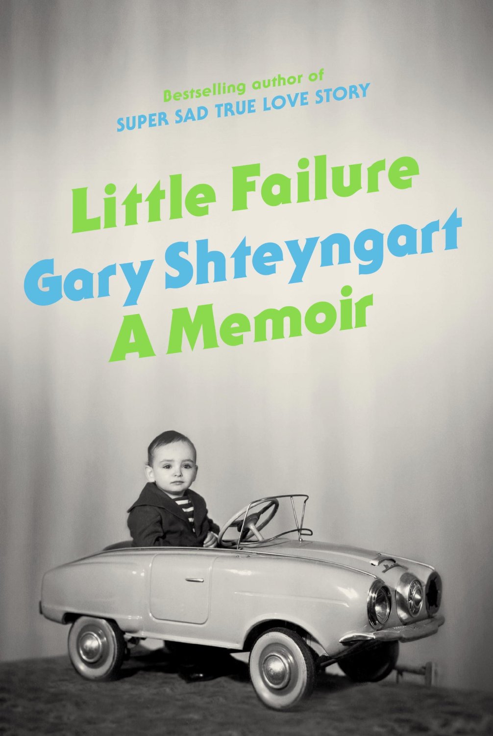
Surely just about everyone has seen this already, but in case you missed it, the new video for Gary Shteyngart’s forthcoming memoir Little Failure, which features James Franco as his husband and Jonathan Franzen as his therapist, is pretty great:
The video also stars David Ebershoff, Rashida Jones, Sloane Crosley, and Alex Karpovsky.
The great book designer George Salter once said that a good jacket “must be in perfect accord with the literary quality of the book. It must be even more if it is to function as an important sales factor, if it is to ‘stop’ the eye of the person passing by.” Of the thousands of books that come through the offices of the Book Review each year, these are the covers and jackets that caught my eye, that compelled me to flip them over to check the back flap to see who designed them.
We agreed on Gabriele Wilson‘s beautiful cover for Middle C by William Gass, but I think I should compile a list of all the great covers from 2013 that I’ve seen since I posted my list on Tuesday. (I’m kidding. Sort of).
Solomon spends more time than Rockwell did worrying about his status in comparison with what she calls the “Abstract Expressionist ilk,” who “glamorized direct and unmediated gestures” and dominated highbrow taste during the 1950s. Rockwell, who was remarkably uncompetitive and nonterritorial, said, disarmingly, “If I were young, I would paint that way myself.” The Connoisseur of 1962, a painting now in the collection of Steven Spielberg that Solomon considers a “masterpiece,” depicts a balding man seen from behind, in a gray suit with hat and umbrella in hand, contemplating what seems to be a Pollock painting. The floor, bluish-gray and white squares and triangles, constitutes a contrapuntal abstraction. Rockwell had fun making his own drip painting, canvas on the floor, and had a photographer record the event just as Hans Namuth, in 1950, had famously documented Pollock wielding a can of paint over the canvas. It’s charming to learn that Willem de Kooning, a longtime admirer of Rockwell, claimed to think that Rockwell’s Pollock was better than the real thing. “Square inch by square inch,” he said, “it’s better than Jackson!”
(American Mirror: The Life and Art of Norman Rockwell is published by Farrah, Straus & Giroux, and is distributed in Canada by my employer Raincoast Books)
I really like Emily Carroll‘s online horror comics, so I’m really pleased that a collection of her work is going to be published by Simon & Schuster next July. Through the Woods will include comics like His Face All Red as well as some new, but similarly dark and folkloric, short stories Carroll has been working on.
All else aside, though, it’s his Rube Goldberg inventions that made him a lasting cultural presence. Goldberg once said his machines — which he drafted with strict but rollicking precision — were a “symbol of man’s capacity for exerting maximum effort to achieve minimal results.” It sometimes took him as long as 30 hours to execute one single-panel piece.
I decided to go in a slightly different direction with my covers list this year (see my lists for 2012, 2011, and 2010). It’s just a straight up list of the fifty covers designs with a few annotations and links a long the way. I’m sorry for woeful under-representation of Australian and NZ designers, and for completely ignoring the entire non-English-speaking world. I will try and do better in 2014. But until then, here, in alphabetical order, are my fifty covers of 2013:
Design is Fine. History is Mine, an eclectic design history blog compiled by Rea Riegel, a copy writer and lecturer from Germany, is one of my favourite new Tumblrs. Go take a look.
(Pictured above: Pierre Reverdy and Pablo Picasso Le chants des morts, 1948)
Created by photographer Joseph O. Holmes, this charming (if occasionally grisly!) 12-minute super-cut features clips of projection booths from 46 different films, from Buster Keaton’s Sherlock, Jr. to Quentin Tarantino’s Inglorious Basterds:
The film debuted at New York’s The Museum of the Moving Image in October as part of the opening reception for Holmes’s The Booth: The Final Days of Film Projection, an exhibition of photographs which runs until January 2014.