Skip to content

The Casual Optimist Posts

Clutching at Straws

Some time back in September 2009, The Casual Optimist turned one-year-old. I didn’t actually notice until later — I had other things going on at the time — but I’ve been thinking about it a lot recently, especially since Joe Sullivan decided to put The Book Design Review on hiatus.

Compiling The Casual Optimist is an amazing experience. I learn something new every day and I meet some incredibly talented, smart people because of the blog. But for better, or worse, The Casual Optimist hasn’t exactly grown as I imagined it would and I often wonder if I spend to much time on the wrong things in one way or another.

The posts about the book trade — the posts that take longest to write — seem to generate the least interest (at least in terms of traffic and comments). The most popular posts by-the-numbers are the interview with designer David Pearson (which I totally get by the way!) and the list of inspirational vintage cover sites. It makes me curious who is visiting and why.

With this in mind, I thought I would hold a straw poll to find out what you want to see more of here. I promise there is no ulterior motive — this is not about boosting traffic, selling ads, or anything sinister — I really am just curious. And I want to make the site better as we move on to Year Two.

So please take a look at the poll if you have a minute (FYI: you can check more than one answer and submit the form more than once). Or, if the poll doesn’t really work for you, leave me a comment, ping me on Twitter (or Facebook), or drop me a line by email if it makes more sense. I’d love to hear from you.

Thanks. :-)

6 Comments

Something for the Weekend

Book wonks are still abuzz about the whole Amazon vs. Macmillan thing (see here previously) — who won, who didn’t, WTF?, and Rupert Murdoch’s shit-stirring — but I’m reliably informed by someone whose job is looking cool at the photocopier* that it is a really boring topic of conversation, so I’m going to move on…

The AIGA Design Archives — including the wonderful 50 Books/50 Covers — has been redesigned by Second Story, mercifully moving it away from its previous Flash interface so we can all link to it properly when we talk about it (pictured above: Brooklyn Modern designed by Projects Projects)

Elements of an Incendiary Blog Post — Painfully on the money (via Kottke):

This sentence contains the thesis of the blog post, a trite and obvious statement cast as a dazzling and controversial insight.

This sentence claims that there are many people who do not agree with the thesis of the blog post as expressed in the previous sentence. This sentence speculates as to the mental and ethical character of the people mentioned in the previous sentence. This sentence contains a link to the most egregiously ill-argued, intemperate, hateful and ridiculous example of such people the author could find.

Coverspy — “publishing nerds hit the subways, streets, parks & bars to find out what New Yorkers are reading…” A cover-oriented variation on Toronto’s Seen Reading (via SwissMiss).

Context and Connections — A great interview with illustrator, graphic designer and writer Frank Chimero:

There’s value to… knowing what your peers are working on, but it’s not a day-to-day concern. You’d probably get further checking a food blog every day, because it triangulates your interests and you’ll naturally come towards it wanting to make connections to what you’re doing and what you already know. Sure, you want your knowledge of the field to be deep, but it’s optimal to have your interests wide and varied. It’s makes your consumption more nourishing too, because all of a sudden you get context!

And finally…

Agent of Chaos — Bonkers and awesome, Werner Herzog (not really) reads Curious George:

(No really, it’s not Werner Herzog).

* Nic: I love you man.

3 Comments

Midweek Miscellany

A Wall in Palestine — more quiet mastery from Henry Sene Yee who excels in projects that require maximum discretion and minimal commentary. Like his cover design for ColumbineA Wall in Palestine is notable for what it leaves out. An early contender for cover the year. You heard it here first.

Making the World Fun to Look At — The Cleveland Plain Dealer has (what is believed to be) the first interview with Bill Watterson, creator of Calvin and Hobbes,  since 1989:

I think some of the reason “Calvin and Hobbes” still finds an audience today is because I chose not to run the wheels off it.

I’ve never regretted stopping when I did.

Amen.

Seven Things Publishers Need to Remember — A nice post by Kobo Books exec (and compulsive list maker) Michael Tamblyn on e-books and pricing:

A reader should never have to worry about “leaving books behind” or “losing their library”. If you can’t download it and move it somewhere else, it’s worth less. Seriously. They’re books, not Atari 2600 video game cartridges.

(But I’m waiting for the “7 Things E-tailers Need to Remember” post Michael. When’s that coming? You can post here if you want)

The Lost 1970 Man Booker Prize — Commemorating novels missed out because of rule changes in 1971. Bonkers. But kind of great.

Problem SolverIan Shimkoviak of The Book Designers interviews the legendary Carin Goldberg for their new blog CoveredUp:

I’m not a sentimentalist. The e-book is inevitable. And they make sense. The publishing industry can’t sustain the old/current model for making/selling books. It’s wasteful and unsustainable. They have to embrace change. Good content will continue to be created whether it’s represented on paper or on a screen.  And there will always be a market, albeit small, for beautiful picture books. The role of the graphic designer is shrinking but it’s in our court to get involved in the next wave of imagery and ideas.

And finally…

Jonathan Lethem, author of Chronic City (which I liked, but wanted to like more), interviewed on KCRW’s Bookworm (via the incroyable Largehearted Boy):

2 Comments

Too Many Books

“We have reason to fear that the multitude of books which grows every day in a prodigious fashion will make the following centuries fall into a state as barbarous as that of the centuries that followed the fall of the Roman Empire.”

“Too many books” is one old complaint. Historian Adrien Baillet wrote that in 1685. Plummeting book prices is another…

An interesting segment about books on NPR’s On The Media from late November 2009:

(Too bad about the dreadful Moxy Fruvous song)

The transcript is here.

(via Lined & Unlined)

Comments closed

Obligatory Apple/Amazon Post

It somehow seems terribly appropriate that I spent the week Apple unveiled the iPad battling with problems with my own PC laptop (*sigh*) and missed a lot of the excitement.

Even at the best of times, I am usually at least a day behind the news cycle, and so not for the first time, I thought I’d write a post as a way to get myself up to speed over the weekend. But, just when I started to think I had a handle on it all, I got sideswiped by the not unrelated kerfuffle between Macmillan and Amazon… (*sigh*)

Needless to say, things are happening at a frightening pace and so this post will probably be out of date even before it is live. It should also go without saying — although I’d better say it anyway — that any opinions expressed here are my own, not those of my employer…

So, as I was saying, Apple launched the iPad and iBooks store.

Many in the tech crowd — who were apparently expecting Jesus 2.0 — were, unsurprisingly, a little disappointed by the name and the lack of features such as multitasking, Flash, and a camera.

But, even if you don’t accept that disappointment is the condition of our age, the loquacious Stephen Fry pointed out that many the same critics were also underwhelmed by the iPhone and look how that turned out:

[E]ven if they couldn’t see that three billion apps would be downloaded in two years… could they not see that this device was gorgeous, beautifully made, very powerful and capable of development into something extraordinary? I see those qualities in the iPad. Like the first iPhone, iPad 1.0 is a John the Baptist preparing the way of what is to come, but also like iPhone 1.0 (and Jokanaan himself too come to that) iPad 1.0 is still fantastic enough in its own right to be classed as a stunningly exciting object, one that you will want now and one that will not be matched this year by any company.

Fry believes (and rightly I think) that the big impact of iPad will be on the media and the way we consume it:

[I]t is a whole new kind of device. And it will change so much. Newspapers, magazines, literature, academic textbooks, brochures, fliers and pamphlets are going to be transformed.

Ivor Tossell makes a similar point in today’s The Globe and Mail. According to Tossell, the iPad will essentially be used to “piss away time on the Internet”:

[S]o now we have a tablet that’s perfect for the couch, and the restaurant table, and the party, and the lecture hall; for reading in the bathroom, for floating in space, and possibly for using in the space-bathroom. Who knows – the future is grand… The question, in the end, isn’t whether you want to spend hundreds of dollars on a new tablet computer. It’s about whether you really want the Internet lying around the house like that.

Of course, this is not news to book folk. I think we have always seen e-readers as a new way to read in the bath.

Nevertheless, the iPad’s sleek design, intuitive interface, and startling low starting price of $499 USD, make it welcome alternative to Amazon’s somewhat ‘fugly’ Kindle. Mashable (although they were not alone) were quick to give reasons why the Kindle is Dead (while others have been equally quick explain why it isn’t).

And then there is the iBooks store. Not only does it support e-Pub, but most of major publishing houses — Penguin, HarperCollins, Simon & Schuster, Macmillan and Hachette (although notably NOT Random House) — have signed up. As Sarah Weiman noted at Daily Finance :

If it wasn’t clear that iPad and iBooks are two shots across the bow of Amazon’s…. Kindle e-reader, Jobs’s left-handed compliments drove the point home: “Amazon has done a great job of pioneering this….We’re going to stand on their shoulders”

It has, of course, been something of an open, if largely misunderstood, secret that publishers are not happy with Amazon pressuring them on prices, discounts, and marketing dollars (although I’m not quite sure anyone expected Steve Jobs to say it aloud) and so it is not surprising that publishers are embracing the iPad. But, with apps for the kindle, better terms for self-published authors, and persistently loud (if vague) announcements about sales, Amazon had clearly been preparing for this moment for some time.

It was still a shock however, when after a disagreement of pricing and terms, Amazon (briefly) upped the stakes even further by withdrawing both print and digital titles published by Macmillan from their site. That Macmillan was coincidentally one of the publishers signed up for iBooks was not lost on people.

As Cory Doctorow notes at BoingBoing, Macmillan were not blameless, but Amazon — perhaps fearing a PR disaster after Macmillan CEO John Sargent went public — quickly capitulated (albeit grudgingly and, as Fast Company and Moby Lives noted, somewhat disingenuously) and things are beginning to quieten down, at least for now.

Others — notably Andrew Wheeler (a braver soul than me), the indefatigable Sarah Weinman, and author John Scalzi (another brave soul), not to mention the mainstream media et al — have done a far better job of unpacking this farrago than I could, especially since I have to be somewhat guarded in what I say.  I’m just going to end by saying that this fight was probably inevitable — predictable even — but, if nothing else, this is surely a sign of things to come…

Update:

For more of the industry nitty-gritty and some (estimated) numbers around the Amazon-Macmillan disagreement, Mike Shatzkin’s post on the subject is also worth reading…

Update 2:

Two things:

One, if I was going to rewrite the part of this post about Amazon (heaven help me), I would  say — and say early — that despite all of the complaints about Amazon, they are good at selling stuff. Publishers like Amazon’s sales figures and relatively low return rates. If Amazon were just rubbish, this wouldn’t be half as complicated as it is…

Two, I wanted to post this from Bobby Solomon’s blog Kitsune Noir on the iPad:

For those who are disappointed by it, who think it’s a rehash of the iPhone, I honestly feel bad for you. I know it doesn’t cook you toast, and I know you wanted it to have lasers, but you’re completely overlooking the fact that no one else on Earth could make a device anything like this. Please prove me wrong, I would love to see some competition on this device…  P.S. They could call it the iDouche for all I care, if it’s amazing who gives a rip?

6 Comments

Typekit

Over the next few days (likely weeks/months) I’m going to be experimenting with Typekit to use a slab serif typeface for headlines on The Casual Optimist.

At the time of writing, you should be seeing the ‘logo’ and ‘tagline’ at the top of the page displayed in the beautiful Adelle by TypeTogether.

I would love some feedback on Typekit (is it intrusive?) and the typeface (is it an improvement?), so let me know what you think in the comments. Cheers.

5 Comments

Dan Mogford’s de Bonos

Earlier this week, London-based graphic designer Dan Mogford kindly alerted me to a series of fresh Edward de Bono covers he designed for the Penguin UK:

At the BPPA book cover panel last night, David Gee was lamenting publishers’ current predilection for blandly neutral Malcolm Gladwell-esque covers for certain kinds of popular nonfiction, and so I’m really glad that Dan (and Penguin) decided to go in the completely opposite direction.  I really like the slab serif (the rather lovely Stag by Christian Schwartz, Dan tells me), bold colours, and light-bulb motif they went with here.

Is it just me or do they have a certain Milton Glaser-like quality?

4 Comments

Under the Covers: Reviewing the Covers of 2009

Tonight is the BPPA‘s annual review of the best and worst book covers of the year.

Sadly Alan Jones, Senior Designer at HarperCollins Canada, had to drop out at the last minute and is being replaced by Boy Wonder David A. Gee (interviewed here) and umm… me. No, I’m not quite sure what they were thinking either (about asking me — David is obviously a great choice)…

The other panellists are freelance designer Ingrid Paulson (also interviewed here), Terri Nimmo Senior Designer at Random House Canada, and Steven Beattie Review Editor at The Quill & Quire.

Panel moderator David Ward of McClelland & Stewart has promised me Jaffa Cakes.

The event is 6:30-8:30 pm at The Arts and Letters Club (3rd Floor) in Toronto. It’s free for BPPA Members, $20.00 for non-members apparently.

There’s more information on the BPPA’s event page.

3 Comments

Midweek Miscellany

The Backwards Novel Seen Backwards by Tom Gauld.

I also love Tom’s Lost Fairy Tales for a promotional concertina booklet made by his agent Heart (surely there’s a full length book to be had here?).

Ways of Reading from A Working Library:

Every book alights a path to other books. Follow these paths as far as you can.

Lovely.

Back to BasicsBooktwo.org‘s James Bridle on the Apple tablet (what else?):

I’ve spent several years urging publishers to get on board with new technologies and try new things, but equally I hope there’s space for a lot of publishers to get back to concentrating on what they do best: acquiring, editing, producing and publishing books… [W]e should probably stop scrambling to get on the latest bandwagon (vanilla Books-as-Apps, I’m looking at you), and concentrate on the basics: ebook production, metadata, integrated marketing, quality and consideration. There is a lot to be done, but this or that device will never be the be-all-and-end-all of the future of publishing.

I think James has a point. But honestly, no one I know (and that is an admittedly limited sample) believes “this-or-that device” will magically “save” publishing. Surely it is only bloggers in need of straw men and ‘journalists’ paid to hyperventilate who say that kind of shit?

Moving (swiftly) on…

Modern Myths — Will Self on H. G. Well’s The War of the Worlds in The Times:

The War of the Worlds is one of those books that demonstrates our culture’s surprising ability to continue the manufacture of myth. I say surprising, because one would think, with all the technological reproducibility of art now at our disposal — from raw print, to film, to digitisation — that there would be no room left for that hazy instability within which myth thrives.

(Pictured above: The NYRB edition of The War of the Worlds with illustrations by Edward Gorey)

And finally, completely unrelated to books…

Dear Coffee I Love You… Yes, yes, I do. (Pictured above: What I’d Rather Be Doing)

2 Comments

Something for the Weekend

Slim pickings in a week in which book nerds obsessed about the implications of the rumoured Apple tablet (and PS – if anyone else describes it as the fucking ‘unicorn’ it’s clobberin’ time…), while in a completely unrelated move (snarf!), Amazon announced it was going to allow iPhone style apps to be uploaded and sold on the Kindle (begging the question when does the Kindle become the Pontiac Aztek?) and — faster than you can say bait and switch — they offered self-published authors improved royalties.

But, anyway, here’s more fun stuff for your weekend pleasure…

What To Leave Out? — I Love Typography‘s favourite fonts of 2009, including the lovely Phaeton and Biographer (pictured above), as well as Jos ‘exljbris’ Buivenga’s  Calluna.

The big graphic novels of 2010 according to Publishers Weekly.

And finally… I’ve been meaning to link to this for ages, at least in part so I could post Erik Mohr‘s cover for Monstrous Affections by David Nickle

Horror Stories — Waaaaay back in November The National Post chatted with the publishers and authors from dark fiction specialists ChiZine Publications :

[W]e wanted to produce beautiful, well-written books. Books you wanted to pick up — and when you did, you wouldn’t be disappointed by what was inside. Essentially, books we ourselves wanted to read…

Genre fiction is notorious for having cheesy, sloppily executed covers with no sense of design or what is attractive to potential book buyers. We’ve been incredibly lucky that Erik has made our books look so good. And by “good” I sometimes mean “disturbing.”

Maybe what we’ve managed to do with CZP is to find a niche that wasn’t being filled…or maybe we created our own niche.

Comments closed

Q & A with Jason Godfrey, Bibliographic

Jason Godfrey’s Bibliographic: 100 Classic Graphic Design Books was one of my favourite books last year.

Published by Laurence King in the UK, the book is distributed by Raincoast in Canada (Chronicle Books in the US) and so I was fortunate enough to have the opportunity to ask Jason a few questions about the book and get some lovely spreads from the publisher.

My original plan was to run the interview on the (recently redesigned) Raincoast website, but ultimately the interview was a little too long for our blog there, so I’ve decided to republish the whole unexpurgated monster here.

As I mentioned on in my original Raincoast blog post, Bibliographic is not history of graphic design or even a definitive list of 100 books on the subject — it’s more of an essential design book shopping list — and basically I really wanted to know why Jason decided to make the book, how he decided on the  final selections, and what exactly was informing his decisions.

We corresponded by email…

What was the inspiration for Bibliographic?

There was a need for a illustrated resource of graphic design publishing. Many books and articles contained very good reading lists but I had always found them rather detached without the visual reference. The best graphic design books are important artefacts in the history of graphic design and many of the books are becoming difficult to find and access.

004-103_1

What criteria did you use to select the books?

The only rule that was applied throughout was that the books had to be visually interesting, there seemed little point in photographing books that would not look appealing on the page. That the books were designed by some of the cream of graphic design this turned out not to be a big problem but it did mean that some important critical analyses had to be put to one side.

Did you ask other designers for their recommendations?

Whilst mentioning to other designers that I was working on Biblographic I found that they were very keen to promote their own favourite titles and it did help extend the list and also confirm the importance of books that had already been chosen. As part of the book I asked about 20 designers to give me a list of 10 books from their own library, this was an idea borrowed from the designer Tony Brook at Spin who had earlier published a newspaper Spin 2 with reading lists from 50 designers.

Was it difficult to decide which recent books to include?

To gauge which newly published titles will come to be seen part of the canon of graphic design books is not the easiest of tasks. Looking back from a distance helps to establish the relevant trends and lends more perspective to any choices. Regardless the best books all seem to be those that can tell a good story. One recent book, Mark Holt and Hamish Muir’s 8vo: On the Outside (Lars Müller Publishers, 2005) did just this, exploring the process of the studio’s work and the effect of technological on this process and output in a thoroughly engaging book.

There are photographs of every book included in Bibliographic. Were any of the books difficult to locate?

A number of the books are from my own collection others I borrowed from friends and colleagues. Some were so precious I had to send the photographer Nick Turner over to where the their owner could keep them in sight at all times. A handful of books I could only locate at the St Bride Printing Library who were kind enough to facilitate their shooting.

Were there any books you wanted to include but couldn’t access?

Early in the process of compiling my list of 100 books I decided that many of the early examples of early 20th Century graphic design books particularly those of the typographic revolutions of the 1920s and 1930s would be too difficult to access as they are now the preserve of museums. It would all have taken me too far from my premise that Bibliographic could be representative of a working studio library.

Which books came close to being in the 100, but didn’t quite make the final cut?

Tough choices had to made particularly where an author or series of books were successful. Alan Fletcher is very well represented in the book and I couldn’t justify putting in the excellent Identity Kits: A Pictorial Survey of Visual Signals (Studio Vista, 1971) a book he co-authored with Germano Facetti the then art director at Penguin Books. Another book that came very close was Robert Bringhurst’s The Elements of Typographical Style (Hartley & Marks, 1992) which I felt lacked the visual punch necessary for Bibliographic.

Of the books you don’t own in Bibliographic, is there one that you particularly covet?

The 1926 Deberny & Peignot, Specimen Général would be a welcome addition to my library. There was copy in a studio I worked for and I was forever using it as a point of reference or just to admire the elegant section dividers designed by Maximilien Vox.

When did you start collecting design books?

There are a few books that I have from when I was a student but I didn’t seriously start collecting until I had been working professionally for a few years and made a decision to stop buying records in favour of what I found to be the more fulfilling occupation of acquiring books.

What is on your ‘to buy’ list?

New Graphic Design in Revolutionary Russia (Lund Humphries, 1972) by Szymon Bojko is a book I am trying to locate. I have yet to see a copy but it was designed by Herbert Spencer the author and designer of Pioneers of Modern Typography (Lund Humphries, 1969) and so I am expecting an interesting book.

In the introduction to Bibliographic, Steven Heller says he has a separate apartment for his books! How extensive is your library?

Mine is not as nearly extensive as Steven’s although it does take up a large part of my studio and I am in need of extra shelving at the moment. It also needs saying that in common with most designers my collection also contains many books on the arts, photography and others of general interest.

What is your own design background?

I graduated from the Royal College of Art in London and worked for a number of years at Pentagram Design, then moved to New York and Austin, Texas before returning to London and setting up my own studio.

What were the challenges of designing a book about design books?

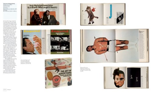
After the efforts of writing Bibliographic the actual design was very enjoyable. Because each spread contains only one book the challenge was in arranging the images to create an enjoyable flow throughout the book. The spreads from the photographed books are so rich with graphic imagery that I was worried that the pages would look like graphic wallpaper if all the images were kept in pro, but changing the scale of the spreads helped to create changing areas of white space and focus the readers attention on one spread at a time.

Could you describe your process for designing books?

Knowing the amount of copy and image count for an average page is the start for any book design project. From this point I can begin to form a grid (invariably using the guides in Derek Birdsall’s excellent Notes on Book Design (Yale University Press, 2004), chose the typefaces, text and headline styles, treatment of imagery and other pagination. This will go to form sample spreads that are approved by the publisher before advancing on the book proper.

What does the future hold for book design?

The evolution of book design seems to move at a glacial pace, its foundations are based on a template centuries old with some 20th Century tweaks by the likes of Lászlo Moholy-Nagy and Gyorgy Kepes. Advances in printing technology have and will allow for more flexibility in how pages are laid out and inevitably there will be new fashions and styles to accommodate but little wholesale change.

Thanks Jason!

6 Comments

Midweek Miscellany

Catcher in the Rye — Illustration and hand-lettering by Toronto-based Darren Booth (self-directed project). Darren has done a rather fine Lord of the Flies cover as well.

The Catastrophist — Chris Hitchens on J.G. Ballard in The Atlantic:

For most of his life, our great specialist in catastrophe made his home in the almost laughably tranquil London suburb of Shepperton, the sheltered home of the British movie studios. He obviously relished the idea of waking one day to find himself the only human being on the planet, to explore a deserted London and cross a traffic-free Thames, to pillage gas stations and supermarkets and then to drive contentedly home.

Read the Printed Word!

I Pledge to Read The Printed Word — Buttons from readtheprintedword.org

“A Day Pass to Fucking Narnia” —  Paul Carr’s ‘Anticipating the Apple Tablet: When Journalism becomes Fan Fiction’ at TechCrunch:

I get that an Apple tablet is big news. I agree with those who say that Apple’s product launches deserve more attention than those from other companies as their products tend to be ‘game-changers’… But until the official launch announcement comes, I would rather not hear another word about Apple and their tablet. Not because it isn’t news – but because so many of the journalists anticipating the launch have dropped any sense of responsibility to their readers and replaced it with cloying fanboyism.

(Please note the funny, if slightly schoolboy, URL of the post)

And finally…

A rather fine new cover by David Drummond.

5 Comments