Skip to content

The Casual Optimist Posts

Something for the Weekend

A fittingly Alvin Lustig-like cover for New Directions by Rodrigo Corral, seen at Book Covers Anonymous.

An Open Book-Publishing Platform — Book Oven’s Hugh McGuire on WordPress as a book publishing platform. It’s an intriguing idea even if don’t accept Hugh’s belief that books and the web will be indistinguishable in a matter of years. And, to judge by the comments, it something a lot of people have been working on.

Afterlife — With the US publication of The Girl Who Kicked The Hornet’s Nest, Charles McGrath looks at Steig Larsson, the late author of the Millennium series, and his unhappy legacy in the New York Times. Sarah Weinman has more on Larsson and the new book (of course)…

Enticement and Exegesis — Knopf designer Peter Mendelsund (who, incidentally, designed the covers for US editions of the Millennium books) on author David Foster Wallace, Infinite Jest, and book cover design:

Book jacket design should concern itself with, in my estimation, equal parts enticement (“Come buy this book”) and exegesis (“This is what this book is about, more or less.”) A good cover doesn’t let one category trump the other. A good cover should not resort to cliché in order to accomplish either. But the real key here, in both categories (enticement and exegesis) is the designer’s ability to work the sweet-spot between giving-away-the-farm, and deliberate obfuscation.

Book jackets that tell you too much, suck. Book jackets that try to change the subject also suck, and are furthermore, too easy.

My interview with Peter about Tom McCarthy’s book “C” is here.

And finally…

It’s a Book, Jackass! — a cute video featuring a tech-loving donkey and a book loving ape for It’s a Book! by Lane Smith, published by Macmillan  (via Chronicle Books):

Comments closed

Penguin RED

Penguin Press Art Director and designer Jim Stoddart talks about his design for the (Penguin Classics)RED edition of Thérèse Raquin by Émile Zola:

Penguin designers Coralie Bickford-Smith and Stefanie Posavec also talk about their designs for series.

There’s more information about the videos and the (Penguin Classics)RED editions on the Penguin Blog and you can see all the covers of all 8 books on Flickr.

You can read my interview with the talented Ms. Bickford-Smith here.

2 Comments

Proust

Open Book Toronto recently asked me to complete their version of the Proust Questionnaire. They have posted my answers — which include recommendations for Memories of the Future by Sigizmund Krzhizhanovsky and Colony by Hugo Wilcken (more of which at a later date I think) — today.  Thank you OBTO!

Comments closed

Flickermood

An amazing typographic feast directed by Sebastian Lange:

(via Nate)

Comments closed

Midweek Miscellany

90 Covers — David McCandless talks about the protracted cover design process for his new book Information is Beautiful (via This Isn’t Happiness):

Engage — Online literary magazine and short fiction hub Joyland — founded by authors Brian Joseph Davis and Emily Schultz — is launching an e-book imprint.

Graphic Novels for Booksellers — A core list compiled by Graphic Novel Reporter.

And if that’s not nerdcore enough for you, take a look at The Periodic Table Of Super-Powers.  “Orphan” is atomic number 1.

Absurdity and Tragedy — Author Jonathan Lethem on Philip K. Dick and his own novel Chronic City at 21C Magazine (via Maud Newton):

I’ve always agreed with the view that – with science fiction – its predictive powers were the least important or least relevant aspect of its public profile. I always loved stuff like Orwell’s 1984, where he explicitly said “It’s 1948, reversed.” I liked writers that were doing allegorical, satirical, fantastical versions of everyday life.

That suggests that Dick’s work is dated to the ’60s and ’70s. And I thought of him very much in this framework, and not as an extrapolative writer… But I think that Dick saw the makings of the contemporary reality we experience so profoundly.

As I’ve mentioned previously, I wanted to like Chronic City more than I did. Dan Green has a comprehensive critique of the book (and Lethem’s post-modernism) at his blog The Reading Experience. Dan is, perhaps, less forgiving than I would be, but definitely smarter…

[W]hile Lethem’s work is consistent with much postmodern fiction in that it is essentially comic, the comedy of a novel like Chronic City is indeed much too gentle, too shy of the more corrosive humor of much postmodern comedy. It isn’t so much that the novel is short on “satiric bite” as that ultimately it is merely satire, a relatively mild critique of post-9/11 New York under Bloomberg, which has become inhospitable to its misfits and nonconformists.

Lethem reads from Chronic City and discusses the book in this video interview with The Guardian.

2 Comments

Something for the Weekend

David Drummond’s Parker Series for University of Chicago Press.

“a little bit Warhol, a little bit Factory Records” —  Christian Schwartz explains why he started type foundry Commercial Type at I Love Typography:

It’s much easier to be an “armchair quarterback,” second-guessing everyone else’s seemingly questionable decisions regarding everything… than it is to deal with the actual reality of budgets, technology, and timelines. Theorizing about how and why things work is all well and good, but putting our ideas into practice is of course the real test…

Typography and JudaicaSteven Heller interviews book designer and typographer Scott-Martin Kosofsky. Fascinating stuff:

It’s the best of times and the worst of times, but I have a feeling that people have always said that… In regard to print, I think we’re at a great moment, with access to mature technology and aesthetics… There’s no excuse for anything looking less than great. But books (and print in general) have lost their pride of place. Book publishers, a group nearly always behind the curve, have failed to grasp that their online counterparts spend a lot of time and money concentrating on User Experience, while they remain unfamiliar with the concept. It wasn’t always that way, but when the professionalism and discipline that was demanded by metal type fell away, things got worse and worse, especially typographically.

Punk — An interview with Jaime Hernandez about Love and Rockets and the recently published The Art of Jaime Hernandez at NYC Graphic:

“That’s how Love and Rockets started: we were just cocky and didn’t know we could fail. We went ahead and published the first one ourselves and didn’t care what the outcome would be, we just wanted to be printed. Hopefully we could sell it and make money, but there was no one to tell us not to. That was the punk part of it. The more we got good response, the more we kept doing it.”

And finally…

The Pollak Coffee Table Book seen at UnderConsideration’s FPO. Breathtakingly beautiful.

Comments closed

Midweek Miscellany

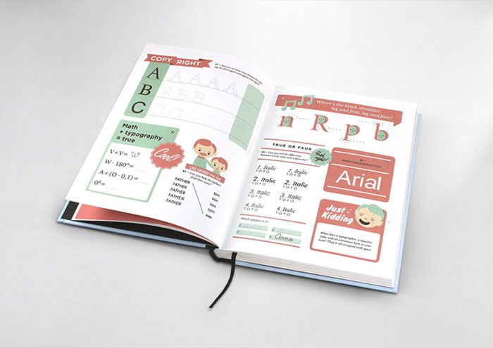
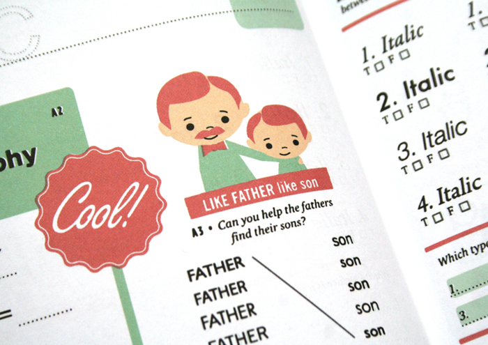
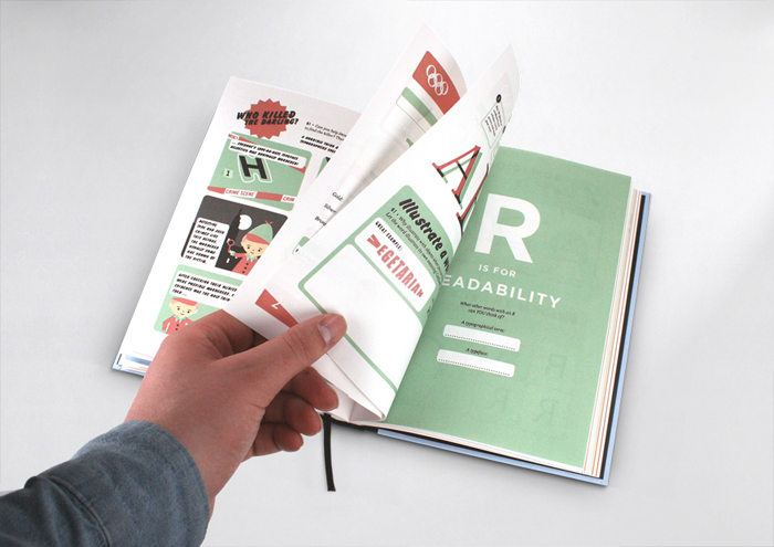
Hyperactivitypography from A to Z — An activity book for typographers (in a lovely retro style) by Norwegian design agency Studio 3. You can flip through the book here.

Life As Lived — Author Sarah Bakewell (How To Live) kicks off a 7-part series on Montaigne in The Guardian:

What is it to be a human being, he wondered? Why do other people behave as they do? Why do I behave as I do? He watched his neighbours, his colleagues, even his cat and dog, and looked deeply into himself as well. He tried to record what it felt like to be angry, or exhilarated, or vain, or bad-tempered, or embarrassed, or lustful. Or to drift in and out of consciousness, in a half-dream. Or to feel bored with your responsibilities. Or to love someone. Or to have a brilliant idea… but forget it before you can get back to write it down…

And also in The Guardian

Alternatives — Tom Lamont asks designers why book covers look different from territory to territory:

Why don’t publishers, then, replicate covers that have been a success abroad? “It does happen but it’s quite rare,” says [Julian] Humphries [art director, Fourth Estate]. Megan Wilson, an art director at Knopf Doubleday in New York, says that American designers are sometimes asked to look at British jackets, “as an example of something that works or doesn’t, but we are rarely asked to use them directly”. [Nathan] Burton tries to avoid looking at alternative covers if he’s working on a book that’s already been published. “It can take you off on odd tangents. It’s always best to work from fresh.”

Great. But, please, can we declare a journalistic moratorium on  “judge a book by its cover” headlines?

“We are your platform”Richard Nash, formerly of Soft Skull, talks about his new start-up Cursor at The Literary Platform. There’s something about this that reminds me of Factory Records in good ways and bad…

A Question of Audience — With Julie Bosman taking over the publishing beat at the NY Times from Motoko Rich, Sarah Weinman breaks down what kinds of book and publishing stories appear in North American newspapers:

I’ve become increasingly aware the longer I’ve written about publishing for a business news site that some stories that are big news within the industry carry little relevance outside of publishing circles. That means certain news items I pay attention to and analyze to death via Twitter… won’t merit larger stories. It also means that certain topics that are discussed endlessly in the publishing bubble (especially the digerati-populated one), while relevant to the outside world, have to be written about in a way that might come off as eye-rolling rehash.

I think Sarah’s being charitable here. Many of the topics discussed endlessly in the publishing bubble and the Twittercosm have absolutely no relevance to, or perceivable impact on, the outside world…

Undercover Icon — A New York Times profile of Irving Harper, the man behind many of George Nelson Associates‘ iconic designs (via The Scout):

“I don’t have a complex mind,” Harper said, and if this assertion seems disarming coming from a designer of his sophistication, the thought is sincere… “With a computer there are too many choices, and I always liked working within limits,” he said. “You know, if you look at Mozart, who had this strict classical framework — an allegro, an andante, a scherzo and a finale — you see that within that formula, he got results he might never have gotten if he had all the options in the world.”

There is more on Harper in a Metropolis Magazine profile from 2001, and a monograph of his paper sculptures by Michael Maharam is apparently on the way (if anyone has details please let me know).

Comments closed

Up There

Up There is a beautiful 12-minute documentary about hand-painted advertising in New York by Malcolm Murray (sponsored by Stella Artois).

It has nothing to do with books — unless you happen to consider print another fading tradition — but I wanted to share it nevertheless:

UP THERE from Jon on Vimeo.

1 Comment

Something for the Weekend

Filthy English — a new cover design by Dan Mogford for Portobello Books.

Hip Flask — An interesting interview with the folks behind 48 Hour Magazine at Gizmodo. There’s some great stuff in the piece, and it’s worth reading from beginning to end, but I particularly liked this insight from Derek Powazek (founder of Fray, co-founder of JPG Magazine, and consultant at MagCloud*):

Print is, at some point, done. However imperfect. It has a rhythm of creation, editing, and publishing. And when it’s done, everyone involved can sit back, look at the thing we made, and feel accomplished.

The web is never done. It’s in a constant state of flux. That’s not good or bad, it just is.

Powazek is also the guy behind Strange Light a print-on-demand magazine that collected photographs of the Australian dust storm that covered New South Wales and Queensland in September last year. He has interesting post about the creation of the magazine on his blog.

No. — A Tumblr that’s apparently devoted to found-type numerals.

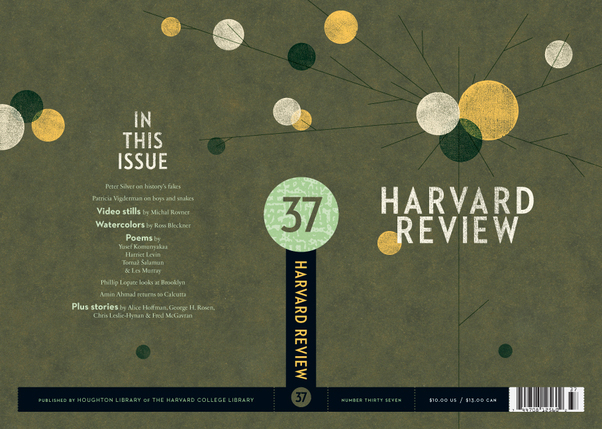
The latest Harvard Review cover by Alex Camlin. My interview with Alex is here.

*Does this make anyone else feel slightly inadequate? — I mean, what have you founded, co-founded or consulted on today?

Comments closed

Midweek Miscellany

Michael Cho‘s cover for the Best American Comics annual 2010 published by Houghton Mifflin Harcourt. Fantastic.

Undefined — The Caustic Cover Critic interviews illustrator and designer Alice Smith:

After sketching ideas, I make compositions using inks and pens to bring collages together, the pen marks might have disappeared in the finished composition, but it’s the pen marks and the rough sketch that helps bring it together. I use old imagery for ethereal effect, playing with visual alchemy and nostalgia. And the quality of printing pre 1950s, photoengravre and proper litho is so much nicer than the pixel fuzz and dots of newer digital printing.

Alice’s portfolio is here.

Scraps of Paper — An interview with superstar designer Rodrigo Corral in Metropolis magazine:

[T]he parts of the process that are unique and special really come from the individual designer’s experience. I think about the people who might read this article, and assuming some will be design students or younger people just getting into book design, I have to say that in order to come up with ideas—which, aside from a solid understanding of typography and typographical context is the most important part of all of this—you have to have an understanding of what has come before and what is current. I’ve spent years in used bookstores and magazine shops looking, admiring, and collecting, and this is all a part of the “design process.” The things I have stored in my brain and all that is still out there to see and learn are all part of the process.

Bought and Discarded — Simon Akam explores the sidewalk booksellers of New York for More Intelligent Life:

What wasn’t clear was what it meant to have a big presence on secondhand stalls. Was it an honour for a book, or a slur on its author’s reputation? Which was more significant—the fact that so many copies had been bought by someone, or the fact that they had since been offloaded again? To add insult to injury, were the titles I encountered in droves lying on the stalls because today’s reading public chose not to pick them up, even at a much reduced price? I needed to find out whether the champions of my survey were much loved, or doubly scorned.

And finally…

The Road: Scenes From the Post-Print Apocalypse by Peter Kuper for the New York Times (via The Ephemerist).

2 Comments

Q & A with Ferran López, Random House Mondadori

I came across the work of graphic designer Ferran López after stumbling on his wonderful book cover blog The Jacket Museum.

Based in Barcelona, and currently working at Random House Mondadori — the Spanish-language joint publishing and distribution venture between Random House and Italian publisher Mondadori — Ferran’s eye for typography and background in photography is evident in his sharp book cover designs.

Although I want to interview more designers who work outside of Canada, UK and US at The Casual Optimist, the opportunity doesn’t often present itself because of my almost total inability to speak any other languages. But when I noticed that Ferran publishes his blog in both English and Spanish, there was absolutely no excuse not to speak to him!

I’m really happy to be able to include Ferran’s answers in both English and Spanish in this interview, but I have also posted all the questions and answers in just Spanish for those who would prefer to read it that way.

And I do want to say a big thank you to Ferran for both his patience and for providing the translation…

How did you get into book design?

Merely by chance. Although my training is photography and I was a photographer for many years, more and more my jobs were getting closer to the world of graphic design. At the end of the year 2000 I was working as a freelance designer and moonlighting doing digital photography manipulation and retouching. Around this time I met Marta Borrell, the Art Director at Random House in Spain (before the joint-venture with Mondadori). She was looking for a graphic designer to work in-house on trade book cover design. Even though I had never tried book design, I was enthusiastic about the idea because I love books. Marta liked my portfolio and my enthusiasm. She took a chance on me and (I like to think) it turned out all right! We have been working together for a decade now.

Casi por casualidad. Mi formé como fotógrafo, aunque desde hace muchos años mi trabajo, por vocación, fue acercándose cada vez más al diseño gráfico. A finales de 2000 trabajaba como diseñador free-lance y en manipulación digital de fotografía. Fue entonces cuando conocí a Marta Borrell, la directora de arte de Random House en España (por aquel tiempo previo a la joint-venture con Mondadori) que estaba buscando un diseñador para la división de libros Trade. A pesar que nunca había trabajado con libros estaba entusiasmado con la idea, ¡me encantan los libros!. A Marta le gustó mi portfolio y mi entusiasmo.  Apostó por mi y creo que la cosa resultó bien. Llevamos ya una década trabajando juntos.

Briefly, could you tell me about working at Random House Mondadori?

It reminds me of a sequence from Billy Wilder‘s “One, Two, Three”. The pace is frantic and the procedures are complex at times, but, although it sounds like a cliché, it is impossible to think of a team of better professionals. Almost everyone in the workplace is young (even the CEO is younger than me!) and this translates into passion. There are 13 of us In the Art Department and sometimes we seem like family or better yet a clan. We suffer a lot, but always together! Just kidding! But at times, when someone is under a lot of pressure or creatively blocked, there is always someone to lend a hand, or at least have a coffee break with.

Se parece mucho a una secuencia de «Uno, Dos, Tres» de Billy Wilder. El ritmo es frenético, los procesos a menudo complicados pero, aunque suene a cliché, es imposible imaginar un equipo de mejores profesionales. Es una empresa joven (¡Hasta la Consejera Delegada es más joven que yo!) y creo que eso se traduce en entusiasmo.

En el departamento de diseño somos 13 personas, a veces parecemos una familia o incluso un clan. Sufrimos mucho, pero siempre juntos. Es broma; pero a veces cuando alguno de nosotros está bajo mucha presión o bloqueado siempre hay alguien con quien compartir el proceso, consultar o al menos con quien tomar un café.
What is your current role there?

At the moment, I am responsible for the Design of the Trade Commercial and the Paperback divisions. In the Paperback Division my job is basically coordination and support. As a designer, my job is mainly centered in book covers for Commercial Trade, bestsellers, novels and mass-market non-fiction for the “Plaza & Janés” and “Grijalbo” imprints.

Also, since its establishment in 2004, I’m also in charge of the “Caballo de Troya” imprint, an experiment: a small independent publisher within a huge publishing company.

Actualmente soy responsable de Diseño de las divisones Trade Comercial y Bolsillo. En la división de bolsillo mi función principalmente es estratégica y de apoyo. Como diseñador mi trabajo se centra en las cubiertas de los libros de Trade Comercial: best-seller, novelas y no ficción de carácter masivo, en los sellos Plaza & Janés y Grijalbo.

También, desde su fundación en 2004 me encargo de Caballo de Troya, casi un experimento: un pequeño sello independiente que vive dentro de un gran grupo editorial.

Approximately how many covers do you work on a season?

About 100 new books a year.

Unas cien novedades al año.

Could you describe your design process?

I don’t follow the same procedure with every book. Some times, I read the briefing and I start visualizing the cover, the message, the photo or the illustration that seems to fit the book. Other times, I need to read, comment, draw, write, web-surf, look out the window and make several trips to the coffee machine to obtain what I want to transmit visually. At times, nothing seems to work and then I begin creating an idea by a typographical approach to unblock myself.

No sigo el mismo proceso con todos los libros. A veces, tal como leo el briefing, empiezo a visualizar la portada, el mensaje, la fotografía o la ilustración que a mi parecer encaja. Otras veces necesito leer, comentar, dibujar, escribir, navegar, mirar por la ventana y hacer varios viajes a la cafetera para conseguir saber lo que quiero que visualmente transmita. En algunas ocasiones ningún método parece funcionar y entonces para desbloquear empiezo a creando la imagen desde la aplicación tipográfica.

What are your favourite books to work on?

Novels where I can’t help getting infatuated with one of its characters. Also books where I can give the cover a hidden meaning or a wicked twist. And finally, those low stream books with a small print-run where I can use daring images.

Aquellas novelas en los que me enamoro perdidamente de alguno de sus protagonistas (a veces es inevitable), los libros en los que se puede esconder una segunda lectura o un giro perverso en la portada y finalmente aquellos libros minoritarios con un corto tiraje que permiten utilizar imágenes más arriesgadas.

What are the most challenging?

Books with complex plots and/or multiple sub-plots. Those where the parties involved in the process of approval (editors, marketing staff, sales, etc.) have diverse ideas of what should the cover reflect. And off course, those books which the sales expectations are extremely high…The pressure is on!

Los libros con tramas laberínticas o con múltiples mensajes y subtramas. Aquellos en los que las distintas partes implicadas en el proceso de aprobación tienen visiones muy distintas de lo que debe comunicar la portada. Y por supuesto aquellos en los que las expectativas de venta son muy altas: The pressure is on!

When you’re working on translated books, do you look at the US or UK covers, or do you try to avoid them?

We always take the original cover into consideration. When a new book comes up, we review the original cover with its editor and the marketing department to see if it would work in Spain. With some authors, for instance, Stephen King or Terry Pratchett, we don’t even consider changing it — their fans would never forgive us. In any case, whether we use the original covers or not, they always help us as guide to which way we want to go.

German and Italian cover versions are always good reference.

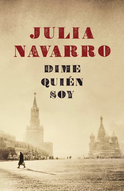
An interesting example is the case of Ken Follet’s “World Without End”. We had both US and UK editions and I designed an adaptation combining the best elements of both. Now, we have the best of them all!

Siempre tenemos en cuenta la portada original. Cuando se presenta el libro valoramos en conjunto con edición y marketing si la portada puede funcionar o no en nuestro mercado. Con algunos autores, como Stephen King o Terry Pratchett ni siquiera nos planteamos el cambio, sus seguidores no nos lo perdonarían. En cualquier caso, utilicemos la portada original o no, siempre nos sirven de guía. Las ediciones alemanas e italianas también son dos buenos referentes.

Como caso curioso, para la edición española de «El mundo sin fin»  de Ken Follet compramos la portada estadounidense y la británica e hice una adaptación combinando lo mejor de ambas. ¡Ahora nuestra portada es la mejor!

Where do you look for inspiration and who are some of your design heroes?

Design books, movie and TV series imagery. Supermarket shelves and flea markets. Second hand book shops and record stores. Obviously on the Web (piece of cake!). Besides book cover design blogs, Ffffound!, But Does it Float, Grain Edit and Some Random Dude are among my favourites.

Spain’s very own Daniel Gil is perhaps responsible that I am working in this field. When it comes to contemporary designers there is a bunch of good ones: Rodrigo Corral, Henry Sene Yee, David Wardle, John Gall, Juan Pablo Cambariere, Peter Mendelsund, Darren Haggar…My list goes on…

En los libros, en el cine y en las series de televisión. En las estanterías del supermercado y en los mercadillos. En las tiendas de discos y libros de segunda mano. En Internet (¡es tan fácil!); además de los blogs de diseño editorial, Ffffound!, But Does it Float, Grain Edit y Some Random Dude son mis sitios favoritos.

El español Daniel Gil es quizás el principal responsable de que ahora mismo yo esté haciendo esto. En cuanto a los contemporáneos hay un buen grupo de excelentes diseñadores: Rodrigo Corral, Henry Sene Yee, David Wardle, John Gall, Juan Pablo Cambariere, Peter Mendelsund, Darren Haggar… Es imposible no dejarse alguno…

What does the future hold for book cover design?

Obviously, things in this field are going to change, but I cannot imagine how. It is completely unforeseeable. In any case, I think covers will always be a great vehicle to sell books, no matter what the medium is. We will just have to wait and see how it will affect our way of working, our tools and our approach.

Las cosas van a cambiar, de eso no me cabe duda, pero me cuesta imaginar como. Es imprevisible.

En cualquier caso creo que las portadas seguirán siendo un argumento excelente para vender libros, sea cual sea el soporte. Si esto es así habrá que ver como afectará a nuestra manera de trabajar, nuestras herramientas y nuestros procesos.

Thanks (gracias!) Ferran!

8 Comments

Midweek Miscellany

Born Modern Alvin Lustig

I’m currently in Vancouver for the Raincoast Books sales conference and I was very happy to see Born Modern: The Life and Design of Alvin Lustig by Steven Heller and Elaine Lustig Cohen on Chronicle Books Fall 2010 list. Design:Related has a short piece about the book here.

(Obvious disclosure: Born Modern will be distributed in Canada by my employer Raincoast Books).

Lessons from Allen LaneJames Bridle on what publishers can learn from the founder of Penguin Books:

Amazon is an infrastructure company, Apple a technology and design company, Google is a search engine. None of them will be able to replicate publishers’ passion for books.

But to take advantage of this, publishers need to look… beyond one-size-fits-all definitions of our product, and beyond publicity-grabbing, short-term management and imprint rearrangements that have nothing to do with readers’ demands.

In short, we need to walk down that platform with Allen Lane again, take a long look at where and how people are reading, and help them to find a good book.

Unknown — The Guardian discusses lost and undiscovered literature, including the work Sigizmund Krzhizhanovsky:

Eventually Krzhizhanovsky succumbed to despair and stopped writing, choosing instead to compose his narratives in his skull. Even those works that were written down, however, feel internal, hermetic. Clearly Krzhizhanovsky expected to remain unread, and so could be as dense and complex as he wished. But if the stories are not always easy to follow, they’re always worth the effort.

The marvelous NYRB recently published Memories of the Future, a collection Krzhizhanovsky’s short stories (and it’s very good).

48 Hour Magazine — Can you write, photograph, illustrate, design, edit, and ship a magazine in two days? An interesting team of people want to find out…

A Lack of Ideas — at The New York Times book blog Paper Cuts tries to define what makes a cliché:

“Words can be overused, or used thoughtlessly…but a cliché… is a phrase that substitutes for a thought. The dictionary calls it ‘an expression or idea that has become trite.’ Individual words don’t become trite — except in a context…”

[W]hat ought to concern readers, writers and editors most is not necessarily the overused words (we all get sick of “lyrical” and “compelling” and their ilk), but rather the intellectual laziness their overuse might signal.

And finally…

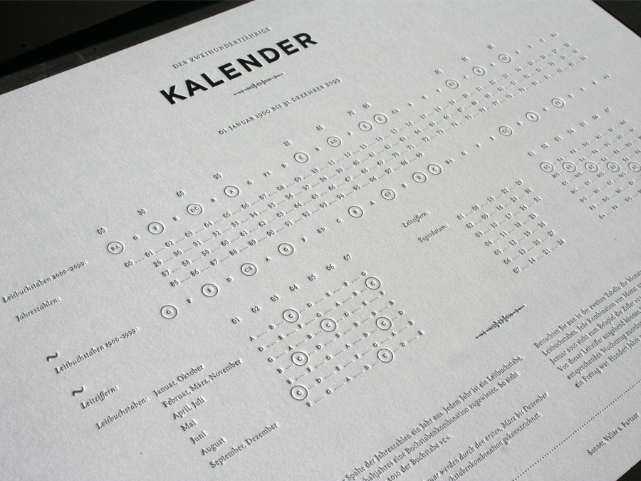
200 Year Kalendar — A beautiful letterpress calendar produced by German design studio Sonner, Vallée u. Partner, seen at Studio on Fire’s blog Beast Pieces (via ISO50).

Comments closed