Skip to content

The Casual Optimist Posts

Some Football Literature for the Weekend

Somehow I managed to miss most of the hype leading up to the World Cup, but now that things are about to kick off I’m actually genuinely excited (not least by England vs. The U.S. on Saturday) and have spent the last couple of days catching up. Here are a few literary, typographical, and just plain interesting things that I’ve stumbled across…

Soccer Aid — A typographic poster for the World Cup designed by Treble Seven | 777 in aid of UNICEF.

Simon Kuper, author of Soccernomics, on CBC Radio’s The Current discussing the World Cup.

The very same Simon Kuper reviews four books about the World Cup and African football for The Financial Times:

Great claims are often made for football’s significance. In fact it’s almost always a mirror rather than a gun: it reflects society, rather than changing it. Usually the sport has just one significant effect on real life: it makes people happier. At least, it usually does.

Nation’s Only Soccer Fan Becoming InsufferableThe Onion of course:

According to sources only peripherally aware of the World Cup, Janovich’s infuriating behavior first became apparent during a Super Bowl viewing party last February when he repeatedly used the phrase “American football” to describe the action on the field. In recent weeks, Janovich has also begun referring to the supposed suspense involved in choosing the players for the U.S. “side,” and has struck up several extended but one-sided conversations concerning figures such as “Kaka” and “Ronaldinho,” generally mystifying and alienating everyone he has come into contact with.

Typographic World Cup T-Shirts. Sadly Drogba is already out for the Ivory Coast, but otherwise these are great (via Kottke).

How Did Football Get So Big? — Tim de Lisle at Intelligent Life:

If the hype is extraordinary, so is the ambient presence. The last World Cup was all around us, on billboards, drink cans and cereal packets, on garage forecourts and millions of flag-bearing cars, in the windows of Boots the chemist and McDonald’s the burger joint (“Want tickets? Win tickets! Buy any large meal to play”). The cup-winning captain from 1966, Bobby Moore, was on every KitKat wrapper, despite having died 13 years earlier; his team-mate Geoff Hurst, now Sir Geoff, was appointed director of football for McDonald’s and had columns in two newspapers. The boys of 1966 were bigger in 2006 than they were in 1966.

Footballers as Film Stars — In a related item at the Intelligent Life blog looks at the Nike’s slick World Cup commercial created by Oscar-winning director Alejandro González Iñárritu (Babel):

And finally… A few literary football lists:

And, not to be outdone, here’s a list of 10 football books worth your time (in no particular order) compiled at great haste for The Casual Optimist by my good friend and recovering sportswriter Nick Clifford who is a great source of useless facts about the beautiful game:

  1. Football Against The Enemy by Simon Kuper
  2. Brilliant Orange: The Neurotic Genius of Dutch Football by David Winner
  3. Full Time: The Secret Life of Tony Cascarino by Paul Kimmage
  4. Futebol: The Brazilian Way of Life by Alex Bellos
  5. The Hand of God: The Life of Diego Maradona by Jimmy Burns
  6. Morbo: The Story of Spanish Football by Philip Ball
  7. Calcio: A History of Italian Football by John Foot
  8. Soccer in the Sun and Shadow by Eduardo Galeano
  9. Among the Thugs by Bill Buford
  10. The Ball is Round: A Global History of Soccer by David Goldblatt

(full disclosure: this list has a couple of late additions from me, so if you disagree, it will probably be with my selections — Nick has impeccable taste).

Update: Flavorwire also has a list of 6 books to read during the World Cup.

2 Comments

Midweek Miscellany

Chris Ware’s cover for the latest issue of The New Yorker (via The Ephemerist).

Pop Will Eat Itself — Author Lev Grossman (The Magicians) on automated recommendations:

[Recommendation engines] introduce us to new things, which is good, but those new things tend to be a lot like the old things, and they tend to be drawn from the shallow pool of things other people have already liked. As a result, they create a blockbuster culture in which the same few runaway hits get recommended over and over again. It’s the backlash against the “long tail,” the idea that shopping online is all about near infinite selection and cultural diversity. It has a bad habit of eating its own tail and leaving you back where you started.

The Dark Underside of American LifeThe Observer‘s film critic Philip French on the late Jim Thompson and Michael Winterbottom‘s film adaptation of The Killer Inside Me:

Thompson was a man of the left, a lifelong alcoholic and became closely acquainted with the dark underside of American life, the lonely crowd where petty criminals, low-level cops, conmen and prostitutes rub shoulders… One of Thompson’s critics has called him without disparagement “a dime novel Dostoevsky”…

And finally… Popville, a super stylish pop-up book by Anouck Boisrobert and Louis Rigaud, published by Macmillan (thanks Sio!):

5 Comments

Gil Scott-Heron Redesigns by Stuart Bache

Born in Chicago, April 1, 1949, poet and musician Gil Scott-Heron is perhaps best known for the politically infused bluesy soul and proto-hip-hop he created with Brian Jackson in the early 1970’s.

Although recently troubled by drug addiction and in and out of prison for drug possession, an apparently resurgent Scott-Heron released his first studio album in 16 years, I’m New Here (XL Recordings), in February, and two of his novels — The Vulture (1970) and The Nigger Factory (1972) — were reissued (for a second time) by Canongate Books with new cover designs by talented UK designer Stuart Bache.

I recently talked to Stuart about Gil Scott-Heron and the redesign…

How did you get into book design?

I fell upon book cover design by shear luck. In late 2005, after a stint of travelling, I decided it was time to think about my career. I found, applied and was surprised (and ecstatic) to be given the job of Junior at Hodder & Stoughton and moved to London.

When did you discover the work of Gil Scott-Heron?

I first discovered Gil Scott-Heron way back in school. We had been reading and discussing To Kill a Mocking Bird in English Class and I remember taking a real interest in the subject, which my teacher at the time picked up on and loaned me both The Vulture and The Nigger Factory.

How did you come to design the covers of his books?

It was a great pleasure to be asked to design the covers for the reissues. I had already been doing some work for Canongate and so when the Art Director asked if I had time to come up with ideas for the reissues I jumped at the chance. It was a fairly short deadline, but I believe those to be the best kind, great for creativity (and a few extra grey hairs).

Could you describe your design process for the covers?

The brief asked for them to be fresh, streetwise, graphic and contemporary. I designed a few covers for each title, with different images and branding styles, which were then passed on to Canongate for their prefered direction.

The final The Vulture cover centred around John Lee (the young lad who is murdered) and the title cried out to be used in some sort of graphic function. The Nigger Factory relied heavily on an image that both showed and did justice to that moment in US history. It also needed a graphic so I added the stripes to represent the flag, but the use of red paint strokes shows the heat and anger involved too.

What is the typeface?

The typeface I used is Futura, probably light. I have a thing about Futura, Century Gothic and the like. It’s the perfect circles of the ‘O’ and ‘C’.

Are they a departure from your usual design work?

These covers stand out for me, especially compared to my usual style. I take a lot of pride in my work but I’m never usually proud of it — I always see something I could have done better. But the Gil Scott-Heron’s showed I could do something completely different…and in a short timescale too.

What are you working on currently?

At the moment I’m working on another title for Canongate called Super Cooperators and Aline Templeton’s new thriller Cradle to Grave for Hodder & Stoughton. This time of year tends to be quiet, too quiet really, but these are nice titles to be getting along with. Cradle to Grave gives me the opportunity to play with my homemade textures and brushes in Photoshop, and Super Cooperators is, once again, going to be something very different from the rest of portfolio.

Where do look for inspiration and who are some of your design heroes?

Ever since I’ve been freelance I have had a renewed enthusiasm for design, I notice everything and I’m hardly out of bookshops — I see books all the time that I think ‘I wish I’d designed that’. It really keeps you on your toes and gives you the incentive and the push to do better.

I owe a lot to Hodder & Stoughton, their Art Department has some of the best designers in the industry and I learned an awful lot during my time there — and if they had never given me the chance I wouldn’t be writing this now.

Thanks Stuart!

Comments closed

Something for the Weekend

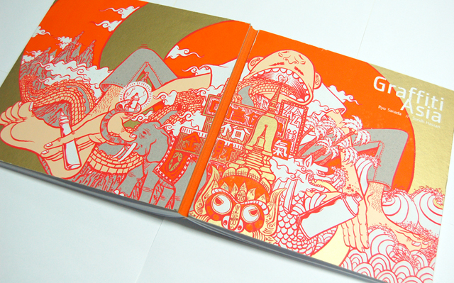
The stunning cover of Graffiti Asia by The SRK‘s Ryo Sanada and Suridh Hassan.  The image doesn’t entirely do it justice as the ‘brown’ is actually spot metallic gold (I think it’s ink, but correct me if I am wrong):

(FULL DISCLOSURE: Graffiti Asia is published by Laurence King, who are distributed in Canada by my employer Raincoast Books).

The Best Film Books chosen by 51 critics for Sight & Sound magazine. The somewhat esoteric Top 5 is here.

The Death and Life of the Book Review — Despite being a well-ploughed furrow (and the predictable nostalgia for print reviews/skepticism about the web) this essay by John Paletta in The Nation is an interesting read, not least because he recognises that the culture of newspapers has downgraded book review sections:

The book beat has been gutted primarily by cultural forces, not economic ones, and the most implacable of those forces lies within rather than outside the newsroom. It is not iPads or the Internet but the anti-intellectual ethos of newspapers themselves… In a news context, “anti-intellectual” does not necessarily mean an antipathy to ideas, though it can be that too. I use the word “anti-intellectual” to describe a suspicion of ideas not gleaned from reporting and a lack of interest in ideas that are not utterly topical.

The Host — KCRW’s Bookworm Michael Silverblatt interviewed in The Believer:

I’ve read all of the work, or in some cases as much of the work as is humanly possible. We all have time and deadlines, accidents, emergencies, but I read as much of it as I can. I’m very against interviewers who do not have time to read the work, who accept jobs knowing that they don’t have time to do the preparation. And that is almost everyone who has a daily interview program. How could you read, or see, or watch, or hear as much as you need to? So, you wing it. And it’s not going to stop. Winging it is going to be the American way.

And speaking of Bookworm, Michael talks to David Shields (Reality Hunger: A Manifesto) and Anders Monson (Vanishing Point: Not a Memoir) about the “New Prose” on this week’s show (NB: I am posting this mostly because Anders Monson references my favourite scene from the TV show Futurama in the first five minutes of the interview):

The Death and Life of the Book Review

Comments closed

Time & Again

Time & Again is a melancholy short film by Jacques Khouri about a man’s repetitive daily life. It is beautifully done with animated Chris Ware-like sequential panels:

(via Drawn!)

3 Comments

Midweek Miscellany

A nice post about the US cover for The Girl With Dragon Tattoo — designed by Peter Mendelsund — and why it is so different from all international versions at the Knopf website:

[Peter] decided to shift away from the more traditional murder-mystery vibe of the foreign editions, instead providing a neon yellow in-your-face punch, a jolt of energy comparable to what Salander brings to the narrative… Knopf’s twist was achieved with the subtle interaction of the Trade Gothic type and a great piece of art in yellow and orange Day-Glo inks. Add a dash of cyan (shades of colors in the blue/green spectrum) to create the green dragon lurking in the background and a tablespoon of black for the title, flap copy, and Stieg’s photo, and voilà!

HP Sauce — Anis Shivani interviews Calvert Morgan, vice president and editorial director of Harper Perennial, for the Huffington Post:

[T]here’s an intensity of dialogue about writing online–and about fiction in particular–that was not happening ten years ago. A lot of the writers I work with are finding like-minded peers and readers, having a forum for discussion now that simply wasn’t available when the only venues you had to get published were little magazines that were distributed to a handful of shops across the country in physical form. We’re passionate proponents of the physical book and we don’t think it’s ever going to go away, but we also know that these online forums… are promoting the interest that these writers have in each other and in fiction generally in a way that can only be good for contemporary writing.

The 11th Plague — In an extract from his new book, My Experimental Life, author A.J. Jacobs gives up multitasking for a month:

Multitasking makes us feel efficient, but it actually slows down our thinking. Our brains can’t handle more than one higher cognitive function at a time. We may think we’re multitasking, but in fact we’re switchtasking, toggling between one task and another. The phone, the email, the phone, back to the email. And each time you switch, there’s a few milliseconds of start-up cost. The neurons need time to rev up.Apparently, multitasking costs the US economy $650bn a year. I’m starting to think this isn’t a problem along the lines of love handles or bad mobile phone service. This is the 11th Plague.

My first day without multitasking… My brain is not cooperating. What the hell is going on? it whines. Where’s my damned stimulation? I sit at my desk and read the newspaper. That’s all. Without checking my emails or eating breakfast at the same time.

This is awful. I feel as if my brain has entered a school zone and has to slow down to 25mph. My plan is to leave my BlackBerry off until noon. I break down at 11.30am.

See also: James Sturm quits the internet.

And finally…

Last Generation of Typewriter Repairmen — Wired visits 3 typewriter repair shops in the Bay area:

Typewriter repair may be a dying art, but it is not a dying business. All three of the shops…  seemed to generate a comfortable living for their respective owners, supported by an eclectic clientele of collectors, design enthusiasts, prison inmates and tweenage girls.

In every case, however, the technicians in charge say that there won’t be a next generation to take their places. If they are right, as time goes on fewer and fewer of the old manual machines will remain in working order. That said, crops of amateur enthusiasts have sprung up to save other obsolete technologies from disappearing entirely…

For many people, the limitations of early writing machines, with their mono-font and unforgiving keyboards, are part of their charm. That bodes well for the future of typewriters, even after the last professional repairman hangs up his apron.

3 Comments

The Distant Hours

Andersen M Studio, the team behind the amazing stop-frame animation book trailer Going West, have produced another stunning short film using intricate paper cut-outs for Kate Morton‘s new novel The Distant Hours (to be published by Pan Macmillan):

(via Creative Review)

5 Comments

Agents of Change

There’s a great op-ed by Stephen Page, chief executive of Faber & Faber, in today’s Guardian about the iPad and publishing:

It’s clear that publishers must move faster to establish our compelling and useful role in the modern life of reading. While acquiring new expertise, we must assert the best of our traditional strengths; providing capital (in the form of advance payments), offering editorial expertise, and creating a readership by designing, creating, storing, promoting and selling the works of writers. But that’s not enough. Publishers also have to explain what value they are bringing to the relationship between writers and readers, a conversation that is made far more transparent through digital media and digital texts.

Page goes on to list what he sees as guiding principles for publishing going forward. These include retaining print and digital rights, reviewing royalties, flexible pricing, connecting to readers, and excellent metadata. He concludes:

The iPad launch is not the moment, but that’s because the moment has passed. We need to work with authors in new ways, and keep pace with reading’s evolution, or better still become agents of change ourselves.

It’s a must-read. If you work in publishing, send it to your CEO.

1 Comment

Something for the Weekend

The charming illustrated cover for John Waters’ new memoir Role-Models by Eric Hanson, who also happens to be the author of A Book of Ages. Art direction on Role-Models by Susan Mitchell at FSG I believe.

And while we’re on the subject of nice book covers…

Isaac Tobin, senior designer at University of Chicago Press, talks to FaceOut Books about his witty cover for Adrian John’s Piracy. You can read my interview with Isaac here.

On the Dohle — PW takes a (slightly fluffy) look at Marcus Dohle’s first two years at the helm of Random House.

Allen Lane to Amazon — A nice audio slide-show history of British publishing in the 20th century at The Guardian.

And speaking of Allen Lane…

Puffin by Design: 70 Years of Imagination (1940 – 2010) seen at The Penguin Blog.

And Simon Houpt on Penguin’s 75th anniversary and their iconic brand in today’s The Globe & Mail:

Until a couple of days ago, Keir Hardie had no idea how many Penguin books he owned. For years he’d been collecting them informally, picking up a few at a time at second-hand shops. “Like a lot of fans, I grew up in a house with Penguin Books on the shelves,” he wrote in an e-mail this week, from his home in Inverness, Scotland. It was the books’ iconic design, he explained, that first grabbed his eye. “There was never much of a pattern to anything else, but the uniformity of the Penguins made them stand out.”

Indeed.

Comments closed

Midweek Miscellany

Caustic Soda — James Morrison AKA Caustic Cover Critic talks about five great covers (and a few terrible ones) at Flavorwire. The great ones include Charlotte Strick‘s design for 2666 by Roberto Bolaño. Charlotte talked about this cover and boxed set with FaceOut Books a while back.

The Case of Abundance — The formidable Clay Shirky interviewed at Publishing Perspectives:

We are already in a world where most books are incomprehensible to most people –- whether that be content comprehension or the question “why would anyone publish that?” — but we don’t notice that anymore.

What has happened with the web is that there is so much content that we have broken all the old filters. And for now, we are experiencing it as the completely overburdened and chaotic environment that it is. But that doesn’t mean people should stop publishing online. It just means that we need better filters. Because in fact, the over-publishing of content has been a normal problem since the invention of the printing press. It’s just that we had ways of ignoring things we didn’t care about. The problem isn’t getting people to shut up, the problem is creating filters to help people find their way to things they want.

And finally…

I’m probably the last person on the interwebs to discover Erik Heywood’s blog on books, bookshelves, bookstores, and libraries (etc.), but it really is quite lovely (via The Silver Lining).

Comments closed

What Is All This?

Fantagraphics Art Director Jacob Covey‘s first foray into designing for prose fiction is this cover for a 600-page collection of short stories by Stephen Dixon, What Is All This?

Incidently, Jacob also did a nice job colouring Gilbert Hernandez‘s cover art for Kristen Hersh‘s new memoir, Rat Girl. The design is by Jaya Miceli at Penguin Books:

You can read my interview with Mr. Covey here.

I colored Gilbert Hernandez’s cover art to Kristen Hersh’s new memoir, Rat Girl. Fairly easy job but it gives me an excuse to plug the book and the design work of Jaya Miceli over at Penguin Books.

2 Comments

Work with a Publisher!

I love Tom Gauld:

Comments closed