Skip to content

The Casual Optimist Posts

Something for the Weekend

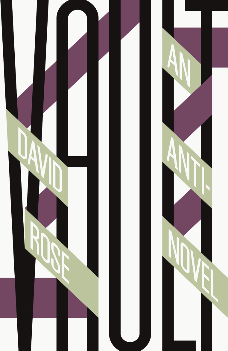
A distinctively typographic cover by David Pearson for Vault by David Rose, new from Salt Publishing.

Giving Up Irony — John Self reviews Edward St. Aubyn’s At Last:

The author’s background, like Patrick’s, is of inherited wealth; perhaps it is this which enables him to treat his characters mockingly and sympathetically at the same time. His brittle, witty prose evokes comparisons with Evelyn Waugh, whose snobbish attraction to the upper classes, looking in on them from without, contrasts with St Aubyn’s cool-eyed appraisal. The phrase “a handful of dust”, quietly slipped into At Last, could be an acknowledgement of the similarities and contrasts.

Patrick is like his creator, not just in his background, but in his stylistic weaknesses:

“It’s the hardest addiction of all. Forget heroin. Just try giving up irony, that deep down need to mean two things at once, to be in two places at once, not to be there for the catastrophe of a fixed meaning.”

The Architecture of the Secret Lair — Mark Lamster for Design Observer:

The Bin Laden compound makes an interesting contrast with the secret modern lairs created for Bond villains by the legendary production designer Ken Adam. These have routinely been described as unrealistic, insofar as they could never be built without drawing attention. It’s curious now, in retrospect, to think that it was fear that kept the local population from Dr. No’s island hideaway (which was just off British and American territory). Though Bond films make us think of visual extravagance, the most visually arresting set from the film was the rather raw interrogation room, with its cross-beam, ocular ceiling. What was in Osama’s basement?
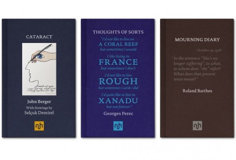
Notting Hill Editions, a new publishing imprint devoted to the essay, launches this month with books by from John Berger, Georges Perec and Roland Barthes among others. The typographic covers were designed by Garvin Hirst at Berlin-based design consultancy Flok.

And finally…

The Burden of Entertainment — Woody Allen discusses five books that still resonate with him:

The Catcher in the Rye has always had special meaning for me because I read it when I was young – eighteen or so. It resonated with my fantasies about Manhattan, the Upper East Side and New York City in general.

It was such a relief from the other books I was reading at the time, which all had a quality of homework to them. For me, reading Middlemarch or Sentimental Education was work, whereas reading The Catcher in the Rye was pure pleasure. The burden of entertainment is on the author. Salinger fulfils that obligation from the first sentence on.

Reading and pleasure didn’t go together for me when I was younger. Reading was something you did for school, something you did for obligation, something you did if you wanted to take out a certain kind of woman. It wasn’t something I did for fun. But Catcher in the Rye was different. It was amusing, it was in my vernacular, and the atmosphere held great emotional resonance for me. I reread it on a few occasions and I always get a kick out of it.

new publishing imprint launching in May, which is dedicated to revitalising and celebrating the essay.
1 Comment

Chip Kidd, Growing Up With Comics

Chip Kidd, designer, writer, and art director at Knopf, talks about his childhood love of comic books with The Comics Archive:

Comments closed

Helvetica in Motion

Helvetica in Motion by Montreal-based multimedia company 333 is another neat typography-inspired video discovered via Nice Type:

Comments closed

Penguin Book Cover Mystery

Plant, Trilogy and Balthus, 1982

Do you recognise these books?

Plant, Trilogy and Balthus is going to be part of an exhibition on the work of Canadian painter Frederick Hagan (1918–2003)  at the MacLaren Art Centre this summer and curator Ben Portis would like your helps identifying the Penguin paperbacks in the picture (click the image above for a closer look).

The only other clues we have are that the books form a trilogy and were published prior to 1982.

If you recognise the books or have any further thoughts or suggestions, please leave a comment below or drop me a line and I’ll pass them on to Ben.

Here are the full details of the painting:

Plant, Trilogy and Balthus, 1982
Frederick Hagan (Canadian, 1918–2003)
oil on hardboard
40.4 x 60.6 cm

Thanks!

5 Comments

Letterpress | Naomie Ross

Here’s a nice short instructional video about printing with letterpress by New York-based designer Naomie Ross:

(via Nice Type)

Comments closed

A Taxonomy of Office Chairs

A Taxonomy of Office Chairs by Jonathan Olivares and published by Phaidon is a visual overview of the evolution of the modern office chair and detailing the most innovative chairs designed and built from the 1840s to the present.

In this video, Olivares talks about the book and the importance of the office chair in design history:

(via Daily Icon)

Comments closed

Midweek Miscellany

Scripts: Elegant Lettering from Design’s Golden Age — new from Steven Heller and Louise Fili, published by Thames & Hudson.

50/50 — Designer Andrew Henderson, curator of Lovely Book Covers, is going to spend 50 days designing 50 covers based on the 50 most influential books of the last 50 years.

See also: Matt Roeser’s New Cover project.

Why She Fell — An interesting article by Daniel Mendelsohn on Spider-Man and Julie Taymor’s ill-fated musical Spider-Man: Turn Off the Dark, in the NYRB:

What made Spider-Man unusual among superheroes when he debuted wasn’t so much the arachnid powers he derived from the radioactive spider…, but his very ordinariness. Bullied at school, worried about girls and money, fussing at and fussed at by his foster parents, the kindly Aunt May and Uncle Ben, Peter Parker is a regular lower-middle-class Joe with pretty average teenager problems… It’s not hard to see how all this made Spider-Man popular among teenaged comic book readers in the 1960s, that decade of the teenager. Indeed, the series marked the beginning of what one historian of the genre called a “revolution” — a newfound interest on the part of comic book creators in emphasizing the protagonist’s “everyday problems” rather than the glamour of being a superhero… The emphasis on Spidey’s ordinary humanness explains why this series, as opposed to a number of other superhero comics, is laden with “heavy doses of soap-opera and elements of melodrama.”

Sheep — Philosopher Simon Blackwell reviews How to Write a Sentence: And How to Read One by Stanley Fish for The New Republic:

It is wrong to think that the sentence is a mere slave, whose function is to bear content, which, while being the really important thing, is also something that could equally have been borne by another. Change the shape and ring, and you change everything. The balance, the alliterations, the variation, the melody, the lights glimmering in the words, can work together to transform even an ugly thought into something iridescent, as when Eli Wallach in The Magnificent Seven expressed his character’s indifference to the suffering he brings the peasants in one perfect, albeit perfectly brutal, sentence: “If God didn’t want them sheared, he would not have made them sheep.” As Fish says in his analysis of this example, here the “air of finality and certainty” is clinched by “the parallelism of clauses that also feature the patterned repetition of consonants and vowels” and then, of course the inevitability of that last dismissive word. If the devil has the best tunes, sometimes the bandits have the best sentences.

And finally…

The aforementioned Steven Heller on the paintings of Paul Rand at Design Observer:

[He] proceeded to tell me how he liked working in all media, including photography and painting and how it influences what he does and how rarely these “other things” are seen in print or elsewhere. Actually, he used excellent judgment insofar as the paintings and watercolors were appealing for their humor and craft, but they were paeans to Klee (and even Cezanne). They were not his true métier (pardon my French). They showed his interests and represented his eye, but painting was not his signature work…

What is there to say about these paintings and watercolors? Are they building blocks or respites from the rigors of graphic design? When I said, “Paul, one of the things I like about you, is that you don’t pretend to be a painter” he had a knowing look. I don’t think he wanted to be a painter, but he wanted to integrate art into graphic design, which he did so very well.

Comments closed

Flip It Back

The always dependable Fresh Signals alerted me to this French video for a new horizontal book format:

This is apparently the “flipback” format that had The Guardian so hot under the collar a few weeks ago. Please feel free to drop me a line or leave a comment if you have more details about it.

4 Comments

Vancouver

I was in Vancouver last week discussing the new titles from Raincoast Books this fall. It was a great week and there are lots of amazing new books coming down the pipe — not least of which is the MASSIVE Saul Bass: A Life in Film and Design by Pat Kirkham and Jennifer Bass published by Laurence King (it looks incredible!) — but I am now really behind on just about everything else and life really caught up with me today. Suffice to say that posting around here might be even more erratic than usual for the next little while. Normal service (whatever that might be) will be back at some point. In meantime, here a few grainy (and rainy!) shots I took of Vancouver…

2 Comments

Pencil It In

In this really nice short video for The Toronto Comics Art Festival, local cartoonists talk about their tools of choice:

(via Drawn!)

Comments closed

Something for the Weekend

Defending the Unusual — Designer Allison Saltzman, art director at Ecco,  interviewed at Caustic Cover Critic:

Everywhere else I’ve worked, the books’ content still informs the cover design, but the overall aesthetic is subject to the publisher’s (and their art director’s) taste. I think the trick to happiness, in this business, is to find yourself a publisher or an art director whose taste you’re comfortable with. And you also need them to trust your instincts as a designer. I am so content at Ecco because the publisher and editors tell me about their books and the audience they’re aimed at, but then they just want me to read them and come up with cover ideas myself. Another good thing about Ecco is that the publisher wants and defends interesting and unusual covers; that’s rare.

Burying the Book — Laura Miller interviews legendary editor and writer Robert Gottlieb for Salon:

[S]ince I’ve been in publishing since the mid-’50s, I’ve lived through all the moments when doom was cried, going right back to “the medium is the message.” The book was dead — I can’t tell you how many times we’ve buried the book in my lifetime. The fact is that we haven’t buried the book, and however all this works out, we’re still not going to be burying the book. People are still going to be reading books, and whether they’re going to be reading them on a Kindle or as a regular physical hardcover book or a paperback or on their phones or listening to audiobooks, what’s the difference? A writer is still sending his or her work to you, and you’re absorbing it, and that’s reading.

Seeing the Pain — Mark Medley talks to Michael Pietsch, editor of the late David Foster Wallace, about constructing the recently released The Pale King:

“This project has been kind of all-consuming,” says Pietsch, whose only other experience editing a posthumous work came in 1985, when he worked on Ernest Hemingway’s bullfighting memoir The Dangerous Summer.

There was no outline, no list of chapters, no clues as to where Wallace planned to take the narrative. The chapters were not in sequence. The names of characters constantly changed. Pietsch thought he’d discovered the novel’s first chapter — the one which begins “Author here” — until he found a footnote explaining precisely why it wasn’t the first chapter. He laughs: “I thought, ‘Oh, I don’t even have a starting point!’ ” Still, the process “was sometimes exhilarating, delightful and joyful because I felt in his presence. And at other times heartbreaking because I saw how hard it was for him. You can’t read this book without seeing pain.”

The War of Independents — Andrew Keen, author of The Cult of the Amateur, on how online piracy is damaging independent filmmakers more than Hollywood:

One of the Internet’s greatest fallacies, its fishiest tale, is the idea of the “Long Tail.” Popularized by Wired magazine editor-in-chief Chris Anderson, first in a 2004 magazine article and then in the bestselling 2006 book, The Long Tail: Why the Future of Business Is Selling Less of More, it argues that the Internet is an ideal distribution platform for independent filmmakers, musicians, and writers struggling to compete against the financial might of mass media conglomerates… But Anderson’s argument has a fatal flaw. He forgets about Internet theft — the online cesspool of illegal peer-to-peer networks and illegal streaming services that has already decimated the music business and is now doing potentially irreparable damage to the motion picture industry. And in the face of piracy, I’m afraid, the belief that all the value in the Internet economy can be located in its tail is, literally, turned on its head. Rather than a long tail, Internet theft’s mass looting of the content industry is transforming the Internet into a fat-headed economy with everything on top — an increasingly unequal medium which discriminates against independent filmmakers and makes it harder, rather than easier, for them to make a living from today’s digital economy.

Before people yell at me, I’m sure that there are counter-arguments to Keen. Constructive ones are welcome in the comments (just leave ad hominem stuff at home).

And finally…

RUR — NPR discusses the origin on the word ‘robot’:

It was the brainchild of a wonderful Czech playwright, novelist and journalist named Karel Capek. He lived from 1880 to 1938. And he introduced it in 1920 in his hit play “RUR,” or “Rossum’s Universal Robots.”… [It] comes from an Old Church Slavonic word, rabota, which means servitude of forced labor. The word also has cognates in German, Russian, Polish and Czech. And it’s really a product of Central European system of serfdom, where a tenants’ rent was paid for in forced labor or service.

And he was writing this play about a company, Rossum’s Universal Robots, that was actually using biotechnology. They were mass-producing workers using the latest biology, chemistry and physiology to produce workers who lack nothing but a soul. They couldn’t love. They couldn’t have feelings. But they could do all the works that humans preferred not to do. And, of course, the company was soon inundated with our orders.

Well, when Capek named these creatures, he first came up with a Latin word labori, for labor. But he worried that it sounded a little bit too bookish, and at the suggestion of his brother, Josef, Capek ultimately opted for roboti, or in English, robots.


2 Comments

Koji Suzuki | Vertical

After watching Lauren Panepinto’s how-to video yesterday and talking with designer Jacob Covey about op-art book covers, I was reminded of Chip Kidd’s amazing designs for the Vertical editions of Koji Suzuki’s Ring books:

Vertical are apparently releasing Edge by Koji Suzuki this fall with a cover by Peter Mendelsund that sticks with the visual theme of the series:

The design is from a few years ago according to Peter (it still looks fresh to me), but clearly I should have nagged him for a better quality image rather than relying on the internet!

Update: Thanks to Peter for sending me a higher-res cover image for Edge. Beauty.

Comments closed