Skip to content

The Casual Optimist Posts

Stanley Kubrick: A Filmography

I posted this on my other site, The Accidental Optimist, yesterday and it got a nice response so I thought I would post it here as well seeing as it’s a long weekend in Canada.

The video is a short animated filmography of Stanley Kubrick by French graphic designer Martin Woutisseth:

If you don’t know about it already, The Accidental Optimist is where I post things I find on the web — usually related to design, architecture, photography, and film — that don’t have a natural place here. You can follow a combined feed of both The Casual Optimist and The Accidental Optimist on Tumblr and Facebook.

Comments closed

Something for the Weekend

The New Museum — Steven Heller profiles Will Schofield, the man behind the awesome 50 Watts blog, for The Atlantic:

For want of money, Schofield notes that he always bought cheap used copies and mass-market editions of the books he actually read. “So before I ever thought about design history, I had stacks of books from New Directions, Grove, Calder, Doubleday Anchor, Ace, and the Time Reading Program. Once I learned the names, I realized I had been long been admiring the work of designers like Paul Rand, Alvin Lustig, George Salter, Milton Glaser, Seymour Chwast, George Giusti, and Roy Kuhlman and illustrators like Edward Gorey and the Dillons.”

A Country Without Libraries — A stirring defence of public libraries by poet Charles Simic for the NYRB:

I don’t know of anything more disheartening than the sight of a shut down library. No matter how modest its building or its holdings, in many parts of this country a municipal library is often the only place where books in large number on every imaginable subject can be found, where both grownups and children are welcome to sit and read in peace, free of whatever distractions and aggravations await them outside. Like many other Americans of my generation, I owe much of my knowledge to thousands of books I withdrew from public libraries over a lifetime. I remember the sense of awe I felt as a teenager when I realized I could roam among the shelves, take down any book I wanted, examine it at my leisure at one of the library tables, and if it struck my fancy, bring it home. Not just some thriller or serious novel, but also big art books and recordings of everything from jazz to operas and symphonies.

See also: Why Libraries Still Matter by Laura Miller for Salon.

God Arrived by Train — An interesting article about the philosopher Ludwig Wittgenstein, and an exhibition on his life currently on display at Schwules Museum in Berlin, 60 years after his death:

Wittgenstein may have gained a reputation as a solitary, tormented and alienated philosopher, but the exhibition seeks to show the many social ties he had in England and Austria, which continued after he was no longer active in academia. Among others, he formed connections with prominent figures such as the philosophers of the “Vienna Circle” (whose school of logical positivism was deeply influenced by his thinking ) – architect Adolf Loos, writer and satirist Karl Kraus and economists Piero Sraffa and John Maynard Keynes. When Wittgenstein returned to Cambridge University in 1929, Keynes wrote to one of their friends: “Well, God has arrived. I met him on the 05:15 train.”

And finally…

Slate has an excerpt from The Influencing Machine by Brooke Gladstone and illustrated by Josh Neufeld, mentioned earlier this week.

Comments closed

Under the Influence

Here’s the neat animated short for the new nonfiction comic book The Influencing Machine by Brooke Gladstone, co-host of NPR’s weekly radio show On the Media, and illustrated by Josh Neufeld:

The book apparently looks at the history of the media and argues against the idea that media is external force outside of our control.

The Influencing Machine is published by W.W. Norton.

Comments closed

Midweek Miscellany

Juggling — The multi-tasking Charlotte Strick,  art editor of The Paris Review, art director at Faber & Faber and Farrar, Straus & Giroux, and book designer,  interviewed at From The Desk Of…

Genre — China Miéville, on his new book Embassytown and genre fiction in The Guardian:

“I love genres; I think they are fascinating. My issue with litfic is not that it is a genre but that (a) it doesn’t think it is and (b) it thinks it’s ipso facto better than all the ones that are genres. Literary fiction of that ilk – insular, socially and psychologically hermetic, neurotically backslapping and self-congratulatory about a certain milieu, disaggregated from any estrangement or rubbing of aesthetics against the grain – is in poor shape.”

Invasion by the Virtual — Iain Sinclair discusses London and five novels that capture the spirit and history of city:

When the railways were first put in, there was devastation, because there were so many competing companies who just ripped up houses right, left, and centre. In the name of catching the spirit of the age and indulging in this technological process (and the idea of progress through science), London was savagely remade. It took a long time to absorb, recover and discover itself through that. At the moment, we’re in this sort of management age — an age of the virtual — in which you can change reality by looking at digitised, computer-generated images and projecting a fantastic city of the future, like a science fiction. People have come to believe that this is reality, even though they are contradicted by observation, which shows you devastated fields, radioactive materials buried in the ground that have been ripped up fast, and absolute destruction… So it is a devastating moment for the city, which I don’t think has ever been under such a prolonged form of invasion by the virtual.

Franzen’s Ugly Americans — Tim Parks on reading Jonathan Franzen’s Freedom in Europe (and, incidentally, the work Swiss novelist Peter Stamm, author of Seven Years, which sounds great) (via Bookslut):

Freedom’s failings are interesting in so far as they deepen the mystery of the book’s international success. It’s one thing for the Americans to hype and canonize one of their favorite authors, but why do the Europeans buy into it? Ever anxious that they need to understand America, fascinated by its glamor and power, Europeans are perhaps attracted to those American novels that explain everything: Roth’s American Pastoral, DeLillo’s Underworld. More than a novel by an American they want The Great American Novel. But of course Europeans also resent American world hegemony and feel (still and no doubt wrongly) superior culturally.

And finally…

20 Books Every Graphic Designer Should Read and an interview with Rick Poynor, founding editor of Eye and a co-founder of Design Observer, who compiled the list, at Designers and Books:

Books always point to other books. A bookshop, like a library, is a fantastic, spatially organized, easily navigable source of vast quantities of interconnected information about what exists for you to discover and know. If someone devised an online virtual space that allowed you to do this kind of rapid, effortless, multifocal, visual, and spatial browsing—perhaps someone has, though it certainly isn’t Amazon or the iPad App Store—we’d applaud them for a brilliant new concept. But these marvelous spaces already exist, at least for the time being, right there in your local shopping street.

art editor of The Paris Review and an award-winning designer known for creating the jackets for books by Roberto Bolaño, Lydia Davis, and Jonathan Franzen, among many others. She is also art director of Faber & Faber, Inc. and of the paperback line at Farrar, Straus and Giroux.art editor of The Paris Review, art director of Faber & Faber and at Farrar, Straus & Giroux,
Comments closed

Killed

Last Thursday The New York Times hosted an exhibition of rejected book jacket designs called ‘Killed Covers’. Fortunately for those of us who don’t live in New York they’ve also posted a gallery of 20 covers from the show.

(Pictured above left: design by Roberto de Vicq, Wetlands. Right: design by John Gall and Leanne Shapton, Autograph Man)

(thx Henry / Alan)

1 Comment

Milton Glaser: Embrace the Failure

To promote their graduation exhibition in May, students from Berghs School of Communication in Stockholm asked prominent creative figures to discuss their ‘fear of failure.’ In this video veteran designer Milton Glaser offers his insights into creative failure (which apply as much to writing as much as design, I would think):

(via Creative Review)

4 Comments

Something for the Weekend

Canadian book designer Bill Douglas annotates one of his favourite covers for the newly launched Toronto weekly The Grid.

Tools of the TradeJonathon Green, author of the three volume Green’s Dictionary of Slang and the somewhat more compact and affordable Chambers Slang Dictionary, on the life of a lexicographer:

What I do is to sit alone in a room with a screen in front of me, a book more than likely to my left, held open by the weight of a discarded piece of chain, and within reach walls full of more books which are not just books but also tools and at the same time both extensions of and bastions for my existence. Some of them I have even made myself. With this screen and books and book-shaped tools I chase down words. And by placing these words in alphabetical order and by naming and defining and providing a word-based background for their existence and more words that illustrate examples of their use I create yet another book which is designated more than any other type to be a tool in its turn.

A Nostalgic Baseline — Harvard English Professor Leah Price, author of The Anthology and the Rise of the Novel and the forthcoming Unpacking My Library: Writers and Their Books, on books as objects:

“In thinking about new media, we measure what we do now against a nostalgic baseline. We compare the way we really do use digital media to the way we imagine we once used printed media, so that we take the reading of printed books to stand for all sorts of values we think we used to have, like sustained attention, linear thinking, noninstrumental appreciation,” Price said. “But if you just count how many pages came off of the printing press at any moment, never in any historical period have books, let alone literary works, been the majority of printed production.”

What Are You? — A wonderful essay by Alexander Chee, author of the novel Edinburgh, on comics, identity and American culture at The Morning News:

At the supermarket when people asked my white mom, “Whose little boy is this?” sometimes I would defiantly insist I was hers, sometimes say nothing, but I’d glare each time as if I had eyebeams that could vaporize them… No one else was like me, except my sister and brother… In the bathroom I sometimes imagined myself as I would have been with either a white face or an Asian one, looking into the hazel part of my eye and seeing the green extend across all the way, or watch it shrink back, covered by brown. The freckles would blanch away or extend until they met and my face turned darker.

It would have been easier to be a mutant, I decided. I sometimes told myself I was one, that it was the only explanation for the reason so many people asked me “What are you?”

The Ludovico Treatment — Steve Rose on Stanley Kubrick’s film adaptation of A Clockwork Orange, released 40 years ago, for The Guardian:

Beyond the UK, the movie has never been out of currency, particularly in the US, and particularly among the young. Its sci-fi stylings have aged remarkably well, and its almost abstract portrayal of out-of-control youth and paternalistic society have made it something of a teenage rite of passage, the movie equivalent of The Catcher in the Rye. Remarkably, it has been a style guide for pretty much every subsequent musical genre… On the big screen, meanwhile, every time you see a gang walking along in slow-motion, a speeded-up party scene, a slow pan out from a closeup of a face, a torture scene set to cheerful music, the chances are it was plundered from Kubrick’s original.

There Are Enough Chairs — A short interview with designer Dieter Rams in the New York Times:

Most of the things are done already — you can’t make it better. Look at chairs: there are enough chairs. There are bad chairs, some good ones, mostly bad ones. But there are, even with a chair, possibilities to make it more comfortable or, from the economic point, you can make it cheaper, save some material or you can try new materials.

And finally…

Because it’s Friday, and because I can, The Velvet Underground Oh! Sweet Nuthin’:

You can thank me later.

Comments closed

“My Favorite Artistic Advice”

Part of Lev Yilmaz’s Tales of Mere Existence Series, My Favorite Artistic advice is a short animated film based on a letter by the artist Sol LeWitt, written to the artist Eva Hesse (with slight alterations by Yilmaz):

(via/thx Jon Gray)

Comments closed

Midweek Miscellany

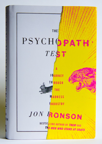
Half Crazy — Matt Dorfman on his great book cover design for The Psychopath Test by Jon Ronson, published by Riverhead Books:

Riverhead did not skimp on the production touches for this one. They sprung for a combination gritty matte finish (which covers the white paper portions of the jacket) and a shiny gloss for the yellow/magenta “crazy” half, thereby giving your sense of touch a noticeable edge if you find yourself blindly scanning your shelf for this book in a dark room (which I have done).

The Intimate Orwell — Simon Leys reviews Diaries by George Orwell, edited by Peter Davison, and George Orwell: A Life in Letters also edited and annotated by Davison, for the NYRB:

From the very start, literature was always Orwell’s first concern. This is constantly reflected in his correspondence: since early childhood “I always knew I wanted to write.” This statement is repeated in various forms, all through the years, till the end. But it took him a long time (and incredibly hard work) to discover what to write and how to write it. (His first literary attempt was a long poem, eventually discarded.) Writing novels became his dominant passion—and an accursed ordeal: “writing a novel is agony.” He finally concluded (some would say accurately), “I am not a real novelist.” And yet shortly before he died he was still excitedly announcing to his friend and publisher Fredric Warburg, “I have a stunning idea for a very short novel.”

Investigative Self-Repair — Author James Lasdun (It’s Beginning to Hurt) reviews Edward St. Aubyn’s latest semi-autobiographical Patrick Melrose novel At Last for The Guardian:

This act of investigative self-repair has all along been the underlying project of these extraordinary novels. It is the source of their urgent emotional intensity, and the determining principle of their construction. Not much gets into these books that doesn’t bear directly on Patrick’s predicament. Exposition is kept to a minimum; there are few descriptive passages, no digressions. For all their brilliant social satire, they are closer to the tight, ritualistic poetic drama of another era than the expansive comic fiction of our own.

And finally…

The General Specialist — Designer, illustrator, and letterer Jessica Hische talks to Method & Craft:

I love learning about new things whether or not they directly connect to how I earn a living and I think that this desire to pay attention to related industries is one of the reasons why I’m a figure in the design community. It’s by learning about many things that you’re able to understand specialization—that design is broken into countless micro-industries. If you don’t understand the differences between them (or acknowledge that they exist), there is no way for you to find your own specialized niche with in it.

Comments closed

Chip Kidd at The Comic Archive

Last week I linked to a short video of Chip Kidd talking about growing up with comics. Now, The Comic Archive have posted a few more segments from that interview in which Chip discusses his book design and work in comics.

In this first clip, Chip talks about his decision to pursue graphic design in college and the influence of comic books on his work:

In this longer segment, he discusses coming to New York, being hired by Knopf as a cover designer, and returning to comics through DC Comics and Pantheon:

And this may just be for the fan-boys, but in this final clip Chip shows off his specially commissioned one-of-a-kind collections of original artwork:

#Envy

Comments closed

In the Wilds | Nigel Peake

With the winter winds and driving rain, things naturally fall apart — twisted, gnarled, and eventually incapable of function. When something goes wrong, the solution is often improvised with whatever is available. This haphazard collage of old materials can make it feel as if the country is in a constant state of disrepair. The fences and gates, in particular, embody this with their bespoke supports. When one part collapses or a hole appears, the ubiquitous blue twine come out to bind everything together. Sometimes the original structure disappears altogether, and all that remains is the collection of parts propping it up. With this unspoken artistry, the unexpected is made.

From the introduction to In the Wilds by Nigel Peake

One of the joys of working at Raincoast Books is receiving books from New York-based publisher Princeton Architectural Press in the mail. This week, a beautiful  6″ by 8″ hardcover called In the Wilds by artist Nigel Peake arrived.

Peake who has worked with the likes of Ninja Tune, The Believer, Blueprint, and Dwell Magazine, lives and works in the Irish countryside (the self-described “middle of nowhere”). In The Wilds collects together his obsessively detailed drawings and watercolors of this rural life — the trees, fields, lakes, and rolling hills, but also farm houses, tractors, fences, and telegraph poles.

It is simply lovely.

Comments closed

Penguin Book Cover Mystery: Update

Is this the cover in the painting?

Certainly a lot of people seem to think so and some things do fit. Titus Groan is, of course, the first book in the Gormenghast trilogy by Mervyn Peake, and this particular Penguin Modern Classics edition was, I believe, first published in 1974. The drawing on the cover (by Mervyn Peake?) is also somewhat similar stylistically to the work of Balthus, mentioned in the title of the painting, so that would make sense I suppose.

However, the features of the faces do not look particularly alike — the features in the painting are more angular — and the hair/shadow to the left of the face on the book cover is notably absent on the cover in the painting. The mood of both seem quite different (to me at least). Can this simply down to artistic license or painterly technique on the part of Hagan?

Other compelling suggestions have been thin on the ground. T.E. Lawrence’s The Mint has been suggested, and there are some similarities to the cover of The Waves by Virginia Woolf, but neither seems quite right and they do not fit with the trilogy alluded to in the title.

There may never be a definitive answer — the artist, Frederick Hagan, died in 2003 — but please let me know if you have any further suggestions or thoughts.

Comments closed