Skip to content

The Casual Optimist Posts

Christoph Niemann | Fresh Air

Illustrator Christoph Niemann talks to Fresh Air‘s Terry Gross about his illustrations for The New Yorker, Newsweek and the New York Times Magazine, and his new kids book That’s How:

I care so much about magazines and newspapers and books. This is the world that I live in as a consumer and that’s why I really care about contributing to this world. And I get a much bigger kick out of having my image seen like million times for like 20 seconds and then it ends up in the trash bin rather than having my image on somebody’s like over somebody’s sofa for 20 years.

NPR FRESH AIR: ‘That’s How’ Christoph Niemann Explains It All

The full transcript is here.

Comments closed

Midweek Miscellany

There’s been much speculation online about who designed the wonderful hand-drawn cover for Big Machine by Victor LaValle (pictured above). Thanks to the nice folks at UK publisher No Exit, I can finally identify the designer as Lynn Buckley, who originally designed the cover for the US publisher Spiegel & Grau.

Collected — Gary Groth, co-founder of alternative comics publisher Fantagraphics, talks about the state of the industry with the Comic Book Reporter (via Robot 6):

By and large, nobody publishes alternative comic books anymore. The reason is fairly obvious; since the reader knows it’s going to be collected in a graphic novel, there’s very little reason for them to buy a twenty-four page comic of something he’s going to get a year or two down the line as a graphic novel, and in the way it probably ought to be published anyway, collected in a single work. I think it’s just an inevitability of the rise of the graphic novel as the dominant form of alternative comics. I don’t know how accelerated that’s going to be for mainstream comics. It feels like it’s headed that way.

Lingua Franca — Tim Parks on translation and international literature for the NYRB:

[N]either readers nor writers are happy any longer with the idea that a literary text’s nation or language of origin should in any way define or limit the area in which it moves, or indeed that a national audience be the first and perhaps only arbiter of a book’s destiny. We feel far too linked, and linked in the immediate present, not to want to see immediately what books are changing or at least entertaining the whole world. And if we are writers, of course, we want our own books to travel as widely as possible.

And finally…

Chisel Away — An interview with designer Christopher Brian King, art director at Melville House, at Slated Magazine:

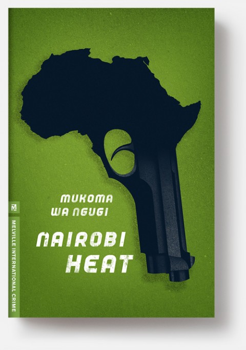
On a conceptual level, [designing for book covers] actually isn’t much different from designing a logo, for example. After all, a logo has to give you a glimpse into the whole story of a company, so it comes down to the same challenge: how do I chisel away at this big, complicated story until it becomes a single elegant image which explains what the whole thing is about? Where book covers differ is that you have a much larger toolkit to work with—typography, color, illustration photography, production tricks, or anything else. Since it’s so open-ended, the real challenge starts to become figuring out which tool is best to use on any given project.

3 Comments

New Genres by Tom Gauld

I love these new illustrations by the super-talented Tom Gauld for an article in The Washington Post Book Review about genre fiction:

You can see more of Tom’s work and his regular literary cartoons for The Guardian on Flickr.

Comments closed

J.J. Abrams | Fresh Air

One last miscellaneous post before the weekend…

Filmmaker J.J. Abrams  talks about his new movie Super 8 and, perhaps most interestingly, his storytelling process with Terry Gross for NPR’s Fresh Air:

In a movie like “The Graduate,” Ben and Elaine had their first real date and they’re, you know, sitting at a restaurant eating in his convertible car and people are being very loud and they put the top up. And they’re having this conversation and you can’t hear it, but you’re watching it. So you get to sort of, you know, fill in the blanks and I think there is a sort of – almost a reflexive reaction that we have to fill the blanks in when there’s something of some substance and pieces are missing. You sort of fill it in.

I think there’s something about the unseen and the unknown that has real value in moments. But I do think that, you know, you can’t apply a magic box approach to everything. And if you go to see a movie or if you watch a show, you better have something of substance that you’re building to. The whole thing in itself can’t be a magic box.

NPR FRESH AIR: J.J. Abrams: The ‘Super’ Career Of A Movie-Crazed Kid

The full transcript is here.

(via The Cultural Gutter)

1 Comment

Something for the Weekend

Simplicity and Economy — Mike Dempsey profiles Keith Cunningham, who designed book covers for Peter Owen, for the Foyles bookshop blog:

A tight discipline can galvanise a creative designer’s mind and Cunningham rose to the occasion with his very first cover for Peter Owen.

This sparse graphic approach was to become the visual hallmark of Peter Owen covers in the 60s and 70s. Over a relatively short period Cunningham quickly created a highly individual ‘brand’ (before the term was used) via the houses jackets distinguished by their utter simplicity and economy.

There is a much longer profile of Cunningham on Dempsey’s own (and excellent) blog Graphic Journey.

Movement and Sound — Marjane Satrapi, author of Persepolis, offers advice on how to film comics:

Animation and comics are false siblings. They resemble one another but they’re two completely different things. The relationship a reader has with a comic is nothing like the one a viewer has with a film. When you read a comic, you’re always active, because you have to imagine all the movements that happen between the frames. In a film, you are passive: all the information is there. And when you make a comic it never happens that you have 500 or 1,000 people reading it in the same place at the same time, all reacting. The language of cinema and comics is different, even though they both use images. In comics, you write with images; they’re like pictograms. And in a movie you think about movement and sound and music, all those things that are not considerations when making comics.

Cutting to the Chase — Alan Moore discusses his new novel Jerusalem with Helen Lewis Hasteley of The New Statesman:

[W]hile his first prose novel, Voice of the Fire (published in the mid-1990s), took 300 pages to cover the county of Northamptonshire, Jerusalem uses 750,000 words to explore an area of Northampton about half a square mile across. “So the next one will be several million words and it’ll just be about this end of the living room.”

Moore says he hopes never to write anything as long as Jerusalem again but he won’t countenance scaling it back. “Any editor worth their salt would tell me to cut two-thirds of this book but that’s not going to happen. I doubt that Herman Melville had an editor — if he had, that editor would have told him to get rid of all that boring stuff about whaling: ‘Cut to the chase, Herman.'”

And finally…

Manual Labour — Peter Foge profiles philosopher Simone Weil, who work for a time in a steel plant and died of self-induced starvation in wartime London, for Lapham’s Quarterly:

Part philosopher, part activist, part mystic, Weil is almost impossible to classify. A youthful Marxist who abandoned the faith in favor of liberal pluralism. A lover of all things ancient Greek who equated the Roman Empire with Nazi Germany and Hitler with Caesa, she was a mass of contradictions. Yet her reputation has grown over time as one of the most original and uncomfortable thinkers of the twentieth century. T.S. Eliot, a great admirer, considered her “a woman of genius, a kind of genius akin to that of the saints.” “A genius,” added one of her many anthologists, “of immense revolutionary range.”
Comments closed

The Psychopath Test | The Book Show

Part funny, part horrifying,  journalist Jon Ronson discusses his latest book The Psychopath Test with Ramona Koval for The Book Show:

THE BOOK SHOW: Jon Ronson The Psychopath Test

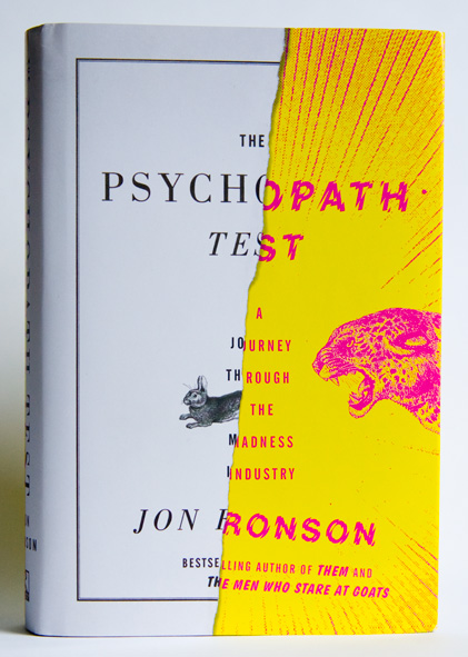
The cover for The Psychopath Test was designed by Matt Dorfman.

Comments closed

Midweek Miscellany

An interview with the talented Allison Colpoys, book designer at Penguin Books Australia, at The Design Files.

Particular Beasts — A brief interview with art director John Gall about teaching book design:

Each book is its own particular beast that has to be designed from the ground up. Every designer has their own way of looking at the problem and coming up with a solution. It can’t help but be personal on some level.

A Twist, Flourish or Quirk — Louise Fili and Steven Heller, authors of Scripts: Elegant Lettering from Design’s Golden Age, on script typefaces at Design Observer:

During the letterpress era [script typefaces] were in such great demand that many people “invented” them, and many others copied them. In some commercial printing shops, composing cases filled with scripts were stacked floor to ceiling to the exclusion of other type. Printers routinely amassed multiple styles of the heavy metal type fonts, each possessing a distinct twist, flourish or quirk, used to inject the hint of personality or dash of character to quotidian printed pieces… Scripts signaled propriety, suggested authority yet also exuded status and a bourgeois aesthetic. The wealthy classes couldn’t get enough fashionable scripts in their diet.

The Pilot Fish and The Whale — David Carr, media columnist at the New York Times, talks about the documentary Page One: Inside The New York Times with screenwriter Aaron Sorkin  for Interview Magazine:

I think one of the things that Page One does an amazing job of demonstrating is the importance of editors. You can see our editor, Bruce Headlam, shaping, arguing, pushing back. Of course, that’s what you don’t have a lot of in the blogosphere. There is nobody pushing people to support what they’re saying, nobody arguing against the assumptions that are brought to the table…

Slow Journalism — An interview with cartoonist and journalist Joe Sacco (Footnotes in Gaza) for the A.V. Club:

[I]t’s one of the slowest art forms or media there is. You know, there’s fast food and there’s the slow food movement; I guess this is slow journalism. It just forces you into it. It’s difficult for me because I love being in the field, so to speak. I love that day-to-day thrill of being in places, and the great privilege of meeting people and going into their homes and seeing what their lives are like. I love that. But when you compare how much time is spent reporting to how much time is spent at a desk just writing and drawing, the reporting is a fraction. That’s just the way it is.

And finally…

Sing Out — Dorian Lynskey, author of 33 Revolutions per Minute, recommends five books about protest songs. The cover of 33 Revolutions per Minute was designed by Jacob Covey.

http://www.bookdepository.com/Footnotes-Gaza-Joe-Sacco/9780805092776/?a_aid=optimist
Comments closed

James Gleick on the Future of Books

The Book Show recently broadcast James Gleick’s closing address to the Sydney Writers’ Festival, in which the author of The Information discusses the future of the printed book:

THE BOOK SHOW: The Future of the Book with James Gleick

Comments closed

le droit de suite

Le droit de suite is a short typographic film by Paris-based designer Pierre-Emmanuel Lyet for the French collective rights management society ADAGP that explains an artist’s resale right:

The French version can be found here.

Comments closed

Jennifer Egan | Writers & Co.

Author Jennifer Egan discusses music, Proust and, of course, her Pulitzer Prize winning novel A Visit From the Goon Squad with Eleanor Wachtel for CBC Radio’s Writers & C0mpany:

CBC RADIO WRITERS & Co. – Jennifer Egan

The paperback cover for the US edition of A Visit From the Goon Squad (pictured above), was designed by the talented Jamie Keenan.

Comments closed

Herbert Bayer’s Book of Maps

Nate Burgos of Design Feast takes an appreciative look at the World Geo-Graphic Atlas (1953) designed by Herbert Bayer with Martin Rosenzweig, Henry Gardiner and Masato Nakagawa. Published in 1953, the book contains 2,200 diagrams, graphs, charts, and symbols about the planet:

The video is part of a new series called ‘Rare Book Feast’ about “the timeless character of books.”

Comments closed

Something for the Weekend

A lovely new cover design by Dan Mogford for All Over the Map by Michael Sorkin (Verso Books).

In an epic two part interview for Bomb Magazine, George Saunders, author of Pastoralia, talks about writing with Patrick Dacey.

From part one:

[O]ne of the challenges of the writing life is to find new things to say and/or new ways to say them. And this is a paradox, because when you write your first book, you actually carve out a great deal of what you’ll end up working with for the rest of your life… [T]hat’s genuinely exciting. But then there’s the next 60 years to get through (!).

From part two:

Sometimes when I read new fiction, I feel that the writers of it, myself included, have a somewhat dysfunctional relationship with our own culture. I don’t mean we disapprove of it. I mean that we have absorbed so much habitual disapproval of it that we are no longer able to see it, and therefore are unable to disapprove of it properly. How can you disapprove (or approve) of something you no longer see? If your palette of possible modes of representation has been habitually narrowed and restricted (to the edgy, the snarky, the hip, etc., etc.), if that palette has been shorn of, say, the spiritual, the ineffable, the earnest, the mysterious—of awe, wonder, humility, the truly unanswerable questions—then there isn’t much hope of any real newness there.

Just as an aside, I love this cover for Pastoralia (I’m not sure who the designer is though. Anyone?):

Mom — A short interview with Gene Hackman in GQ. I’ve always been a fan of Hackman’s acting, what I didn’t realise is that he is also a novelist:

Yeah, they tell you not to write about your mom in books, but I don’t know how you keep from doing that.

Fantastic. Hackman’s most recent novel is Payback at Morning Creek.

And finally…

A gallery of vintage Irish book covers from the 1920’s to 1970’s curated by Niall McCormack, a graphic designer based in Dublin. Pictured above: Cuir Síos Air, Fallons. Cover design by Cor Klaasen. (Via The Donut Project).

Comments closed