Skip to content

The Casual Optimist Posts

Something for the Weekend

Sweet Nuttin’ — A primer on George Herriman’s classic and wonderfully idiosyncratic comic strip Krazy Kat at Robot 6:

Krazy Kat is far from a chore… Indeed, it is rarely anything less than a delight to read, although it can be a bit challenging for newcomers. The early strips are dense with wordplay, while the later strips take on the quality of near-abstract paintings at times. Then there’s Krazy’s off-kilter dialogue (“If only I could be star or a moom or a komi or ivin a solo eeklip. But me, I’m nuttin”). Thus, whichever book you decide to dive into first, I’d recommend taking your time. Read (and reread) the strips slowly and don’t feel the need to rush through.

Unhappy Endings — Jason Zinoman, author of Shock Value: How a Few Eccentric Outsiders Gave Us Nightmares, Conquered Hollywood and Invented Modern Horror, talks to Terry Gross for NPR’s Fresh Air:

I think that as you look at this period from ’68 to the end of the ’70s, generally, first of all, you see a lot more unhappy endings. There isn’t this kind of catharsis at the end that you see in a lot of movies before that.

The central kind of monsters are no longer werewolves and vampires and the supernatural. The central monsters are – or I guess I would say the central monsters become serial killers and zombies… And I think the other thing that marks it is there’s a certain kind of moral ambiguity about these movies and just generally a sort sense of confusion and disorientation that marks most of these films.

Meanwhile, over on KCRW filmmaker and author John Sayles talks about his hefty new book A Moment in the Sun with Michael Silverblatt for Bookworm.

And finally…

Rick Poynor on the dictionary as art concept for Designer Observer:

With book design, we should value appropriateness to subject, vivid animation of content, and the dexterity and panache with which the designers interpret every purposeful, cherishable convention of the book. The notion of continual reinvention as a worthwhile or attainable goal is particularly misplaced here…

Comments closed

Midweek Miscellany

60 Years of Innovation — The estimable John Self on publisher Peter Owen for The Guardian:

It cannot simply be good luck that leads one man to publish such an embarrassingly long list of riches. Owen is clear that both “literary acumen and a business mind” are essential. He has survived where other publishing houses forging a similar path, such as those of Marion Boyars and John Calder, have been closed or sold, and had their lists filleted by larger houses; if you are just “an editor buying books you like, with no idea how to run a business,” Owen says, “you don’t stand a chance.” For him, a distinctive look helped: bold (and presumably inexpensive) two-colour covers by Keith Cunningham may have lacked the cool of Jan Tschichold’s Penguin templates, but gave the list a uniform feel. The odd commercial success helped more, with titles which caught the public mood such as Siddhartha and The Man Who Planted Trees. Owen may not always have liked his authors (Salvador Dali was “a creep [but] not as mad as you’d think. When you mentioned money, he suddenly became very sane”), but it’s hard to question his commitment to new and avant-garde writing.

Goodbye To All That — The Economist glumly ponders the fate of Borders and independent bookstores:

The problem, however, is that no one seems willing to buy full-price books anymore. Campaigns to get people to buy books from their local bookstores—such as “Save Bookstores Day” on June 25th—miss the point. While there is demand for real bricks-and-mortar places to gather, drink coffee and read new books, such places can’t exist if the market can’t accommodate them… [T]he market is squeezing out a meaningful public space. It will be interesting to see what fills the void these bookstores leave behind.

“Interesting” is probably not the adjective I would have used personally…

Dead Cool — Comics critic Paul Gravett talks about his new book 1001 Comics You Must Read Before You Die with Bleeding Cool:

Initially, the American publishers tried to insist that every one of 1001 Comics must be available in English. But I had to insist that this would exclude loads of absolute masterpieces, and it wouldn’t make the book work in the other languages it is going to appear in, such as French or German. So somewhere around 12 per cent or so of the 1001 are not available in English, at least not yet. I seriously hope that exposure in 1001 will alert publishers and motivate them to translate them.

And finally…

Naomi Yang, designer, visual artist, publisher and founding member of the band Galaxie 500, talks with Print Magazine:

A book has always been an object! That is what can be so wonderful about them and so different than a digital book—or even a print-on-demand book. A book is an entire world: you see the cover, you pick it up, you feel the material of the cover, you turn it over, you read the back—and then you open it! You get the progression of the half-title, the title page, the table of contents and then that first page of text, that first line. And there are so many small things, the page numbers, the running heads, the proportions of the margins—the same elements in each book—but how will you do it this time?


1 Comment

Henning Mankell | BBC World Book Club

Author Henning Mankell talks to Harriett Gilbert about Faceless Killers, the first novel featuring Inspector Kurt Wallander, for the BBC World Book Club:

BBC WORLD BOOK CLUB: Henning Mankell

2 Comments

Paula Fox | Writers & Company

Paula Fox, storied author of Desperate Characters, talks about writing and her memoir Borrowed Finery with Eleanor Wachtel in this archive interview for Writers & Company from 2002:

CBC RADIO WRITERS & COMPANY: Paula Fox Interview 2002

The cover above, from Fox’s collection of stories and essays News From the World published earlier this year by W. W. Norton, was designed by Roberto de Vicq de Cumptich.

2 Comments

Something for the Weekend

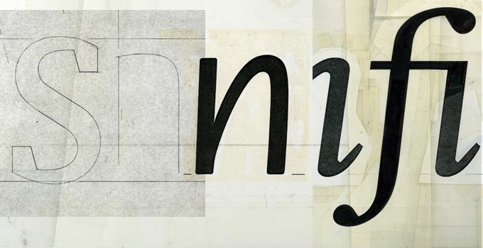
Simplicity with Sophistication — Typographer Gerard Unger talks about his work and the influence of Wim Crouwel with MyFonts:

What seemed amazing when I joined [Crouwel’s] company Total Design in 1967 was how simple it all seemed. When Wim explained how to design and do typography, you got the impression it had always been done like that and that it couldn’t be done any other way — maximum clarity. Later, I realized that this approach also had its limitations. When graphic designers had to select a typeface, they automatically specified Helvetica and stopped thinking. Wim’s own work was different: it seemed clear and simple, but was full of refinement, which comes naturally to him. That is probably why it is so attractive to younger generations: simplicity with sophistication. Yet I personally wouldn’t welcome a revival of Swiss typography — it was too formulaic. Also, I think design should be more of a social thing than that. For too long, graphic design has been about individualism and about fulfilling personal ambitions.

The Doctrine of Immaculate Rejection— A wonderful with E. B. White from the Paris Review 1969. It’s a great read, but it’s hard not to get the feeling it comes from a more genteel era that has long since disappeared (via Longform):

I revise a great deal. I know when something is right because bells begin ringing and lights flash. I’m not at all sure what the “necessary equipment” is for a writer—it seems to vary greatly with the individual. Some writers are equipped with extrasensory perception. Some have a good ear, like O’Hara. Some are equipped with humor—although not nearly as many as think they are. Some are equipped with a massive intellect, like Wilson. Some are prodigious. I do think the ability to evaluate one’s own stuff with reasonable accuracy is a helpful piece of equipment. I’ve known good writers who’ve had it, and I’ve known good writers who’ve not. I’ve known writers who were utterly convinced that anything at all, if it came from their pen, was the work of genius and as close to being right as anything can be.

And finally…

Type and Still Imagery — Writer-director Mike Mills, who began his career as a graphic designer, talks about his semi-autobiographical movie Beginners with AIGA:

Before I was a filmmaker I loved Godard as a graphic designer. He does the best design, to me. And a lot of my graphics being very, almost sort of didactic or presentational, or sort of centered and clean, to me really comes from how Godard uses type and still imagery in his films, in Tout va bien or One Plus One or Pierrot le Fou, so Godard’s been influencing me for a very long time. And the graffiti in the film is much more sort of May 1968, sort of Situationist graffiti rather than being like hip-hop graffiti.

There is also a book, Drawings From the Film Beginners, that accompanies the movie (thx @Henry)

Comments closed

Jarvis Cocker on Writing

Jarvis Cocker talks to Faber Publishing Director Lee Brackstone about songwriting and the publication of Mother, Brother, Lover, his first collection of lyrics:

Mother, Brother, Lover will be published by Faber in October.

(via Largehearted Boy)

Comments closed

When Movies Mattered | The Marketplace of Ideas

Film critic Dave Kehr discusses the cinema of the 1970’s and his book When Movies Mattered: Reviews from a Transformative Decade with Colin Marshall for The Marketplace of Ideas podcast:

THE MARKET PLACE OF IDEAS: Dave Kehr When Movies Mattered mp3

2 Comments

Backlit | Ingrid Paulson


Toronto-based designer Ingrid Paulson has designed these four covers for a new paperback reprint series called ‘Backlit’ to be published by ECW Press this fall.

Lovely stuff.

4 Comments

Midweek Miscellany

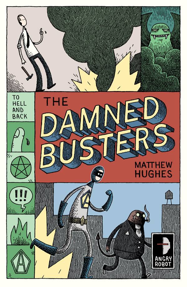
Cartoonist and illustrator Tom Gauld chats with the Angry Robot blog:

I find [robots] almost endlessly interesting. There is tragedy in their place between sentient beings and disposable products. And … they are much easier to draw than real people.

I’m hoping to interview Tom here as well sometime soon (just as soon as I think of something smart to ask him).

Hard Scenes — Actor, writer and director John Turturro talks about his work and one of my all time favourite films Miller’s Crossing at the A.V. Club (via Biblioklept):

Sometimes you think about movies, and you say, “Well, I want to try to do something that’s not exactly in a movie.” If you’ve ever been in a very dangerous situation, you know that people will do all kinds of things to keep themselves alive. It was very well-written, but you want to imagine what it’s really like to be in that kind of situation. It depends on what you’re willing to do, and in real life you would do a lot of different things. I tried to capture a little bit of that… to do something that was almost a little difficult to watch, because people aren’t trying to be heroic at those moments.

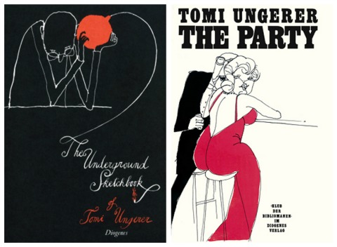
Curiosity and Collecting — Writer and illustrator Tom Ungerer in conversation with Julie Lasky at Design Observer:

One of the most important things for one’s own development is curiosity. Once you have curiosity, you just accumulate. My interests go from botany to mineralogy, geology, anatomy, history. Sometimes I’ve been bitten like bug. I buy one object and I’m so fascinated that I start collecting. And then when I finish collecting, and the collection doesn’t inspire, I give it away, like my toy collection of 6,000 pieces that I donated to my hometown museum for children.

Learning to Write — An interview with author Zadie Smith at The Literateur:

[O]ne of the things I look for in other people’s writing is the ability to confer freedom. That’s what I want to be able to do myself. I like a writer who doesn’t have to be in total control of how their readers react. More mystery, less explanation. All I can say is I’m working on it. But it’s so hard! I really feel I’m just at the base of a huge mountain called ‘learning how to write’. I’m still only 35. Learning to write is a task that takes up your whole life.

And finally…

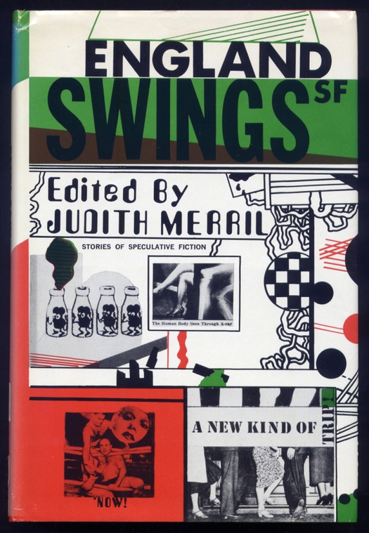
Rick Poynor on the unusual cover design for England Swings SF, published in 1968, also at Design Observer.

Comments closed

The Prince & The Sea | Emily Carroll

I loved last year’s spooky His Face All Red, and now cartoonist Emily Carroll has just posted a new, similarly atmospheric strip called The Prince & The Sea.

Carroll recently won the Joe Shuster Award for ‘Outstanding Webcomics Creator.’

Comments closed

Chasing the White Dog

I posted cover design for Chasing the White Dog by Max Watman earlier today on The Accidental Optimist, but I thought it was worth reposting here now that it’s been identified as the work of Roberto de Vicq.

According to Roberto, the difficult part was finding the glass jar!

I came across the book itself on the Algonquin Books blog summer reading list compiled by their staff last week.

Comments closed

Something for the Weekend

An interview with Toronto based lettering designer Ian Brignell at The Case and Point:

I’m influenced by just about everything, but I especially like the work that was done on packages from the 19th and early 20th century. I also enjoy amateur hand-lettered signs, since they often contain very quirky and original details that I would never think of. I have to mention that during college I saw a book with some examples of Herb Lubalin’s lettering work, and this was one of the moments that really made me want to pursue lettering for a living.

All Things Considered — An interview with Nate Burgos about his Rare Book Feast video project:

I enjoy writing about anyone and anything which interest me on my design-related blog, an all-people-and-things-considered destination. Then there’s tweeting, lots of it. Twitter is newsprint. Designer Lorraine Wild said, “You have to be interested in culture to design for it.”

Dull But DurableThe Guardian‘s Justin McGuirk on Soviet design and a new book on the subject called Made in Russia by Michael Idov:

There were some genuinely classic designs… The Lomo camera, with its super-saturated film, is still hugely popular in an otherwise digital world. The avos shopping bag, essentially a string vest with handles, was ubiquitous and remains far preferable to plastic bags, just as the collapsible portable cup is preferable to millions of plastic and polystyrene ones. The ribbed drinking glass, meanwhile, and the Saturna and Raketa vacuum cleaners, simply lasted for ever. We may mock Soviet design, but there are lessons to heed from it. Durability, for one. In our disposable culture, rapid replacement cycles have almost inured us to the idea that nothing lasts. Such is the price, apparently, of free enterprise and consumer choice.

Secretly Young — John le Carré’s keynote speech at the Think German Conference earlier this month (via Bookslut):

I was young when I started writing about George Smiley — twenty-eight — and Smiley was already old, a proxy father. But Smiley’s journey through the novel, despite his age, is the journey of a young man’s self-discovery. Underneath his inconspicuous exterior, he is a sensitive man still growing up, still looking for answers, and for the experience that delivers them.

In short: he is secretly young.

And Smiley’s private journey — from this first novel, right through to his last — for me at least, with the advantage of hindsight and no longer the responsibility of writing about him — is a single Bildungsroman that leads him through disappointments, mistaken loves, failures and occasional successes, to some kind of ultimate maturity: that is to say, to the point when he discovers that the object of his life’s search is neither the absolute enemy of his imagination, nor the absolute answer to his quest.

See also: Tom McCarthy, talks about his novels Remainder and C, and his life in Prague and Berlin before becoming a published writer, at The Days of Yore:

Your book is being held up as, you know, avant-garde, or as an anti-novel, or as anti-realist… None of these seem quite right. My understanding of the avant-garde is as a historical thing, it had a moment and it has an implication for now, but it’s almost like saying, “Are you leading the French revolution?” “No!” [Laughs.] If you pay too much attention, then when you sit down to write you’ve been primed to think: “Okay, so I’m being avant-garde; how do I be avant-garde?”

I don’t know exactly where I’m going next, but I don’t think it’ll be anything that blatantly looks either avant-garde or not avant-garde or realist or not realist.

And finally, seeing as it’s Friday…

A Pixaresque animated homage to the late Dave Stevens to mark the 20th anniversary of the film adaptation of his comic The Rocketeer:

(via Robot 6)

Comments closed