The Film Before The Film is a documentary short by the Berliner Technische Kunsthochschule about the history of opening titles. Although the narration is a little flat, the film itself is a visual treat:
Comments closedTag: Typography
Something for the Weekend
Typgraphica’s favourite typefaces of 2012. There’s a lot to love about Balkan Sans by Nikola Djurek and Marija Juza. But check out the ligatures on Levato by Felix Bonge:
Chasing the White Rabbit — Francine Prose on dreams and literature, at the New York Review of Books blog:
Literature is full of dreams that we remember more clearly than our own. Jacob’s ladder of angels. Joseph saving Egypt and himself by interpreting the Pharoah’s vision of the seven fat and lean cows. The dreams in Shakespeare’s plays range as widely as our own, and the evil are often punished in their sleep before they pay for their crimes in life. Kafka never tells us what Gregor Samsa was dreaming when he awakens as a giant insect, except that the dreams were “uneasy.” Likely they were not as uneasy as the morning he wakes into. By the end of the first paragraph of “The Metamorphosis,” Gregor has noticed his arched, dome-like brown belly, his numerous waving legs. “What has happened to me? he thought. It was no dream.”
Krautrock on the Underground — An excerpt from Earthbound by Paul Morley, part of the Penguin Lines series for the 50th anniversary of the London Underground, at The New Statesman:
“Krautrock” was the convenient collective name given in a slightly jokey, slightly wary and affectionately patronising way to an eclectic collection of radicalised German groups from very different parts of the country that contained musicians who were born in the few years before, during or just after the Second World War. Another collective name for these groups, still frivolous but more descriptive of their mission to create sound never heard before on our planet and invent music that could make you feel you were leaving the earth behind, was “kosmische”. As well as Can, these groups included Kraftwerk, Tangerine Dream, Amon Düül II, Cluster, Popol Vuh, Harmonia, Neu! and Faust, and they were looking for ways to repair their traumatic recent history, remove the crippling infection of fascism, break free of totalitarian artistic repression, negotiate turbulent social and emotional currents, and radically, romantically reinstate the positive, progressive elements of their mortified national psyche.
See also: Jonathan Gibbs looks at the design of the Penguin Lines series at The Independent.
And finally…
Fact-Checking at the New Yorker, an excerpt from a new book called The Art of Making Magazines:
When the new, remade The New Yorker of the last decade was gearing up and we started getting all these late-breaking stories, issues such as logic and fairness and balance—which previously had been the responsibility of the editors—began to fall on the checkers. This wasn’t by anybody’s design. It was because the editors were really busy putting these stories together and they wanted us to look at things from the outside and see how they were framed, and look at them from the inside and look at the logic and the way they were reported and the way quotes were used and many other such things.
That responsibility came to us not in the way of anybody saying suddenly, “You’re doing that.” It just became that when a problem arose, they would come to us and say, “Why didn’t you warn us?” And so it just became clear that there was this gap between editing and checking that had opened up under the pressure of later-breaking stories, and it just seemed logical that we should fill it. It made our job more challenging, and more fun.
(via Kottke)
1 CommentQ & A with Misha Beletsky, Part Two
In part one of our conversation, Misha Beletsky, art director at Abbeville Press, discussed his interest in the work of German-born designer and calligrapher Ismar David, the subject his recent book The Book Jackets of Ismar David, published by RIT Press. In this second and final part of our interview, Misha and talks about his own work as a designer and an art director:
How did you become interested in design?
The father of a boyhood friend in Russia was a book designer. He had a photo lab set up in his closet, took pictures of letters, and pasted them up with rubber cement. Having access to creation of the book, that holy of the holies of the bookish world I grew up in seemed like magic. I thought it was the coolest thing in the world. One day I tagged along with this friend to take night classes at the Moscow Printing Institute. Suddenly, I felt it was no longer a world I could enjoy as a guest, but a world I could be a part of. I felt it was not only something I liked doing, but an area where I could make a real difference. When I arrived in the US, one particular image from a RISD catalog influenced my decision to choose this school over others: a photograph of a calligraphy class. The unassuming black-and-white image spoke to me more than all lavish and clever full-color catalogs of other schools not because I wanted to become a calligrapher, but because I knew this was a place that based its design education on a solid ground. The essential training in typography I received at RISD laid the ground for my summer internship with David R. Godine, Publisher in Boston. This small press started out as a letterpress printing shop in a barn and over the years has been responsible for more important books on book design and typography than any single publisher in this country. There I caught the bug of fine printing. I began appreciating printer’s ink, impression, and paper, and there I was indoctrinated about the proper use of old style figures and small caps. I learned to consider all elements of the book as a part of one system where the whole is more than a sum of its parts and each part is integrally related to each other. Empowered by my discovery of the letterpress, I went back to school to spend my Senior year hand-setting metal type, carving woodcuts, and printing my own limited-edition books. My first job after school designing book interiors for Alfred A. Knopf was the best way to apply the ideals of fine printing to real-life trade publishing. Knopf house style had changed little since the heady days of W.A. Dwiggins, George Salter, and Warren Chappell. I explored every nook in the corporate library, taking in every book designed by the best designers of the 30s, 40s, and 50s. Their lessons are still with me today.
Could you describe your book cover design process?
Most of the books I design are art books, which usually implies I am responsible for both the cover and the interior design. This means I have a rare privilege of making sure the cover and the interior design agree. I usually start from the inside out: I decide on the interior typography first, and then move on to the jacket. Unlike most trade books, where cover designers are only limited by their imagination and their budget in the choice of the artwork, the cover image for illustrated books usually comes from within the book. I select an image, crop it, and design the typography. This limitation made me keenly aware of how much you can do with type alone and sympathetic to the designers of the past who were able to achieve great results with limited tools.
What do you look for in a designer’s portfolio?
I look for understanding of and an eye for traditional book typography. Only a handful of portfolios out of hundreds I reviewed had it.
Do you see any prevalent trends in contemporary book design?
There is a relatively new trend of purely decorative covers and bindings by Coralie Bickford-Smith and others that seems to be a reaction to the overwhelming number of clever designs. As far as interiors go, by and large, I see a lot of unexciting work of decent quality and very little great work. I keep waiting for a resurgence of good typography, but it has not arrived yet.
What advice would you give a designer starting their career?
Read Ben Shahn’s The Shape of Content. Learn calligraphy, drawing, and printmaking. Learn letterpress printing from metal type. Manual skills cannot be emphasized enough.
Who are some of your design heroes?
Bruce Rogers, the subject of my new book. He had an almost unfathomable sensitivity to typography. In his lifetime he was famous to a point of embarrassment. Today he is hardly ever talked about. Yet, to me he remains the most versatile and the most accomplished practitioner of our craft.
Another name is Vladimir Favorsky, a towering genius of Russian graphic arts, completely forgotten outside of Russia. For many years he taught at VKhuTeMas, the Russian sister-school of the Bauhaus (which evolved into the design department of Moscow Printing Institute where I briefly studied), yet he was in opposition to the Constructivist ideas espoused by most professors there. He developed an original design philosophy of his own that integrated Avant-garde ideas with the traditional craft of wood engraving. Ironically, his fusion of the old and the new may prove more relevant today than the radical rejection of the old by his famous modernist colleagues.
What does the future hold for book cover design?
Who knows? What does the future hold for visual art or for our culture at large? It seems we’ve been living in a cultural twilight zone. We’ve tried Modernism and we came to a logical dead end, we’ve tried revolting against Modernism, and we’ve become tired of that, too. What’s next? I hope we can learn to build on top of what the previous generations learned instead of rejecting whatever the last fashion was and trying to outdo it. In the words of Goethe that Ismar David loved to quote, “What you inherited from your fathers, acquire it to make it your own.”
Thanks Misha! (And I couldn’t resist including this…)
Comments closedQ & A with Misha Beletsky, Art Director Abbeville Press, Part One
Misha Beletsky is the art director of New York’s Abbeville Press, an independent publisher of fine art and illustrated books.
Towards the end of last year, Misha was kind enough to send me a copy of his recent book, The Book Jackets of Ismar David, published by RIT Press.
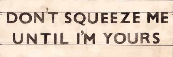
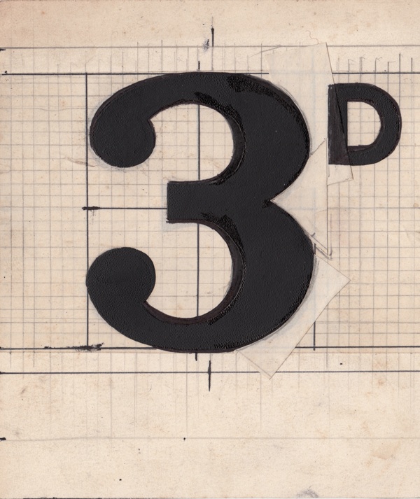
A German-born graphic artist, David worked in Germany and then Jerusalem before moving permanently to the United States to become part of a group of accomplished calligraphers who also worked as book jacket designers in New York in the 1950s. David’s bold and expressive style was informed by a mastery of the typographic tradition (he designed a calligraphic Hebrew typeface called David Hebrew), and he worked for many of leading publishers of the day including Alfred A. Knopf, Harper and Row, Houghton Mifflin, Random House and others.
In this post, the first of a two-part interview, Misha discusses the book and his interest in the work of Ismar David.
When did you first come across the work of Ismar David?
Anyone who reads Hebrew is familiar with David’s work, whether they are aware of it or not: David Hebrew, a font he designed happens to be one of the most ubiquitous Hebrew typefaces for text setting. I was first exposed to his work outside of type design as I researched my article on the history of Hebrew typography around twelve years ago.
What interested you about him?
David’s work is powerful and beautiful, yet little known. He had a rare ability of using traditional skills and historical knowledge to arrive at strikingly contemporary results.
Did David’s work change when he moved to the US?
His work matured and became more diverse, as he grew in his craftsmanship and absorbed many exciting influences of 1950s’ New York design scene. He was working alongside other accomplished calligrapher jacket designers like George Salter, Warren Chappell, Arnold Bank, Phil Grushkin, Charles Skaggs, Oscar Ogg, Jeanyee Wong, and Lili Wronker, among others. They all knew each other and learned from each other’s work.
Do you consider David to be primarily a book designer or a calligrapher?
He was a graphic artist who used calligraphy as a primary means of expression. He was equally comfortable designing book jackets, architectural interiors, logos, advertisements, and monumental inscriptions, depending on the project at hand.
What was special about his Hebrew typeface ‘David’?
It was the first 20th c. Hebrew text type, whose letterforms were not based on an existing typographic model, but found inspiration in historic calligraphic hands. David distilled the idea of the Hebrew letter to its purest form.
How did David’s work differ from his contemporaries Paul Rand and Alvin Lustig?
His work could not be called clever or conceptual. He relied on the sheer power of the letter, shape, and color to create stunning jackets that told the book’s story through a primary visual vocabulary.
Is David’s work still relevant today?
I believe it is. Twenty years into the “conceptual revolution” in our book cover design, the Modernist idiom is getting a bit tired. We are ready for something different. There is a renewed interest in traditional typography and design craftsmanship, and it is here that we could learn a thing or two from David.
Do you think we’re seeing a revival of calligraphy, lettering and hand-drawn type?
Somewhat: if Pinterest stats are any indication, lettering compositions are trending along with pictures of fashionable outfits, cute puppies, and expensive home interiors. It’s not a complete comeback, though. On one hand, a few talented designers like Marian Bantjes and Jessica Hische are enjoying a tremendous degree of success with their decorative lettering work. On the other hand, the work of traditionally trained calligraphers is still in relatively low demand. What seems encouraging, though, is a renewed interest in, and appreciation of, calligraphy as a craft. I would attribute the interest in this and other handicrafts to the backlash against the proliferation of the computer that has left the hand out of the creative process. At the same token, the plethora of visual resources now available on the Internet provides unprecedented access to the rare historical calligraphic books and manuscripts. In this case the same computer is actually helping to make the handicraft popular again.
Thanks Misha.
You can find more images from The Book Jackets of Ismar David on Facebook. Part two of my converation with Misha will be available tomorrow.
Comments closedMidweek Miscellany
Toy Monkeys — Steven Heller interviews Canadian artist and illustrator Gary Taxali for Imprint:
Illustration is in rapid flux. How pictures are being used defies what we traditionally knew about illustration. Many artists are empowered by new digital media. Yet I sense a fear about the continued life of a still picture. People were talking about how illustrations needed to “move” two years ago. That’s not illustration, that’s animation. Most illustrators can’t animate. The timeless power of a still image will never leave the human psyche despite what new gadgets can accomplish.
(pictured above: I Love You, OK? by Gary Taxali, published by teNeues)
Stanley Kubrick’s 1972 rejection letter to Anthony Burgess, at Letters of Note:
I earnestly hope that our all too brief friendship will survive me telling you that the MS is not a work that can help me make a film about the life of Napoleon. Despite its considerable accomplishments, it does not, in my view, help solve either of the two major problems: that of considerably editing the events (and possibly restructuring the time sequence) so as to make a good story, without trivializing history or character, nor does it provide much realistic dialogue, unburdened with easily noticeable exposition or historical fact.
As Shaun Usher, editor of Letters of Note, points out: “Burgess was undeterred, and Napoleon Symphony was published as a novel in 1974. Kubrick’s movie, however, failed to materialise.”
Strange Places — Owen Hatherley reviews Museum without Walls by Jonathan Meades, for the London Review of Books:
What Meades does most often is praise things, especially things that are habitually ignored: he is surely our greatest exponent of what the Russian Formalists called ostranenie, ‘making-strange’. Architecture, as an art form, isn’t quite mundane enough to be made strange, and for that reason Meades would seldom recognise his writing as being about ‘architecture’ as such. Rather, it is about Place, somewhere architecture happens, at times in a very dramatic way, but doesn’t necessarily have the leading role. Architects take non-art, ‘the rich oddness of what we take for granted’, the mutability, detritus and accident that define truly worthwhile Place, and replace them with something static and unchangeable. However, unlike Iain Sinclair or the London ‘psychogeographers’… Meades does not fetishise the spaces between. ‘I have to admit to a fondness for pitted former rolling stock dumped in fields and for abandoned filling stations,’ he writes. ‘But man cannot live by oxidisation alone. It’s not a question of either atmospheric scrappiness or gleaming newbuild. It’s a question of both/and. It’s a question of the quality of the atmospheric scrappiness, the quality of the newbuild.’
And finally…
The best thing I’ve seen in ages… Roy Gardner’s designs for the sales tickets in his store Gardners’ Market Sundriesmen on Commercial St in Spitalfields, London:
Comments closedNo doubt knocking up these sales tickets was all in day’s work to Roy Gardner – just one of the myriad skills required by a Market Sundriesman – yet a close examination of his elegant graphic designs reveals he was also a discriminating and creative typographer.
Design Matters with Roberto de Vicq de Cumptich
Designer Roberto de Vicq de Cumptich interviewed by Debbie Millman for Design Matters. Wonderful stuff:
Roberto’s most recent book Men of Letters & People of Substance is published by Godine:
Comments closed
Midweek Miscellany
Patchwork — Artist Lilli Carré talks about her story collection Heads or Tails with Robot 6:
I wanted to include the majority of the short stories I’ve produced over the past five years, and so I went through all my stuff and arranged them not chronologically, but by how they each fed into each other. The book contains stories collected from anthologies, some new work, and a few pieces that I reformatted from small run mini-comics, artists books, and drawings that I’ve made over the years. My style changes quite a bit from project to project, so the book has a kind of patchwork quilt feel to it, but I wanted to make sure there was a solid thread between how one story feeds into the next.
The Activists — An interview with Dennis Johnson and Valerie Merians, founders of Melville House, at The Rumpus:
A lot of our early work was activist books… We were always kind of motivated in that way. When you have your own publishing house, you have to follow your own tastes, so we were publishing whatever we liked. We were also publishing a lot of translated fiction, because we felt that something that was important in the United States that was important then and still now, to combat that sort of insular feeling that we are all there is. To bring other writers and voices into the language, and get them exposed to new readers.
Nice — A lovely profile of Ben McFall who manages The Strand’s fiction section, in the New York Times:
Mr. McFall grew up in Detroit, the only child of two schoolteachers, and he studied literature and music in college. He worked at a bookstore in Connecticut after graduation and then moved to New York in the mid-1970s to flourish as an actor, singer, poet and openly gay man. He took a job at the Strand in 1978.
“Back then, it was a cruel place; I was the first nice person to work here,” Mr. McFall said.
And finally…
Learn New Old Skills — An interview with type designer and calligrapher Seb Lester at Salon:
I’ve gone back to basics in recent years and placed a lot of emphasis on traditional tools… I have realized that calligraphy makes me a better type designer with digital tools and vice versa. There is a beautiful synergy between the two. There is also something very satisfying about making expressive marks and calligraphy has a humanity and expressive quality hard to capture with a computer. A personal motto at the moment is learn new old skills.
Comments closed
Something for the Weekend
Rubbish — Rachel Cooke on the artist Kurt Schwitters at The Guardian:
Merz doesn’t mean anything: it is a nonsense word (it comes from Commerzbank, an ad for which appears in one of his earliest collages). But after 1918 everything Schwitters made was Merz, whether it was periodical, painting or poem. He was a one-man movement. “The word denotes essentially the combination of all conceivable materials for artistic purposes,” he said. “And technically the principle of equal evaluation of the individual materials… A perambulator wheel, wire-netting, string and cotton wool are factors having equal rights with paint.” In other words, art could be made from the things most people regarded as rubbish. Almost overnight, he became a collagist.
There is a slide-show of Schwitters’ collages here.
Also: Merzman: The Art of Kurt Schwitters, is a fascinating 30-minute BBC Radio 4 documentary about the artist and his work in Britain.
The exhibition Kurt Schwitters in Britain opens at the Tate January 30, 2013.
Going Underground — The iconic London Underground typeface, designed by Edward Johnston in 1913, turns 100:
“Underground” — later known as “Johnston” — was circulated as a lettering guide for sign-painters and also made into wood and metal type for posters, signs, and other publicity materials used throughout London’s transport network.
Johnston himself only drew one weight of the typeface. He based its weight and proportions on seven diamond-shaped strokes of a pen stacked in a row. This gesture even shows up in the typeface itself, with the characteristic diamond used as the tittle of the “i” and “j”. He felt so strongly about the weight of the design that when another student of his agreed to create an accompanying set of bold capitals, Johnston wouldn’t speak to him for decades afterward.
And finally…
Fire Hose — James Gleick on the Library of Congress collecting and storage of Twitter messages, for the New York Review of Books:
Comments closedThis is an ocean of ephemera. A library of Babel. No one is under any illusions about the likely quality—seriousness, veracity, originality, wisdom—of any one tweet. The library will take the bad with the good: the rumors and lies, the prattle, puns, hoots, jeers, bluster, invective, bawdy probes, vile gossip, epigrams, anagrams, quips and jibes, hearsay and tittle-tattle, pleading, chicanery, jabbering, quibbling, block writing and ASCII art, self-promotion and humblebragging, grandiloquence and stultiloquence. New news every millisecond. A vast confusion of vows, wishes, actions, edicts, petitions, lawsuits, pleas, laws, proclamations, complaints, grievances. Now comical then tragical matters.
Call it what you will, the Twitter corpus now forms a piece of “the creative record of America” and therefore falls squarely within the library’s mission…
Midweek Miscellany
Accidental Effects — Rick Poynor on the street photography of designer Robert Brownjohn, at Design Observer:
Brownjohn tended to include enough of the setting to give a strong sense of the look and atmosphere of the place where he found the lettering or graffiti. The British capital’s dour post-war street texture was fascinating and meaningful to him. As an American and a recent arrival in London, he would have seen everything with the newcomer’s hungry and hypersensitive eye, whether the pictures were taken in a single day touring around town by taxi, as the story would have it, or in the course of several trips. Brownjohn shows the bricks, the stone, the doorways and window frames, the railings, the adjacent fixtures, the surrounding structure… [He] valued the accidental effects wrought by dilapidation, the elements, or human hands, in their own right, as a kind of visual music or poetry, irrespective of the formal design applications that these expressive details might go on to inspire.
Drowning in Film — Movie critic David Thomson, author most recently of The Big Screen, in conversation with Greil Marcus, at the LA Review of Books:
I have become more and more interested in the way different movies are like the water in a river. They’re constantly flowing into each other. Indeed, it’s a form that you can’t actually think of or describe as separate items. It’s the flow, it’s the sequence. And I think that we’re at a point in history where it’s not really as significant who makes what particular movies, it’s the constant flow. And like any flow of that kind, you say it’s like being carried down a river, and a lot of time perhaps you feel it’s on a sunny day and it’s very pleasant, but you can drown in a river. It seems that a lot of the culture, elements that I would hope to see maintained, are in danger of being drowned.
And finally…
Abnormal Activities — Patrick Ambrose interviews Iggy Pop for The Morning News:
Comments closedIggy Pop… obliterated the barrier between the artist and spectator. “I’m interested in being able to do that while maintaining the formality of the dinner engagement,” he says with a hearty laugh. “There has been a tremendous change in the cybernetics of rock and roll over the past 50 years. If you look back to the mid- to late-’50s, you’ve got maybe Elvis or Eddie Cochran playing on a flat-bed truck in a gas station parking lot with presumably 1,200 doomed teenagers dancing, chewing gum and knifing each other while religious leaders burn records and make racial slurs about the music. Now, you’ve got thousands of people obediently shuffling into these concrete civic centers to sponge up something in places where nothing really happens.”
Midweek Miscellany

A design collaboration between Paul Buckley and Jessica Hische, Penguin Drop Caps is a 26-book series of hardcover classics. The first six books go on sale November 27th. See the covers at Imprint.
Plumbing — An interview with book designer John Gall at The Believer:
A cover is a structural part of the book. It protects the pages. It provide the first impression of the content. It’s an eye-catching device – maybe the book’s only means of advertising. It can even add to the editorial content of the book; you can kill bugs with it. Then, after you buy the book, the cover takes on another function. It’s your visual connection to the book as you develop a relationship with the material. It can also communicate to others who you are. I’m one of those people, who when I visit someone, I snoop around and see what’s on their bookshelves. I’m not doing this to judge them, but to find some common interest, a connection to that person.
There is also this great anecdote about Tom McCarthy and the cover for Remainder:
We did a photo shoot for his cover so it appeared that the book was being slowly immersed into blue liquid. We had to create a somewhat elaborate setup to get it just right. We sent the author a photo of the studio setup as a souvenir, showing the tripods and lights and water tanks. A year later he wrote back saying he had an argument with some artist friends of his over dinner. They were looking at the studio-set photo and were insisting that it was all a fake setup and that the cover was executed in Photoshop; that the photo shoot was all staged to provide “proof,” like a fake moon landing!
My Q & A with John is here.

Graveyard Stillness — Andrew Beckett reviews Unknown Pleasures by Joy Division bassist Peter Hook for The Guardian:
Joy Division, for all the graveyard stillness of their record sleeves, were participants in a frenetic golden age for British pop, which had begun with punk in 1976 and would peak, commercially at least, with the British dominance of the American charts in 1983. Groups grew up fast and seized their moment, or disappeared. Yet Joy Division did not earn enough from their feverish touring and recording to give up their day jobs. Hook worked in the offices of the Manchester Ship Canal Company, Curtis at an employment exchange, and Sumner for a film company where his “job was to colour in Danger Mouse”.
And finally…
The Fight Against Loss — A lovely essay by Simon Schama on why he writes:
Orwell’s four motives for writing still seem to me the most honest account of why long-form non-fiction writers do what they do, with “sheer egoism” at the top; next, “aesthetic enthusiasm” – the pleasure principle or sheer relish of sonority (“pleasure in the impact of one sound on another”); third, the “historical impulse” (the “desire to see things as they are”), and, finally, “political purpose”: the urge to persuade, a communiqué from our convictions.To that list I would add that writing has always seemed to me a fight against loss, an instinct for replay; a resistance to the attrition of memory.
Comments closed
Something for the Weekend

For the launch of his new book Building Stories, Chris Ware has two exhibitions opening this weekend. The first opens tonight at the Carl Hammer Gallery in Chicago. The second opens on Saturday at the Adam Baumgold Gallery in New York. Both shows will display original art from the new book.

The Snail — The ‘accidental’ history of the @ symbol at the Smithsonian Magazine:
Called the “snail” by Italians and the “monkey tail” by the Dutch, @ is the sine qua non of electronic communication, thanks to e-mail addresses and Twitter handles. @ has even been inducted into the permanent collection of the Museum of Modern Art, which cited its modern use as an example of “elegance, economy, intellectual transparency, and a sense of the possible future directions that are embedded in the arts of our time.”
A short profile of artist and designer Ray Eames at Dwell:
According to Beatriz Colomina, in her essay “With, or Without You: The Ghosts of Modern Architecture,” even though Charles and Ray Eames were revolutionary by including her name in the brand as an equal partner, Ray didn’t always receive her fair share of credit. An editor from the New York Times once erased Ray’s name from an article on the Eameses, despite protests from the writer, Esther McCoy. McCoy was outraged, and wrote Ray an apology letter outlining her frustrations over the omission (and the editor’s insistence on calling the Eames lounge a casting couch), “This is sheer nonsense; the broad audience isn’t titillated by the phrase casting couch nor does it object to a woman being credited for work,” she wrote.
And finally…
ShortList on Mary Harron’s movie adaptation of American Pyscho:
Comments closedIf there’s one moment in American Psycho that sums up the film’s utter greatness, it’s the business card scene. On the one hand, parodying the narcissism of Eighties yuppies, on the other, lending an insight into the warped psyche of the film’s protagonist… And 10 years after the film was first released, it’s certainly one of the reasons why this darkly hilarious Wall Street satire, based on the Bret Easton Ellis novel, is considered a cult classic and one of the greatest films of the past decade.
Midweek Miscellany

Steven Heller shares a few pages from Effective Type-use for Advertising, self-published by Benjamin Sherbow in 1922, at Imprint.
Lost in the Shuffle — Brian Appleyard profiles the writer and critic Clive James:
James’s television work, brilliant as it was, has tended to blur his identity as one of the most influential writers of his time. At one level every newspaper is still packed with James wannabes, his prose tricks and tropes are imitated everywhere; at another level, the whole 1980s wave of new British fiction, especially Martin Amis, showed signs of having learnt from James. Most important was his invention of a way of writing seriously about popular culture.
Listed — Phil Patton on the age of the list, for the New York Times:
We’re living in the era of the list, maybe even its golden age. The Web click has led to the wholesale repackaging of information into lists, which can be complex and wonderful pieces of information architecture. Our technology has imperceptibly infected us with “list thinking.”
Lists are the simplest way to organize information. They are also a symptom of our short attention spans.
And finally…
Swallowing Up the Past — John Gray on J. G. Ballard and memory, for BBC Magazine:
Comments closedThrough a kind of inner alchemy, the Shanghai of his childhood became the London of his first major novel The Drowned World, also published in 1962.
Irreversibly altered by climate change so that it has become a region of tropical lagoons and advancing jungle, the city is almost unrecognisable, though the weed-choked streets remain intact in the depths of the lagoons and the upper floors of a few crumbling hotels continue to be habitable.
Like many of Ballard’s characters, the novel’s central protagonist – a biologist who shares many of Ballard’s own preoccupations with time and memory – doesn’t regret the passing of the old world. At the end of the novel he finds fulfilment in the sun-filled wilderness that is swallowing up the past.


