Well, this is rather lovely… Gentlemen of Letters is a 16 minute documentary about sign painters in Dublin:
The film features the work of Kevin Freeney, Colm O’ Connor, Maser, James Earley, and Kevin Freeney Jr.
(via Quipsologies)
Comments closedBooks, Design and Culture
Well, this is rather lovely… Gentlemen of Letters is a 16 minute documentary about sign painters in Dublin:
The film features the work of Kevin Freeney, Colm O’ Connor, Maser, James Earley, and Kevin Freeney Jr.
(via Quipsologies)
Comments closed
In a new video for Gestalten.tv designer Paula Scher discusses her creative process and her vision of branding and identity design:
Comments closedA rather lovely short film on sign painter Mike Langley by Dress Code:
(via I Love Typography)
Comments closed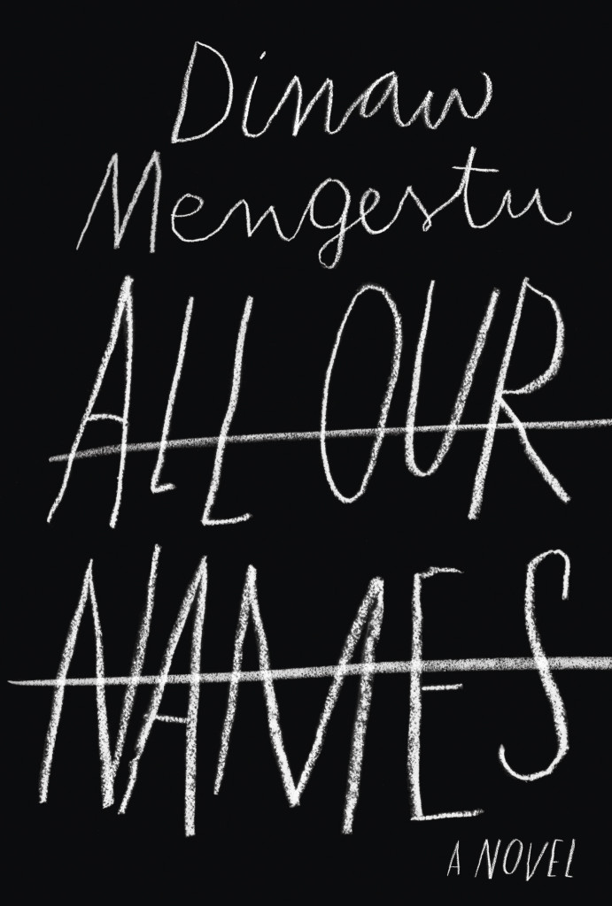
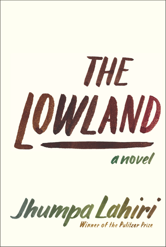
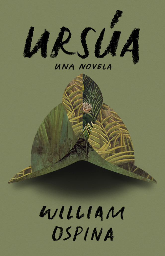
If you’ve walked into a North American bookstore recently, or you’ve been paying attention to the book reviews on this side of the Atlantic, you will have no doubt seen the stylish black cover for All Our Names by Dinaw Mengestu with its distinctive chalkboard lettering. Or perhaps you remember the hand-lettered cover for the Knopf edition of The Lowland by Jhumpa Lahiri? It was one of my favourite covers of the past year. Both are the work of Venezuelan designer Isabel Urbina Peña. Now based in New York City, Isabel is a cover designer for Random House and creator of a typographic zine called Rants from a Stranger.
Since relaunching her website earlier this year, Isabel’s cover designs have been featured on numerous blogs already (including here), but I was thrilled to have the opportunity to talk to her earlier this month about her work and career in greater depth.
Isabel and I corresponded by email. Here is our conversation:
Do you remember when you first became interested in design?
I think because of my parents, art was in my life since I can remember. But, when I was in 7th grade there was a big boom of internet start-ups in Venezuela and I remember clearly “deciding” that I wanted to be a graphic designer then…I was 13 and the concept of what graphic design was at the time was probably wrong, but that moment definitely steered me in this direction. Also, there was a moment in my “foundation year” in college where one of my type teachers talked about how the “typographer” was present in the page, but invisible to the reader and that just flipped a switch in my brain.
Is anyone else in your family creative?
Both of my parents are architects and they really motivated my sister and me creatively while growing up.
We spent half of our childhoods going to museums, plays, as well as ceramic, poetry and creative writing classes. My dad also paints and belongs to a drawing circle. When I was little he would sit with me and walk me through art books or give me a canvas and ask me to paint from inspiration, or even from some big painting like Van Gogh’s sunflowers. Paul Klee, Gauguin and Chagall are a few of the artists that I discovered through them when I was six or seven… I have to say my mind was blown, I still cherish those moments.
Were there a lot of books in your house growing up?
A ton. My dad also reads a LOT… So he wanted me to be “a reader.” I would get books for Christmas, birthdays, holidays, regular days…no Nintendo growing up… believe me that was tough, haha. He really sparked a love for reading and I would find new material everywhere; at my grandma’s I would read through all my uncle’s adventure books; at garage sales I started picking up Penguin paperbacks because they looked so simple and literary. Reading felt like something my dad and I shared, but it was also mine to discover.
Did you study design in Venezuela?
Yes, I studied at a small school called ProDiseño. Until very recently the “campus” was literally a two-flight house with a tub and a living room. Classes were really small, so everyone knew each other. The school started after a group of 80 students from IDD (Instituto de Diseño Neumann) left to start their own school. Neumann was founded by a large group of European immigrants who taught them design through the Bauhaus principles. Prodiseño had a very strong inclination towards clean, conceptual design. Everything had a purpose and “a why.” The content always came first; then the form. It was a very special experience and it prepared me to do anything (design, typography, illustration, animation, motion graphics…) and most importantly taught me to learn how to “think.” It was a very complete, Renaissance-style education.
Is there a strong arts/design community in Caracas?
Definitely, though it is a rather small one compared to New York City, it is very interesting.
There are a lot of events that support the arts and design and mostly DIY culture. A lot of self-proposed shows and collectives that put on parties with great visuals and self-produced posters. Also, a lot of zines and self-published publications are popping all over town.
How is living in New York different?
Well, New York is different in every way: from the variety of people you meet to the cultural experiences that are available to you. Living here, for me, has been a rich experience loaded with references of all kinds, and motivation. If anything it makes me expect more from myself and aim higher.
How long have you lived there?
This is my 6th year in New York, but it honestly feels like I just got here. Of course, I’ve learned so much and evolved, but it feels like it never gets old.
Does what’s going on in Venezuela worry you?
YES, I am glad you asked.
I am extremely worried by what’s going on in Venezuela and I think not enough people know about our situation. Protests started almost two months ago and people are being murdered and attacked on the streets daily and there doesn’t seem to be any change in the attitude of the current government. The truth is the people have the right to protest for the many problems that Venezuelan people are dealing with right now (the extreme insecurity they live in, the rapidly increasing inflation rates, the scarcity of many basic necessities and the extreme corruption, just to name a few) and the way that the government is handling this protests is, just, criminal. There are human right violations occurring left and right and even though there is proof (video and photos) for a lot of these events, the government is turning a blind eye and not doing anything to impart justice. Instead they focus their efforts in bullying opposition leaders and undermining the people’s rights. It is very, very sad and scary for all Venezuelan people and unfortunately change won’t come easily… but Venezuelans are still fighting hard, hopefully with a brighter future awaiting for all.
Can you describe your process for designing a book cover?
I start by reading the book and the TI (Title Info) sheet, getting familiar with the author and his backlist, if there is one. I take a bunch of notes and list ideas while and after I’m reading. I try to list everything—you never know when the “silliest” idea will spark something good. I’ll do a mood board and sketch a selection of these ideas in small (2 x 3 inches or so) detailed thumbnails with pencil and paper. Depending on the book, developing these ideas might be on or off the computer. I do a lot of paperback-size pencil sketches to define a lot of the lettering shapes and details.
Sometimes I will ink and do minimal clean up in the computer and sometimes I digitize the lettering in a font editing software and make the comps. Once I do that, I usually present a range of “developed” ideas and looks to my art director. We discuss if we need to adjust or tighten anything and then show the editors.
What are your favourite kinds of projects to work on?
Honestly, I am quite new at this, and I try to get the most out of any project. Figuring out what best represents the book I’m working on is one of the things I enjoy the most. That said, I really love doing all the cover art from scratch, and creating a “unique” design with custom lettering and illustrations.


Can you tell me about your zine “Rants from a Stranger”?
Rants from a Stranger is a self-published “booklet” inspired by zines, graphic novels, comics and the DIY culture. I like to call it a “typographic novel,” though it doesn’t really qualify as a graphic novel because of its length, and it is more on the zine realm. I love type and lettering and this was the perfect excuse to hand-letter more and produce a periodical self-published piece where I had full control of the creative direction.
I thought it would be fun and different to develop a series of “comics” without illustrations and solely use lettering as the “characters” of the story. So far there are two black and white issues and the third issue (special edition, in color) is coming out in late April as a collaboration with a very talented musician and artist from Venezuela, Mariana Martin Capriles, aka Mpeach. I’m really excited about this issue because of our collaboration, and also because it comes with a paper record player and a flexi EP record of her new song, “Boogaloo Mutante.”
Who are some of your design heroes?
Gerd Leufert, Gego (Gertrude Goldschmidt) and Nedo Mión Ferraro were very important figures in my formation as a designer and I still look through their books every time I have a chance. Their students, now well known graphic designers, and former teachers of mine, like Álvaro Sotillo, Gabriela Fontanillas and Carlos Rodríguez have always inspired me through their impeccable work and dedication.
Doyald Young’s lettering work take my breath away, and old school type designers like W.A. Dwiggins and Frederic Goudy are daily inspirations.
Who do you think is doing interesting work right now?
So many brilliant folks out there! Freddy Arenas, my super talented other half, does amazing motion graphics and illustration.
In the cover design world, my co-workers are doing great stuff, all the time. Linda Huang, Joan Wong, Pablo Delcán, Kelly Blair, Megan Wilson, Peter Mendelsund, Carol Carson, Stephanie Ross… From the type, design, art and illustration world Jesse Ragan, Village, Kris Sowersby, OCD, Steve Powers (ESPO), Sergio Barrios, Wayne White, Craig Ward, Alex Trochut, Elizabeth Carey Smith, Gustavo Dao, Suzi Sadler, Ryan Bernis, Priyanka Batra, Sasha Prood, Ping Zhu, Victo Ngai, Elana Schenkler, Geoff McFetridge, Nobrow Press, quite a mix…
I could keep going…
What advice would you give a designer starting their career?
Try harder. I think it’s really important to be critical of your own work and be able to accept its faults. Always, strive for more and be hungry. At the same time, embrace your mistakes, learn from them and move on to the next project. I am a big fan of tweaking and fixing til the end of days… but sometimes you just have to learn to let go of projects and keep going. Erik van Blokland said to our Cooper Type class (regarding typeface design), “Release early and release often; recognize what you did wrong in the project and try again.” I remind myself to do that everyday.
I think you should always try to work in what you love and feel passionate about. Even if it means reinventing yourself and making up your own projects in your spare time. This is where the good work will be. Don’t be afraid to make changes and try different things if you need to.
What’s in your ‘to read’ pile?
I’m currently reading Americanah by Chimamanda Ngozi Adichie and Inter Views by James Hillman. I really want to read Dissident Gardens by Jonathan Lethem, My Age of Anxiety by Scott Stossel and The Goldfinch by Donna Tartt from this past season.
Someday, I’d love to re-read Cortazar’s Hopscotch (Rayuela) and all of Jorge Luis Borges.
The list goes on…
Do you have system for organizing your books?
Ha, no. I used to be very organized and had them alphabetically, color code them, etc… Those days are over… Nowadays, I move them around pretty often and they stay wherever they land.
Do you have a favourite book?
Not really a favourite single book, but I do have an influential shortlist: Virginia Woolf’s The Waves, L’Étranger by Albert Camus, Cuentos de Amor, Locura y Muerte by Horacio Quiroga, Piedra de Mar by Francisco Massiani, Ficciones by Jorge Luis Borges, Oscar Wilde’s Collection by Siruela (Biblioteca de Babel).
Thanks Isabel!
4 Comments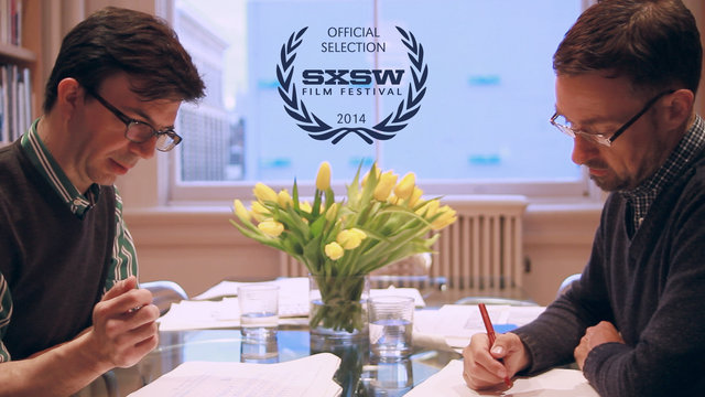
Dress Code‘s documentary short about typographers Jonathan Hoefler and Tobias Frere-Jones, Font Men, “gives a peek behind the curtain into the world of Jonathan and Tobias. Tracking the history of their personal trajectories, sharing the forces that brought them together and giving an exclusive look at the successful empire they built together.” The film is a SXSW 2014 Official Selection:
I felt rather sad watching this knowing that Hoefler and Frere-Jones are parting ways acrimoniously.
(via Quipsologies)
2 Comments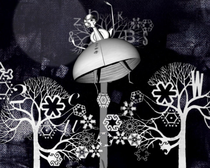
How is that I’ve not seen Herzog and the Monsters before now? Lesley Barnes‘ lovely 2006 short animated film, made at the Glasgow School of Arts, has just about all you could wish for: “a small boy who steals words, a forest full of monsters and lots of vintage penguin books.”
Barnes’ music video for I Didn’t See It Coming by Belle and Sebastian is also charming:
(via The Dissolve)
Comments closed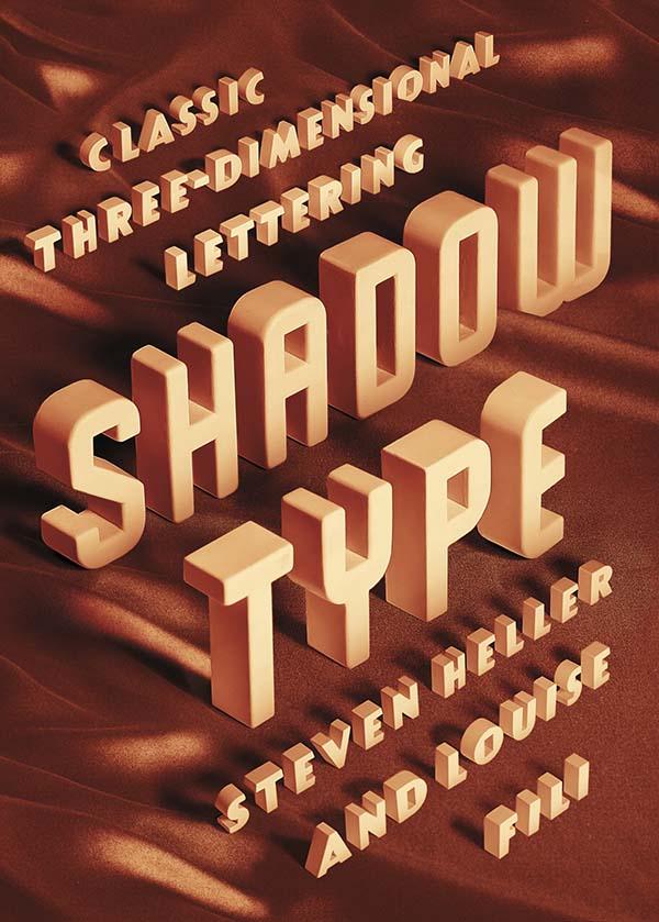
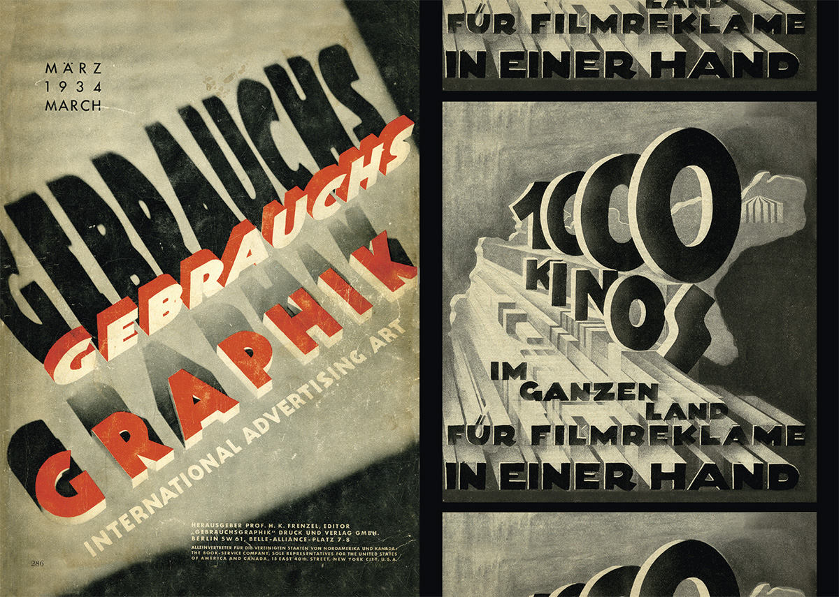
“Dimensional typefaces toy with human perception, challenging the limits of cognition. Whether framed by a subtle tint or a bold silhouette, in color or in black and white, a shadow adds bulk, enabling the words to rise voluminously from otherwise flat and unmonumental surfaces. Shadow faces are typographic trompes l’œil, fascimiles of real three-dimensional letters and inscriptions in sculpture and architecture… This sculptural essence of shadow type adds not only to the letters’ visibility, but also to their continuing allure.”
Just thinking about how much Steven Heller writes makes me a little giddy. The renowned art director, educator, design historian, and critic provides a steady stream of design commentary in newspaper, magazine and journal articles (not to mention his blog for Print magazine, The Daily Heller). He has authored, co-authored, or edited over 100 books on design, illustration and typography, including the recent Shadow Type: Classic Three-Dimensional Lettering, co-authored with his partner Louise Fili.
Shadow letters started to make an appearance on merchants’ signs in the 18th-century, and were introduced as metal typefaces as early as 1815, but they did not become common in printed text until later in the 19th-century. After a surge in popularity among printers and their clients, type foundries began to provide a wide selection of styles and sizes, and by the late 19th-century shadow wood type was also in demand, coming in extra-large sizes so it could be used outdoors. “Whether custom drawn, or as metal or wood type, shadow letters animated newspaper and magazine mastheads, product labels, and, indeed, all kinds of signs and posters.”
Published in September last year by Princeton Architectural Press, and distributed in Canada by Raincoast Books, I had the opportunity to ask Steven about Shadow Type, his interest in design ephemera, and how he finds time to write.
 Do you remember when you first became interested in design?
I was interested in pictures at an early age. I wanted to be like Jules Feiffer, a comics artist. Design came later. I was studying the work of some German satirists, who were also designers.
Did you grow up in a creative household?
Not especially.
Where did you begin your design career?
At 14 I worked for an ad agency doing RussssTogs. Didn’t go well. It took another 3 years before I was hired by an underground paper to do layouts.

When did you first start writing about design history?
When I was at the NY Times as OpEd art director, I did a little bit of writing on those Germans I mentioned. Then it accelerated to writing about publications and other historical themes.
How do you find the time write?
There’s always time.
Do you still get excited when you hold one of your own books in your hands for the first time?
Yes, the thrill is still there. But the high lasts shorter. An addict gets used to the fix and needs another and another. These days, I don’t rip the envelope right open. I let it sit for hours, so I have something to look forward to. Weird, I guess.

Why did you and Louise decide to write a book on classic three-dimensional lettering?
We did the first one on Scripts. We’ve done series before, they didn’t start out that way, but evolved. This evolved into Shadow Type. I have long loved the dimensional, colourful, sculptural letters.
When was the heyday of ‘shadow type’?
19th, 20th and 21st centuries. Its never gone out of style. But the golden age was late 1880s to 1940s.

Why did it become popular?
Dimensionality on flat surface. Our eyes love to be fooled.

Why do you think there is a renewed interest in ornate typography and lettering?
It comes and goes. I see a shift away again. But it has to do with the joy we get from ornament and I think it parallels what goes on in clothing.
Has Louise’s work contributed the revival of decorative type?
Possibly. But she’s not decorative per se. Her type choices are elegant. She’s about precision and aesthetic pleasure.

Do all the examples in the book come from your own collection?
For Scripts and Shadow yes. And for the next one too, that’s Stencil Type.


Why does design ephemera hold such a fascination for you?
I’ve come up with all sorts of reasons, but the all seem bogus. I feel the stuff somehow represents who I am. But I also love being a repository of history. More than that, I cannot say.
Your son, Nicolas Heller, recently made a film about your den called “The Cave.” What was that experience like?
He’s a great talent. I just set him loose. And he made his film. The stuff in that place should be interpreted by others. The juxtapositions of objects and books are at times wonderful.
What’s Nicolas working on now?
He’s doing a series of documentaries on eccentric New Yorkers called NO YOUR CITY, he’s also filming designers for documentaries produced by Brian Collins.
Do you have a favourite book?
Of my own? I’ve done over 165, but I love Iron Fists. Of other people? There are too many to say.
 What books are in your ‘to read’ pile?
I just finished Deborah Solomon’s biography of Norman Rockwell – smartly done. And I finished Year Zero by Ian Buruma about the year 1945, makes the blood chill and boil. On the pile is a thick book about the Beatles. Not sure I’ll get to that.

Is there one book you think all designers should read?
I love Ben Shahn’s The Shape of Content. I also love The Hare with Amber Eyes, but for me, nothing is so essential that I’d stand on the mount and scream that they should read the tablets.
Thank you, Steven!
1 Comment
Steven Heller and Louise Fili talk about their beautiful new book Shadow Type in a new video for Designers & Books:
The video is part of the Designers & Books Online Book Fair, a wonderful directory of design books that you can browse in all sorts of interesting ways.

(Shadow Type is published by Princeton Architectural Press in the United States, and distributed by my employer Raincoast Books in Canada)

Close Not Touching is a beautiful short film by DILLONROSE.COM about the work of designer and typographer Gerald Cinamon.
Born in Boston in 1930, Cinamon moved to England in 1960, eventually becoming chief designer at Penguin Books. Strongly influenced by Swiss design, Cinamon utilized a combination of bold colour, clean lines and sans serif typography that was unique in British book design at the time. Now an influence on a new generation of type-inspired designers, the film includes a conversation between Cinamon and David Pearson:

An exhibition of Cinamon’s work, Gerald Cinamon: Collected Work Since 1958, opened at the ICA in London this week, and new book Graphic Design Gerald Cinamon, designed by Danny McNeil at SEA design, is available here.
Although a live appearance by Cinamon has had to be cancelled, Pearson will be discussing text design at Penguin at the institute on September 13.
A full-length feature documentary about Cinamon by DILLONROSE.COM will be available to download from iTunes in February 2014.
Comments closed
Making Bird Noises — Dwight Garner profiles novelist John Le Carré, for the New York Times:
In his lesser books, le Carré’s prose can thin out perilously, but at his best, he’s among the finest writers alive. There’s a reason Philip Roth has called “A Perfect Spy,” le Carré’s 1986 autobiographical work of fiction, “the best English novel since the war.” The Times of London ranked him 22nd on a list of the 50 greatest writers since 1945. His books are less about espionage than they are about human frailty and desire; they’re about how we are, all of us, spies of a sort.
See also: Mark Lawson reviews Le Carré’s latest, A Delicate Truth, for The Guardian.
(Pictured above: the cover to the US edition, illustrated by Matt Taylor)
And while we’re at it… James Campbell reviews Kurt Vonnegut: Letters edited by Dan Wakefield, which has just been released in the UK:
[Anatole] Broyard was scarcely wrong to say that Vonnegut’s reputation suffered a blow with each new book; he is a classic example of a writer whose renown endures through the success of a single novel. Yet the tone was ever recognisable, and even lesser-known books – Slapstick, Deadeye Dick, Hocus Pocus – sold well. In response to a question from a reader in 1991 about the relationship of his style to “jazz and comedians”, he replied: “I don’t think about it much, but now that you’ve asked, it seems right to say that my writing is of a piece with nightclub exhibitionism … lower class, intuitive, moody, and anxious to hold the attention of a potentially hostile audience.”

New England — Alan Moore talks to Pádraig Ó Méalóid about League of Extraordinary Gentlemen, Nemo: Heart of Ice, his unfinished novel Jerusalem, and his Lovecraftian work-in-progress Providence:
with Providence, what I am doing is, I’m looking as much at American society in 1919 as I am looking at Lovecraft, in terms of my research, and I am connecting up Lovecraft’s themes, and Lovecraft’s personality, to a certain degree, with the tensions that were then incredibly evident in American society… It’s starting from – if Lovecraft’s characters, if Lovecraft’s monsters, if Lovecraft’s locales actually existed in A Real World, then what would they really be like, and what would the world be like?
In part two of the interview, Moore discusses his recent film projects and other work.

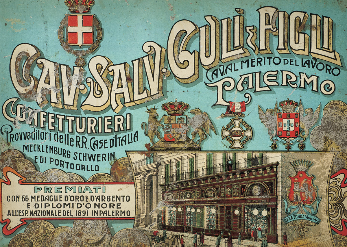
Who? — Steven Heller talks to Unit Editions Adrian Shaugnessy about Jurriaan Schrofer (1926-90): Restless Typographer at Imprint. It’s a rather short interview, but there are some lovely illustrations!
Any finally…
Still my favourite thing on the internet this week:

Phillip Marsden’s one-page comic strip ‘Hipster Hairdo’ for Off Life #4 (PDF).
Comments closed

The Man — An interview with the talented Seb Lester, typographer and artist, at The Raw Book:
People may associate me with flourished calligraphy and intricate formal script styles, but I don’t want to be known as a stylist because I feel I can do a wide variety of things. I want to try to constantly evolve and progress, with quality being the only theme running through my work. No one would guess most of the projects I’ve worked on have been done by me.
There is something quite wonderful about watching Lester at work:
The Beauty of Letterpress — An online resource and showcase created by Neenah Paper, featuring “the best and most innovative letterpress work in the industry today.”
And finally…
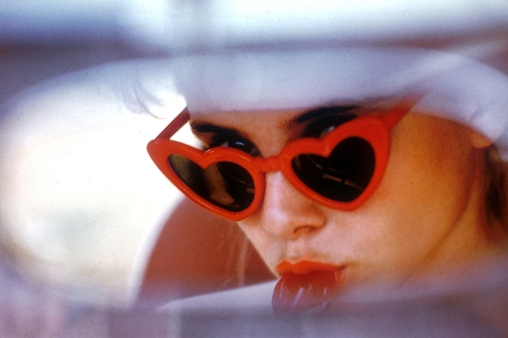
Heart-Shaped Box — Phil Bicker, a senior photo editor at TIME, interviews photographer Bert Stern at Time Lightbox:
1962… also saw the release of Lolita, directed by his old friend Stanley Kubrick. He asked Stern to take some publicity shots for the film. Stern took then 13-year-old actress Sue Lyon and her mother to a five-and- dime store in Sag Harbor, on eastern Long Island, to make the pictures. “I walked into the store and saw all these sun heart-shaped sunglasses and candy canes and other fun stuff that became the props for the shoot. I had not seen the movie but I underlined passages in Nabakov’s book that would make picture ideas. I always work with words that become pictures.”
See also: Stern discusses his work and Shannah Laumeister’s new documentary Bert Stern: Original Mad Man at the New York Times’ T Magazine.
Comments closed