Skip to content

Tag: Typography

Gray318 TYPO Talk Berlin

everything is illuminated gray318

“I’m not a designer, not an illustrator, and certainly not a type designer – I’m a misfit…Publishing – that’s where people who don’t quite fit in end up.”

The TYPO Talks blog recaps Jon Gray‘s recent talk at TYPO Berlin:
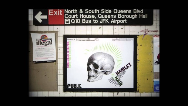
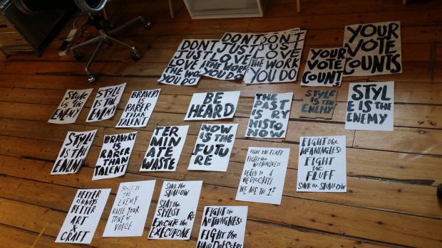
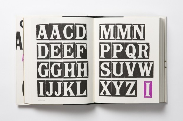
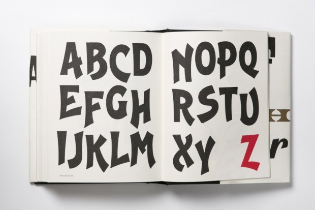
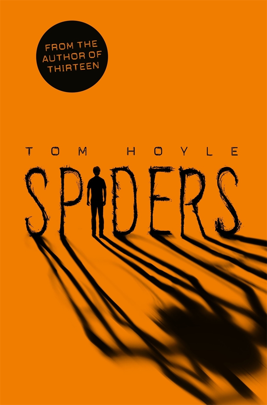
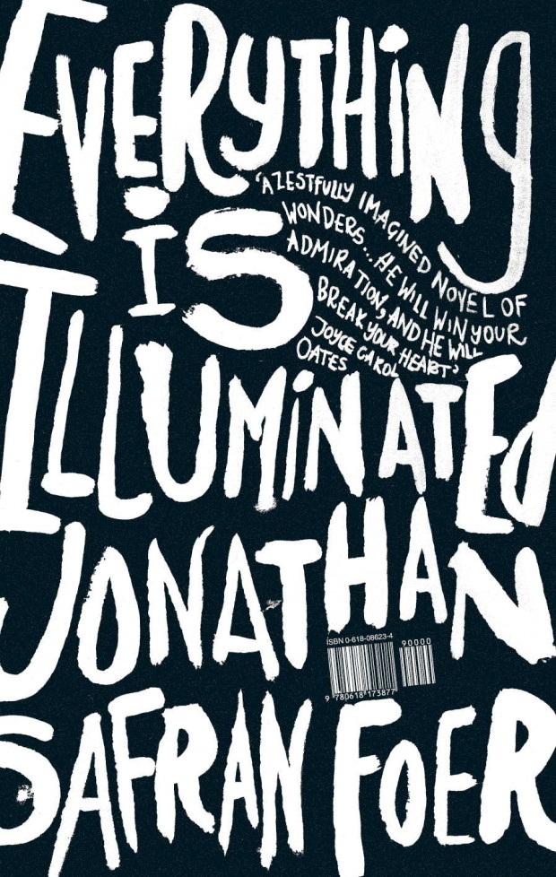
Gray looked around for inspiration and got interested in old hand written signs often posted at churches. Written by sign writing dilettantes who need to communicate something to their fellow churchgoers, to Gray these signs tell a story, they speak of dedication, personality, of love. The signs reference a specific time and place, an idiosyncratic personality and character. Gray took the loose and spontaneous quality of the handwriting on these signs and used it for the cover of “Everything is Illuminated”.

What he got gave him one of these rare moments where “You make something and you know it works, it’s something new – I made it and it was completely me. I liked it, Penguin loved it, the author was all over it.” Published in 2002, the rough all-over hand-lettering on the cover contrasted strongly with the clean lines and vector graphics that had been dominating graphic design for a while then. It was the avant-garde of what Steven Heller called “The Decade of Dirty” when handmade aesthetics became fashionable again. And it marked the very beginning of the still ongoing revival of hand-lettered typography.

Comments closed

Freunde von Freunden: Erik Spiekermann Interview

Freunde von Freunden visit the apartment and studio of designer and typographer Erik Spiekermann:

A look around his tidy, if eclectic, home offers an eye pleasing sampler of the designer’s interests. One of his home’s main attractions is his two-story bookshelf, mostly filled with titles pertinent to his profession and only accessible by the seated pulley system Spiekermann developed for one of his favorite leisure activities – browsing his massive library and getting lost in his passion for words and images. “It’s almost like a safety net having all my books here. I have a lot of cool stuff that other people don’t have, and I love browsing and discovering books I’ve had 50 years. I’d love to spend time just browsing through my bookshelves. Every time I go to look for something I find something else, you get totally stuck. There’s nothing better than getting stuck on a Sunday afternoon with books you’ve forgotten about.”

MG_9983

And on a related note, Madeleine Morley spends a day at Spiekermann’s print workshop, p98a for Port magazine:

The process of printing is repetitive, slow, and surgical, but also very peaceful and contemplative – like knitting or carpentry. We insert pieces of paper into the letterpress, rotate the handle, stack the print on a drying rack, re-ink the font, then start again. By this point, we begin to develop a consistent and robot-like rhythm, but we’re a clunky, less graceful team in comparison to  guild of typographers.

I ask [Alexander] Nagel why he prefers this method of design: “It has more… sinne,” he replies, using a German word that is difficult to translate. The term means ‘touch’ or ‘sense’. It refers to the haptic, but also means ‘significance’. This is something people say a lot about the printed page and its physical tangibility, but it’s something you don’t quite appreciate until you’re actually building one of these templates from metal, wood and paint.

Comments closed

Ladislav Sutnar: Visual Design in Action — Facsimile Edition

Ladislav-Sutnar-VDA-original

I don’t post too many crowd-funded publishing projects here on the Casual Optimist — there are so many of them, and so few seem really significant — but I’m more than happy to support the Designers and Books

campaign to create a facsimile reprint of Visual Design in Action by modernist graphic designer Ladislav Sutnar. First published in 1961, and out of print for decades, it looks very worthy of a revival:

You can read more about the book and the campaign here.

Ladislav-Sutnar-VDA-01

Ladislav-Sutnar-VDA-02

Comments closed

Paula Scher: Ephemeral or Indelible?

cm-paula-scher

This is wonderful stuff:  designer Paula Scher discusses the different kinds of ink she has used throughout her career at Creative Mornings New York:

Comments closed

Inside Marion Deuchars Studio

dandad-deuchars

D&AD visits Marion Deuchars in her studio to talk about her work and creating hand-lettered signs for Judging Week 2015:

Comments closed

Alan Kitching’s A-Z of Letterpress

9781780674810

I just received an advance copy of Alan Kitching’s A-Z of Letterpress from UK publisher Laurence King, and it really is a lovely little book for type and letterpress enthusiasts.1

The accordion-playing Kitching has featured on the blog before of course, but over the course of his career he has worked as a compositor, typographer, graphic designer, teacher, and poster artist. He founded the Typography Workshop in 1989 and, according to designer Derek Birdsall (renowned for his cover designs at Penguin amongst other things), Kitching single-handedly “breathed new life into the dying embers of letterpress” by teaching a new generation of designers how to compose type by hand.

a-z_of_letterpress_spread_01

A collaboration with Pentagram partner Angus Hyland, and designed in-house by Alexandre Coco, the book itself contains 39 alphabets shown letter by letter, presented from A to Z. All the founts are wood letter founts from Kitching’s collection, and every image in the book was printed by hand on a Vandercook no. 3 proof press.

a-z_of_letterpress_spread_03

It really is a thing of beauty. Printed on thick, creamy paper, the letter forms and page layouts are quirky and charming. The colours and metallic ink are vibrant and surprising. Even better, it is also a teaser of sort — Laurence King recently announced it will be publishing a monograph of Kitching’s work in 2016. Can’t wait.

a-z_of_letterpress_spread_08

Comments closed

Being Mr. K

family

In latest Creative Characters newsletter from MyFonts, designer Julia Sysmäläinen talks about designing FF Mister K, the typeface based on Franz Kafka’s handwriting used by Peter Mendelsund for his redesign of Schocken’s Kafka covers:

Originality, authenticity, and honesty are crucial qualities to me. I think Mr. K has all of that, just like Franz Kafka’s manuscripts do. While I was working on it, I realized that while Mister K is a font, it is also the visualization of a personality. The font is not pretty, or beautiful in the classic sense — and it doesn’t want to be.

It’s a bit like Kafka’s work. There is no beauty in it as such, but rather a confrontation with reality that goes so far as to be repellent. There are all kinds of attributes — stupidity, cunning, weakness, strength, bitterness, humor, lightness, etc. The authenticity of this confrontation is visually reflected in the manuscripts — and also in Mister K Regular, the style in the font family that is most similar to the original Kafka manuscripts.

Whoever wishes to use the typeface must be willing to embrace this ambiguity. Mister K is not particularly suitable for lending a consumer-friendly smoothness to some brand; but there are corporate identities to which it fits very well. I was pleased to see it used by the Norwegian band Flunk, for Stokke highchairs, and for wellness products by Dresdner Essenz; and, of all things, in the logo of an upmarket design hotel in Berlin, Das Stue. What I found even more astounding was its appearance at the international insurance company Watson Towers (an ironic coincidence, as Kafka himself was an employee at an insurance company). But somehow it made sense: “The organic, hand-drawn nature of the logo and graphic system creates a personal and distinctive look amidst the impersonal, corporate, language of its competitors…” — that’s how Interbrand, the design agency, described the project. In its semi-perfection the typeface simply oozes a kind of honesty. That’s its strength, and brings it closer to a lot of people.

Comments closed

Recovering a Lost Typeface

In this short video for the BBC, designer Robert Green talks about his reconstruction of the lost Doves Press typeface:

Comments closed

ABCD Award Winners 2015

Congratulations to all the winners at last night’s Academy of British Cover Design Awards!

Children’s

shh
Shh! We Have a Plan by Chris Haughton; design by Chris Haughton (Walker Books / March 2014)

Young Adult

9781447250463

Spiders by Tom Hoyle; design by Rachel Vale; illustration by Sam Hadley (PanMacmillan / November 2014)

Sci-Fi / Fantasy

Wolves-tpb
Wolves by Simon Ings; design by Nick May; illustration by Jeffery Alan Love (Gollancz / January 2014)

Mass Market

tigerman
Tigerman by Nick Harkaway; design Glenn O’Neill (William Heinemann / May 2014 )

Literary Fiction

Badmouth-jk
Badmouth  by Alan Wall; design by Jamie Keenan (Harbour Books / January 2014)

Crime / Thriller

The Black-Eyed Blonde


The Black Eyed Blonde by Benjamin Black; design by Jonathan Pelham (Mantle / February 2014)

Non-Fiction

plenty-more
Plenty More by Yotam Ottolenghi; design by by Caz Hildebrand and Sakiko Kobayashi / Here Design (Ebury Press / September 2014)

Series Design

city-of-iron-fish
Gollancz Simon Ings; design by Nick May; illustration by Jeffery Alan Love

(Above: City of Iron Fish. Gollancz / April 2014 )


Classics / Reissue

Metamorphosis
Metamorphosis by Franz Kafka; design by Jamie Keenan (W. W. Norton / February 2014)

Women’s Fiction (Joint Winners)

puny-sorrows

All My Puny Sorrows by Miriam Toews; design by Helen Crawford-White / Studio Helen (Faber & Faber / June 2014)

burial-rites
Burial Rites by Hannah Kent; design by James Annal ( Picador / March 2014 )

Well done Jon Gray and Jamie Keenan for organizing the awards. All the shortlisted covers — selected by judges Mark Ecob, Yeti Lambregts, David Mann, Richard Ogle, Donna Payne, Rafi Romaya, Henry Steadman, Jim Stoddart, Rachel Vale,  and Claire Ward  —  can be found on the ABCD website.

You can see the 2014 winners here.

Comments closed

Aldus Manutius and the Roots of the Paperback

aldus

The New York Times visits ‘Aldus Manutius: A Legacy More Lasting Than Bronze‘, an exhibition of nearly 150 books from the press Aldus founded in Venice in 1494:

Gutenberg may have invented the movable-type printing press, used to create his monumental Bibles. But anyone who has ever sat in a cafe, or in the bath, with a paperback owes a debt to Aldus and the small, cleanly designed editions of the secular classics he called libelli portatiles, or portable little books.

“It’s become a cliché to call them the forerunners of the Penguin Classics,” G. Scott Clemons, the president of the Grolier Club, said during a recent tour of the installation in progress. “But the concept of personal reading is in some ways directly traceable to the innovations of Aldus’s portable library…”

…The Aldine Press, in its start-up phase, emphasized Greek and Latin lexicons and grammar manuals. In 1495, Aldus began publishing the first printed edition of Aristotle. In 1501, he released the first of his small octavo editions of the classics, books “that could be held in the hand and learned by heart (not to speak of being read) by everyone,” as he later wrote. The show includes 20 libelli portatiles, all bearing Aldus’s printer’s mark, a dolphin curled around an anchor. (The colophon is still used today by Doubleday.) Some of the books were treated as treasures, and customized with magnificent decoration that harked back to the tradition of illuminated manuscripts. Others were workaday volumes, filled with marginal scribbles….

…Aldus’s contributions to the art of printing [include the] first italic typeface, which he created with the type cutter Francesco Griffo, a shadowy fellow who broke with Aldus acrimoniously and then slugged a man to death with an iron bar before reputedly meeting his own demise at the end of a hangman’s rope. Italics, which were intended to mimic the humanist handwriting of the day, first appeared in a modest five words in a 1500 edition of the letters of St. Catherine and soon spread to other Aldines, and beyond.

And then there was the roman typeface devised for a 1496 book by the humanist scholar Pietro Bembo — the inspiration for the modern font Bembo, still treasured by book designers for its grace and readability.

“The book itself is almost frivolous,” Mr. Clemons said of the text, which recounts a trip to Mount Etna. “But it launched that very modern typeface.”

The exhibition runs until April 25, 2015.

Comments closed

Masters of Letters

albertus-opara

Sartorial site Mr Porter asks five designers — Mat Maitland, Eddie Opara, Sagi Haviv, Edwin Van Gelder, and Chip Kidd — about their favourite typeface. Here’s Eddie Opara of Pentagram on Berthold Wolpe’s Albertus, the typeface used for the street signs of the City of London:

I didn’t know what the font was until I got to design school. And I was so fascinated by it because of the way it’s cut. It’s based on metal engraving techniques, the effect being that it has is these acute angles, almost 45 degree angles in each letter. It’s also insanely hard to use. I’ve tried to use it and I’ve not been able to. Why is it my favourite font, then? I think that your favourite is always what you can’t have.

(via Theo Inglis)

Comments closed

Typeface Mechanics with Tobias Frere-Jones

FutMed-overlay

You know when Tobias Frere-Jones starts discussing the mechanics of typefaces you should pay attention. In the first post of a new series, he looks at the “overshoot”:

Square shapes like H have a simple and stable relationship to the baseline and cap height. Their upper and lower edges coincide with these boundaries and stay put. But only a narrow sliver of an O is the full height, and the rest of the shape falls away. The parts that are too short greatly outnumber the parts that are big enough, so we conclude — wrongly, but very reliably — that the round shape is too small.

If the “correct” height appears inadequate, “too much” will look right. So the is made taller and deeper than the H, even if the most stringent mathematical reasoning would declare it incorrect. But we read with our eyes, not with rulers, so the eye should win every time. Typefaces from any period will demonstrate this compensation, often called “overshoot”.

Comments closed