Skip to content

Tag: Typography

Criterion at Thirty

criteriondesigns_bbs_covers

In a fascinating piece for the Paris Review, art director and book designer Charlotte Strick talks to the Criterion Collection’s head art director Sarah Habibi, and designer/art director Eric Skillman about their work:

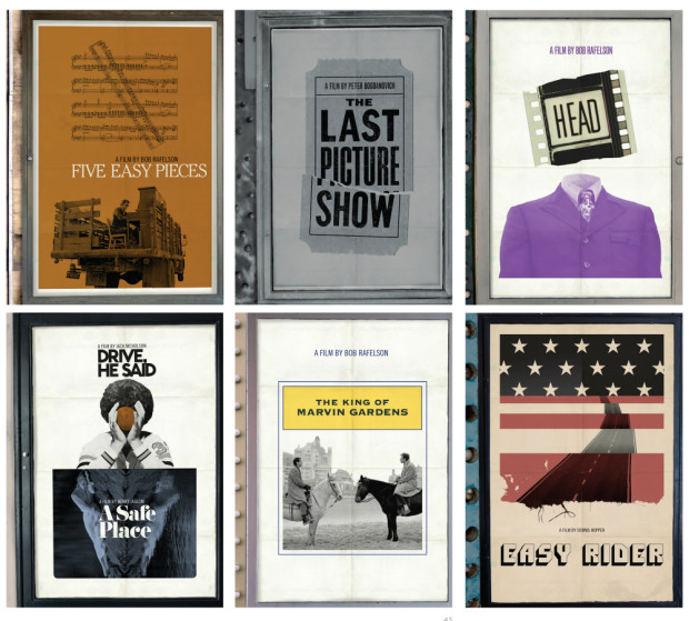
“There are cases where everyone thinks of a movie in one way, but Criterion feels the director was aiming to say something different than what is typically thought. So for us, it’s about repositioning the film to show that it’s not actually the film that marketing people said it was all those years ago.” Package design can do a lot of this work. Instead of traditional marketing meetings, Criterion holds what they call “brief meetings,” in which the staff reviews a film’s historical significance—where it occurred in the director’s career, its genre, the political climate, and so on. After a brief, they typically have two to three weeks for initial cover sketches. Habibi referred to this as “the heavy lifting period,” in which they aim to nail down the look and style they’re after. Once a cover direction has been selected, another three months is spent refining the artwork and carrying the visual language throughout the entire package so that the design feels truly unified. Design by committee, Habibi insisted, never produces the most inspired work, so to ensure that the designs don’t become muddled by too many voices, they strive to keep the approval process as simple as possible and the meetings quite intimate with only the art department, the in-house producer, and the most senior staff weighing in.

Comments closed

TypeChap on the Beauty of Decaying Typographic Signage

Typechap1

Website Typorn1 talks to Stephen ONeill about his photographs of found type, lettering, and signs, TypeChap:

“I’m always on the look out for the vernacular and spectacular, documenting beautiful old letters and signage before they disappear… Through my photographs I want to provide inspiration for designers, sign-writers and photographers to keep these wonderful old letterforms alive… It’s interesting to see how positively clients react to type. One very dry financial client I worked for, were totally sold on some letterpress ads (very much influenced by the great Alan Kitching) and it became their house style for about 3 or 4 years – something of a miracle in an industry swamped with weak stock imagery”

Typechap3 Typechap10

1 Comment

Deep Vellum Book Cover Design by Anna Zylicz

Mountain and the Wall Full design by Anna Zylicz

At the Toronto launch of John Freeman’s new anthology last night — encouragingly called ’10 Reasons to Not Shoot Yourself in the Face Over the State of Literature’ — Literary Hub‘s Jonny Diamond mentioned design as a reason to be optimistic about current state of publishing. In particular, Jonny called out the book covers of Deep Vellum, a Dallas-based literary non-profit that publishes literature in translation.1 The covers, designed by Anna Zylicz, are strange, minimal, and instantly recognizable. There’s something of a hard-edged Peter Saville feel to them. I especially like the cover for Sphinx by Anne Garréta. Anna Zylicz is clearly a designer to watch.

sphinx design by Anna Zylicz

Mountain and the Wall design by Anna Zylicz

Calligraphy Lesson by Anna Zylicz

Indian design by Anna Zylicz

1 Comment

Jamie Keenan on Book Cover Design

Little Apple design Jamie Keenan

Book designer Jamie Keenan talks to Shiny New Books about his design process and designing the covers for Pushkin Press’s Vertigo imprint:

I think designers might have brains that are set up slightly differently to ‘normal’ people (there are always a lot of left handed people design departments). Quite often someone will mention authors and titles of books to me and it won’t mean anything, but when I look those books up on Amazon and see some pictures, I’ll realise I’ve read them or even worked on them. Words don’t seem to lodge in my brain in the same way that images do – I’m useless at remembering people’s names, but I can recognise someone because I sat next to them on a bus three years ago. When I read a book, I’m not sure if I experience in the way you’re supposed to do. It’s hard to describe, but from reading a book I get a sense, in quite an abstract way, of what the tone of the cover for that book should be. Each book seems to create its own world with its own rules and logic. And working on a book you don’t like is always easier – there’s nothing worse that trying to design a cover for your favourite book. It’s like being so keen to be friends with someone that you instantly become the most boring person in the world.

1 Comment

More Noam Chomsky Designs by David Pearson

Rethinking Camelot design David Pearson

I posted David Pearson‘s first four Noam Chomsky covers for Pluto Press back in January. Now, the next four books in the series have been released.

The typeface is apparently Druk, designed by Berton Hasebe for Commercial Type. At the Creative Review, David talks about his design of the series.

Propaganda design David Pearson

Comments closed

Adrian Frutiger: His Type Designs Show You the Way

The New York Times obituary for type designer Adrian Fruitger who died at the age of 87 on September 10  in his native Switzerland:

The son of a weaver, Adrian Johann Frutiger was born on May 24, 1928, in Unterseen, near Interlaken, Switzerland. As a youth he hoped to be a sculptor, but his father discouraged him from plying so insecure a trade. Apprenticed to a typesetter as a teenager, he found his life’s work.

In 1952, after graduating from the School of Applied Arts in Zurich, Mr. Frutiger moved to Paris, where he was a designer with the type foundry Deberny & Peignot, eventually becoming its artistic director. There he created some of his earliest fonts, among them Président, Méridien and Ondine; in the early 1960s he founded his own studio in Paris.

Commissioned to create signage for airports and subway systems, Mr. Frutiger soon realized that fonts that looked good in books did not work well on signs: The characters lacked enough air to be readable at a distance. The result, over time, was Frutiger, a sans serif font designed to be legible at many paces, and from many angles.

One of Frutiger’s hallmarks is the square dot over the lowercase “i.” The dot’s crisp, angled corners keep it from resolving into a nebulous flyspeck that appears to merge with its stem, making “i” look little different from “l” or “I.” (For designers of sans serif fonts, the gold standard is to make a far-off “Illinois” instantly readable.)

For more on Frutiger and his work, there is an interesting interview with the designer in the spring 1999 issue of Eye Magazine.

Comments closed

Munari’s Books

MunarisBooks-Cover_WEB

Before turning his attention to graphics and advertising, Italian artist and designer Bruno Munari (1907-1998) made his mark as a member of the Futurists, an avant-garde art movement fascinated by modernity, mass production, and pushing at technological limits.

The influence of Futurism — not to mention modernism’s jokers Dada and Surrealism — is apparent throughout Munari’s Books, a collection of Munari’s book design recently published in English by Princeton Architectural Press. Munari relentlessly experimented with typography, photography, collage, and printing materials. There is a book made of metal, another that comes with a hammer. There is page after page of special papers, unique bindings, loose pages, punches, tears, and flaps. The breadth (and the volume!) of his work is staggering, and it all crackles with this restless sense of innovation, urgency, and provocation.

Bruno-Munaris-ABC-cover_WEB
Bruno Munari’s ABC (image credit: Cleveland: World Publishing Company, 1960)

“A great children’s book, with beautiful expressive figures, the right story, printed simply, would not be accepted (by some parents), but children would love it.”1

But Munari’s designs and illustrations are also surprisingly full of warmth and wonder. This is most apparent in his expressive illustrations, and the large number of books Munari produced for very young children. Even readers familiar with Bruno Munari’s ABC and Bruno Munari’s Zoo, may find themselves astonished at just how many other extraordinary children’s books he created that aren’t currently available in English.

Abecedario-de-Munari_WEB
Abecedario de Munari (image credit: Rome: Emanuele Prandi, 1942)
Abecedario-de-Munari2_WEB
Abecedario de Munari (image credit: Rome: Emanuele Prandi, 1942)

“we need to deconstruct the myth of the artist-hero who produces only masterpieces for the intelligent. We have to show that as long as artists are outside the problems of everyday life, only a few people will be interested. And now, in these days of mass culture, artists must climb down from their pedestals and be so kind as to design a butcher’s sign.”2

If Munari’s Books has a shortcoming, it is the rather academic introductory texts (they will be useful for better design writers than me, but I got little sense of the Munari’s life or the personality behind the designs from them). Fortunately, the book is peppered with lively quotations from Munari himself. The most pithy come from Arte come mestiere, a collection of Munari’s writing on design first published in English in 1971 as Design as Art (and reissued as a Penguin Modern Classic in 2008). The short essays in Arte come mestiere were originally written for Milan daily newspaper Il Giorno, and they address everyday life as well as design. They’re witty, discursive (and sometimes even surprisingly practical), and a perfect accompaniment to the illustrations in Munari’s Books.

disegnare-il-sole_WEB
Disegnare il sole (image credit: Mantua: Graziano Peruffo, 1980)
La-favola-delle-favole_WEB
La favola delle favole (image credit: Mantua: Maurizio Corraini Editore, 1994)
Nella nebbia di Milano (inner) WEB
Nella nebbia di Milano (Mantua: Graziano Peruffo, 1968)
Comments closed

Pushkin Vertigo Crime Series Designed by Jamie Keenan

Vertigo Keenan

At the Creative Review blog, Jamie Keenan talks about his cover designs for Pushkin Press‘s new crime fiction imprint Pushkin Vertigo:

“From the beginning I wanted to come up with something that looked alien, as though someone had brought it back from a holiday in a country you’d never heard of”

They make for a stunning set.

Jamie also created that rather nice “PV” logo for the imprint. Nicely done Mr. Keenan.

I Was Jack Mortimer Keenan

Master of the Day of Judgment Keenan

She Who Was No More Keenan

The Disappearance of Signora Giulia Keenan

The Tokyo Zodiac Murders Keenan

Vertigo, The Tokyo Zodiac Murders, The Disappearance of Signora Giulia and Master of the Day of Judgment will be published by Pushkin Vertigo on next month; two more titles, I Was Jack Mortimer and She Who Was No More, will be published in November.

Comments closed

David Pearson on Slow Design

david pearson melbourne writers fest WH Chong

Award-winning Australian designer and art directer W. H. Chong interviews David Pearson — who is giving a series of talks on book design in Australia this week — for his column Culture Mulcher:

I love the Gandhi quote, ‘There is more to life than increasing its speed’ (particularly reassuring words for a slow-working technophobe).

I do worry that many technological advancements are enabling us to achieve not very much, but at a much faster rate. For example, I cannot understand the very modern desire to produce work using a series of time-saving shortcuts when it is the duration of the working process itself that allows us to question, edit and fine-tune our output. To speed up or bypass this process is to give up on so much and risks the work lacking any discernible ‘human’ quality.

That said, I do work very slowly and sometimes think that a warm and welcoming hobbyist’s industry, like publishing, is the only place that would have me.

David is delivering a lecture, We Are What We Read, at the Powerhouse Museum in Sydney tomorrow (Tuesday, August 25) at 6.30pm, and will be discussing contemporary book design at the Melbourne Writers Festival on August 29 and August 30, although I believe the second event is sold out.

Comments closed

Russian Plays in Translation Designed by John Gall

The brilliant John Gall has designed a wonderful set of minimal book covers for Theater Communications Group’s Russian drama series:

Month-in-the-country-mech_670
A Month in the Country by Ivan Turgenev (Theatre Group Communications / February 2015)

The-Inspector-Mech-ID5_670
The Inspector by Nikolai Gogol (Theatre Group Communications / June 2015)

Cherry-Orchard-front.6.16_670
The Cherry Orchard by Anton Chekhov (Theatre Group Communications / August 2015)

1 Comment

The Retiring Type: Intelligent Life on Edward Johnson

3679629462_bc4885b1ef_o

At Intelligent Life, Catherine Nixey tells the story of Edward Johnson, creator of the London Underground’s typeface:

The Underground didn’t commission a font to look different from commercial ones simply to sell it straight back to the commercial world. But that world wanted the font nevertheless. And so Johnston’s pupil Eric Gill obliged, creating Gill Sans, which would go on to be used on everything from the classic Penguin Books design to the BBC logo (since 1997)—and, later, many a Word document.

There is some suggestion that even Gill, not a man to be easily abashed, may have felt uneasy about this. He sent Johnston a letter that manages to turn, in a moment, from humility to boastful defiance. “I hope you realise”, he wrote, “that I take every opportunity of proclaiming the fact that what the Monotype people call ‘Gill’ Sans owes all its goodness to your Underground letter. It is not altogether my fault that the exaggerated publicity value of my name makes the advertising world keen to call it by the name of Gill.”

Did Johnston mind? We don’t know exactly. “I don’t think there was bitterness,” says his grandson. Though there was no money, either. “He was so lacking in business sense, he never charged a going rate for his work and so couldn’t make ends meet.” For the Underground font, Johnston was paid 50 guineas—about £4,000 in today’s money (he handed 10% of it on to Gill). By the time he died in 1944, “the finances were in a terrible state,” Andrew Johnston adds. “There had been a fund started by calligraphers in America to help this destitute master craftsman.”

(image via Mikey Ashworth on Flickr)

Comments closed

Virago Modern Classics Daphne du Maurier

JamaicaInn_YA

This summer UK publisher Virago is publishing two sets of Daphne du Maurier’s most famous titles with new and beautifully illustrated covers.

According to editorial director Donna Coonan, du Maurier’s reputation has flourished in recent years. She is also an author with cross-generational appeal. “The heroines of her best-known novels are young women at a turning point in their lives,” says Coonan. “These are beautifully written books that are exciting, suspenseful and brilliantly atmospheric. There is passion, danger, romance . . . and pirates!”

For over a decade Virago published du Maurier’s backlist with a uniform style. “They sat nicely together in a set, but were starting to look a little dated and lacked individuality,” says art director Nico Taylor. “I had never read du Maurier before, but once I got stuck in I realised just how diverse her writing is which led me to the idea that presenting each novel with a distinctive, individual look would be the best way to ensure du Maurier’s work continues to look fresh.”

Rebecca

For the first three titles in series (there are a staggering 17 or so more to come!), Taylor worked with illustrators Neil Gower (Jamaica Inn, Frenchman’s Creek) and Jordan Metcalf (Rebecca). “It became clear that it would be hard to avoid some of the obvious reference points from each title, but I was keen that they were used in an integrated or suggestive way… all credit has to go to the illustrators for imagining their respective covers in such distinctive ways.”

Rebecca_YA


Alongside this refreshed backlist, Virago is also planning to introduce these same three classics — French Man’s Creek, Jamaica Inn, and Rebecca, — to young adults with new covers by Iacopo Bruno. “This was a great opportunity to show that du Maurier is a big contribution to the gothic novels popular with this age group of readers,” says art director Sophie Burdess. “I wanted to create a set of covers primarily composed of evocative gothic typography that gave du Maurier the authority and appeal she deserves as well as giving a feel for the individual themes of each novel,” she continues. “[Iacopo] is a rare and exceptionally beautiful illustrator and hand lettering artist who knows just how to pitch the work for a younger audience… the task of creating a set of beautiful compositions of elegant hand lettering and vignette illustrations was very safe in his hands.”

Comments closed