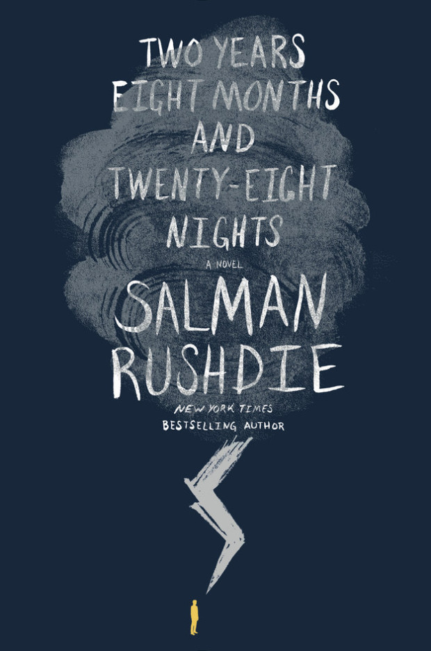
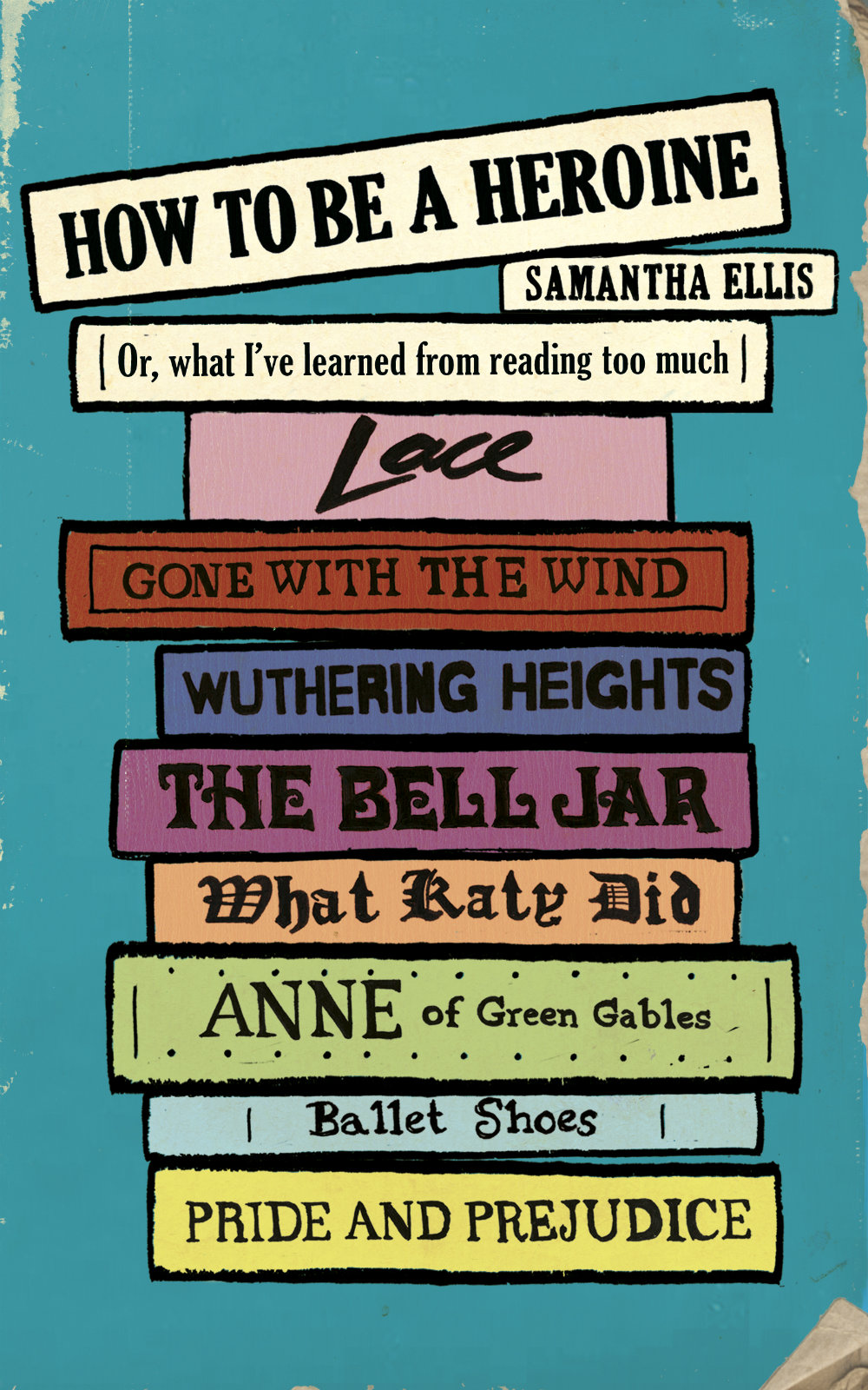
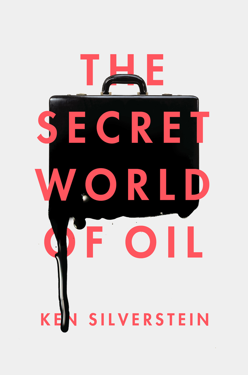
The cover of the US edition of Salman Rushdie’s first adult novel in seven years. Two Years Eight Months and Twenty-Eight Nights (Random House, September 2015), was revealed on Buzzfeed last week.1 While the cover itself is perfectly fine, the most remarkable thing about it is how much it looks like a novel for young adults.
…and the lovely hand-lettered YA covers of Australian designer and illustrator Allison Colpoys:
For the Forest of a Bird by Sue Saliba; design by Allison Colpoys (Penguin / January 2015)
Something in the World Called Love by Sue Saliba; design by Allison Colpoys (Penguin / August 2008)
After some further thought, however, I realised that it is even more reminiscent of the cover for the novel Waiting for Doggo by Mark B. Mills, designed by Yeti Lambregts (Headline, November 2014), which made me wonder if, perhaps, we are starting to see more adult covers that look like YA?
Since the success of Harry Potter, publishers have known that adults read ‘children’s books’ for pleasure, and they will often try to appeal these to older readers with more mature covers. On Twitter last week, American YA cover designer Erin Fitzsimmons (interviewed on the blog here), identified this as ‘crossover appeal.’ But crossover appeal can go both ways, and it seems that adult covers are being designed to reach the widest possible audience too.
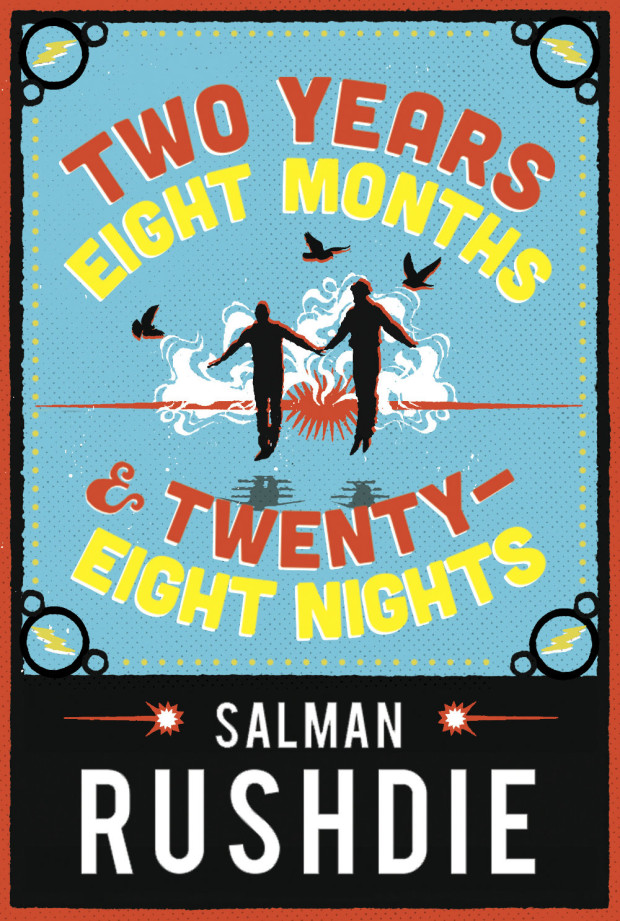
This trend is more pronounced in the UK where bright and whimsical illustrated covers are common for commercial fiction. The vibrant cover of the UK edition of Two Years Eight Months and Twenty-Eight Nights (and the accompanying backlist) — beautifully illustrated by Sroop Sunar and unveiled today — is a perfect example:
According to CMYK, the Vintage Books design blog, Sunar was inspired by printed ephemera found in India around the time of Independence, and the brightly coloured covers would work equally well for YA as for adult fiction:
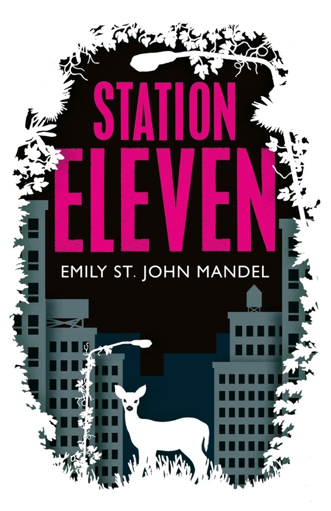
US publishers have (I think) been slower to market adult fiction to younger readers in this way. Although hand-lettering has become very common on US covers for a while now, photographic images still dominate commercial fiction covers. Compare, for example, the UK cover of Station Eleven by Emily St. John Mandel, illustrated by Nathan Burton (left), with US edition designed by Abby Weintraub (on the right):
From my own experience, I can also think of at least one quirky illustrated cover — for an upcoming literary novel that the publisher has very high hopes for — that was killed at the last minute in favour of a more traditional photographic one. The original design could easily have been for a gothic Young Adult fantasy. The new cover, much less ambiguous, is clearly intended for adult book clubs.
Adam by Ariel Schrag; design by Christopher Moisan (Mariner / June 2014)
Crazy Rich Asians by Kevin Kwan; design by Joan Wong (Anchor / May 2014)
How to Tell Toledo from the Night Sky by Lydia Netzer; design by Olga Grlic (St. Martin’s Press / July 2014)
Even so, Two Years Eight Months and Twenty-Eight Nights and a few other recent coverssuggest that US publishers are willing to experiment, and as audiences for YA and adult fiction become harder to differentiate, we will only see more covers that blur those lines.
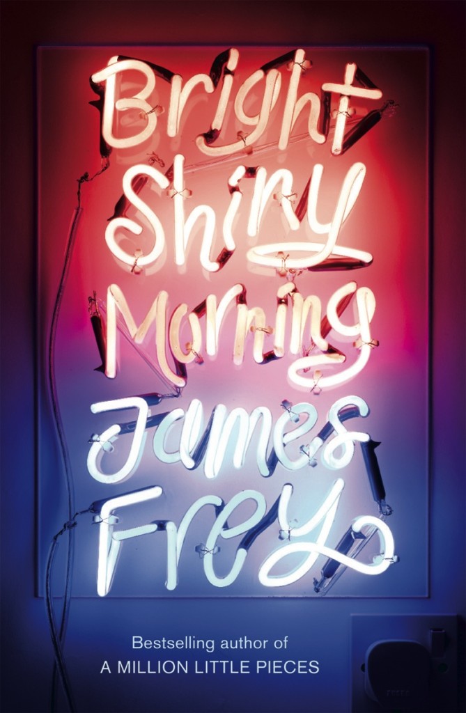
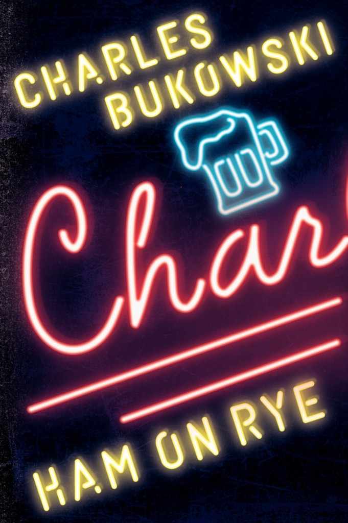
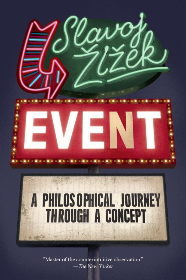
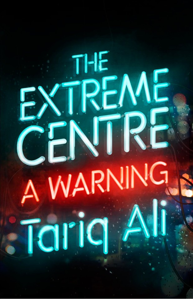
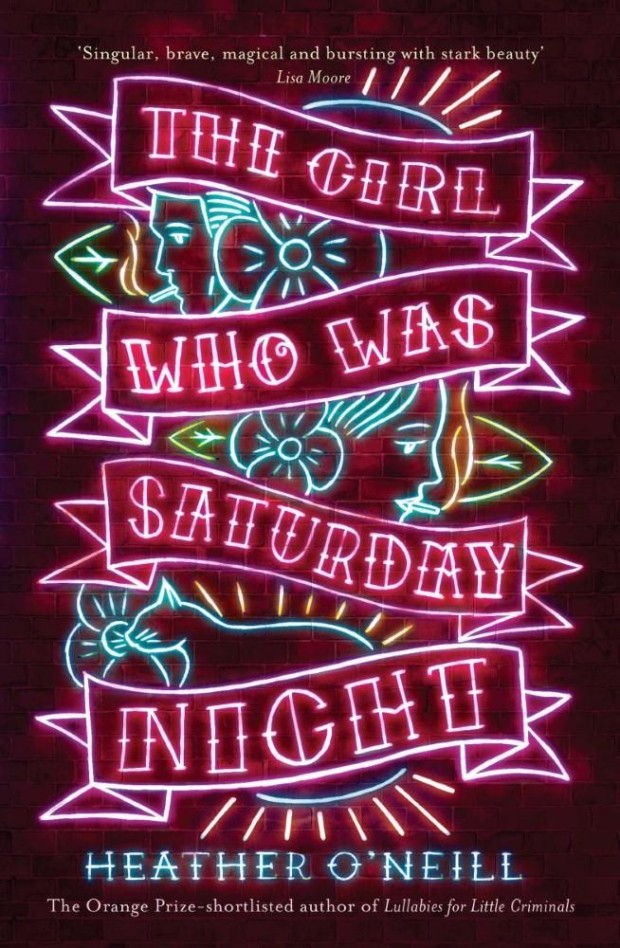
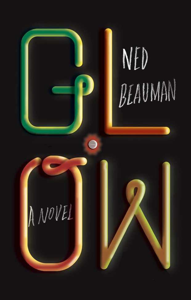
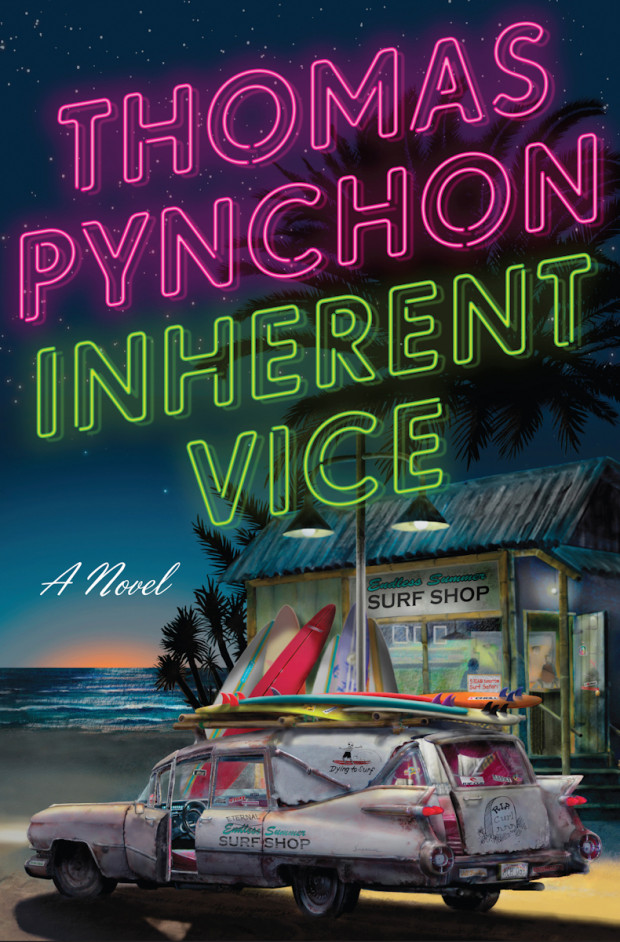
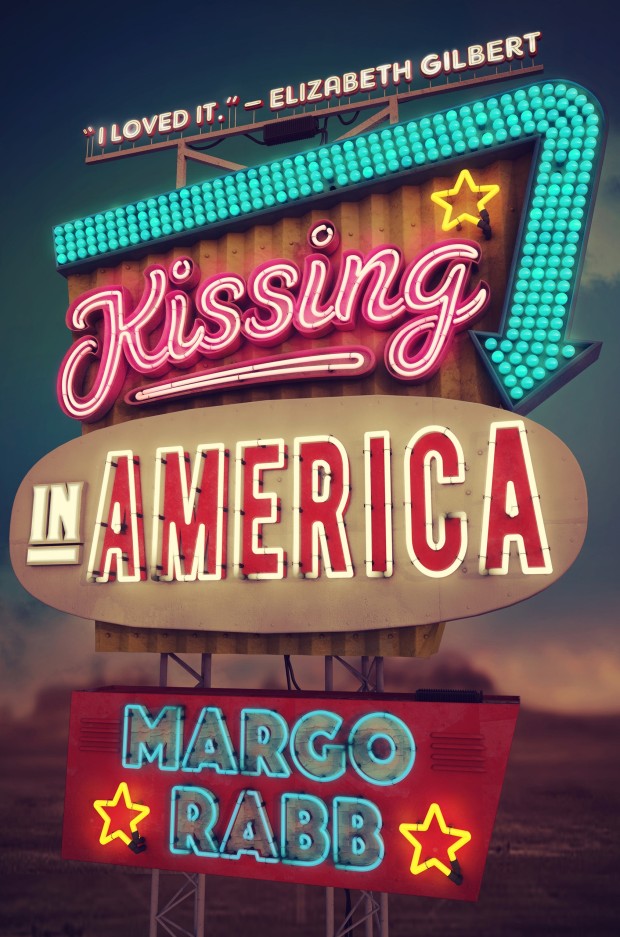
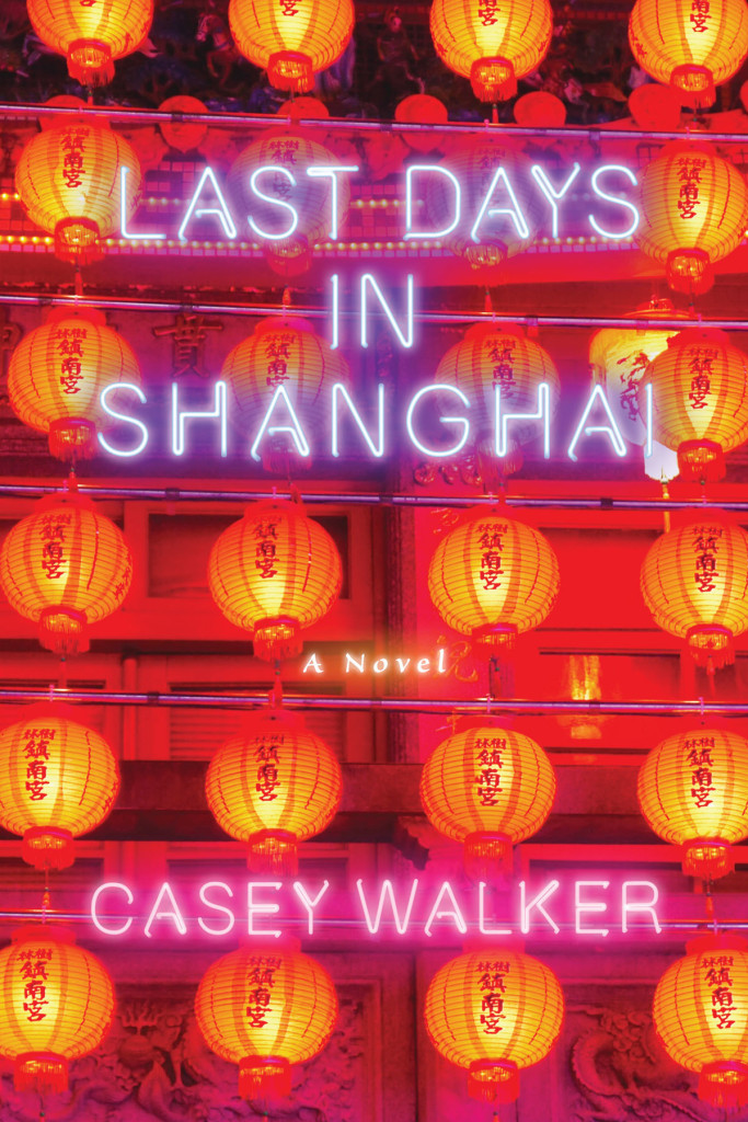
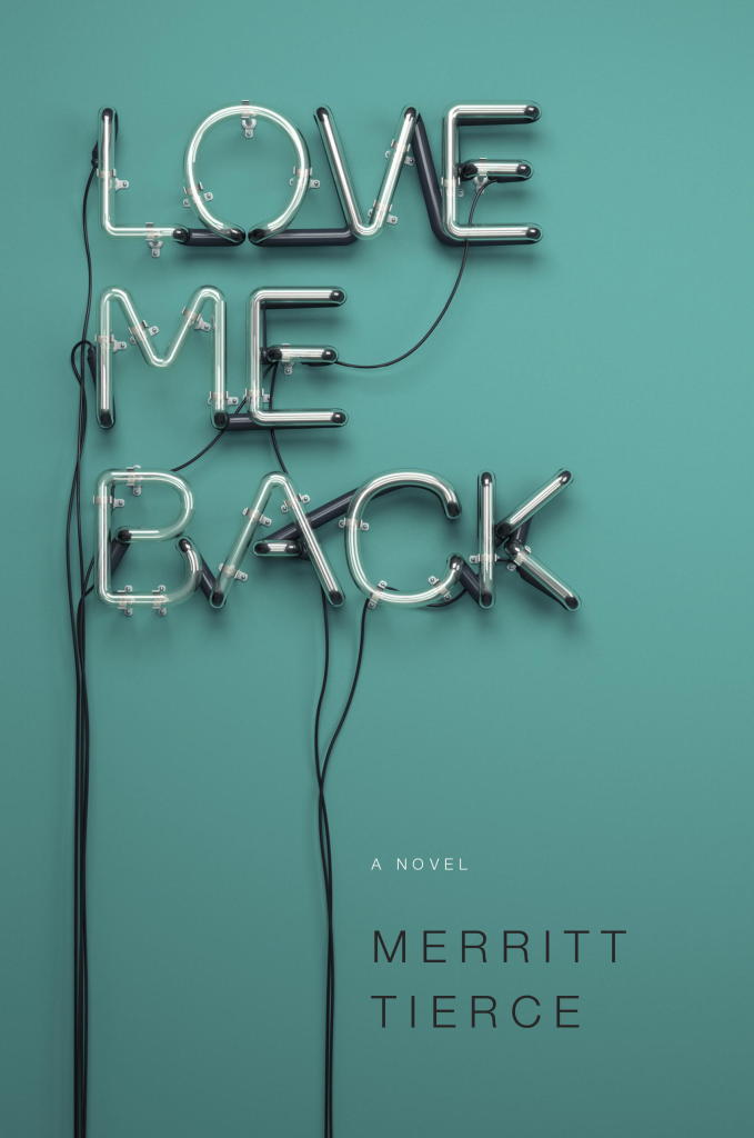
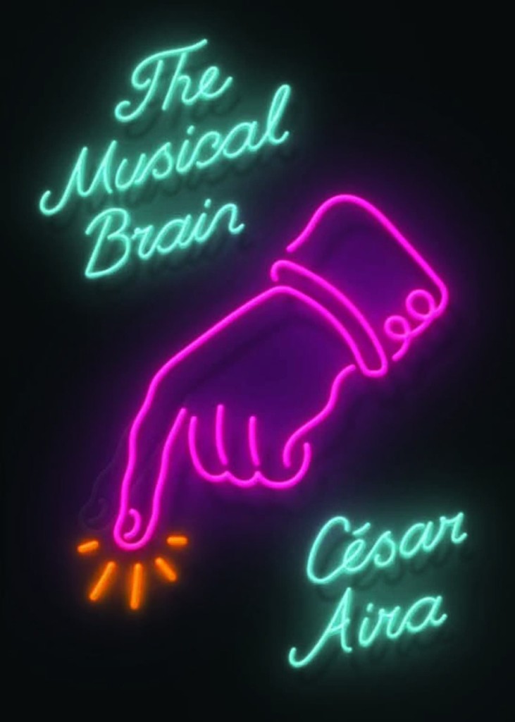
Inspired by the recent Blur album cover designed by Tony Hung (read more about it here) amongst other things, here are a selection of (relatively) recent books cover designs using lettering inspired by neon signs (pictured above: Bright Shiny Morning by James Frey, designed by the one and only Gray318 in 2008):
This is the last of the monthly cover round-ups for 2014, and I have a lot to cram in before I start on my big end of year list, so it’s a bit of corker (if I do say so myself) with lots of gold foil and other fancy finishes:
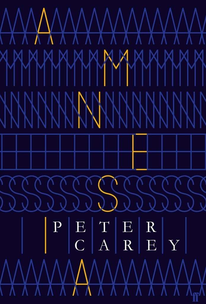
Amnesia by Peter Carey; design by Alex Kirby (Faber & Faber / October 2014)
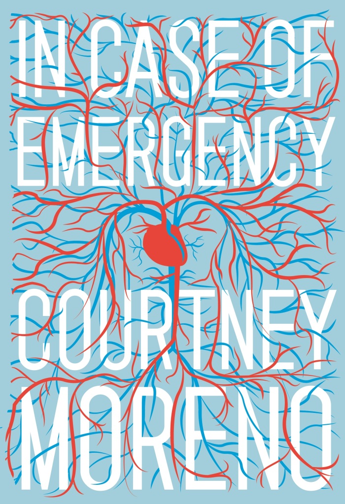
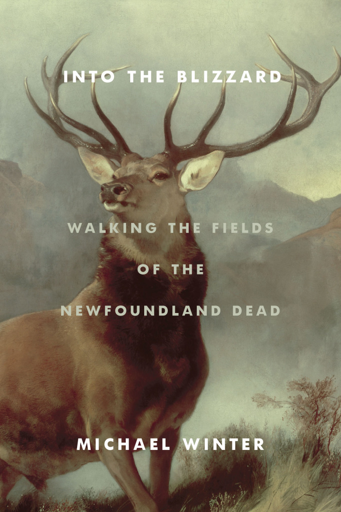
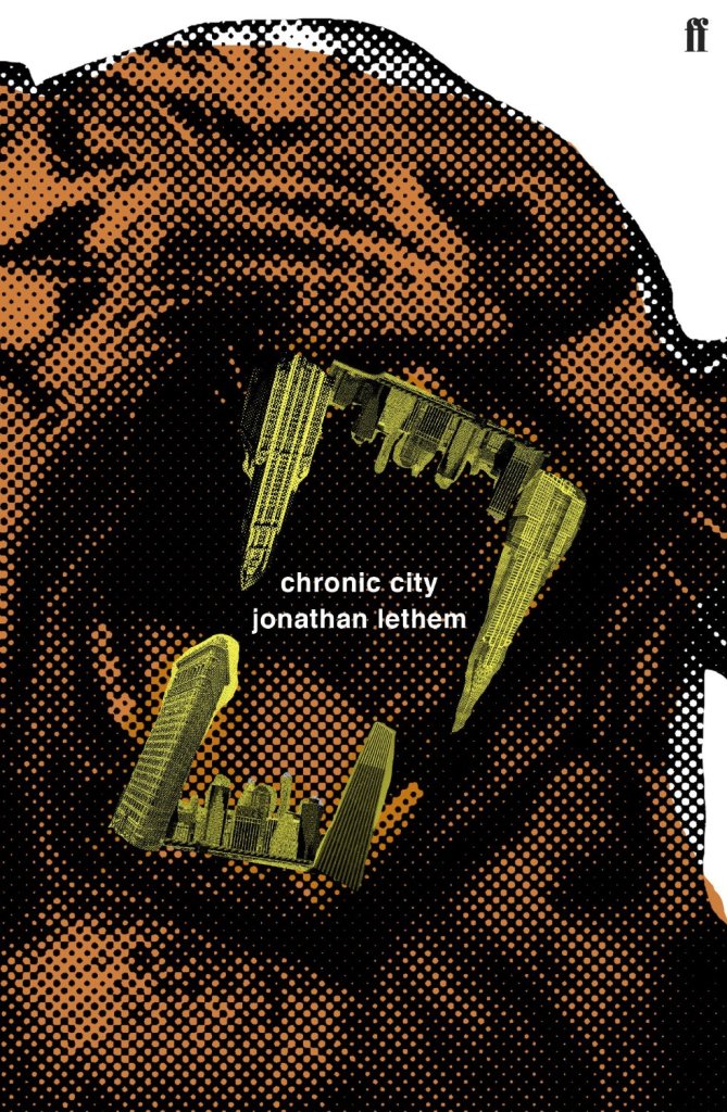
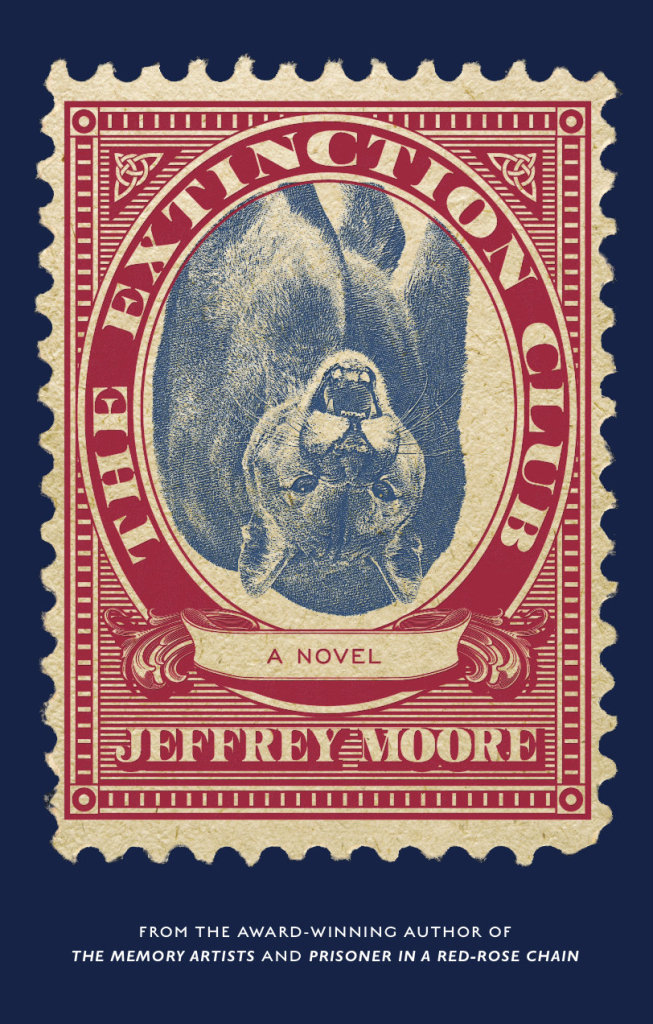
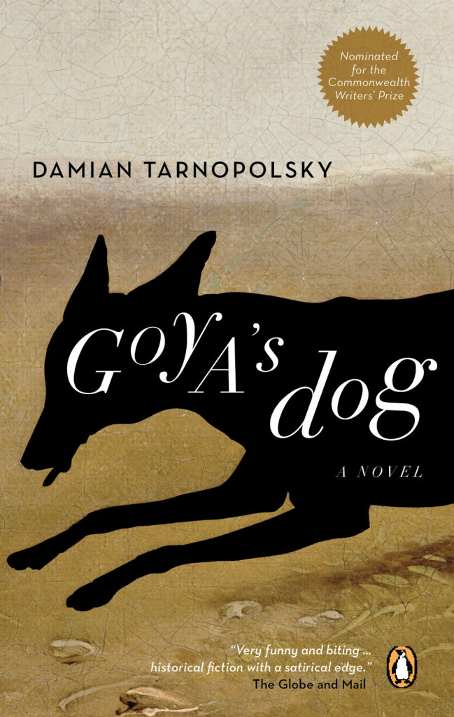
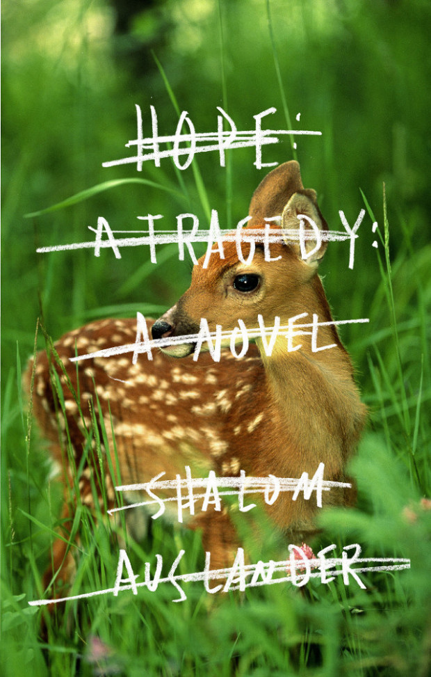
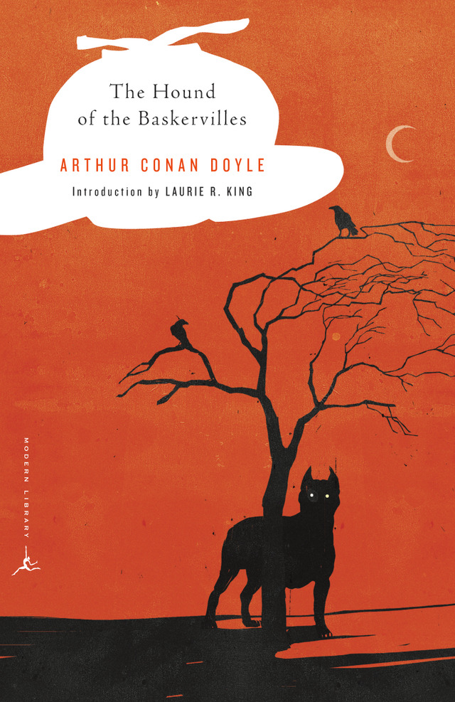
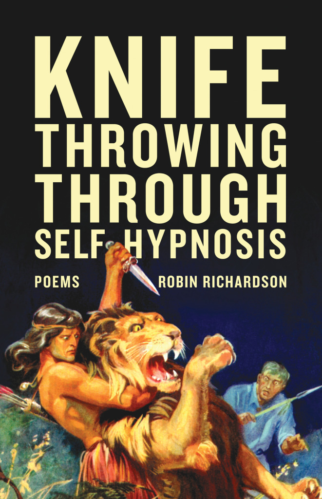
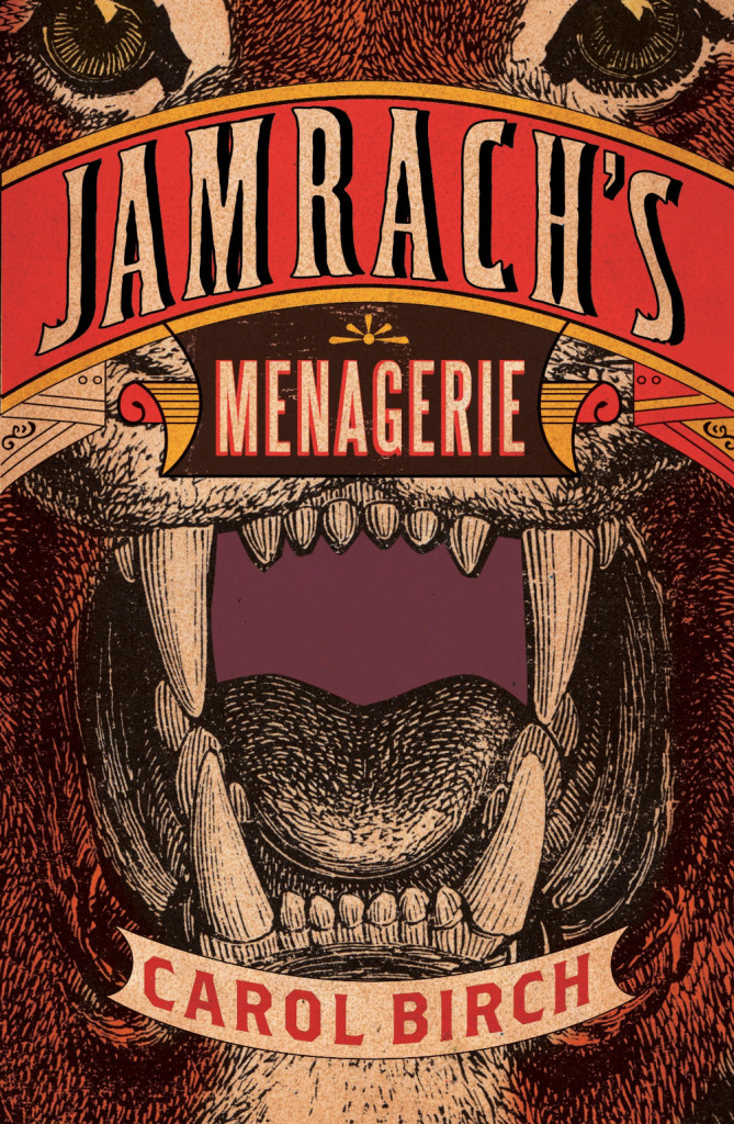
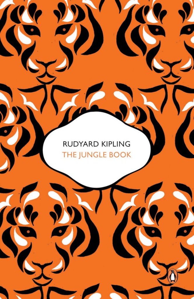
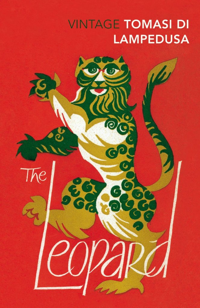
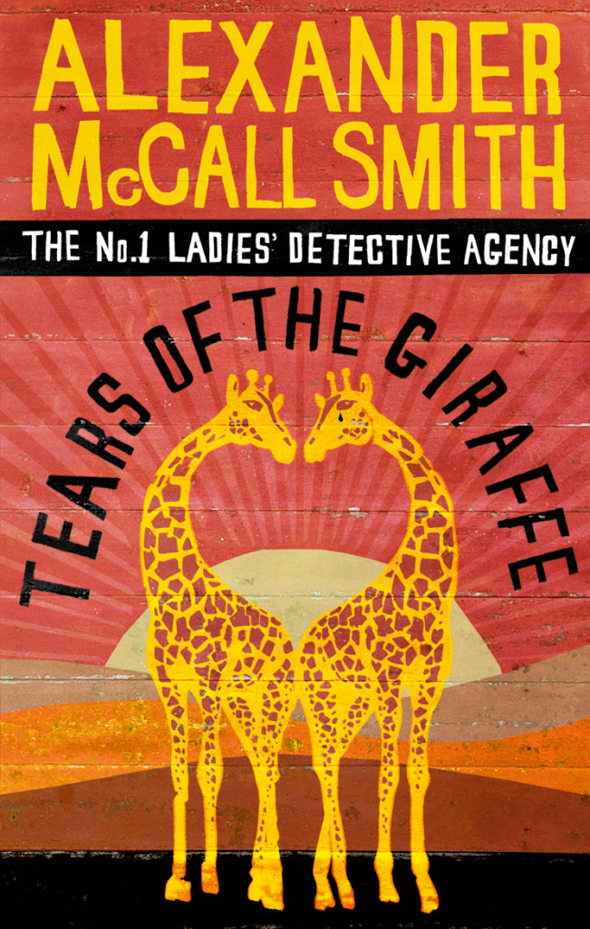
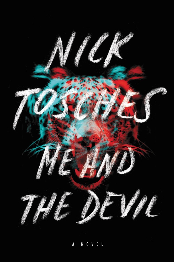
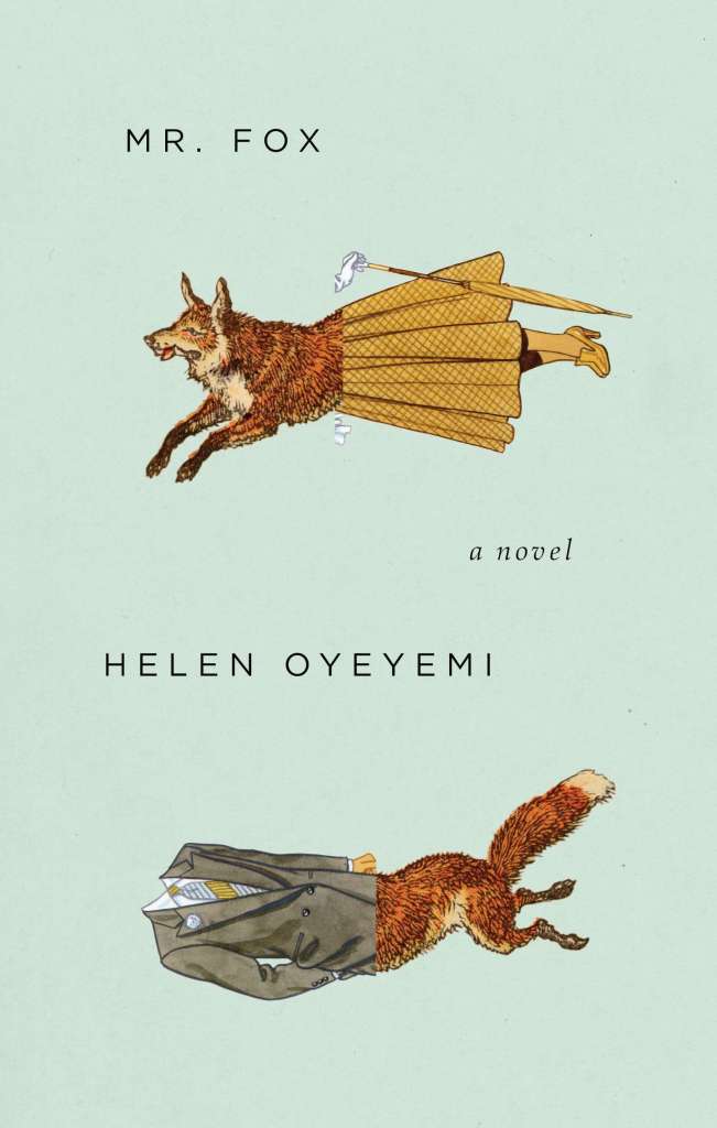
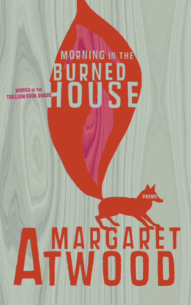
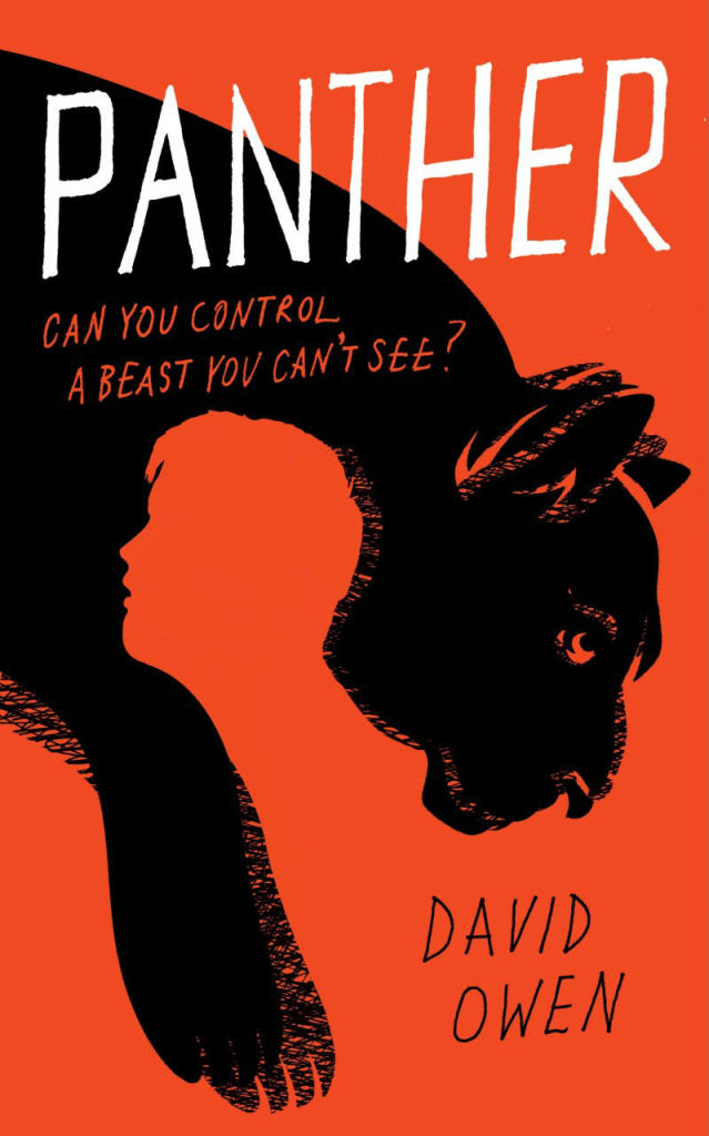
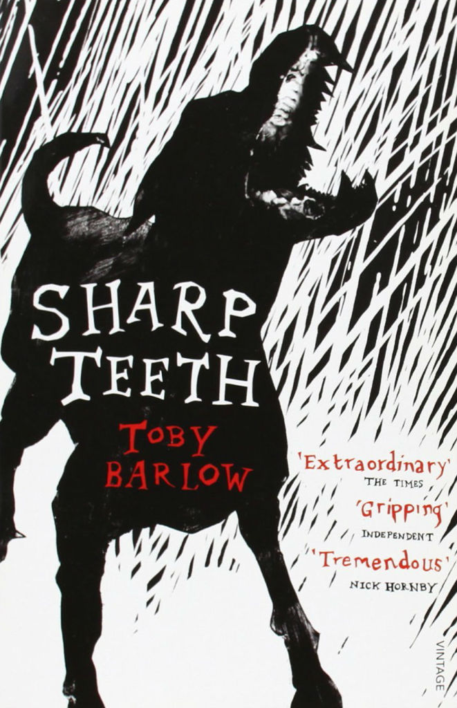
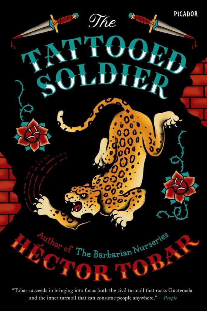
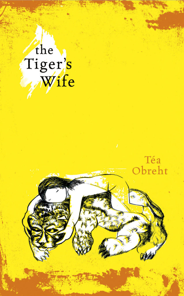
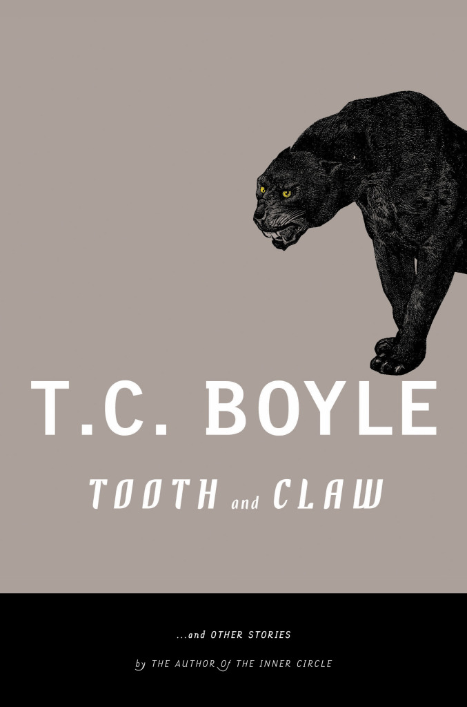
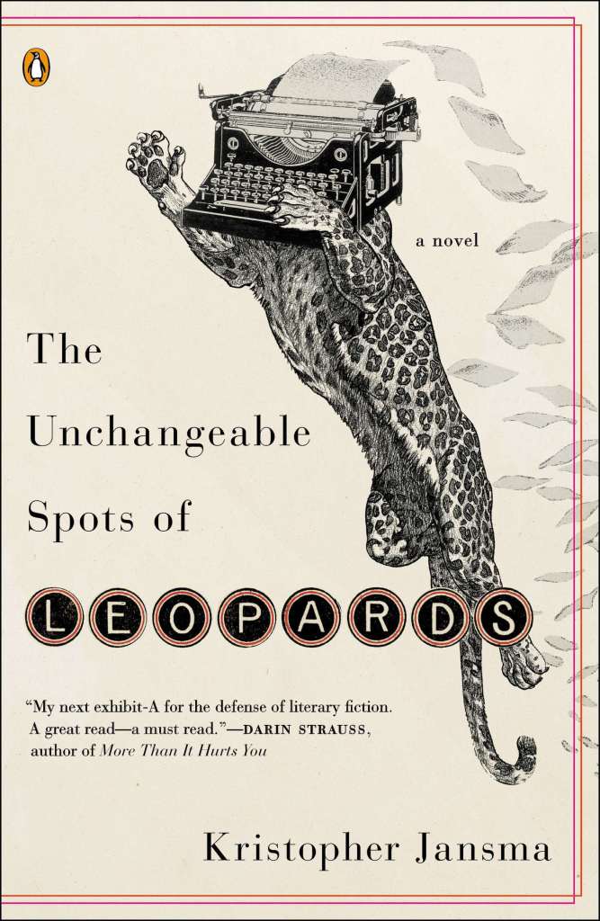
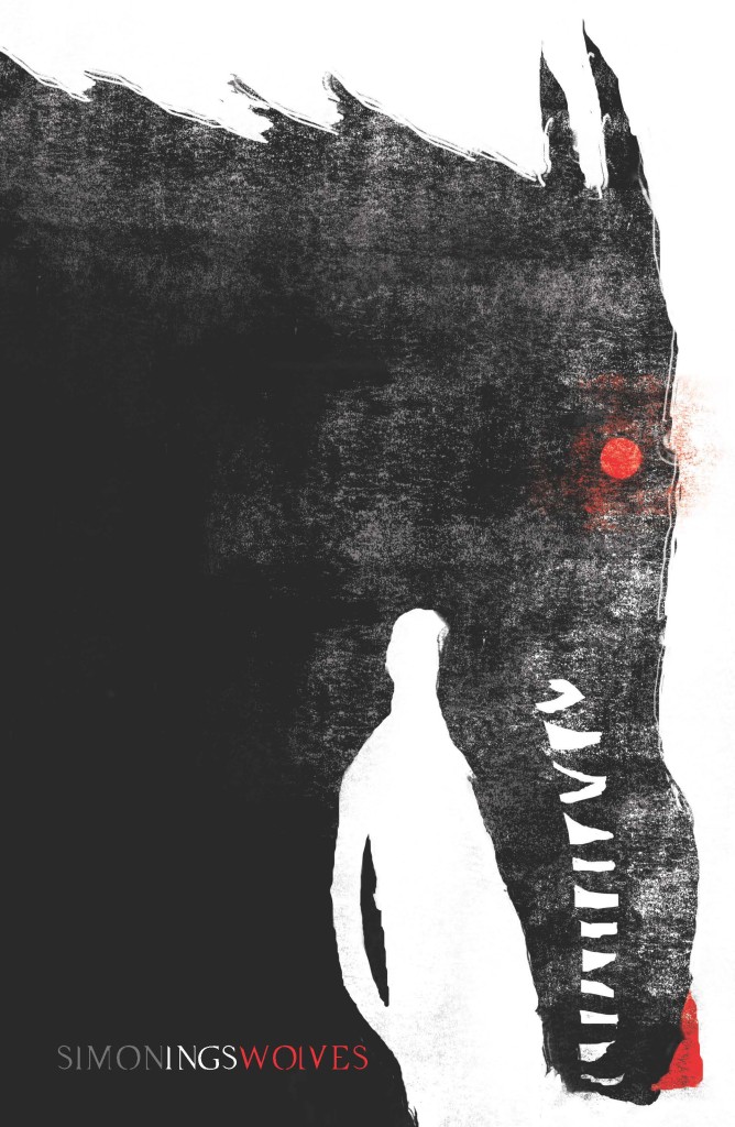
Lions and tigers and bears! Oh my! I’m kicking off a new series today on animal book covers. The first post is on ‘beasts’ — mostly ‘wild’ beasts, but one or two more domesticated (and dead) animals may have nosed their way in. Other posts series will look at birds, bugs, reptiles and amphibians, and quite possibly sea creatures and farm animals (unless someone pays me a large amount of money to stop before that). Thanks to all the designers, ADs, publicists and others who have been helping me with images and credits. If you notice that some information about a cover is missing, please let me know.
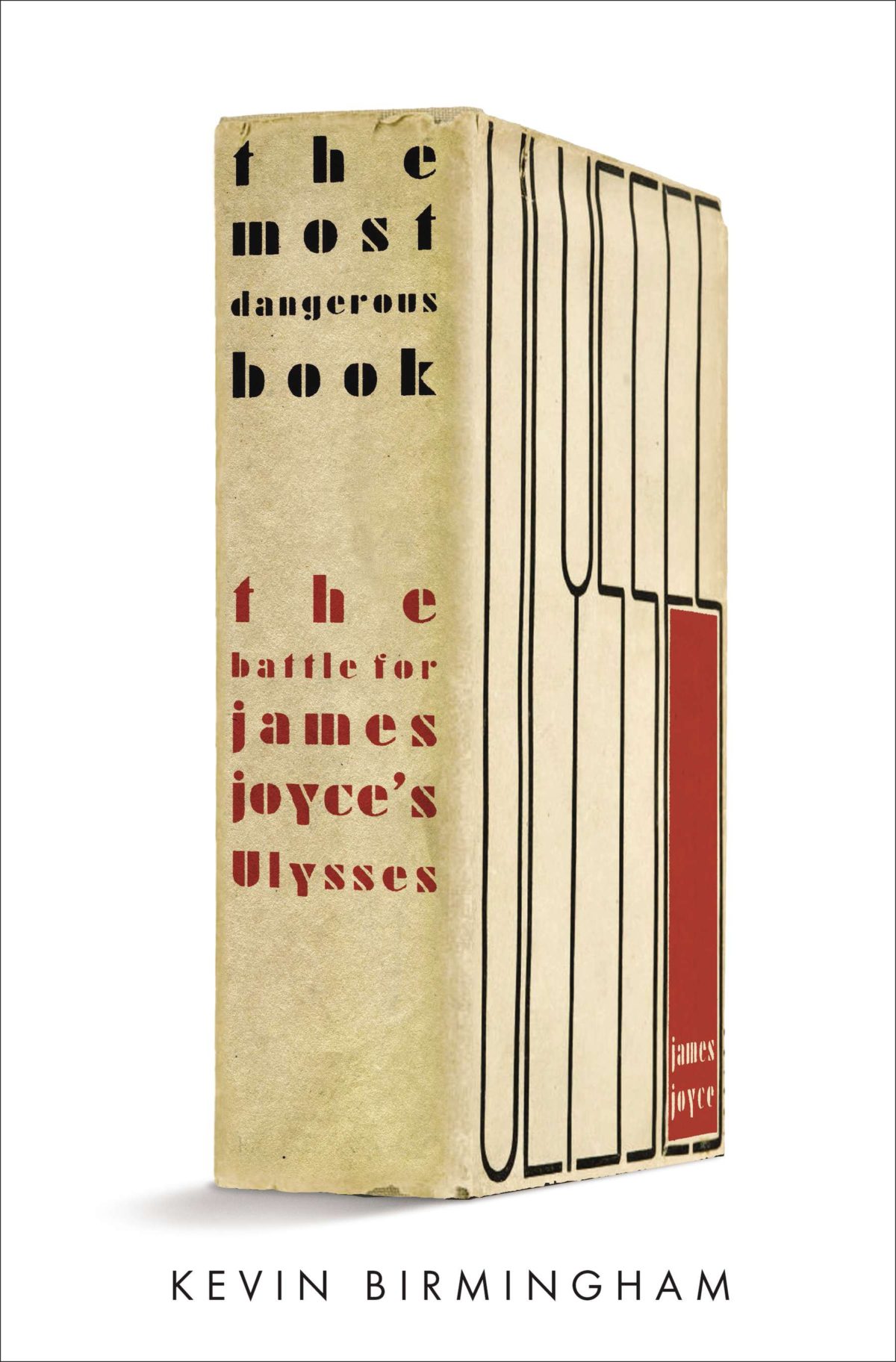
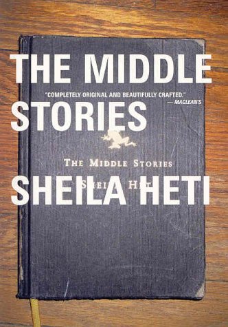
It started, innocently enough, with a tweet from my friend Steven Beattie, book review editor of Canada’s Quill & Quire magazine, about the cover of The Most Dangerous Book, Kevin Birmingham’s new ‘biography’ of Ulysses by James Joyce, designed by Ben Wiseman (Penguin June 2014).
That sparked a conversation with designer David Gee and Joseph Sullivan of The Book Design Review about books on book covers. Joe wrote a a post on the subject in 2009 on the subject, and I rather naïvely thought it would be easy (EASY!) to post a few contemporary examples of the trend, completely underestimating what an undertaking such a project would become.
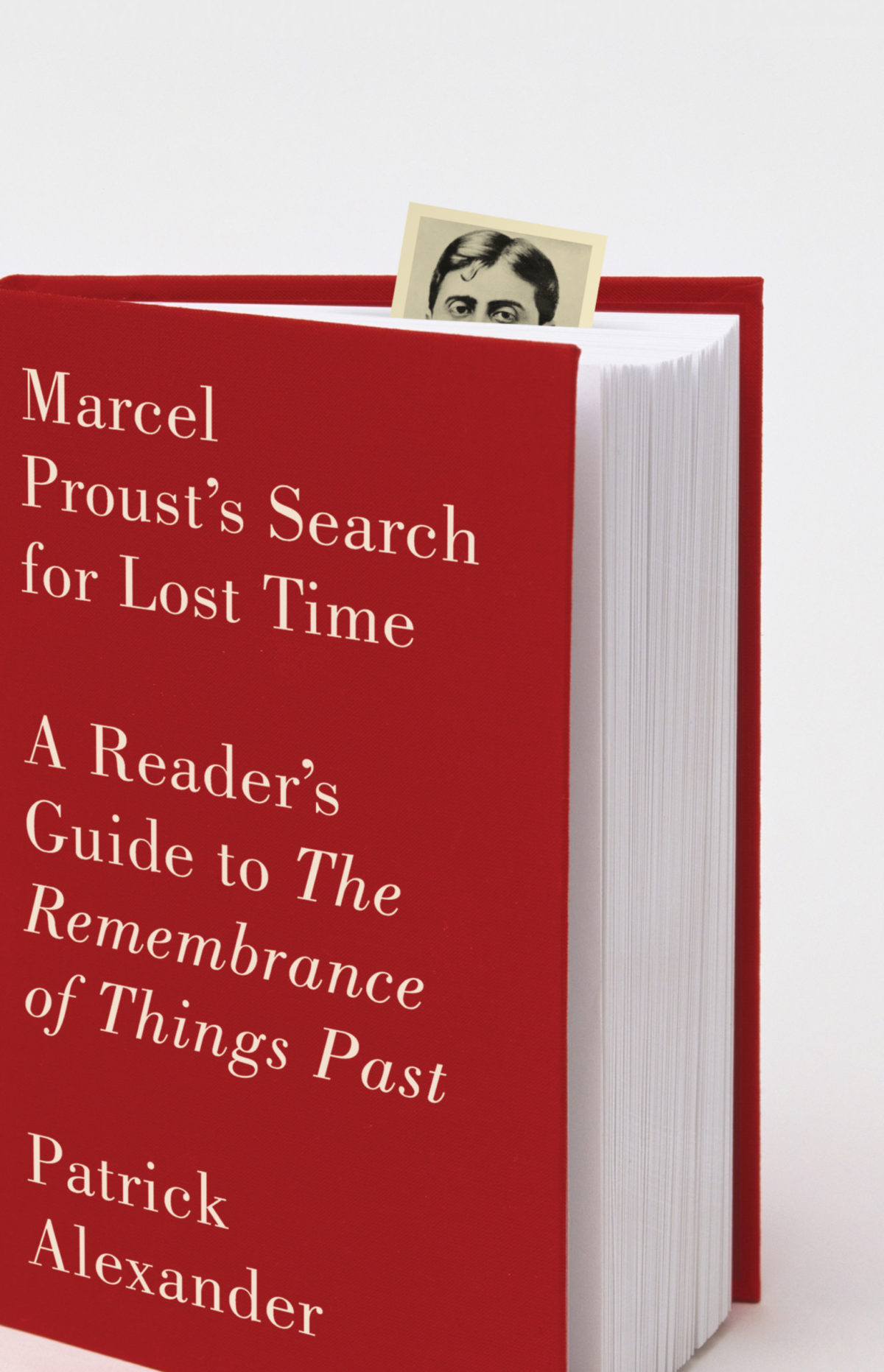
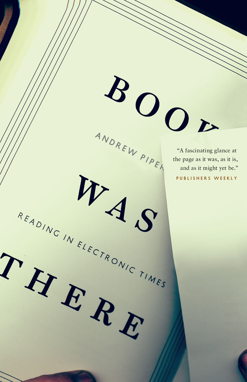
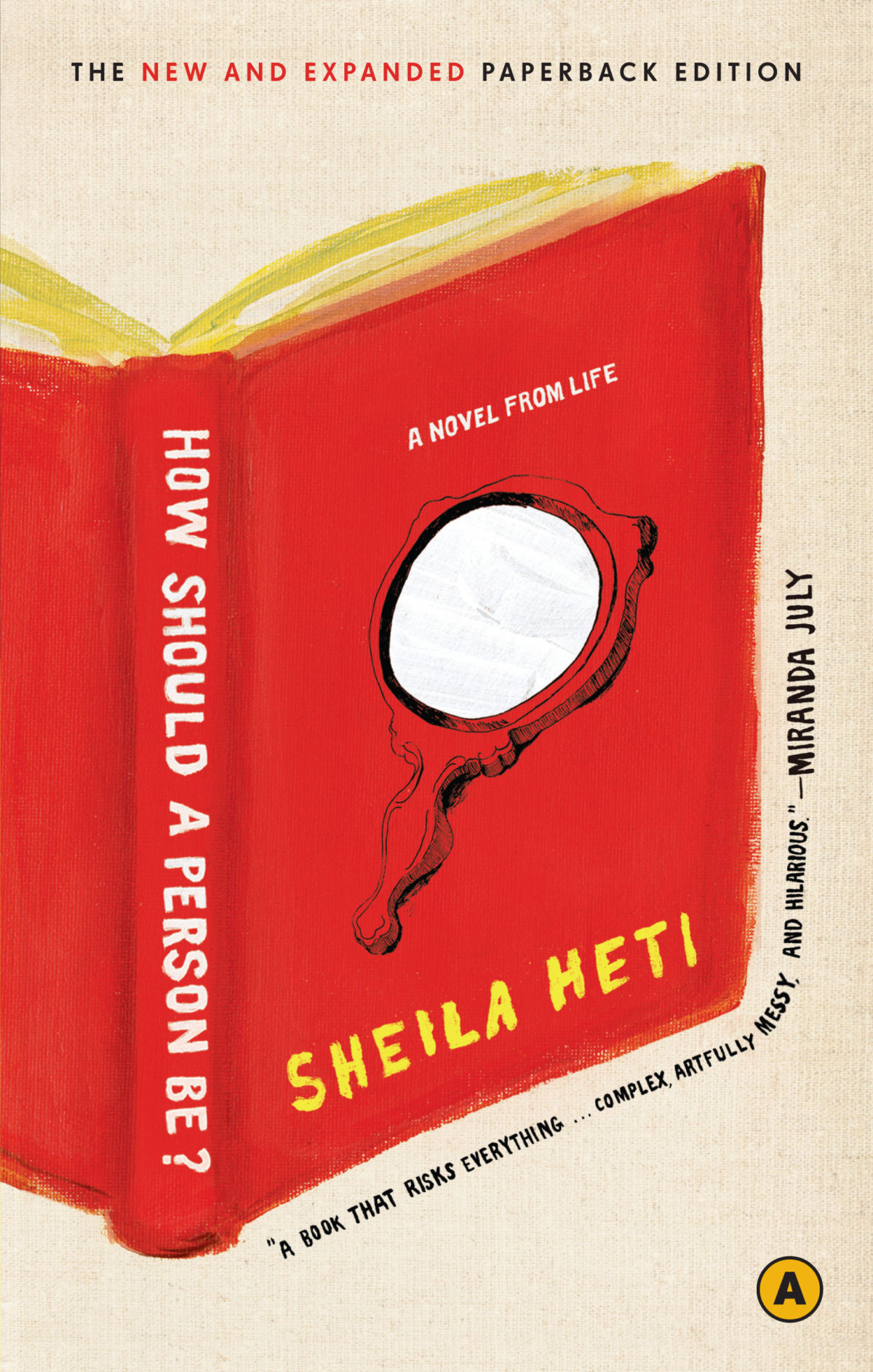
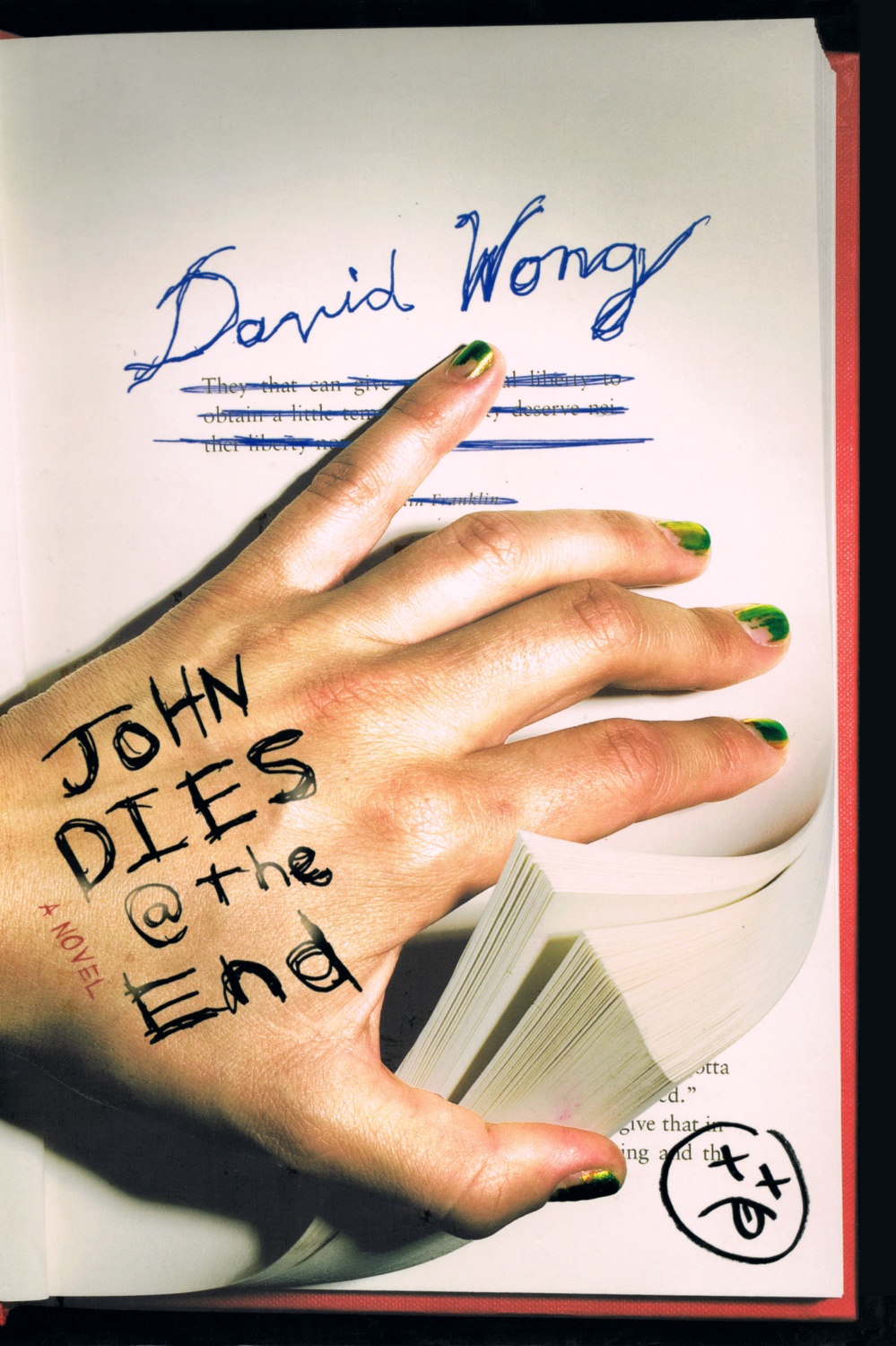
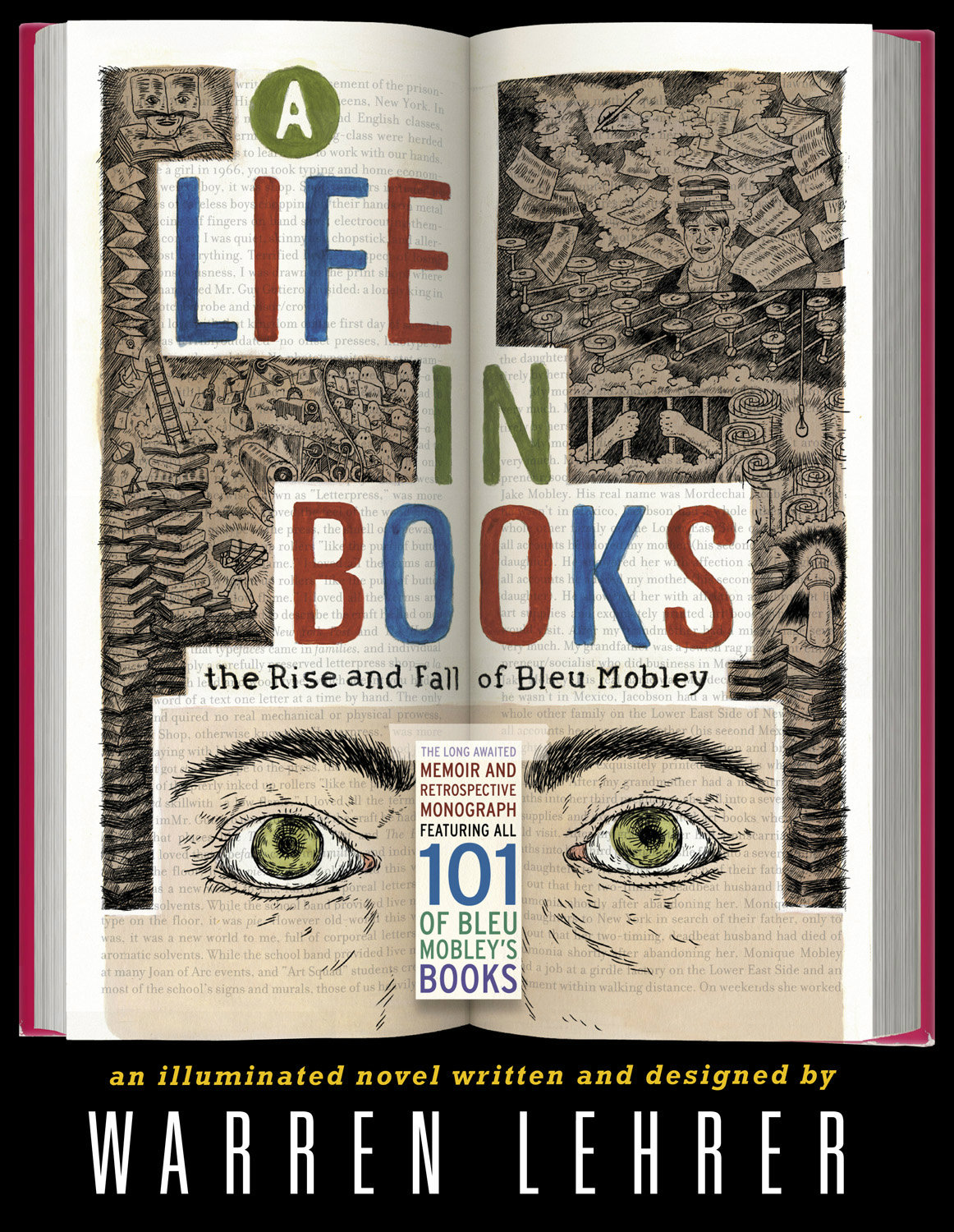
What follows is an attempt to showcase some of different ways designers incorporate books into their cover designs. Along side covers from the past five years, I’ve included some earlier examples from Joe’s post, and this post about ‘meta-covers’ from HTML Giant. Many of the images of the older titles are small (and some are just not very good), but where I have been able to source a larger image, I’ve included it at full (or close to full) size. I’m indebted to the Book Cover Archive, which is still an invaluable resources after all this time, Ferran Lopez‘s (also mothballed) Jacket Museum, and all the designers and book folk who sent me cover images, and helped me in numerous other ways. Thank you. This isn’t comprehensive survey but, to be honest, I had to stop somewhere…
The Knowledge by Lewis Dartnell; design by Kris Potter (Penguin April 2014) Priceless by William Poundstone; design by Jennifer Carrow (Hill & Wang January 2010)
Publish Your Photography Book by Darius D. Himes & Mary Virginia Swanson; design by David Chickey & Masumi Shibata (Princeton Architectural Press March 2011)
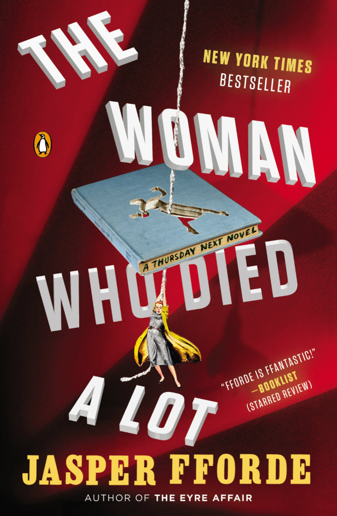
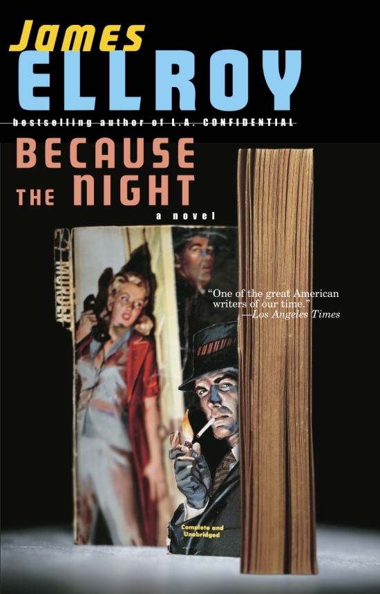
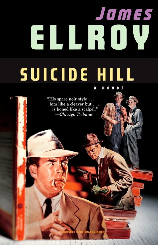
And those of you with a good memory will remember Chip Kidd used also art by Thomas Allen for a series of James Ellroy titles publisher by Vintage in the US:
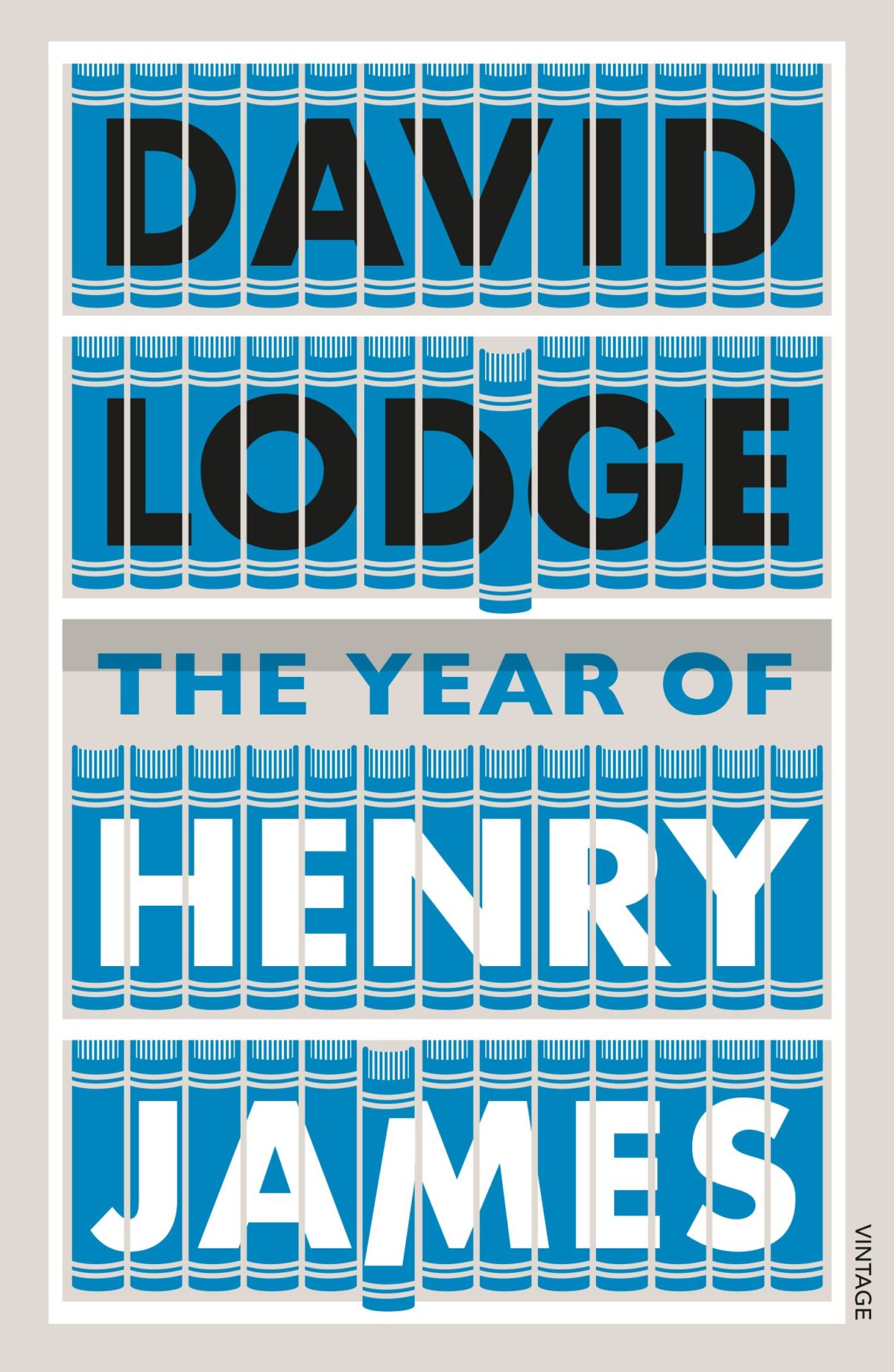
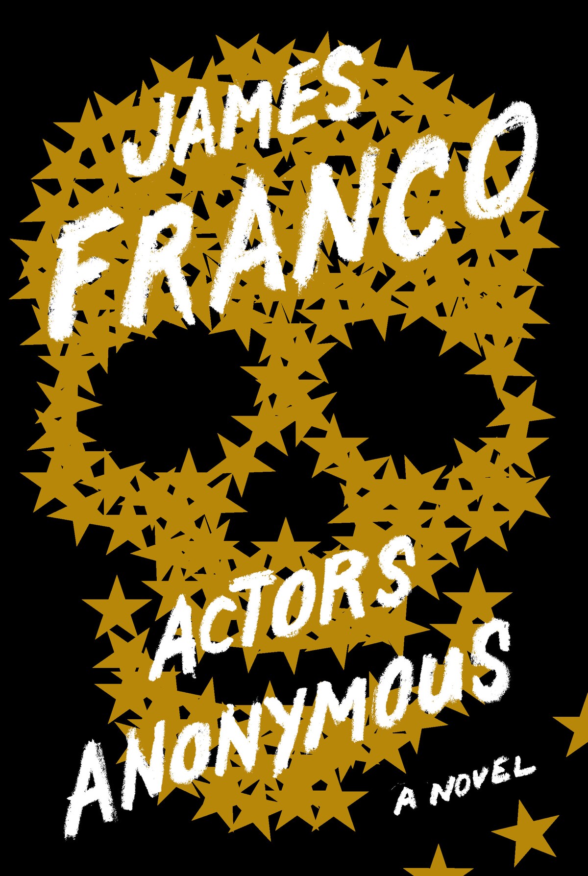
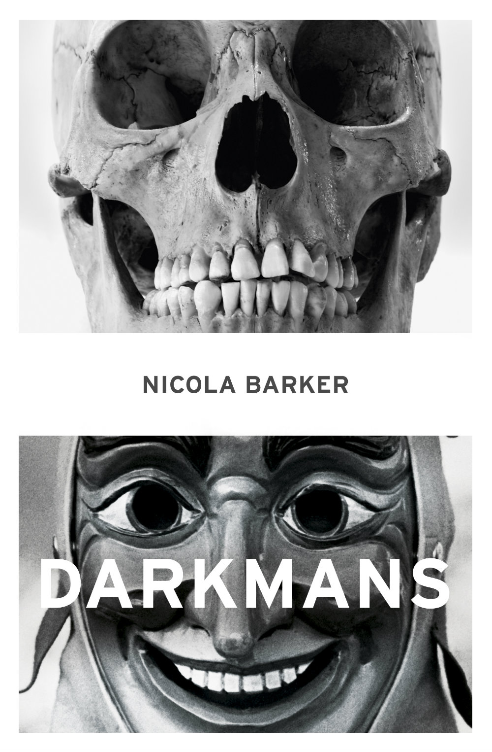
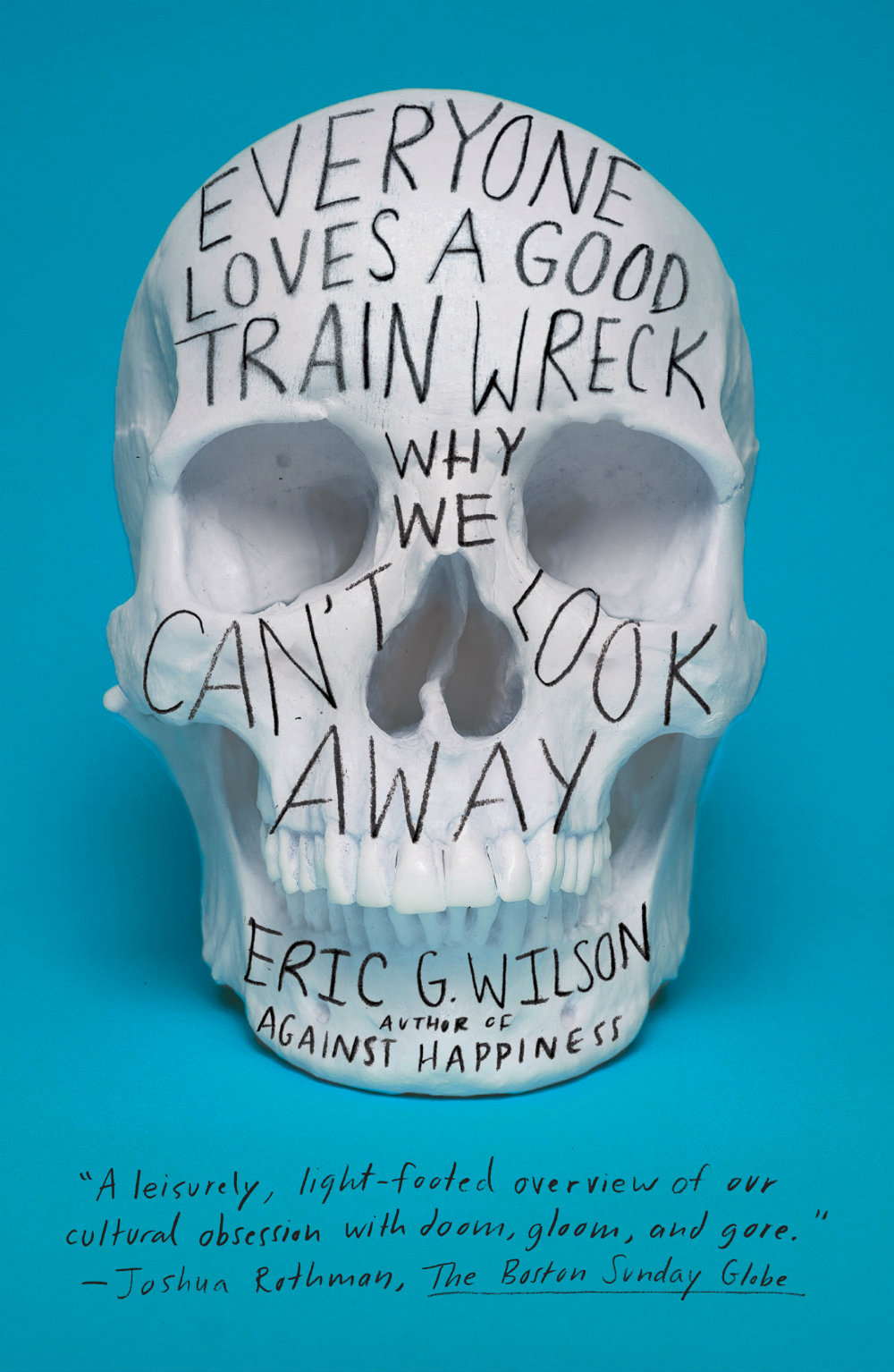
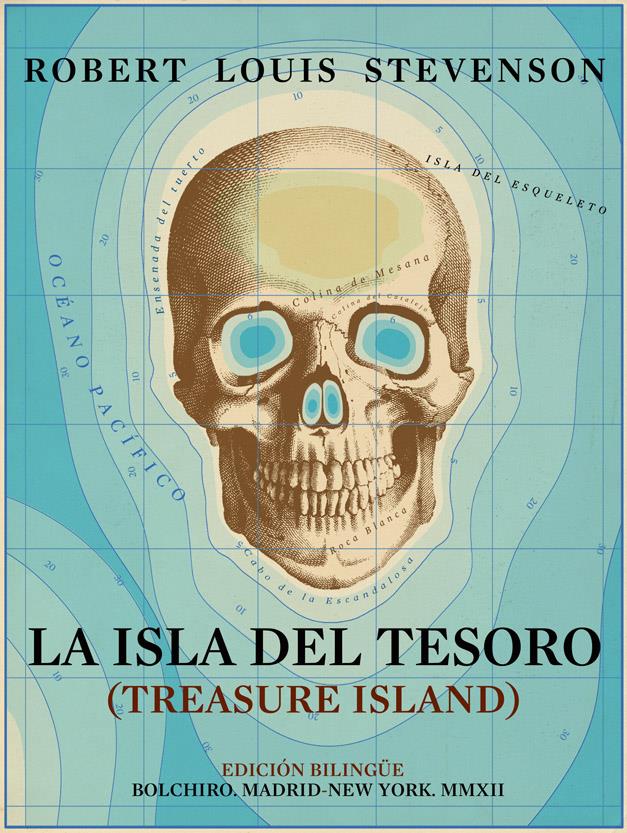
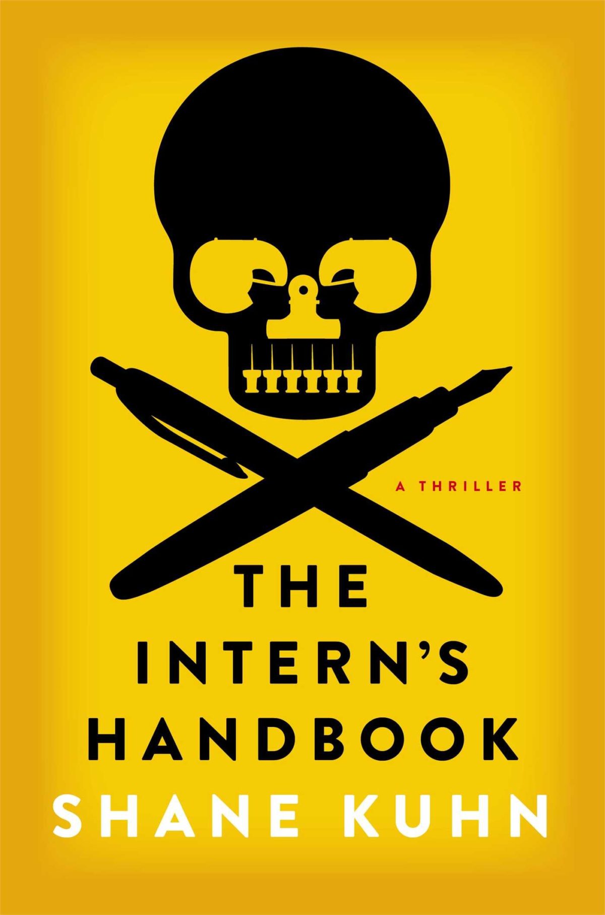
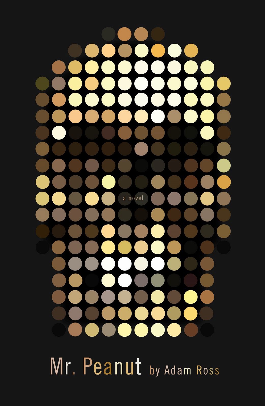
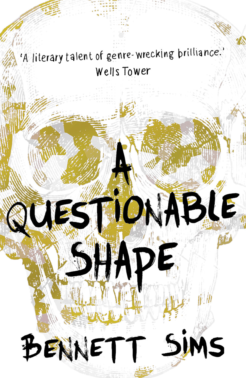
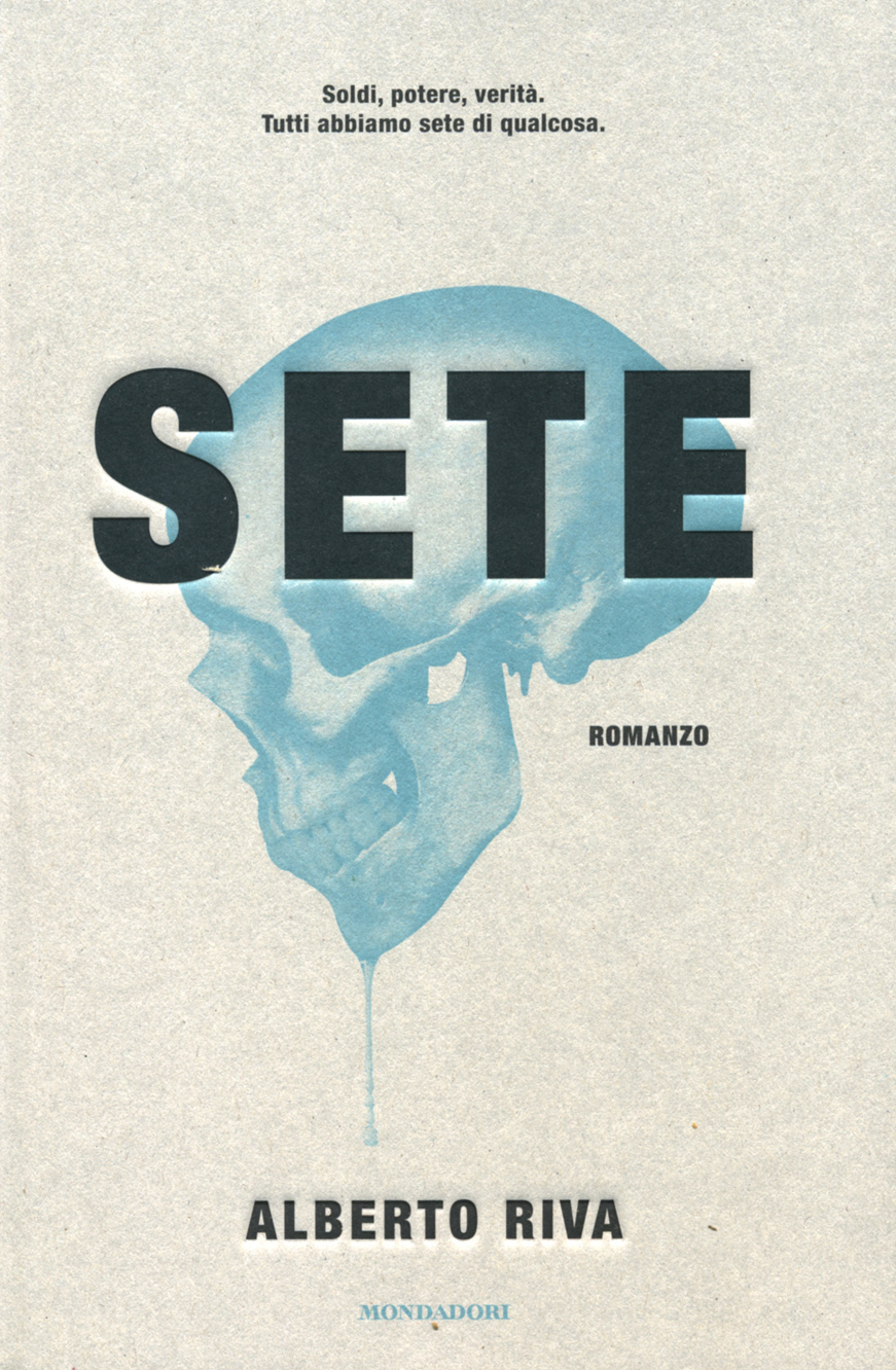
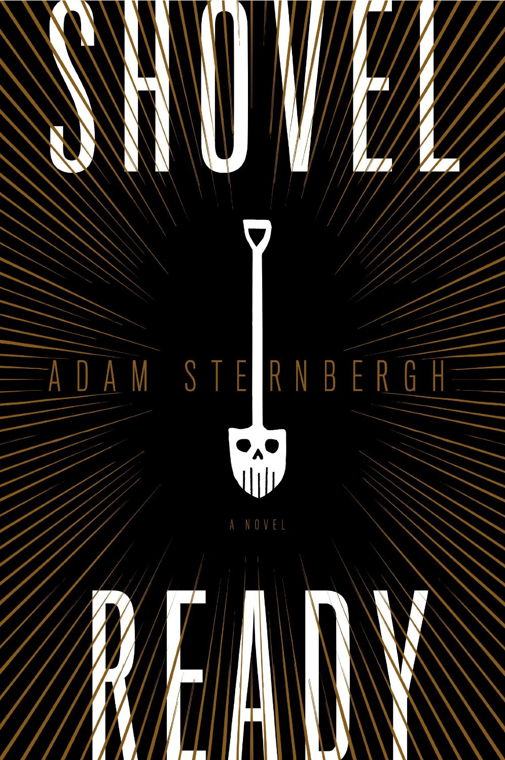
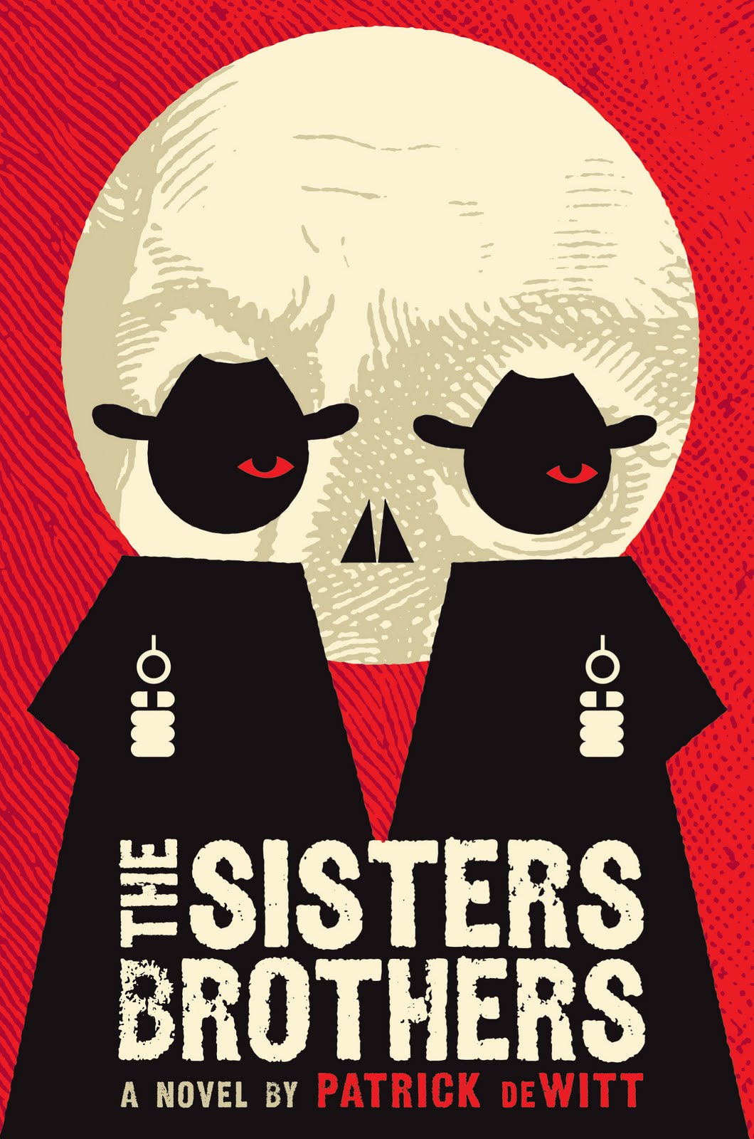
A comprehensive visual history of the human skull is surely an entire Steven Heller book in the making (I guess we’ll just have to make do with a Wikipedia page for now). But as Faye Dowling’s contemporary compendium The Book of Skulls1 makes plain, what was once taboo — terrifying even — has become a pop culture phenomenon. Images of skulls now appear in art, design, fashion, and illustration. Apparently we like to be reminded we are all going to die. Even book covers are not immune. Here are a few recent examples that caught my eye:
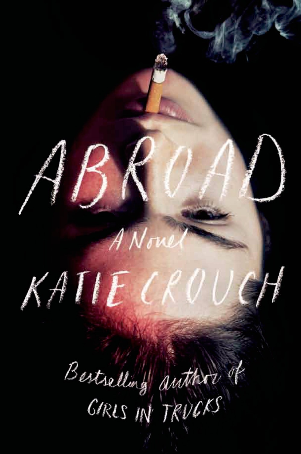
Well, this seems to have become a regular thing doesn’t it? I have to confess that I still haven’t quite figured out exactly what covers to include in these monthly posts, only that they’re recent and I like them. It’s even harder to decide what to leave out. Anyway, I hope you enjoy this month’s selection. Leave your thoughts in the comments… Abroadby Katie Crouch; design by Rodrigo Corral (FSG June 2014)
A bit late in the day on this, but the British edition of HHhH by Laurent Binet, designed James Paul Jones Senior Designer at Vintage Books, is quite something. The book was recently released in paperback in the UK.
The Language Policy — Further thoughts from Tim Parks on the role of editors, at the NYRB Blog:
As readers, it seems, we love to feel we are in direct, unmediated contact with an especially creative, possibly subversive mind and that we are getting all of its quirks and qualities unmediated and unmitigated by the obtusity of lesser folks perversely eager to return everything to the expected and mundane. This is no doubt why so little is said about editing even in the more learned papers, while nothing at all appears in the popular press, let alone at a promotional level. One cannot imagine, for example, a publisher launching an advertising campaign to boast that it has the most attentive copy editors in the business and can guarantee that everything you may read from its list has been properly purged of anything grammatically iffy, or foreign, or idiosyncratic.
Numbers — Rick Poyner on The Book of Numbers created by Herbert Spencer Spencer in collaboration with his daughter, Mafalda:
The concept is simple enough. “We live in a world full of numbers: on houses and shops, on buses and motor cars, on magazines and packages, on stamps and labels, in fairgrounds and markets, on boats and aeroplanes, on road signs and posters,” write the Spencers. A series of photographs documents the occurrence of the numbers 1 to 100 going about their business somewhere out there in the world. Most numbers — seen on a showcard, a trash can, a hanging sign, a ceramic tile, a bus stop — receive their own images. In a few cases, such as house numbers and a set of maps, several consecutive numbers form a photogenic group within the same picture.
All hotels are haunted. It doesn’t matter which hotel; it’s already played host to a murder, an overdose, an accidental death with a story. You’re kidding yourself if you don’t see this, if you don’t recognize you sleep with ghosts. Every hotel staff has its stories, any cleaning woman or bellhop knows the score. In Wilkie Collins’ 1878 gothic novel The Haunted Hotel, an Italian villa is converted to a hotel shortly after it houses an unexplained, horrific tragedy. On opening night, a guest (“not a superstitious man”) takes Suite 14, and leaves hurriedly the following morning. The next night another couple take the suite; throughout the night the woman has horrifying dreams—awake, “afraid to trust herself again in bed,” she too makes excuses and leaves.
Assume, then, that every nightmare you’ve ever had in a hotel was a cry for help, some violence from the past reaching out to you.
Situational overload is not the problem. When we complain about information overload, what we’re usually complaining about is ambient overload. This is an altogether different beast. Ambient overload doesn’t involve needles in haystacks. It involves haystack-sized piles of needles. We experience ambient overload when we’re surrounded by so much information that is of immediate interest to us that we feel overwhelmed by the neverending pressure of trying to keep up with it all. We keep clicking links, keep hitting the refresh key, keep opening new tabs, keep checking email in-boxes and RSS feeds, keep scanning Amazon and Netflix recommendations – and yet the pile of interesting information never shrinks.
The cause of situational overload is too much noise. The cause of ambient overload is too much signal.
Bluntly, the novella is in its Golden Age as a form right now because no one is beating it with a stick until nickels fall out. So my plan for the novella is — drum roll: Do nothing. Or do whatever little is required to steward the status quo. Let’s agree, shall we, to keep throwing around the inane term Great American Novel, and to never, ever utter the phrase Great American Novella.
And on the subject of The New York Times Magazine…
The Speed of Change — Former Design Director for NYTimes.com Khoi Vinh on the new design of the New York Times Magazine:
Digital publishing is supposed to be much quicker than print publishing, but this… suggests that more important than the speed of medium is the nimbleness of the business behind it. The print side of The New York Times takes a lot of good natured ribbing for being slow to publish news, but it’s still very, very good at what it does. Which is to say that few organizations can publish on a weekly basis and still effect the kind of major change that this redesign represents.
In some ways, the digital side of the business is not as nimble as that. To be sure, few companies can execute digital publishing as well as The New York Times… But partly because the medium is much younger and constantly changing, partly because best practices are less well-defined, and partly because the mission is more diffuse, execution is a more intricate, protracted and, often, inefficient affair on the digital side.
New Directions celebrates its 75th anniversary in 2011 and to mark the occasion, creative director at large Rodrigo Corral commissioned illustrator Felix Sockwell to redesign their iconic colophon by Heinz Henghes. Sockwell writes about the redesign process (and vomiting!) here (via MobyLives).
I felt that the existing cover was to some extent a brand for the book — it appeared in the media quite a bit. It’s different from what we would do in that it’s — and I mean no disrespect to Andrew [Steeves, co-publisher of Gaspereau Press] — but it’s a more literary small-press treatment. It’s very appropriate to the way they publish the book, but it was clear, of course, that we were going to try and push this out into the marketplace in a much wider way. So it seemed to me that the idea was to take what they had, because people might remember this as the cream-yellow book with the solider, and make it a little more contemporary, trade-friendly, a little more aggressive as it were. It wasn’t so much a design from scratch, the way I would normally approach a novel. The way I would describe it is I didn’t build the house, I repainted it, did some new wiring.
And finally…
Jonathan Safran Foer’s “unmakeable” book Tree of Codes published by Visual Editions and printed by Belgian publisher and printer Die Keure, seen at Fast Company.
An Archaeology of Business Cards — Penguin book designer Coralie Bickford-Smith discusses her workspace and her work with From the Desk Of…:
Right now I’m in the middle of designing a 20-book series, as well as sundry standalone titles, and my desk is usually a mess of ideas and scribbles on innumerable scraps of paper. There’s a whole archaeology of business cards, post-it notes and other treasures under there. I like to be surrounded by the current proofs to make sure the designs are working and that any tweaks are made in time for the final print. I like my desk – it’s my own tiny world in a big office.
Reading is always part of the process when we’re working on a book jacket or cover for fiction. I read, I take notes, I take breaks. I’ll stop on the title, re-read it, and think about how it plays into the book and its overall message and intent. It’s rare to be able to illustrate the tone of the entire story by only depicting one moment from the book, so I prefer using a new image or design that I feel represents the story accurately.
I did not get the impression that Lustig went into the book jacket biz with a literary bent. He did, however, have the temerity to try just about anything. And since, as a kid, he was interested in designing his way, he just, well, designed his way. So, I guess “confidence” is the right word. It was ballsiness. He had a vision—wherever it came from—and he pursued it. He was largely self-taught.
An Open Book-Publishing Platform — Book Oven’s Hugh McGuire on WordPress as a book publishing platform. It’s an intriguing idea even if don’t accept Hugh’s belief that books and the web will be indistinguishable in a matter of years. And, to judge by the comments, it something a lot of people have been working on.
Afterlife — With the US publication of The Girl Who Kicked The Hornet’s Nest, Charles McGrath looks at Steig Larsson, the late author of the Millennium series, and his unhappy legacy in the New York Times. Sarah Weinman has more on Larsson and the new book (of course)…
Enticement and Exegesis — Knopf designer Peter Mendelsund (who, incidentally, designed the covers for US editions of the Millennium books) on author David Foster Wallace, Infinite Jest, and book cover design:
Book jacket design should concern itself with, in my estimation, equal parts enticement (“Come buy this book”) and exegesis (“This is what this book is about, more or less.”) A good cover doesn’t let one category trump the other. A good cover should not resort to cliché in order to accomplish either. But the real key here, in both categories (enticement and exegesis) is the designer’s ability to work the sweet-spot between giving-away-the-farm, and deliberate obfuscation.
Book jackets that tell you too much, suck. Book jackets that try to change the subject also suck, and are furthermore, too easy.
My interview with Peter about Tom McCarthy’s book “C” is here.


 The Rejection of Literalism
 Design Dossier: Graphic Design for Kids