
By Tom Gauld for The Guardian, of course.
This has happened at pretty much every event I’ve ever attended at a book festival.
1 CommentBooks, Design and Culture

At Brooklyn magazine, Molly McArdle profiles Roxane Gay, author of An Untamed State, Bad Feminist and, most recently, Difficult Women:
Comments closed“What more could I say that I haven’t already said?” Gay asks in an conversation about publishing and diversity we had via email last year. Though the industry-wide dialogue has in many ways gotten stuck (as a lot of things that benefit white people do)—mired by a lack of willingness to do the work, commit the resources—Gay’s own efforts changed the terms of the discussion.
“She’s given us a wonderful model,” Saeed Jones says over the phone. “She could just be a great writer, that would be more than enough, but she’s gone beyond that,” he explains. “She’s showing us how to navigate difficult online spaces. She’s editing and championing people.”
He knows from experience. In 2012 Gay edited Jones’s essay “How Men Fight for Their Lives” for The Rumpus, which became the germ (and the title) for the memoir he’s now working on. “When people read that essay and feel surprised or moved by the candor or the vulnerability, it’s because Roxane made me feel safe,” Jones explains. She went on to invite him to contribute to a special issue of Guernica—a piece that became part of his award-winning debut collection of poetry, Prelude to Bruise. They’ve since shared the stage several times, most recently in front of a sold out audience at the 92nd Street Y this February. “Roxane is the kind of editor who says, ‘You are doing something important. Keep doing it.’ For writers particularly interested in examining gender, the body, power, race, identity—that is an essential and all too rare experience. There are not too many people out there you can trust. With Roxane,” he says, “people feel like themselves.”

The Rumpus interviews Will Evans the founder and publisher of Deep Vellum, an independent small press focused on works in translation based in Dallas, TX:
I’m very new to this, and I’m most definitely an outsider. I don’t really know how other people do their editing process. I’ve never worked in a publishing house with an editing team that they have to run stuff by. I’m curious, editorially it has somehow happened that Deep Vellum books are quite different from Open Letter books and quite different from Archipelago books and I don’t really know how or why that happens. We all just love stories and want to bring them to different audiences, but at the end of the day, the books that we need to publish that fit our brand are all kind of different, and that’s amazing to me. I love independent publishers because you get that more personal aesthetic choice.


Deep Vellum’s distinctive book covers, designed by Anna Zylicz, have featured on the blog before. And here’s Evans talking about founding Deep Vellum back in 2014:
Comments closed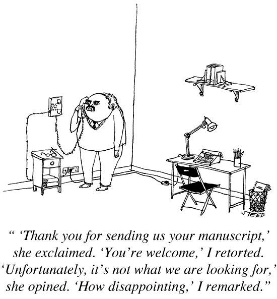
Edward Steed for The New Yorker.
Comments closed


At The Literary Hub, the talented Jennifer Heuer on gendered book covers and being a woman designer:
1 CommentI love what I do and I’ve been fortunate enough to work with a lot of amazing art directors on a lot of great projects. I’m always grateful for the work I get. But I’ve talked to a lot of women in the industry over the years, and there is a clear pattern we’ve all experienced. One day a few months ago, I was commissioned to work on the backlist of a prolific women’s lit author. Minutes later, an art director called about a memoir in which the author was “always the bridesmaid.” Later that day: a novel about a wife dealing with her husband’s indifference while balancing her new career and motherhood. Three projects from three different art directors. All aimed directly at women readers.
I doubt that many of my male colleagues have had the same experience. And that day wasn’t an anomaly.
The talented art director and cover designer Catherine Casalino has told me, “When you’re on the receiving end of a project, it’s hard to say no, and even harder to explain why you don’t want to work exclusively on women’s fiction,” and continued with, “I think if we mixed things up a little more—hired women to design sports books and hired men to design cookbooks—we’d get some fresh and unexpected designs. And that would benefit all of us in the industry.” Another female designer has written to me saying, “It’s no surprise that women are assigned these topics—being women, it’s natural to assume we are interested in these things—but sometimes the associations are so tenuous that you start wondering if the gender bias is actually a form of laziness.”

CNN Philippines interviews Elda Rotor, vice president and publisher of Penguin Classics at the Penguin Random House in New York:
Comments closedThe main joy is bringing an audience to a work that would otherwise lead a quiet life, not having the chance to be brought into the light of a modern readership. A greater joy is hearing individual responses of how enlightening or enjoyable a book has been, and connecting that experience with the fact that the edition was a Penguin Classic. The challenges are working very hard to edit, produce, and publish a book and to see its reception to be very modest. So either you realize that the readership was small, or that for some reason we failed to reach a wider audience for a variety of factors… In the 10 years I’ve worked at Penguin Classics, it’s proven to be true that there is nothing that compares to a quality edition of a great work of literature. We are very much in the digital world, providing e-books for much of our list. But there’s something about the physical beauty of a book, finely executed inside and out, that readers find deeply satisfying. We bring much work and thought into the production of our books, from authoritative texts, interior design, to cutting-edge book design, and we have built a strong reputation for this distinction. Developing series such as the Penguin Drop Caps, Penguin Horror, Civic Classics, and soon the Penguin Orange Collection and Penguin Galaxy represents our dedication to our readers and curating special series for their interests that are beautiful objects unto themselves. Overall it reflects the deep respect we have for the reader’s experience and our focus on enriching that experience with a Penguin Classic.
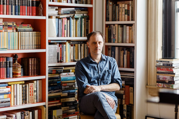
In this profile of Peter Mendelsund in the June issue of Rhapsody Magazine, there is a lovely bit about the designer’s architect-artist father:
Comments closedIn the living room of Knopf associate art director Peter Mendelsund’s Upper Manhattan apartment, inspiration is everywhere: a battered, sea-green first edition of Ulysses; a toy version of the rocket Tintin takes to the moon; the vertebra of a blue whale; and, on top of his baby grand piano, a wooden model of a convention center made by his father, in the mid-’70s, when he worked for a New York architecture firm. It was never built, because the firm didn’t win the competition (Renzo Piano did), nor were any of his other models, because, in his late 30s, Benjamin Mendelsund was diagnosed with a brain tumor and devoted the rest of his life—he died at 48—to sculpture and painting. “He cut out all the bureaucracy of architecture,” Mendelsund says, “and turned to this.” He points to a small canvas painted entirely black except for two rectangles—two faded photos of a barn’s loft, its window open to the bright of day.
That image of a window onto a window is central to the signature style that’s made Mendelsund one of our preeminent book jacket designers: geometric, fascinated with negative space, striving to capture infinity through simplicity. You see the painting echoed in his cover for Martin Amis’s 2006 novel, House of Meetings, for which he photographed a tiny simulacrum of a room, its perspective slanting toward a miniature door. You see it in his many book jackets with drop-cuts—holes carved out of an image—like the diamond torn from a woman’s face on an early cover for The Girl With the Dragon Tattoo, back in 2005 when it was called The Man Who Hated Women. And you see it in his May 11, 2015, New Yorker cover, which features an American flag smashed like a storefront window, a single star-shaped hole evoking the myriad emotions of last year’s civil unrest in Baltimore.
His father’s second act as an artist also helps explain how, at 33, Mendelsund had the confidence to abandon his career as a classical pianist (“Eventually, I realized that I’d never truly be world class”) and reinvent himself. His wife suggested he try something visual—he was always drawing; he had designed their wedding invitation. “Sometimes the obvious things take a long time to see.”

Joanna Scutts reviews The Lady with the Borzoi, Laura Claridge’s new biography of Blanche Knopf, for the New Republic:
When the house of Knopf launched in 1915, publishing was a gentleman’s pursuit—amateur, clubbish, WASP, and above all, male. Blanche and Alfred navigated this casually anti-Semitic world, holding themselves aloof from their alcoholic, philandering competitor, the “pushy Jew” Horace Liveright, founder of the Modern Library and publisher of T. S. Eliot’s The Waste Land. Over the years there would be female secretaries, copywriters, reviewers, and editors at Knopf. There would be women in charge of little magazines and the children’s-book divisions of big publishers. But there would be no other woman in the publishing industry with the status of Blanche Knopf—either in the 1920s, when she signed Langston Hughes and Willa Cather, or in the 1950s, when she celebrated Albert Camus’s Nobel prize and oversaw the translation of Simone de Beauvoir’s The Second Sex. And despite it all, although her husband swore he’d put her name on the masthead, he never did…
Comments closed…For the Knopfs, marriage proved much more difficult than publishing. In Claridge’s hands Alfred Knopf takes his place in twentieth-century literature’s crowded pantheon of assholes—his great loves were the American Southwest, expensive wine, and the ritual humiliations of his friends, his family, and most of all, his wife. One after another, acquaintances and co-workers attest to a relationship that today we’d call toxic; a stew of jealousy, incompatibility, violence, and—just when it couldn’t get worse—yearning affection.
In a special report, WNYC’s On the Media recently took a look at the publishing industry and print books. It covers a lot of ground — including the subversive history of adult colouring books, Amazon’s bricks-and-mortar bookstore, and South Korea’s quest for a Nobel Prize in Literature — but the opening segment, ‘Why the Publishing Industry Isn’t in Peril‘, with LA Times books editor Carolyn Kellogg is an excellent overview of the current state of US publishing:
Comments closed
