Skip to content

Tag: peter mendelsund

Mendelsund on Lolita

Knopf book designer Peter Mendelsund has written a fascinating essay on cover design and Lolita by Vladimir Nabokov:

Book jackets these days, for reasons I won’t unpack, seem to revel, overtly, in wit, conceptual deviousness, unusual clever or droll juxtapositions — we, as a professional community, seem to have elevated the visual bon mot above all other virtues. Again, I won’t delve into the “why” of the matter here for want of space, but suffice it to say that clever work is the work that is celebrated in our community. Not that wit in itself isn’t valuable, and doesn’t have an appropriate place in design — but wit is not the same thing as insightfulness, and often insightfulness is what is called for in a book jacket. Our fetishizing of cleverness has taken a toll I believe, in that (quite often) these clever solutions work at cross-purposes to the (more often than not sincere) narratives they represent. A book in which an author has gone out on a considerable limb in order to write in a genuine and unaffected fashion does not want a cover that winks at the reader. Wit, when it becomes compulsive (as anyone knows who has a friend who puns too often) quickly becomes its opposite- dullness or predictability.

Peter says this is just the first in a series of posts about the process of “jacketing works of fiction”. One can only hope.

(pictured above: a proposed jacket for Nabokov’s Lolita by Emmanuel Polanco)

Comments closed

Midweek Miscellany

Peter Mendelsund chats with Chip Kidd about his office for the redesigned From The Desk Of:

I’ve always been a ‘nester’, I think most designers are. The difference now between my office and my bedroom as a child is the dearth of KISS posters (I mean NOW, not then).

(Frankly I’m surprised the universe didn’t collapse from all that awesomeness contained in a single room)

And on a related note, Mendelsund is one of many designers who work is included in AIGA’s recently announced 50 Books / 50 Covers list (although several covers appear to be attributed to their art directors rather than the designers themselves, no?).

Math-Lit — Helen DeWitt, author of The Last Samurai and the forthcoming Lightning Rods, interviewed at BookForum:

Chance often plays a big part in fiction, but it is generally not chance as this is mathematically understood, which tends to be counter-intuitive. A while back I discovered Edward Tufte’s brilliant books on information design, The Visual Presentation of Quantitative Information, Envisioning Information, and so on. I read Gerd Gigerenzer’s Reckoning with Risk, about why we have trouble calculating probabilities using percentages, even when it’s a matter of life and death (a doctor working out the likelihood that someone is genuinely HIV-positive, based on a positive test result); I read Peter Bernstein’s Against the Gods on the history of risk; I read Michael Lewis’s Moneyball, on the way sabermetrics had transformed professional baseball. It seemed to me that one could use Tufte’s methods to incorporate this tremendously interesting subject into fiction.

The cover design for Lightning Rods is by Steven Attardo for Rodrigo Corral Design.

And finally…

The legendary George Lois talks about his covers for Esquire  with Gym Class Magazine. There’s no shortage ego, but I love this anecdote about playing a soft ball game against The New Yorker:

So I go over there with my glove and my sneakers, and I could not believe it. I looked at the team. The third baseman was Gay Talese. The second baseman was Gore Vidal. It was not a team of athletes. I said: ‘Oh my god, they’re all literary geeks.’ He said: ‘No, no, we’re going to have fun.’

Now I’m serious about playing softball or basketball. I don’t screw around, I play with great ballplayers, I’m a good athlete. I said: ‘Harold, this side is terrible.’ He said: ‘No no!’

We went over and played THE NEW YORKER, and I think we lost 18–3, and the only reason we got three runs is because I hit three homers. I don’t remember being there for any other reason.

Comments closed

Midweek Miscellany

A little late on this, but 50 Watts has posted the winners of  Polish Book Cover contest. Will Schofield’s co-judges were Aleksandra and Daniel Mizieliński, editors of 1000 Polish Book Covers, and Peter Mendelsund. All the amazing entries are here. Pictured above: A Clockwork Orange by Chris Taylor.

Fragments of Experience The Guardian reviews Modernist America by Richard Pells:

Film editing, he tells us, owes debts to cubism, futurism and surrealism. Cutting from one shot to another enables the cinema to “create a feeling of movement as well as a sometimes fractured sense of time and reality. The fragments of experience, captured in a single shot and then juxtaposed with other shots to produce a multiplicity of perspectives, are the cornerstones of the cinema, and they are also central to the modernist view of the world.”

Music from Nowhere — Rob Young, author of Electric Eden, interviewed in the LA Times:

[P]art of my argument is that the British folk revival did actually begin much earlier than… the 1950s — you have to look back at the late 19th century and the Victorian folk collectors… [William] Morris is important because what you find in the 1880s and ’90s is a surge of conservation and preservation projects starting up, mainly by people who were horrified at the destructive effects of industrial progress on the landscape, the environment and the labor conditions of the working class. Morris was at the forefront of this, and his time-travel novel “News from Nowhere” sets out the utopian conditions of a better world in which the future is actually like a medieval golden age.

Gestalt-Ingenieur — Dieter Rams on design, Jonathan Ives and Apple for The Daily Telegraph:

I am troubled by the devaluing of the word ‘design’. I find myself now being somewhat embarrassed to be called a designer. In fact I prefer the German term, Gestalt-Ingenieur. Apple and Vitsoe are relatively lone voices treating the discipline of design seriously in all corners of their businesses. They understand that design is not simply an adjective to place in front of a product’s name to somehow artificially enhance its value. Ever fewer people appear to understand that design is a serious profession; and for our future welfare we need more companies to take that profession seriously.

And finally…

Music for Dieter Rams — a mini-album by Jon Brooks (via The Donut Project):

“Every sound on this record, from the melodic sounds to the percussion, the atmospheric effects to the bass lines originates from the Braun AB-30 alarm clock.”

Awesome.

Comments closed

Koji Suzuki | Vertical

After watching Lauren Panepinto’s how-to video yesterday and talking with designer Jacob Covey about op-art book covers, I was reminded of Chip Kidd’s amazing designs for the Vertical editions of Koji Suzuki’s Ring books:

Vertical are apparently releasing Edge by Koji Suzuki this fall with a cover by Peter Mendelsund that sticks with the visual theme of the series:

The design is from a few years ago according to Peter (it still looks fresh to me), but clearly I should have nagged him for a better quality image rather than relying on the internet!

Update: Thanks to Peter for sending me a higher-res cover image for Edge. Beauty.

Comments closed

Something for the Weekend

Visual Vocabulary — An interesting interview with book designer Peter Mendelsund at Czech Position:

I definitely take into account the author’s native culture, though whether I choose to adopt something stylistic from this culture depends on the vagaries of the particular project. There are times when one wants to accentuate the universal aspects of a writer’s work; and there are times when one wants to situate an author in a specific time and place… With Kafka, I would argue that his greatness lies in the universality of his ideas, that his writing transcends time and place… Conversely, with many other writers, nationality is at the core of their work — their great subject is place and contextual identity. They may write about Czech-ness, or English-ness, etc. These are the books where it makes the most sense to bring the local artistic tropes and visual cues to bear. For what it’s worth, I love delving into the visual vocabulary of different cultures.

The Casual Optimist interview with Peter is here, and you can read my 2-cents on his Kafka redesigns here.

The Polish Club50 Watts asks you to design the Polish edition of your favourite book. $400 is up for grabs.

Living by Dying — Ben Ehrenreich, author of The Suitors and Ether (forthcoming), on the death of the book in the new Los Angeles Review of Books:

For the record, my own loyalties are uncomplicated.  I adore few humans more than I love books.  I make no promises, but I do not expect to purchase a Kindle or a Nook or any of their offspring.  I hope to keep bringing home bound paper books until my shelves snap from their weight, until there is no room in my apartment for a bed or a couch or another human being, until the floorboards collapse and my eyes blur to dim.  But the book, bless it, is not a simple thing… [W]hat could it mean for the book to die?  Which sort of book?  And what variety of death?  What if the book had only ever lived by dying?

A World Made of Stories — James Gleick, author of The Information, on memes:

In the competition for space in our brains and in the culture, the effective combatants are the messages. The new, oblique, looping views of genes and memes have enriched us. They give us paradoxes to write on Möbius strips. “The human world is made of stories, not people,” writes the novelist David Mitchell. “The people the stories use to tell themselves are not to be blamed.” Margaret Atwood writes: “As with all knowledge, once you knew it, you couldn’t imagine how it was that you hadn’t known it before. Like stage magic, knowledge before you knew it took place before your very eyes, but you were looking elsewhere.” Nearing death, John Updike reflected on

A life poured into words—apparent waste intended to preserve the thing consumed.

Fred Dretske, a philosopher of mind and knowledge, wrote in 1981: “In the beginning there was information. The word came later.” He added this explanation: “The transition was achieved by the development of organisms with the capacity for selectively exploiting this information in order to survive and perpetuate their kind.” Now we might add, thanks to Dawkins, that the transition was achieved by the information itself, surviving and perpetuating its kind and selectively exploiting organisms.

Cull or be Culled — NPR’s Linda Holmes on how we are missing everything:

You used to have a limited number of reasonably practical choices presented to you, based on what bookstores carried, what your local newspaper reviewed, or what you heard on the radio, or what was taught in college by a particular English department. There was a huge amount of selection that took place above the consumer level. (And here, I don’t mean “consumer” in the crass sense of consumerism, but in the sense of one who devours, as you do a book or a film you love.)

Now, everything gets dropped into our laps, and there are really only two responses if you want to feel like you’re well-read, or well-versed in music, or whatever the case may be: culling and surrender.

And on a related note…

Lester Bangs’ Basement — Bill Wyman on collecting and scarcity at Slate:

Lester Bangs, the late, great early-rock critic, once said he dreamed of having a basement with every album ever released in it… [T]he Internet today is very much like [that]. In its vastness, cacophony, and inaccuracy, it’s also very reminiscent of Borges’ Library of Babel. Just as that library contained books made up of every possible combination of letters, in the corners of the Internet I’m concerned with here you can find similar chaos: The song “Let It Be” by the Beatles, sure, but also mislabeled as by the Stones, by the Kinks, by the Hollies, by the “Battles” … and also with, of course, those same labels attached to entirely different songs (like “Let It Bleed”).

Anyway, is it enough?

For some, the enjoyment of art or culture has fetishistic aspects. To them, being a fan is about something more than just experiencing the art. There will always be collectors, fixating on the physical objects, like the great LP jackets from the 1960s and 1970s… And there will always be people who can’t be happy unless they have something regular fans don’t. Indeed, a friend of Bangs’, long after he died, said to me that the unspoken corollary in Bangs’ mind to his fantasy was that no one else would have access to it.

Happy Easter.

Comments closed

Peter Mendelsund and the Art of Metamorphosis

I posted about Peter Mendelsund’s reinterpretations of Kafka for Schocken Books rather breathlessly earlier this week, and I wanted to revisit them now I’ve had some time for greater reflection.

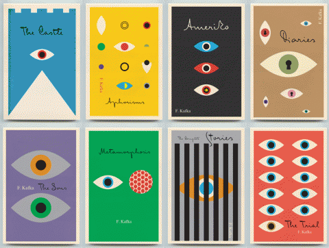
The covers are exceptional designs and surprising reinterpretations of Kafka. What particularly interested me, however, is that they are also a surprising direction for Mendelsund to go in.

As Peter himself notes in his original post, the natural impulse when designing Kafka is to draw on the avant-garde art movements of the early 20th Century. These movements — which smashed together fine art, design, typography, photography, montage, and film — burgeoned in Central and Eastern Europe in aftermath of the Russian Revolution and the First World War, a period when Kafka himself was writing (he died in Vienna in 1924).

Unsurprisingly, recent reinterpretations of Kafka (at least the ones that have eschewed the non-design of an author photograph) have incorporated elements taken from Surrealist photography, modernist posters, and silent film.

The influence of the avant-garde is often apparent in Mendelsund’s work. Covers such as The Idiot, Crime and Punishment and The Double and The Gambler by Fydor Dostoevsky, House of Meetings by Martin Amis, and K. by Roberto Calasso all incorporate elements of Suprematism, Constructivism, DADA and other stark European art movements of the early 20th Century. The new covers, however, which focus on the humour in Kafka’s writing, move in a new direction and incorporate elements from the optimistic age of American mid-century modern design.
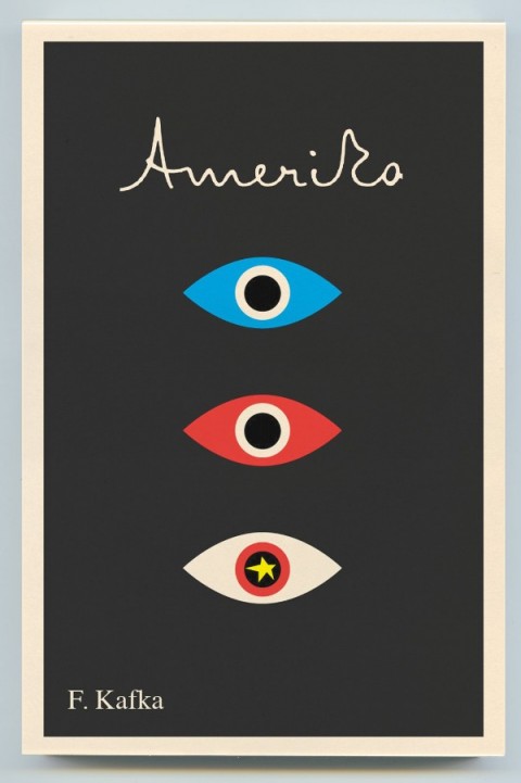
Mendelsund’s use simple geometric shapes, flat colour backgrounds, and stripe patterns are typical of work by Paul Rand and Alvin Lustig.

Hand-written lettering of the type we see in Mendelsund’s Kafkas is used to great effect in Lustig’s design for Kafka’s Amerika and is characteristic of several of Rand’s book covers.

As others have noted, the eye motif used by Mendelsund is also similar to Rand’s iconic IBM poster (and his unused logo for the AIGA). But in this instance at least, Rand is clearly not the only influence. His contemporary Rudolph de Harak used the same motif in his cover design for T.E. Lawrence By His Friends published by McGraw-Hill in 1963.

There are echoes too of an exhibition poster by American expatriate designer E. McKnight Kauffer who designed the cover for the Random House edition of James Joyce’s Ulysses published in 1949 (and who was reputedly an influence on Lustig), and a George Salter cover for a Robert Bloch novel, The Scarf, published by The Dial Press in 1947.

The eye motif also recalls Bill Golden’s CBS logo designed in 1951 (repeated in the British Associated Televison ATC logo), which was itself inspired by a Shaker ‘All Seeing Eye’ symbol Golden had seen. And it is perhaps no coincidence that Mendelsund’s design for The Castle (and McKnight Kauffer’s poster) is reminiscent of the masonic Eye of Providence (also known as the “all-seeing eye of God”) familiar from the US one dollar bill.

Of course, not all of these elements and influences are new to Mendelsund’s work (see his designs for The Millennium Trilogy boxed set), and the new covers draw on some of his more familiar inspirations such as Jean Arp, a founding member of the DADA movement (and likely an influence on Lustig), and post-war European design (see Germano Facetti’s design for George Orwell’s 1984 designed in the early 1960’s).

But compare the Kafka covers to Mendelsund’s recent designs for The Snowman by Jo Nesbø  or C by Tom McCarthy, and the difference is striking. To look at these macabre designs for Knopf — which seem to owe more to the cut-and-paste of DADA, the punk aesthetic of Barney Bubbles or, perhaps, the anti-design of David Carson’s Ray Gun —  is like looking at the work of a wholly different designer.

That Mendelsund is capable of reinterpreting and subverting mid-century modern and making it his own not only demonstrates his creative flexibility, but serves to reminds us that one of his greatest strengths as a designer is his ability to surprise and delight us.

8 Comments

Mendelsund vs. Kafka

Amerika | Peter Mendelsund

Peter Mendelsund on his remarkable (and unexpectedly Paul Rand-like) Kafka redesigns for Knopf imprint Schocken:

After all, what is it that makes Kafka, Kafka? The economy; the dark humor; the teasing inscrutability; the brilliance of the thought-experiments; the hieratic and esoteric flavor of the constructions; the disorienting cadence of the prose; the impeccable, internal, magical logic that drives the mechanical toy theaters of his work; the much discussed Jewishness (as if this was easy to parse); the “concrete abstractions” (in the words of Zadie Smith)…. I suppose what some find most relevant and compelling in Kafka is his ability to inspire in them that paradoxical feeling that great literature always aspires to arouse in readers—the feeling of the universality of their own alienation. Kafka is the ne plus ultra of alienation– alienation being arguably the defining emotional condition of the 20th century.

There is more at Peter’s blog JACKET MECHANICAL.

4 Comments

Pigskin Over Wood

CBS News looks at the past, present, and future of book covers, and talk to Knopf’s Associate Art Director Peter Mendelsund and some guy called Chip Kidd:

Comments closed

Peter Mendelsund: Stieg Larsson Boxed Set

Peter Mendelsund, Associate Art Director at A.A. Knopf, talking about the design of The Millennium Trilogy boxed set:

Comments closed

Something for the Weekend

Limits and Boundaries — Peter Mendelsund, associate art director at Knopf, discusses his cover design for Jo Nesbø’s The Snowman with The New Yorker’s ‘The Book Bench’:

[O]ften my favorite jackets are the ones done after repeated rounds of failure and rejection. There’s something to be said for the desperation that rejection engenders in me. Sometimes, when the process feels most intractable and hopeless, a kind of last-ditch clarity appears. That being said, it’s also nice when you get it on the first stab.

And on the subject of super-talented book designers… A short Q &A with Coralie Bickford-Smith, Penguin senior cover designer, at 10 Answers.

I, Reader — Alexander Chee on e-books and life spent reading for The Morning News:

Many ponderables remain regarding the e-book. At a personal level, I am someone who has read books in poor light for decades without hurting my vision (despite what my mother claimed), and I’m keeping, well, an eye on that—the iPad gives me headaches in ways reading on paper never did. As a writer and former bookseller, I understand the e-book’s imperfections and limits, and monitor the arguments that it will end publishing or save it, and potentially kill bookstores, which would kill something in me, if it were to happen. But I also believe that the book as we know it was only a delivery system, and that much of what I love about books, and about the novel in particular, exists no matter the format. I’ve lately been against what I see as the useless, overly expensive hardcover, and I admit I enjoy the e-book pricing over hardcover pricing. Still, I’ll never replace the books on those shelves, and there’ll always be books I want only as books, not as e-books, like the new Chris Ware, for example, which would be pointless on an e-reader. This really is just a way for me to have more.

Rage Against the Machine — Onnesha Roychoudhuri’s long and much talked about article on Amazon for the Boston Review:

What happens when an industry concerned with the production of culture is beholden to a company with the sole goal of underselling competitors?…

The conceit is that that $9.99 price tag is what the market demands. But in this case Amazon is the market, having—with no input from its suppliers—already dictated the price and preempted the standard fluctuations that competition and improved efficiency impose on prices…

Cheap books are easy on our wallets, but behind the scenes publishers large and small have been deeply undercut by the rise of large retailers and predatory pricing schemes. Unless publishers push back, Amazon will take the logic of the chains to its conclusion. Then publishers and readers will finally know what happens when you sell a book like it’s a can of soup.

Talking About My Generation — The LA Times’ David L. Ulin on Gary Trudeau’s 40: A Doonesbury Retrospective:

[T]he trick, the secret of “Doonesbury,” that, in its topicality, its ongoing dailiness, it is really about something more profound. Trudeau highlights that in his introduction: “It’s not about Watergate,” he writes of the collection, “gas lines, cardigans, Reaganomics, a thousand points of light, Monica, New Orleans, or even Dubya.” No, indeed, although such elements do show up here, more important are the people, the dance of generations, their humanity. This is where “Doonesbury” is at its most compelling…

And finally…

Andrew Kuo, who creates off-beat music infographics for The New York Times,  talks about his new book of personal work,  What Me Worry (published by The Standard), at Interview Magazine (thx PMac!).

2 Comments

Something for the Weekend

Sadly I missed the book launch earlier this week, but Toronto-based artist and illustrator Gary Taxali talked to the Torontoist and The National Post about his new kids book This is Silly!. You can see more of Taxali’s amazing book covers here.

ArtifactsMaximus Clarke has a fascinating conversation with William Gibson about his new novel Zero History :

I reach instinctively for something without knowing why, and place it in the narrative, and if it strikes a resonant chord with me, I’ll leave it there… But I myself have wondered why I do that — why I depict a universe of man-made objects, with people walking among them (laughs). My best answer is that it’s the way I perceive things. And I also suspect that the narratives of objects are more available to us when the objects themselves have become slightly decrepit. So I think my interest in old things, and worn things, isn’t about nostalgia in any conventional sense; it’s about the revelation of the narrative of how that object came to be in the world, and what it once might have meant to someone.

And on a somewhat related note, an interview with J.G. Ballard from the Winter 1984(!) issue of The Paris Review:

I would say that I quite consciously rely on my obsessions in all my work, that I deliberately set up an obsessional frame of mind. In a paradoxical way, this leaves one free of the subject of the obsession. It’s like picking up an ashtray and staring so hard at it that one becomes obsessed by its contours, angles, texture, et cetera, and forgets that it is an ashtray—a glass dish for stubbing out cigarettes.

The Black Arts — Book cover designers discuss their devious techniques for winning a clients approval with Peter Mendelsund and Peter Terzian:

Yes, a good design should speak for itself—but what if the client isn’t listening? Well, that’s when designers employ methods that are not taught in design school. Psychological methods. Machiavellian methods. Used-car-dealer methods. Manipulation. Intimidation. Seduction.

The PDF is here.

And Peter T has clearly been busy. The editor of Heavy Rotation: Twenty Writers on the Albums That Changed Their Lives has an article on books about album cover art at BookForum.

And finally (and on the subject of music)…

Finding Our WayRadiohead bassist Colin Greenwood reflects on the digital “pay what you think it’s worth” release of their album In Rainbows in 2007  and the band’s distribution options for their new songs:

I buy hardly any CDs now and get my music from many different sources: Spotify, iTunes, blog playlists, podcasts, online streaming – reviewing this makes me realise that my appetite for music now is just as strong as when I was 13, and how dependent I am upon digital delivery. At the same time, I find a lot of the technology very frustrating and counter-intuitive. I spend a lot of time using music production software, but iTunes feels clunky. I wish it was as simple and elegant as Apple’s hardware. I understand that we have become our own broadcasters and distributors, but I miss the editorialisation of music, the curatorial influences of people like John Peel or a good record label. I liked being on a record label that had us on it, along with Blur, the Beastie Boys and the Beatles.

(via Subtraction)

Comments closed

Something for the Weekend

What Do You Do With These Things? — Andrew Pettegree, author of The Book in the Renaissance, interviewed at the Boston Globe (via The Second Pass):

What you’ve got to do once you’ve got 300 identical copies of a book is you’ve got to sell it to people who don’t even yet know they want it. And that’s a very, very different way of selling…

It’s this classic example of how you get technological innovation without people really being aware of the commercial implications, of how you can make money from it. There’s quite a little similarity in the first generation of print with the dot-com boom and bust of the ’90s, where people have this fantastic new innovation, a lot of creative energy is put into it, a lot of development capital is put into it, and then people say, “Well, yeah, but how are we going to make money…?”

Your Brain on Gadgets — NPR looks at digital overload:

The average person today consumes almost three times as much information as what the typical person consumed in 1960, according to research at the University of California, San Diego.

And The New York Times reports that the average computer user checks 40 websites a day and can switch programs 36 times an hour.

“It’s an onslaught of information coming in today,” says Times technology journalist Matt Richtel.

Digital Horde — Fast Company on the launch of The Mongoliad, Neal Stephenson’s experiment with digital storytelling and social media:

The innovation in The Mongoliad… [is] in the entire concept of a serialized, dynamic, digital “book” that includes video, imagery, music, and background articles among the text of the storyline and comes with a social media companion, with which fans/readers can comment and interact. The social aspect even goes so far as including badges, the new digital “reward” phenomenon, which readers can earn for taking part in particular activities. The book will be available online via a browser, and also through dedicated apps for Apple iDevices and Android phones.

There’s more about the venture at The New York Times. At what point, however, does this stop being a novel and start being a game? Can we tell anymore…?

This Is Our Niche — Steven Heller talks to Sonic Youth’s Thurston Moore and editor Eva Prinz about Ecstatic Peace Library for the The New York Times:

Moore and Prinz believe that the analog and digital are more distinct in books than in other media. “To say that an art book can be an e-book is ignorant of the tradition and art of color separations, printing and binding,” Prinz said. “Likewise, to suspect that a digital storytelling experience is simply a pdf downloaded on your iPad or Kindle platform is disrespectful to the interactive arts and artists.” She has been experimenting with video game technology to create their first e-book. “In similar processes to those employed by the 1960s experimental subcommittee of the College de Pataphysique, a group of French writers and poets who called themselves OuLiPo (Ouvroir de litterature potentielle),” Prinz continued, “Ecstatic Peace Library is creating new ways to ‘escape’ into literature and art.”

The Wolf Hall EffectIntelligent Life looks at the growing respectability of  historical fiction in the wake of Hilary Mantel’s Booker Prize winning novel.

And finally…

Little Acts of Civil Disobedience — A profile of book designer Peter Mendelsund by Stefan Kamph from 2009 that I hadn’t seen previously (thx Jacob):

Moments of humor and surprise in a cover are a designer’s “little acts of civil disobedience,” says Mendelsund, and he “would like to think that if you’re a good reader there are little exegetical clues you can sneak in.” The court artist hides his private mark in the appointed painting.

Peter also recently posted his beautiful designs for the Steig Larsson deluxe boxed set at his blog JACKET MECHANICAL.

Comments closed