Skip to content

Tag: peter mendelsund

More Recent Book Covers of Note

Seeing as it’s a long weekend in Canada, and The Independent, The New York Times, The Atlantic, and countless other fly-by-night operations are jumping on the book design blog train (and doing it far better than me, damn it), here’s another round of recent covers that have caught my eye (just so you know who’s boss):

 419 by Will Ferguson; Design by Dan Mogford

The Antidote by Oliver Burkeman; Design by Scriberia

Coin Locker Babies by Ryu Murakami; Design by David Pearson

The Enchanted Wanderer by Nikolai Leskov; Design by Peter Mendelsund

Gun Guys: A Road Trip by Dan Baum; Design by Jason Booher

The Private Life: Why We Remain in the Dark by Josh Cohen; Design by FUEL

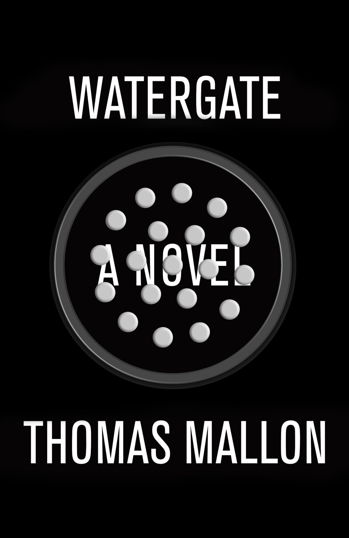
Watergate by Thomas Mallon; Design by Evan Gaffney

What the Family Needed by Steven Amsterdam; Design by Jen Heuer

1 Comment

Something for the Weekend

Excitingly Wrong — An interview with Peter Mendelsund at Porter Square Books:

I am always interested by anything graphical that strikes me as (this is difficult to put into words) excitingly wrong. There is a cool-factor to certain images that lie just on this side of disagreeable…pictorial effects that make me think “this will bother a lot of unimaginative people.” Whenever I see something like that, a piece of art or graphic design that has that special kind of wrongness about it, I think “I need to do something like this myself.” Attendant to this is always the feeling of “in the future, this will be done a lot.” In other words, today’s ugly is tomorrow’s beautiful.

Lurking Menace — Ostensibly reviewing David Bowie Is, the catalogue for the current V & A exhibition, and Bowie’s new album, The Next Day, Ian Buruma looks back at the performer’s career at the NYRB:

[Bowie] drew his inspiration from anything that happened to catch his fancy: Christopher Isherwood’s Berlin of the 1930s, Hollywood divas of the 1940s, Kabuki theater, William Burroughs, English mummers, Jean Cocteau, Andy Warhol, French chansons, Buñuel’s surrealism, and Stanley Kubrick’s movies, especially A Clockwork Orange, whose mixture of high culture, science fiction, and lurking menace suited Bowie to the ground. Artists and filmmakers have often created interesting results by refining popular culture into high art. Bowie did the opposite: he would, as he once explained in an interview, plunder high art and take it down to the street; that was his brand of rock-and-roll theater.

This Movie is About Hope — Film Comment has a transcript of Steven Soderbergh’s San Francisco International Film Festival ‘State of Cinema Address’:

 The simplest way that I can describe it is that a movie is something you see, and cinema is something that’s made. It has nothing to do with the captured medium, it doesn’t have anything to do with where the screen is, if it’s in your bedroom, your iPad, it doesn’t even really have to be a movie. It could be a commercial, it could be something on YouTube. Cinema is a specificity of vision. It’s an approach in which everything matters. It’s the polar opposite of generic or arbitrary and the result is as unique as a signature or a fingerprint. It isn’t made by a committee, and it isn’t made by a company, and it isn’t made by the audience. It means that if this filmmaker didn’t do it, it either wouldn’t exist at all, or it wouldn’t exist in anything like this form.

Read the whole thing. It reminded me of William Goldman’s famous comment about Hollywood in Adventures in the Screen Trade: “nobody knows anything.”

See also: At the New York Times film critic A. O. Scott looks at Soderbergh’s ‘Twitter narrativeGlue.

And finally…

Just to the Right of Karl Marx — At the Financial Times, Julia Hobsbawn remembers her father, the historian Eric Hobsbawn:

The cemetery plot, situated as my husband Alaric wryly pointed out later “just to the right of Karl Marx”, had been freshly dug…  My mum Marlene had bought the plot in an expensive and expansive act of love several years earlier. She is 81 and was my father’s unsung muse for 50 years, dealing constantly with demands on his time from students, publishers, editors and broadcasters while acting as his general reader…

My dad was pleased knowing that he would end up there. Highgate Cemetery’s east wing is full of iconoclasts from the intelligentsia. I can picture him, glasses pushed up over his high forehead, peering longsightedly at the guide produced by the Friends of Highgate Cemetery Trust about its history, hoovering up the text and filleting it for us in an exact and pithy way. “Ah yes,” he might say, energised like a freshly charged battery by what he had just read, “you see what is really interesting about this is…”

Comments closed

You’ll Never Get Anywhere Like That

Or a Few Thoughts on the Cover Design of The Bell Jar (An Illustrated Essay of Sorts)

In his recent essay ‘Graphic Design Criticism as a Spectator Sport’ designer Michael Bierut (author of 79 Short Essays on Design) suggested that “at a time where more people than ever are engaged with design,” design criticism has been reduced to a “seemingly endless series of drive-by shootings punctuated by the occasional lynch mob, conducted by anonymous people with the depth of barroom philosophers and the attention span of fruit flies.”

Unsurprisingly, I thought of Mr. Bierut during the recent furore about the cover design of The Bell Jar.

When Faber and Faber published a 50th anniversary edition of Sylvia Plath’s novel last month with a brightly coloured new cover, they can hardly have expected a controversy. But the design, which features a photograph of a woman holding a compact and touching up her make-up, was, it turned out, nothing less than “a ‘fuck you’ to women everywhere.” It was so truly hideous, that if “Sylvia Plath hadn’t already killed herself, she probably would’ve” when she first saw it. It was “THE BELL JAR as chick lit” — “1990s chick lit“!

It wasn’t much better when the designers weighed in. If the diplomatic Jamie Keenan thought Faber hadn’t “got it quite right,” Barbara DeWilde was less equivocal: “it’s a travesty… I’m still almost speechless that it was published in this form.”

We are, of course, morbidly fascinated by Plath, who died tragically young — there are at least 3 new books about her life being published this year alone. That The Bell Jar is both semi-autobiographical and her only novel makes our opinions about it even more intense.

But just how much of the criticism was actually fair?

On the face of it, the image isn’t entirely inappropriate. Mirrors (and photographs) are a recurrent motif in the book (one of its working titles was The Girl in the Mirror). The novel even begins with Esther working for a fashion magazine in New York. She talks about her looks, her clothes and her make-up. She carries a compact in her bag. Esther is fixated with appearances even as she struggles against being defined by hers.

Nor is the new design some kind of “chick lit makeover” — that just seemed like a convenient, if inaccurate, headline. While defining what qualifies a ‘chick lit’ is notoriously difficult, the cover has none of whimsy usually associated with the genre. Furthermore the new design wasn’t a sudden attempt to make the book look more feminine. The beautiful Faber Firsts cover from 2009 designed by Mark Swan also uses a glamorous retro image (albeit a disturbingly cropped one).

In fact, the new cover, also designed by Swan, is much more jarring than the Faber Firsts’ almost romantic image. There’s an angular sickliness to it — an awkward, unpleasant toxicity. The bright colours are unnaturally heightened, the pose mannered, the jerky lettering like “loops of string lying on the paper” blown askew.

As Faber themselves would later would confirm, it was meant to unsettle. The intent “was that the image of the expressionless woman ‘putting on her mask’ and the discordant colour palette would suggest ambivalence and unease.”

Certainly the new cover, is harder to like. It is indisputably ugly, especially compared to Swan’s earlier design or the original Faber cover from 1967 (pictured above) designed by Shirley Tucker (if not more so than this Warholian shocker from 1998). But tasteful covers rarely stand out on the shelves and from a marketing perspective there isn’t anything necessarily wrong with something being dissonant. It can be startling effective as Peter Mendelsund’s covers for Simone de Beauvoir demonstrate. Disruptive designs can also provoke interest in new readers and there is even some anecdotal evidence this is precisely what has happened with The Bell Jar — it is, apparently, “doing the business.”

Still, the design of The Bell Jar fails, at least as an accurate representation of the book. The mirror’s reflection does nothing to imply the introspection or detachment of the novel — only a coquettish vanity and narcissism. The woman in the photograph is just too put-together, too worldly. The mannered glamour is reminiscent of the stifling fashion photography of the 1950’s. This isn’t a 19 year-old’s face, “bruised and puffy and all the wrong colours.” There is no ennui or anxiety on display. No hint of poverty or isolation. Nothing of the suicidal depression aor a person coming apart. There is none of the disappointment. It is just an icily cool model posing for a photograph — an image Esther herself denies:

The magazine photograph showed a girl in a strapless evening dress of fuzzy white stuff, grinning fit to split, with a whole lot of boys bending in around her. The girl was holding a glass full of a transparent drink and seemed to have her eyes fixed over my left shoulder on something that stood behind me, a little to my left. A faint breath fanned the back of my neck. I wheeled around.

The night nurse had come in, unnoticed, on her soft rubber soles.

“No kidding,” she said, “is that really you?”

“No, it’s not me. Joan’s quite mistaken. It’s somebody else.”

To make matters worse for Faber, they also revealed the new cover shortly after Penguin Classics reissued new editions of George Orwell with cover designs by David Pearson. The contrast is unfavourably stark. Where Pearson deftly combines wit and originality with respect for material (not to mention Penguin’s design heritage), the stock photography, anachronistic type and bright colours of The Bell Jar seem crass and gaudy.

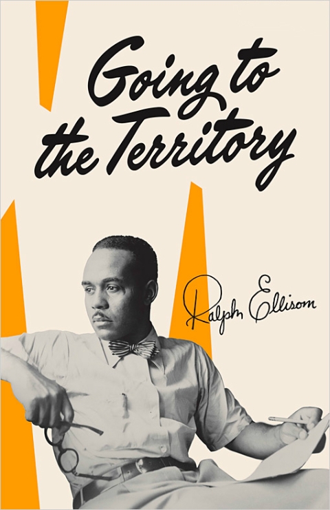
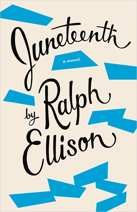
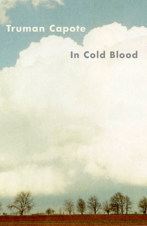
Comparisons with similarly stylish new editions of Kafka and Joyce designed Peter Mendelsund, Truman Capote designed by Megan Wilson, and Ralph Ellison designed by Cardon Webb, are unequally unflattering. It’s not hard to see that Plath, like so many other women writers, has been decidedly short-changed.

As Fatema Ahmed, noted in her post ‘Silly Covers for Lady Novelists‘ for the London Review Books blog, “the anniversary edition fits into the depressing trend for treating fiction by women as a genre, which no man could be expected to read and which women will only know is meant for them if they can see a woman on the cover.”

In recent years, contemporary writers as diverse as Francine Prose, Jodi Picoult, Jennifer Weiner, Meg Wolitzer, Fay Weldon, and Lionel Shriver have all noted how fiction by women is marginalized. No matter that women buy the most books, women writers are less well-reviewed, win fewer literary awards, and all too often the covers of their books don’t accurately reflect nature of the work itself.

If books by Jonathan Franzen, Chad Harbach and Ben Marcus are designed to look different and stand out on the shelves, contemporary literary fiction written by women tends to look the same regardless of the book’s subject matter. All too often there is a photograph of woman on the cover — pretty, domesticated, inoffensive and wistful. The assumption is that women only want to read certain kinds of stories, and that men don’t want to read books by women at all. In discussing the treatment of her own work, Shriver dryly pointed out, “publishing’s notion of ‘what women want’ is dated and condescending.”

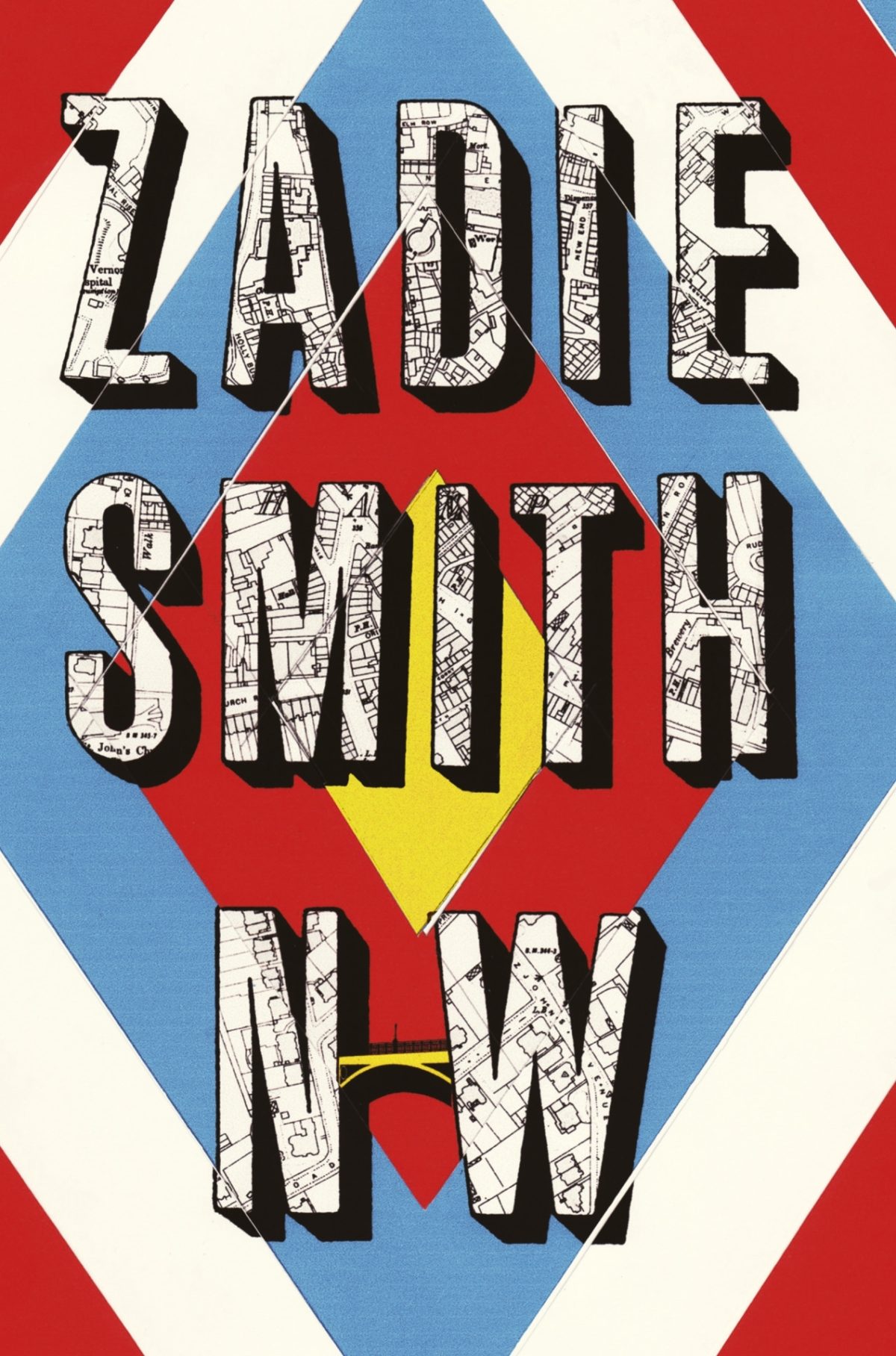
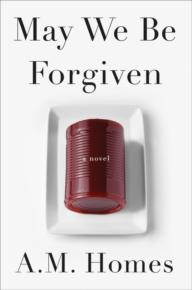
This isn’t always true, of course. Hilary Mantel’s Thomas Cromwell novels defy all expectations. See Now Then, Jamaica Kincaid’s first novel in 10 years, has a type-only cover. The Casual Vacancy by J. K. Rowling is notable for its hand-drawn lettering and calculated, corporate blandness. Both the American and the British editions of Zadie Smith’s NW — designed by Darren Haggar/Tal Goretsky and Gray318 respectively — are stunning. Alison Forner’s sinister canned cranberries for May We Be Forgiven by A. M. Homes is a neat inversion of domesticated happiness. The Penguin Modern Classics reissues of Carson McCullers designed by Jim Stoddart — with images selected by Penguin Press picture editor Samantha Johnson — also demonstrate that 20th century classics by women do not have to suffer from poor design or gender stereotypes.

There are surely other isolated examples too. But one can’t help thinking they are exceptions that prove the rule, and it is a particularly bitter irony that Plath’s novel about a young woman struggling with society’s expectations of her should, 50 years later, expose that woman writers are still stereotyped and treated poorly in comparison to their male counterparts. My sense is, however, that this latest controversy is a sign that the tide is turning. Women, both writers and readers, are being more outspoken about what is wrong with the way their books are handled by publishers and the media. They expect more and they expect better. This is the upside of design as a spectator sport. White middle-aged men are no longer the only voices being heard. Thankfully.


I was recently asked for my opinion on the new cover of The Bell Jar for an article in the Chicago Tribune. This an edited and expanded version of my comments to journalist Nara Schoenberg for that article. Thanks to everyone who gave feedback on an earlier draft of these remarks.


9 Comments

Monday Miscellany

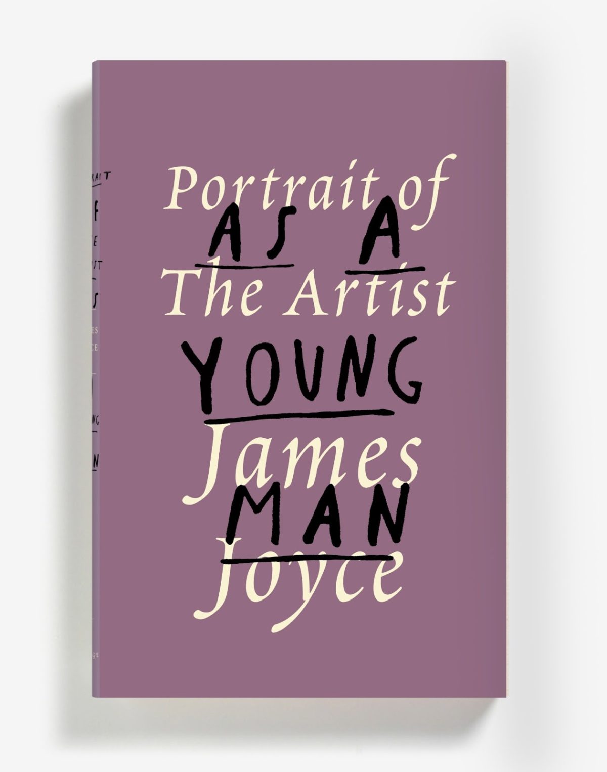
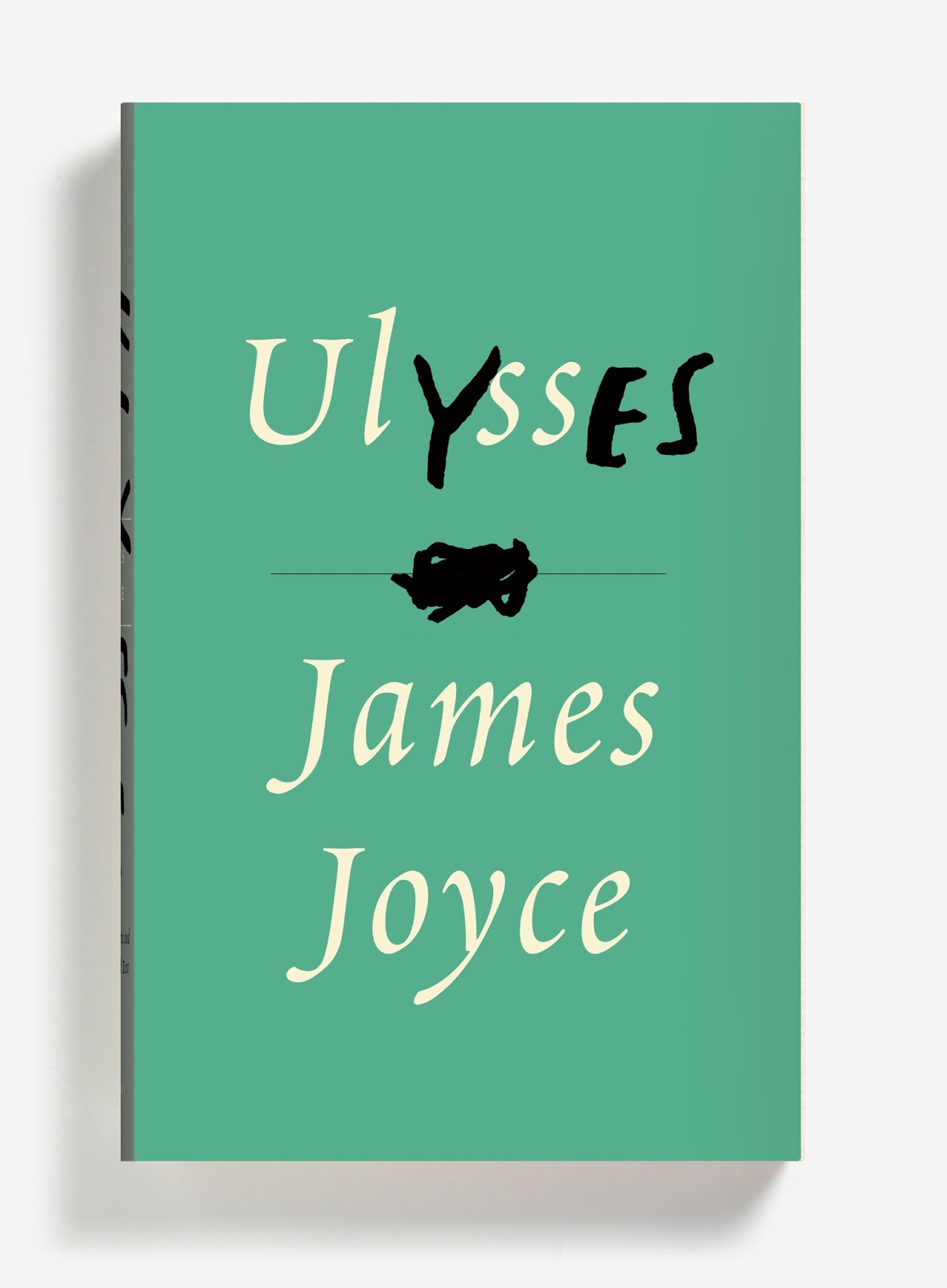
Three new James Joyce cover designs, and one extraordinary post by Peter Mendelsund.  Brilliant stuff…

The Box — Author Michael Chabon on the films of Wes Anderson at the NYRB Blog:

Anderson’s films have frequently been compared to the boxed assemblages of Joseph Cornell, and it’s a useful comparison, as long as one bears in mind that the crucial element, in a Cornell box, is neither the imagery and objects it deploys, nor the Romantic narratives it incorporates and undermines, nor the playfulness and precision with which its objects and narratives have been arranged. The important thing, in a Cornell box, is the box… All movies, of course, are equally artificial; it’s just that some are more honest about it than others. In this important sense, the hand-built, model-kit artifice on display behind the pane of an Anderson box is a guarantor of authenticity; indeed I would argue that artifice, openly expressed, is the only true “authenticity” an artist can lay claim to.
The Same Curious Brain — A profile of author and artist Oliver Jeffers, at the National Post:

Jeffers doesn’t just tell stories. He’s an artist — paintings, printmaking, collage — and a commercial and editorial illustrator, with clients ranging from Anthropologie and Weight Watchers to the Guardian and Newsweek. His monograph Neither Here Nor There, which was published last summer, is a collection of his non-children’s work — a bust of Darth Vader; a satellite crash-landed in a cornfield; a hammer nailed to a wall — though it still feels like part of the same universe. Jeffers prefers it this way.

“My books are all about telling stories, and a lot of my art is about asking questions,” he says. “But they’re equally extensions of the same curious brain.”

And finally…

The Spy Novelist Who Knows Too Much — a New York Times story about the decidedly nasty-sounding 83-year-old French pulp novelist Gérard de Villiers so implausibly bonkers it probably has to be at least partially true:

Last June, a pulp-fiction thriller was published in Paris under the title “Le Chemin de Damas.” Its lurid green-and-black cover featured a busty woman clutching a pistol, and its plot included the requisite car chases, explosions and sexual conquests. Unlike most paperbacks, though, this one attracted the attention of intelligence officers and diplomats on three continents… “It was prophetic,” I was told by one veteran Middle East analyst who knows Syria well and preferred to remain nameless. “It really gave you a sense of the atmosphere inside the regime, of the way these people operate, in a way I hadn’t seen before.”

And it gets better from there…

Comments closed

Favourite Covers of 2012

For the past couple of years now (since Joseph Sullivan put the Book Design Review on ice in fact), I’ve been posting a short list of my favourite covers for books for the year. Now that thing for the New York Times is out of the way, I’m free to post my list for 2012.

To make a couple of very general observations about book design this year, the cover that probably made the greatest impact was Fifty Shades of Gray. It was a design that made it OK to read erotica in public, something which surely contributed to the book’s breakout success — a point not lost on other publishers who rushed to re-package their own erotica titles in a similar fashion. The results inevitably lacked the finesse of the original, but imitation is the sincerest form of flattery, as they say…

But while the cover of Fifty Shades of Gray smartly defied the conventions of its genre, it wasn’t an exciting cover and some publishers seemed to be more conservative in their design choices, playing it safe or relying on formulas. The jacket for The Casual Vacancy could hardly have been more forgettable, and it was not alone. A bland sameness crept in. Perhaps that could be said every year. I suspect, however, that smaller budgets, tighter deadlines, and readers browsing thumbnails rather than shelves had an effect.

Nevertheless, some publishers were willing to trust their art directors and designers, and publish interesting and challenging covers. If I was to identify a common theme to my choices this year, it would be hand-drawn lettering and illustrated designs. With the ubiquity of stock photos and uninspired type-choices, that seems to be where the interesting things are happening, at least to my mind. Perhaps photographs will make a come back next year?

After Freud Left edited by John Burnham; designed by Isaac Tobin
University of Chicago Press

All Men Are Liars by Alberto Manguel; design by Jason Booher
Riverhead

El asenino hipocondríaco by Juan Jacinto Muñoz Rengel; design by Ferran López, illustration Santiago Caruso
Plaza & Janés


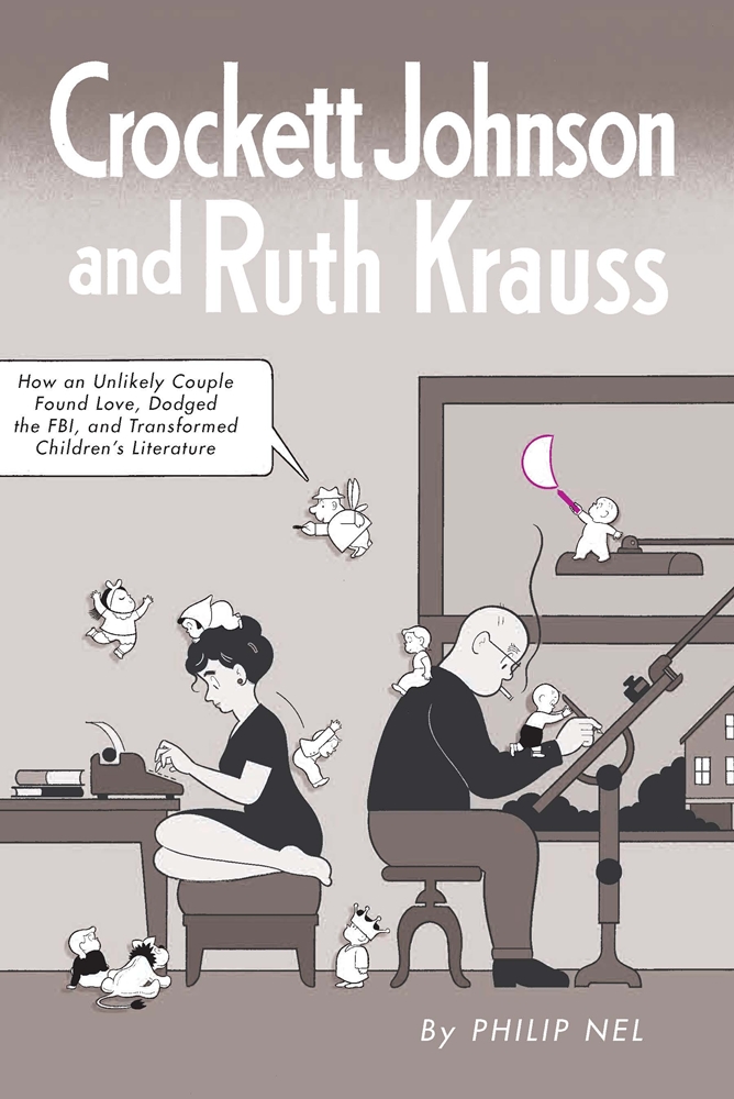
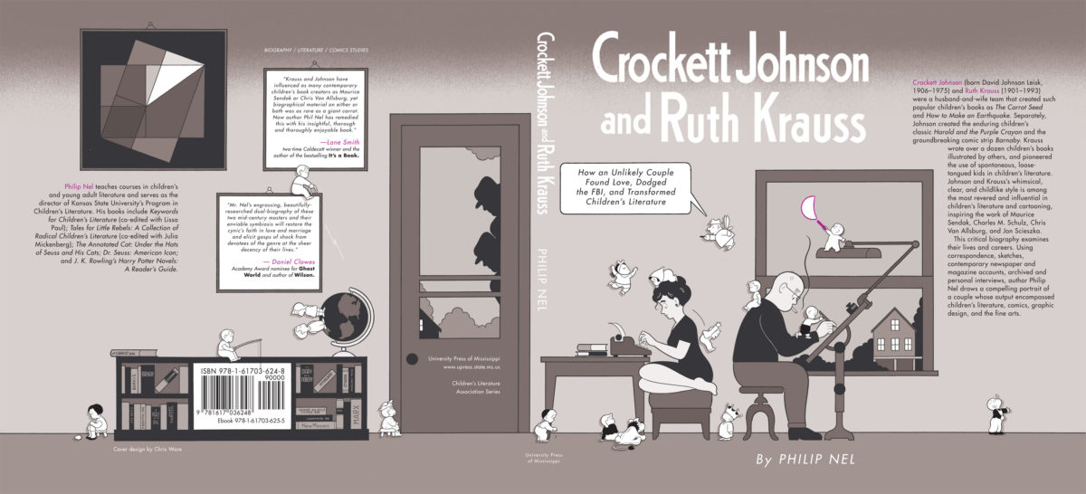
Crockett Johnson and Ruth Krauss by Philip Nel; design by Chris Ware
University Press of Mississippi

Cruel Britannia by Ian Cobain; design by FUEL
Portobello Books

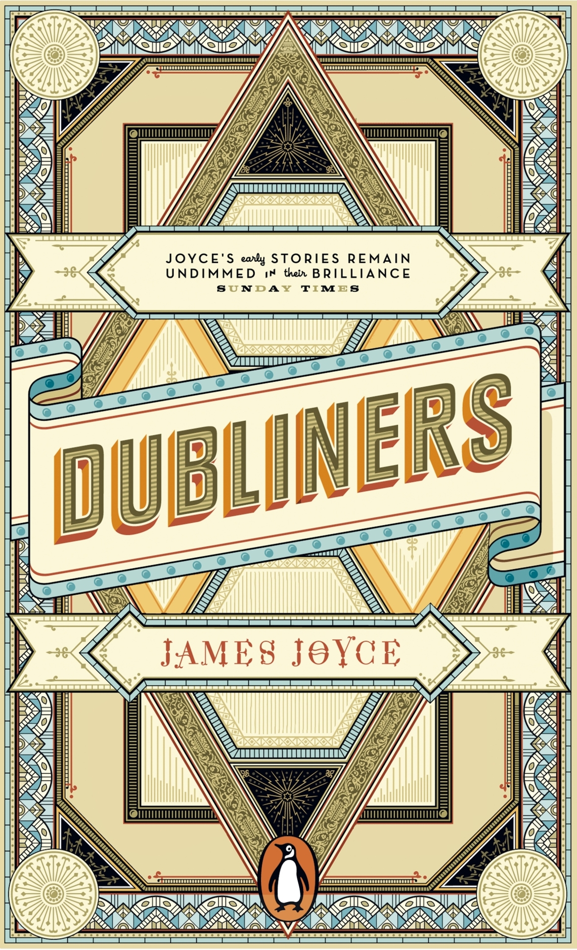
The Dubliners by James Joyce; design by Apfel Zet / Richard Bravery
Penguin Essentials, Penguin (UK)

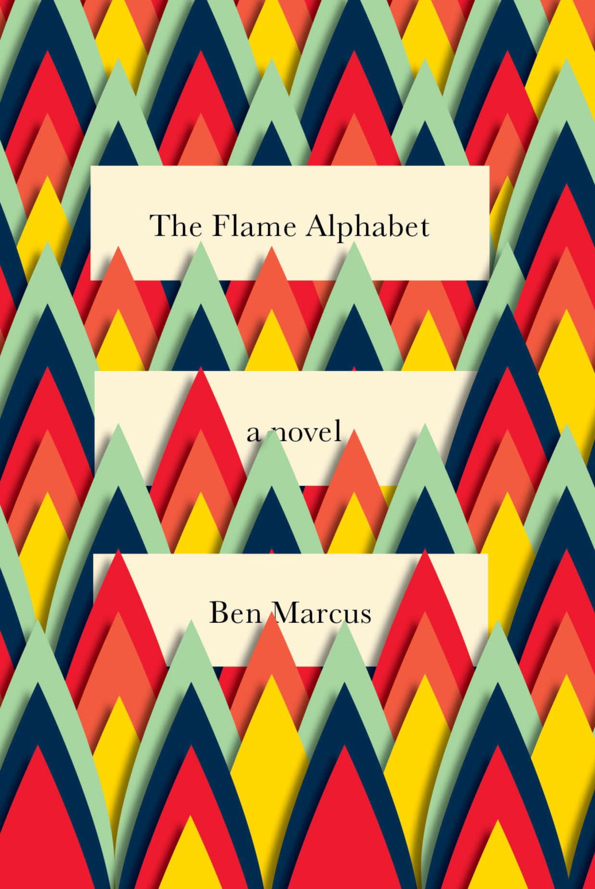
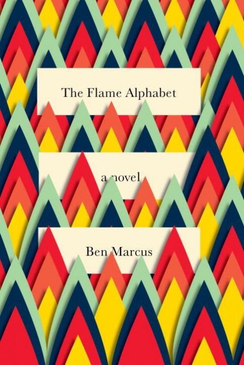
The Flame Alphabet by Ben Marcus; design by Peter Mendelsund
Knopf

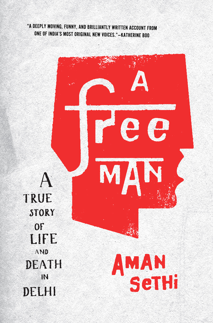
A Free Man by Aman Sethi; design by Ben Wiseman
W.W. Norton

Goodbye to Berlin by Christopher Isherwood; illustration by Vania Zouravliov

Vintage Isherwood, Vintage (UK)

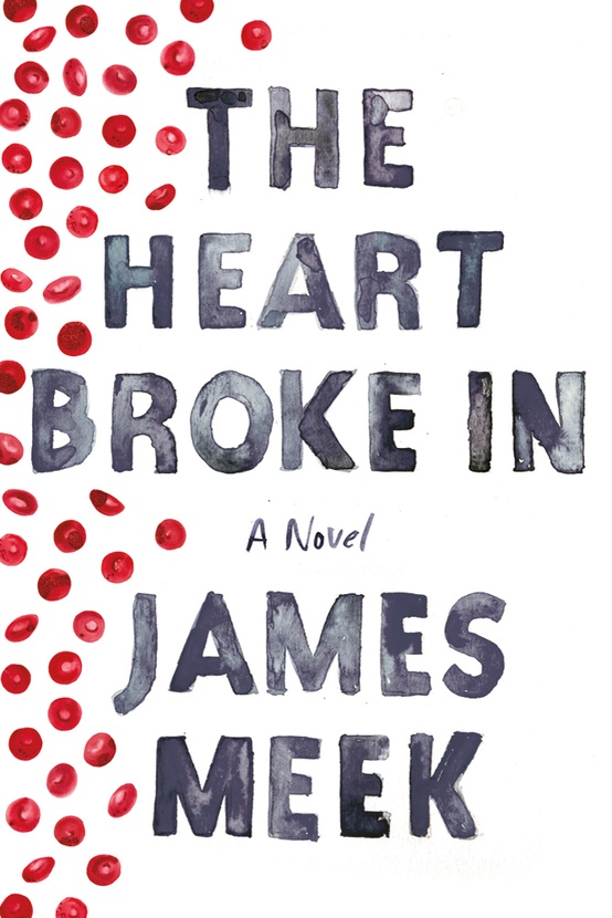
The Heart Broke In by James Meek; design by Jennifer Carrow; illustration by Michele Banks
Farrar, Straus & Giroux

Hope: A Tragedy: A Novel by Shalom Auslander; design by John Gall
Riverhead

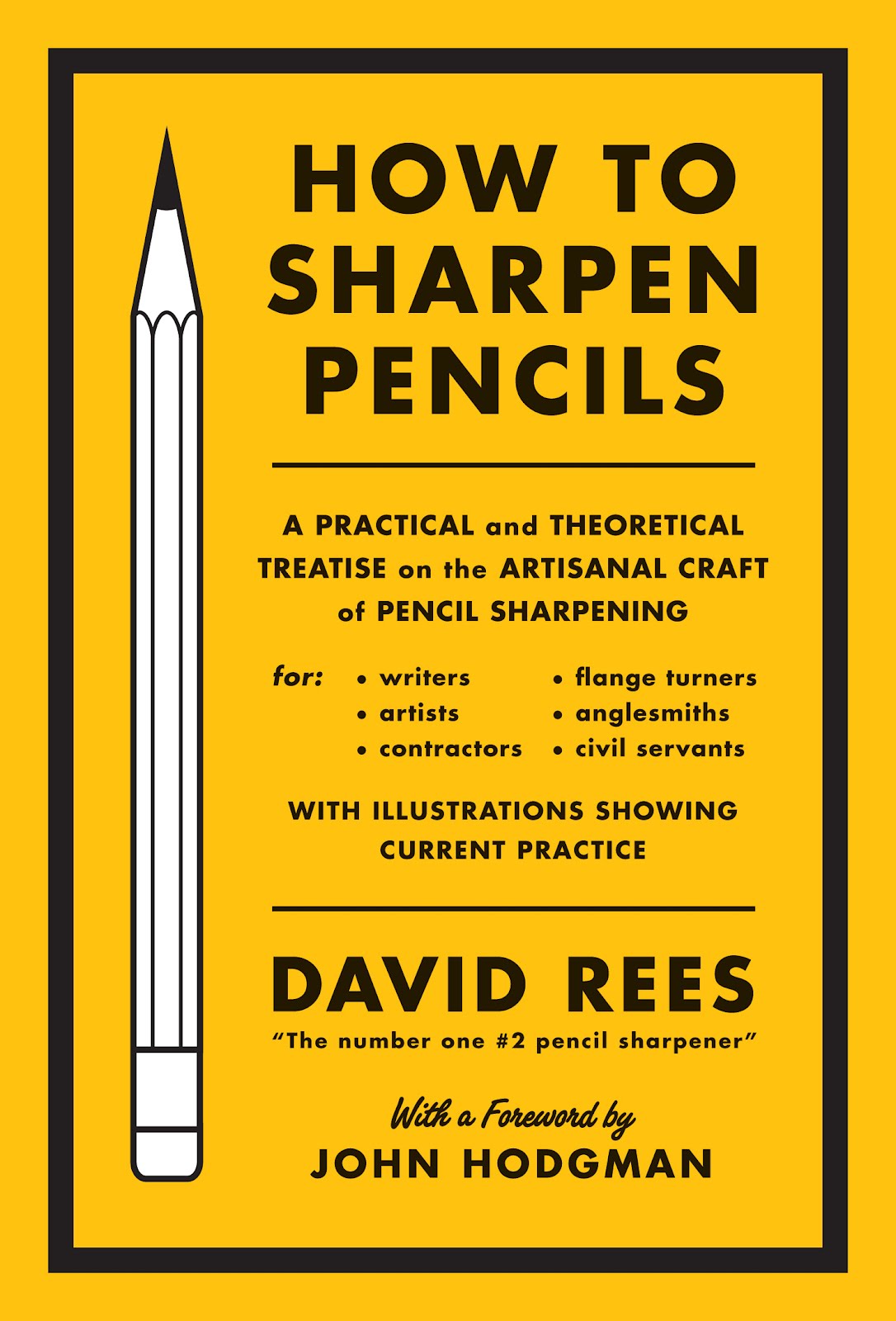
How to Sharpen Pencils by David Rees; design by Christopher Brian King
Melville House

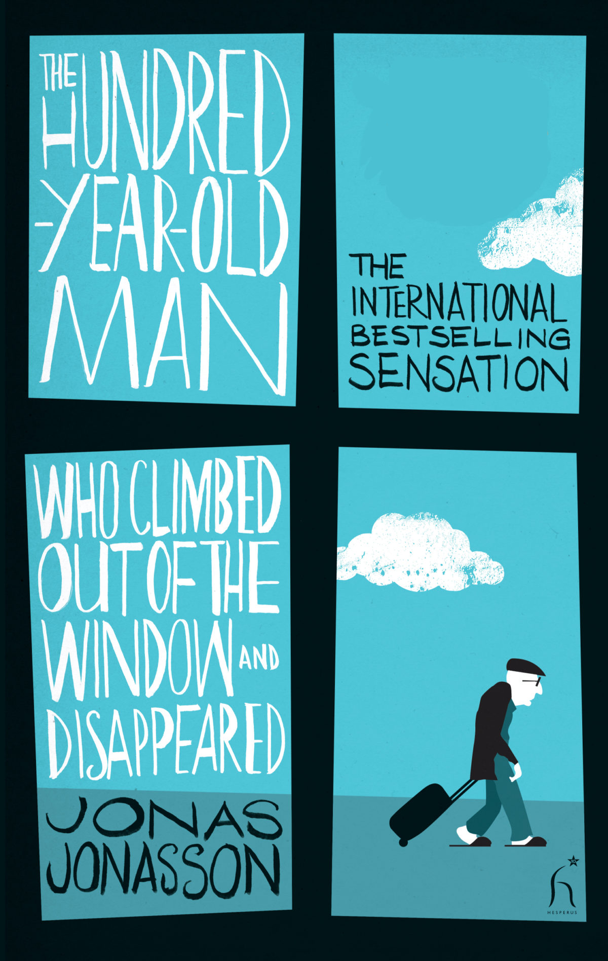
The Hundred-Year-Old Man Who Climbed Out of the Window and Disappeared by Jonas Jonasson; design by Jonny Pelham
Hesperus Press

Husk: A Novel by Corey Redekop; design by David A. Gee

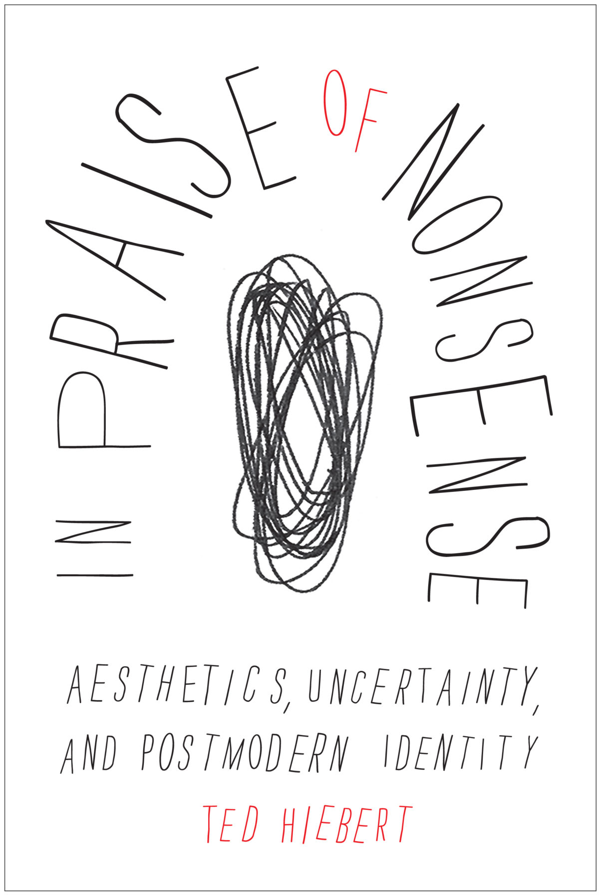
In Praise of Nonsense by Ted Hiebert; design by David Drummond
McGill-Queens University Press

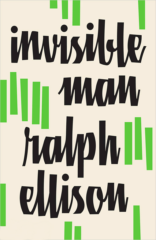
Invisible Man by Ralph Ellison; design by Cardon Webb

Vintage (US)

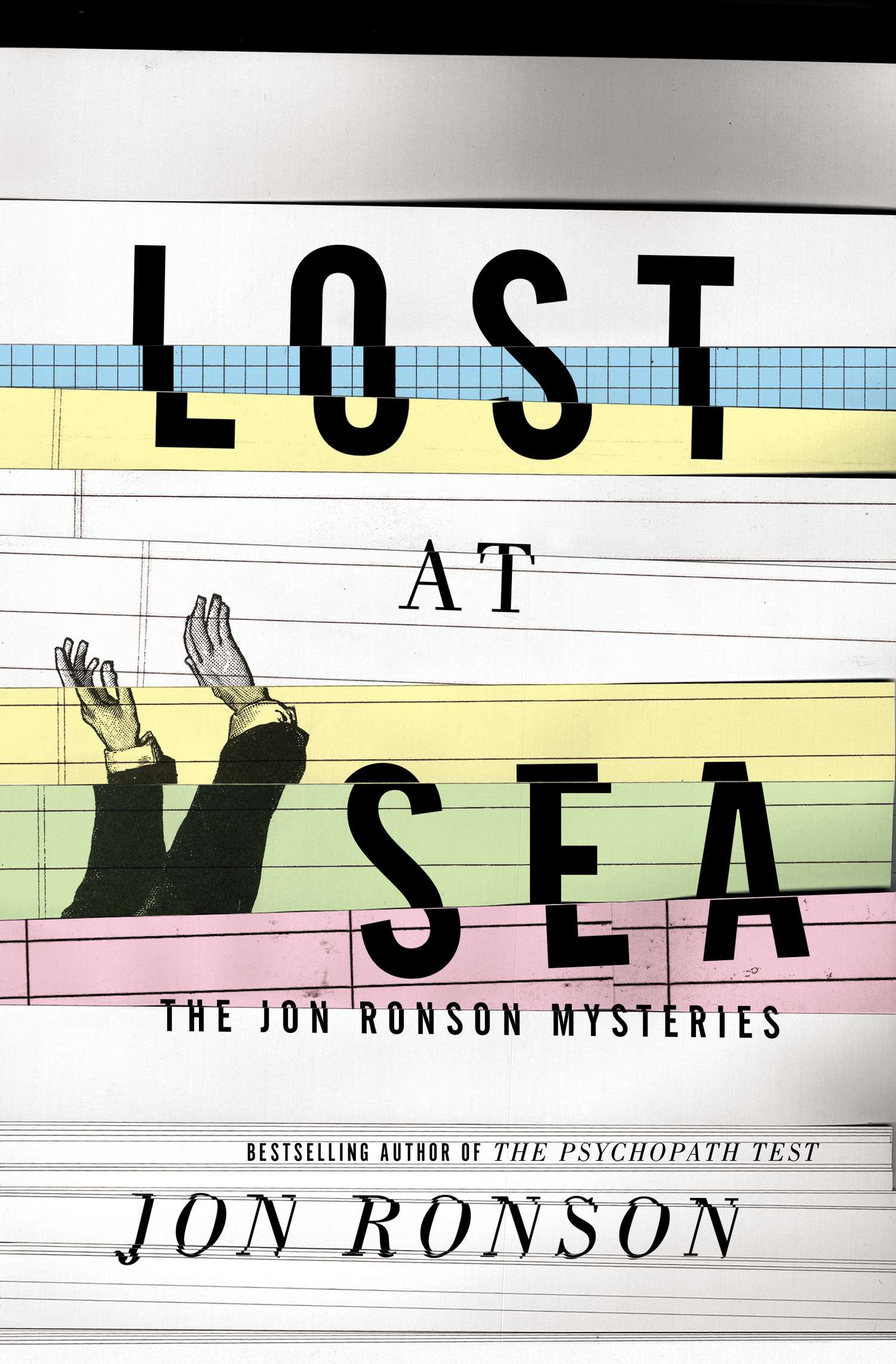
Lost at Sea by Jon Ronson; design by Matt Dorfman
Riverhead

May We Be Forgiven by A. M. Homes; designed by Alison Forner
Viking

Men in Space by Tom McCarthy; design by John Gall
Vintage (US)

NW by Zadie Smith; designed by Gray318
Hamish Hamilton

Office Girl by Joe Meno; design by Cody Hudson, photograph by Todd Baxter
Akashic

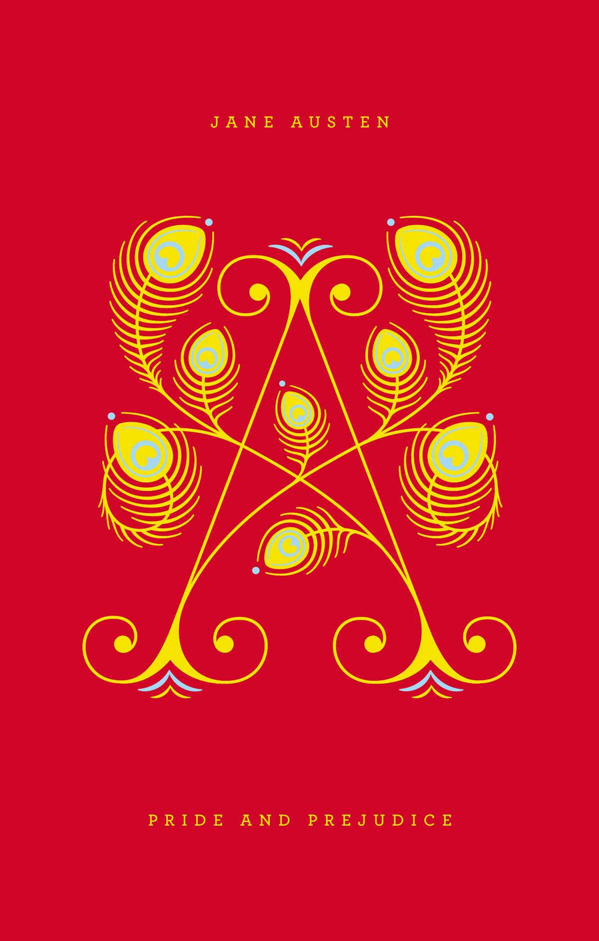
Pride and Prejudice by Jane Austen; design by Jessica Hische / Paul Buckley

Penguin Drop Cap, Penguin (US)

Swimming Studies by Leanne Shapton; design Leanne Shapton / Matthew Young
Particular Books

Watergate: A Novel by Thomas Mallon; design by Paul Sahre

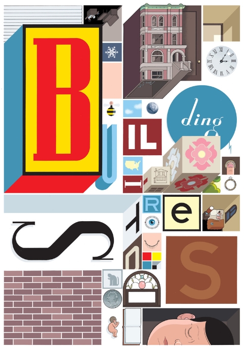
Why We Build by Rowan Moore; illustration by Diane Berg
Picador (UK)

Honourable Mentions:

;

You can find my lists for 2010 and 2011 here and here, and if you haven’t seen my 50 covers post from earlier this year, you can find that here. Happy Holidays!

16 Comments

50 Memorable Covers From the Last Four Years

The Casual Optimist turned 4 years old at the end of last week. While not exactly a historic achievement, the blog has lasted the length of a presidency and exactly 3 years, 11 months longer than I thought it would. In order to celebrate this minor triumph, I thought I would post some memorable book covers from the last 4 years. It was going to be 10 covers, then it was 20… It quickly became 25, then it was 30… by 30 I figured I might as well do 40… I missed 40 and had to cap it at 50. It was just for fun and not meant to be a definitive survey — it’s just 50 covers that have stuck in my mind. Let me know what you would’ve included in the comments. Leave a comment or send me an email if I am missing details or have incorrectly attributed something.

The keen-eyed among you will also notice that there are no covers from 2012. I’m keeping my powder dry. You can expect a post of my favourite covers of the year in the not too distant future. You can let me know your picks for 2012 in the comments as well. In the meantime, I’m going on vacation so this will be my last post for a while.

So here you go — 50 great covers with some occasional notes. Enjoy…

13 Comments

Midweek Miscellany

An interview with award-winning Toronto-based illustrator Gary Taxali at GrainEdit.

How Disappointing — Book designer Peter Mendelsund on what we picture in our minds when we read literary works:

“Call me Ishmael.” What happens when you read this line? You are being addressed, but by whom? Chances are you hear the line (in your mind’s ear) before you picture the speaker. I can hear Ishmael’s words more clearly than I can see his face. (Audition requires different neurological processes than vision, or smell. And I would submit that we hear more when we read than we see). Picturing Ishmael requires a strong resolve.

But if you indeed took the trouble to summon an image of Ishmael what did you come up with? A sea-faring man of some sort? Is this a picture or a category? Do you picture Richard Basehart, the actor in the John Huston adaptation? How disappointing.

(All I can say is that the follow-up essay had better be about comic books, Peter!)

The Secret Detectives — An interview with Patti Smith in The Telegraph:

“When I was young I knew William Burroughs really well. And William’s secret desire, which he never quite did, was to write a straightforward detective novel. How good would that have been! And I used to say, ‘you have to do it William!’ And he’d say” – Smith gives a passable impersonation of the Burroughsian growl – “‘Oh, I don’t know, one of these days.’ William was like the embodiment of a detective, I just loved him so much.”

Our Greatest Creation — Jonathan Glancey, The Guardian‘s former architecture and design correspondent, reviews City: A Guidebook for the Urban Age by P.D. Smith:

The stuff of lofty intentions and grubby backstreet life, the city represents much of our restless and contradictory natures. “In this dynamic, cosmopolitan space,” Smith writes, “lies the wellspring of our creativity as a species. The greatest cities nurture and stimulate ideas in science and the arts that are the very heart of human civilisation. For this reason, sustainable, humane and well-governed cities are our best hope for the future.”

Amen.

Hiding in Plain Sight — Type designer Ramiro Espinoza on ‘Amsterdamse Krulletter’, the curly lettering painted on the windows of traditional pubs in Amsterdam, and his only typographic revival Krul:

The fact that such gorgeous and original letters have largely been ignored in a country with such a rich type- and letter-making tradition reminds me of the plot of Edgar Allan Poe’s famous story “The Purloined Letter”. In the story, an important document cannot be found because it is lying in plain sight. Sometimes things can become invisible to us because of their very familiarity.

Avant Garde — Adrian Shaughnessy on life and work of designer Herb Lubalin at Imprint:

I have a pet theory about why Lubalin is currently popular: In the eyes of many designers, he offers a way of designing—and of communicating—that doesn’t require expensive art direction, over-manicured photography, or grandiose presentation. Lubalin proved that to be effective, all you need is a typeface and a good idea. In other words, he is a designer for the age of austerity.

Unit Editions’ forthcoming limited edition monograph, Herb Lubalin: American Graphic Designer, 1918–81, will be available in August.

And finally (and also at Imprint)…

An interview with designer and collage artist Graham Moore, who incorporates mid-century modern ephemera and fragments from billboard posters into his work.

Comments closed

Something for the Weekend

A stunning jacket design by the great Isaac Tobin for After Freud Left, published by University of Chicago Press.

You can read my interview with Isaac from 2009 here.

Bauhütte to Bauhaus — A fascinating overview of the Bauhaus by Frank Whitford, author of the Thames & Hudson ‘World of Art’ book Bauhaus,  for the TLS:

The structure of the Bauhaus… followed, as Gropius thought, medieval principles. He coined the school’s name so as to echo the word Bauhütte, in the Middle Ages the German for a guild of masons, builders and decorators. And the teaching was based on specialist workshops where you learned your trade by carrying out actual projects, graduating from apprentice to journeyman and master. The teachers were at first called Masters and not Professors, a revolution in a country where academic snobbery was the norm.

Calligraphica — A new tumblr devoted to calligraphy and hand drawn type (pictured above: ‘One Hope One Quest’, by Greg Papagrigoriou).

Persuasion — Michael Bierut talks to Designers & Books about his collection 79 Short Essays on Design:

Even the best designers have to persuade people all the time. They have to persuade people to hire them; then they have to persuade people to go with the recommended solution; then they have to persuade people to realize that solution in the best possible way. Simply showing someone a nice design is almost never enough. This constant effort—and all the rejection that inevitably ensues—obviously requires healthy confidence and nerves of steel, if not a strong ego.

And finally…

Critic James Lasdun reviews The Flame Alphabet by Ben Marcus for The Guardian:

Language, the debasement, banality and ultimate toxicity thereof, is his subject. It’s a staple topic of avant garde literature, from the Prenzlauer Berg writers of the former East Germany to the Language poets of the American academy. All proceed, more or less, on the basis that verbal communication has been fatally corrupted by political or literary abuse and can be rescued only by a total dismantling and reassembly. Results vary (I’ve yet to read a Language poem that didn’t make me want to dissolve it in acid), but Marcus’s own, especially in The Age of Wire and String, have been haunting and inventive.

Comments closed

Favourite Covers of 2011

After posting my long overdue picks for 2010 last week, here are my selections for my favourite book covers of 2011.

I’m currently reading Where The Stress Falls a collection of writing by Susan Sontag published in 2001. In an essay about art she quotes Paul Valéry on the painter Corot. “One must always apologize for talking about painting” he says. I know just what he means. I feel the same way about book design. Perhaps even more than a painting, what you see is what you get with a book jacket. If you have to explain why it works, it probably doesn’t. Or you’re talking to the wrong crowd. But there’s something else too. I also feel like I need to apologize for not knowing more; for producing reductive lists like this one; for being, well, so presumptuous…

The 2011 list has changed a few times in the last few days and would likely be different again if you asked me tomorrow — not for lack of quality you understand, but simply because narrowing the list down to a manageable number and deciding which should be in the final ‘top 10’ was just plain hard. This isn’t a definitive survey of book covers in 2011 by any means (sorry!) it’s simply a list of the book jackets that caught my eye this year — designs I thought that were beautiful, a bit different, audacious, a bit out of the ordinary, a bit worthwhile…  I’m grateful to all the designers who created these covers, who gave me suggestions and helped me source the images. Once again, I’ve been struck by their generosity. Nevertheless I have surely I’ve missed some great covers. Tell me what they are in the comments.

10 Comments

Design Matters with Peter Mendelsund

Peter Mendelsund — senior book designer at Knopf, art director for Vertical Press and all-round superstar — talks to Debbie Millman on Design Matters:

DESIGN MATTERS: Peter Mendelsund mp3

I interviewed Peter last year about his book cover design for the Knopf edition of Tom McCarthy’s novel C, and you can read a short essay I wrote about his cover for the Schocken editions of Kafka here.

1 Comment

My Favourite Covers of 2010

At the end of last year, Joseph Sullivan, curator of the late lamented The Book Design Review, asked me to write about my favourite covers of 2010. I’d always stayed away from such posts in the past because it was Joseph’s thing (his 2009 list is here). But since it was Joe who was doing the asking and The BDR was on “indefinite hiatus,” how could I not?

For various reasons, the list I compiled didn’t get used in the end, and it has sat in my drafts folder for about year now. I now have a list of my favourite covers of 2011, but before I post it I thought I would share that original list from 2010, if only for a bit of context.

I’ve made a few minor alterations to the list I sent to Joe — mostly to better accommodate the series designs and to fully utilise 12 months of regret and hindsight — but it is more or less intact, in spirit at least.

I’ve included the short introduction I wrote for the original piece to explain my process (or lack thereof…).

(Hindsight = 20/20: Apparently I like negative space. A LOT).

The Top 10 Book Covers of 2010

Selecting an annual top 10 of anything — film, music, books — is fraught with difficulty. Not only do you have to sift through all things you have seen, heard, and read over the course of a year (assuming you can remember them all), you must somehow take into account all the things you meant to get to and didn’t (where does one even start?). Worse, you are haunted by the awful, inevitable realization that there were any number of incredible things so outside your usual cultural range that they didn’t even register on your consciousness — the “unknown unknowns,” to borrow Donald Rumsfeld’s immortal phrase. Fate usually decides that you will discover at least one previously unknown work of brilliance exactly 24-hours after you publicly declare your favourites…

Then, having grappled with (ignored) all those thorny issues (and plunged on regardless), there is further problem of what actually constitutes good (let alone “great”) book cover design. Part science, part art (part pleasing interested parties), good book cover design is slippery and alchemical. How does one judge? Using what criteria? Ask 10 designers and you will surely get 10 differently nuanced answers.

I have not read all the books on this list, so I cannot claim authority on appropriateness of every cover to its subject (surely an significant consideration, and yet who would want to limit their list only to the books they had read?), so my criteria, such as they were, included the quality of the overall design — the composition, image selection and typography — as well as originality, swagger and the indefinable  je ne sais quoi essential in my opinion to really great covers.

And with that complete abdication from any claim to comprehensiveness or authority, I introduce my picks for the top 10 book covers of the last year with apologies to all the designers — particularly outside of North America and the UK — whose amazing work I have missed, forgotten, or otherwise neglected.

The covers are presented in alphabetically by title.

3 Comments

Fictions | Peter Mendelsund

Knopf designer Peter Mendelsund has just posted the second of his meditations on designing book covers for fiction:

When setting out to design a book jacket for a work of fiction, whether we are aware of it or not, we designers are picking our subject matter from a limited set of bins. Though the choices we can make as designers are unlimited, the categories that define most of the choices we make when we pluck these ideas from their native fictions, are, on the face of it, quite easy to list.

Well worth reading all the way through, including the extensive footnotes.

Comments closed