Skip to content

Tag: peter mendelsund

McCarthyism

Best known previously for his art-house novel Remainder and saving literature from itself, author Tom McCarthy has been pretty much everywhere since the somewhat surprising inclusion of his new novel C on the Booker long-list. Tom may not actually be bigger than Jesus — or the bookies favourite — but he certainly does give good interview…

To James Purdon for The Observer :

“The avant garde can’t be ignored, so to ignore it – as most humanist British novelists do – is the equivalent of ignoring Darwin. Then you’re just a creationist. It’s ostrich-like. It needs to be worked through – which is not the same thing as imitation…

People use [‘experimental’] when what they actually mean is ‘not conforming to a certain type of realism’, and that’s just as much a literary convention as anything else. Burroughs said his ‘cut-up’ writing was more realistic than Jane Austen. I think he was right. You’re being assailed by associations and networks. Everything is a code…”

To Tim Robey for The Telegraph :

“We exist because we are awash in a sea of transmission, with language and technology rushing through us…”

And to Stuart Evers for The New Statesman:

“Commentators and critics seem to want fiction either to be blatantly avant-garde and postmodern, or to be realist and 19th century; but really most literature is neither nor… ‘The avant-garde’ describes a specific historical moment that belongs to the early part of the 20th century. Certainly in C there is a huge amount of that moment behind the writing; the avant-garde is definitely embedded in it. But at the same time I think it gets used as catch-all term now for something that isn’t retrograde, anything that’s not a kind of nostalgic, kitsch version of the 19th-century novel, which is what much of middlebrow fiction right now is.”

C has been reviewed by Christopher Taylor at The Guardian and by John Self at Asylum, and you can keep track of Tom various comings and goings at Surplus Matter.

My interview with Tom McCarthy and book designer Peter Mendelsund is here.

Update: The fine folks at 3:AM Magazine have also posted an interview with Tom about C.

4 Comments

Midweek Miscellany

Finding a Cover for The Girl With the Dragon Tattoo — A WSJ article and slideshow on the cover design process for the bestselling novel by Steig Larsson:

For three months, Peter Mendelsund, a senior designer at Knopf, prepared nearly 50 distinct designs…  Mr. [Sonny] Mehta ultimately endorsed the vivid yellow jacket with the swirling dragon design: “It was striking and it was different.”

Peter Mendelsund has some further thoughts about the cover, Wittgenstein, David Foster Wallace, and design in a great post on his blog JACKET MECHANICAL:

Due to many factors (the mechanisms of the approval process; design’s fundamentally commercial aspects…) when one examines the field of design, one cannot help but come to the conclusion that good design must be, above all, likeable.

Design is too intimately entangled with matters of taste (to use Wittgenstein’s word) to be demanding enough to be Art. I have to say that in my years in the field, I’ve yet to be made to cry by a work of design. I’ve yet to be forced to view the world differently due to a work of design. I’ve yet to be really, truly gripped by a work of design. I know it’s deeply self-defeating to say this, yet, the best design has only ever evoked in me the feeling of “that’s cool.”

And on the subject of book cover design…

Creative Problem Solving — Macmillan Designers and art directors Susan Mitchell, Charlotte Strick, and Henry Sene Yee discuss the state of book cover design at FSG‘s new Work in Progress blog:

We’re interpreting or packaging other people’s ideas. If someone gives me a manuscript, I interpret it. That’s problem solving… I’m not just here to create something beautiful. Sometimes I’m here to be a plumber. I love that aspect—I can fix things. I’ll make it balance, whatever it is.

Still Reading? — Patrick Kingsley on the art of slow reading for The Guardian:

Still reading? You’re probably in a dwindling minority. But no matter: a literary revolution is at hand. First we had slow food, then slow travel. Now, those campaigns are joined by a slow-reading movement – a disparate bunch of academics and intellectuals who want us to take our time while reading, and re-reading. They ask us to switch off our computers every so often and rediscover both the joy of personal engagement with physical texts, and the ability to process them fully.

Also in The Guardian

Unwanted — A 12-page comic strip tale of unwanted immigrants by Joe Sacco, author of Safe Area Gorazde, Footnotes in Gaza, and Palestine

…And on a not unrelated note: Publishing Perspectives looks at comics and graphic novels in the Middle East and how they are pushing at cultural boundaries.

And finally…

Bob Stein of The Institute for the Future of the Book interviewed by On The Media:

The western version of the printing press is invented in 1454. It takes 50 years for page numbers to emerge. It took humans that long to figure out that it might be useful to put numbers onto the pages.

What is slightly curious about this interview is that Stein acknowledges the essentially unpredictable messiness of the future, and yet it doesn’t seem to stop him…

Comments closed

Midweek Miscellany

A nice post about the US cover for The Girl With Dragon Tattoo — designed by Peter Mendelsund — and why it is so different from all international versions at the Knopf website:

[Peter] decided to shift away from the more traditional murder-mystery vibe of the foreign editions, instead providing a neon yellow in-your-face punch, a jolt of energy comparable to what Salander brings to the narrative… Knopf’s twist was achieved with the subtle interaction of the Trade Gothic type and a great piece of art in yellow and orange Day-Glo inks. Add a dash of cyan (shades of colors in the blue/green spectrum) to create the green dragon lurking in the background and a tablespoon of black for the title, flap copy, and Stieg’s photo, and voilà!

HP Sauce — Anis Shivani interviews Calvert Morgan, vice president and editorial director of Harper Perennial, for the Huffington Post:

[T]here’s an intensity of dialogue about writing online–and about fiction in particular–that was not happening ten years ago. A lot of the writers I work with are finding like-minded peers and readers, having a forum for discussion now that simply wasn’t available when the only venues you had to get published were little magazines that were distributed to a handful of shops across the country in physical form. We’re passionate proponents of the physical book and we don’t think it’s ever going to go away, but we also know that these online forums… are promoting the interest that these writers have in each other and in fiction generally in a way that can only be good for contemporary writing.

The 11th Plague — In an extract from his new book, My Experimental Life, author A.J. Jacobs gives up multitasking for a month:

Multitasking makes us feel efficient, but it actually slows down our thinking. Our brains can’t handle more than one higher cognitive function at a time. We may think we’re multitasking, but in fact we’re switchtasking, toggling between one task and another. The phone, the email, the phone, back to the email. And each time you switch, there’s a few milliseconds of start-up cost. The neurons need time to rev up.Apparently, multitasking costs the US economy $650bn a year. I’m starting to think this isn’t a problem along the lines of love handles or bad mobile phone service. This is the 11th Plague.

My first day without multitasking… My brain is not cooperating. What the hell is going on? it whines. Where’s my damned stimulation? I sit at my desk and read the newspaper. That’s all. Without checking my emails or eating breakfast at the same time.

This is awful. I feel as if my brain has entered a school zone and has to slow down to 25mph. My plan is to leave my BlackBerry off until noon. I break down at 11.30am.

See also: James Sturm quits the internet.

And finally…

Last Generation of Typewriter Repairmen — Wired visits 3 typewriter repair shops in the Bay area:

Typewriter repair may be a dying art, but it is not a dying business. All three of the shops…  seemed to generate a comfortable living for their respective owners, supported by an eclectic clientele of collectors, design enthusiasts, prison inmates and tweenage girls.

In every case, however, the technicians in charge say that there won’t be a next generation to take their places. If they are right, as time goes on fewer and fewer of the old manual machines will remain in working order. That said, crops of amateur enthusiasts have sprung up to save other obsolete technologies from disappearing entirely…

For many people, the limitations of early writing machines, with their mono-font and unforgiving keyboards, are part of their charm. That bodes well for the future of typewriters, even after the last professional repairman hangs up his apron.

3 Comments

Something for the Weekend

A fittingly Alvin Lustig-like cover for New Directions by Rodrigo Corral, seen at Book Covers Anonymous.

An Open Book-Publishing Platform — Book Oven’s Hugh McGuire on WordPress as a book publishing platform. It’s an intriguing idea even if don’t accept Hugh’s belief that books and the web will be indistinguishable in a matter of years. And, to judge by the comments, it something a lot of people have been working on.

Afterlife — With the US publication of The Girl Who Kicked The Hornet’s Nest, Charles McGrath looks at Steig Larsson, the late author of the Millennium series, and his unhappy legacy in the New York Times. Sarah Weinman has more on Larsson and the new book (of course)…

Enticement and Exegesis — Knopf designer Peter Mendelsund (who, incidentally, designed the covers for US editions of the Millennium books) on author David Foster Wallace, Infinite Jest, and book cover design:

Book jacket design should concern itself with, in my estimation, equal parts enticement (“Come buy this book”) and exegesis (“This is what this book is about, more or less.”) A good cover doesn’t let one category trump the other. A good cover should not resort to cliché in order to accomplish either. But the real key here, in both categories (enticement and exegesis) is the designer’s ability to work the sweet-spot between giving-away-the-farm, and deliberate obfuscation.

Book jackets that tell you too much, suck. Book jackets that try to change the subject also suck, and are furthermore, too easy.

My interview with Peter about Tom McCarthy’s book “C” is here.

And finally…

It’s a Book, Jackass! — a cute video featuring a tech-loving donkey and a book loving ape for It’s a Book! by Lane Smith, published by Macmillan  (via Chronicle Books):

Comments closed

Q & A with Peter Mendelsund and Tom McCarthy

In the early days of The Casual Optimist I scribbled out a short list of book designers I wanted to interview. More designers have been added since then, but a few of the original list remain un-interviewed. At the top of the list has been the name I actually wrote down first: Peter Mendelsund.

As Senior Designer at Knopf, Mendelsund’s designs feature here regularly. Much as I love his covers, however, Peter has been interviewed extensively elsewhere. I just haven’t known how to approach his work in a way that he would find interesting.

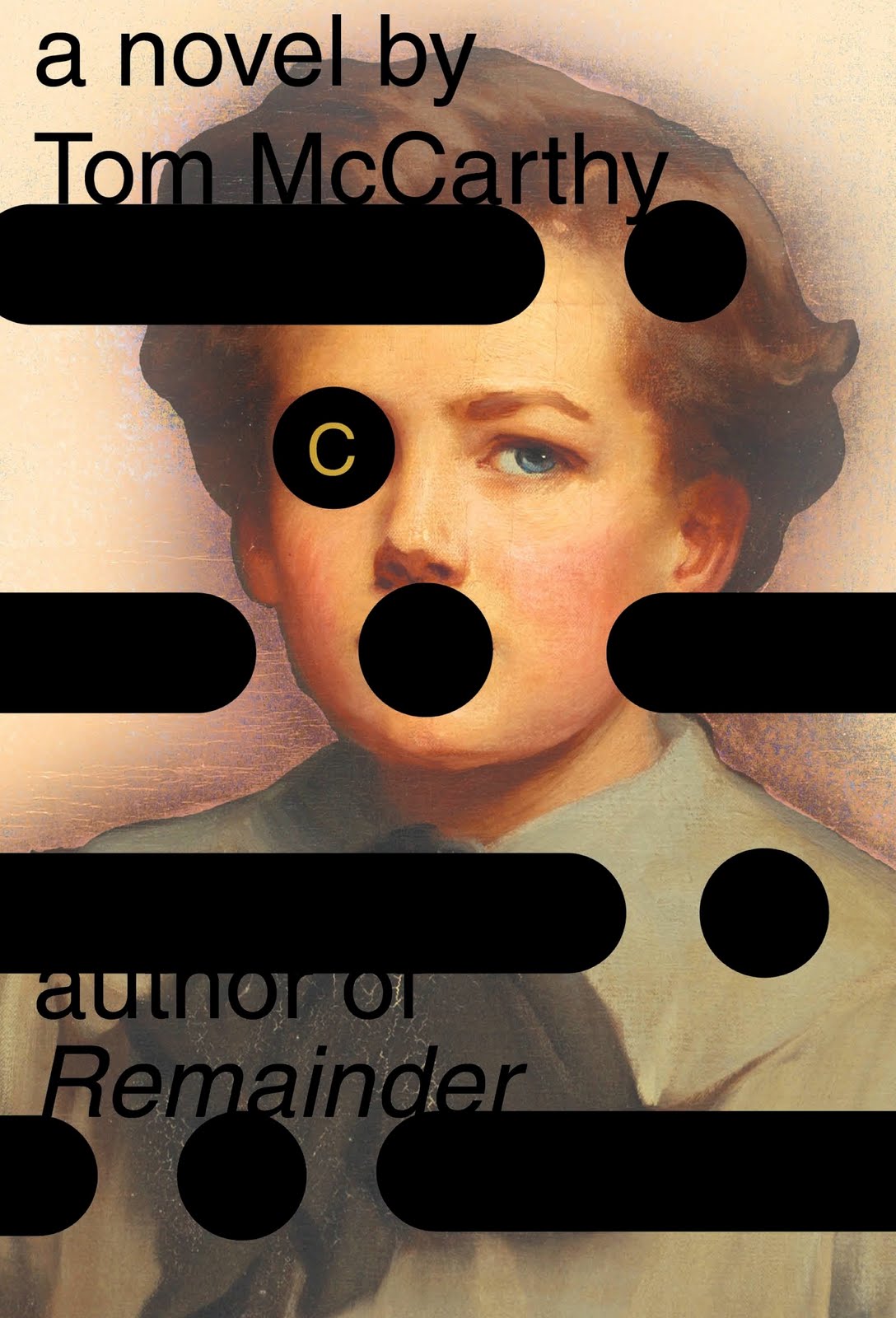
That was until I saw the shockingly subversive jacket design for Tom McCarthy‘s new novel “C”. The pairing of Mendelsund, the designer who is a musician, and McCarthy, the author who is an artist, was — it seemed to me — inspired.

A perfect opportunity…

What follows is primarily an interview with Peter about that design for “C”. But over the course of a few emails, Peter and I both decided to bring Tom into the conversation. I had met Tom shortly after the release of his debut novel Remainder and Peter had, it transpired, met Tom in New York after Knopf had signed “C”. It made sense to both of us.

It is a long, but absolutely fascinating exchange. Peter kindly answered my questions more fully than I had any right to expect and Tom, who was contributing from Stockholm, was more than gracious in less than ideal circumstances. I’m grateful to them both.

7 Comments

C

Tom McCarthy and Peter Mendelsund, together at last…

6 Comments

Midweek Miscellany

Reading a Book is Reading a Book — Peter Ginna has another thoughtful post on about the Random House e-book rights controversy (which better articulates some of what I was trying to get at here).

A Decade of Fear — David Ulin, book editor of The LA Times, looks back at the last 10 years (and forward to the next).

Book Lovers Never Go To Bed Alone — a Tumblr collection of  bookshelves (via index//mb)

Hello, I’m Robot! — A somewhat surreal — but definitely awesome — Soviet kids’ book at A Journey Round My Skull

And…

Russian Artists and The Children’s Book 1890-1992 — 512 pages, full color with over 1100 images. Written and privately published by Albert Lemmens and Serge Stommels in The Netherlands. Yours for only $195 plus shipping (seen at The Daily Heller).

And…

Three Designers from Moscow — MyFonts interviews Russian type designers Vera Evstafieva, Alexandra Korolkova and Elena Novoselova.

And… Thinking of MyFonts…

…They’ve just released the rather lovely exljbris slab serif Museo Slab. Regular Museo Slab and Museo Slab Italic are free downloads.

The Book Design Review‘s Favourite Covers of 2009 — All good choices. Go vote. Now.

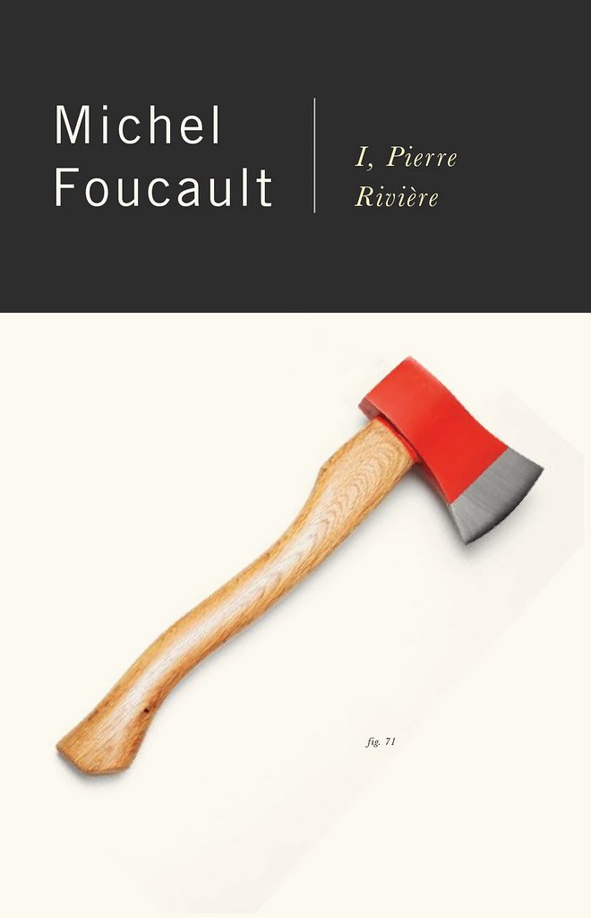
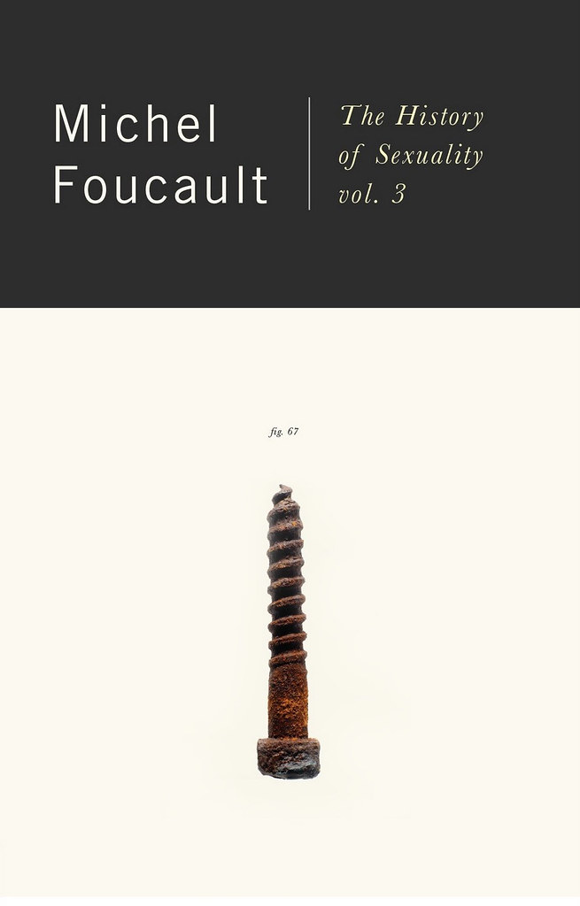
And… Have I mentioned just how incredible Peter Mendelsund’s new Foucault covers are…? I did? OK. Just want to make sure…

RUSSIAN ARTISTS AND THE CHILDREN’S BOOK 1890-1992.
1 Comment

New Vintage Foucault

Peter Mendelsund’s faultless redesigns for the Vintage editions of Foucault

Stunning.

5 Comments

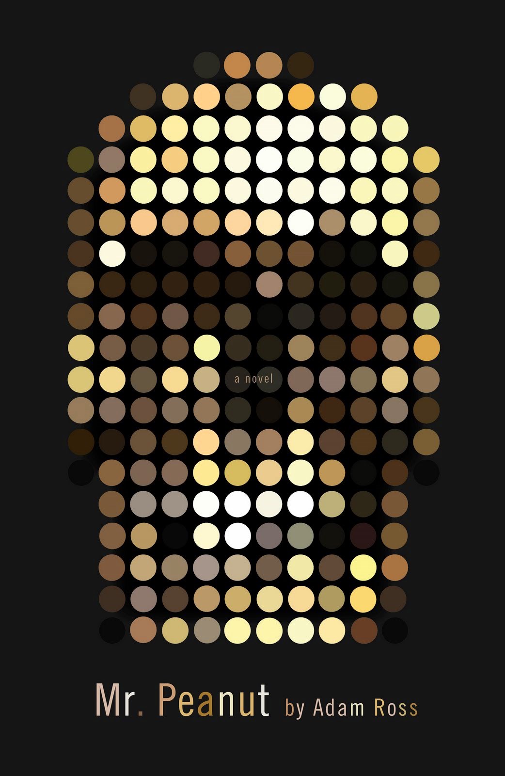
Mr. Peanut

From Mr. Mendelsund. Brilliant.

Comments closed

Midweek Miscellany, August 26th, 2009

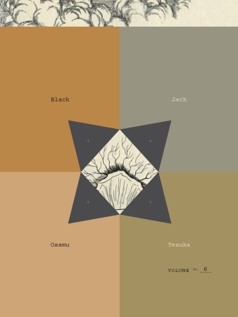
Black Jackets — The mighty Peter Mendelsund is giving away all of Osamu Tezuka’s Black Jack manga series in return for some assistance designing the next cover.

Take That! And That! And That! — Sony, having recently announced a pocket-sized reader and their switch to the ePub format, have now unveiled a new wireless electronic book reader with a 7-inch touch screen.

And on a related note, E-Reads tries to unpack some of the complex issues around Sony, ePub, and DRM.

Typedia — much linked to elsewhere (causing a severe strain on their servers earlier this week), Typedia is “a community website to classify typefaces and educate people about them.” I have no idea what I might use it for, but it looks pretty neat. You can also follow them on Twitter.

On the subject of typography, check out The Alphabetography Project, a photography blog cataloging found letters of the alphabet.

And hell, why not take a look June Corley’s charming typographic sculptures while you’re at it (via The Daily Heller and pictured below)…

Board — Also much linked to elsewhere, the New York Observer‘s Leon Neyfakh looks at three new hardcover books designed without dust jackets. It’s not exactly “the new thing” — more a case of the mainstream catching up with indies perhaps (and a light news day) — but there are still some interesting comments about book design:

Most of the publishers experimenting with jacketless hardcovers, including Viking, FSG, and Graywolf, are consciously taking their cues from the folks at McSweeney’s, who have been putting out beautiful books designed in this style for years. For Eli Horowitz, the managing editor at McSweeney’s, the method is a means of restoring some of the permanence and singularity to the book as object.

From the Design Desk — Designer Suzanne LaGasa talks about the cover design process at Chronicle Books.  (Full disclosure: Chronicle are distributed in Canada by Raincoast Books, my employer).

Big Comics — reviewsnthings asks notable comic artists, writers, publishers, editors and the like “what’s your opinion of the term ‘Graphic Novel’?” stirring up some interesting reactions. Here’s Leigh Walton, comics editor, and Top Shelf’s marketing coordinator, for example:

I find it intensely frustrating, in the sense that I can’t fully support it and I can’t fully dismiss it. Great minds have worked for ages to invent a better term, and they’ve failed. Its shortcomings are obvious — it’s based on a term, ‘novel,’ which has specific requirements of length and content, and it can never replace ‘comics’ as a general term for the medium… Yet ‘comic book’ was reserved ages ago for a format that isn’t really very booklike at all.

Mixtape — Robin McConnell is compiling cartoonists’ playlists for Inkstuds (the radio show about comic books), including Love and Rockets legend Jaime Hernandez.

And lastly, something for the fanboys to argue over: The Top 70 Most Iconic Marvel Comic Panels. (via LinkMachineGo)

1 Comment

Monday Miscellany, May 25th, 2009

Health Insurance and ShostakovichCaustic Cover Critic interviews über-book designer Peter Mendelsund:

Book jackets, mind you — which are already needless, redundant, frivolous items in life’s already cluttered inventory — themselves need designing. This arcane little tidbit came as something of a shock to me. “Someone gets paid for that?”

The Ampersand — a blog about ampersands. Really.

Hard Decisionsthe National Post interview Andrew Steeves, co-founder and co-publisher of Gaspereau Press, about their recently announced cutbacks:

I think it’s important to stress that I don’t think this is directly related to the more general economic downturn. Honestly, when you start a business from scratch you gradually try and figure out what size works for what you’re doing. I mean, you go through so many years where there isn’t a normal; the year previous can tell you nothing about what to expect.

And more good stuff from the National Post — In this month’s installment of their Ecology of Books series, Mark Medley talks to Evan Munday of Coach House Books, and looks at the thankless task of being a book publicist.

The Wankers Shelf — Nicholas Royle on the ethical dilemma presented by authors who are wankers (via 3:Am Magazine):

Do you have a Wankers shelf? I do. It’s for books by Wankers. Books that are so bad – or books by authors who are Wankers, whose books might actually be OK, from time to time, but they themselves are such unbearable Wankers – that you wonder if the best thing to do, rather than giving these books to charity, is to keep them out of circulation.

I fear the nuance is lost here for North American readers — but anyone associated with McSweeney’s is probably a Class A wanker if that helps. Martin Amis, he’s a definitive wanker. Who would be on your wanker shelf?

And lastly…, I may have rather unfairly dismissed the new volume of The League of Extraordinary Gentlemen Century: 1910 as “mildly disappointing”, but — like most of Moore’s work — it is undisputedly clever and even if I read 1910 another half-a-dozen times, I’ll still miss half the allusions, references, and knowing winks… Fortunately Jess Nevins has posted some very helpful annotations for the amateur nerd (via LinkMachineGo).

Comments closed

Midweek Miscellany, April 15th, 2009

The #amazonfail shitstorm — from Amazon’s awful “ham-fisted”  glitch (a phrase so dirty it’s probably de-listed from their own searches) to the seething self-righteous indignation on Twitter — has been enough to make me want turn off the internet and go back to bed. But if you need  an overview of the whole sorry story, business reporter Andrea James has done a very thorough job following it for Amazon’s local newspaper the Seattle Post-Intelligencer, and summaries, shivering with schadenfreude, can be found in the New York Times, The Guardian, Wall Street Journal, and the National Post.  No doubt the other major dailies were all over it too…

Former PW editor Sara Nelson at The Daily Beast , Evgeny Morozov at Foreign Policy, and the Vromans Bookstore Blog offer some alternative perspectives.

But I’ve got to say I agree with Jessa Crispin at BookSlut: “I’m bored with this.”

(UPDATE: Clay Shirky has written perhaps the most thoughtful post on #amazonfail I’ve read to date: The Failure of #amazonfail)

Lets. Move. On…

Straight Up — Knopf designer Peter Mendelsund who moonlights as art director of Vertical Press and blogs at Jacket Mechanical,  interviewed at the always ace FaceOut Books (Smell Man by Munenori Harada, designed by Peter Mendelsund pictured above).


Contact — Filmmaker and writer Adam Harrison Levy on William Klein’s recent appearance in New York and the importance book-signings (William Klein: Buicks, 2 tiered, New York, 1955, Howard Greenberg Gallery, pictured above):

A book signing is a manifestation of an urge to recover something that we, as a culture, fear losing — namely the hand of the artist in the age of mechanical (and digital) reproduction. Now more than ever it seems that we want to get close to creativity: to hear the voice and see the skin and experience the physical presence of the person who made something that we deem to be meaningful. Is this because so much of our lives now is mediated through a screen?

What Went Wrong? — An interesting article (and something of a mea culpa) in the Boston Globe about the mistakes and missed opportunities made by newspapers underestimating the impact of the web.

In Perpetua — MyFonts strike up a ‘dialogue’ with Eric Gill (1882 – 1940), stonecarver, graphic artist, type designer and writer:

If we insist on the ornamental we are not making the best of our system of manufacture, we are not getting the things that system makes best. The process by which a railway locomotive has become the beautiful thing it now is, this process must be welcomed in all other departments of manufacture. … And ornamental typography is to be avoided no less than ornamental architecture in an industrial civilization.

We Love Typography —  “FFFFound for all things type, typography, lettering, & signage” created by I Love Typography in collaboration with Kari Pätilä.

And finally, I would like to pass on my condolences to the friends and family of Derek Weiler, editor of the Quill & Quire, who died at the weekend, aged 40.

Comments closed