Skip to content

Tag: new yorker

Bob Mankoff: Anatomy of a New Yorker cartoon


Yes, it’s a TED Talk (sorry), but this seems apropos after yesterday’s post about Ivan Brunetti — The New Yorker‘s longstanding cartoon editor Bob Mankoff discussing humour and the magazine’s “idea drawings”:

(And if you’re a cynic, it might also help explain why you don’t think a lot of The New Yorker‘s cartoons are funny!)

At the TED Blog Mankoff selects his favourite New Yorker cartoons.

1 Comment

Ivan Brunetti’s Aesthetics

I’m a little late in the game on this (as usual), but teacher and cartoonist Ivan Brunetti has a new book out this month from Yale University Press. An illustrated autobiography of sorts, Aesthetics: A Memoir is a retrospective of Brunetti’s work to date, including previously unpublished drawings, personal photographs, and handmade objects:


There is a short excerpt from the book at the Paris Review Daily, and a lengthy review at The Comics Journal.

Coincidentally, Brunetti is also the cover artist for latest edition of The New Yorker:


1 Comment

Auteurmatic for the People

At the New Yorker, film critic Richard Brody, author of Everything Is Cinema: The Working Life of Jean-Luc Godard (and a man with prodigious beard), offers some interesting thoughts on ‘Vulgar Auteurism’ (a new term to me, if not exactly a new idea) and the legacy of the New Wave:

In opposition to the constipated naturalism of the art-house consensus—whether the one that prevailed sixty years ago or that of today—crudeness has an intrinsic merit, and it’s easy to detect the same impulse behind [Vulgar Auteurism] and Godard’s decision to dedicate “Breathless” to the B-movie studio Monogram Pictures. Getting rid of prejudices—acknowledging that there’s no such thing as intrinsically good acting or cinematography or direction, but only the evidence of artistic inspiration—is as great a discovery for critics as for filmmakers. From the start, Godard repudiated the false merits of so-called production values, but he invested the film not with the elements of the usual Monogram movie but with a rich and complex collection of high-art references, intellectual divagations, and documentary-based techniques, all held together by an aesthetic philosophy that owed more to Sartre than to Hawks. His praise of cheapness and scruffiness wasn’t in the service of those qualities but of the virtues of the grandest, greatest art and ideas he knew. The hat tip to the gangster genre served to embody his most intimate emotions and personal experiences—and, for that matter, to suggest the way that those very intimacies had become tied up, for better or worse, with the experience of moviegoing.

New Yorker

Comments closed

Timothy Goodman: The New Yorker Fiction Issue


For the New Yorker‘s Summer Fiction Issue, ‘Crimes and Misdemeanours,’ designer Timothy Goodman created six black and white ‘title cards’ to the stories in the magazine.  According to Goodman, the designs “cover an array of styles from Gothic to Western to 70’s Bollywood, depending on the premise of stories. Two of the pieces were laser cut, all of them were shot on top of textures or old photos to capture the noir vernacular.”

There is also a nice video trailer for the issue, shot by Grant Cornett and edited by Ivan Hurzeler:

(via Design Work Life)

Comments closed

Françoise Mouly: In the Service of What the Artist is Saying

In a follow up to his short Q & A with Françoise Mouly and her partner Art Spiegelman for the National Post, David Balzer has a fascinating full-length interview with Mouly, publisher of Toon Books and art editor of the New Yorker, at Hazlitt:

I think that if you set out with a scripted outcome, you don’t succeed. I’m acting out things that work on me. I spent most of my terribly unhappy childhood years immersed in books. I found early on that it was a great way to escape any kind of arguments with my parents or emotional upheaval. I loved reading and being lost in a book. I trained as an architect. As an architect you’re part of a team and no architect can build a house by themselves. But a bookmaker can make a book all by themselves. And an author: look at my husband’s book, or Marjane Satrapi’s Persepolis—she manages to convey a very rich world, and her personality is very well expressed in a book that shows her handwriting, that has a sense of her.

In a way I got a very classical education growing up in France in the sixties, and learning Latin, Greek, French and English. But I’m well versed in the technological part of the 21st century. The common denominator for me is stories, narrative structure. That’s how I understand things. I find them, books, the right recipient for something that is both complex and nourishing. I watch movies and enjoy them; I watch, you know, The Wire and TV shows, but still, the stories I read in books inhabit my brain in a special way. Those characters are very present in my thinking. And children’s books are a very real part of how I think. So I find it a privilege to actually be in communication, to leave a trace of something that’s actually going to be read.

Hazlitt

Comments closed

Midweek Miscellany

A few remembrances of art critic Robert Hughes, author of The Shock of the New, Nothing If Not Critical and Things I Didn’t Know among others, who died earlier this week aged 74…

Maria Bustillos for The Awl:

“The Shock of the New”… brought him fame, and no wonder. It’s a marvel: a solid education in post-Impressionist modern art of the 20th century in the form of a luscious entertainment stretching over hours and hours; awareness, scholarship, wit, and a visual sensitivity matched for once by an equally sensitive sense of language, all delivered in a brisk, whip-smart, slightly clipped Anglo-Australian voice of enormous power and beauty.

Adam Gopnik for The New Yorker:

Hughes believed in modern art with something close to innocence. Although “The Shock of the New” is in many ways an account of the tragedy of modernism—the tragedy of Utopias unachieved, historical triumphs made hollow, evasions of market values that ended by serving them—that tragedy is more than set off by the triumph of modern artists.

Jonathan Jones for The Guardian:

Hughes believed in modern art, whose story he told more eloquently than anyone else ever has. He was not some stick-in-the-mud. But he compared art in the 1900s with the art of today and observed that even our best do not deserve comparison with the pioneers of modernism. This is a truth that is hard to refute. The words of Robert Hughes have cost me a lot of sleep.

I’m sure there are many more… What a loss…

See also: obituaries in The Guardian,  New York Times, and The Telegraph.

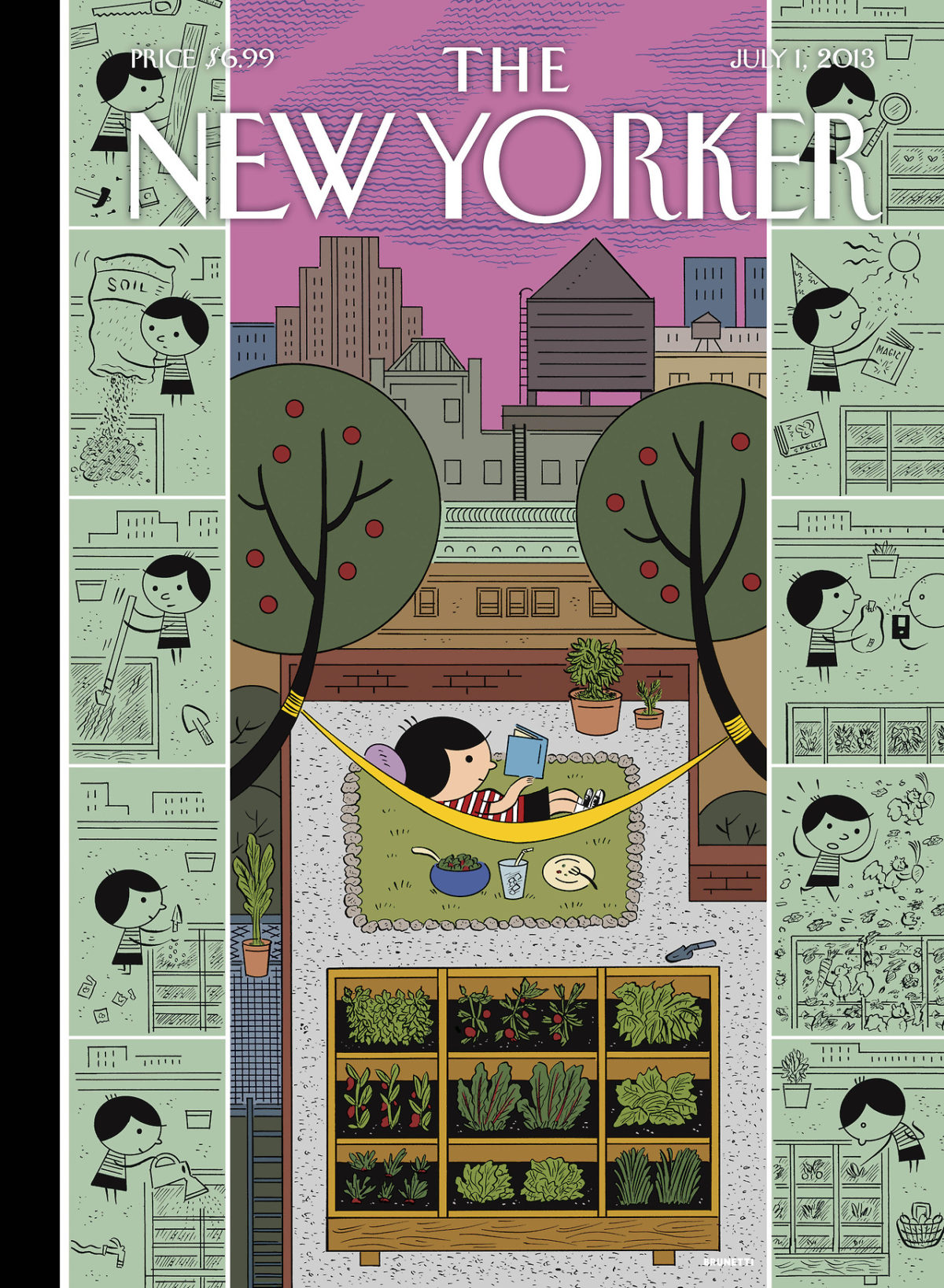
Fertilizer — The always fascinating Jeet Heer reviews Blown Covers: New Yorker Covers You Were Never Meant to See by Françoise Mouly, for the LA Review of Books:

the deeper value of Blown Covers is the insight it gives us into Mouly’s editing process. Editing is a very difficult art to write about, being by its very nature invisible, and based on thousands of tacit, unstated backstage decisions. Blown Covers shows that every idea that makes the page requires an editorial environment where new concepts are constantly being generated. Since the rejection rate is high, this can be frustrating for artists, but Mouly gets around this problem in part by allowing her artists to go all out during the brainstorming sessions, so that even if the idea doesn’t make the cover there is still the pleasure of daring to think of something new and fresh. The failed ideas are the necessary fertilizers of successful covers.

And finally…

Collective Unintelligence — James Gleick, author of The Information, on Autocorrect, for the New York Times:

In the past, we were responsible for our own typographical errors. Now Autocorrect has taken charge. This is no small matter. It is a step in our evolution — the grafting of silicon into our formerly carbon-based species, in the name of collective intelligence. Or unintelligence as the case may be.


2 Comments

Jay Rubin on Translating Murakami

In an interview for the New Yorker, Haruki Murakami’s longtime translator Jay Rubin talks about the work of the Japanese author (whose new book 1Q84 has just been published) and his own work as a translator:

New Yorker Outloud: Translating Murakami mp3

The New Yorker also published a Murakami short story, Town of Cats, translated by Rubin, in September.

Comments closed

Something for the Weekend

Simplicity with Sophistication — Typographer Gerard Unger talks about his work and the influence of Wim Crouwel with MyFonts:

What seemed amazing when I joined [Crouwel’s] company Total Design in 1967 was how simple it all seemed. When Wim explained how to design and do typography, you got the impression it had always been done like that and that it couldn’t be done any other way — maximum clarity. Later, I realized that this approach also had its limitations. When graphic designers had to select a typeface, they automatically specified Helvetica and stopped thinking. Wim’s own work was different: it seemed clear and simple, but was full of refinement, which comes naturally to him. That is probably why it is so attractive to younger generations: simplicity with sophistication. Yet I personally wouldn’t welcome a revival of Swiss typography — it was too formulaic. Also, I think design should be more of a social thing than that. For too long, graphic design has been about individualism and about fulfilling personal ambitions.

The Doctrine of Immaculate Rejection— A wonderful with E. B. White from the Paris Review 1969. It’s a great read, but it’s hard not to get the feeling it comes from a more genteel era that has long since disappeared (via Longform):

I revise a great deal. I know when something is right because bells begin ringing and lights flash. I’m not at all sure what the “necessary equipment” is for a writer—it seems to vary greatly with the individual. Some writers are equipped with extrasensory perception. Some have a good ear, like O’Hara. Some are equipped with humor—although not nearly as many as think they are. Some are equipped with a massive intellect, like Wilson. Some are prodigious. I do think the ability to evaluate one’s own stuff with reasonable accuracy is a helpful piece of equipment. I’ve known good writers who’ve had it, and I’ve known good writers who’ve not. I’ve known writers who were utterly convinced that anything at all, if it came from their pen, was the work of genius and as close to being right as anything can be.

And finally…

Type and Still Imagery — Writer-director Mike Mills, who began his career as a graphic designer, talks about his semi-autobiographical movie Beginners with AIGA:

Before I was a filmmaker I loved Godard as a graphic designer. He does the best design, to me. And a lot of my graphics being very, almost sort of didactic or presentational, or sort of centered and clean, to me really comes from how Godard uses type and still imagery in his films, in Tout va bien or One Plus One or Pierrot le Fou, so Godard’s been influencing me for a very long time. And the graffiti in the film is much more sort of May 1968, sort of Situationist graffiti rather than being like hip-hop graffiti.

There is also a book, Drawings From the Film Beginners, that accompanies the movie (thx @Henry)

Comments closed

Christoph Niemann | Fresh Air

Illustrator Christoph Niemann talks to Fresh Air‘s Terry Gross about his illustrations for The New Yorker, Newsweek and the New York Times Magazine, and his new kids book That’s How:

I care so much about magazines and newspapers and books. This is the world that I live in as a consumer and that’s why I really care about contributing to this world. And I get a much bigger kick out of having my image seen like million times for like 20 seconds and then it ends up in the trash bin rather than having my image on somebody’s like over somebody’s sofa for 20 years.

NPR FRESH AIR: ‘That’s How’ Christoph Niemann Explains It All

The full transcript is here.

Comments closed

Alex Ross | School of Life

In this short interview, Alex Ross, music critic of The New Yorker and author of The Rest is Noise and Listen to This, discusses music and music criticism:

Thanks to the chaps at We Made This for directing me to The School Life of video series.

Comments closed

Bring the Noise: Alex Ross Talks to Paul Morley

Paul Morley interviews fellow music critic Alex Ross, author of The Rest is Noise and Listen to This,  for The Guardian:

Morley’s post about critics, and meeting Alex Ross, is also worth reading:

I’ve always liked a critic who doesn’t think like anyone else. Someone who takes me so much by surprise with their opinions, approach and rigour that they themselves become a kind of artist. I like a critic who demonstrates that they deserve to evaluate and document the work and art of others by writing in such a way that the work makes more sense, sometimes only makes sense, because of what they write and why they write it. I loved critics, whether it was Kenneth Tynan, Susan Sontag, Tom Wolfe, Richard Meltzer, John Updike, Roland Barthes, Pauline Kael, Angela Carter or Lester Bangs, for the way they made it clear, with such evangelical poise, precision and purpose, that without the great critic, the world, and the worlds of those that made up the world, was never properly finished off.

Comments closed

Chris Ware, The New Yorker

Another heart-rending, all too relatable, illustration by Chris Ware for the October 11th issue of The New Yorker:

After last year’s killer Halloween cover, Ware is fast becoming one of the most incisive commentators on modern parenting.

Acme Novelty Library #20 by Chris Ware is available from Drawn & Quarterly next month. (Full disclosure: D+Q are distributed in Canada by Raincoast Books)

(via The Ephemerist)

5 Comments