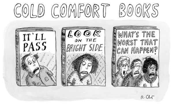
Joe Dator for The New Yorker.
(I feel like this is a variation on a gag that has been going around independent bookstores for a while now, but it gets more accurate by the day. I guess we have to laugh or we will cry, right?)
Comments closedBooks, Design and Culture
Joe Dator for The New Yorker.
(I feel like this is a variation on a gag that has been going around independent bookstores for a while now, but it gets more accurate by the day. I guess we have to laugh or we will cry, right?)
Comments closed
Dan Chiasson takes a look at the making (and meaning) of Stanley Kubrick’s ‘2001: A Space Odyssey’ for The New Yorker:
Kubrick brought to his vision of the future the studiousness you would expect from a history film. “2001” is, in part, a fastidious period piece about a period that had yet to happen. Kubrick had seen exhibits at the 1964 World’s Fair, and pored over a magazine article titled “Home of the Future.” The lead production designer on the film, Tony Masters, noticed that the world of “2001” eventually became a distinct time and place, with the kind of coherent aesthetic that would merit a sweeping historical label, like “Georgian” or “Victorian.” “We designed a way to live,” he recalled, “down to the last knife and fork.” (The Arne Jacobsen flatware, designed in 1957, was made famous by its use in the film, and is still in production.) By rendering a not-too-distant future, Kubrick set himself up for a test: thirty-three years later, his audiences would still be around to grade his predictions. Part of his genius was that he understood how to rig the results. Many elements from his set designs were contributions from major brands—Whirlpool, Macy’s, DuPont, Parker Pens, Nikon—which quickly cashed in on their big-screen exposure. If 2001 the year looked like “2001” the movie, it was partly because the film’s imaginary design trends were made real.
Much of the film’s luxe vision of space travel was overambitious. In 1998, ahead of the launch of the International Space Station, the Times reported that the habitation module was “far cruder than the most pessimistic prognosticator could have imagined in 1968.” But the film’s look was a big hit on Earth. Olivier Mourgue’s red upholstered Djinn chairs, used on the “2001” set, became a design icon, and the high-end lofts and hotel lobbies of the year 2001 bent distinctly toward the aesthetic of Kubrick’s imagined space station.
I have to confess that I’m with Renata Adler — I’ve always found 2001 to be simultaneously “hypnotic and immensely boring.” I think I just like reading about Kubrick’s films far more than I actually like watching them.
Chiasson’s essay reminded me Keith Phipps great series on science fiction films ‘The Laser Age’ for late and lamented film website The Dissolve, which started with 2001. Someone really should collect those essays together into a book if they haven’t already,
The cover of Michael Benson’s book on the making of 2001, Space Odyssey, was designed by Rodrigo Corral and was featured in this month’s book covers post.
Comments closed

Hilton Als on James Baldwin, movies, and Raoul Peck’s documentary I Am Not Your Negro, for The New Yorker:
Comments closedOne has the sense, in the sections of “I Am Not Your Negro” that are devoted to Baldwin’s relationship to film, that Peck is stepping in to make the film that Baldwin couldn’t make. From the beginning of his career, Baldwin longed to make movies. In the introduction to his 1955 landmark collection, “Notes of a Native Son,” he wrote, “About my interests: I don’t know if I have any, unless the morbid desire to own a sixteen-millimeter camera and make experimental movies can be so classified.” To my knowledge, Baldwin never satisfied that desire (morbid, perhaps, because he knew of the herculean effort that goes into getting any movie made), but he never stopped yearning to be a filmmaker. Like a number of other significant twentieth-century authors—James Agee, Truman Capote, Susan Sontag, and his friend Norman Mailer—he knew that the page was not enough in the modern world; cinema was a powerful medium with many more “readers.” What would his life as an artist have been like, and what would American cinema be like now, had it opened itself up to him?
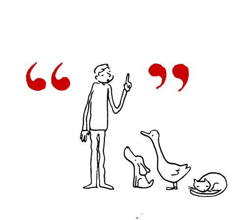
Grant Snider has drawn a lovely series of cartoons on punctuation for The New Yorker.


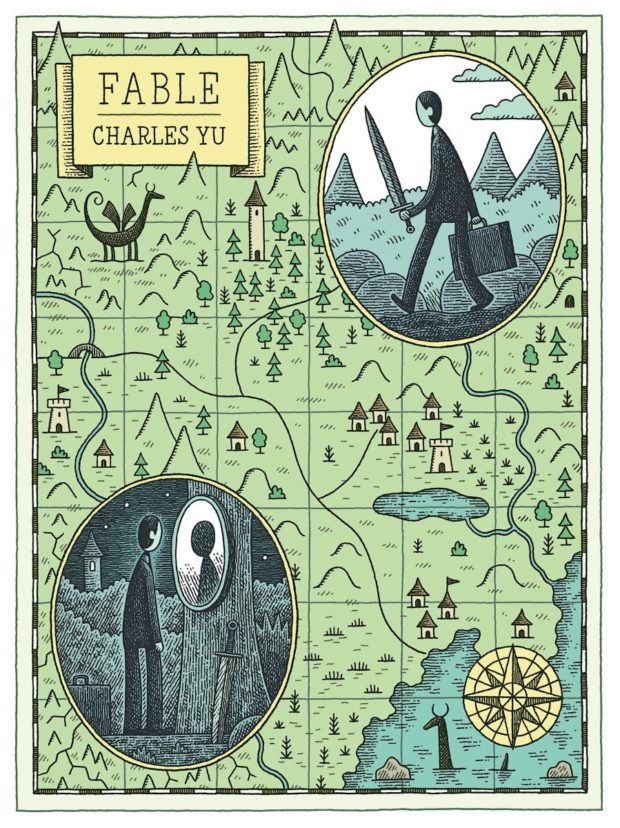
Not an actual book cover, but a new Tom Gauld illustration for a Charles Yu (Sorry Please Thank You) short story in The New Yorker.
Tom has also just joined Instagram if that’s your thing.
Comments closedIn a lovely piece for The New Yorker, Daniel A. Gross talks to blogger Brad Bigelow, the man behind the Neglected Books, about rediscovering forgotten literature:
Comments closedMost novels are forgotten. Glance at the names of writers who were famous in the nineteenth century, or who won the Nobel Prize at the beginning of the twentieth, or who were on best-seller lists just a few decades ago, and chances are that most of them won’t even ring a bell. When “The Moonflower Vine” resurfaced and ricocheted around the publishing world, it became an unlikely exception.
What’s strange about the journey of that book—and about our moment in the history of publishing—is that its rediscovery was made possible by an independent blogger, named Brad Bigelow. Bigelow, fifty-eight, is not a professional publisher, author, or critic. He’s a self-appointed custodian of obscurity. For much of his career, he worked as an I.T. adviser for the United States Air Force. At his home, in Brussels, Belgium, he spends nights and weekends scouring old books and magazines for writers worthy of resurrection.
“It can just be a series of almost random things that can make the difference between something being remembered or something being forgotten,” Bigelow told me recently. On his blog, Neglected Books, he has written posts about roughly seven hundred books—impressive numbers for a hobbyist, though they’re modest next to the thousands of books we forget each year. “It’s one little step against entropy,” he said. “Against the breakdown of everything into chaos.”
The New Yorker‘s ‘Comma Queen’ Mary Norris considers (mis)use of the words “massive” and “awesome”:
Comments closed
Pretty much.
YA covers for 2015 coming soon.
(Cartoon by Bruce Eric Kaplan for The New Yorker)
Comments closed