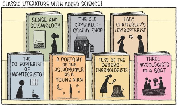
Tom Gauld has made a print for London comics store Gosh! to celebrate their 30th anniversary. You can buy it online here.
1 CommentBooks, Design and Culture

The Rumpus interviews Will Evans the founder and publisher of Deep Vellum, an independent small press focused on works in translation based in Dallas, TX:
I’m very new to this, and I’m most definitely an outsider. I don’t really know how other people do their editing process. I’ve never worked in a publishing house with an editing team that they have to run stuff by. I’m curious, editorially it has somehow happened that Deep Vellum books are quite different from Open Letter books and quite different from Archipelago books and I don’t really know how or why that happens. We all just love stories and want to bring them to different audiences, but at the end of the day, the books that we need to publish that fit our brand are all kind of different, and that’s amazing to me. I love independent publishers because you get that more personal aesthetic choice.


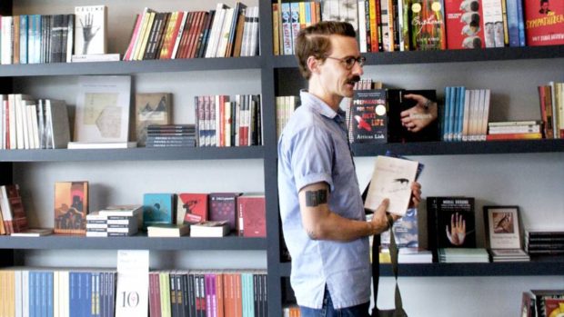
Deep Vellum’s distinctive book covers, designed by Anna Zylicz, have featured on the blog before. And here’s Evans talking about founding Deep Vellum back in 2014:
Comments closed
Author Tom McCarthy talks to Bookworm about his latest novel Satin Island:
KCRW Bookworm: Tom McCarthy on Satin Island mp3
The rather splendid cover for the US paperback edition published earlier this year by Vintage (pictured above) was designed by John Gall.
Comments closed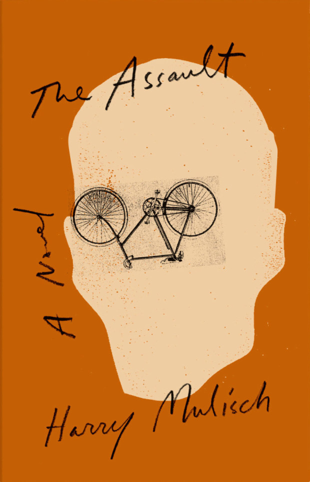


At Literary Hub, Designer Oliver Munday discusses his design process and reading the whole text:
Comments closedAs designers, we are forced to read quickly, and incisively, mining for the clues to the coveted iconic cover. It can feel careless at times, leading me to believe that my reading skills are being dulled. I think of the author in this process, and in some ways the guilt that I may feel about a less-than-ideal reading of their text is exceeded by the potential of presenting their book with the best possible jacket, one that their audience of ideal readers will appreciate. A cover that feels simultaneously unexpected and inevitable.
I used to aspire to a process that created an expanse for reading each text, one that merged the ideal-designer and ideal-reader into one, but found the boundaries of distinction too severely marked. It would be amazing to have the time, space, and inclination to read an entire text when designing its cover, but I have realized that is not essential. There may be times when my two selves are reconciled, but in the event that they exist separately, a reading designer, divided against himself, will remain standing.
On the latest Monocle 24 Culture show, host Robert Bound discusses the recent rise in translated fiction with Anne Meadows, commissioning editor at Portobello and Granta, and Lisette Verhagen, foreign-rights agent at David Godwin Associates, while Andrew Mueller talks to Deborah Smith, Man Booker International Prize-winning translator of The Vegetarian by Han Kang, and Lyndsay Knecht visits Deep Vellum in Dallas:1
Monocle Culture with Robert Bound Books in Translation mp3
Comments closed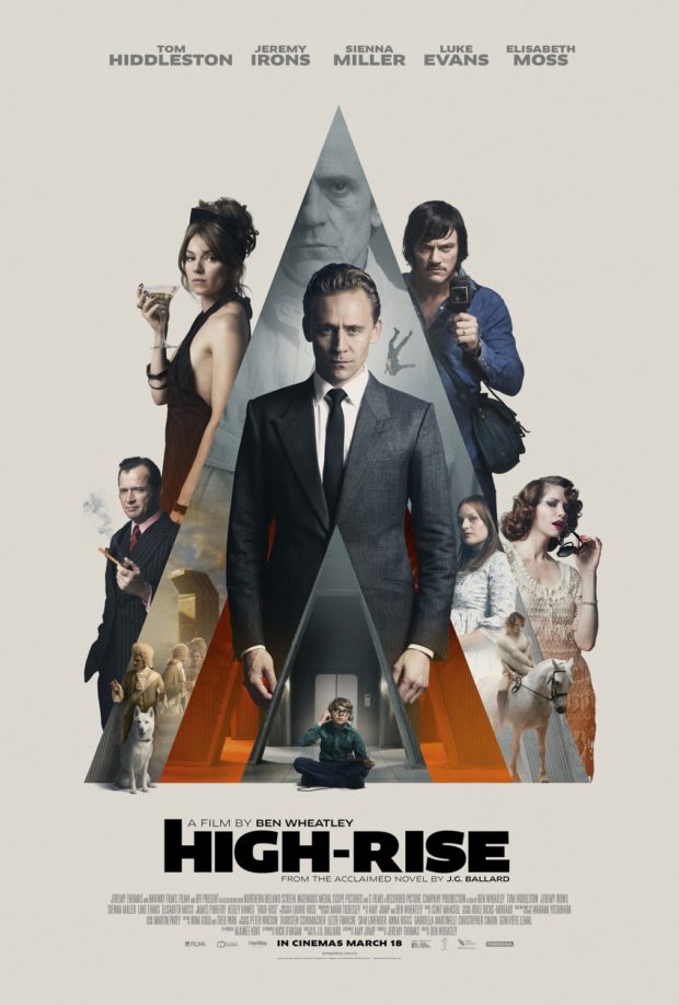
Andrew F. Sullivan, author of ultra-violent urban noir WASTE,1 reviews Ben Wheatley’s adaptation of High-Rise by J.G. Ballard for TIFF.Net:
Wheatley and Ballard point to a pattern—a dissolution of social order that cannot be prevented by technology or progress. Even the most unnatural setting seems to only drive humanity back to its base needs—food, water, shelter, flesh. The past, the basest parts of being human, carry more weight than any building, any new technological development. Elevators become new traps for the hunters. The supermarket on the seventh floor is one last place to forage. Even the soundtrack reimagines this future past for the audience, Portishead performing ABBA’s pop hit “S.O.S.” as a warning for the residents and viewers alike—a dirge for a new world.
Residents begin to harvest the building itself for what they need and reject the outside world. Wheatley’s design team has mimicked the 70s-era incredibly well, but everything is innovative. The products and designs on the shelves are made specifically for this brave new world. The future is behind us. The high-rise becomes a place unto itself—a slow motion horrorshow.
Much like his previous work, Wheatley refuses to provide a straight narrative for the audience and at times, the film descends into an anarchic blend of images without the rules to bind them—as it should. We scurry past a horse on a rooftop, a gang of TV presenters armed with baseball bats and chair legs, a dog drowned in the pool. Parties turn into rituals, sacrifices, religious ceremonies and then dissolve back into chaos once again. Wheatley’s camera starts out sleek and mannered, transitioning smoothly from one floor to the next. However, once the social order slides, the narrative structure breaks under the strain. Viewers slider from one party to another, the camera following bodies as they rise and fall. The film itself opens with an ending.
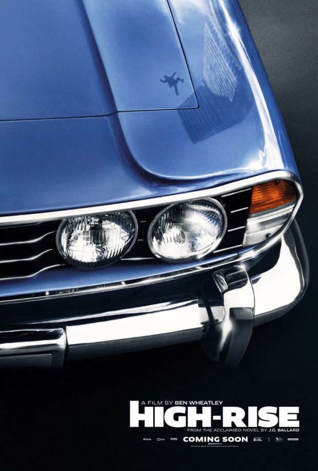
Edwin Turner has also written about High-Rise at Biblioklept. Ed’s opinion of the movie is less favourable than Andrew’s, but his post also pointed me to Tasha Robinson’s interesting review of the film at The Verge:
There’s a touch of Luis Buñuel’s ‘Exterminating Angel’ in the way everyone in the building seems to be stuck there, isolated from the outside by mutual consent, for no reason anyone cares to address. But Wheatley’s visual style never feels beholden to Buñuel. It’s more familiar from 1960s speculative-fiction films. The Brutalist architecture and cold sterility of the building suggests Jean-Luc Godard’s ‘Alphaville,’ and the polished futurism and stiffly remote characters are reminiscent of François Truffaut’s ‘Fahrenheit 451.’ The retro cars, suits, and architecture all put ‘High-Rise’ more in a quaint, remote past than a dystopian future. They also add to the sense of otherworldliness that hangs over the film.
And so does the sense that High-Rise is driven more by Wheatley’s poster-ready striking images — a suicide falling from a high balcony in ultra slow motion, Laing expressionless and spattered with paint — than by any sort of human drives. “Laing would surrender to a logic more powerful than reason,” Hiddleston narrates, hand-waving away any irrational behavior. No one in the film really operates on reason, they just represent emotional factions. Wilder becomes a feral, untrustworthy spirit of the denied and oppressed. Ann becomes an equally monstrous symbol of the selfish, out-of-touch aristocracy that actively enjoys spitting on everyone below them. Both sides are poisonous. Laing isn’t an innocent caught in the middle, he’s desperately looking for a place to fit in, and his narrative isn’t about saving anyone, not even himself.


2 Comments
Tom Gauld‘s cartoon on the future for book lovers for The Guardian this weekend.
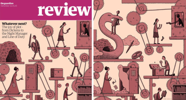
Tom also did the cover and interior illustration in this weekend’s Guardian Review for an article on plot by John Mullan.

Joanna Scutts reviews The Lady with the Borzoi, Laura Claridge’s new biography of Blanche Knopf, for the New Republic:
When the house of Knopf launched in 1915, publishing was a gentleman’s pursuit—amateur, clubbish, WASP, and above all, male. Blanche and Alfred navigated this casually anti-Semitic world, holding themselves aloof from their alcoholic, philandering competitor, the “pushy Jew” Horace Liveright, founder of the Modern Library and publisher of T. S. Eliot’s The Waste Land. Over the years there would be female secretaries, copywriters, reviewers, and editors at Knopf. There would be women in charge of little magazines and the children’s-book divisions of big publishers. But there would be no other woman in the publishing industry with the status of Blanche Knopf—either in the 1920s, when she signed Langston Hughes and Willa Cather, or in the 1950s, when she celebrated Albert Camus’s Nobel prize and oversaw the translation of Simone de Beauvoir’s The Second Sex. And despite it all, although her husband swore he’d put her name on the masthead, he never did…
Comments closed…For the Knopfs, marriage proved much more difficult than publishing. In Claridge’s hands Alfred Knopf takes his place in twentieth-century literature’s crowded pantheon of assholes—his great loves were the American Southwest, expensive wine, and the ritual humiliations of his friends, his family, and most of all, his wife. One after another, acquaintances and co-workers attest to a relationship that today we’d call toxic; a stew of jealousy, incompatibility, violence, and—just when it couldn’t get worse—yearning affection.