Marion Deuchars, who has created books for Laurence King as well as book covers for the likes of Canongate, Orion and Penguin, talks about working in illustration in this short film by Chris Thomas:
Comments closedBooks, Design and Culture
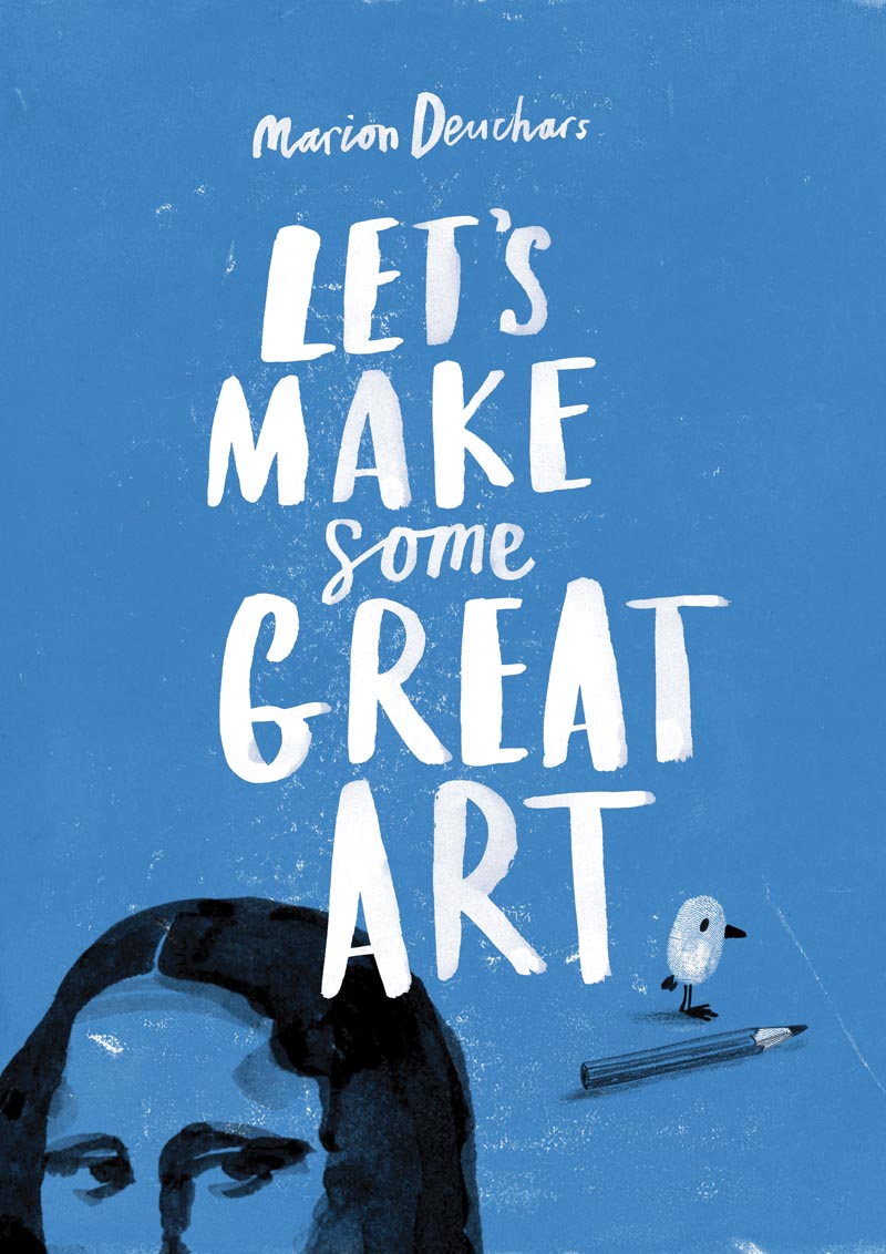
Marion Deuchars, who has created books for Laurence King as well as book covers for the likes of Canongate, Orion and Penguin, talks about working in illustration in this short film by Chris Thomas:
Comments closedA lovely new video about Oliver Jeffers and how he creates his picture books:
Comments closed
Minimal Realism — The first part of a Charley Harper retrospective at Codex99 (via Coudal):
Commercial ad work proved difficult for Harper. He was frustrated illustrating the “happy housewife” and began to tire of realism altogether, stating that it “revealed nothing new about the subject, never challenged viewers to expand their awareness, (and) denied me the freedom of editorializing.”
He began to experiment with a new style where perspective was replaced with hard-edged two-dimensional shapes reduced to only straight lines and curves and where shading and depth were replaced by overlapping color. To caricature and simplify at the same time. The idea was “…to push simplification as far as possible without losing identification.” He would eventually call it “minimal realism.” It was a style that would take him 30 years to perfect.
Magic Pencil — A lovely profile of illustrator Quentin Blake by Jenny Uglow, at The Guardian:
He was among a new wave of British illustrators who began work in the 1950s and 60s, an extraordinary flowering, benefiting from the greater availability of four-colour half-tone printing. The brilliant artists of that generation, each with their distinctive signature, still seem fresh. It’s extraordinary to find that Shirley Hughes, Judith Kerr and Peter Firmin are in their 80s, while Raymond Briggs, Helen Oxenbury, David McKee and Tony Ross were all born, like Blake, in the 1930s. A galaxy of later stars have followed and authors and illustrators have often formed notable partnerships: Oliver Postgate and Peter Firmin, Allan and Janet Ahlberg, Julia Donaldson and Axel Scheffler, and, of course, Dahl and Blake.

Also at The Guardian: Alan Moore on Hollywood and his low-budget film Jimmy’s End (available for free online), at The Guardian:
“My main experiences in the past had been of the Hollywood variety, which was on many levels repulsive to me. Every film is a remake of a previous film, or a remake of a television series that everyone loved in the 1960s, or a remake of a television series that everyone hated in the 1960s. Or it’s a theme park ride; it will soon come to breakfast cereal mascots.
“But I’d always thought I liked the idea of a really cheap, little film. If you want to be a writer or an artist, all you need is a Biro and a Woolworths jotter; it’s a democratic medium. I love films that are made with almost no budget.”
And on a related note:
The Shit We Hate — Artist and illustrator Jamie Hewlett on a possible return to Tank Girl:
I started looking at [Tank Girl] and realised that, apart from the last three or four strips I drew in that 10 year period, pretty much 90% of it was shit. Really, it was. I spoke to [Tank Girl writer] Alan Martin, and he remarked on how it had been so successful, yet the execution on our part was so bad. I said that “now we’re in our forties, and I can draw much better, and you’re a much better writer, wouldn’t it be great to revisit Tank Girl, do a one-off graphic novel, but do a really good one, and really knock it out of the ball park?’ So we might do that next year. It’s a great character, so anarchic; just a tool for us to rant about all the shit we hate.
And finally…
Stranger than Science Fiction — History professor Michael Saler on Alan Turing, at the TLS:
Comments closedRecent histories charting the intertwined origins of the nuclear age and the “digital universe” provoke the queasy feeling that our species is positioned precariously between atomic night and transhuman dawn. Ironically – and reassuringly – the principal instigators of this new era, such as Alan Turing and John von Neumann, showed themselves to be human, all too human, their fallibilities and resiliencies restoring a more grounded perspective about our future. The triumph of a Dr Strangelove or a Hal 9000 remains a possibility, but either scenario pales before the lived reality of their flesh-and-blood progenitors.

“I want everything I do to look spontaneous. It’s not that I think illustration should necessarily be like that, but this is what I can do.”
In this short interview for the Tate, illustrator Quentin Blake talks about his new book Beyond the Page. Written by Blake, it chronicles his projects over the past ten years, including his works for the walls of hospitals, galleries and other public spaces:
Comments closedA beautifully shot interview with British illustrator Jamie Hewlett:
It would be lovely to see Hewlett — co-creator of Tank Girl and Gorillaz (if you must) — draw some new full-length comics again.
(via Coudal)
Comments closed
Illustrator Michael Wertz explains the process of hand-printing 100 copies of his limited letterpress edition book Dog Dreams at the San Francisco Center for the Book:
A trade edition of Dog Dreams is now available from Ginko Press.
(via Drawn!)
2 Comments
I really enjoyed Naïve: Modernism and Folklore in Contemporary Graphic Design, so I really think I have to pick up Echoes of the Future: Rational Graphic Design and Illustration, also published by Gestalten. A “compilation of recent graphic design and illustration that is inspired by our collective visual memory”, the book includes work by Gianmarco Magnani, AKA Silence Television, who (calling all enterprising art directors) ought to be doing book covers (if he isn’t already):

But moving on…
“The only thing left on the high street that doesn’t want either your soul or your wallet” — Zadie Smith on libraries at the NYRB:
What kind of a problem is a library? It’s clear that for many people it is not a problem at all, only a kind of obsolescence. At the extreme pole of this view is the technocrat’s total faith: with every book in the world online, what need could there be for the physical reality? This kind of argument thinks of the library as a function rather than a plurality of individual spaces. But each library is a different kind of problem and “the Internet” is no more a solution for all of them than it is their universal death knell.
And on a sort of related note…
The Disease-Carrying Book — John Sutherland reviews How To Do Things With Books in Victorian Britain by Leah Price for the Literary Review:
The public library, introduced in Manchester with much municipal self-congratulation in the early 1850s, was ‘free’, unlike ‘leviathan’ circulating libraries such as Mudie’s and W H Smith’s that catered to the middle classes. The lower classes lick their index fingers to turn the page. A quaint ‘fumigator’ in which Victorian public libraries could decontaminate their stock is illustrated in Leah Price’s discussion of the disease-carrying book. Victorians were wedded to the ‘miasmic’ theory of disease. Yet it wasn’t air but spittle that was the vector of the dreaded consumption.
Reality is Elsewhere — Steve Wasserman on Amazon at The Nation:
For many of us, the notion that bricks-and-mortar bookstores might one day disappear was unthinkable. Jason Epstein put it best in Book Business, his incisive 2001 book on publishing’s past, present and future, when he offered what now looks to be, given his characteristic unsentimental sobriety, an atypical dollop of unwarranted optimism: “A civilization without retail bookstores is unimaginable. Like shrines and other sacred meeting places, bookstores are essential artifacts of human nature. The feel of a book taken from the shelf and held in the hand is a magical experience, linking writer to reader.” That sentiment is likely to strike today’s younger readers as nostalgia bordering on fetish. Reality is elsewhere.
Also at The Nation — Michael Naumann on Germany’s bookstores and literary culture:
Since the late 1840s in Germany, the ambiguous character of books—simultaneously a commodity and a cultural work—has defined internal discussions in the publishing business. Putting aside the implicit hubris of German nationalism, the country’s self-aggrandizement as a veritable Kulturnation, the fact remains that in Germany the cultural definition of the “book” as a major source of intellectual, scientific, economic and aesthetic self-improvement has carried the day over the capitalist notion that a book is a commodity and therefore deserving of no special considerations. The book as such is sacred. One does not throw books away.
And finally…

The Graphic Modern: USA, Italy and Switzerland 1934–66 exhibition curated by Patricia Belen and Greg D’Onofrio of Kind Co. is on display at Fordham University at Lincoln Center, should you happen to be in New York between now and July 26th.
Comments closed
Another charming illustration by Grant Snider for the New York Times Book Review. It appears alongside a review of John Sutherland’s Lives of the Novelists. Nicely done, sir. Nicely done.
Comments closed
Lyra Kilston reviews Saul Bass: A Life in Film and Design for the LA Review of Books.
The Well-Made Book — An interesting article by Michael Agresta on how printed books, and their design, are changing in the digital age:
Now, as we move into the digital age, the well-made copy has come to occupy a familiar, almost nostalgic middle ground between the aura of an original and the ghostly quality of a computer file. A mass-produced paper book, though bulkier and more expensive, may continue to be more desirable because it carries with it this material presence. And presence means something—or it can, at least, in the hands of a good book designer.

Innards and Interiors — The Bauhaus: Art as Life exhibition at the Barbican reviewed at The Financial Times:
Paul Klee favoured risotto with steamed calf’s heart, sour liver and lung ragout: in the kitchen, as in his paintings, he was obsessed with innards, interiors, reconfiguring essential forms. Wassily Kandinsky lived in a streamlined white apartment but, incongruously, cooked on a “kamin” – a Russian wood-burning stove made from heavily ornamented black iron. Josef Albers claimed “I paint the way I spread butter on pumpernickel” – robustly and straightforwardly; he called the colour mixes in his “Homage to the Square” series his “recipes”. And Swiss painter and vegetarian zealot Johannes Itten was driven out of Weimar because he hijacked the Bauhaus kitchen and alienated director Walter Gropius by producing only “uncooked mush smothered in garlic”. The Barbican’s new exhibition… gives a whole new flavour to the story of the art school long seen to embody sober, purist German modernism.
Weird Comics — Local small press publisher Annie Koyama profiled in the Quill & Quire:
Koyama says her strategy for the year ahead is “to throw everything against the wall and see what sticks,” but she acknowledges her biggest business challenge is twofold: increasing print runs to improve margins and lining up reliable distribution for the fledgling firm. After working around the clock for nearly four years… she says her goal now is to create a sustainable enterprise that can continue to fulfill its artist-centric mandate… She’s also considering expanding into children’s books. But not in the way you’d expect. “While there are a million good kids’ books out there, there aren’t a million good kids’ comics I can see – especially not weird ones,” she says.
And finally…

Maurice Sendak, “author of splendid nightmares” has passed away aged 83. The New Yorker has made a short Art Spiegelman comic about meeting Sendak available online. And here is a wonderful interview with author from December last year:
Comments closed
Freelance illustrator and paper artist Kevin Stanton recently contacted me about his book illustrations for the new Signature Shakespeare editions of Romeo and Juliet and Macbeth.
Art directed by Ashley Prine at Sterling Publishing, and with additional typography by the immensely talented Chin-Yee Lai, both books have laser-cut covers, as well as five laser-cut interior illustrations per book, and more than 30 other illustrations.
The results are beautiful and the project sounded like fascinating undertaking, so I thought I would ask Kevin a little more about it.
We corresponded by email.


How did the project come about?
Two years ago, at the very beginning of my foray into freelancing and just a month after graduating from Pratt, I received an unsolicited email from Pamela Horn, a Editorial Director at Sterling Signature. It turns out that a higher-up in the company had seen my work at Pratt’s Annual Pratt Show and passed my portfolio on to her!
After we met a few times, she mentioned that she’d been looking to do a project with a paper artist, and that when the right one came along she would let me know. Initially this had meant a series of Classics book covers, but that fell through. Nine months after our first interview, I got the call — Pam wanted to do a series of Shakespeare plays, starting with Romeo and Juliet and Macbeth, each with a cover and fifteen plates! And that was a dream job right there! And after some discussion with my Art Director, Ashley Prine, it got even better, even more unreal: today it is a hardcover book with a laser-cut cover, five interior two-layer laser-cut illustrations, and almost forty printed spots, spreads, act openers and motifs. And my name on the cover to boot!

How did you approach such a big project?
The process was interesting to figure out. After hand-cutting a great deal of the book, we realized that scans of the pieces didn’t look good and there was no quick-fix for turning them into vectors. Enter my friend and assistant, Victoriya Baskin. Since my sketches before I cut are like maps of everything (I don’t freehand anything), she was able to vector it all together so that we had a product that could be printed on the pages and sent to the laser-cutter with clean, expert lines! And the work can be edited, which was our primary concern with paper.

How you feel about the final results?
It’s been an absolute dream. As a young illustrator, and one that works in paper, I couldn’t have hoped for a better display of my work than these books. I am so happy with them, although seeing them on the shelves in a book store is the most surreal experience for me. It’s a privilege to work with my entire team, and an honor to have been a part of such a phenomenal production! Much Ado about Nothing and Hamlet are next in line to be published in November!

Thanks Kevin!
You can see more of Kevin’s work on these books on his blog.
7 CommentsUnder Paul Buckley’s art direction at Penguin US, UK-based illustrator Matt Taylor has produced two more stunning John le Carré covers. The type and design is by Gregg Kulick.


You can see the previous covers in the series here, and, according to Matt, there are a couple more on the way. Happy day.
Comments closed
I first saw the work of Nigel Peake in his book In The Wilds, published by Princeton Architectural Press in 2011. Collecting Nigel’s beautiful and meditative drawings and watercolours of rural landscapes and buildings, the book reminded me of both of the work of Paul Klee (Highways and Byways, for example) and Rings of Saturn, W. G. Sebald’s discursive record of ambling through East Anglia.
I subsequently discovered, of course, that Nigel had already produced a significant body of work prior to In the Wilds, including illustrations for Ninja Tune, Hermes, the Royal Horticultural Society, Habitat, The Believer and Dwell magazine, as well as several books.
And in this shiny digital age, there is undoubtedly something wonderful in Nigel’s meticulous hand-drawn maps and tumbledown sheds. We corresponded by email.
Do you remember when you first become interested in art and illustration?
I feel like I have always drawn. Some of my earliest memories are associated with painting and the things that surround it, the plastic containers that held the primary colours and the smell from the cheap paint. When I was growing up I did not really think in terms of design or illustration I just had a wish to draw all the time. And that is still true now, I type this surrounded my paints, pens and paper… so maybe not much has changed. Drawing for me, is essentially a way of thinking through a thought or an idea, to document and try to understand what is around me.

What was your first job as illustrator?
When I was still studying and finishing my architecutural thesis I designed a snowboard graphic for a company in California. After that I worked on a project with Ninja Tune…

And how did the project for Ninja Tune come about?
In truth I am not too sure, I remember leaving a zine for DJ Food when he was djing at Edinburgh, I was not even thinking of it in terms of work , I just wanted to share my work with those that I admired. One way or another I ended up drawing the artwork for the Coldcut ‘Sound Mirror’ LP and singles. They were really nice people to work with and I have made a few other things for them since.

You’re also an architect as well as an artist. How does that inform your work?
I am not a ‘complete’ architect – in that I have yet to finish it professionally. I did study it for 6 years. Studying architecture did not directly affect how I draw, but it did introduce me to a lot of different ways of thinking. I read a lot of interesting books and listened to some wonderful conversations. It was hard work, and the studio ethic of working all day is still engrained in me. I am interested in architecture and how it holds all these moments that occur every day. I recently made a book about the bridges of London, these fantastical structures that essentially have become invisible to those who live there. It is amazing to be in a city and look around, and you have all these forms and shapes that where designed and made by us. It is the combination of our efforts.
Why did you decide to move away from the city?
It was not intentional, it just happened. I was tutoring and drawing projects and then I seem to end up in the country, I probably got tired of being in a city. I had been living in Edinburgh for 8 years. At the moment I travel a lot with my work so it is nice to live somewhere that is quiet and simple, and a place that I want to return to.

What is it about the details of vernacular architecture that particularly interest you?
I am not sure, it is probably because it is what I have grown up around. I enjoy how things are put together, and vernacular architecture is very honest in that respect – you can see what holds what up.
Also a lot of things fall apart because of the wind and the rain and old age, and I find this equally beautiful because when this happens you see all the parts that where previously hidden to the world.
It is an architecture determined by what is close to hand and so the materials and colours used are more interesting. Blue twine holds it together and plastic bags and old gates bridge the gaps.


Is there a tension between your love of the countryside and your fascination with built structures?
Not particulary, probably because I look at them with the same interest, when I look at a leaf I am still amazed by the detail and the wonder of it and then when I look at a skyscraper I can not believe that we can make such incredible structures. The only tension is that if I spend too long in a city I want to go to the places where there are no buildings, I particularly miss the sea if I have not seen it for a while.
Do you take a lot of photographs or do you rely more on sketchbooks?
I do take photographs, but not to draw from, but just to remember things that I see along the way. I also like how a camera allows you to frame what is around you – by taking a photo of something you edit everything else around you and that one moment is held. I keep sketchbooks and draw in them every day not because I think it is fashionable or because I think I should but because I will forget things – so I use them to hold those things that might turn into something someday. I think this idea of keeping a book comes from school because for years we sat at tables with books marked maths, geography, chemistry… so it seems normal to keep writing and drawing things into a book.

Apart from nature and buildings, where do you look for inspiration?
Nearly everything I see has an affect upon me, one of my favourite things is to sit and just look, not as a form of procrastination but as a way of observing what is around me. There is so much to see and hear in everything.
Beyond what I see, I know that music is probably my biggest influence. In the same way that I have early memories of drawing – these are entangled with memories of music. My mother played Gracelands on repeat in the house or the car. And my father always had Pet Sounds. On a Friday night we would have record night and each of us would get to choose one to play. I always listen to music when I am drawing or making things. It is such a beautiful thing to close your door for a while, sit at your table and put on a record and simply draw.


You publish some of your work with Analogue Books in Edinburgh. How did that come about?
I studied architecture in Edinburgh and Analogue opened a few years after I had arrived. I remember going in and liking the books they had and more importantly the people who owned it seemed kind. And so I started to bring some work in and got to know Russell and Julie through that. Since then we have published zines and books and exhibitions and probably eaten a lot of McVities biscuits. They are some of the best people I have met through my work. Hopefully in the next few months we are going to make some new things.
Your work does seem particularly well suited to the books. Are you interested in the juxtaposition of word and pictures?
Books are wonderful objects. There were a lot of books around me when I was growing up.
The possibilities are endless, in terms of what words and pictures can do. Making a book is as close as I will get to making an album. With this form, you can tell a story or not, but with each page you can explore an idea, knowing that it will be seen after what went before, so for me there is a beautiful rhythm to a book. The flicking of a page has great joy in it. For now I like making work as a series ( maps, sheds, bridges, birds, billboards, cameras…) and so books are perfect for this exploration.

Who are a few of your favourite writers?
To name a few who I can always return to, in no order.
John Steinbeck, Earnest Hemmingway, F Scott Fitzgerald, Seasmus Heaney, George Simenon, Maj Sjowall and Per Wahloo, Francis Ponge, Jorge luis Borges, Gaston Bacherlard, Walter Benjamin, Arthur Conan Doyle and John Cheever.
What are you reading currently?
At the moment I am living in Austria and have read all the books I packed so for now I am reading the newspaper.
Thanks Nigel!
Full Disclosure: In the Wilds by Nigel Peake is published by Princeton Architectural Press, and distributed in Canada by my employer Raincoast Books.
7 Comments