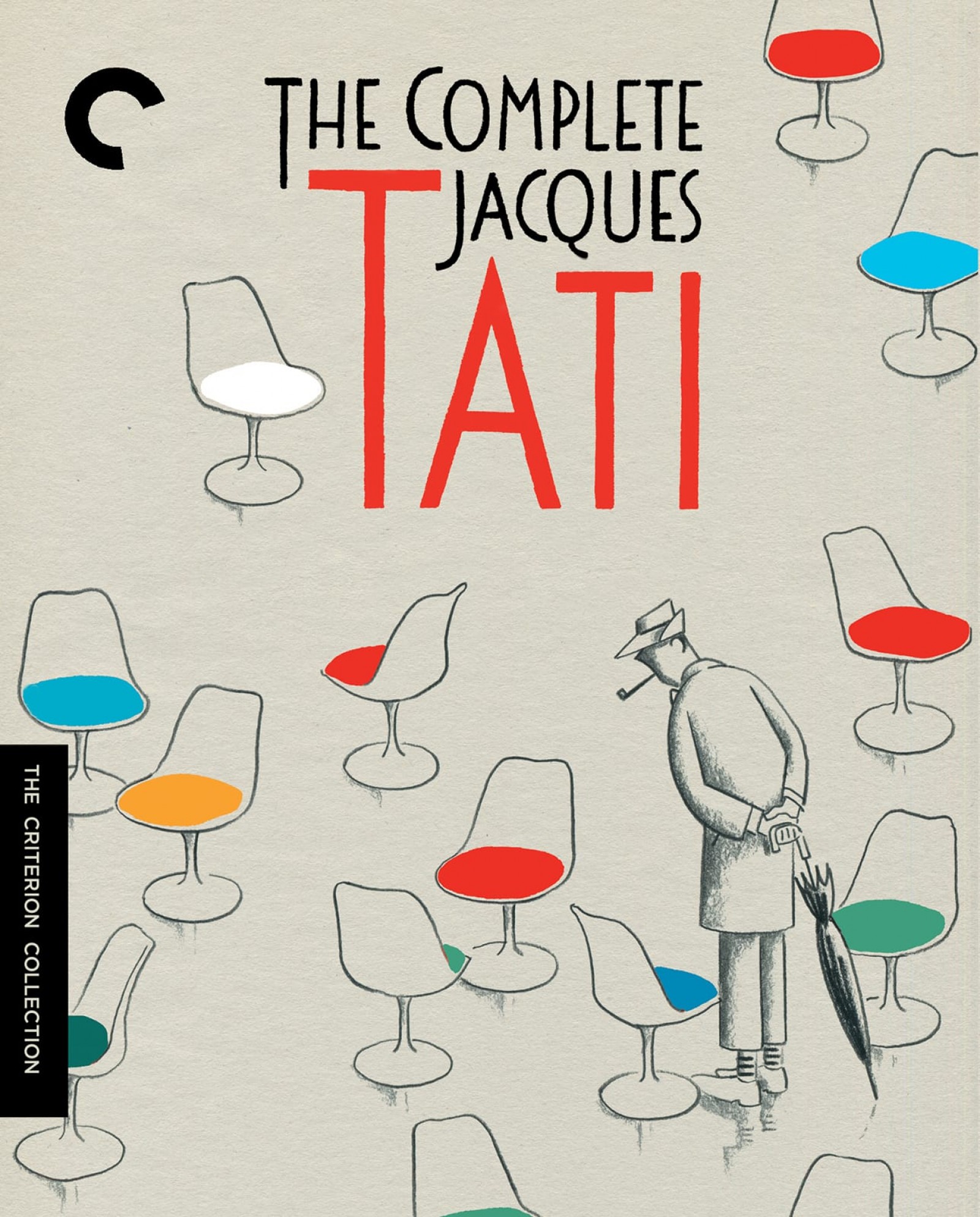
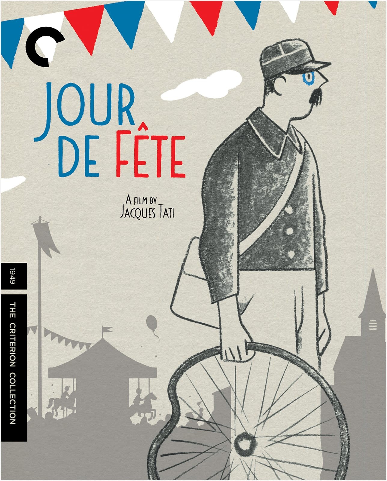
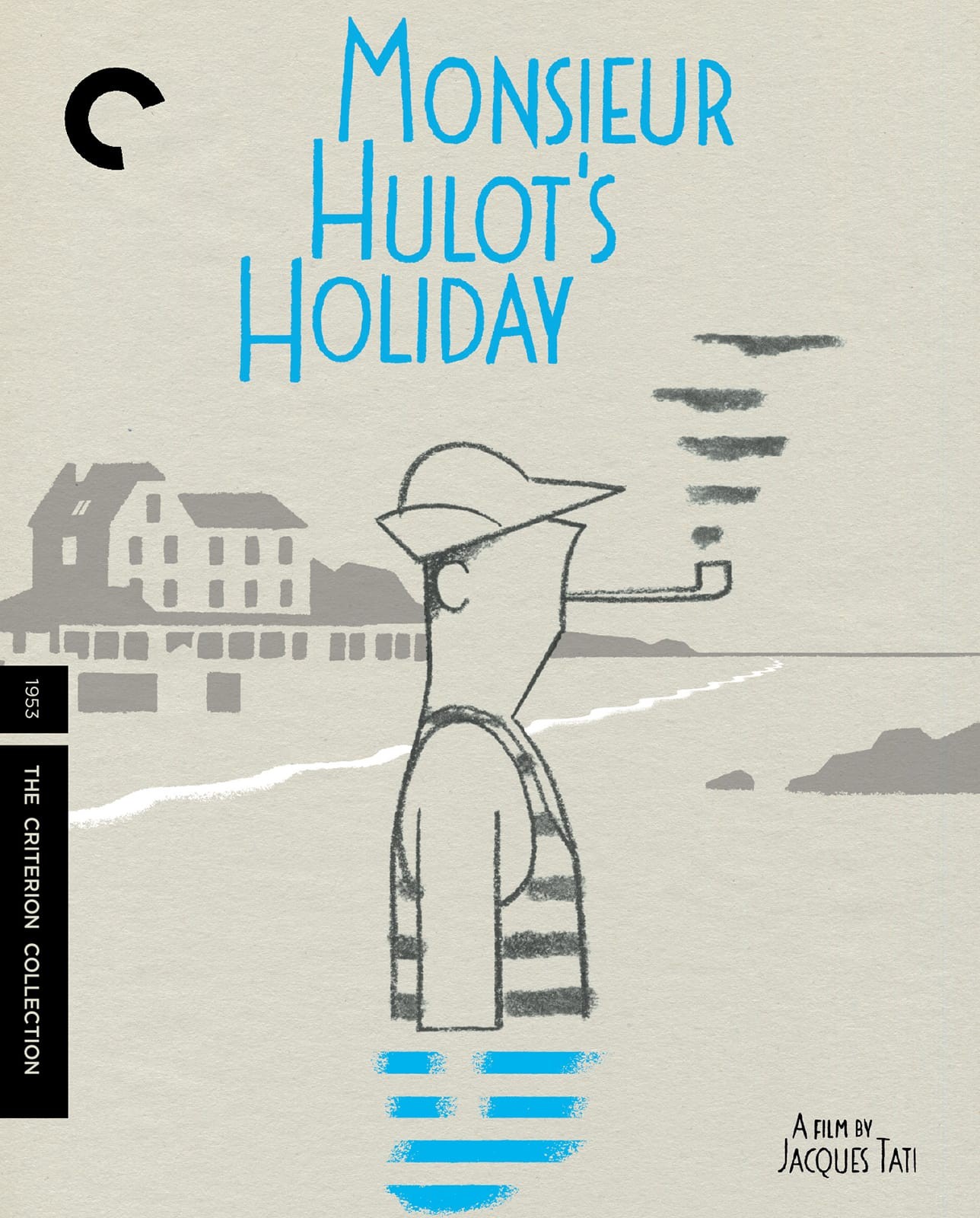
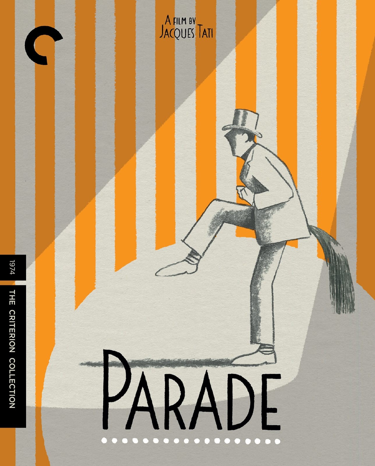
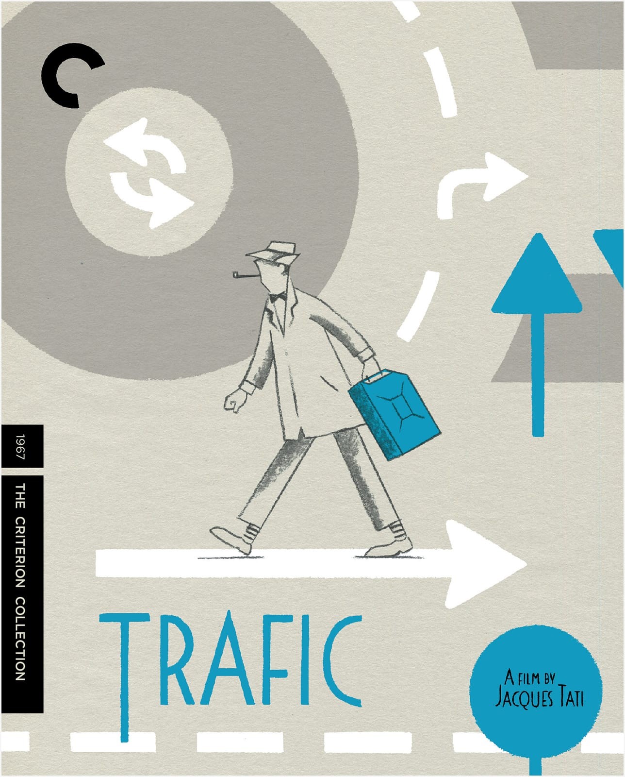
I am at least a year late on this, but I do love these covers for the Criterion Collection box set of Jacques Tati films. The illustrations are by Belgian illustrator David Merveille who has also created a series of books inspired by the work of Jacques Tati. Currently, only Hello, Mr. Hulot is available in English, but I believe a second book, Mr. Hulot on the Beach, will be published in English in 2016 by NorthSouth Books.
You can see more of David’s designs and illustrations for the box set on his blog.
Thanks to designer Andy Allen for bringing these covers to my attention. Images and other interesting stuff via Adrian Curry’s marvellous Movie Poster of the Week column.
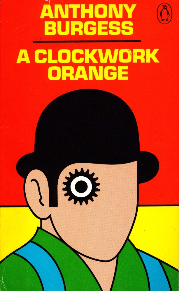
This month on the Poster Boys podcast, designers Brandon Schaefer and Sam Smith look back at 45 years of Penguin design history from the early years of the company under the direction of typographer Jan Tschichold to the work of art director David Pelham in the 1970s. Inspired by David Pelham’s famous design for the cover of A Clockwork Orange, Sam and Brandon also take a look at the artwork for Stanley Kubrick’s film adaptation of Anthony Burgess’s cult novel:
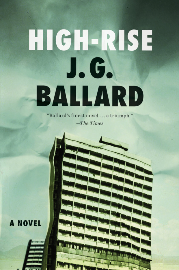
With the release of the Ben Wheatley movie adaptation starring Tom Hiddleston imminent, Chris Hall looks at High-Rise and the ‘inner-space’ of J. G. Ballard’s science fiction for The Guardian:
High-Rise is the final part of a quartet of novels – the first three are The Atrocity Exhibition (1970), Crash (1973) and Concrete Island (1974) – with each book seeded in the previous one. Thematically High-Rise follows on from Concrete Island with its typically Ballardian hypothesis: “Can we overcome fear, hunger, isolation, and find the courage and cunning to defeat anything that the elements can throw at us?” What links all of them is the exploration of gated communities, physical and psychological, a theme that is suggestive of Ballard’s childhood experiences interned by the Japanese in a prisoner-of-war camp on the outskirts of Shanghai in the 1940s. It was, he always claimed, an experience he enjoyed.
The built environment is not a backdrop, rather it is integral and distinctive in its recurring imagery – from abandoned runways, to curvilinear flyovers and those endlessly mysterious drained swimming pools. Perhaps more than any other writer, he focused on his characters’ physical surroundings and the effects they had on their psyches. Ballard, who died in 2009, was also interested in the latent content of buildings, what they represented psychologically. Or, as he once obliquely put it, “does the angle between two walls have a happy ending?” – by which he meant that we project narrative on to external reality, that the imagination remakes the world. In Ballard’s fiction, nothing is taken at face value.
In High-Rise and Concrete Island especially, Ballard examines the flip side to what he called the “overlit realm ruled by advertising and pseudo-events, science and pornography” that The Atrocity Exhibition and Crash mapped out. Under-imagined or liminal spaces, such as multi-storey car parks and motorway flyovers, act as metaphors for the parts of ourselves that we ignore or are unaware of. His characters are often forced to assess the physical surroundings and, by extension, themselves rather than to take them for granted.
The Rev John Graham, better known as Araucaria, set the Guardian’s cryptic crossword for 55 years. In December 2012, Araucaria announced that he was dying of cancer through a series of clues in a crossword. In this short film, Graham talks about puzzles, the memories and ideas that inspired him, and setting crossword number 25,842:
Somewhat related to that Keith Phipps essay Why Star Wars? (mentioned here a couple of days ago), Wired has an oral history of Industrial Light & Magic, the special effects shop founded by George Lucas to work on the movie:
Industrial Light & Magic was born in a sweltering warehouse behind the Van Nuys airport in the summer of 1975. Its first employees were recent college graduates (and dropouts) with rich imaginations and nimble fingers. They were tasked with building Star Wars’ creatures, spaceships, circuit boards, and cameras. It didn’t go smoothly or even on schedule, but the masterful work of ILM’s fledgling artists, technicians, and engineers transported audiences into galaxies far, far away.
As it turns 40 this year, ILM can claim to have played a defining role making effects for 317 movies. But that’s only part of the story: Pixar began, essentially, as an ILM internal investigation. Photoshop was invented, in part, by an ILM employee tinkering with programming in his time away from work. Billions of lines of code have been formulated there. Along the way ILM has put tentacles into pirate beards, turned a man into mercury, and dominated box office charts with computer-generated dinosaurs and superheroes.
And if you were wondering where it all went wrong, it was probably the precise moment George Lucas had this revelation:
I never thought I’d do the Star Wars prequels, because there was no real way I could get Yoda to fight. There was no way I could go over Coruscant, this giant city-planet. But once you had digital, there was no end to what you could do.
In the most recent installment of the Laser Age, the Dissolve’s fascinating history of science fiction films from the 1960s to the 1980s, Keith Phipps turns his attention to Superman, Star Trek, and Flash Gordon — three movies released in the immediate wake of Star Wars. It’s a great read if you are at all interested in this stuff, but it’s also a perfect excuse to revisit Phipps’s earlier — but oh, so timely — essay, ‘Why Star Wars?’:
Why? Of all the science-fiction films released in the long wake of 2001: A Space Odyssey and Planet Of The Apes, why did Star Wars take hold in a way no film before it had? None of the many answers are entirely satisfying. But combining a few of them lets us make some sense of the question.
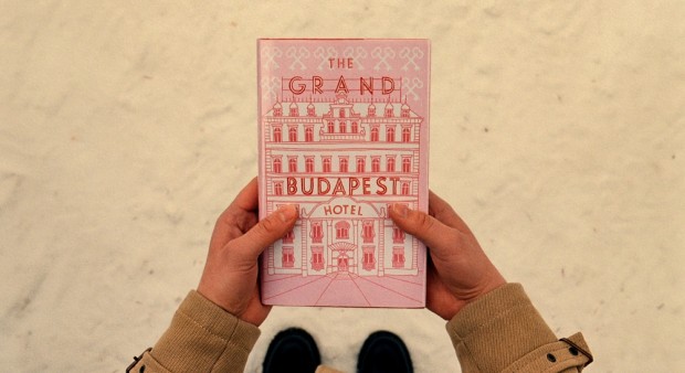
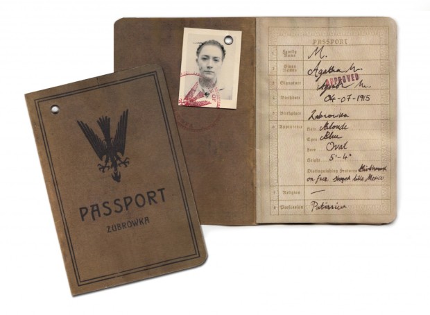
Designer Annie Atkins talks to Design Week (registration required) about her work on Wes Anderson’s The Grand Budapest Hotel, and “the often ‘invisible’ role of graphic design on screen”:
“Most of the skills I employ today are things I’ve learnt on set,” Atkins says. “Before starting this job, I hadn’t really hand-crafted anything since being a child. Things like taking up a quill; getting my paints and pencils out; hand-binding books – I never would have done that in the advertising agency I was working in.”
Of course, 11 hours isn’t solely devoted to creating art. While a lot of the day is spent in a “production line” of stitching, gluing, folding, ripping things up, sticking them back together again, tea staining and pouring fake blood over things, there are less glamorous elements to the job too.
“A lot of the day is paperwork,” Atkins says. “Organising, planning, scheduling, ordering materials – that’s the boring bit. Then some of the day is liaising with art directors and the production designer to figure out the style and directions things will go in. Then it’s bums on seats, making stuff.”
It’s that “making” part that is so important. “It’s tempting to sit at a computer and make everything that way,” she says. “But if you’re working in a period in the past, you really have to understand the methods that were employed to make those graphics at the time, then imitate – or even better, use – them to give that authenticity.”
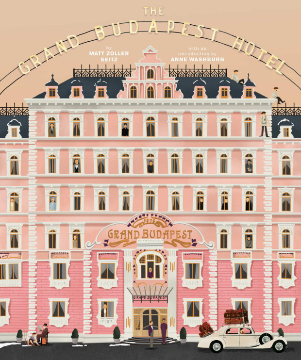
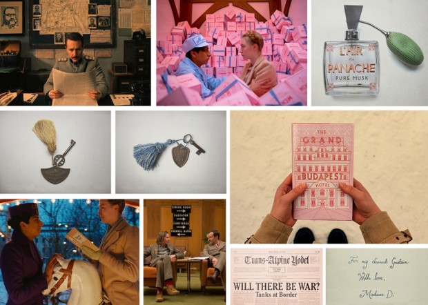
I posted about Wes Anderson’s Zweig-inspired film The Grand Budapest Hotelquitealotin2014. But as the film won four Oscars last month (including the award for production design) and I revisited the movie this past weekend, I don’t feel too bad about posting a few links about it again — it is so beautifully designed and constructed.
“The Grand Budapest Hotel” is an incredibly rich film, one of his best, definitely the most logistically and maybe thematically complex. It’s kind of every Wes Anderson film stacked one on top of the other, like a wedding cake.
While RogerEbert.com produced this 16 minute video essay adapted from the book:
The book even has a nice animated trailer:
Elsewhere, Quartz interviewed the film’s lead graphic designer Annie Atkins:
“A fictitious country needs all kinds of graphics: flags, banknotes, passports, street signs,” she told Quartz. “It’s impossible to imagine graphics like these. You have to do your research and you’ll find treasures that you couldn’t even have begun to sit down and draw until you saw them in front of your eyes.”
Working closely with Anderson and the film’s production designers Adam Stockhausen and Anna Pinnock, Atkins meticulously hand-crafted almost every of piece of ephemera shown on camera. “Every piece I made began with showing Wes a collection of real examples from the period,” she explained. “We looked at hundreds of pieces of design from Eastern Europe at the beginning of the last century as reference.”
And Deadline talks to production designer Adam Stockhausen about the film and working with Anderson:
Wes knew that he wanted the hotel to be pink. That’s one of the fun things about working with him—he has such a strong sense of color and makes very bold, daring choices that, just left to my own devices I’m not sure I would have come up with. So, working with him is inspiring in that way. And then it’s a process—working with colors that go together, adding in tones that help balance things, figuring out what the right pinks are. The funny thing is, we started with all this pink, and I think this would be true of any color—if you use too much of it, you stop seeing it because it’s everywhere and you start taking it for granted. So, we found that we had to add in yellows and different colors to kind of cut it back so you could see it more. And it’s those kinds of things you learn as you’re going; in this case, we learned from taking a section of the walls in the hotel and painting them.
Most of the inspiration we had for the hotel came from our site visit to Karlovy Vary in the Czech Republic. But we also put tons of research into the setting before we visited Europe. We looked at archive photos from many different hotels, including several hotels in London, Scotland, Switzerland—all over the place. Personally, I think the design was most influenced by the Grandhotel Pupp, which sits on a hill overlooking the town of Karlovy Vary.
The town of Karlovy Vary is filled with pastel-colored buildings that line the riverfront, and it has several hotels that stand on hills that look over the town. The whole place had the right feeling we wanted to convey in the movie.
That National Geographic article also alerted me to this interesting featurette about the creating the film’s hotel in a department store in Görlitz, Germany:
Related to yesterday’s post on Gramercy Typewriter Co. in New York, here’s a short film about U.S. Office Machines, one of the last remaining typewriter repair shops in Los Angeles:
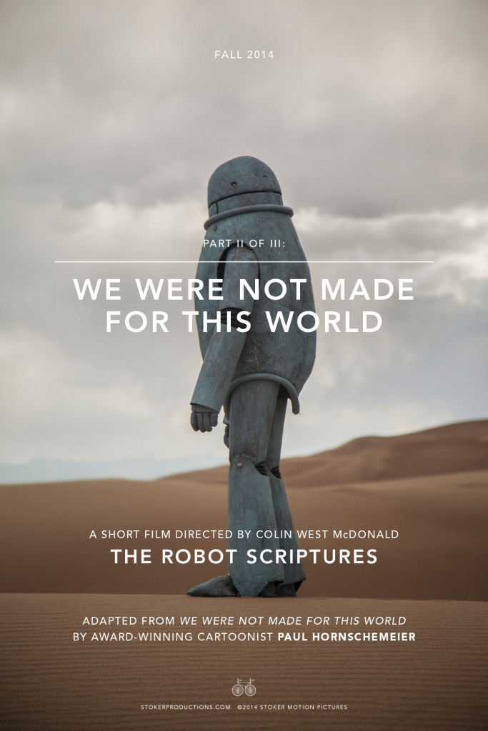
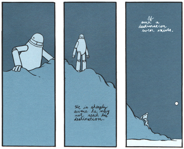
Directed by Colin West McDonald, We Were Not Made For This World is a short science fiction film based on the comic strip of the same name by cartoonist Paul Hornschemeier about a robot searching for his creator:
‘We Were Not Made for This World’ was first published in Project Telstar by AdHouse and later collected in Let Us Be Perfectly Clear by Fantagraphics.
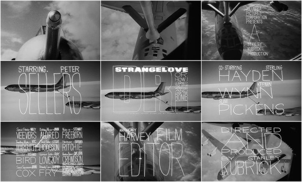
The wonderful Art of Title looks back at the title sequence for Stanley Kubrick’s Dr. Strangelove or: How I Learned to Stop Worrying and Love the Bomb designed by Pablo Ferro:
Pablo Ferro’s loose letterforms and slack compositions superimposed over aircraft footage represented a distinct departure from American title design of the time. Prior to 1966, the aesthetic of main titles was defined primarily by designers Binder, Brownjohn, and Frankfurt and their symbolic geometry, clean typography, and bold graphic forms. The stage was set for Ferro’s strain of ambitious artistry. His lettering, variously squat, long, and lean, allows the footage to peek through, unobtrusive but utterly individual. It was all done by hand, with grease pencil on glass.
In an interview with Pablo Ferro himself, the designer discusses that distinctive lettering:
I tried to do the lettering like it’s usually done in films, but he said, “Pablo, I don’t know whether to look at the lettering or look at the plane. We have to see both at the same time.” I said to myself, oh boy, how could you do that? I remembered that I do my own lettering, just doodling around, thin and tall and things like that, and I thought I’d try that.
We did a test and it worked! Stanley filled the screen with my lettering. It was perfect! You could see the plane and you could see the lettering at the same time.
Coincidently, Vienna-based foundry FaceType actually released a typeface inspired by Ferro’s lettering called Strangelove Next a few years ago. I’m sure I’ve seen it on a couple of book covers.