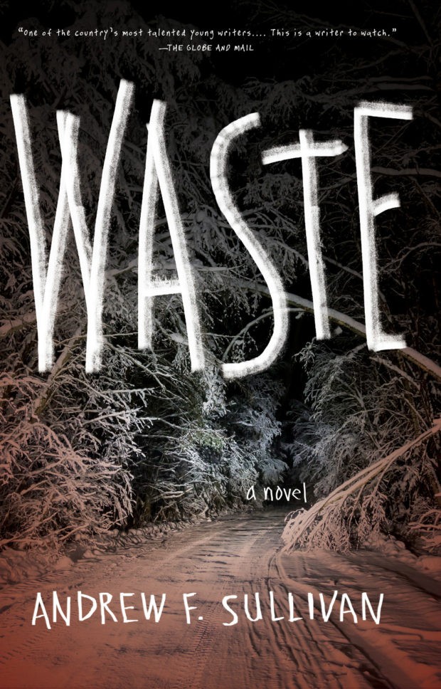
I mentioned Andrew F. Sullivan’s piece on High-Riselast week, and I recently spoke to the author about his own novel WASTE, and about influence of David Lynch on his writing in a Q & A for Publishers Group Canada:
Initially, I think I was very resistant to Lynch. I think I thought a lot of it was just nonsense for the sake of nonsense. It was Blue Velvet that won me over, that showed me you could implicate and confront your audience, you could tell a sad, vicious truth and people would want to hear it/see it. Lynch opened up so many opportunities to leave the explanation out, to make the work immersive and unsettling while still dancing around the established conventions for storytelling. What he was doing seemed very singular, but also invested in the everyday, in waking up, going to work, putting in the hours. He created a world, especially in Twin Peaks, that began as just slightly askew, plausible even. He lured you into the nightmare and then told you it was real. And everyone questions the theories their friends have, there is no code to break. His work exposes the peculiarities of each audience member in their own response—their passions, fears and obsessions. How can they make this story make sense? What demons does it awaken?
Lynch is still doing that. He is always doing that.
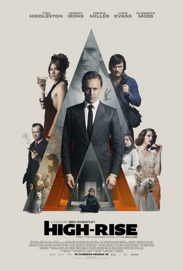
Andrew F. Sullivan, author of ultra-violent urban noir WASTE,1 reviews Ben Wheatley’s adaptation of High-Rise by J.G. Ballard for TIFF.Net:
Wheatley and Ballard point to a pattern—a dissolution of social order that cannot be prevented by technology or progress. Even the most unnatural setting seems to only drive humanity back to its base needs—food, water, shelter, flesh. The past, the basest parts of being human, carry more weight than any building, any new technological development. Elevators become new traps for the hunters. The supermarket on the seventh floor is one last place to forage. Even the soundtrack reimagines this future past for the audience, Portishead performing ABBA’s pop hit “S.O.S.” as a warning for the residents and viewers alike—a dirge for a new world.
Residents begin to harvest the building itself for what they need and reject the outside world. Wheatley’s design team has mimicked the 70s-era incredibly well, but everything is innovative. The products and designs on the shelves are made specifically for this brave new world. The future is behind us. The high-rise becomes a place unto itself—a slow motion horrorshow.
Much like his previous work, Wheatley refuses to provide a straight narrative for the audience and at times, the film descends into an anarchic blend of images without the rules to bind them—as it should. We scurry past a horse on a rooftop, a gang of TV presenters armed with baseball bats and chair legs, a dog drowned in the pool. Parties turn into rituals, sacrifices, religious ceremonies and then dissolve back into chaos once again. Wheatley’s camera starts out sleek and mannered, transitioning smoothly from one floor to the next. However, once the social order slides, the narrative structure breaks under the strain. Viewers slider from one party to another, the camera following bodies as they rise and fall. The film itself opens with an ending.
Edwin Turner has also written about High-Rise at Biblioklept. Ed’s opinion of the movie is less favourable than Andrew’s, but his post also pointed me to Tasha Robinson’s interesting review of the film at The Verge:
There’s a touch of Luis Buñuel’s ‘Exterminating Angel’ in the way everyone in the building seems to be stuck there, isolated from the outside by mutual consent, for no reason anyone cares to address. But Wheatley’s visual style never feels beholden to Buñuel. It’s more familiar from 1960s speculative-fiction films. The Brutalist architecture and cold sterility of the building suggests Jean-Luc Godard’s ‘Alphaville,’ and the polished futurism and stiffly remote characters are reminiscent of François Truffaut’s ‘Fahrenheit 451.’ The retro cars, suits, and architecture all put ‘High-Rise’ more in a quaint, remote past than a dystopian future. They also add to the sense of otherworldliness that hangs over the film.
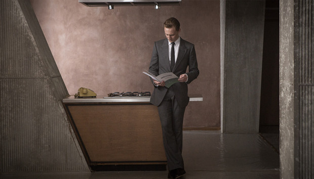
And so does the sense that High-Rise is driven more by Wheatley’s poster-ready striking images — a suicide falling from a high balcony in ultra slow motion, Laing expressionless and spattered with paint — than by any sort of human drives. “Laing would surrender to a logic more powerful than reason,” Hiddleston narrates, hand-waving away any irrational behavior. No one in the film really operates on reason, they just represent emotional factions. Wilder becomes a feral, untrustworthy spirit of the denied and oppressed. Ann becomes an equally monstrous symbol of the selfish, out-of-touch aristocracy that actively enjoys spitting on everyone below them. Both sides are poisonous. Laing isn’t an innocent caught in the middle, he’s desperately looking for a place to fit in, and his narrative isn’t about saving anyone, not even himself.
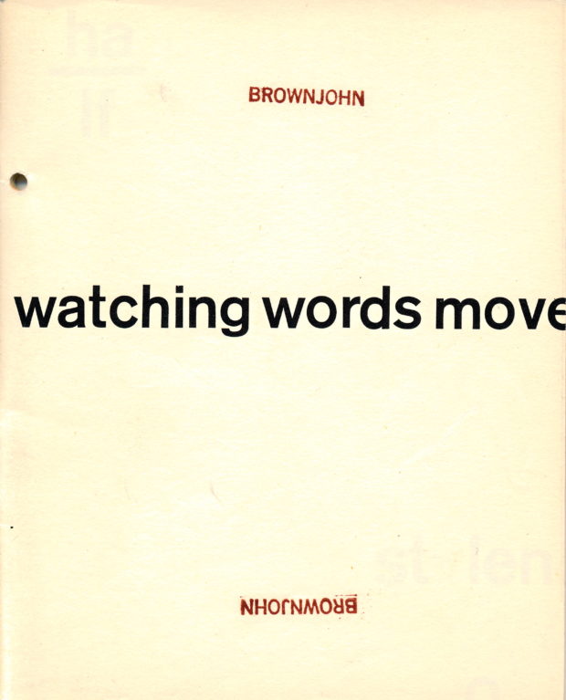
If you’re unfamiliar with Brownjohn’s work, I would also recommend picking up a copy of Sex and Typography, Emily King’s book on the designer published by Princeton Architectural Press a few years back.
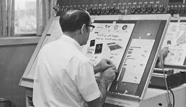
Before the desktop computer revolutionized the way the graphic design industry worked, type and image were painstakingly put together by hand with the aid of various ingenious machines and tools.
Currently in production, the documentary, Graphic Means explores graphic design production of the 1950s through the 1990s—from linecaster to photocomposition, and from paste-up to PDF.
It looks fascinating:
You can support the production the film by pre-ordering a copy from the Graphic Means website.
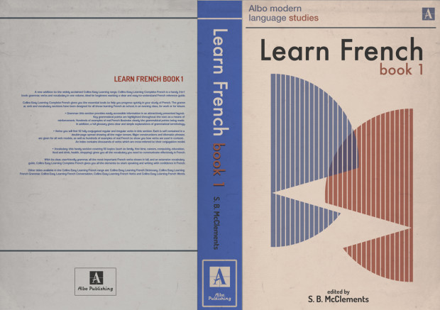
I’m a bit late to this, but the Creative Review talked to graphic artists Michael Eaton and Felicity Hickson about their fantastic looking work on Ben Wheatley’s film adaptation of J.G. Ballard’s High-Rise, which included designing book covers, record sleeves, cigarette packets, supermarket products and apartment plans…
ME: It was a really fun one – from a design point of view, everything just looked so cool from that time. One of the first things I did was the Learn French book… I looked at old 70s school textbooks. And quite early on with Felicity, we worked out what the main fonts of the film would be.
We had fonts on the office wall that Ben and Mark Tildesley, the production designer, liked – certain things would have their own font; the high rise itself, the supermarket and everything had a sort of ‘brand’ within the building. So from the start, you were aware of how you could stick to a certain aesthetic. Then you’d be given your task by the set decorator [Paki Smith] from the script.
FH: We had a few references, but [for the supermarket] Paki had the wonderful idea of using colour as the main graphic; so you’d have these blocks of colour. We did blocks of products, so as you went down the aisle, rather than seeing individual products you saw bold, graphic shapes. It wasn’t a line of ten different brands on the shelf, you had all these own-label ‘Market’ brands. It was a ‘stylised’ view of dressing.
ME: We realised when we saw the shelves just how much it would take to fill the space. We looked at references for that – Andreas Gursky’s shots of supermarkets with loads of repeats of the same packaging, that was the starting point. We also looked at old images of phone books, any kind of instructional manual, toy kits.
We looked at covers of things, such as Penguin books and magazines. Also, the buyers on the film would be out buying props and every so often they’d come in with, say, a box of comics, or TV guides from the 70s. So we had all this great stuff lying around the office we could look through.
At the Paris Review blog, Henry Giardina considers the relationship between film director Fritz Lang and writer Thea von Harbou, with particular reference to their adaptation of the epic poem Die Nibelungenlied for the screen:
Fritz Lang and Thea von Harbou weren’t collaborators so much as co-conspirators: they had one of the strangest, most fruitful partnerships in the history of film, an erotic and artistic alliance that helped the new medium establish an emotional and political grammar. In the course of their eleven-year marriage, the pair, who met in 1920, made roughly a dozen films, often with Von Harbou writing the screenplays—adapted largely from her own work—and Lang in the director’s chair. They shared an expressive aesthetic vision, an exacting work ethic, and an almost tyrannical unwillingness to compromise with others. They changed people’s minds about their movies and, in radical ways, they changed each other. Their dedication manifested in odd ways—even though, a year into their affair, the bloom had already gone off the rose, they continued to live together, work together, and keep up the pretense of monogamy for another decade. She looked past his philandering; he looked past her increasingly fascist politics; they kept a full calendar. “We were married for eleven years,” von Harbou said later, “because for ten years we didn’t have time to divorce.”
I haven’t seen Star Wars: The Force Awakens, and I’ve been surprised by my own ambivalence towards it. But as someone who was almost exactly the right age for the original trilogy (give or take a year or two) — and still has a slightly morbid fascination with Star Wars as a cultural phenomenon — I’ve managed to read rather a lot about it.
I particularly enjoyed two articles specifically about The Force Awakens. First off, there’s Aaron Bady’s essay Our Star Wars Holiday Special for The New Inquiry:
Every beat in The Force Awakens reminds you that you are watching fan service. It recycles the original Star Wars with the same shameless and joyous abandon that the original trilogy “recycled” chanbara samurai movies, WWII movies, pulp sci-fi, and anything else that George Lucas happened to come across and devour. And this point is worth underscoring: Lucas gobbled up and digested so many different pop cultural predecessors, and did it so directly and shamelessly, that to subject any of the resulting crap to standards of originality is to fundamentally misunderstand how it works, or why. The man literally cut together footage from WWII fighter pilot films and then re-shot it as space battles; his first treatment actually plagiarizes Donald Richie’s description of The Hidden Fortress. But to accuse him of “plagiarism” is like accusing him of making a movie. If it felt good, he released it, and that’s Star Wars: sensation and feeling without thought or coherence. Star Wars is the indescribable goodness of the images and sounds, and the way that goodness overwhelms and digests the rest of it. Star Wars misses the target if it aims. Just let go, Luke. Trust yourself.
Critics have blamed J.J. Abrams, or George Lucas, or Disney (as Lucas and Michael Hitzlik have) for the film’s lack of novelty, but whomever they’ve singled out, the range of causes has been far too narrow, locating responsibility within the production narrative of The Force Awakens. That’s typical. For decades Star Wars has inspired a strangely blinkered sort of criticism that leans on the franchise’s unique success and Lucas’s unique authority to justify treating it as somehow apart from Hollywood as a whole. It has been seen as responsible for the end of The ’70s, but somehow not the product of that ending. Worse, Lucas’s own cod-Jungian narrative theory has governed the understanding of the films’ stories to the exclusion of changes in Hollywood storytelling over the same period.
As a result, criticisms — or defenses — of Star Wars’s narrative retreading are misguided, not because the film is narratively innovative, but because critics continue to regard it as far more immune to the broad tendencies in big-budget Hollywood filmmaking than it is now or ever was.
Both articles probably contain spoilers (if that matters to you), and although neither one convinced me that I must actually go see The Force Awakens, they seem to be clear-eyed assessments of where it sits vis a vis the original film.
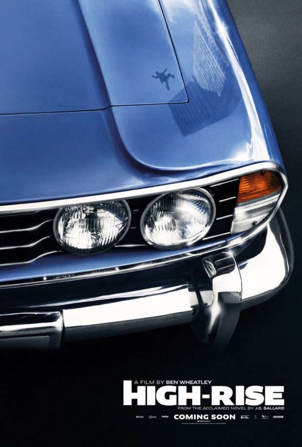
Although the early reviews have not been especially kind to the Ben Wheatley film adaptation of J.G. Ballard’s High-Rise, the trailer looks amazing. The Anthony Royal Architecture website is also a nice touch.
Because film is a visual medium, each project comes with an established aesthetic, which for a designer can be inspiring but also sometimes limiting. The challenge is in figuring out how best to channel that aesthetic—either by distilling it down to a single still composition, or somehow bouncing off of it in an interesting way.
I try not to make such a strong distinction between “illustration” and “design.” Almost everything I make involves some custom-created components, whether it’s type or image or decorative elements or whatever, so for me it’s not such a hard line between the two disciplines. Whatever technique will best solve a problem—assuming it’s within the limits of my abilities—I’ll give it a try.
Because we have access to such great films, we’re lucky enough to be able to call on the best illustrators in the world to work on them, so really it’s total hubris that I ever design anything myself. When I draw something myself, it’s usually because I have such a strong, specific idea of what it has to be that I would be literally dictating exactly what to draw and how, which is no fun for anyone. You’ve got to leave room for the artist to surprise you, otherwise why bother?
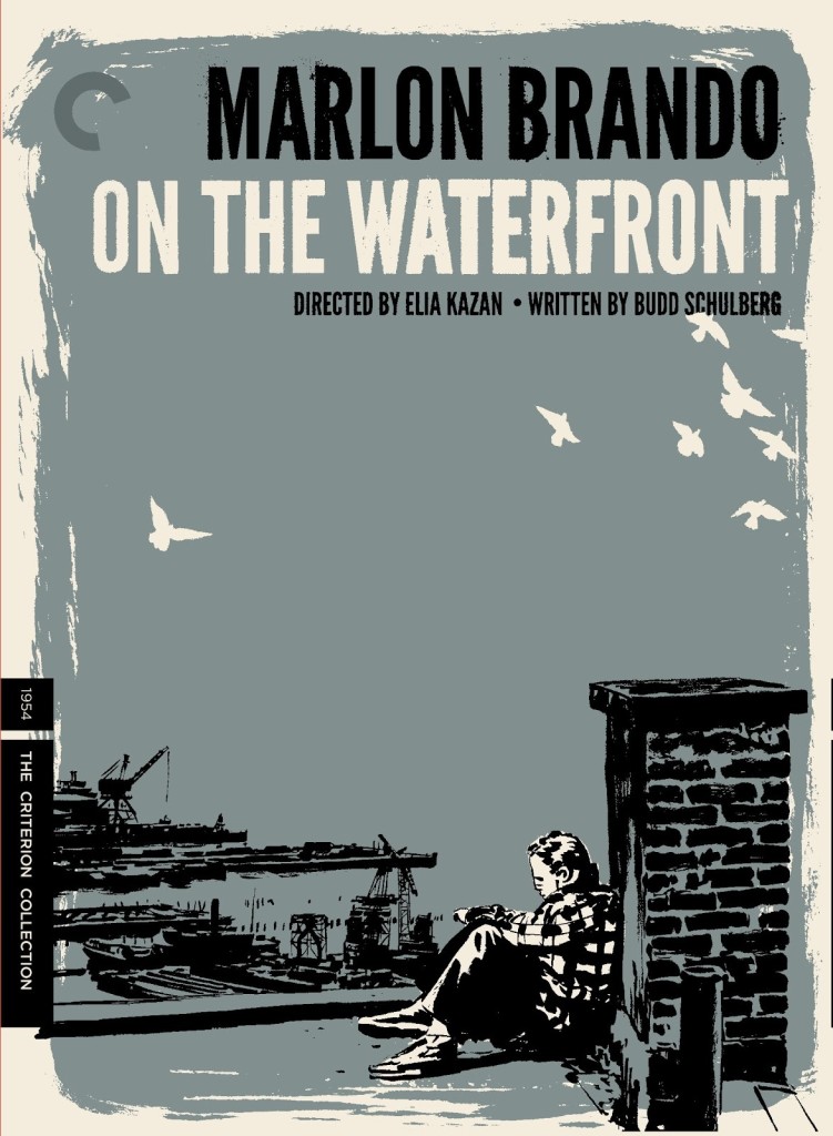
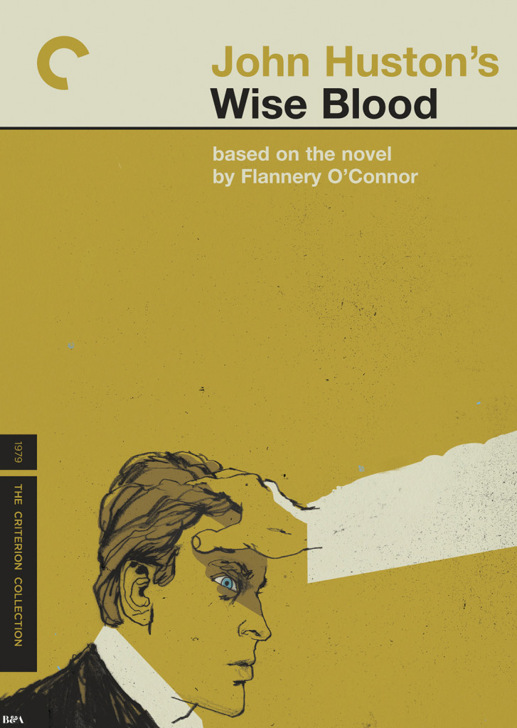
And on Newman’s own blog, Skillman selects his 10 favourite Criterion DVD covers.
In a fascinating piece for the Paris Review, art director and book designer Charlotte Strick talks to the Criterion Collection’s head art director Sarah Habibi, and designer/art director Eric Skillman about their work:
“There are cases where everyone thinks of a movie in one way, but Criterion feels the director was aiming to say something different than what is typically thought. So for us, it’s about repositioning the film to show that it’s not actually the film that marketing people said it was all those years ago.” Package design can do a lot of this work. Instead of traditional marketing meetings, Criterion holds what they call “brief meetings,” in which the staff reviews a film’s historical significance—where it occurred in the director’s career, its genre, the political climate, and so on. After a brief, they typically have two to three weeks for initial cover sketches. Habibi referred to this as “the heavy lifting period,” in which they aim to nail down the look and style they’re after. Once a cover direction has been selected, another three months is spent refining the artwork and carrying the visual language throughout the entire package so that the design feels truly unified. Design by committee, Habibi insisted, never produces the most inspired work, so to ensure that the designs don’t become muddled by too many voices, they strive to keep the approval process as simple as possible and the meetings quite intimate with only the art department, the in-house producer, and the most senior staff weighing in.