In this short video for the BBC, designer Robert Green talks about his reconstruction of the lost Doves Press typeface:
Comments closed
Published March 18, 2015
Books, Design and Culture
In this short video for the BBC, designer Robert Green talks about his reconstruction of the lost Doves Press typeface:
Comments closed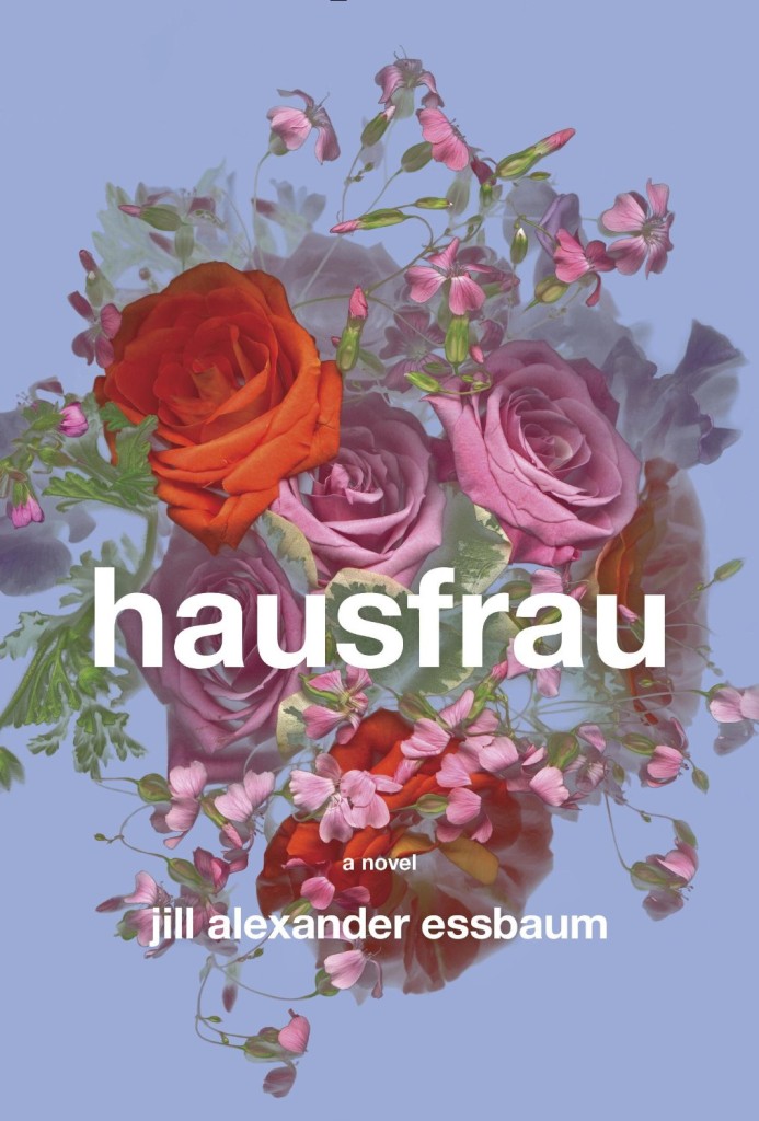
If you’ve ever wondered quite how many iterations a cover can go through before the final one is chosen, this video cycles through a multitude of design ideas for the US edition of Hausfrau by Jill Alexander Essbaum published by Random House this month:
“I worked with five designers, one illustrator and two letterers on more than a hundred versions of the jacket,” Robbin Schiff, executive art director at Random House, told Mashable. “The final design, with its stark Swiss typography against the moody and lush floral grouping, conveys a sensual but claustrophobic atmosphere”.1
And, if you’re interested, you also read about the cover of the UK edition created by Maricor/Maricar (pictured below) on the Picador Blog. The whole process sounds a little less… fraught.
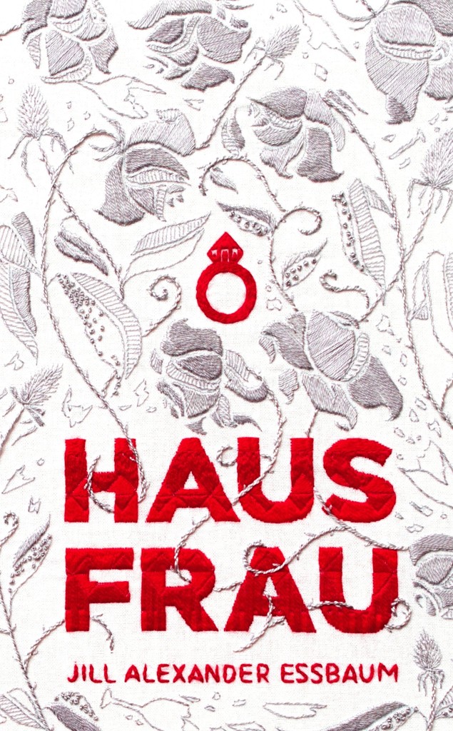
UPDATE: Thank you to the folks at Random House for letting me know that the final cover for the US edition was designed by the talented Gabrielle Bordwin. The video was created by Caroline Teagle.
1 Comment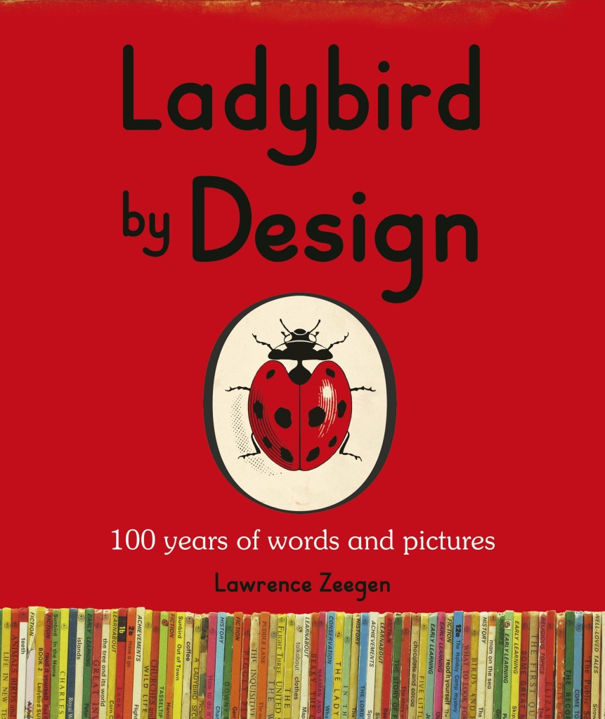
As previously mentioned, Ladybird By Design is an exhibition of over 200 of original book illustrations from the late 1950s to early 1970s currently on display at the De La Warr Pavilion in Bexhill on Sea.
In this short film, Lawrence Zeegen, curator of the exhibition and author of the accompanying book, and Jenny Pearce, daughter of former Ladybird editorial director Douglas Keen, talk about the history of Ladybird and what made the books so special:
Comments closed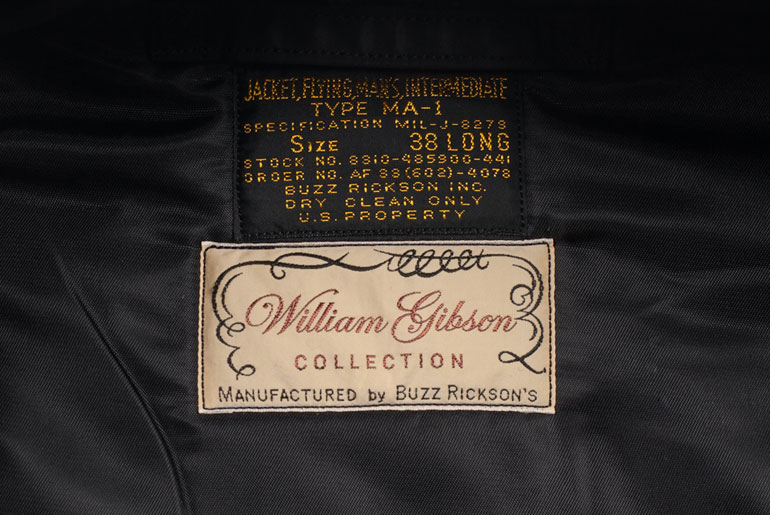
I’d be the first to admit that I didn’t really get on with William Gibson’s latest novel The Peripheral, but I really enjoyed his ‘Blue Ant’ trilogy — Pattern Recognition, Spook Country, and Zero History.
Interestingly, the (fictional) Buzz Rickson MA-1 flight jacket worn by Cayce Pollard, the protagonist in Pattern Recognition, led to the Japanese clothing company working with Gibson to manufacture a line of clothes (including the aforementioned black MA-1) inspired by the author. In this fascinating interview with Rawr Denim, the author discusses Buzz Rickson, Japanese pop culture, workwear, authenticity and more:
Comments closed“Authenticity” doesn’t mean much to me. I just want “good”, in the sense of well-designed, well-constructed, long-lasting garments. My interest in military clothing stems from that. It’s not about macho, playing soldiers, anything militaristic. It’s the functionality, the design-solutions, the durability. Likewise workwear.
Military clothing is built to strict contract, but with the manufacturer cutting ever corner they can without violating the specifications. The finishing on a Rickson reproduction is exponentially superior to the finishing on most of the originals, and I’d much rather have a brand-new exact copy that’s more carefully assembled…
…[In] 1947 a lot of American workingmen wore shirts that were better made than most people’s shirts are today. Union-made, in the United States. Better fabric, better stitching. There were work shirts that retailed for fifty cents that were closer to today’s Prada than to today’s J.Crew. Fifty cents was an actual amount of money, though. We live in an age of seriously crap mass clothing. They’ve made a science of it.
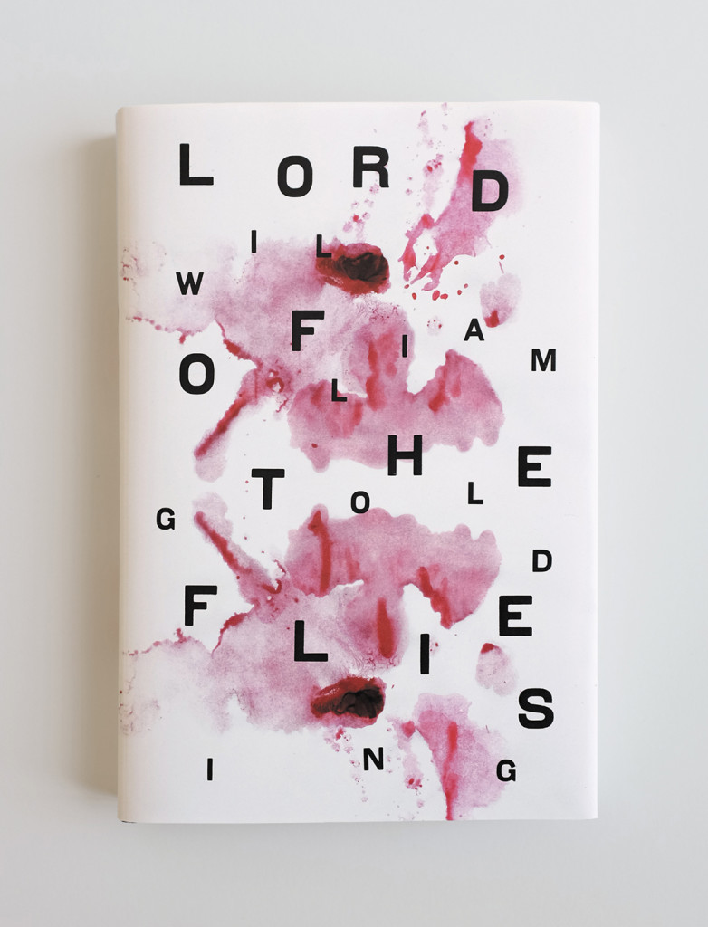
At the AIGA’s Eye on Design blog, Margaret Rhodes talks to Jason Booher, art director of Penguin imprint Blue Rider Press, about book cover design:
Comments closedThe key to creating stellar covers, according to Booher, is to first throw out the tired adage about not judging books by them. “Graphic design is really about selling things,” he says. Lest that sound soulless, the good news here is that Booher is selling other people’s creative ideas. And while every book is unique, Booher says he starts by reading the six or so manuscripts he gets per season, and then mentally digests them all. “You read it, you try and find the soul of the book, something that makes it special, and make it come alive,” he says.
Congratulations to all the winners at last night’s Academy of British Cover Design Awards!
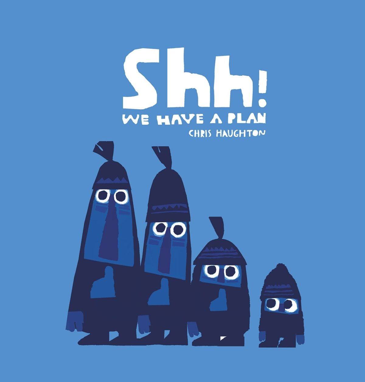
Shh! We Have a Plan by Chris Haughton; design by Chris Haughton (Walker Books / March 2014)
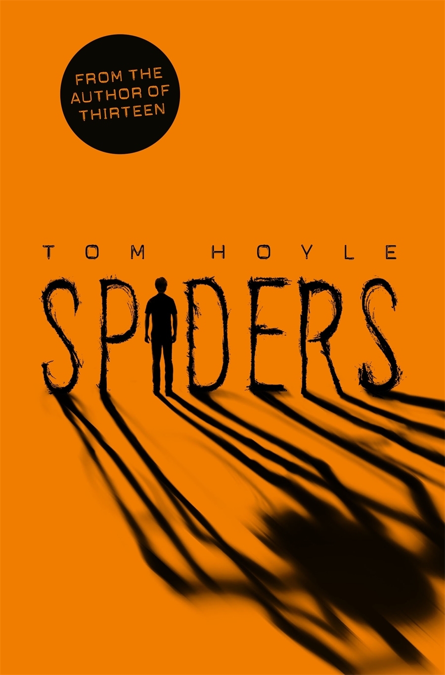
Spiders by Tom Hoyle; design by Rachel Vale; illustration by Sam Hadley (PanMacmillan / November 2014)
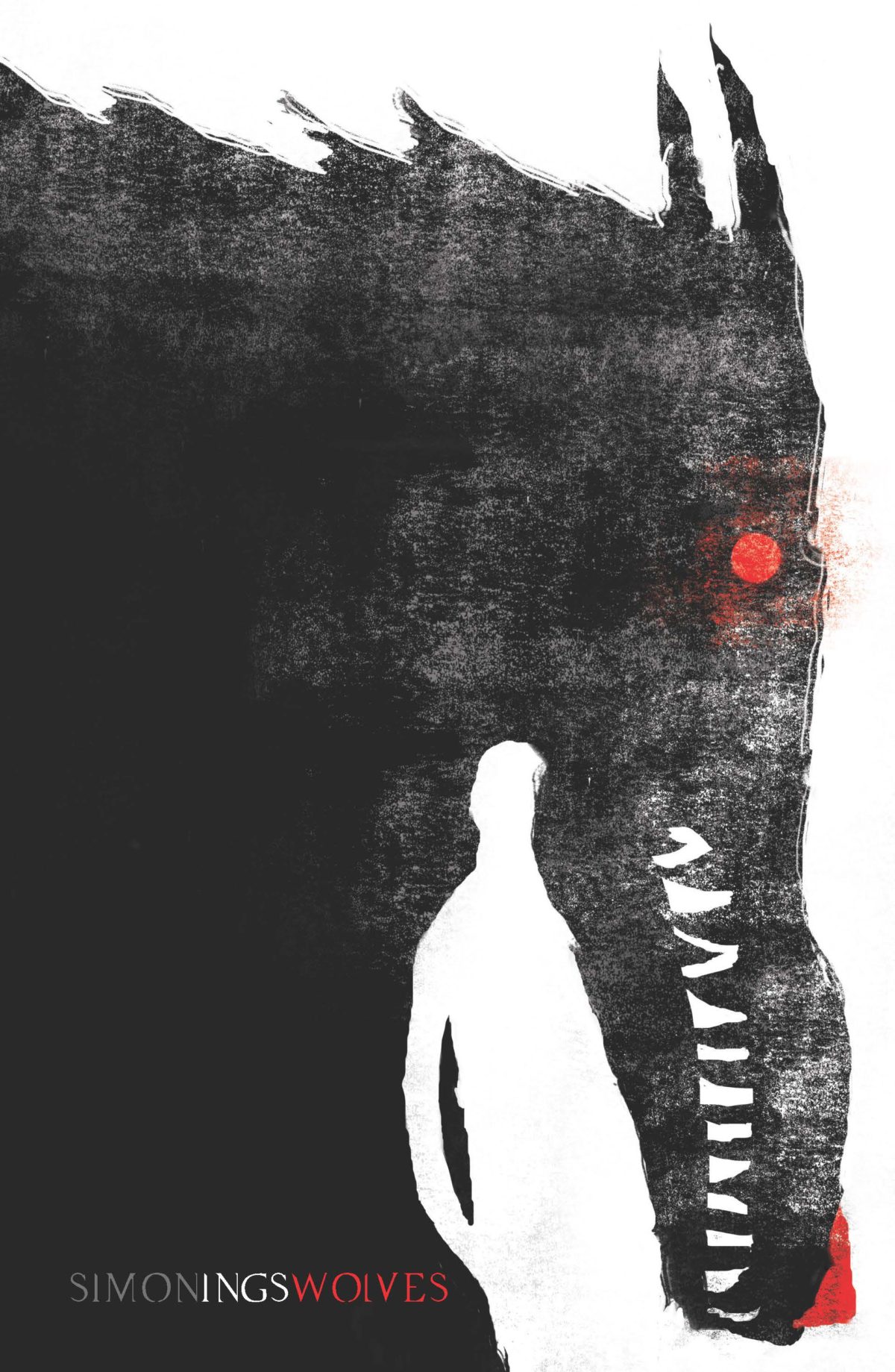
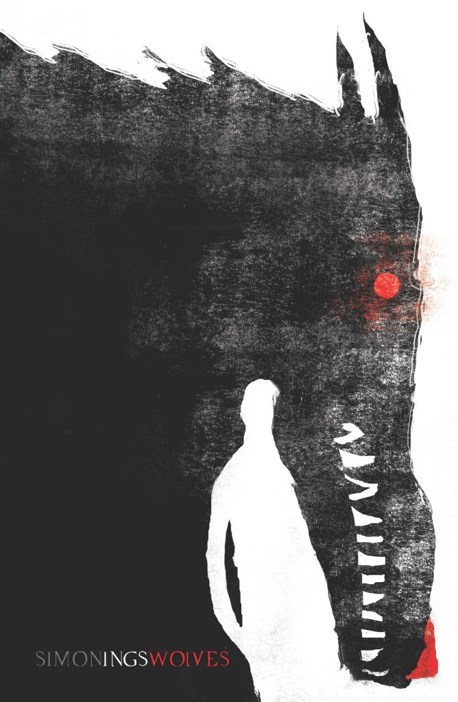
Wolves by Simon Ings; design by Nick May; illustration by Jeffery Alan Love (Gollancz / January 2014)
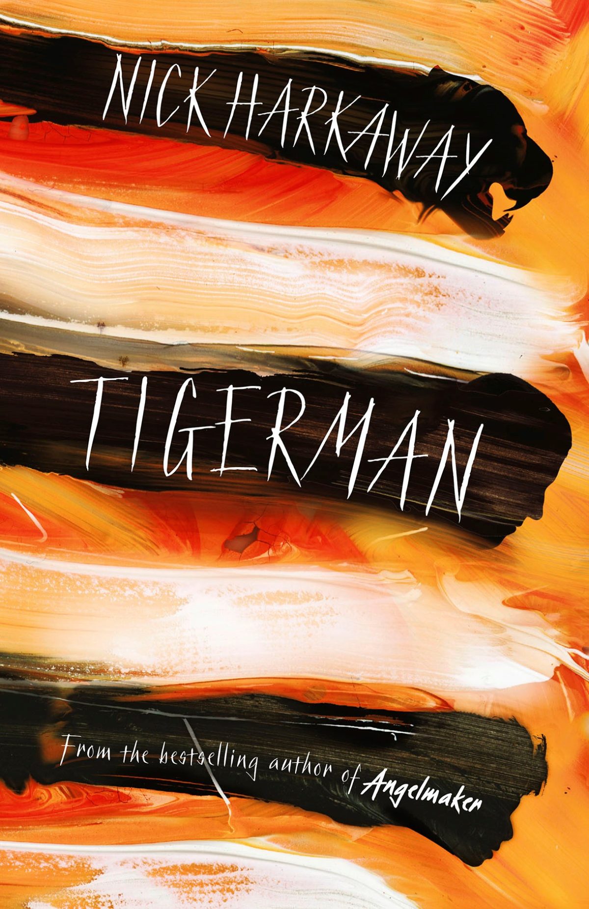
Tigerman by Nick Harkaway; design Glenn O’Neill (William Heinemann / May 2014 )
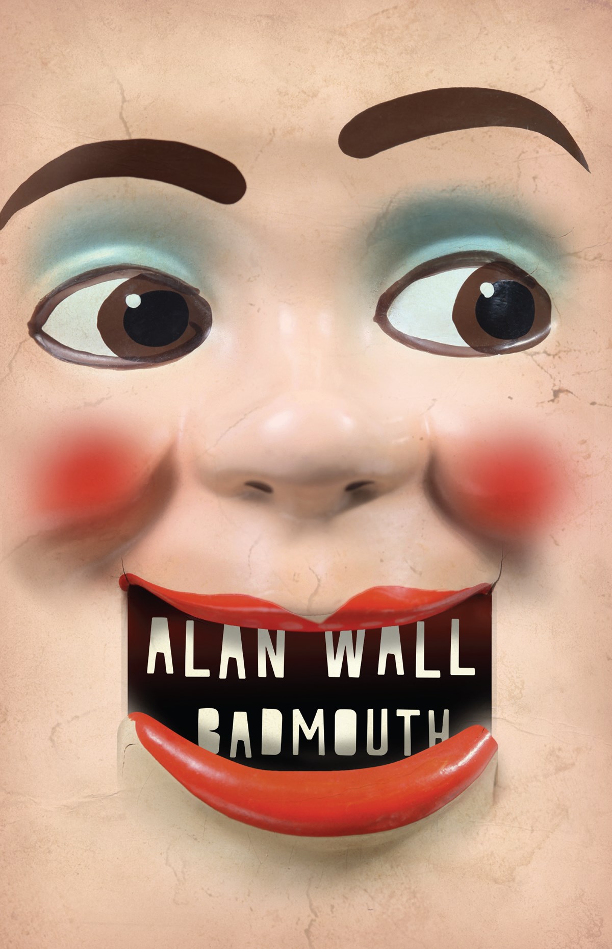
Badmouth by Alan Wall; design by Jamie Keenan (Harbour Books / January 2014)
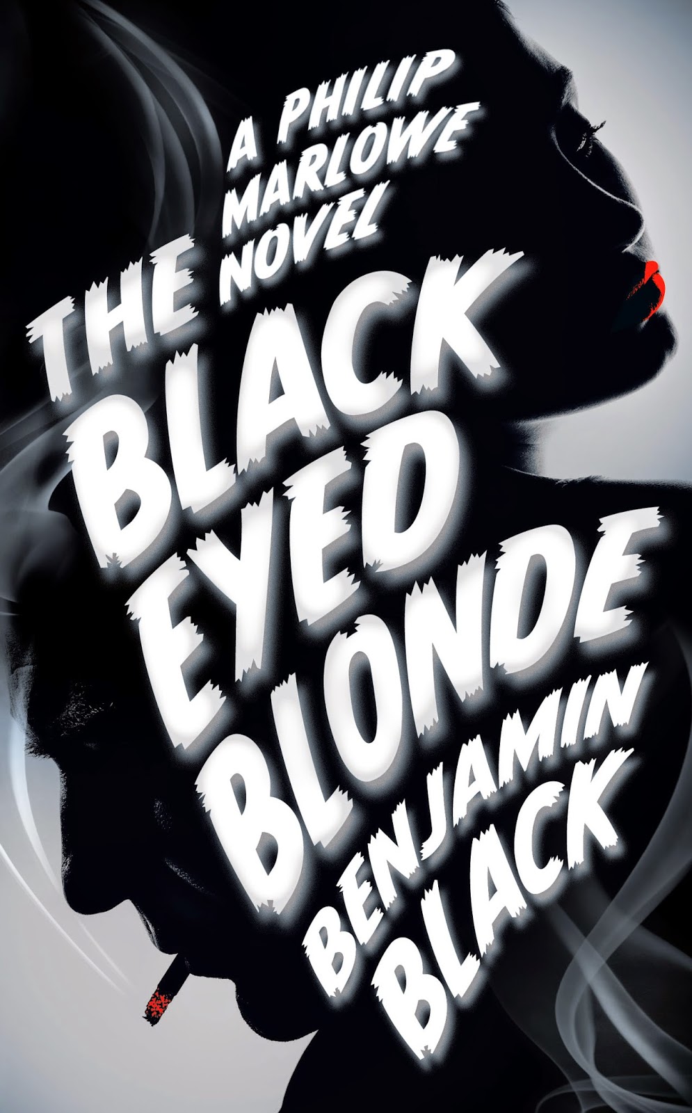
The Black Eyed Blonde by Benjamin Black; design by Jonathan Pelham (Mantle / February 2014)
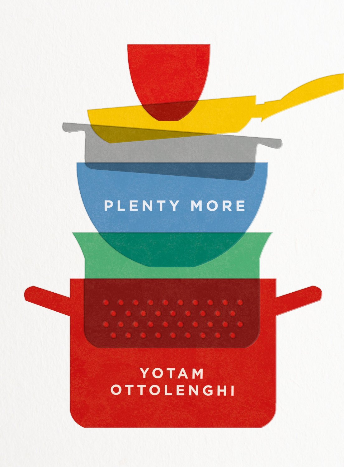
Plenty More by Yotam Ottolenghi; design by by Caz Hildebrand and Sakiko Kobayashi / Here Design (Ebury Press / September 2014)
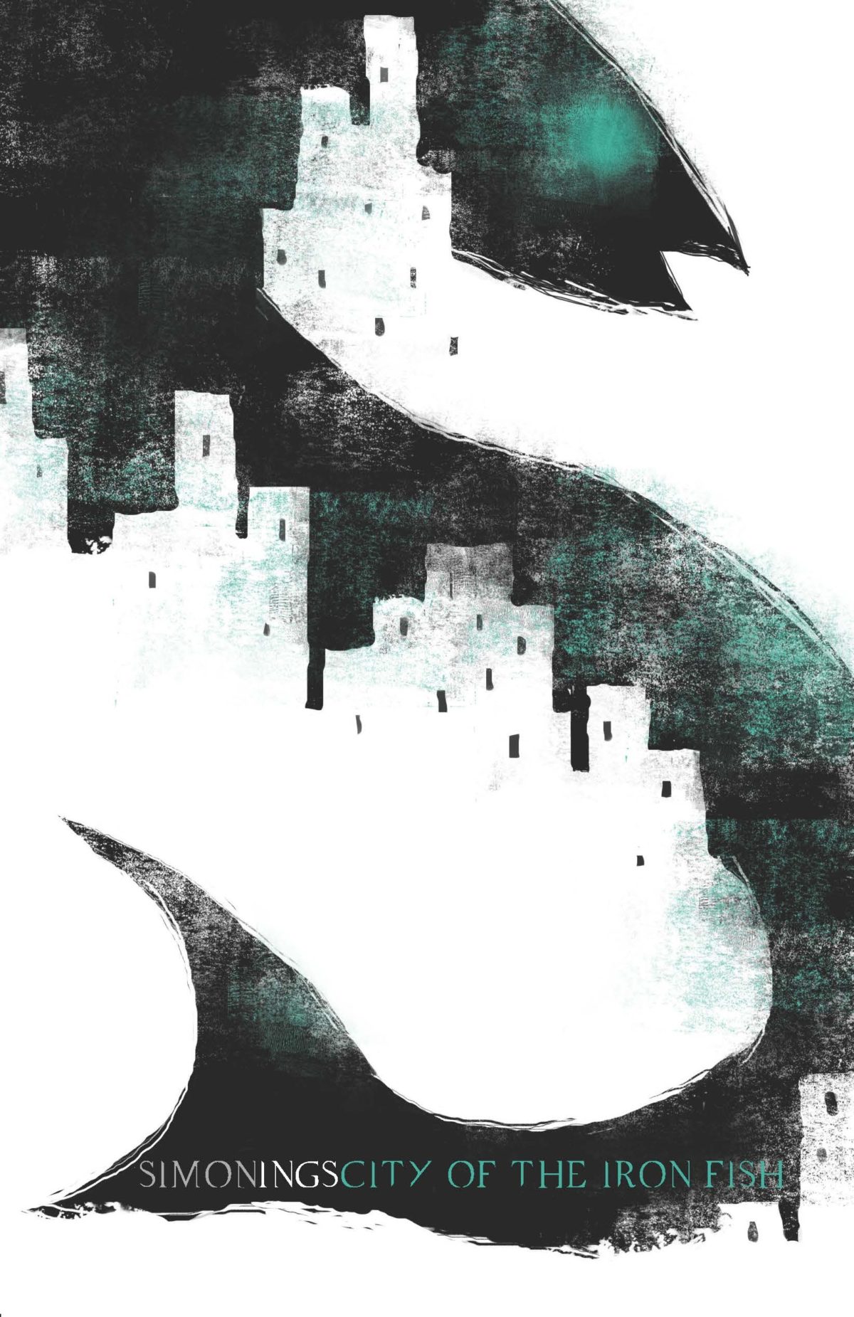
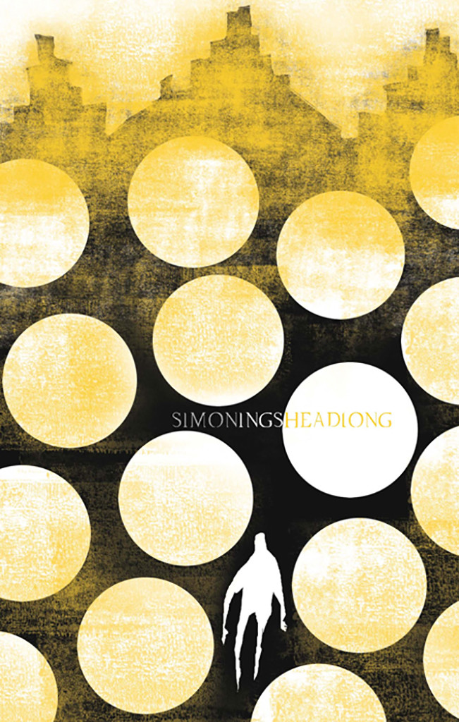
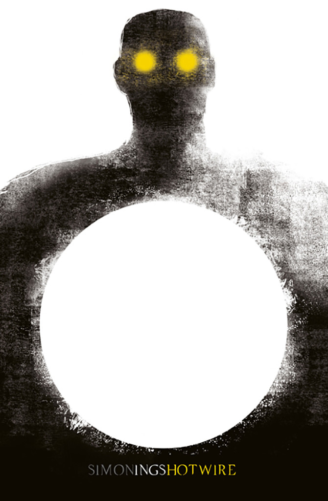
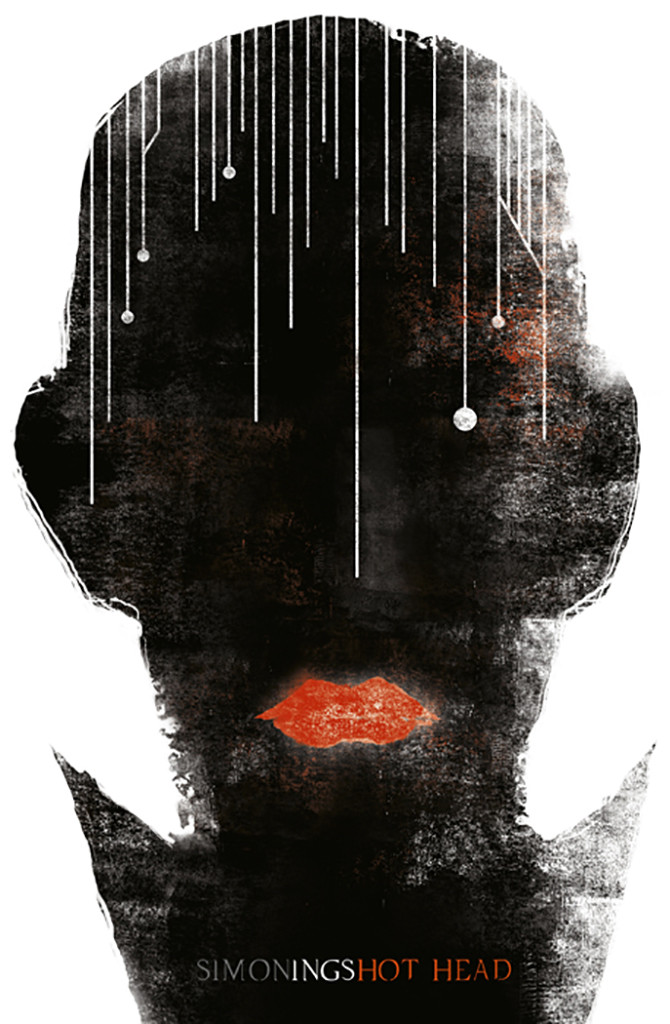
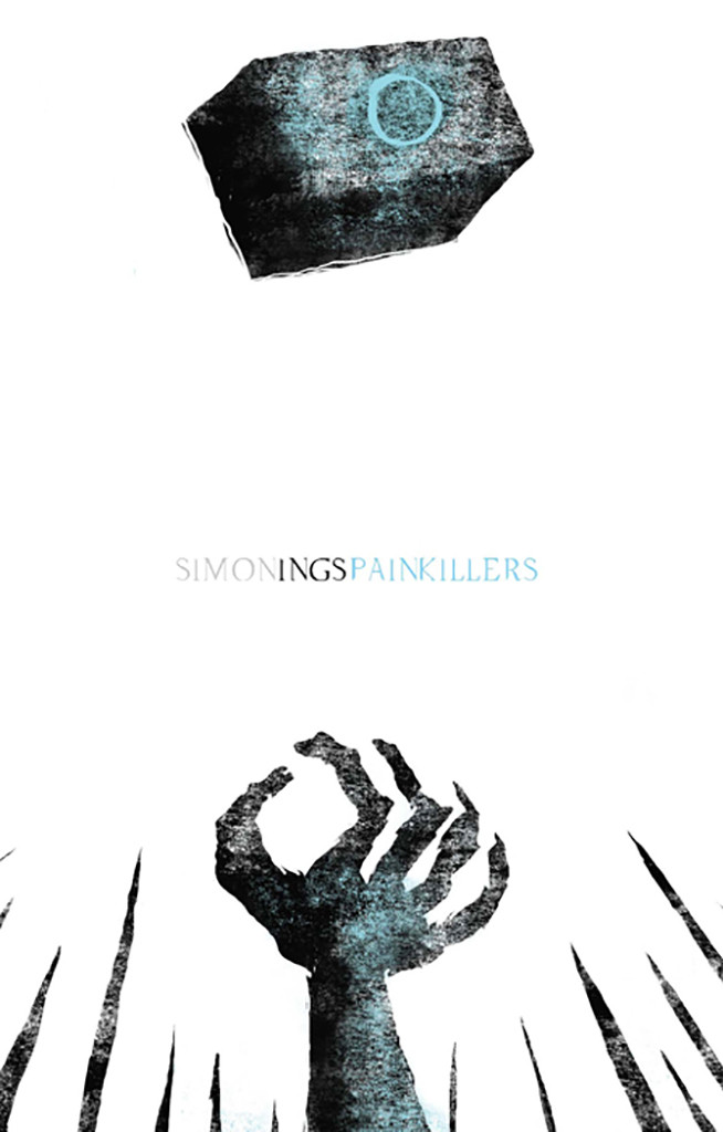
Gollancz Simon Ings; design by Nick May; illustration by Jeffery Alan Love
(Above: City of Iron Fish. Gollancz / April 2014 )
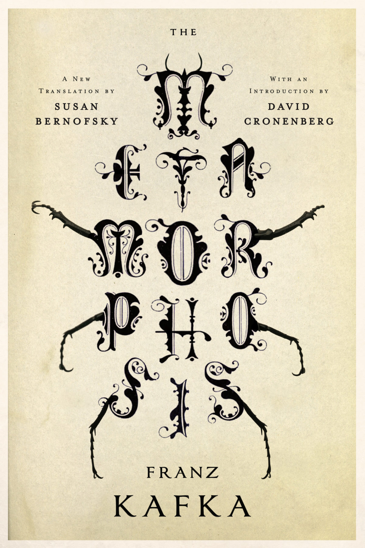
Metamorphosis by Franz Kafka; design by Jamie Keenan (W. W. Norton / February 2014)
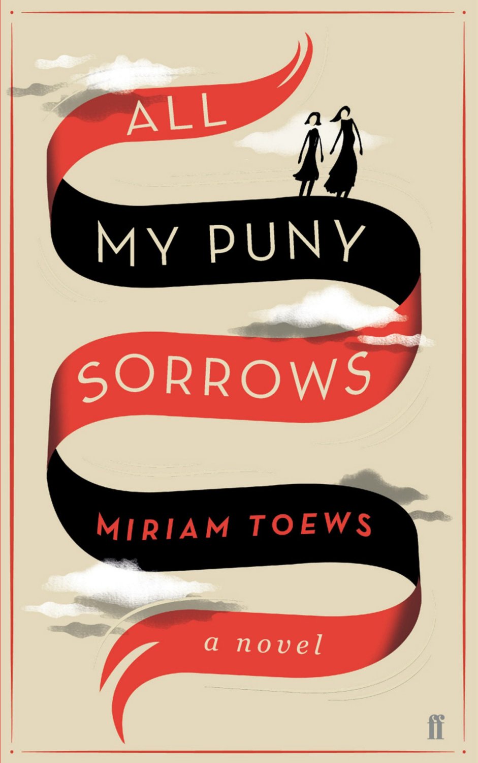
All My Puny Sorrows by Miriam Toews; design by Helen Crawford-White / Studio Helen (Faber & Faber / June 2014)
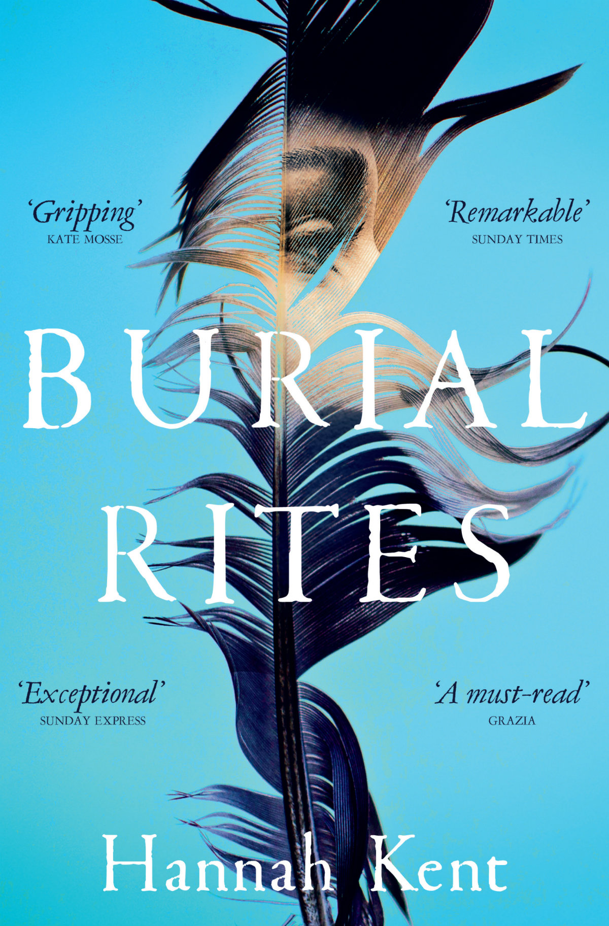
Burial Rites by Hannah Kent; design by James Annal ( Picador / March 2014 )
Well done Jon Gray and Jamie Keenan for organizing the awards. All the shortlisted covers — selected by judges Mark Ecob, Yeti Lambregts, David Mann, Richard Ogle, Donna Payne, Rafi Romaya, Henry Steadman, Jim Stoddart, Rachel Vale, and Claire Ward — can be found on the ABCD website.
You can see the 2014 winners here.
Comments closedHere is March’s selection of new and noteworthy covers. It’s a little bit of the Merto and Mendelsund show I’ll admit, but I assure you there really are some brilliant covers by other designers this month too!
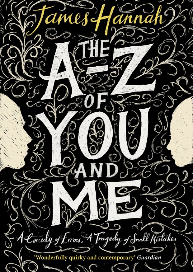
The A-Z of You and Me by James Hannah; design by Leo Nickolls (Doubleday / March 2015)
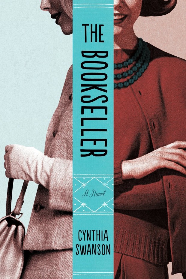
The Bookseller by Cynthia Swanson; design by Kimberly Glyder (Harper / March 2013 killed)
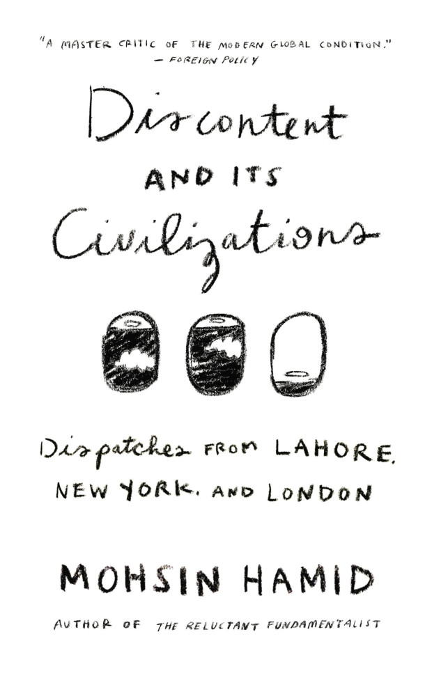
Discontent and its Civilizations by Mohsin Hamid; design by Rachel Willey (Riverhead / February 2015)
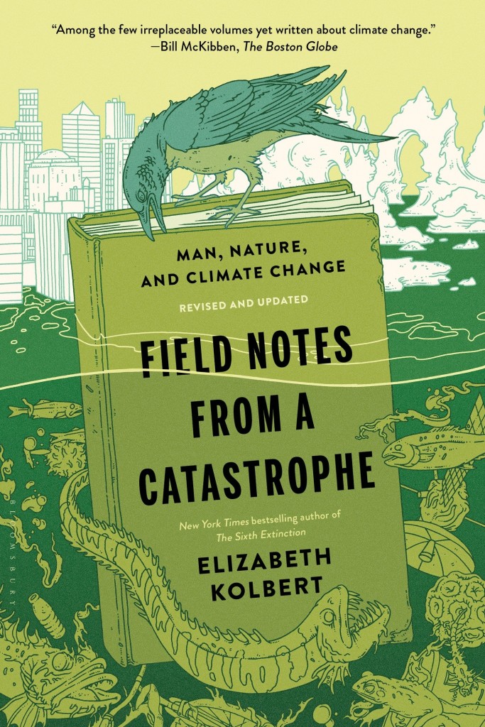
Field Notes from a Catastrophe by Elizabeth Kolbert; design by Patti Ratchford; illustration by Eric Nyquist (Bloomsbury / February 2015)
I also loved Eric’s ‘H is for Hawk’ illustration in the February 22nd edition of The New York Times Book Review.
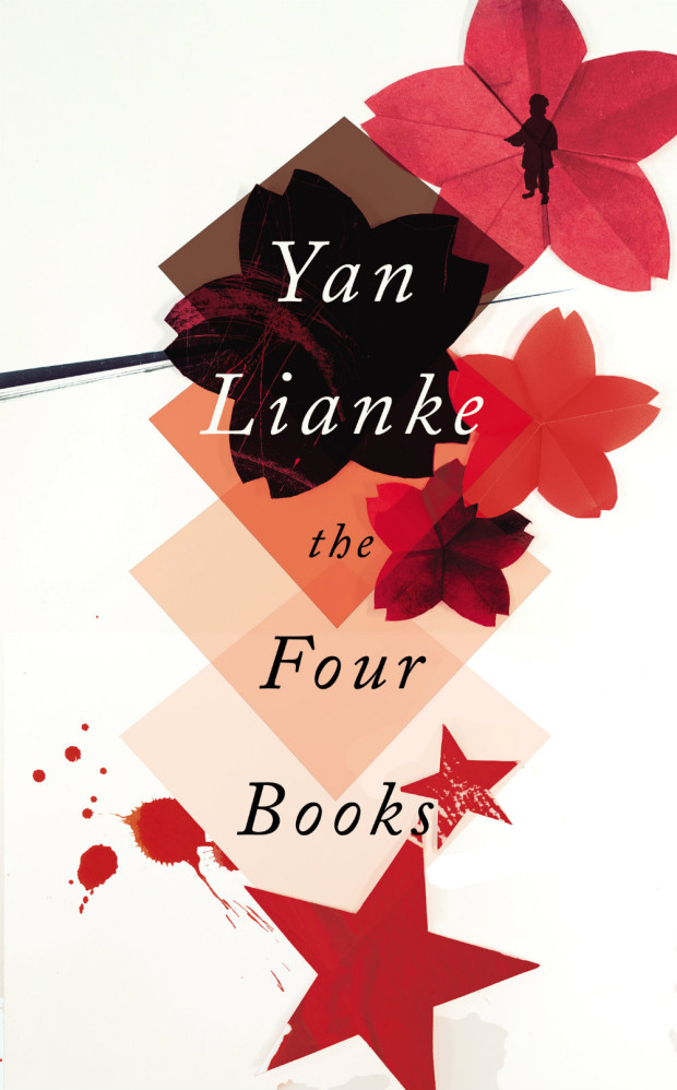
The Four Books by Yan Lianke; design by Matt Broughton (Chatto & Windus / March 2015)
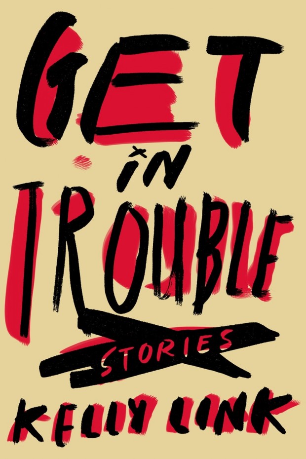
Get in Trouble by Kelly Link; design by Alex Merto (Random House / February 2015)
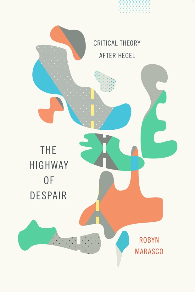
The Highway of Despair by Robyn Marasco; design by Jennifer Heuer (Columbia University Press / March 2015)
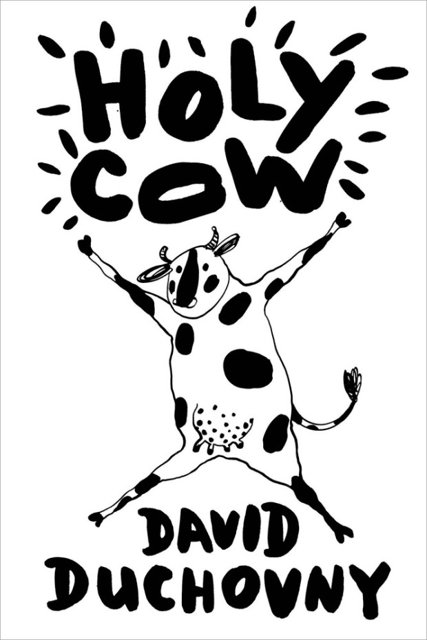
Holy Cow by David Duchovny; design by Rodrigo Corral; illustration and lettering by Natalya Balnova (Farrar, Straus & Giroux / February 2015)
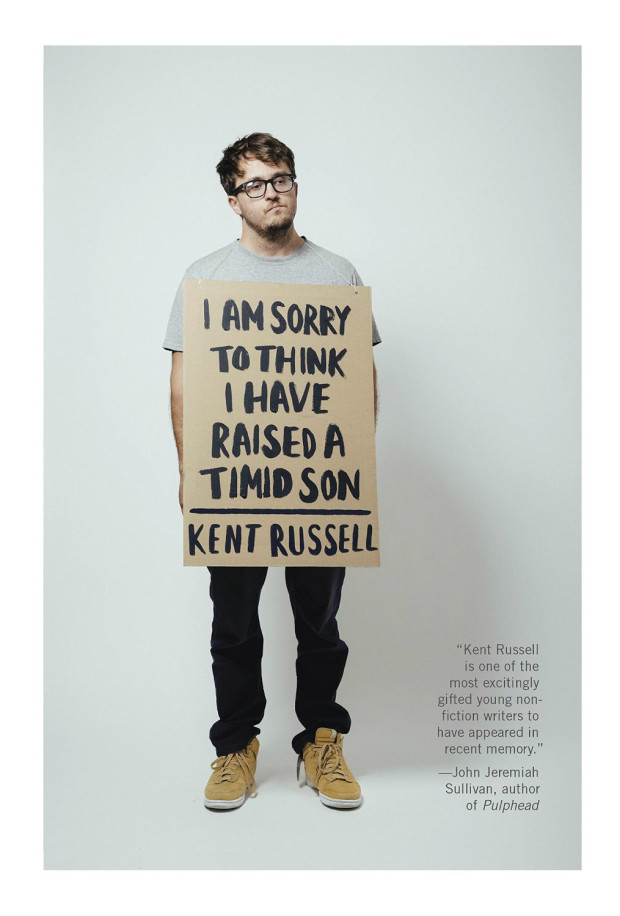
I Am Sorry to Think I Raised a Timid Son by Kent Russell; design by Peter Mendelsund; hand lettering by Janet Hansen; photography by George Baier IV (Knopf / March 2015)
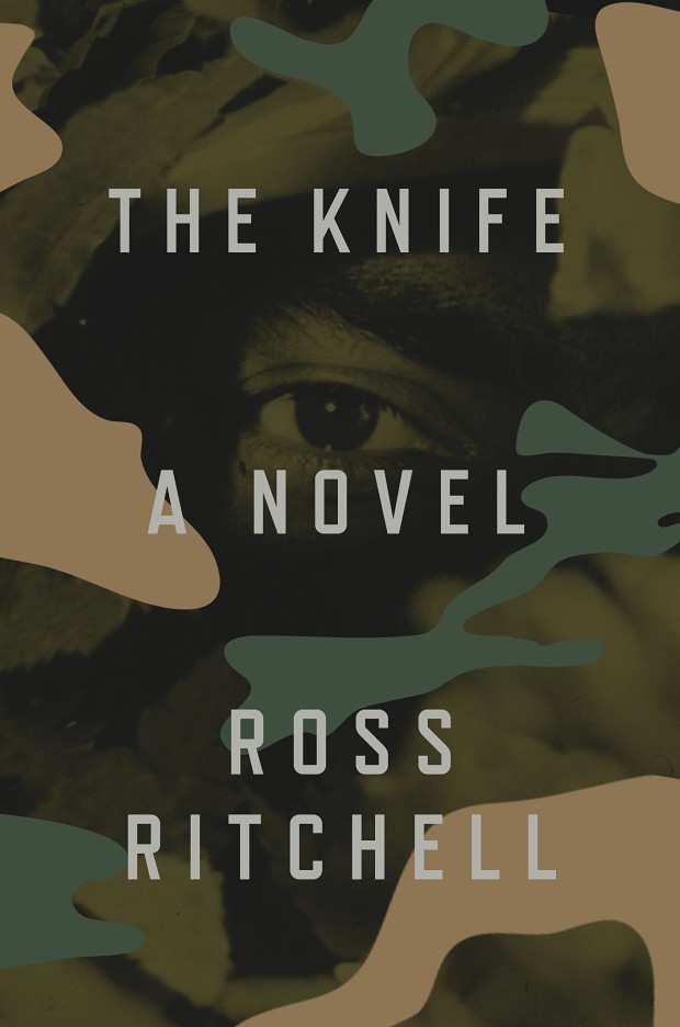
The Knife by Ross Ritchell; design by Alex Merto (Blue Rider Press / February 2015)
(Camouflage book covers are the New Thing!)
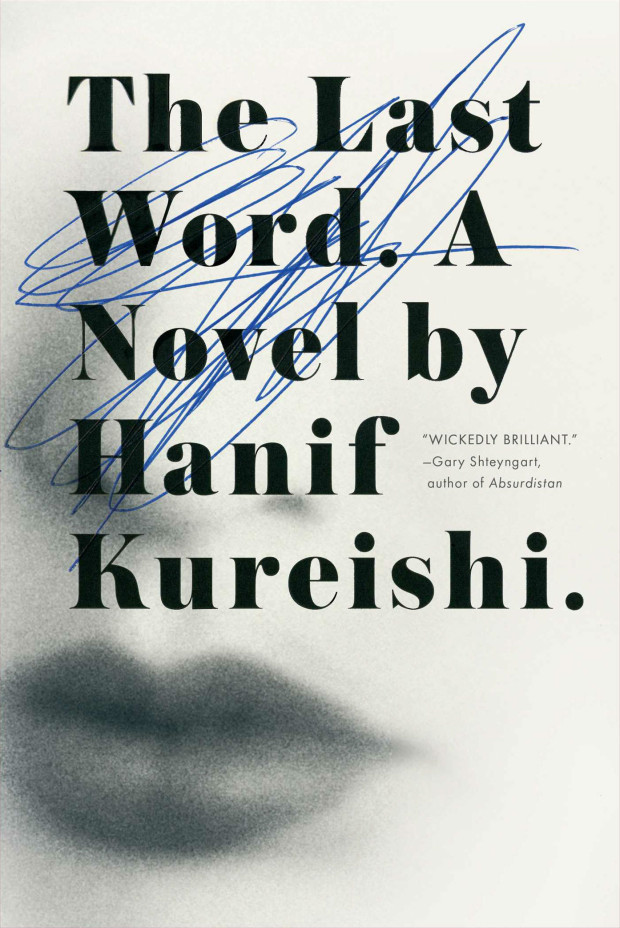
The Last Word by Hanif Kureishi; design by Jaya Miceli (Scribner / March 2015)
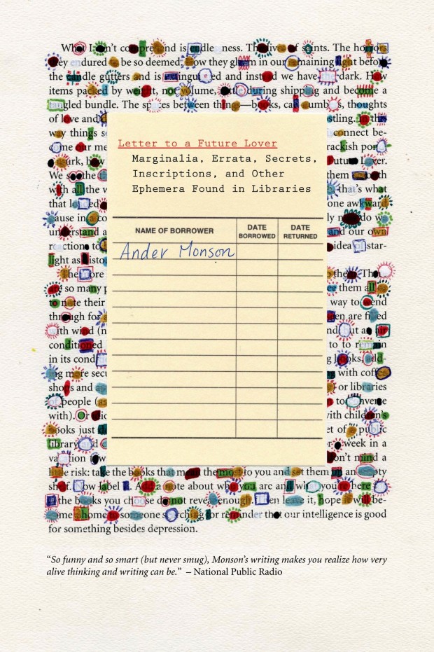
A Letter to a Future Lover by Ander Monson; design by Marian Bantjes (Graywolf / February 2015)
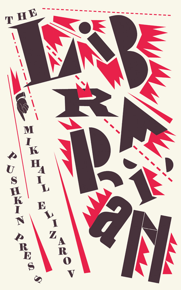
The Librarian by Mikhail Elizarov; design by David Pearson (Pushkin Press / March 2015)
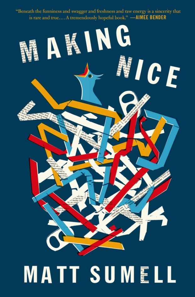
Making Nice by Matt Sumell; design by Gray318 (Henry Holt & Co. / February 2015)
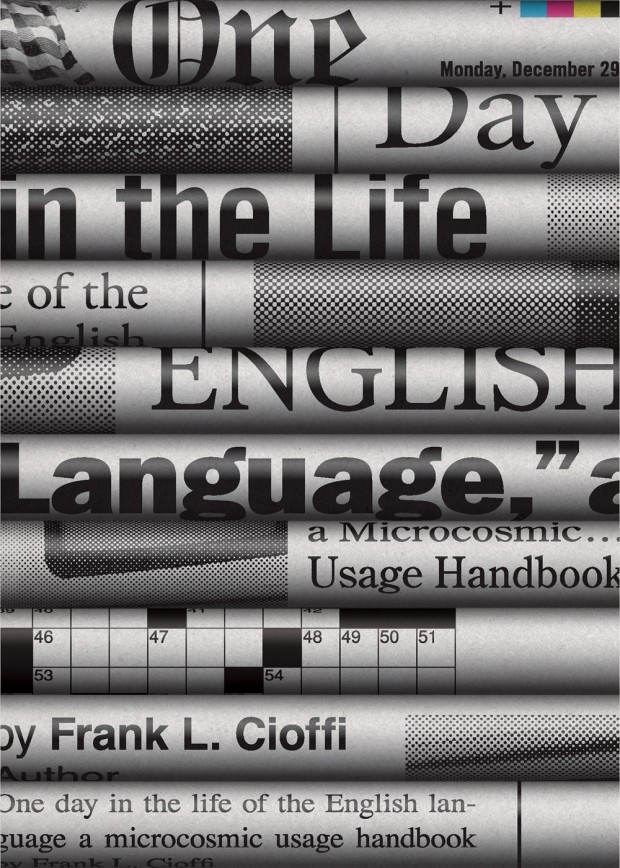
One Day in the Life of the English Language by Frank L. Cioffi; design by Chris Ferrante (Princeton University Press / March 2015)
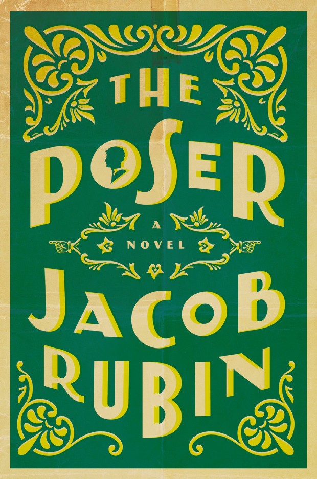
The Poser by Jacob Rubin; design by Will Staehle (Viking / March 2015)
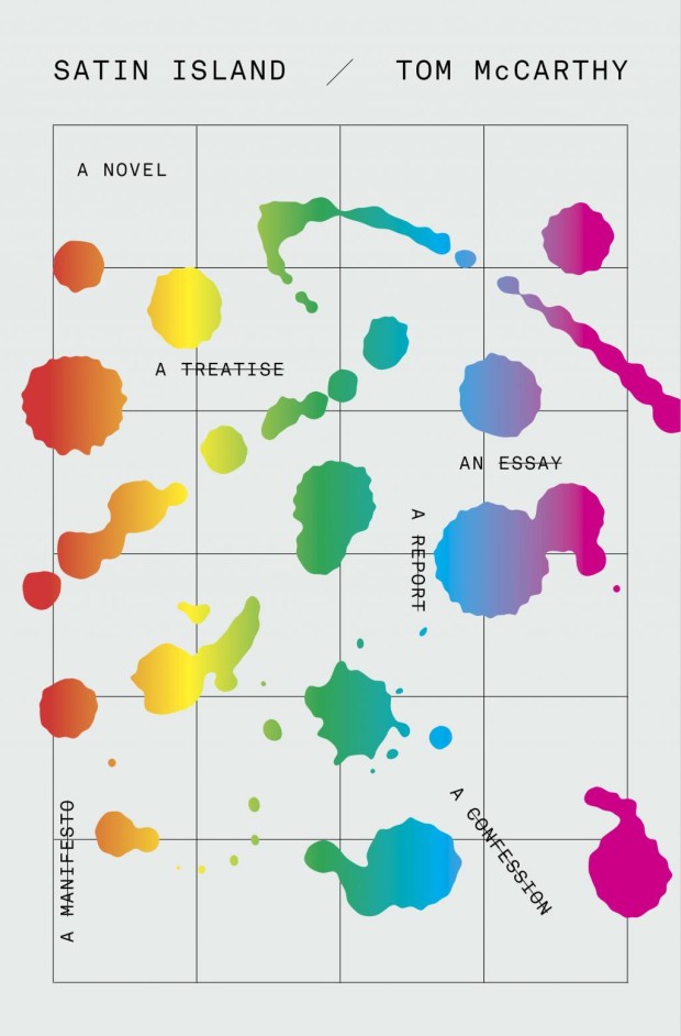
Satin Island by Tom McCarthy; design by Peter Mendelsund (Knopf / February 2015)
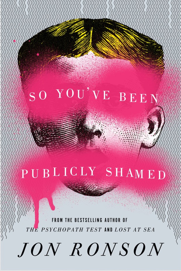
So You’ve Been Publicly Shamed by Jon Ronson; design by Matt Dorfman (Riverhead / March 2015)
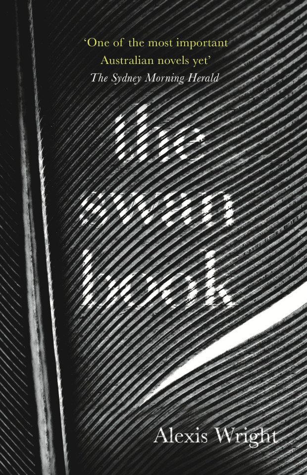
The Swan Book by Alexis Wright; design by Ceara Elliot (Corsair / March 2015)
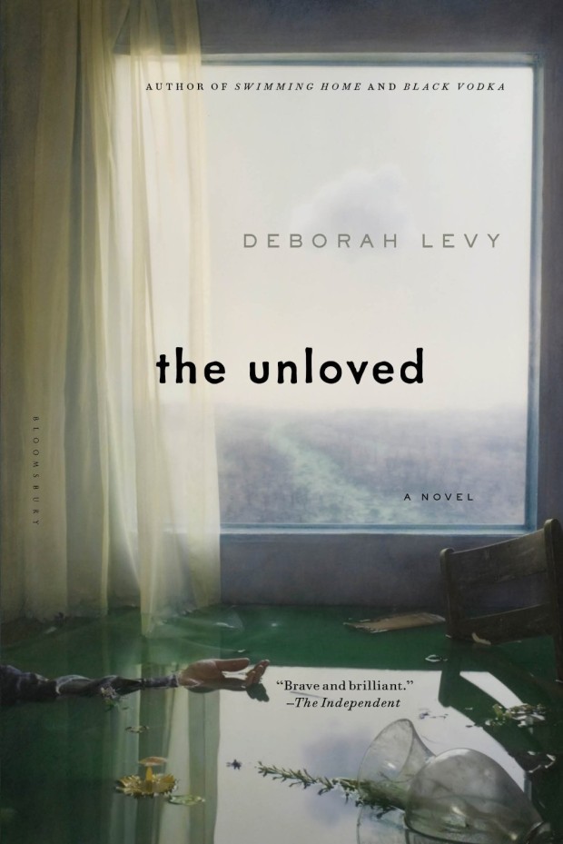
The Unloved by Deborah Levy; design by Katya Mezhibovskaya; photograph by Robert and Shana ParkeHarrison (Bloomsbury / March 2015)
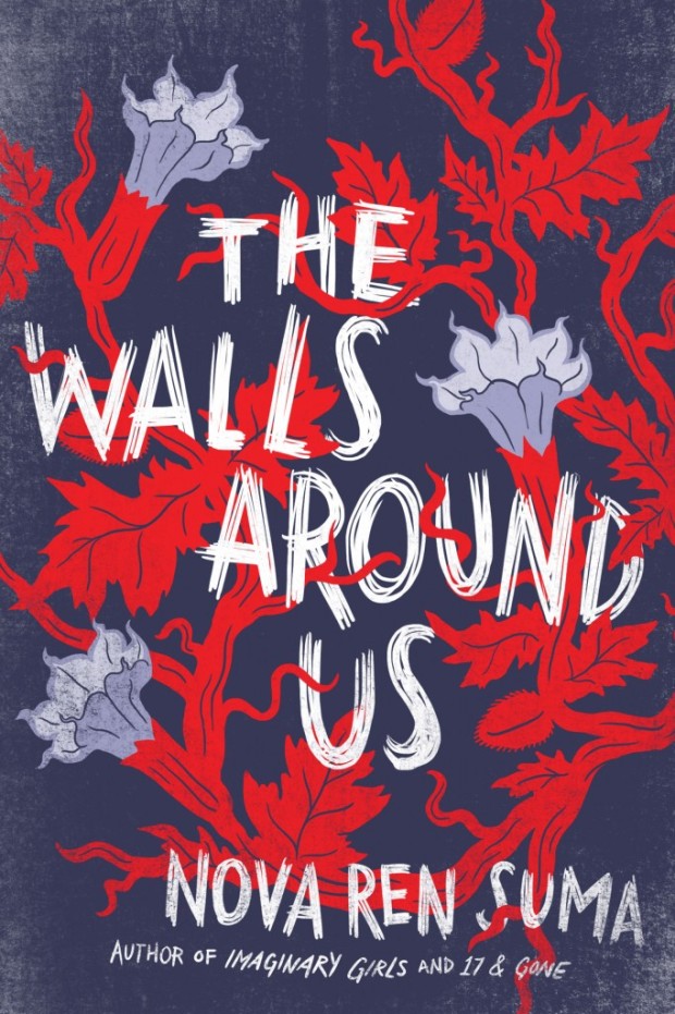
The Walls Around Us by Nova Ren Suma; design by Connie Gabbert (Algonquin Books / March 2015)
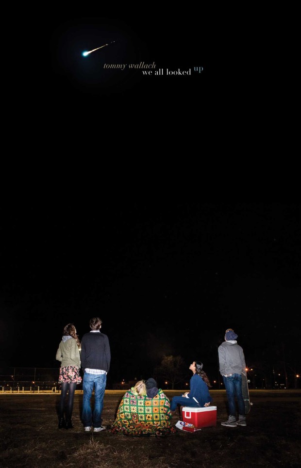
We All Looked Up by Tommy Wallach; Lucy Ruth Cummins; photographer Meredith Jenks (Simon & Schuster / March 2015)
The version of this cover which caught my eye was actually wordless — and I believe that was the designer’s original intention — so I’m a wee bit disappointed that the publisher didn’t quite have the courage to follow through on that.
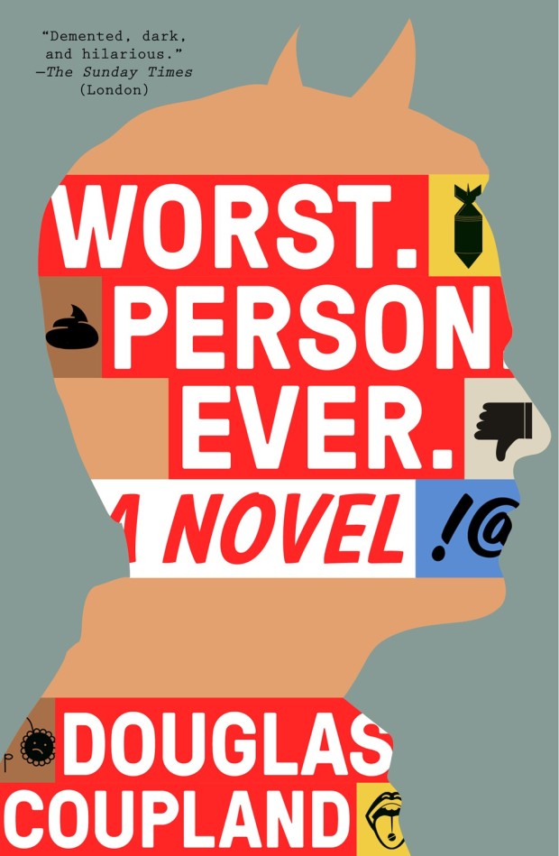
Worst Person Ever by Douglas Coupland; design by Alex Merto (Plume / March 2015)
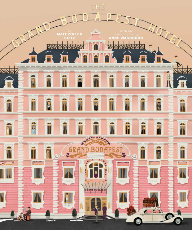
I posted about Wes Anderson’s Zweig-inspired film The Grand Budapest Hotel quite a lot in 2014. But as the film won four Oscars last month (including the award for production design) and I revisited the movie this past weekend, I don’t feel too bad about posting a few links about it again — it is so beautifully designed and constructed.
First of all, there is a new book about the movie, The Wes Anderson Collection: The Grand Budapest Hotel, by Matt Zoller Seitz, author of the original Wes Anderson Collection.
Back in January the New York Times spoke to Seitz:
“The Grand Budapest Hotel” is an incredibly rich film, one of his best, definitely the most logistically and maybe thematically complex. It’s kind of every Wes Anderson film stacked one on top of the other, like a wedding cake.
While RogerEbert.com produced this 16 minute video essay adapted from the book:
The book even has a nice animated trailer:
Elsewhere, Quartz interviewed the film’s lead graphic designer Annie Atkins:
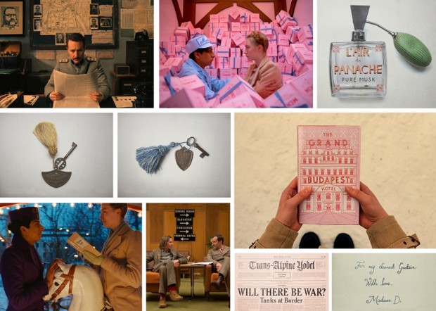
“A fictitious country needs all kinds of graphics: flags, banknotes, passports, street signs,” she told Quartz. “It’s impossible to imagine graphics like these. You have to do your research and you’ll find treasures that you couldn’t even have begun to sit down and draw until you saw them in front of your eyes.”
Working closely with Anderson and the film’s production designers Adam Stockhausen and Anna Pinnock, Atkins meticulously hand-crafted almost every of piece of ephemera shown on camera. “Every piece I made began with showing Wes a collection of real examples from the period,” she explained. “We looked at hundreds of pieces of design from Eastern Europe at the beginning of the last century as reference.”
And Deadline talks to production designer Adam Stockhausen about the film and working with Anderson:
Wes knew that he wanted the hotel to be pink. That’s one of the fun things about working with him—he has such a strong sense of color and makes very bold, daring choices that, just left to my own devices I’m not sure I would have come up with. So, working with him is inspiring in that way. And then it’s a process—working with colors that go together, adding in tones that help balance things, figuring out what the right pinks are. The funny thing is, we started with all this pink, and I think this would be true of any color—if you use too much of it, you stop seeing it because it’s everywhere and you start taking it for granted. So, we found that we had to add in yellows and different colors to kind of cut it back so you could see it more. And it’s those kinds of things you learn as you’re going; in this case, we learned from taking a section of the walls in the hotel and painting them.
Stockhausen discusses the locations in the movie with National Geographic:
Most of the inspiration we had for the hotel came from our site visit to Karlovy Vary in the Czech Republic. But we also put tons of research into the setting before we visited Europe. We looked at archive photos from many different hotels, including several hotels in London, Scotland, Switzerland—all over the place. Personally, I think the design was most influenced by the Grandhotel Pupp, which sits on a hill overlooking the town of Karlovy Vary.
The town of Karlovy Vary is filled with pastel-colored buildings that line the riverfront, and it has several hotels that stand on hills that look over the town. The whole place had the right feeling we wanted to convey in the movie.
That National Geographic article also alerted me to this interesting featurette about the creating the film’s hotel in a department store in Görlitz, Germany:
And, with that, I think I’m done.
(For now.)
Comments closed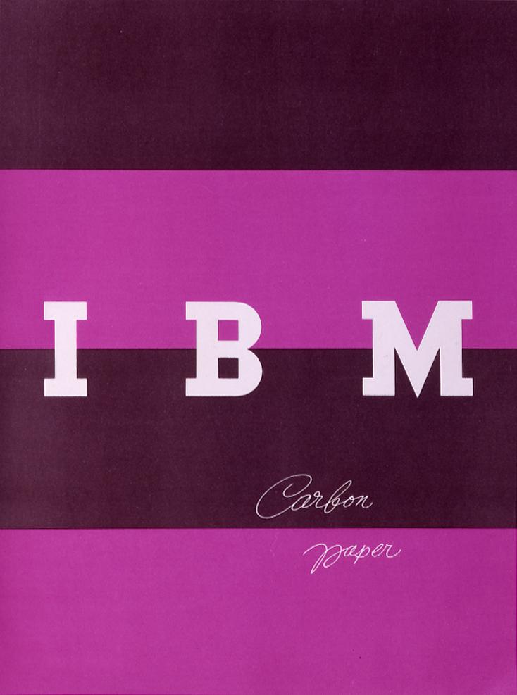
At the New York Times, Ken Johnson reviews Everything is Design: The Work of Paul Rand, a new exhibition at the Museum of the City of New York:
Considering the punchy, wildly inventive covers he created in the 1950s for books by Henry James, Albert Camus, Jean-Paul Sartre and Herbert Marcuse, you might suppose that he aligned with the liberal intellectual wing of that period’s culture. From the late ’50s on, when he began working directly for corporations to shape their public identities, it seems he pledged allegiance to corporate America.
What he did for companies like IBM, ABC and, unfortunately, Enron, was to give each a unified public identity by visual means. He didn’t just create logos; he applied his designs to many facets of a businesses, from business cards and letterheads to product packages, and he required absolute uniformity in all those aspects. What was the secret of Mr. Rand’s success? One of several books about design that he wrote and illustrated is open to a page where he talks about the logo he created in 1962 for ABC, the image of three sans-serif, lowercase letters on a disc. Referring to a picture of the logo that’s heavily, almost but not quite illegibly blurred, he asks, “How far out of focus can an image be and still be recognized?” Pretty far, if it’s a Rand design.
That’s important because, unlike fine art works, graphic images are meant to survive less than ideal conditions. Awareness of that necessity is a big part of what makes Mr. Rand a godfather of today’s image-saturated media world. If it gives some politically oriented viewers pause to think of his evidently unwavering faith in American capitalism and of how he imprinted corporate identities on the minds of millions, that just makes his story all the more interestingly complicated.
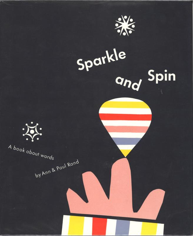
There’s also an interesting review of the exhibition by Amelia Stein at The Guardian:
Rand liked to argue that manipulation is integral to design. It is a designer’s job, he wrote in Thoughts on Design (1947), to manipulate ingredients in a given space – to manipulate symbols through juxtaposition, association and analogy. These days, it is difficult to separate logos and branding from other, more insidious forms of manipulation. A recent return to flatness in corporate design – emblematized by Apple’s decision to abandon skeuomorphism in 2013 – could be seen as an attempt to invoke Rand’s heyday, when consumers trusted a brand’s visual cues to communicate some essential truth.
This is an important aspect of Rand’s legacy, enormous and complicated as it is. Although Everything is Design stops short of addressing the lasting implications, artistic and otherwise, of Rand’s work, it provides us with a necessary basis from which to do so… [Looking] at Rand is valuable if we want not just to be as good as Rand, but to understand the complexity of what it is to be good.
The exhibition runs February 25 — July 19, 2015.
Comments closed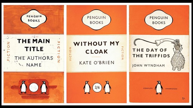
At BBC Arts, Brian Morton writes about 80 years of Penguin paperbacks:
The ubiquity of Penguin books in modern British publishing conceals a paradox best expressed by founder Allen Lane’s colleague and biographer Jack Morpurgo, who said that even in Allen Lane’s lifetime, Penguin became “the least typical member of the genus it was said to have created”.
There had been paperbacks before Penguin – all French books were paperback for instance and Woolworth’s, soon to be a key outlet for the new imprint, sold their own cheap editions – but few ranged so eclectically and wide.
And, in a second article, he looks at the legacy of their covers:
Comments closedNo other house had quite Penguin’s confidence in design. Pan Books, which began publication a decade after, in the mid 40s, were defined by a Mervyn Peake colophon of the god playing his pipes, a hint perhaps that here was a house that wasn’t going to trouble you with books on microeconomics or English churches… but with something more sensuous and possibly sensual…
…At the opposite extreme, but no less successful in their way, were the Fontana Modern Masters which began publication under Frank Kermode’s editorship in the 1970s, combining seriousness, a quick-crib approach to major thinkers and a stunning simple visual device, which was that each group of books featured a tessellating cut-up of an abstract painting by Oliver Bevan.
Buy them all, lay them out on your table and you had a bit of modern art. Painterly abstraction and san-serif typeface seemed to go together and seemed to fit as well as Bevan’s angles…
…But it was Penguin which continued to perfect the idea of cheap books as items that might be collected and displayed.
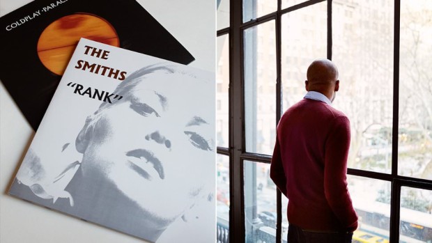
Sartorial site Mr Porter asks five designers — Mat Maitland, Eddie Opara, Sagi Haviv, Edwin Van Gelder, and Chip Kidd — about their favourite typeface. Here’s Eddie Opara of Pentagram on Berthold Wolpe’s Albertus, the typeface used for the street signs of the City of London:
I didn’t know what the font was until I got to design school. And I was so fascinated by it because of the way it’s cut. It’s based on metal engraving techniques, the effect being that it has is these acute angles, almost 45 degree angles in each letter. It’s also insanely hard to use. I’ve tried to use it and I’ve not been able to. Why is it my favourite font, then? I think that your favourite is always what you can’t have.
(via Theo Inglis)
Comments closed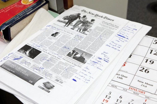
In a fascinating piece for Popular Mechanics, Reeves Wiedeman looks at how the New York Times gets made in 2015. It’s interesting how their graphics department has evolved in the past few years:
The Times employs approximately 1,300 journalists, a classification that now includes much more than writers, editors, and photographers. There are videographers and developer–journalists and graphic designers, who insist that you not call them graphic designers. Every section of the paper has been affected by the Internet, but the graphics department is hardly recognizable from the days not long ago when, to accompany a story about Borneo, for example, it would simply produce a small black-and-white map of Borneo. [Graphics editor] Duenes’s desk still produces traditional newspaper graphics, but it also now employs thirty-five people who have expertise in statistics, programming, cartography, 3D modeling, motion graphics, audio production, or video editing. At the department’s two long desks, designer Haeyoun Park combs through data on the racial breakdown of police forces—a story the graphics team reported without any instigation from print reporters—while nearby Matt Bloch is updating the paper’s digital hurricane tracker… A breaking-news event might require eight members of Duenes’s team, who are otherwise free to focus on the kind of in-depth reporting for which the Times‘ print reporters are generally known. Last August a graphics editor who had been tracking police data for four years discovered that the New York Police Department had more or less ended its controversial stop-and-frisk policy, which some critics had described as racial profiling. This was news to the reporters on the Metro desk, and the editor there assigned a story to go along with the graphics department’s analysis.
The story, and the graphic, ran on the front page.
I also particularly liked the stuff about their R & D Lab:
1 CommentThe R&D Lab opened nine years ago with the goal of looking three to five years into the future. (TheTimes declined to say how much it cost to build.) Marc Frons, the company’s CIO says he has no idea how people will interact with theTimes in ten years, “whether it’s on your wrist, or your forehead, or you take a pill, or it’s a holographic contact lens, or a head-up display in your vehicle—or on your mirror in your bathroom.” The lab explored E Ink before the Kindle even existed, was responsible for delivering the earliest versions of the paper’s mobile news alerts, and helped the Times become the first publisher with an application on Google Glass. One of the lab’s researchers recently designed a brooch programmed to light up whenever a topic is mentioned that matches something the wearer read about online that day. What good would that do, exactly? Boggie answers with enthusiasm, “We don’t know yet!”