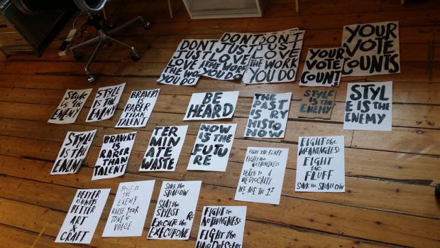
D&AD visits Marion Deuchars in her studio to talk about her work and creating hand-lettered signs for Judging Week 2015:
Comments closedBooks, Design and Culture
D&AD visits Marion Deuchars in her studio to talk about her work and creating hand-lettered signs for Judging Week 2015:
Comments closed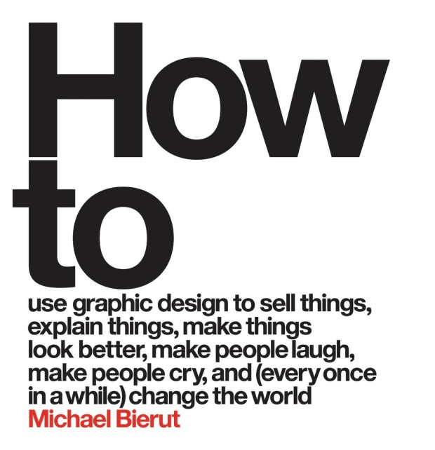
More wisdom from designer Michael Bierut, this time in an interview with Dave Benton for Behance’s 99U:
Comments closedI have to admit I don’t like working on projects where I sense that the cosmetic side of design is meant to be the main differentiator. My design work isn’t interesting enough to differentiate something that’s not interesting otherwise. I look for things that are full of interest and that I am interested in, where I can really see the raison d’etre and the need that they are fulfilling in the world. If you really get all that, then you can calibrate what the appropriate response is design-wise.
I am not one of those designers who are eager to expand the role of a graphic designer. I’m a graphic designer. I know I’m good at that. I’m not an expert about customer service. I’m not an expert about coming up with the valuation of an IPO. If someone comes to me and has a shitty product, I will say tell them upfront that I don’t know why people would use this and that, to me, it doesn’t make sense, and I’m not sure a logo is what they need right now. But I’m not someone who is dying to have a seat at the table and have input earlier in the process; I’m surrounded by people who have goddamn opinions about things they don’t know anything about, and I don’t want to be one of those people.
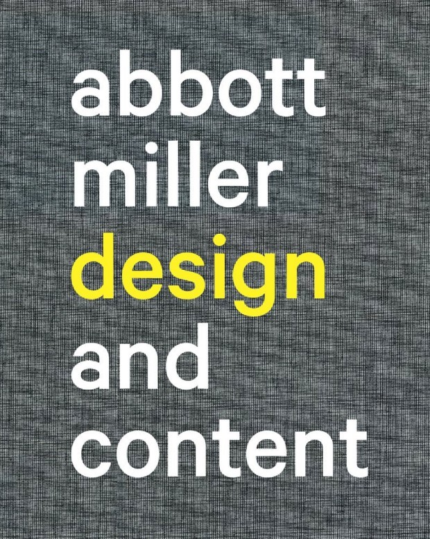
The first in a new series of video interviews with people making books, Pentagram partner Abbott Miller talks to Design Observer about his recent monograph Abbott Miller: Design & Content:
And this is just a reminder to myself as much as anything: the fantastic typeface on the book’s cover is Calibre from Klim Type Foundry.
Comments closed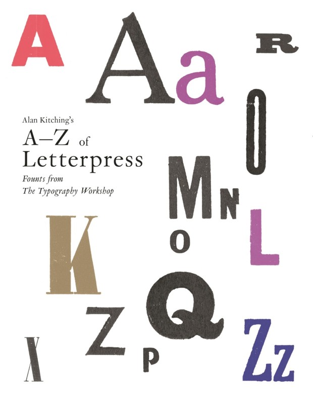
I just received an advance copy of Alan Kitching’s A-Z of Letterpress from UK publisher Laurence King, and it really is a lovely little book for type and letterpress enthusiasts.1
The accordion-playing Kitching has featured on the blog before of course, but over the course of his career he has worked as a compositor, typographer, graphic designer, teacher, and poster artist. He founded the Typography Workshop in 1989 and, according to designer Derek Birdsall (renowned for his cover designs at Penguin amongst other things), Kitching single-handedly “breathed new life into the dying embers of letterpress” by teaching a new generation of designers how to compose type by hand.
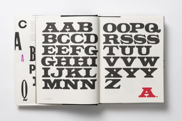
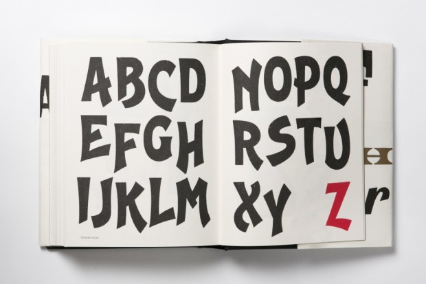
A collaboration with Pentagram partner Angus Hyland, and designed in-house by Alexandre Coco, the book itself contains 39 alphabets shown letter by letter, presented from A to Z. All the founts are wood letter founts from Kitching’s collection, and every image in the book was printed by hand on a Vandercook no. 3 proof press.


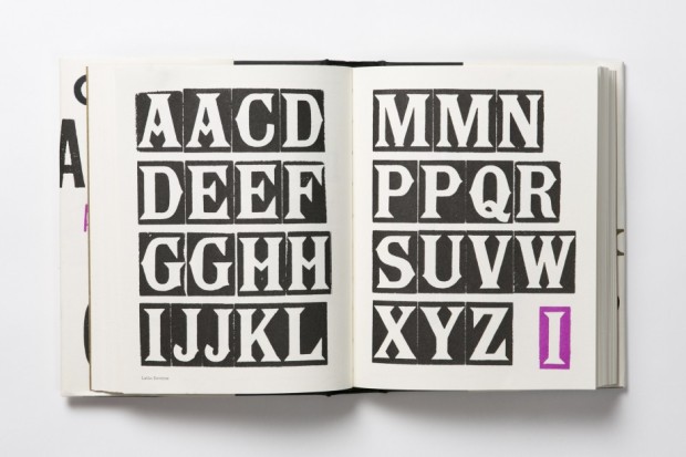
It really is a thing of beauty. Printed on thick, creamy paper, the letter forms and page layouts are quirky and charming. The colours and metallic ink are vibrant and surprising. Even better, it is also a teaser of sort — Laurence King recently announced it will be publishing a monograph of Kitching’s work in 2016. Can’t wait.
Never mind that still feels like some crazy never-ending winter in Toronto, it’s (allegedly) April so here are a few new and recent covers that have caught my eye in the past month…

American Warlord by Johnny Dwyer; design by Oliver Munday (Knopf / April 2015)
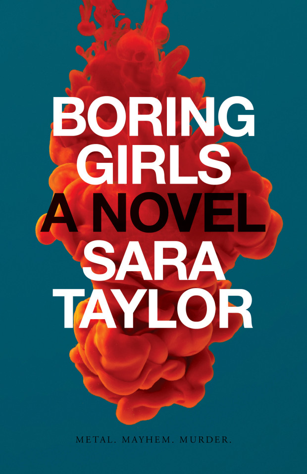
Boring Girls by Sara Taylor; design by David A. Gee (ECW / April 2015)
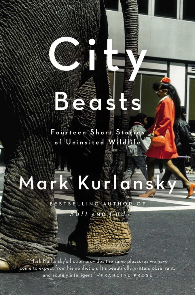
City Beasts by Mark Kurlansky; design by Rachel Willey (Riverhead / February 2015)
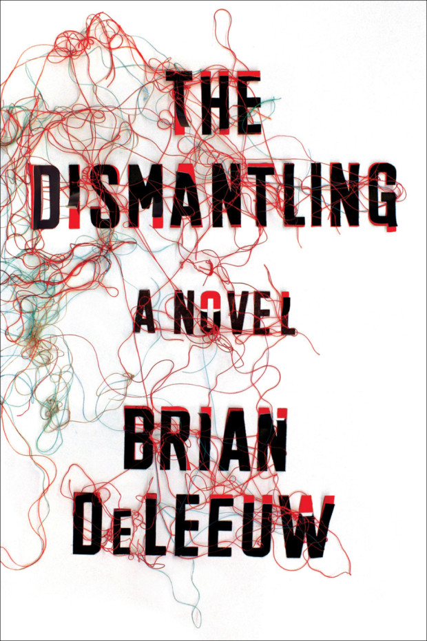
Dismantling by Brian DeLeeuw; design by Zoe Norvell (Plume / April 2015)
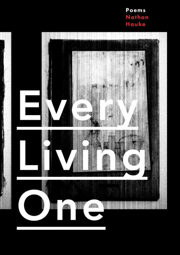
Every Living One by Nathan Haukes; design by Alban Fischer (Horse Less Press / March 2015)
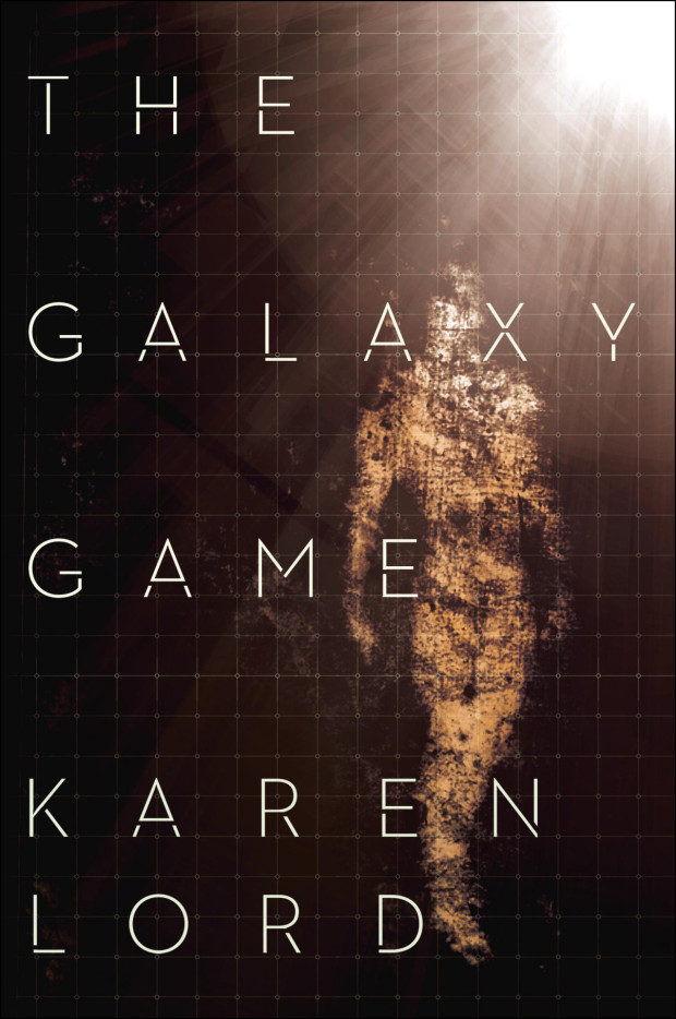
The Galaxy Game by Karen Lord; design by Charles Brock (Del Rey / January 2015)
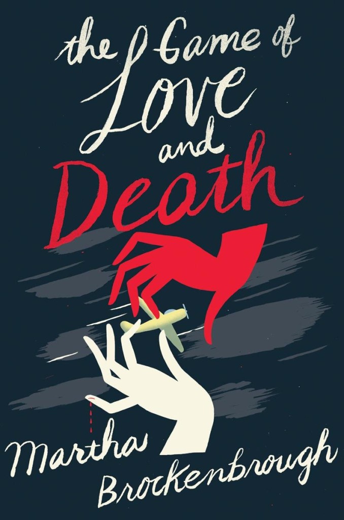
The Game of Love and Death by Martha Brockenbrough; design by Nina Goffi; illustration by Christopher Silas Neal (Scholastic / April 2015)
(You know who could do an amazing Harper Lee cover? Christopher Silas Neal, that’s who!)
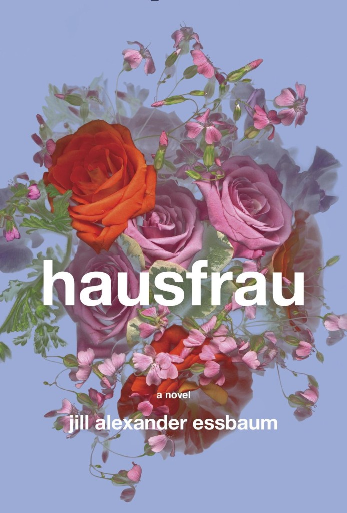
Hausfrau by Jill Alexander Essbaum; design by Gabrielle Bordwin (Random House / March 2015)
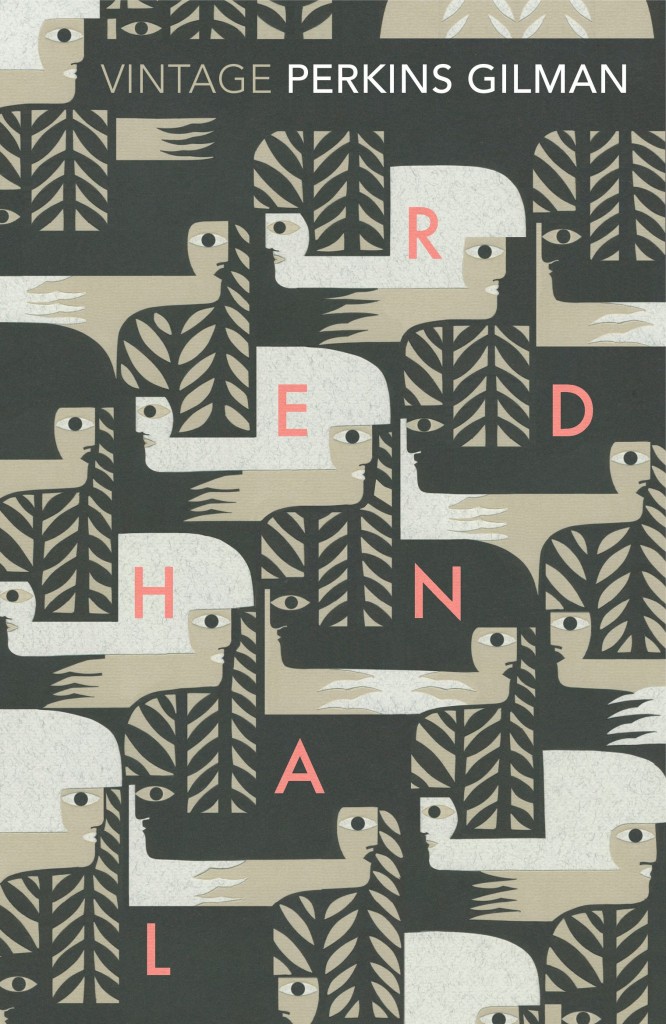
Herland by Charlotte Perkins Gilman; design by Julia Connolly; illustration Petra Börner (Vintage / April 2015)
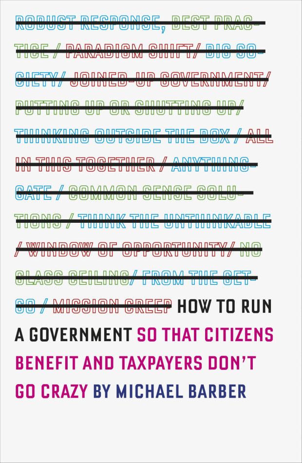
How to Run a Government by Michael Barber; design by Barnbrook (Allen Lane / March 2015)
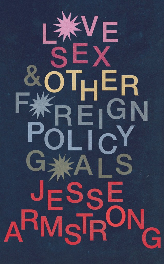
Love and Other Foreign Policy Goals by Jesse Armstrong; design by Matt Broughton (Jonathan Cape / April 2015)

The Man Who Planted Trees by Jim Robbins; design by Thomas Ng; photograph Peter Kupfer (Spiegel & Grau / March 2015)
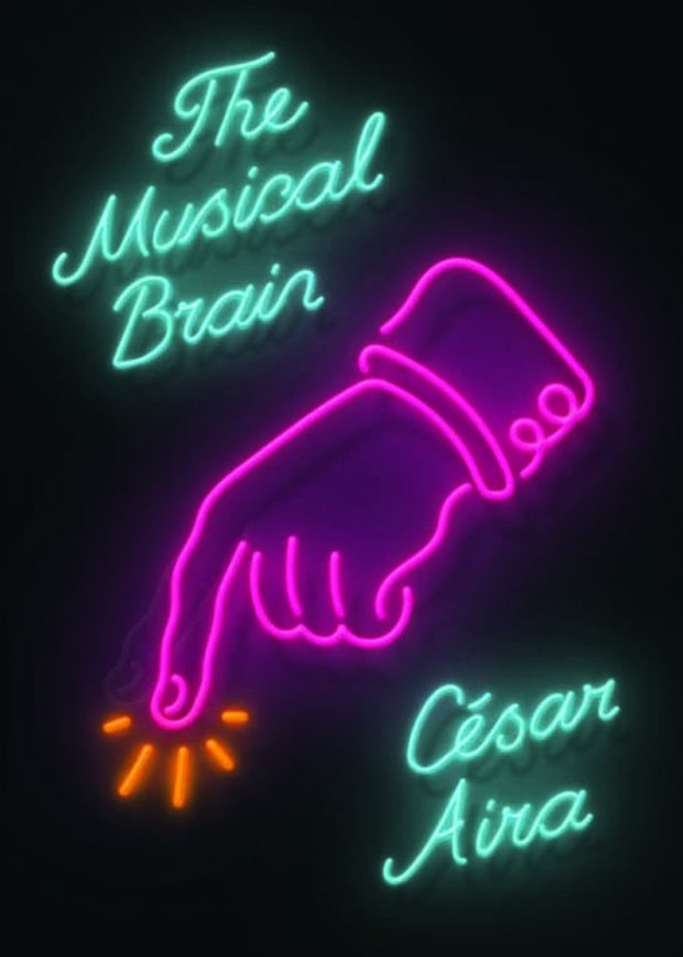
The Musical Brain by César Aira; design by Rodrigo Corral (New Directions / March 2015)
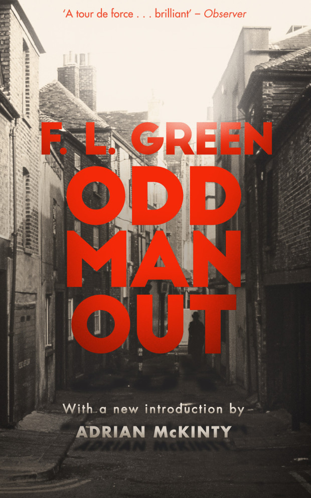
Odd Man Out by F. L. Green; design by M. S. Corley (Valancourt Books / March 2015)
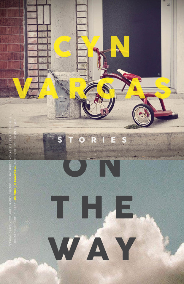
On the Way by Cyn Vargas; design by Alban Fischer (Curbside Splendor / April 2015)
(I also like Alban Fischer’s cover for Does Not Love by James Tadd Adcox, published by Curbside Splendor in 2014, a lot)
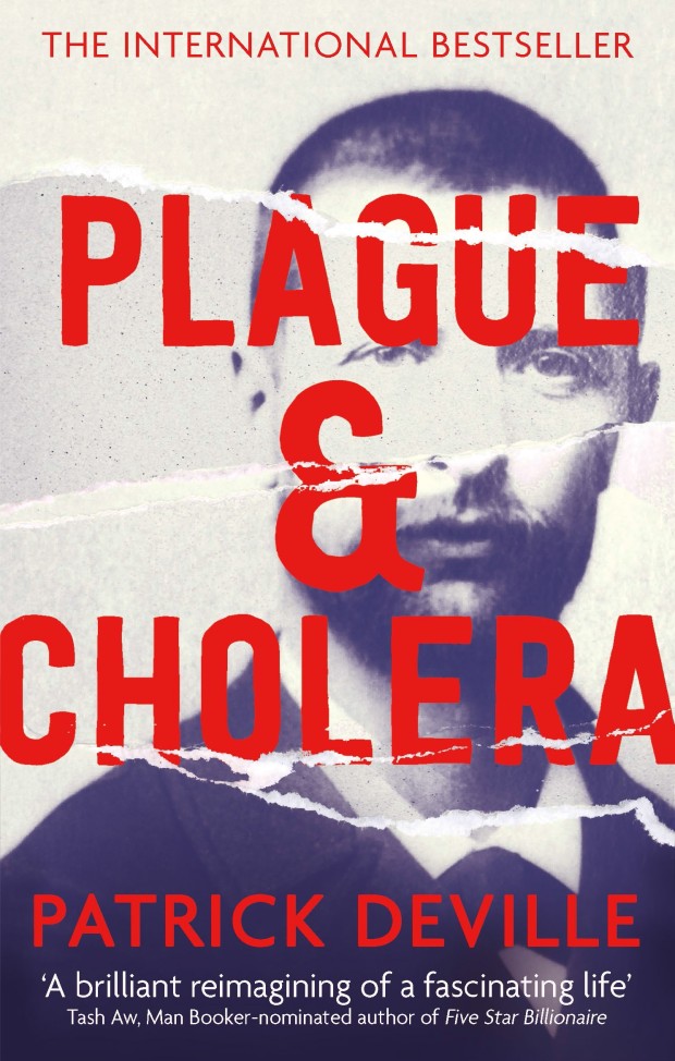
Plague and Cholera by Patrick Deville; design by Sian Wilson (Abacus / April 2015)
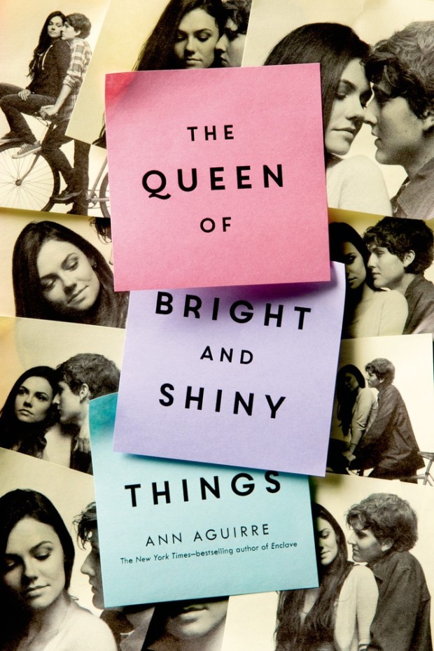
The Queen of Bright and Shiny Things by Ann Aguirre; design by Anna Booth; photography by Jon Barkat and Gary Spector (Feiwel & Friends / April 2015)
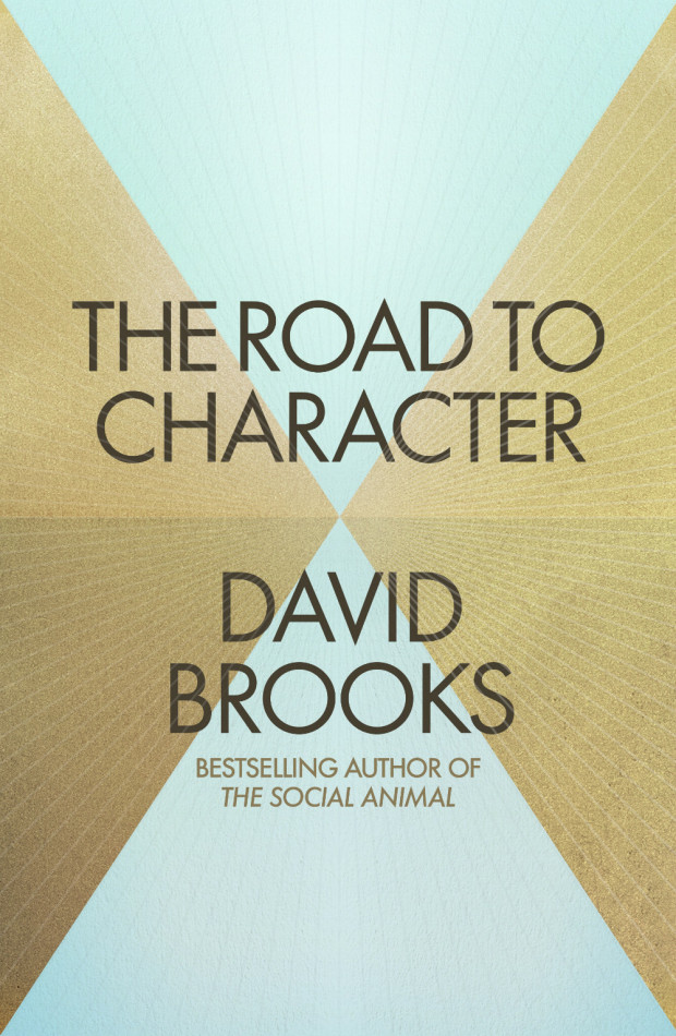
The Road to Character by David Brooks; design by Jim Stoddart (Allen Lane / April 2015)
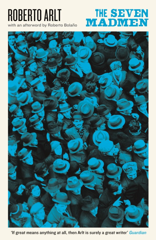
The Seven Madmen by Roberto Arlt; design by Steve Panton; series design Peter Dyer (Serpent’s Tail / February 2015)
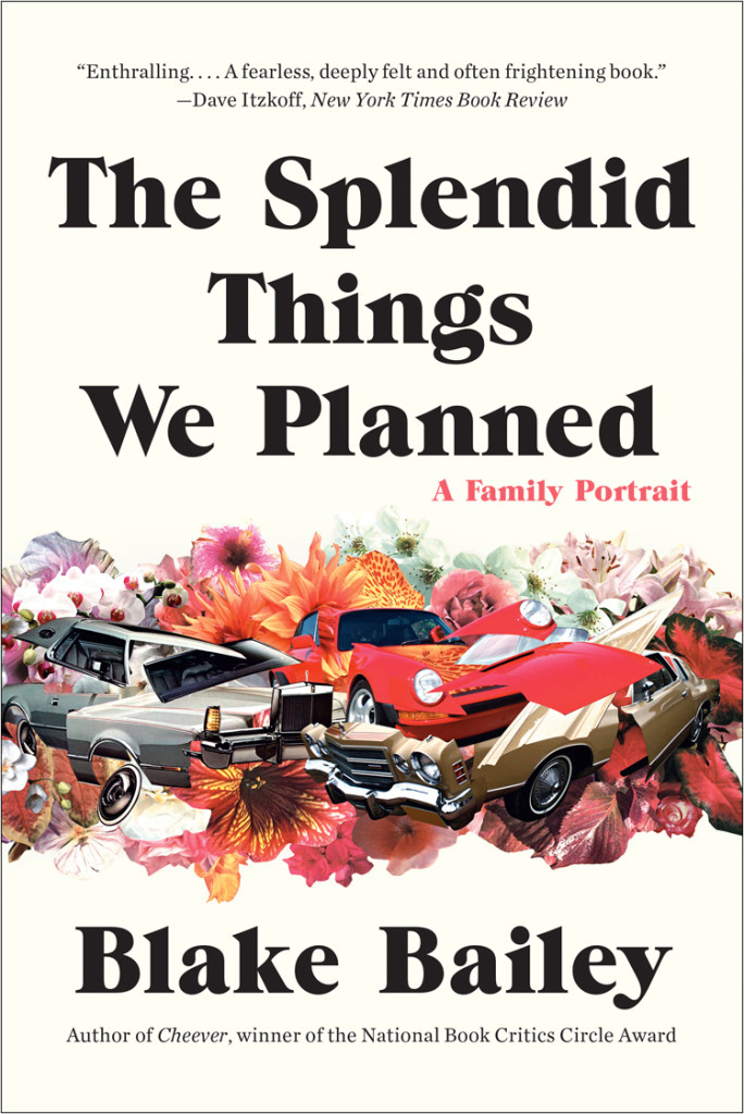
The Splendid Things We Planned by Blake Bailey; design by Greg Mollica; cover art by Matthew Cusick (W. W. Norton / February 2015)

The Strange Case of Rachel K by Rachel Kushner; design by Paul Sahre (New Directions / March 2015)
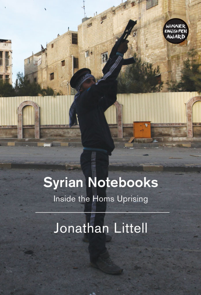
Syrian Notebooks by Jonathan Littell; design by David A. Gee; photograph by Mani (Verso / March 2015)
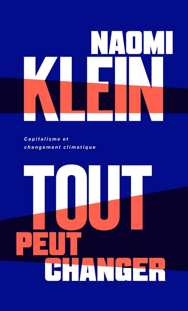
Tout Peut Changer by Naomi Klein; design by Nouvelle Administration (Lux Éditeur / March 2015)
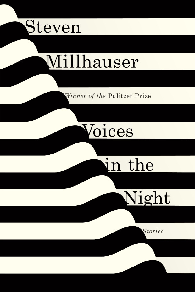
Voices in the Night by Steven Millhauser; design by Janet Hansen (Knopf / April 2015)
(Another great 2014 cover I missed — but saw in a bookstore recently — is Janet’s design for Hiding in Plain Sight by Nuruddin Farah)
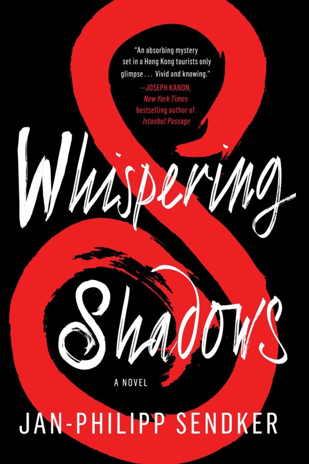
Whispering Shadows by Jan-Philipp Sendker; design by Gray318 (Atria / April 2015)
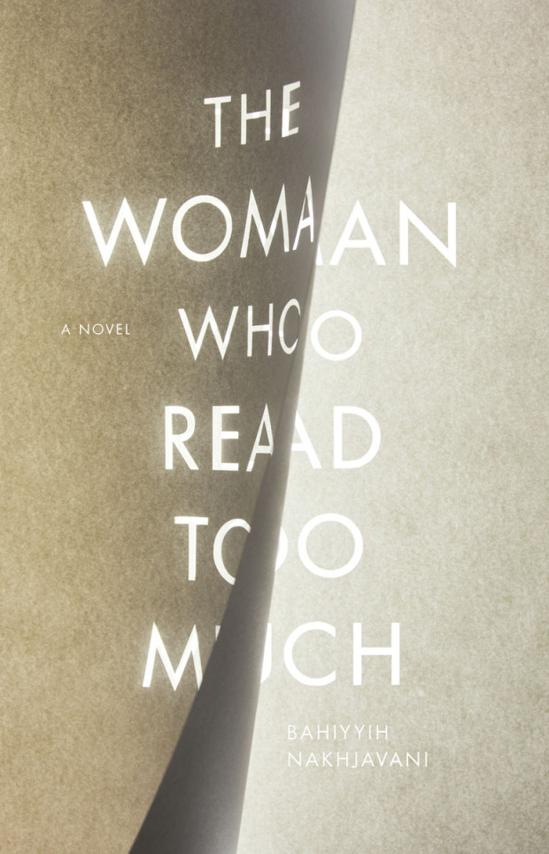
The Woman Who Read Too Much by Bahiyyih Nakhjavani; design by Anne Jordan (Stanford University Press / April 2015)
(I like this unused unused comp very much too)
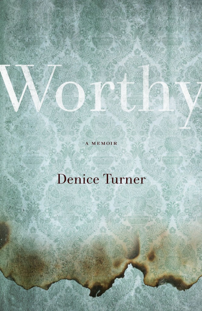
Worthy by Denice Turner; design by Kimberly Glyder (University of Nevada Press / April 2015)

The Great Discontent has a really interesting (and long) interview with Michael Bierut about his career in graphic design:
Comments closedThe reason I love graphic design is because it’s a way to get paid to learn new things. For example, let’s say someone asks if you’d like to design a book. It’s not about being interested in pagination, covers, binding, typography, or paper. Those are all important, but what really makes designing a book fun is being interested in whatever the book is about. Sometimes it’s a great and exciting book that you’re really into: that’s like someone asking, “Would you like to sit and eat ice cream with me?” But sometimes it’s a book whose subject you don’t know about at all, so you get to talk to people who may be the world’s foremost experts on that subject. Even better!
When I brief interns about a project, I don’t say, “It’s this big and it has x amount of words and pictures.” I say, “These people are trying to do this, they’re trying to get this message across, and their big challenge is that.” Those pieces of information put the project into a larger context. That’s how I learned when I was starting out. I was a pretty good designer in college, and I’m not sure I’m a better craftsperson as I was then. However, I’m a much better designer now because I made people pay me to go from dumb to smart over and over and over again.
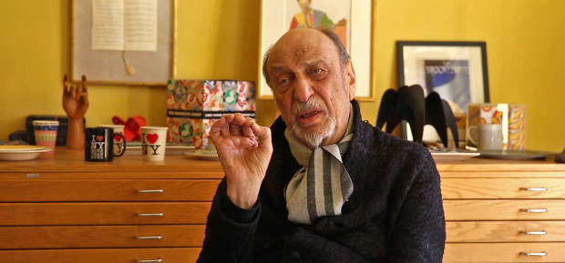
The New York Times T Magazine visits designer Milton Glaser, co-founder of New York magazine and Push Pin Studios, in his studio:
Comments closed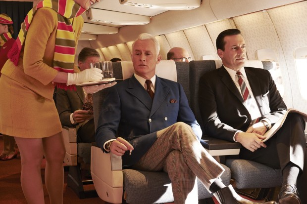
Another overdue link from my ‘longreads’ bookmarks, The Hollywood Reporter talks to the cast and crew of Mad Men about the early days of the show now that it is about to come an end:
Christina Wayne (former senior vp scripted programming, AMC) Years earlier, I’d wanted to option Revolutionary Road [Richard Yates’ novel about suburbia in the 1960s]. But I was a nobody screenwriter, and [Yates’ estate] held out for bigger fish, which they got with Sam Mendes. So when I read [the Mad Men script], it resonated with me. This was a way to do Revolutionary Road, week in, week out. When we had lunch with Matt for the first time, I gave him the book. He called me after and said, “Thank God I’d never read this because I never would have written Mad Men.”
Perhaps more interesting, however, is James Meek’s lengthy article for the London Review of Books on the show’s superficiality, and its curious relationship with advertising:
Comments closedSterling Cooper, the fictional advertising agency around which Mad Men is built, is a caricature of the commercial TV system that produced the series: a pool of creative people in bitter thrall to the accountants and deal-makers they rely on for money. Although we learn in parenthesis that the agency gets most of its income from commission on the ads it places, for dramatic purposes the agency is divided into two departments: Creative, which comes up with campaign slogans, artwork and copy for ads, and Accounts, which persuades, charms, fawns, bribes and pimps its way to getting and keeping corporate clients. Mad Men is a show about writers dependent on advertising, written by writers dependent on advertising, the difference being that the fictional writers of Creative write the ads on which they depend.
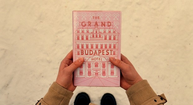
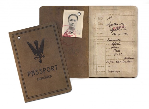
Designer Annie Atkins talks to Design Week (registration required) about her work on Wes Anderson’s The Grand Budapest Hotel, and “the often ‘invisible’ role of graphic design on screen”:
“Most of the skills I employ today are things I’ve learnt on set,” Atkins says. “Before starting this job, I hadn’t really hand-crafted anything since being a child. Things like taking up a quill; getting my paints and pencils out; hand-binding books – I never would have done that in the advertising agency I was working in.”
Of course, 11 hours isn’t solely devoted to creating art. While a lot of the day is spent in a “production line” of stitching, gluing, folding, ripping things up, sticking them back together again, tea staining and pouring fake blood over things, there are less glamorous elements to the job too.
“A lot of the day is paperwork,” Atkins says. “Organising, planning, scheduling, ordering materials – that’s the boring bit. Then some of the day is liaising with art directors and the production designer to figure out the style and directions things will go in. Then it’s bums on seats, making stuff.”
It’s that “making” part that is so important. “It’s tempting to sit at a computer and make everything that way,” she says. “But if you’re working in a period in the past, you really have to understand the methods that were employed to make those graphics at the time, then imitate – or even better, use – them to give that authenticity.”
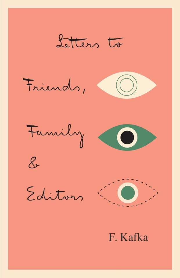


In latest Creative Characters newsletter from MyFonts, designer Julia Sysmäläinen talks about designing FF Mister K, the typeface based on Franz Kafka’s handwriting used by Peter Mendelsund for his redesign of Schocken’s Kafka covers:
Originality, authenticity, and honesty are crucial qualities to me. I think Mr. K has all of that, just like Franz Kafka’s manuscripts do. While I was working on it, I realized that while Mister K is a font, it is also the visualization of a personality. The font is not pretty, or beautiful in the classic sense — and it doesn’t want to be.
It’s a bit like Kafka’s work. There is no beauty in it as such, but rather a confrontation with reality that goes so far as to be repellent. There are all kinds of attributes — stupidity, cunning, weakness, strength, bitterness, humor, lightness, etc. The authenticity of this confrontation is visually reflected in the manuscripts — and also in Mister K Regular, the style in the font family that is most similar to the original Kafka manuscripts.
Whoever wishes to use the typeface must be willing to embrace this ambiguity. Mister K is not particularly suitable for lending a consumer-friendly smoothness to some brand; but there are corporate identities to which it fits very well. I was pleased to see it used by the Norwegian band Flunk, for Stokke highchairs, and for wellness products by Dresdner Essenz; and, of all things, in the logo of an upmarket design hotel in Berlin, Das Stue. What I found even more astounding was its appearance at the international insurance company Watson Towers (an ironic coincidence, as Kafka himself was an employee at an insurance company). But somehow it made sense: “The organic, hand-drawn nature of the logo and graphic system creates a personal and distinctive look amidst the impersonal, corporate, language of its competitors…” — that’s how Interbrand, the design agency, described the project. In its semi-perfection the typeface simply oozes a kind of honesty. That’s its strength, and brings it closer to a lot of people.


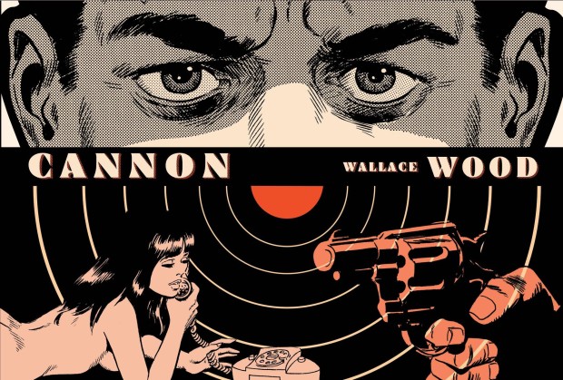
At Sequart, designer Emory Liu talks about working at Seattle comics publisher Fantagraphics:
Comments closedMy first start in the design world came through designing / screen printing posters, and doing album artwork for bands. I played in a bunch of bands, and starting out, we just ended up having to do a lot of the work ourselves, art included. I also took design classes at School of Visual Concepts, eventually graduating with an Interdisciplinary Visual Arts degree from University of Washington in 2005. I feel very fortunate to be hired by Fantagraphics, as I had no previous experience designing full books, but just came from a job that heavily depended on InDesign. I think I just had enough experience to pass, and a DIY aesthetic that fit with the other designers… [It’s] interesting, because most of the time we have a ton of creative control. Editorial is usually hands off, and we’re working from scratch, keeping in mind not to overstep the comic artist themselves. A lot of the work is old work being re-released, and just the repackaging of the product with new covers can do wonders, give the book new life. At the same time we’ll get a few titles where we get very little input. Some artists demand complete control, and I’d take the role of facilitator more than designer. As fast as I’d like to get through those, they always end up taking the longest.
In a great interview with Design Indaba, designer Michael Bierut talks about a new book about his work, How to: Use graphic design to sell things, explain things, make things look better, and (every once in a while) change the world, to be published later this year by Thames and Hudson:
In the second part of the interview he talks about the loneliness of design, and (inevitably!) designing logos:
Comments closed