Skip to content

Tag: design

Typeface Mechanics with Tobias Frere-Jones

FutMed-overlay

You know when Tobias Frere-Jones starts discussing the mechanics of typefaces you should pay attention. In the first post of a new series, he looks at the “overshoot”:

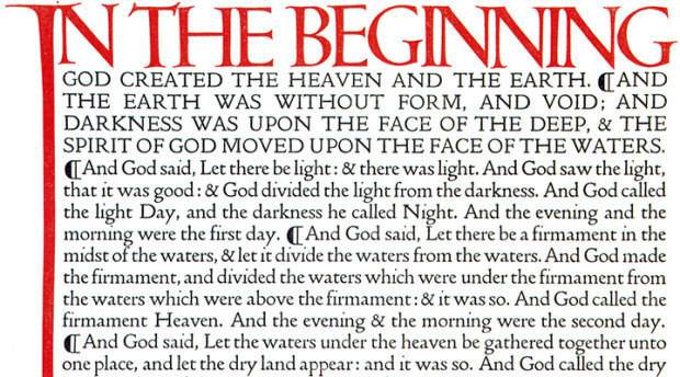
Square shapes like H have a simple and stable relationship to the baseline and cap height. Their upper and lower edges coincide with these boundaries and stay put. But only a narrow sliver of an O is the full height, and the rest of the shape falls away. The parts that are too short greatly outnumber the parts that are big enough, so we conclude — wrongly, but very reliably — that the round shape is too small.

If the “correct” height appears inadequate, “too much” will look right. So the is made taller and deeper than the H, even if the most stringent mathematical reasoning would declare it incorrect. But we read with our eyes, not with rulers, so the eye should win every time. Typefaces from any period will demonstrate this compensation, often called “overshoot”.

Comments closed

All Heart

With Valentine’s Day just around the corner, I thought I would share a few book covers that use hearts as part of their design…

all-about-love
All About Love by Lisa Appignanesi; design by Jamie Keenan (W. W. Norton / July 2011)
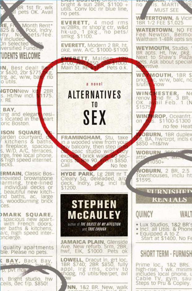
Alternatives to Sex
Alternatives to Sex by Stephen McCauley; design by David Ter-Avanesyan (Simon & Schuster / March 2006)

9780143122371
American Supernatural Tales edited by S. T. Joshi ; design by Paul Buckley (Penguin / October 2013)
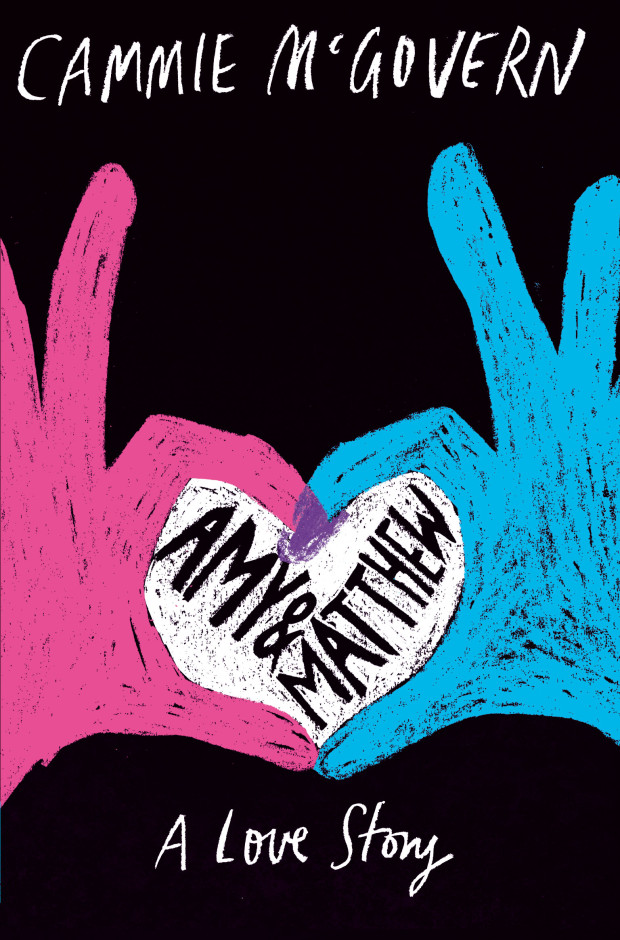
Amy-and-Matthew
Amy and Matthew by Cammie McGovern; design by Sharon King-Chai (Macmillan Children’s Books / March 2014)

9780143120209B
The Campus Trilogy by David Lodge; design by Heads of State (Penguin / October 2011)
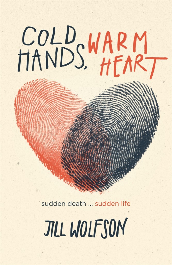
9781406325416
Cold Hands, Warm Heart by Jill Wolfson; design by Jack Noel (Walker Books / November 2011 )
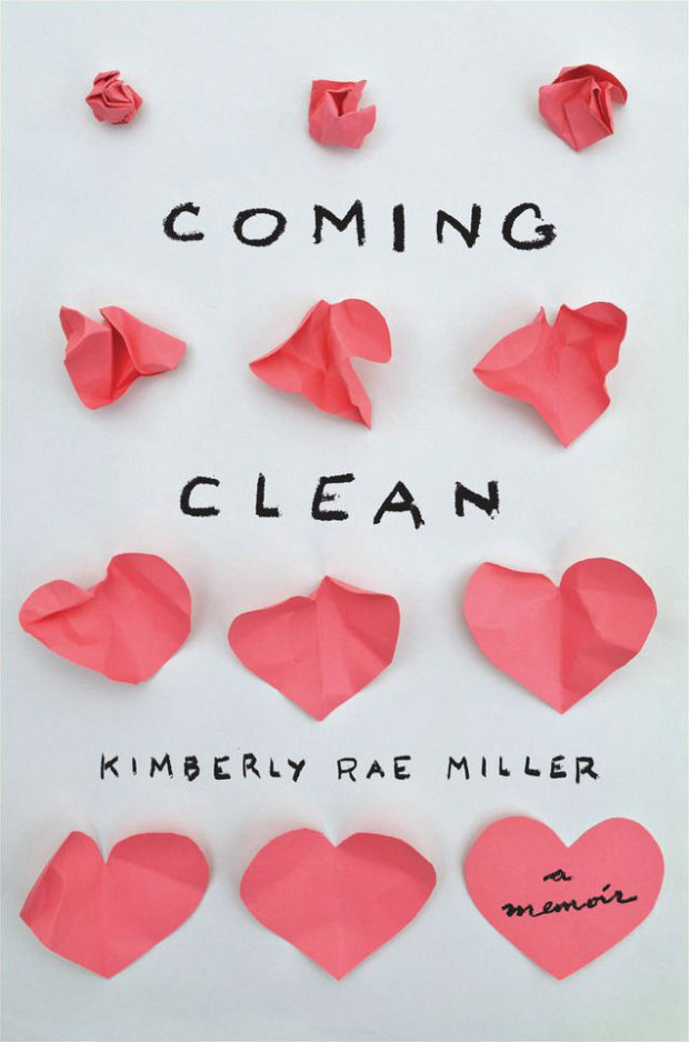
coming-clean
Coming Clean by Kimberly Rae Miller; design by Lynn Buckley (New Harvest / July 2013)
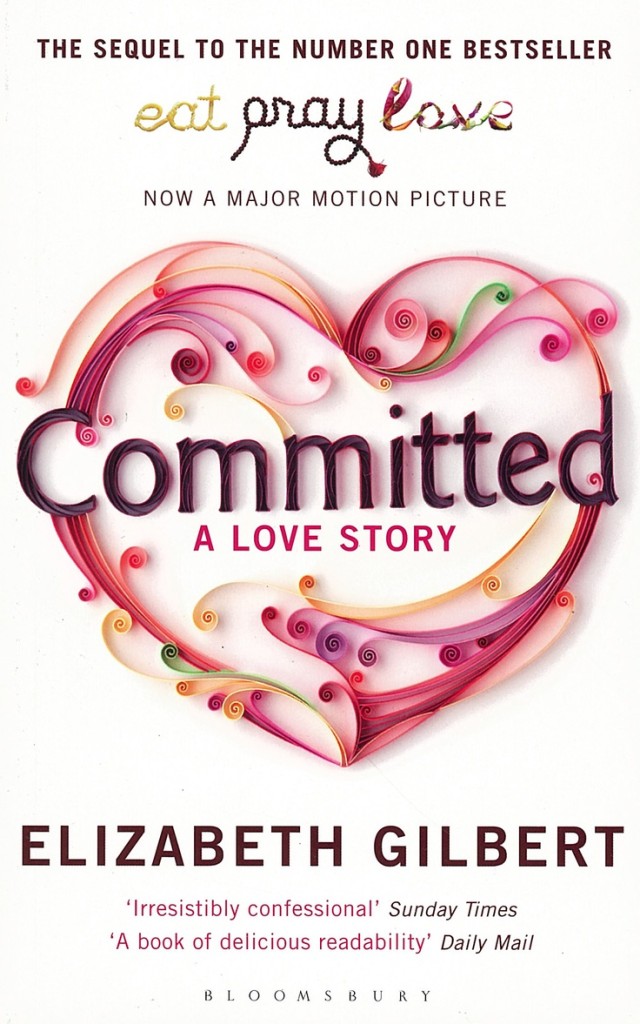
committed

Committed by Elizabeth Gilbert; design by Helen Crawford-White; illustration by Illustration Yulia Brodskaya (Bloomsbury / January 2011)

don't-you-forget-about-me
Don’t You Forget About Me by Jancee Dunn; design by Catherine Casalino (Villard Books / July 2008)

eat-my-heart-out
Eat My Heart Out by Zoe Pilger; design by Rose Stallard (Serpents Tail / January 2014)
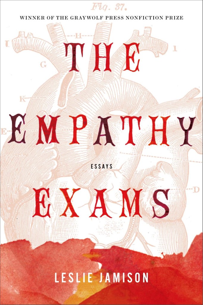
9781555976712
The Empathy Exams: Essays by Leslie Jamison; design by Kimberly Glyder (Graywolf / April 2014)

Untitled-10
Fraught Intimacies by Nathan Rambukkana; design by David Drummond (UBC Press / May 2015)
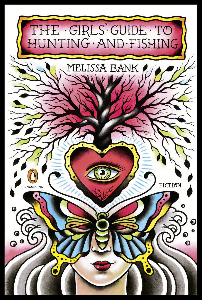
9780143119692_GirlsGuide_CV.indd
The Girls’ Guide to Hunting and Fishing by Melissa Bank; cover art by Lina Stigsson (Penguin / July 2011)
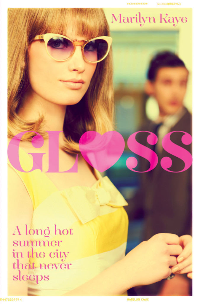
978144722397901
Gloss by Marilyn Kaye; design by Rachel Vale (Macmillan Children’s Books / June 2013 )
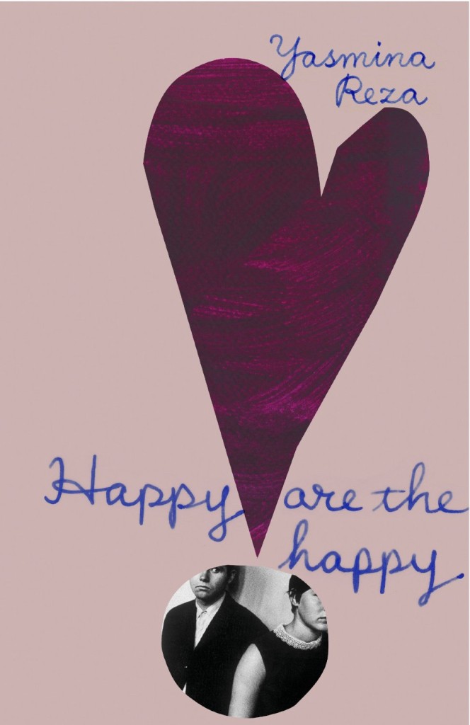
happy-are-the-happy-suzanne-dean
Happy are the Happy by Yesmina Reza; design by Suzanne Dean (Harvill Secker / July 2014)

The recently released US edition of Happy are the Happy published by Other Press, and designed by Kathleen DiGrado, also features a heart on the cover (if you know who the designer is, please let me know):
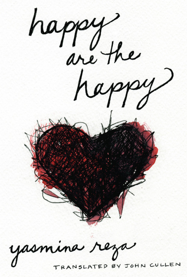
Happy-Are-The-Happy-US

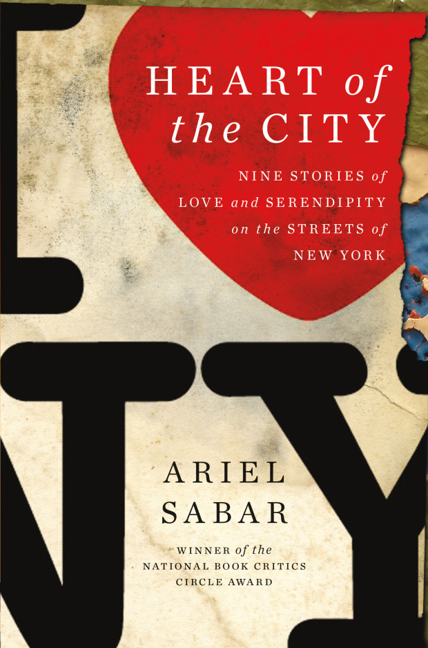
Heart of the City_Sabar_HSYee
Heart of the City by Ariel Sabar; design by Henry Sene Yee (Da Capo / January 2011)
heart-of-darkness
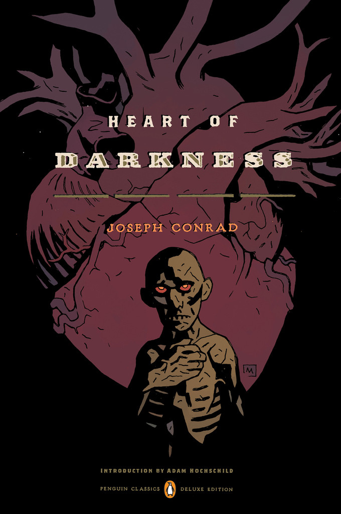
Heart of Darkness by Joseph Conrad; design by Paul Buckley; art by Mike Mignola (Penguin / August 2012)

volkswagen
How to Keep Your Volkswagen Alive by Christopher Boucher; design by Christopher Brian King (Melville House / September 2011)
how-to-love
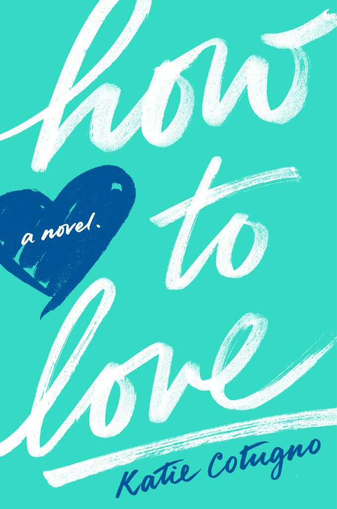
How to Love by Katie Cotugno; design by Alison Klapthor; cover art by Alison Carmichael (Balzer + Bray / October 2013)
hundred-hearts
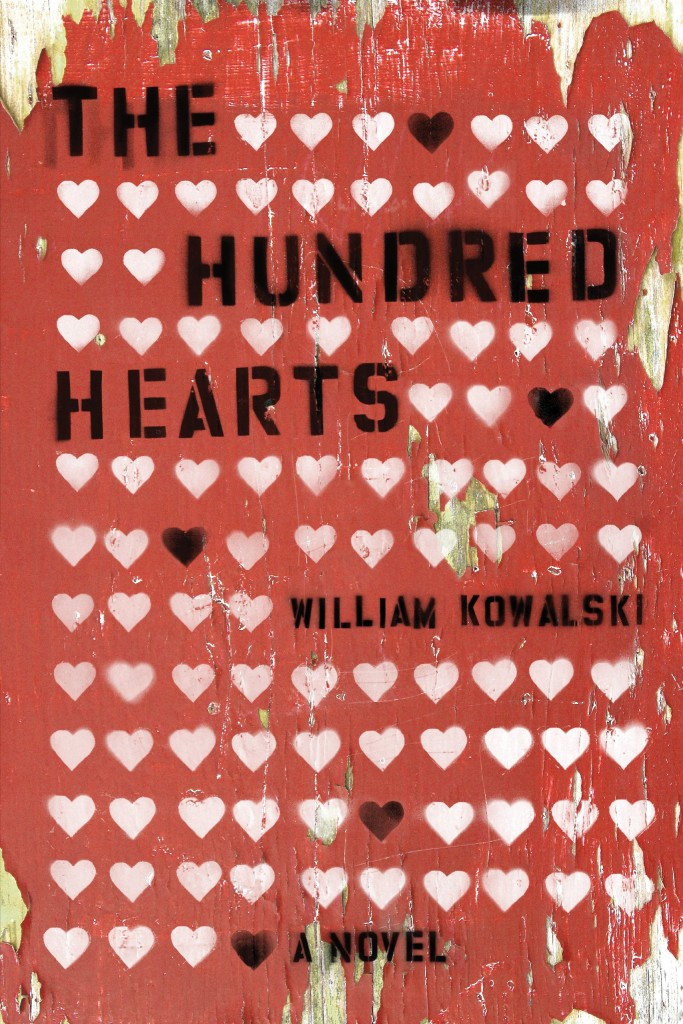
The Hundred Hearts by William Kowalski; design by Michel Vrana (Thomas Allen / May 2013)
9781940450261
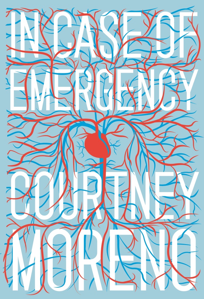
In Case of Emergency by Courtney Moreno; design by Sunra Thompson (McSweeney’s / September 2014)

in-case-we-die
In Case We Die by Danny Bland; design by Jacob Covey (Fantagraphics / September 2013)

9781250052896
Irritable Hearts: A PTSD Love Story by Mac McClelland; design by Keith Hayes (Flatiron Books / February 2014)

9780226018928
Learning to Love Form 1040 by Lawrence Zelenak; design by Isaac Tobin (University of Chicago Press / April 2013 )
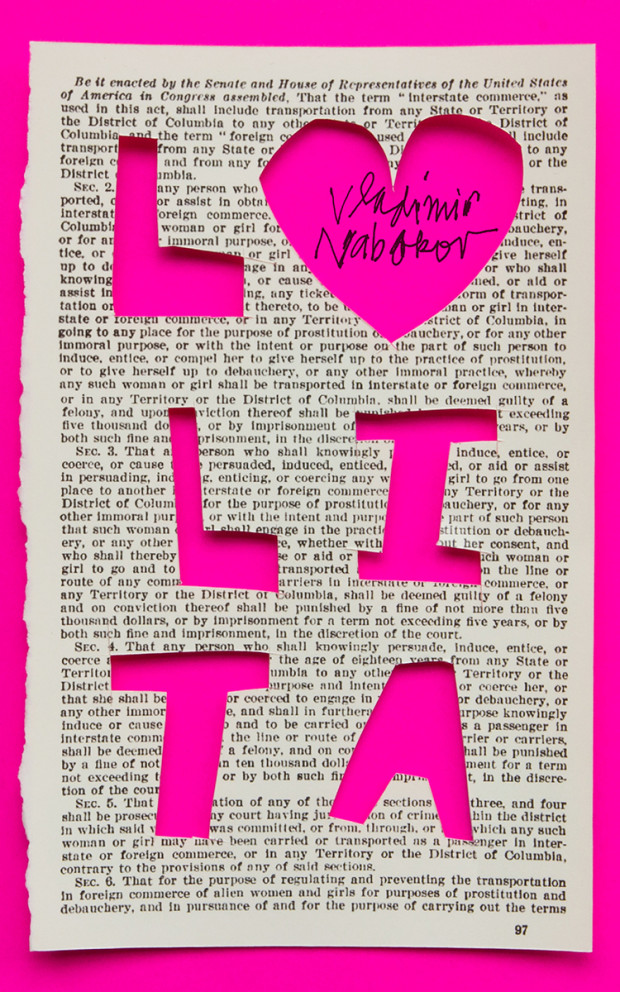
lolita-bierut
Lolita by Vladimir Nabokov; design by Michael Bierut (Lolita Book Cover Project / 2013)

love-poems
Love Poems by Bertolt Brecht; translated by David Constantine and Tom Kuhn; design by Jennifer Heuer (W. W. Norton / December 2014)
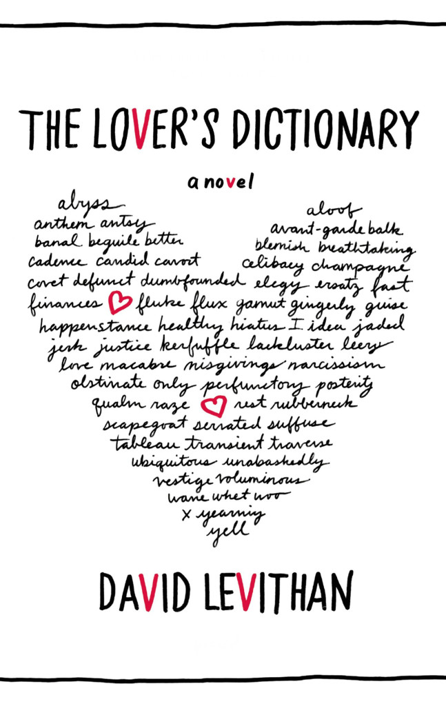
lovers-dictionary
The Lover’s Dictionary by David Levithan; design by Jennifer Carrow (Farrar, Straus & Giroux / February 2011)
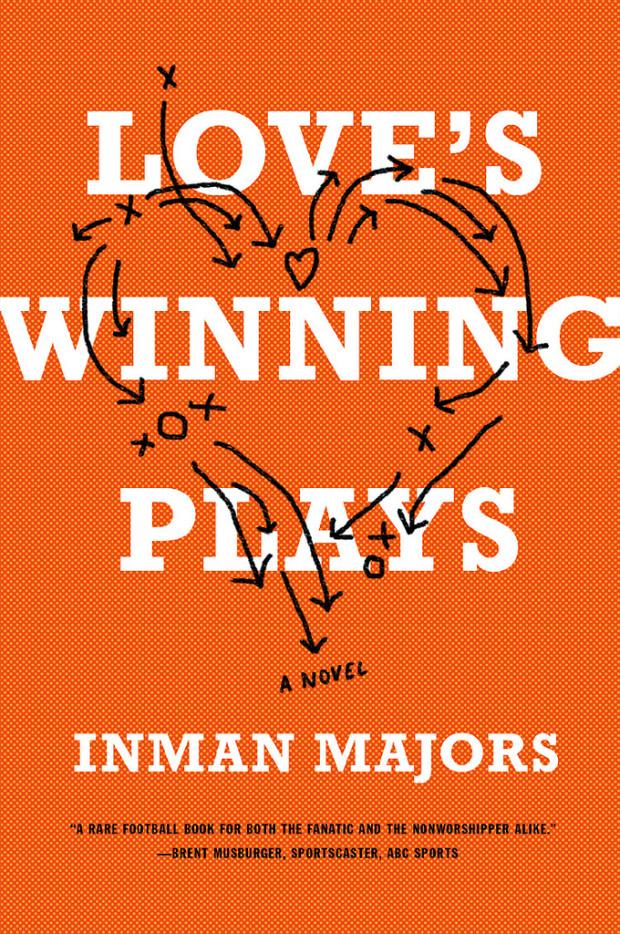
loves-winning-plays
Love’s Winning Plays by Inman Majors; design by Eric White (W. W. Norton / July 2013)

man-who-touched-his-own-heart
The Man Who Touched His Own Heart by Rob Dunn; design by Ploy Siripant (Little, Brown & Co. / February 2015)

marriage-plot
The Marriage Plot by Jeffrey Eugenides; design by Jo Walker (Fourth Estate / April 2012)
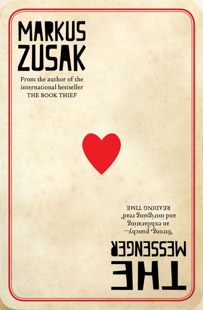
zusak
The Messenger by Markus Zusak; design by Sandy Cull / gogoGingko (Pan Macmillan / November 2013)
On-the-Noodle-Road
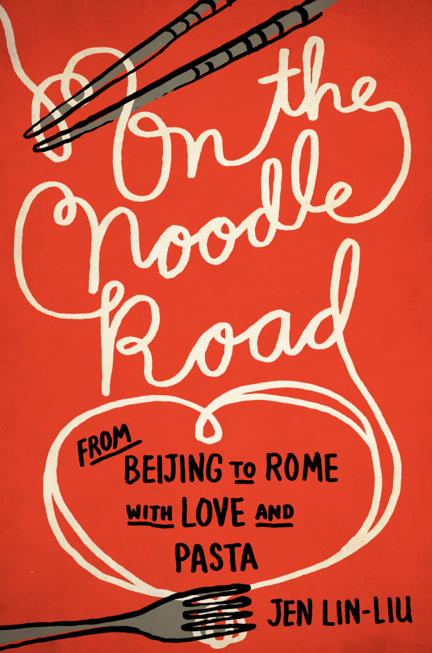
On the Noodle Road by Jen Lin-Liu; design by Lynn Buckley (Riverhead / July 2013)
ps-i-love-you
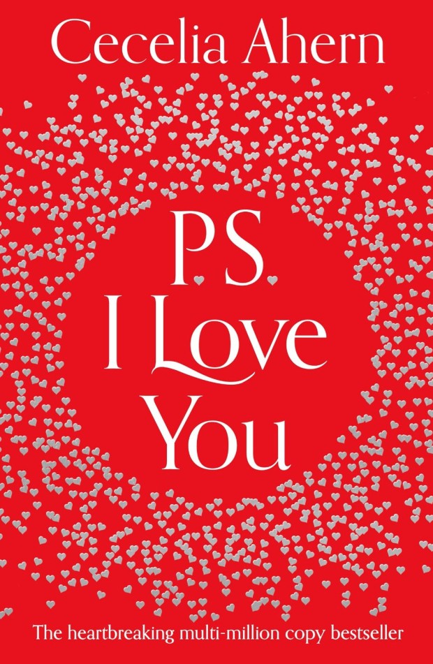
P. S. I Love You by Cecelia Ahern; design by Heike Schüssler (HarperCollins / January 2014)
teeth
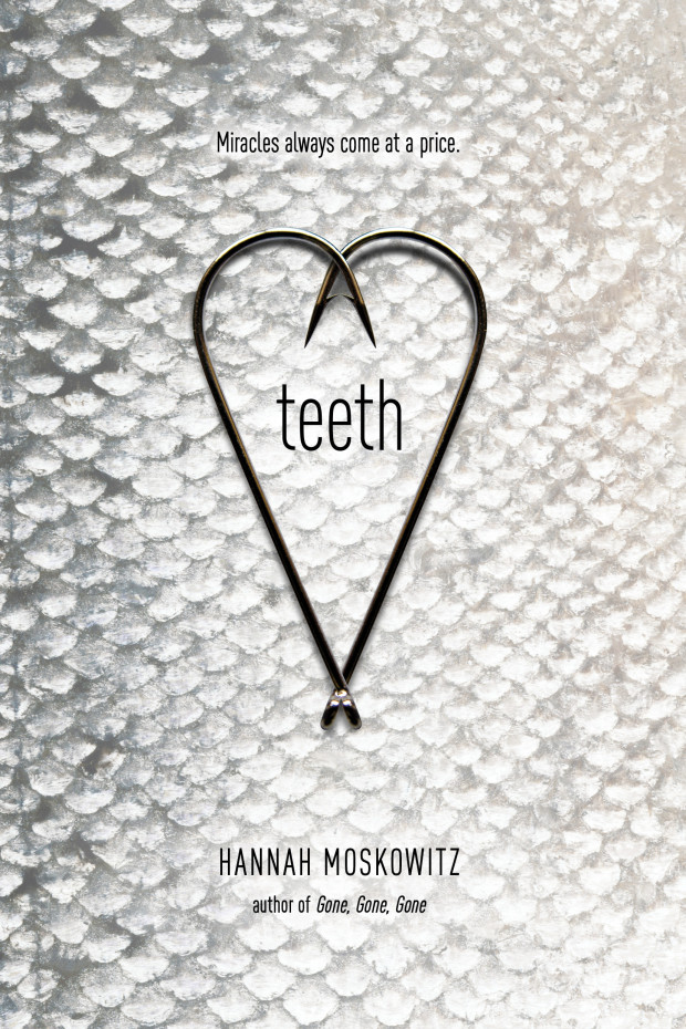
Teeth by Hannah Moskowitz; design by Angela Goddard (Simon & Schuster / January 2013)

things-we-know
Things We Know by Heart by Jessi Kirby; design by Erin Fitzsimmons (HarperCollins / May 2015)

Doern art
The Wet Engine by Brian Doyle; design by David Drummond (Oregon State University / May 2012)
with-or-without-you
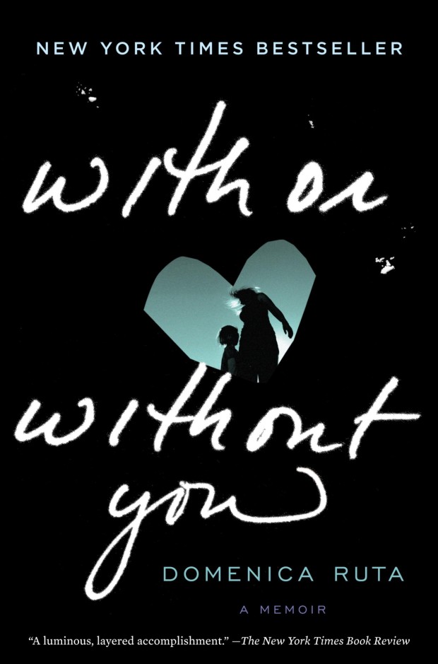
With or Without You by Domencia Ruta; design by Greg Mollica; lettering by Rebecca Siegel  (Spiegel & Grau / February 2013)
4 Comments

Lettres Libres

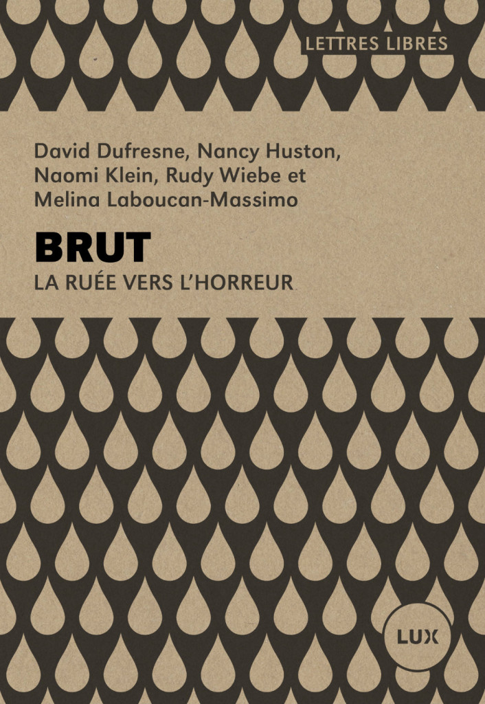
Brut_LL

Canadian designer Catherine D’Amours kindly let me know about her work at Nouvelle Administration to redesign the ‘Lettres Libres’ series published by Montreal-based publisher Lux Éditeur, with the help of Jolin Masson, a freelancer for the team. Printed on craft paper, each cover has its own pattern based on the subject of the book.

I am also a big fan of Catherine’s work for Le Quartanier, another Montreal-based publisher. You can read more about her NOVA series here.

1 Comment

Book Covers of Note February 2015

Here is this month’s selection of new book covers that have caught my eye…

angry-youth-comix
Angry Youth Comix by Johnny Ryan; design by Keeli McCarthy (Fantagraphics / February 2015)
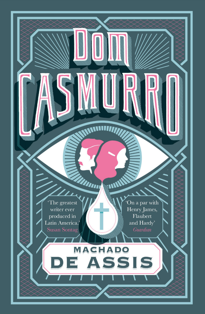
Dom Casmurro hi-res
Dom Casmurro by Machado de Assis; design by Nathan Burton (Daunt Books / February 2015)

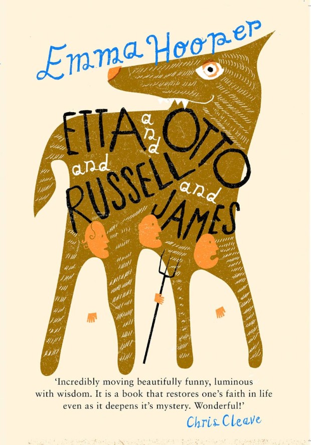
etta-otto-russell-james
Etta and Otto and Russell and James by Emma Hooper; design by Gray318 (Penguin / January 2015)

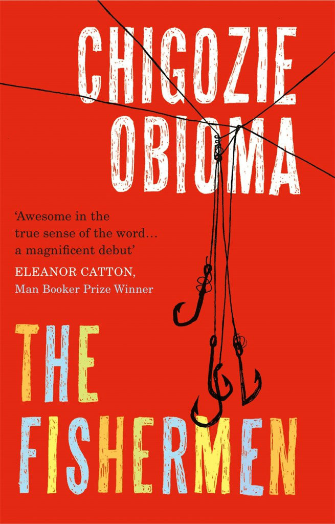
fishermen-gray318
The Fishermen by Chigozie Obioma; design by Gray318 (Pushkin Press / February 2015)

Girl In The Dark
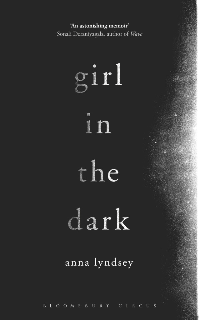
Girl in the Dark by Anna Lyndsey; design by Greg Heinimann (Bloomsbury / February 2015)

i-am-radar
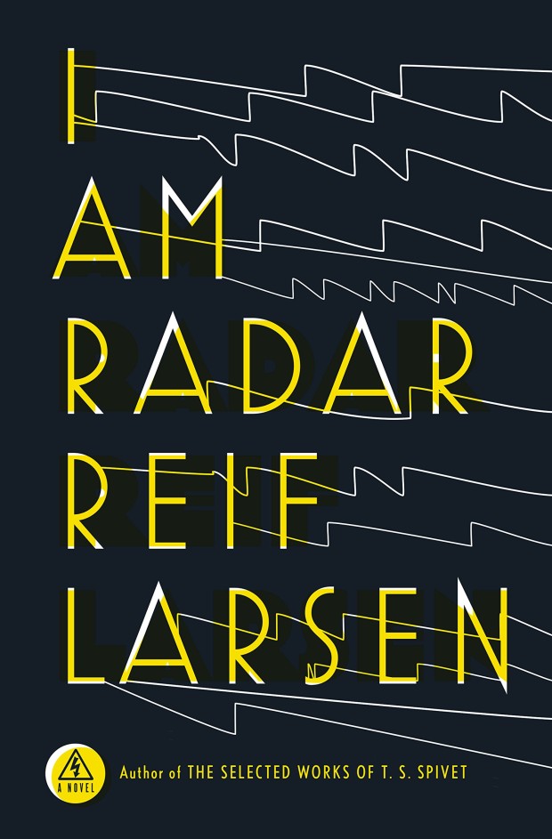
I Am Radar by Reif Larsen; design by Will Staehle (Penguin Press / February 2015)

ismael-and-his-sisters
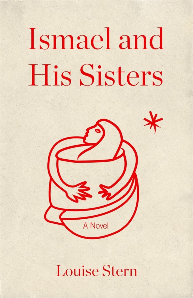
Ismael and His Sisters by Louise Stern; design by Dan Mogford (Granta / February 2015)

italians
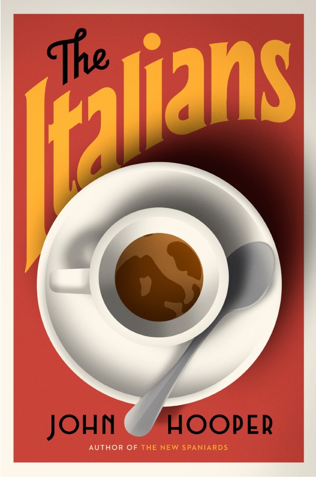
The Italians by John Hooper; design by Nicholas Misani (Viking / January 2015)

karate-chop-pearson
Karate Chop by Dorthe Nors; design by David Pearson (Pushkin Press / February 2015)

munich-airport
Munich Airport by Greg Baxter; design by Anne Twomey (Twelve Books / January 2015)

room
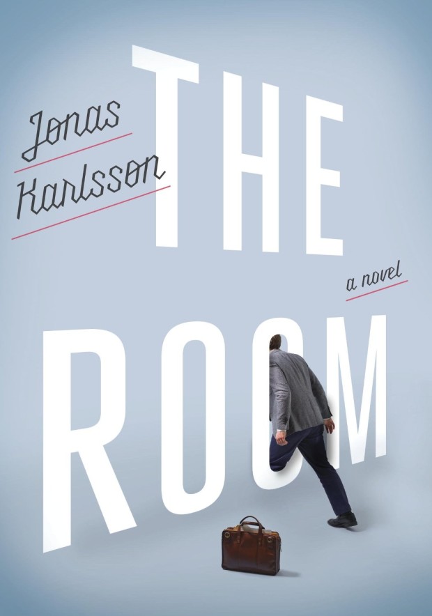
The Room by Jonas Karlsson; design by Christopher Brand; photograph by George Baier IV (Hogarth / February 2015)

shooting-stars-burton
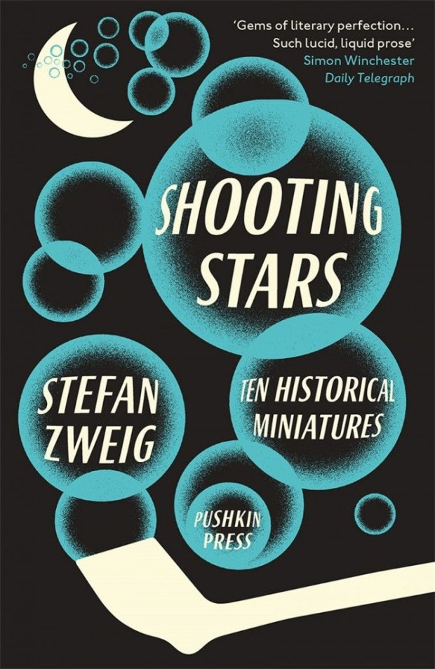
Shooting Stars by Stefan Zweig; design by David Pearson (Pushkin Press / February 2015)


Pudd’nhead Wilson and The Prince and the Pauper by Mark Twain; design by Isabel Urbina Peña (Vintage / February 2015)

utopia-of-rules
The Utopia of Rules by David Graeber; design by Christopher Brian King (Melville House / February 2015)

2 Comments

The Doves Type Revival

DovesBibleTidcombe720x400

I missed this wonderful story about the infamous lost typeface of English Arts and Crafts publisher Doves Press — unceremoniously “bequeathed” to the Thames by one of the co-founders of the press —  in The Economist last month:

Between August 1916 and January 1917 Cobden-Sanderson, a printer and bookbinder, dropped more than a tonne of metal printing type from the west side of the bridge. He made around 170 trips in all from his bindery beside the pub, a distance of about half a mile, and always after dusk. At the start he hurled whole pages of type into the river; later he threw it like bird seed from his pockets. Then he found a small wooden box with a sliding lid, for which he made a handle out of tape—perfect for sprinkling the pieces into the water, and not too suspicious to bystanders.

Those tiny metal slugs belonged to a font of type used exclusively by the Doves Press, a printer of fine books that Cobden-Sanderson had co-founded 16 years earlier. The type was not his to destroy, so he concealed his trips from his friends and family and dropped his packages only when passing traffic would drown out the splash. There were slip-ups, all the same. One evening he nearly struck a boatman, whose vessel shot out unexpectedly from under the bridge. Another night he threw two cases of type short of the water. They landed on the pier below, out of reach but in plain sight. After sleepless nights he determined to retrieve them by boat, but they eventually washed away. After that he was more careful.

Now, almost 100 years after the original metal type was lost, Doves has been revived as a digital typeface:

For three years [Richard Green] has been crafting a digital reproduction of the famous face—the first fully usable Doves font since the original metal pieces were swallowed by the Thames. In search of perfect curves and precise serifs, he reckons he has redrawn it at least 120 times. “I’m not really sure why I started. In the end it took over my life.”

Intrepid fans have occasionally tried to recover pieces of the type from the river, but no one has ever found any, so Mr Green had to beg and borrow Doves books as a reference. That sounds simple—yet the uneven printing that letterpress-lovers cherish made tracing the type impossible. Once ink hits paper, no single letter is reproduced identically. Guessing the shape of the metal that made the marks takes time and patience. Guess wrong, and the error is imperceptible at first; but lined up in text the letter looks awkward, the typeface distracting.

That painstaking process is similar to the technique Cobden-Sanderson and Walker used to create the Doves type, itself a confection of two earlier designs. Doves owes most to the type of Nicholas Jenson, a Venetian printer from the 15th century whose clear and elegant texts shunned the gothic blackletter favoured by print’s early pioneers. A few letters were added, and others redrawn. The arrow-straight descender of its lower case ‘y’ divides critics; purists lament the thick crossbar of the upper case ‘H’. Most people neither notice nor care. “No more graceful Roman letter has ever been cut and cast,” opined A.W. Pollard, a contemporary critic, in the Times. Simon Garfield, a modern writer, celebrates its rickety form, which looks “as if someone had broken into the press after hours and banged into the compositor’s plates.”

You can read more about the history of Doves and the digital revival at Typespec.

And apparently a small amount of the original metal type was recently salvaged from the Thames too. Amazing.

2 Comments

Student Editions by Ákos Polgárdi

DK-Jokai-KEF

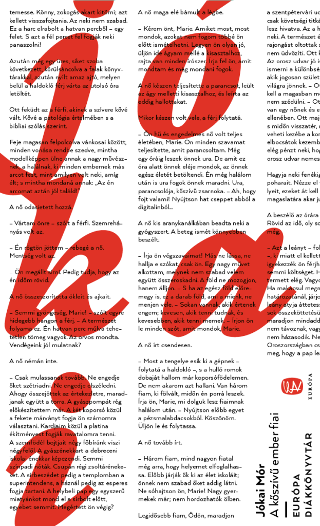
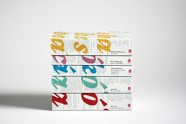
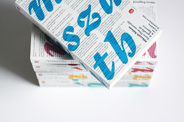
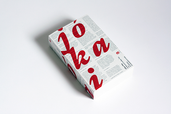
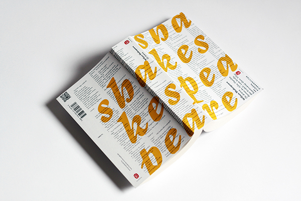
These rather fabulous typographic covers were designed by Ákos Polgárdi for Európa Könyvkiadó‘s Student Editions series. Works of classic literature from Hungary and around the world, each cover features text from the book as a background pattern.

student-editions-1 student-editions-2student-editions-4 student-editions-3

You can see more of Ákos’ book covers on his website.

Comments closed

Ladybird by Design

ladybird-by-design-4

The Guardian‘s Kathryn Hughes visits Ladybird By Design, an exhibition of over 200 original illustrations from the golden age of Ladybird Books:

To enter Ladybird’s world again is to relearn a universe that is both strange yet uncannily familiar. Inevitably the books express the values of their times. In the Peter and Jane series (aka Key Words Reading Scheme), Peter tends to hang out with Daddy in the garage, while Jane helps Mummy get the tea. Fair-haired and blue-eyed, every one in the children’s world looks exactly like them, apart from Pat the dog.

Still, if Ladybird books were conservative on gender and race, they were positively brisk on class. The world of Peter and Jane – and all the other children who appear in the Ladybird universe doing magic tricks, going to the shops, taking batteries apart or learning to swim – is both modern and modest. As illustrated by Berry, Wingfield and Martin Aitchison, the children appear to live in one of the postwar new towns. Their home is probably privately owned but it could conceivably be a newly built council house. Their adventures involve going on a train or to the beach with Mummy and Daddy. There are no prep-school japes here, no solving of improbable mysteries or clifftop rescues.

Perhaps this achievable utopia was a compensatory fantasy for the illustrators who, born around 1920, had mostly known childhoods far harder than this. Busy providing a safe, stable environment for their own little Peters and Janes, men such as Berry and Wingfield showed a world where things were, on the whole, getting better. Modernity increasingly presses into the frame: Jane and Peter eat off a table that looks like knock-off Habitat, Mummy wears slacks and Daddy even starts to help with the washing-up. More disruptive changes, though, are kept at a safe distance. Carnaby Street, with all its troubling freedoms, has no place in the Ladybird world, nor does the cold war or Vietnam.

For those of you who didn’t grow up in the UK, Ladybird Books were slim illustrated hardcover books for children. They were educational, or at least ‘improving’, and so creepy that I think they’ve actually scarred the national psyche. If you are of certain age, the books trigger a shiver of queasy nostalgia — without Ladybird Books the horrifying weird of The League of Gentleman or Scarfolk is just inconceivable — and yet I still think of them fondly. Sort of.
9780723293927
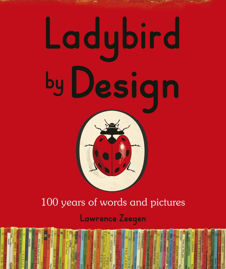
The exhibition, which opens later this week, takes its title from a forthcoming Penguin book called Ladybird by Design. Written by Lawrence Zeegen, Professor of Illustration and Dean of the School of Design at the London College of Communication, the book celebrates 100 years of Ladybird, and examines the social and design history of the publisher. It is sure to be smashing.

1 Comment

Art of the Title: Dr. Strangelove or: How I Learned to Stop Worrying and Love the Bomb

strange_c2-0-800-0-0

The wonderful Art of Title looks back at the title sequence for Stanley Kubrick’s Dr. Strangelove or: How I Learned to Stop Worrying and Love the Bomb designed by Pablo Ferro:

Pablo Ferro’s loose letterforms and slack compositions superimposed over aircraft footage represented a distinct departure from American title design of the time. Prior to 1966, the aesthetic of main titles was defined primarily by designers BinderBrownjohn, and Frankfurt and their symbolic geometry, clean typography, and bold graphic forms. The stage was set for Ferro’s strain of ambitious artistry. His lettering, variously squat, long, and lean, allows the footage to peek through, unobtrusive but utterly individual. It was all done by hand, with grease pencil on glass.

In an interview with Pablo Ferro himself, the designer discusses that distinctive lettering:

I tried to do the lettering like it’s usually done in films, but he said, “Pablo, I don’t know whether to look at the lettering or look at the plane. We have to see both at the same time.” I said to myself, oh boy, how could you do that? I remembered that I do my own lettering, just doodling around, thin and tall and things like that, and I thought I’d try that.

We did a test and it worked! Stanley filled the screen with my lettering. It was perfect! You could see the plane and you could see the lettering at the same time.

Coincidently, Vienna-based foundry FaceType actually released a typeface inspired by Ferro’s lettering called Strangelove Next a few years ago. I’m sure I’ve seen it on a couple of book covers.

Comments closed

Noam Chomsky Series Design by David Pearson

Layout 1

Designer David Pearson has created some rather nice typographic covers for the UK editions of Noam Chomsky available from UK publisher Pluto Press.

Layout 1

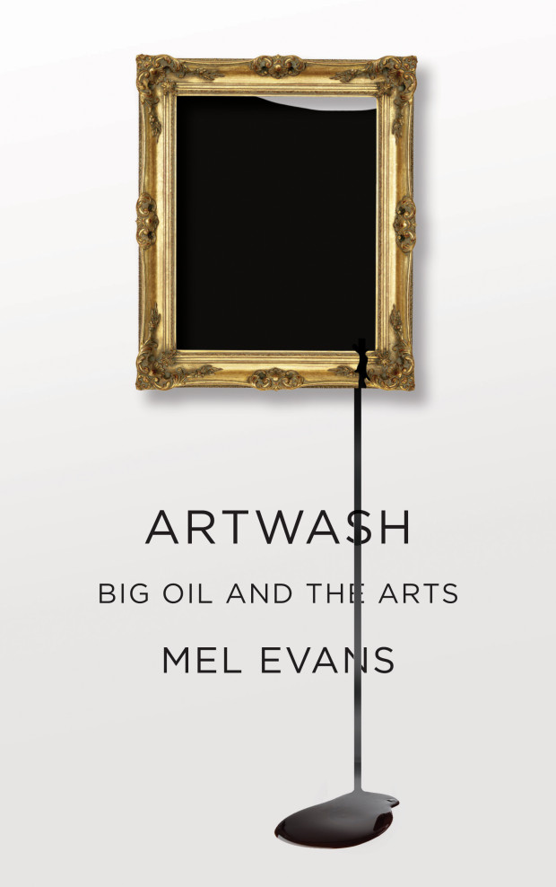
In addition to the talented Mr. Pearson, Pluto Press’s design manager Melanie Patrick kindly let me know that the publisher is currently working with designers such as David Drummond, David Gee, Jamie Keenan, Dan Mogford, and Jarrod Taylor. You can see some of the results on their new Tumblr Pluto Press Covers, including this slick (ba-dum ching!) cover for the forthcoming Artwash by Mel Evans, designed by Mr. Keenan:

artwashrgbhighres

Comments closed

Aaron Draplin on Logo Design

I doubt most of you don’t need advice on how to design a logo (or maybe you do? Who knows?), but Aaron Draplin enthusing about design is always fun. In this video for Lynda.com, Draplin talks about his design process for logos, and even manages to talk about a few of his favourite books along the way:

Comments closed

Portrait of a Letterpress Printer

Portrait of a Letterpress Printer is a short documentary about William Amer, a letterpress printer and instructor based in Rockley NSW, Australia. I have serious shed envy…

Comments closed

Books Covers of Note January 2015

January’s selections include some of this month’s new releases plus a few stragglers from 2014 that were undeservedly overlooked last year:

against-the-country
Against the Country by Ben Metcalf; design and illustration by Leanne Shapton (Random House / January 2015)

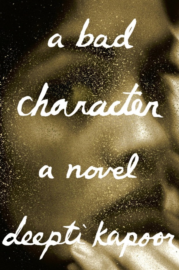
bad-character-novel
A Bad Character by Deepti Kapoor; design by Janet Hansen (Knopf / January 2015)

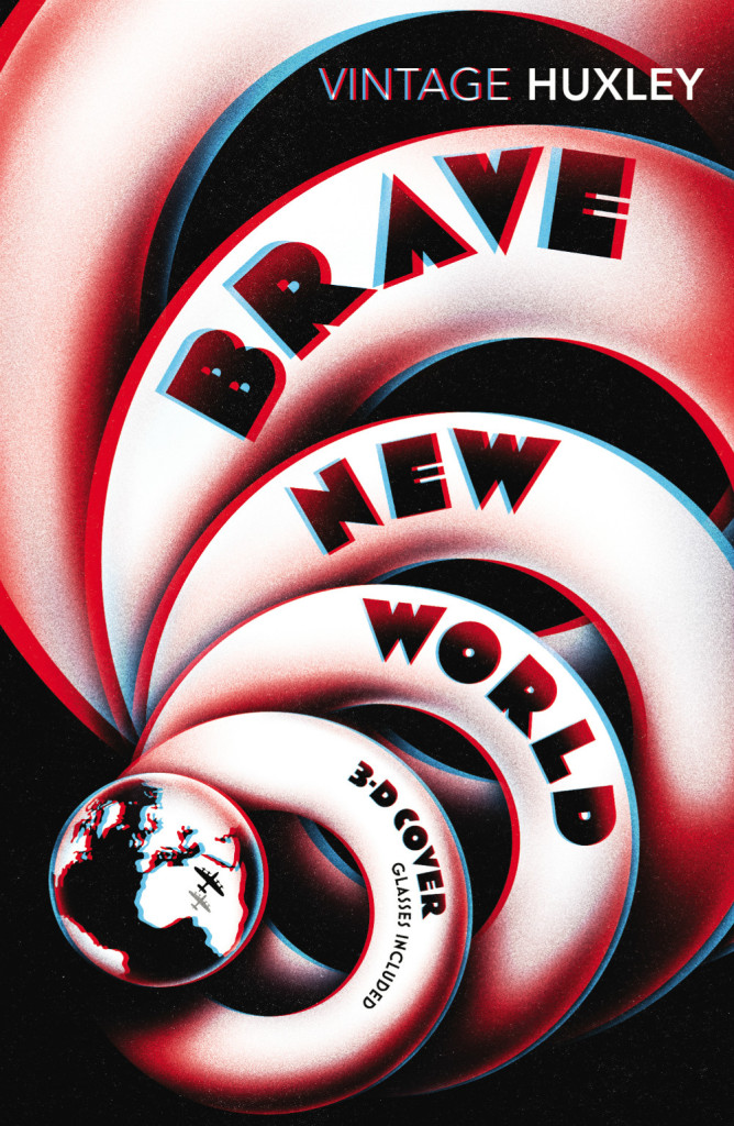
Brave New World
Brave New World by Aldous Huxley; design by Scot Bendall & Richard Carey / La Boca (Vintage / November 2014)

fifty-mice
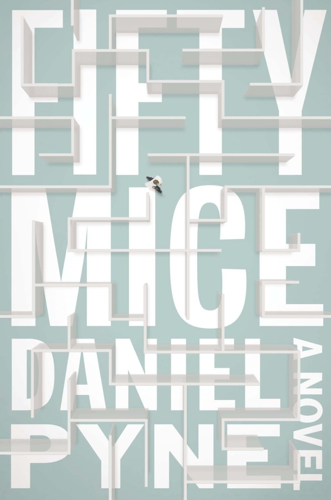
Fifty Mice by Daniel Pyne; design by Alex Merto (Blue Rider Press / December 2014)

first-bad-man
The First Bad Man by Miranda July; design by Mike Mills (Scribner / January 2015)

91bGUNqrbPL._SL1500_
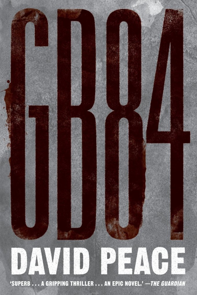
GB84 by David Peace; design by Christopher King (Melville House / November 2014)

hall-of-small-mammals
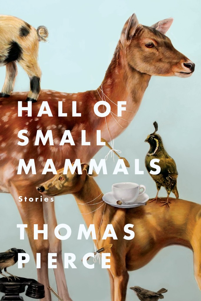
Hall of Small Mammals by Thomas Pierce; design by Grace Han; cover art by Kate Bergin (Riverhead / January 2015)

9781250052216
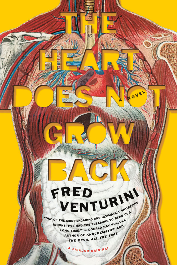
The Heart Does Not Grow Back by Fred Venturini; design by Henry Sene Yee (Picador / November 2014)

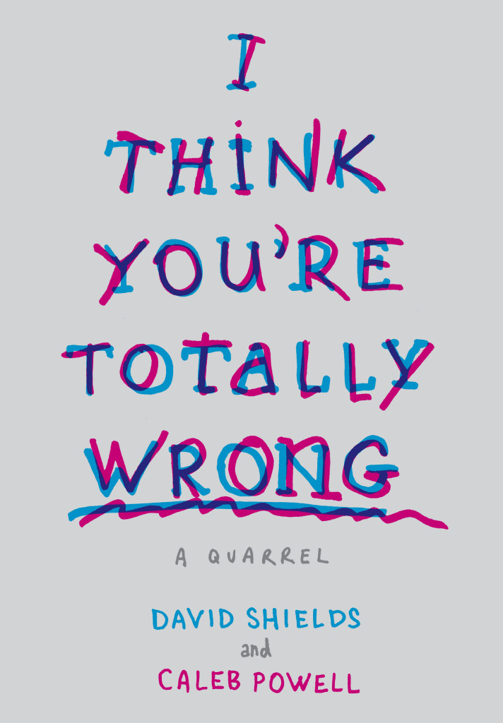
I-THINK-YOURE-TOTALLY-WRONG
I Think You’re Totally Wrong: A Quarrel by David Shields and Caleb Powell; design by Chip Kidd (Knopf / January 2015)

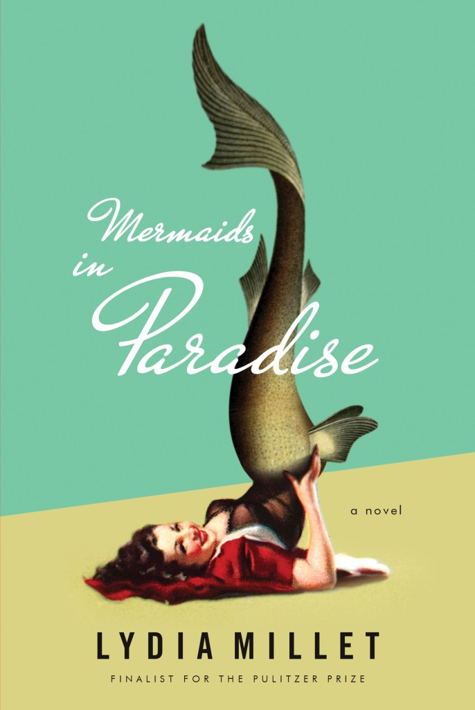
mermaids-in-paradise

Mermaids in Paradise by Lydia Millet; design by Chris Welch Design (W. W. Norton / November 2014)

9780241004968
Trouble in Paradise By Slavoj Žižek; design by Richard Green (Allen Lane / November 2014)

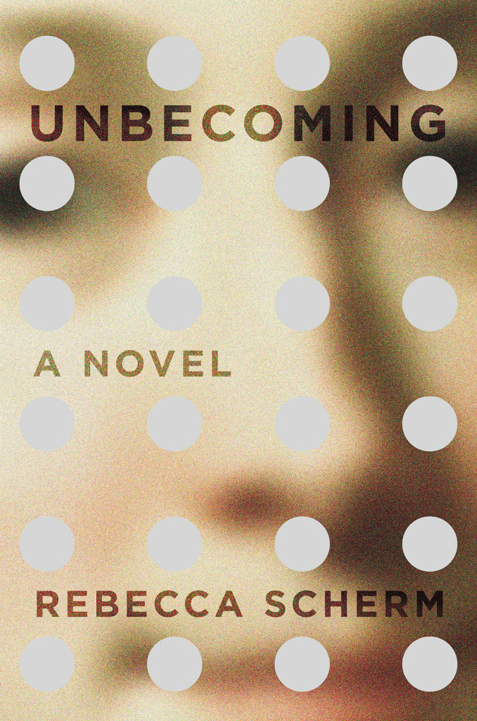
unbecoming
Unbecoming by Rebecca Scherm; design by Paul Buckley (Viking / January 2015)

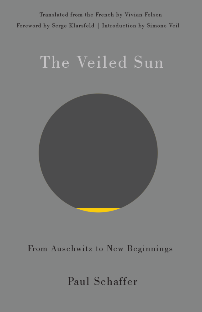
schafferzf
The Veiled Sun by Paul Schaffer; design by David Drummond (Véhicule Press / January 2015)

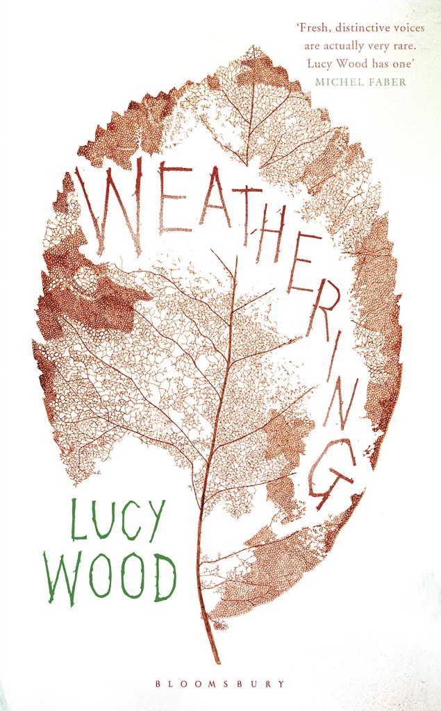
weathering
Weathering by Lucy Wood; design by Greg Heinimann (Bloomsbury / January 2015)

X
X by Ilyasah Shabazz with Kekla Magoon; design by Matt Roeser (Candlewick Press / January 2015)

Comments closed