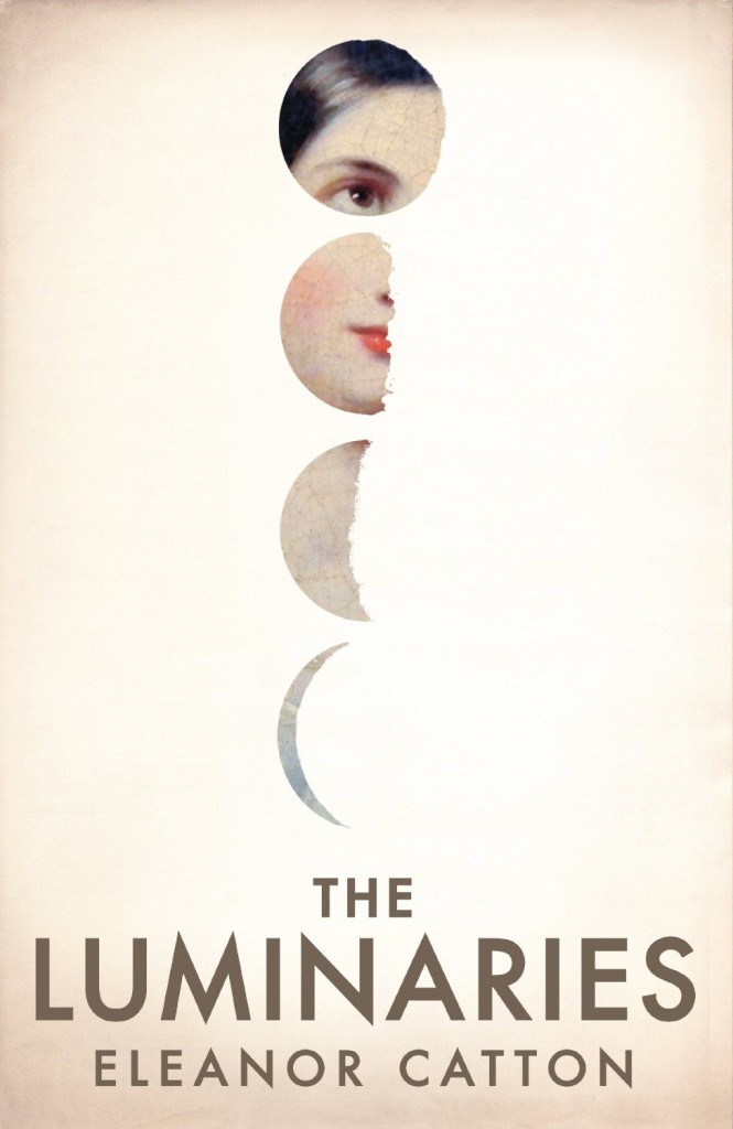
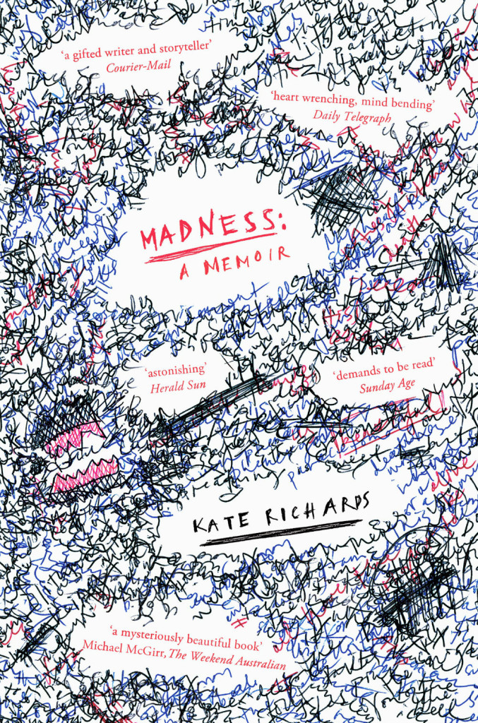
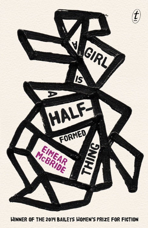
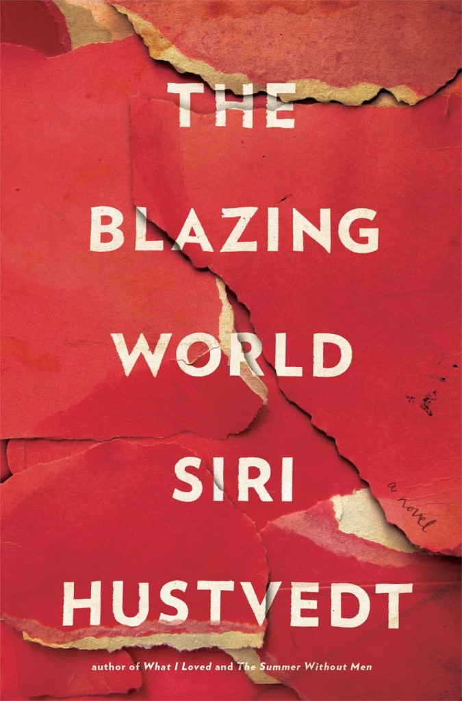
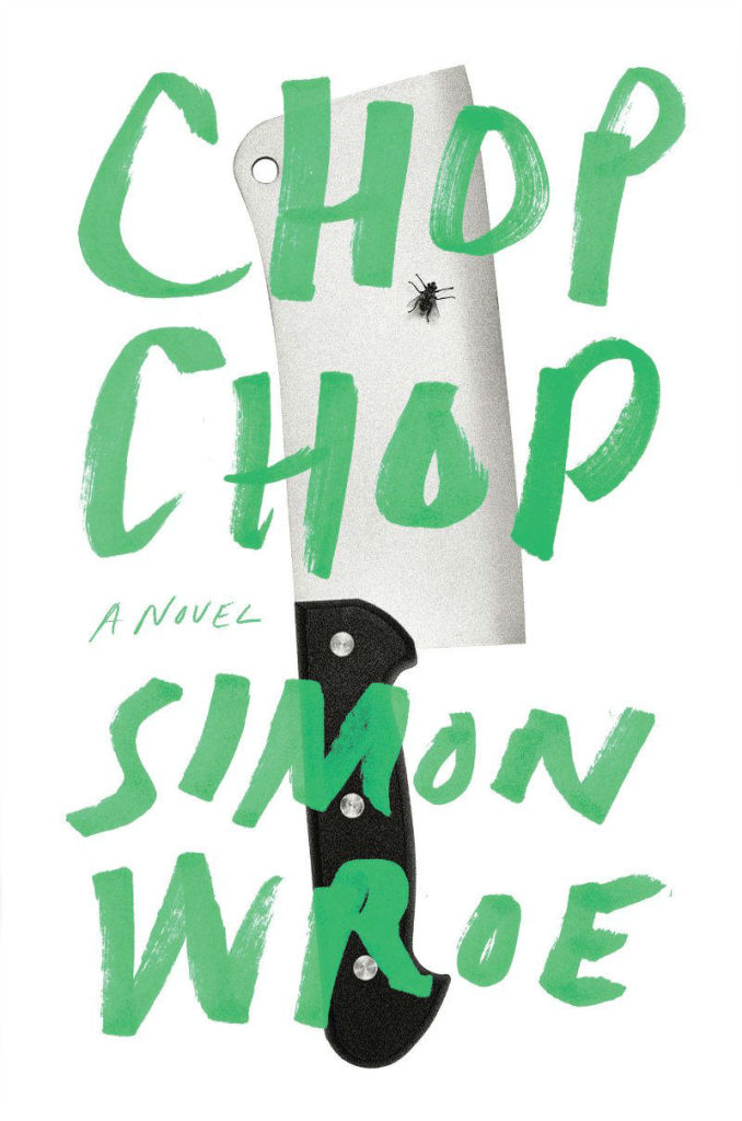
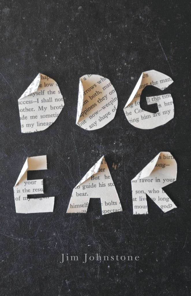
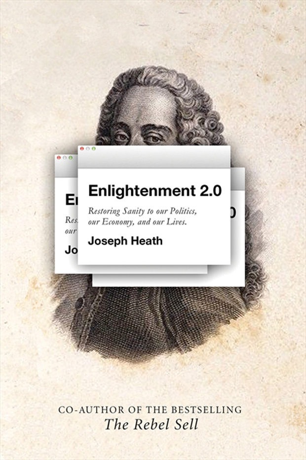
Now that all the amateur ‘best of 2014’ lists are out of the way, it’s time for the professionals submit their covers to the actual design competitions. Last week 50 Books / 50 Covers opened for entries. Meanwhile the closing dates for this year’s Australian Book Design Awards and ABCD15 in the UK are fast approaching…
50 Books / 50 Covers
Design Observer announced the opening of the 50 Books/50 Covers competition for books published in 2014. The competition will accept online entries from January 7, 2015 to March 18, 2015. See the guidelines for more details.
If you live in the United Kingdom, the Academy of British Cover Design (ABCD) has announced the opening of its second annual cover design competition. Books published between January 1 and December 31 2014 by any designer based in the UK are eligible. All entries must be received by the 31st January 2015.
The Australian Book Designers Association (ABDA) has also announced the 63rd Australian Book Design Awards. The awards are open to any book designed and published for the first time in Australia between 1 January 2014 and 31 December 2014. Entries close on Friday 23 January 2015.
Type designer Erik Spiekermann recently spoke to MyFont’s Creative Characters newsletter about his career and his return to letterpress printing:
I think it’s very appropriate to discuss the new interest in analog technologies, and the ways that young people are now finding to combine the analog and the digital. In fact, the difference between the two is disappearing. As type specialist Indra Kupferschmidt also remarked recently — there’s no longer any reason to make things for the screen that look worse than designs made for print. Anybody who does layouts for the screen must know about type and typography just as well as someone who designs for paper. So what counts is, just like before, how to get the message across. We have the technology, there is no more excuse for a job badly done.
What I find very interesting is the movement of people who are savvy in digital design but are genuinely interested in analog techniques. It is now more than a passing trend; there must be a deeper motive why we are newly interested in the hand-made and the haptic, material and three-dimensional aspects of type and design.
BBC Radio 4’s Front Row talks to Suzanne Dean, creative director at Random House UK, about the art of book cover design. Dean, who was very publicly thanked by Julian Barnes for her work on his book The Sense of an Ending, has been responsible for more Booker-winning covers than any other designer apparently.
Host John Wilson also chats with designer Matthew Young about the relaunched Pelican Books, while authors Ian McEwan, Tom McCarthy and Audrey Niffenegger, and Telegraph books editor Gaby Wood, share their thoughts on what makes a good book cover.
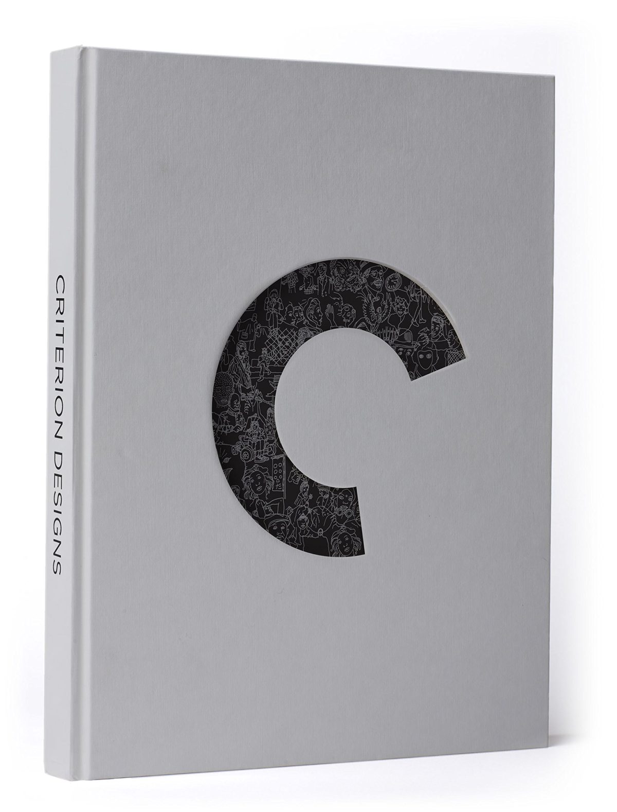
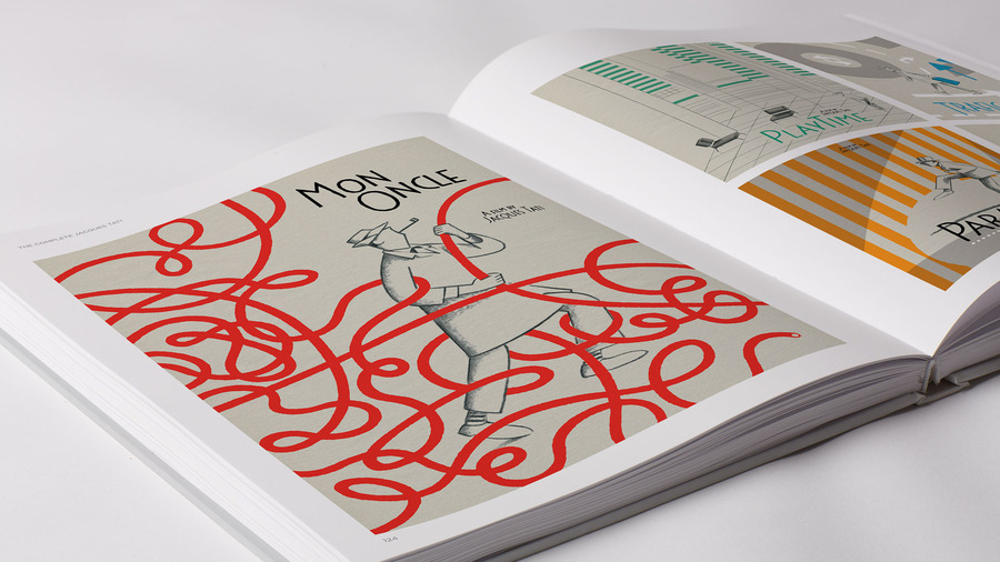
Another book for the wishlist (because in a shocking development no one gave it to me for Christmas), Criterion Designs features covers, art, and sketches art commissioned for the Criterion Collection. It looks beautiful…
In the past, I’ve often included a few series designs in with my favourite covers of the year. This year, I saw so many great covers that were part of a series, I thought a they deserved a post of their own…
Don Quixote by Miguel de Cervantes; design by Nathan Burton (Alma / 2014)
The Gambler by Fydor Dostoevsky; design by Nathan Burton (Alma / 2014)
Notes from the Underground by Fydor Dostoevsky; design by Nathan Burton (Alma / 2014)
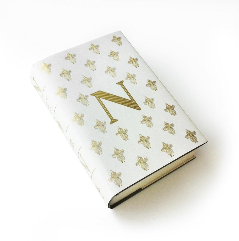
Alma Classics; design by Nathan Burton (Alma / 2014)
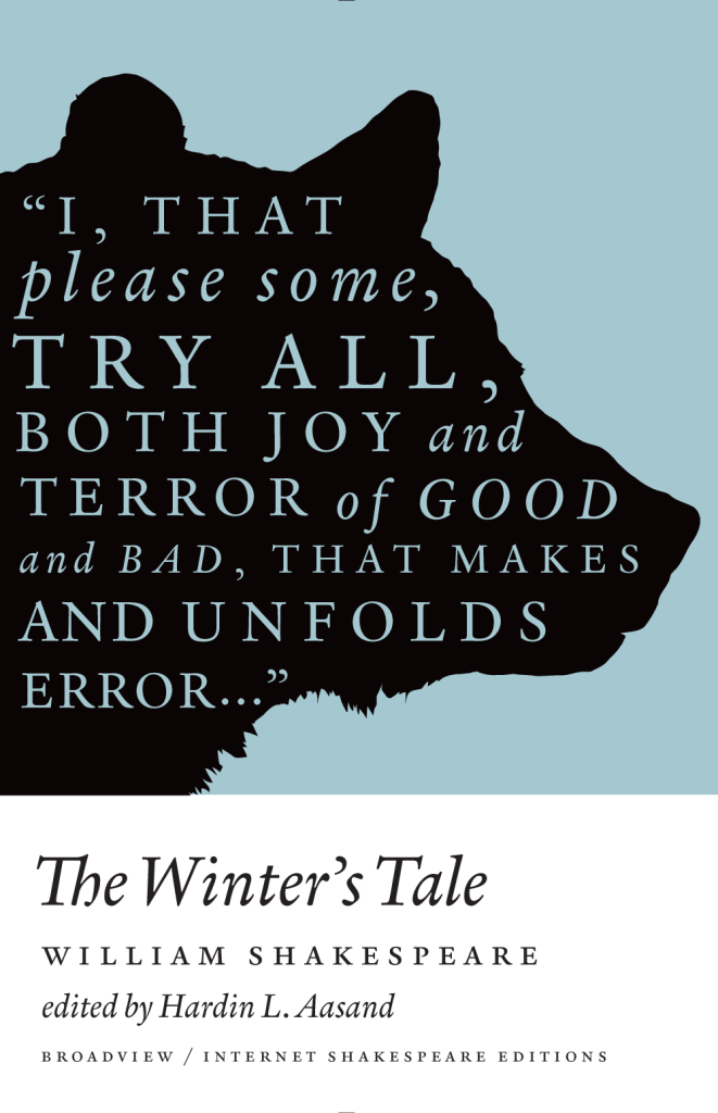
A Winter’s Tale by William Shakespeare; design by Michel Vrana (Broadview / 2014)
As You Like It by William Shakespeare; design by Michel Vrana (Broadview / 2014)
Henry V by William Shakespeare; design by Michel Vrana (Broadview / 2014)
Broadview Shakespeare; design by Michel Vrana (Broadview / 2014)
Nova Express by William Burroughs; cover art by Julian House (Penguin Classics 2014)
The Son Machine by William Burroughs; cover art by Julian House (Penguin Classics 2014)
The Ticket That Exploded by William Burroughs; cover art by Julian House (Penguin Classics 2014)
The Cut-Up Trilogy by William Burroughs; cover art by Julian House (Penguin Classics 2014)
Snapshots–Nouvelles voix du Caine Prize; design by David Pearson (Éditions Zulma / 2014)
Le Complex d’Eden Bellweather by Benjamin Wood; design by David Pearson (Éditions Zulma / 2014)
L’Exception by Auður Ava Ólafsdóttir ; design by David Pearson (Éditions Zulma / 2014)
Éditions Zulma; design by David Pearson (Éditions Zulma / 2014)
Come, Sweet Death by Wolf Haas; design by Christopher Brian King (Melville House / 2014)
Resurrection by Wolf Haas; design by Christopher Brian King (Melville House / 2014)
Book designers, you do amazing work. Thank you. I am especially grateful to all the designers and art directors (not to mention publicists and other publishing folk) who have shared their wisdom, provided me with images, and helped me with design credits this year — these posts would not be possible without you. I also want thank my fellow book design bloggers, notably Book Covrs, Booketing, and Caustic Cover Critic, for their sterling work, and my local bookstores, Type, Book City on the Danforth, Ben McNally Books, and Indigo Bay & Bloor, for letting me browse their shelves.
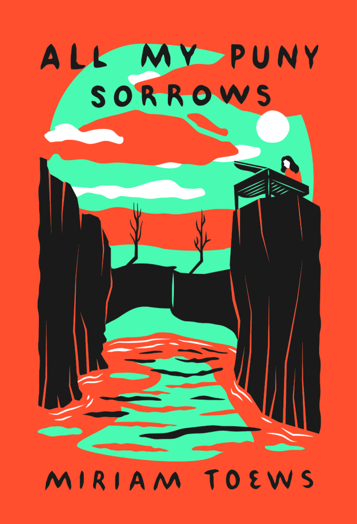
Here are my covers of 2014:
All My Puny Sorrows by Miriam Toews; design by Sunra Thompson (McSweeney’s / November 2014)
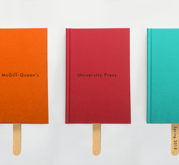
For the past few years, Quill & Quire (magazine to the stars) has asked Canadian books designers choose their favourite covers of the year. This year, however, instead of choosing a book cover like everybody else, David Gee picked out the McGill-Queen’s University Press Spring 2015 catalogue designed by David Drummond.
After laughing pretty hard at Mr. Gee’s audacity (and his transparent attempts to never work in this town again), I realised I would love to do a post on great catalogue covers.
Print catalogues can be beautiful things, and as David Gee himself points out, “the simple fact that publishers’ catalogues tend to fly under the public radar doesn’t mean they’re easy to design.” They’re are also an endangered species. Publishers are cutting costs, and most are switching to digital alternatives. Now would seem like the perfect time to celebrate the charm of the print catalogue before it disappears completely.
I don’t usually ask for submissions, but I don’t think I can possibly gather enough material together for this by myself. So if you’ve ever toiled thanklessly over a publisher catalogue and you’d like to see a little appreciation for your hard work, send me an email (hello [at] casualoptimist . com] with your favourite catalogue covers (and interiors if you wish), and I’ll showcase all my favourites in the New Year. The images should be hi-res jpegs or pngs (at least 620px wide), and please be sure to include the publisher information, and all the relevant credits.
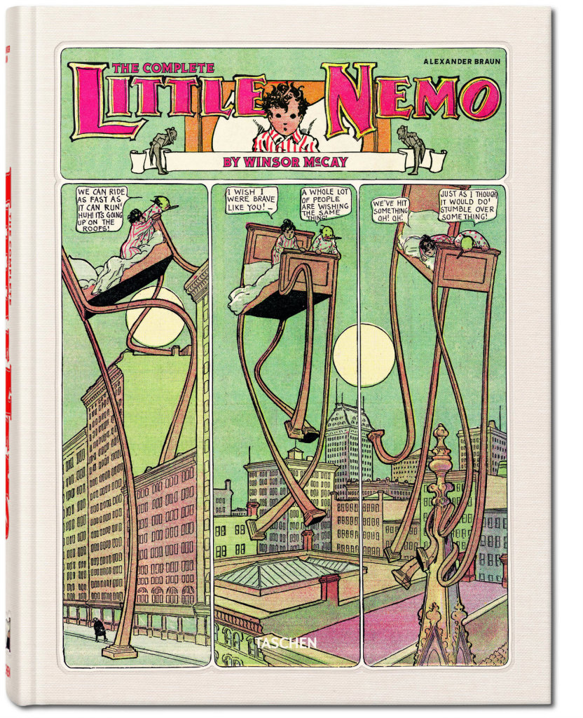
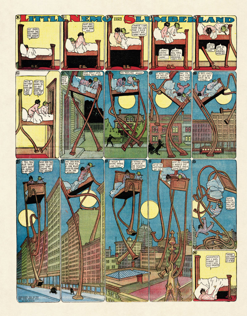
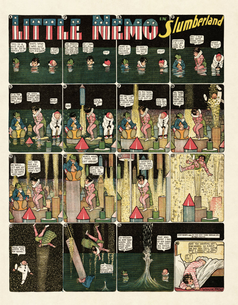
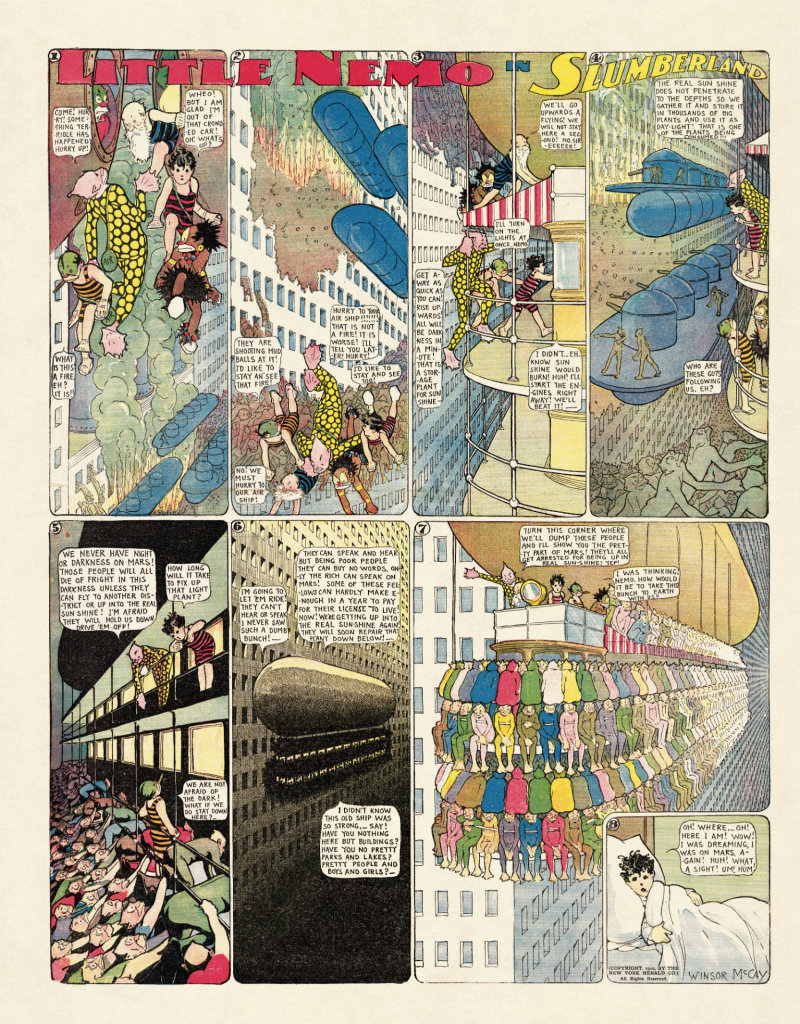
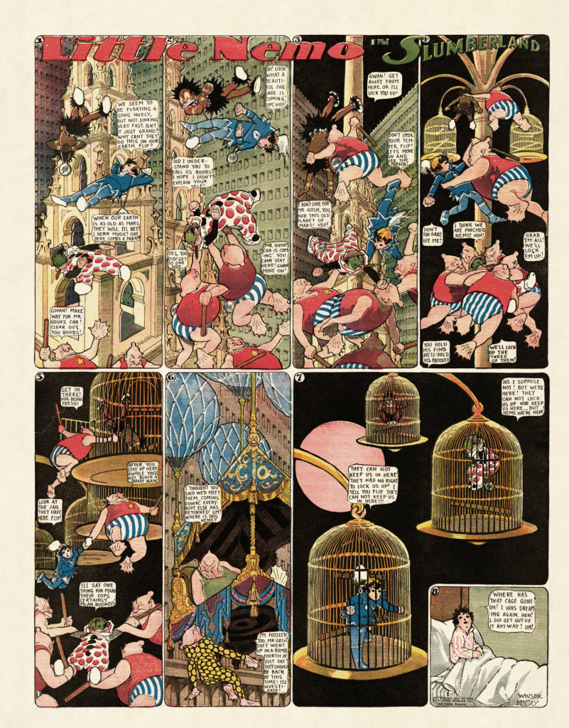
If you were wondering what to get me for Christmas this year, Taschen recently published Winsor McCay: The Complete Little Nemo 1905–1927, which collects together all 549 of Winsor McCay’s extraordinary Little Nemo strips.
First published in The New York Herald in 1905, McCay’s innovative, beautifully detailed strips have been available online for sometime, and there have been attempts at reprint collections before, but this oversize edition looks absolutely gorgeous:
As I am still working on my 2014 cover posts, it seems like a good time to let you know that the Academy of British Cover Design (ABCD) has announced its second annual cover design competition.
The competition is open to any designer based in the UK for covers published in 2014. There are ten categories:
Children’s
Young Adult
SciFi/Fantasy
Mass Market
Literary Fiction
Crime/Thriller
Non-fiction
Series Design
Classic/Reissue
Women’s Fiction
I find it hard to think about design in terms of changing the world, but it’s important to think about design in terms of the decisions you make about what you make. Ask yourself: “What am I putting out into the world? Am I helping sell Big Macs or deodorant or iPhones or whatever?” I have nothing against any of those, but at some point in my life, I decided to focus on books. Books are intrinsically good: even the worst book—with some notable exceptions—isn’t truly bad. If people are reading, it is good. As designers, we’re attached to the selling of something; no matter what we’re making there is a selling component. In that sense, the decision to work with books was very much about the larger picture of what I was helping to usher into the world.
Acceptance by Jeff VanderMeer (US); design by Charlotte Strick; Illustration by Eric Nyquist (FSG / 2014)
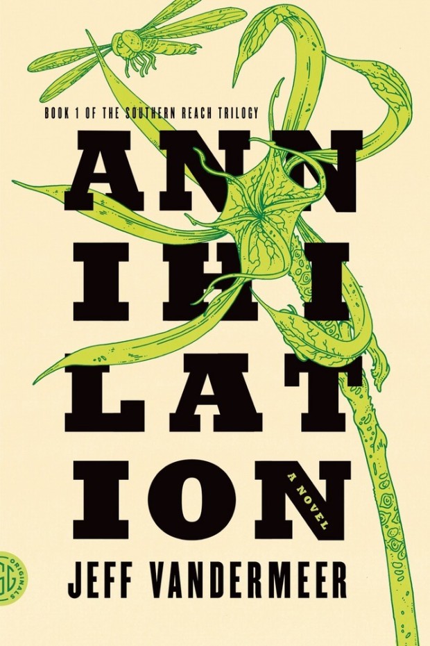
If you only bookmark one long(ish) thing to read today, make sure it’s the slightly bonkers conversation between Jeff VanderMeer, author of the Southern Reach Trilogy, and book designer Peter Mendelsund at Boing Boing:
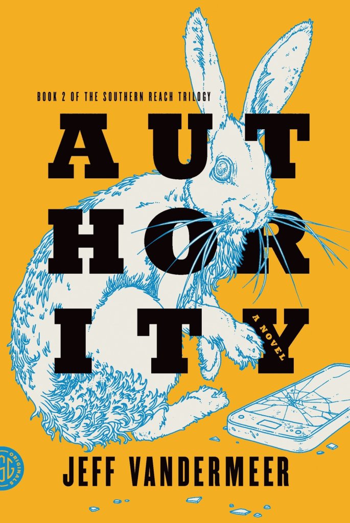
JV: I very much like how you draw out in ‘What We See When We Read’ this idea of creation of character by the constraints around them. Which helps to create an outline of the character. It’s more or less how I thought of Control in ‘Authority’. Taking this even farther, I think that writers like Karen Joy Fowler do something even weirder where sometimes the absence of text or the cutting of text creates a ghost or resonance that allows the reader to fill in the space. Is there an equivalent effect in art/design? Perhaps it’s something you’ve played around with in your own work. An absence that denotes presence.
PM: “An absence that denotes presence” could be the definition of a good book cover. Good book covers are hard to make, I think, specifically because a designer is asked to deploy the facts of a narrative without showing anything explicit about the setting or characters. It’s a tricky balancing act. Everything is done by implication, proxy, metaphor or analogy.
So what is left off of a jacket is crucial. (I’ve often said that most of my day in the office is spent either suggesting things or hiding things.) I’m not an anti-intentionalist or anything, but I do believe that the reader deserves, to some extent, the right to co-create a fictional world alongside the author. So when you make the author’s world explicit on a cover, you’ve taken something from the reader.
VanderMeer also talks to his editor Sean MacDonald about the process of writing the books at the FSG Work in Progress blog. The post includes an amazing cover for the Polish edition of Acceptance. If anyone can tell me who the designer/illustrator is, I would be much obliged…