Skip to content

Tag: design

Midweek Miscellany

Well, oh shit. Go fuck yourself — The pugnacious George Lois in BlackBook magazine:

The design was the idea. I don’t design, if you know what I mean. If you want Andy Warhol being devoured by his own fame in a can of Cambell’s soup, you just put the can there and you have him drowning in it. Case closed.

You’re knocked down by the idea, and the fact that it’s got complete clarity visually. Don’t complicate it with busy work.

That’s the way I do everything. If I was a doing a magazine, it’s not a question of if I’d be having more white space. It’s a question of every third or fourth spread I’d make a spread that would take your breath away — or piss you off. Or something.

“Yoda” — An interview with Dieter Rams at More Intelligent Life (Thanks Ben S.):

We have enough products. If you look at the market you have ten or 20 coffee makers that basically look all the same, doing all the same thing: they are making coffee. We don’t need 20 of these things, we need one good one.

Less, But Better… Less, But Better… [REPEAT].

The View From TorontoNational Post book critic Philip Marchand (formerly of the Toronto Star) talks to Conversations in the Book Trade:

I’m not sure how much “trouble” literature is in. The age of Tennyson was the last period in literature when “serious” literature found a mass market. Ever since, we’ve had a very small minority of readers for “serious” stuff, and a fairly large audience for thrillers, romance novels, detective novels, and so on. Then there’s the Da Vinci Code phenomenon in which everybody, from your dentist to your car mechanic, is reading a certain book – in order to be able to join in discussions about the book on social occasions, if for no other reason.

Frontmatters — Alex Camlin, Creative Director at Da Capo (interviewed here), has started a blog! Yay Alex!

This is Display! — Another site (along with the Alvin Lustig archive) that probably should have been on yesterday’s list of inspiring websites, Display is a “curated collection of 59 (and growing) important graphic design books, periodicals and ephemera.”

Comments closed

Q & A with Jacob Covey, Art Director Fantagraphics Books

I get excited just about every time I post an interview on The Casual Optimist (I am officially a cheap date), but it is a special thrill to post a Q & A with Jacob Covey, designer and Art Director at Fantagraphics.

Partly this is because I’m grateful that in defiance of all reason, publishing wisdom, cold, hard financial facts, bitter law suits, common sense and ‘good taste’, pioneering Seattle-based comics publisher Fantagraphics even exists.

Partly it’s an excuse (not that I really need one) to post Love + Rockets cover art.

And partly it’s because I thought there was a very real chance the interview wouldn’t happen.

But mostly it is because there is something about Jacob’s work — which combines the Chantry-esque DIY design aesthetic of skate art, gig posters, record sleeves, underground comix, zines and punk, with a Ware-like preoccupation with detail and precision — that resonates with me and fits so perfectly with Fantagraphics.

Needless to say, Jacob’s award-winning work has been featured in Print, Communication Arts and How.

We caught up over email…

How did you get into book design?

The germ of the thing started with working at the public library where I was a conspicuously slow page. I would look at every cover I was shelving, setting aside certain ones to check out and carry a few blocks away to a color photocopier. I liked having the inspiration around and I couldn’t afford to buy design books. This was around 1999, when I was beginning to study graphic design and at night was staying out late shooting photos of bands for record labels, local monthlies, and things like that. As for getting into book design professionally, in late 2003 I had just moved back to the Northwest after leaving a job in Los Angeles at a skate company. I was interviewing for a job to churn out ads at the local alternative weekly, The Stranger, and the Art Director, Joe Newton, kindly suggested that I instead talk to Gary Groth at Fantagraphics. They were looking for a new designer but apparently they were in no hurry to actually hire someone as I basically called relentlessly for six months. I think I was just the last man standing at the other end of the phone line so they hired me.

 Briefly, could you tell me about working at Fantagraphics?

If the publishing industry is a zoo, then Fantagraphics is the monkey house. It’s not a conventional workplace and you could get tetanus from walking barefoot but it’s a place where everyone is laboring out of love and there’s a lot of receptivity to trying new things and having your ideas heard. Much more so than I think is possible at most publishers. I have immense respect for the history of the company as an archivist of great work and I have the opportunity to deal with our publishing decisions on a regular basis. It’s satisfying in that way– but the office itself is a neglected three story house with 30 years of dusty artwork, ancient paste-ups, and discarded razor blades strewn about. So it’s not for everyone.

As for the work, Fantagraphics publishes the great cartoonists from Charles Schulz to R. Crumb, but as often as not I’m designing a book of paintings or a collection of pop culture artifacts or even the occasional prose novel.

You’re also a freelance designer. How is that different from your role as art director at Fanta

For one thing I’ve established myself with Fantagraphics enough that I know the material well and have to explain my decisions less. They’re very supportive and because of that I am mostly pushing myself to do better work. With my freelance clients there’s a lot more to learn from their needs and the process involves more time spent on researching and exploring ideas. The freelance work is also much more varied subject matter. For example, as I type this I’m working on the branding for a 2011 museum exhibition focusing on the band Nirvana, a non-fiction book cover for HarperCollins, a band t-shirt design, an AIGA event poster, and a book layout for a start-up imprint in the UK. There are a lot of other publishers I’d like to work with but I’m a pretty shoddy self-promoter.


Could you describe your design process?

In the case of Fantagraphics, I hate to say that most of the time there are so many projects on my plate that I’m just cranking the books out, trying to trust my instincts and learning from any mistakes. We have a list of about 50 books a year with only me and one other designer, Adam Grano, along with our works-through-the-night production guy, Paul Baresh, scanning and laying out everything from the books to the ads and supplying media requests — if we get behind schedule we rarely hire out for another designer, the book simply gets published late. So there’s a lot of pressure to just keep moving. The job requires a lot of discipline to approach books with an eye on getting them approved by the editor/artist without delays and yet still make them interesting. There is process but it’s very accelerated and it’s not unusual that I have to go with my first impulse for a book design and wish I had time to do a dozen more comps.


Is designing for reprint collections different than designing for new material?

Notably, the job description of a cartoonist and a graphic designer are similar in that they both work with text and images but the truth is very few cartoonists have a very developed design sense (just as my cartooning skills are sub par). Working with individual artists on original material can be a really rewarding collaboration or a Sisyphean attempt to improve an idea that the artist is married to. So, in truth, the deader the artist, the easier my job — reprint collections have a more dispassionate approval process.

What are your favourite books to work on?

I’m not sure that there’s any type of book that’s my favorite to work on but I’ve become very comfortable with the process that goes into art books in general. I just finished working on a very collaborative book of VHS box art with the collector/editor Jacques Boyreau and I enjoyed that. The subject matter itself isn’t necessarily what’s interesting to me but there was a long process of sitting with Jacques early on and determining the best way to showcase the work, which ended up being very austere, spotlighting the actual physical history of the boxes and conjuring the experience of seeing them in their element by retaining the old, beaten up boxes, plastered in rental stickers. Some of these boxes we had to prop back together from having been chopped up for those large plastic cases that were used in videostores. In the end, there was more of an anthropological story to looking at the boxes themselves rather than just the art that was on them.

This doesn’t work for every project but it’s great for receptive, collaborative editors. It’s fun to step into someone else’s fixation and figure out how to present the material more evocatively, in a way that will pull other people into what the editor loves about the subject. To design in a way other than plop-plop-plop, here are the images and some nice captions. Then I finish that book and it’s my job to find out and communicate what’s exciting about the next one.

How much say do the artists involved have in the design of their books?

Assuming the artists are involved in a given project, they generally have all the say they want. Fantagraphics publishes The Best and we have to respect the artists’ wishes and peccadilloes. They’re visual people so we usually end up with a good package, if not always a great one.

How are final cover decisions made at Fanta?

On a lot of projects I get more say than is customary for the Art Director but it ultimately rests on the in-house editor of the project and the outside artist or editor whose book it is. We all hash out our opinions about what works for the material and the market but we don’t really have scheduled meetings to sit down and scrutinize. Again, it’s all pretty swift moving.

Who else do you think is doing interesting work right now?

Honestly I can’t seem to go on the web without being intimidated by all the talent that’s out there. I couldn’t list all the people. By far, the designer who most consistently floors me is Peter Mendelsund. The man works brilliantly in every genre thrown at him. I also have to say how happy I am that the Design Works Group guys are in nearby Oregon. I don’t know any other book designers here in Seattle so it’s great to have them around, making a good name for the Northwest.

Where do you look for inspiration and who are some of your design heroes?

I’m a cliché: Inspiration is wherever it turns up.

Art Chantry has been really important throughout my development and is someone whose talent and vision I admire a great deal. I think his influence shows up the most in my work, though not necessarily in the most obvious ways. Chantry, Lester Beall and the Constructivists were my heroes when I used to proclaim design heroes. I would definitely add Mendelsund and Paul Sahre to my contemporary list.

Of course you can’t work in comic book design without acknowledging the significance of two of the world’s most important contemporary designers, Chip Kidd and Chris Ware. They made it possible for me to do a lot of what I do with Fantagraphics.

Could you tell me a little about your personal project Beasts! ?

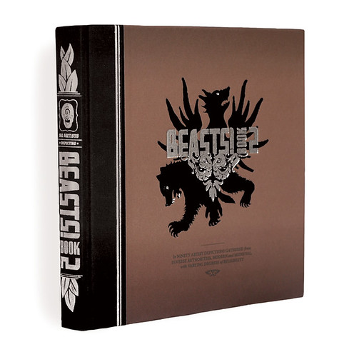
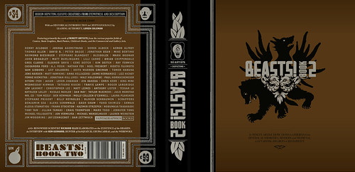
Beasts! is a classical bestiary of mythological creatures as depicted by some of my favorite contemporary artists from the worlds of comics, skate graphics, rock posters, children’s book illustration, the fine art world, et cetera. The first book is now in its fourth printing and the second and final volume came out in early 2009. Each book has ninety artists and four writers involved. I call myself the curator of the project as it’s more like an art exhibit than a standard art book. I wrote up brief descriptions based on my research of creatures, then the artists chose the creature that was most interesting to them and the writers would pen proper text based on historical references to the creatures. It’s a lot more serious than people seem to expect. I like these stories, I like that these creatures existed to someone who told the original story, and it was great to see them given form — a lot of the beasts are very obscure and before I got art from an artist there usually wasn’t any depiction to be found for a beast. There are also interviews with respectable experts like the marine biologist, artist, and writer Richard Ellis as well as contemporary eyewitnesses to some mysterious beasts.

Did you design the Beast! books as well as edit them?

Yes, except the Chinese edition that just came out. The publisher translated and totally repackaged it for that market. It was part of my intent with Beasts! to see what could come of a close working relationship between the editor and the designer on a book project. (Obviously I took that to the extreme by performing both roles.) Books are generally fairly linear, straight-forward affairs or sometimes they’re eccentric art books that end up feeling like design masturbation. I’m interested in what can happen somewhere in between these things that will engage the reader to enjoy multiple readings or even to just feel like more of a participant in the whole experience. There are a lot of interesting details that never make it into books simply because the designer isn’t involved with the editorial side or is otherwise not involved on a collaborative level.

What does the future hold for book cover design?

Everyone’s got an opinion on that and my voice would just be din. It’s hard to say if it’s like the film world facing VCRs or the music world facing MP3s but it’s not bleak to me.

Thanks Jacob!

You can find more of Jacob’s work on his website.

UPDATE: Jacob was kind enough to send me a few more images to accompany the interview and these have now been added to the original post.

8 Comments

Dieter Rams: Less and More

“The un-spectacular things are the important things — especially in the future”

A fascinating Gestalten.tv interview with legendary Braun designer Dieter Rams:

The book Less and More: The Design Ethos of Dieter Rams is published by Gestalten this month to accompany an exhibition of the same name at the Design Museum in London (18 November – 07 March 2010).

(NB: Post updated with the Vimeo version of the video)

1 Comment

Q & A with David Gee

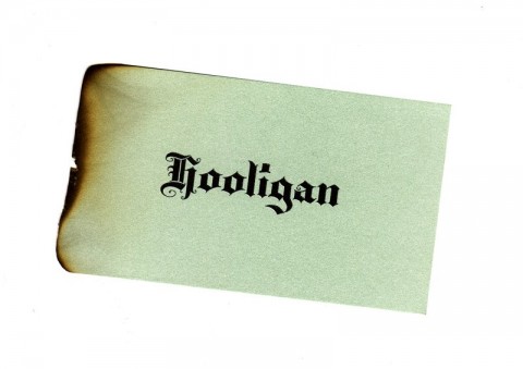
I am somewhat in awe of Canadian designer David Gee. Not only does he fashion stylishly left-field book covers for independent publishers and major houses, he is also willing to scorch individual business cards by hand using vice-grips and a blowtorch (see above).

And he does it all part-time. While holding down a day job.

To an aspiring generalist like me, knowing that David manages to work in more than one creative field is incredibly inspirational. And, as most of us struggle to do to even one thinking well, it is simply breathtaking that David’s work — in both his chosen fields — is brilliant and apparently effortless.

David and I chatted about his designs — and the day job — over email earlier this month…

How did you did get into designing books?

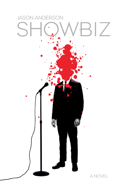
A friend of mine, Jason Anderson, wrote his first novel a few years back and he asked if I would be a ‘careful reader’ and give him some feedback on his manuscript. He later dropped a bomb on me asking if I would design the cover, too. Anyway, the publisher, ECW Press, loved the final cover and they eventually asked me for more and it all kind of snowballed from there. This cover ended up in a Quill & Quire article, an Applied Arts design annual and even GQ Italia. After a year or two of doing freelance stuff for ECW, I just started emailing other publishers and I got a lot of “Yeah, we loved that Showbiz cover!” responses.

What are the pros and cons of designing part time?

Well, the upside is that I don’t burn out too easily. Since my inbox is rarely overflowing, I can take my time with projects and make sure they get the attention they deserve or in some cases, might not deserve. Also, I find that I can still bring a bit of an outsider’s approach to my work. The cons include not being able to build up my portfolio as quickly as I’d like or log the hours that certain jobs end up requiring.

Approximately how many titles do you work on a year?

Roughly twenty or so titles a year. I don’t turn down any work at all, if I can help it. There are the usual pre-catalogue rushes but, for the most part, it’s manageably and workably steady, all year long.

Who are some of the publishers you’ve worked with?

My Main clients include ECW Press, HarperCollins, W.W. Norton, Penguin and Hamish Hamilton, to name a few. I should really try to add to my client roster but, at the end of the day, I’ve little time left for self-promotion since I’m doing this on the night shift. Add that to the “cons” list.

Do you work more on fiction or nonfiction titles?

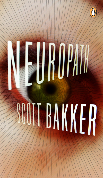
It balances out a bit but my meat and potatoes seem to be in non-fiction work. In addition to the fiction titles I’ve been doing for Penguin, they’ve been sending me a bit of science fiction work too, which has been a lot of fun. The Hamish Hamilton titles have been a big boost to my ego and hopefully my skills as a cover designer, too. HarperCollins is mostly non-fiction and ECW sends me just about anything you can think of from abstract poetry to scandalous wrestling bios.

What are your favourite books to work on?

Every job creates its own unique set of challenges, so it’s hard to say if one trumps the other. With fiction I approach the conceptual end of things more laterally and obliquely whereas with non-fiction I try to approach the execution laterally if only in order to separate the book from similar titles on that particular shelf.

What are the most challenging?

I haven’t the breadth of experience required to provide a quantitative, scientific answer to that. They’re all challenging since the last thing I ever want to do is just phone it in. I recently finished a cover for a book on the history of beer in Canada, which for a hoser like myself was just so ominously and ridiculously huge and daunting a task I think I actually lost sleep over it.

What is the “day job”?

I’m an advertising copywriter working in television and radio, mostly. My business cards say “Senior Writer” actually, even though my family still doesn’t understand what I do for a living despite the awards. (I’m required by a secret and arcane advertising edict to mention that I have won awards. Many awards.)

Does working in advertising influence how you think about book design?

I think what my day job has trained me to do is recognize a good idea in its purest, raw form. My own personal barometer goes something like “Is this actually an idea or is it just acting like an idea?” which means does the core concept have an element of truth to it, doing service to the product/service/book cover, or am I just relying on flashy execution alone?

Could you describe your design process?

It usually begins with an immediate gut-reaction to the brief, scribbling this idea down and then entirely forgetting about the project for a few days. Most of the hard work is purely mental, trying to formulate concepts and visualize their treatments. Executionally, I don’t really do a lot of back-end tinkering, making the type one-point bigger or smaller, etc. I’m pretty rigid at the mechanical stage but overall, I tend to “play it where it lies”, to borrow a golfing term (for some reason). I think this comes from my vocational history of working in lead-type print shops and sign-painting shops when I was a young lad, onto my get-your-hands-dirty fine art schooling and my Letratone and line-tape design background, all of which predate computers and their sinister ability to allow you the chance to second-guess yourself every step of the way.

Where do look for inspiration and who are some of your design heroes?

I like different designers for different reasons. I respond to David Drummond’s thinking. I always assumed he had an advertising background (which I later found out he does), as his ideas are right on the money and need little in the way of window-dressing. Peter Mendelsund’s covers have a weird quality; seemingly equal parts glib and fussy. Henry Sene Yee’s covers are quietly dignified. The usual suspects, I suppose. I’d be remiss if I didn’t doff the proverbial to my online chums Jason Gabbert, Kimberly Glyder, Ingrid Paulson, Nate Salciccioli, Christopher Tobias & Michel Vrana.

Inspiration is always in the brief. You just have to find it yourself.

What does the future hold for book cover design?

Not a clue. Same strategies, different tactics? If my own personal future of book cover design affords me the opportunity to continue to do this (and maybe work with Eric Hanson on a project or design some Donald Barthelme books), I welcome it with open arms.

Thanks David!

You can see more of David Gee’s work on his blog.

4 Comments

Q & A with Isaac Tobin, University of Chicago Press

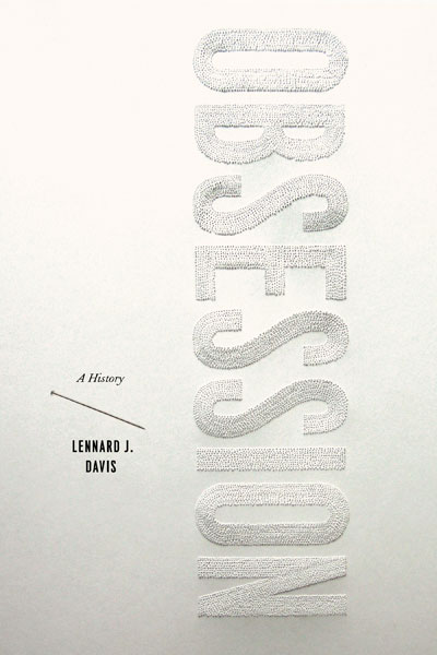
To my embarrassment, it wasn’t until his wonderful design for Obsession by Lennard J. Davis that I really began to pay attention to Isaac Tobin‘s work. There was something about the lettering — painstakingly created with pin pricks into thick cardstock — that made me curious about the designer. Who would do that?

But clearly I should have been paying closer attention.

By the time Obsession was published last year, Isaac’s work had already been recognised by the Art Directors Club, the Association of American University Presses, and The Type Director’s Club, and his covers included in AIGA 50/50 and the Print Magazine Regional Annual.

As senior designer at the University of Chicago Press, his portfolio is full of understated, witty designs for books on topics as diverse as American humor, citrus, Iraq, Islam, Italian culture, Victorian illumination, Yiddish and everything in between. And thanks to his imaginative use of type, there is always a lot more show than tell, which cannot be easy with academic titles (and their epic subtitles).

Needless to say, Isaac is more than just one cover. I think his work is remarkable. I hope you agree…

Design by Isaac Tobin

Design by Isaac Tobin

What inspired you to become a book designer?

I grew up in a family of academics and my parents were always working on their books; sending off manuscripts, going over proofs, preparing indexes, and eventually receiving their cover designs.  I was always interested in art but designing books didn’t occur to me until much later.

I studied graphic design at RISD and fell in love with typography but wasn’t sure what to do after graduation. Luckily one of my teachers (who worked as a book designer) knew that books would be a good fit for me, and let me know that Beacon Press, one of her clients, had an opening for an assistant designer.

Book design turned out to be perfect for me, and I’ve semi-unintentionally ended up in the familiar world of academic publishing, about as close as I could get to the family business while still doing graphic design. And now I’ve had the privilege of designing covers for both of my parents. My brother is writing his dissertation right now so I may also get to design the cover of one of his books.

Design by Isaac Tobin

Briefly, could you tell me about University of Chicago Press?

The University of Chicago Press is the largest university press in the U.S. We publish about 250 books a year. About a third of those are trade books for general audiences, and the rest are either specialist or academic monographs. Print runs vary dramatically but I’d say the average is about 1000. And of course we’re most well known for publishing the Chicago Manual of Style.

There are 8 of us in the book design department, and we all design both covers and interiors, as well as typeset illustrated books in-house. Jill Shimabukuro, our creative director, has put together a really strong group of designers and it’s a great place to work.

Illustration by Lauren Nassef; design by Isaac Tobin

What is your role there, and approximately how many covers do you work on a season?

I’m a senior designer, and work on about 30-40 covers per year.

How is working at university press different from working at a trade publisher?

I think the biggest difference is that university press designers normally work on both covers and interiors (and typeset illustrated books too). Most trade designers are much more specialized, and work on either covers or interiors.

Academic press art and production budgets are also probably lower than at trade publishers, but I imagine all publishers are trying to cut costs wherever they can these days.

Design by Isaac Tobin

Could you describe your design process?

It really depends on the book. When I’m assigned a book I jot down my first ideas in crude thumbnail sketch form. These tend to be the most obvious and cliched solutions, but sometimes my first reaction is the strongest and purest.  Most of the time I put together a big messy Illustrator file filled with visual research and typeface tests. I like to quickly style the title in lots of different typefaces so I can get a sense of the potential word shapes. Then I start combining and recombining various elements and quickly building crude comps so I can explore lots of different options at once. I like being able to zoom out and see all my different comps in a single window. The hardest part is always when I have to stop generating new ideas and variations and start editing down to a single design.

Design by Isaac Tobin

What are your favourite books to work on?

I’ve gotten to work on a couple of books that focus on the history of a single idea; Obsession and Accident. Both were dream opportunities from a design perspective because they were each about a single, clear, yet abstract subject, and their short titles allowed for bold, expressive typography.

I also enjoy working on the less glamorous academic monographs with small print runs and specialist audiences. They often have really suggestive and interesting subject matters. And because of the lower sales expectations it also tends to be easier to get more subtle or unusual designs approved.
Design by Isaac Tobin

What are the most challenging?

The covers that are asked to communicate too much. Sometimes the title of a book doesn’t clearly define the genre or subject matter, so it is important for the jacket design to define it instead. Sometimes everyone can’t agree on just how a book should be positioned in terms of subject matter and genre, and we have to go through multiple cover designs before the right balance is found.
Lettering by Lauren Nassef; design Isaac Tobin

What was the inspiration for the cover of Obsession: A History?

This book is a wide ranging history of the idea of obsession and the way it has changed over time. Because obsession can be such an important part of the creative process, I wanted to find a way to make the cover itself a result of an obsessive act.

To keep things simple I decided to not bring in outside imagery and work with the title itself. I’m a sucker for the classic typography 101 exercise where you make a word look like its meaning, and the one-word title was a great opportunity. But my attempts to construct the word “obsession” with repetitive typographic elements on the computer were falling flat. My wife pointed out that the computer was making the repetition too easy, and it would be better to make it by hand so the hours of work would be visible in the final product. She had actually been making drawings with pin pricked holes years ago and suggested using that technique. Right away I knew she was right, and could see exactly how the cover would come together.

What was it like collaborating with Lauren on the cover?

Like many of our collaborations, it emerged naturally. I pitch a lot of my cover ideas  to her first, and show her all of my comps, so she’s often involved in my work, and in the course of one of these discussions we realized that not only was her idea the right idea for the book, but she was the one who could pull it off. This was a very easy collaboration for me; she pretty much came up with the idea and then did basically all the work. All I had to do was design the typography (in my go to home-made sanserif Attleboro), take the photo at the end, and handle the ancillary type.

Design by Isaac Tobin (using display type Attleboro)

Spread from Whiskey Tango Foxtrot

Do you see any recent trends in book design?

It seems like more cover designers are creating their own lettering and imagery these days. I guess the DIY approach that started with crude and faux-naive hand-made designs has evolved into something more refined and craftsmanship-based. A lot of these custom letterforms and images are being drawn on the computer, but whether handmade or digital they are clearly labored over.

I’m probably too close to the subject matter to be a good judge though. I try not to analyze design trends or how my work fits into them too much. I used to do that a lot and found it kind of crippling, so I’ve been trying to follow my instincts more. My instincts are probably just subconscious recapitulations of the dominant trends, but I’m happier this way.

Illustration Lauren Nassef; design Isaac Tobin

Where do look for inspiration and who are some of your design heroes?

I really can’t believe how many great cover designers are working right now. It’s both incredibly inspiring and humbling. The list of designers I love is too long to recite here and you’re off to a great start with this interview series. I don’t know if the field is getting stronger or if the internet is making it easier to see more work. Maybe a bit of both; the internet is breaking down barriers and putting all of us in direct conversation/competition, leading to better work. Design Related has been a big part of this, as have all the cover blogs. I remember when the only way to see new covers was to prowl bookstores and pore over the AAUP and AIGA annuals.

I’m continually inspired by the work my colleagues at the UofC Press are doing. I think we’ve all gotten better over the last few years and keep inspiring each other. It’s always exciting when I go to grab a print from the communal laser printer and accidentally see someone else’s cover. Not all of my colleagues have websites (yet!) but here are the ones who do: Matt Avery, Maia Wright, Natalie Smith, Mike Brehm, and Dustin Kilgore.

My good friends from college Jenny Volvovski and Matt LaMothe started a design firm with another RISD friend, Julia Rothman, and they’re doing amazing work. And finally my wife Lauren Nassef is a constant inspiration. She just completed the second year of her drawing blog where she posts a new drawing every day.

Design by Isaac Tobin

Interior detail from Cartographies of Travel & Navigation

What does the future hold for book cover design?

I’m really not sure.

But E-books are definitely going to change things. I won’t get into the future of text design (except to say e-books won’t really be viable until they support decent typography and don’t strip away all our work in favor of badly justified default fonts) but I would speculate that cover design is going to get less focused on the cover itself and more on what you might call book identity systems. As books are increasingly sold in multiple formats and for different devices, we’ll have to transition away from designing objects to designing open ended systems. In a best case scenario, this could be great and provide lots of opportunities for inventive designs that range from masterfully produced collectible physical books to all manner of online formats. I hope that publishers continue to support cover design and recognize the value that good design can add to their books, whatever format they may be published in.

Thanks Isaac!

Illustration by Lauren Nassef; design by Isaac Tobin (for Kiepenheuer & Witsch)

You can see more of Isaac’s work at his website and design:related portfolio.

10 Comments

Something for the Weekend, November 13th, 2009

Is this a new cover for J G Ballard’s Crash? HarperCollins Canada have a release date of November 2nd, so I guess so. And I would assume The design/illustration is by the immensely talented David Wardle who did the previous covers in this seriesCan anyone confirm?

In any case, I think the Warhol/Banksy Elizabeth Taylor illustration fits the book pretty well and it’s a nice counterpart to the Marilyn Monroe on the cover of Atrocity Exhibition.

Moving the Needle — Literary agent Nathan Bransford on the challenges facing publishers in the HuffPo:

One of the big recent surprises in the industry… is a newfound difficulty making a splash… with adult nonfiction. Now, to get an idea of what a huge problem… this is, bear in mind that for many years adult nonfiction was the bread and butter workhorse of the industry. Fiction, except for very very established authors, has always been regarded as something of a crapshoot. Nonfiction, on the other hand, was a source of relative stability, and… healthy margins.

Not so much anymore. Everything is difficult to break out.

Artists’ eBooks — a new project from James Bridle and booktwo.org (now, James, if you could only get my bkkeepr badge work properly…)

I Don’t Know WhyUnderConsideration‘s FPO (For Print Only) looks at the quirky and deliciously creepy There Was An Old Lady by Jeremy Holmes, published by Chronicle Books (and — full disclosure alert — distributed by Raincoast in Canada)

And finally…

The (slightly bonkers) illustrator and musician mcbess has a new book (and vinyl record!) called Malevolent Melody coming out from Nobrow:

(If you haven’t seen the insane mcbess/The Dead Pirates Dirty Melody/Wood animated video, you can find that here if you are so inclined).

Update: Thanks to Deanna McFadden of the Tragic Right Hip and HarperCollins Canada for confirming with her UK counterparts that the Ballard cover was designed by David Wardle.

2 Comments

5 Secrets from 86 Notebooks

“If you do what you love and you find other people who do what they love, you’ll be successful, you’ll do great work, [and] chances are you’ll actually make money miraculously enough. If you combine that with a bit of egotism and a taste for the spotlight you could also become famous, but definitely I promise you’ll be happy.”

Michael Bierut, partner at Pentagram and author of the truly excellent 79 Short Essays About Design (yes, yes, full disclosure: distributed by Raincoast Books in Canada), shares five simple secrets for doing great creative work at the 99% Conference in New York earlier this year:

.

And what does this have to do with books specifically? Well, the final thing Michael talks about is a really cool school libraries project…

2 Comments

Missed Things: Friday

Floating — Toronto illustrator Michael Cho on his cover art and interior illustrations for The Amazing Absorbing Boy by Rabindranath Maharaj (published by Random House Canada).

The Ideal Studio Library — It’s Nice That interviews designer Jason Godfrey about his beautiful new book Bibiographic: 100 Classic Graphic Design Books, published by Laurence King,  (and yes, full disclosure, LK are distributed in Canada by my employer Raincoast Books):

My aim was to create the ideal studio library of graphic design books and put this into a book format. I had always felt that there was a need for a visual reference to that could give flesh to many reading lists that have been published… The really tricky choices were the more recent books as it is difficult to know whether they will become classic points of reference, time will tell if I made the right choices on these books.

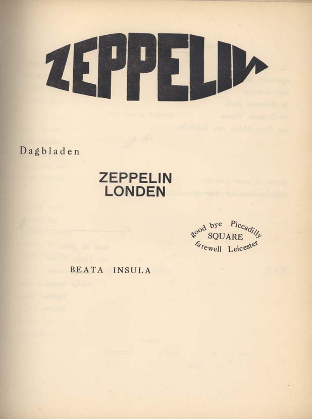
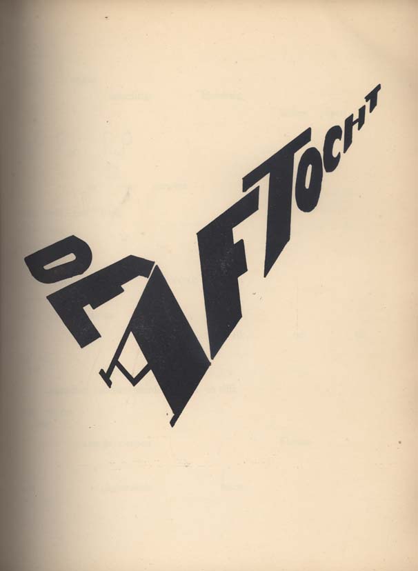
Bezette Stad —  A book of poems by Paul van Ostaijen, illustrated with woodcuts by Oskar Jespers, available in full at the University of Iowa Libraries’ astonishing International Dada Archive (via the lovely Aqua-Velvet).

And finally…

ENOUGH! — The hilariously on the money Editorial Anonymous:

I REALLY NEED A FRICKING BREAK FROM THE “FUTURE OF PUBLISHING” TALK… I don’t need to read any more of these articles, and neither do you.

A quick overview:

1. Publishing is a somewhat crappy business. Which makes it PRETTY MUCH LIKE EVERY OTHER BUSINESS.
2. Publishing has a future. NO ONE KNOWS WHAT IT WILL BE.

So everyone can stop
a. COMPLAINING
and
b. COMPLAINING.

Thank you.

No, no, Thank YOU.

3 Comments

Midweek Miscellany, September 23rd 2009

It’s funny how topics of conversation sometimes repeat themselves for no apparent reason. This week Romek Marber and his designs for Penguin have come up with sufficient frequency for me to take it as a sign I should post some links about about him:

Eye Magazine has a great article about his classic design of Penguin Crime Series:

Marber’s grid allows for different placements of title and author’s name depending on the length of the title and the needs of the design as a whole. There are small inconsistencies in some of the vertical measurements on a few of the books, probably due to printer’s error, but the basic design is sufficiently robust that it does not matter… With the typographic structure in place, Marber could concentrate on producing images that reflected the atmosphere of the books, which he read with relish from cover to cover. He was a graphic image-maker of great versatility, able to sum up the stories with motifs and ciphers that contrived to be both playful and threatening. Many of these whodunnits were decades old, but his interpretations gave them a contemporary allure.

The Ministry of Type shows you how to construct the famous Marber grid.

Apt Studio have a Marber WordPress theme (demo). Are any literary blogs using this I wonder?

And there’s this great Flickr set of Romek Marber Crime Covers.

Please let me know if you have any other good Marber links…

In other news…

The Electro-Plasmic Hydrocephalic Genre-Fiction Generator 2000 by David Malki (via INDEX // mb).

The Awesomeness Manifesto — I’m a little skeptical about these kinds of manifestos simply because they’re not terribly useful, but Umair Haque’s list is as interesting for its criticism about the chimera that is ‘innovation’ as for what is says about the warm and fuzzy  ‘awesomeness’.

1 Comment

Designer Q & A’s Round One

Monday’s interview with Paul Buckley wrapped up the first round of my Q & A’s with book designers. I’ve been overwhelmed by the generosity of the designers who have participated in the series and I’ve had some great correspondence from designers and non-designers alike who have read the posts. I owe a lot of people a lot of thanks. Thank you. But now the fall book season is well and truly under way now and there’s going to be a (hopefully) short hiatus before the second round of Q & A’s start.

As with round one, I’m hoping to talk to designers who are in different stages of their careers and whose work is interesting and distinctive. I’m very excited about the designers who have already agreed to answer my questions, and I have some ideas about other designers who I’d love to be involved.

Suffice to say it should be good (fingers crossed) — it’s just going to take a little time — so I hope you can be patient while I try and set things up (and juggle life and the day job).

In the meantime, here’s a recap of the great designers I spoke to this summer:

Nate Salciccioli, designer, The DesignWorks Group

Ingsu Liu, VP Art Director, W.W. Norton and Co.

Ingrid Paulson, designer,  Ingrid Paulson Design

Michel Vrana, designer, Black Eye Design

Alex Camlin, Creative Director, Da Capo Press

Coralie Bickford Smith, Senior Designer, Penguin Press

Paul Buckley, VP Executive Creative Director,  Penguin US

And these two older interviews might also be of interest if you missed them:

Ben Pieratt and Eric Jacobsen, dudes, The Book Cover Archive

Ellen Lupton, designer, writer, editor, educator, Design Writing Research

Thanks.

3 Comments

Midweek Miscellany September 16th, 2009

Rejected Covers by Klas Ernflo — Typography to make you weep (with either joy or envy). (via ISO50)

Poet of Desolate Landscapes — Author Jonathan Lethem on J.G. Ballard in the New York Times:

[V]ery few writers I’ve encountered, even those I’ve devoted myself to, have burrowed so deeply in my outlook, and in my work, where I find myself recapitulating Ballardian patterns not for their beauty (though they are beautiful) but for their tremendous aptness in attempting to confront the dying world before me, and inside me.

Ira Glass on the Internet and Public Radio — The host of NPR’s This American Life talks to Jesse Brown for a TVO Search Engine podcast (is it just me, or is there something gently life affirming about the fact Ira Glass doesn’t know who Chris Anderson is?)

“Well, it’s still more fun than a lot of other jobs” — Over at The Barnes & Noble Review, Daniel Menaker, author and former Executive Editor-in-Chief of Random House and fiction editor of The New Yorker, discusses — with bracing candour I might add — publishing and the role of book editors (don’t read if you are even slightly depressed):

[T]he tectonically opposing demands on publishing — that it simultaneously make money and serve the tradition of literature — and its highly unpredictable outcomes and its prominence in the attention of the media have made it a kind of poster adult for capitalism and the arts in crisis.

All awfully close to bone, and yet somehow Menaker also misses something vital about publishing and the opportunities that are arising…

Slovakian Book Covers — More amazing stuff from the genius A Journey Round My Skull (above: Binding illustration for Moji přátelé milionáři by Bernt Engelmann, 1968)

No-Man’s Land — A little late to the party, but over at  The Atlantic, technology journalist Kevin Maney looks at why the future might not be so bright for the Kindle (and he doesn’t even mention the iPhone):

Life, it turns out, is a series of tradeoffs between great experience and high convenience... Most successful products and services aim for one or the other, but not both. Products and services that offer neither tend to fail.

That’s why, despite all the great press it’s gotten, Amazon.com’s Kindle may be in trouble: in aiming to provide both a great experience and supreme convenience, it has achieved neither.

And lastly…

Words on Film — Designer Ed Cornish discusses his fantastic, but unused, cover designs for the 2009 D&AD student award brief for typography (sponsored by Faber and Faber) at FaceOut Books (because I haven’t linked to FaceOut for about 5 minutes right?).

1968, binding illustration for Moji přátelé milionáři by Bernt Engelmann
Comments closed

Midweek Miscellany, September 9th, 2009

Getting Paid by the Joke — Roy Hattersley on Keith Waterhouse, author of Billy Liar, who died last week aged 80:

One of the great lines, spoken in the subsequent film version by Wilfred Pickles playing Billy’s father, combined fury and bewilderment. Why, he demanded to know, had his son told the neighbours that he had only one leg. Billy worked in a dismal office – an ironic tribute to Waterhouse’s first job as clerk to an undertaker. It seemed a step up for the son of a door-to-door vegetable salesmen and a cleaner who had left Osmondthorpe Council School at 15 with an interest in books but no qualifications and few prospects.

When’s That Book Coming Out? — A nice breakdown of the production process by Shelby Peak which explains why it seems to take a long time for books to be released after an author has turned in their final manuscript. Every time I read something like this, I wonder why we don’t hear from publishing professionals more often. It would be great to see publishers explain this kind of thing on their own blogs. (via blog.rightreading)

Spine Out — John Gall has started a blog. Holy fuck.

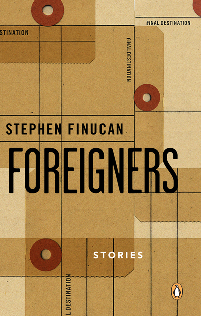
And — on a related note — there is a nice conversation on Vintage’s The Sun & Anchor blog between designer Peter Buchanan-Smith and photographer Todd Hido about the new Raymond Carver covers (commissioned by John Gall).

Doing the Work — A fascinating interview with Australian book designer Tony Palmer at Caustic Cover Critic:

Sometimes you hear the bigger book publishers described as being like factories – where the work is churned out in a mechanical and unthinking way. It’s never been like that for me at Penguin. The editors, production staff and designers all love their work. But love can be wild and unpredictable. So I’ve dreamt of being a plumber. I like the way water moves on surfaces. I like the fact that there are only four different ways to plumb a house. But book design? Gawd, maybe there’s about 120 right ways to do a good book cover, and there are probably millions of ways to make a bad one.

And finally…

A Master of ReinventionBrad Mackay, director and co-founder of the Doug Wright Awards, reviews David Mazzucchelli’s remarkable Asterios Polyp for The Globe & Mail. The Comics Reporter has a critical reading guide.

6 Comments