Skip to content

Tag: design

The Abolition of Built-In Obsolescence

A nice short video about Dieter Rams’ design philosophy and the recent exhibition of his work at the Design Museum London:

What has this got to do with books? Well, it’s a timely reminder to care about what we make…

(video via Coudal Partners’ Fresh Signals)

1 Comment

Something for the Weekend

Big Shit-Eating Grin — George Lois chooses 12 of his favourite Esquire covers at New York magazine. There are more iconic Esquire covers at George Lois’ website and there is, of course, a new book, George Lois: The Esquire Covers @ MOMA, published by Assouline. (NB the image above is not one of Lois’ 12, but it is great).

Objects of Desire — An interesting University College London podcast about the history of books and publishing featuring Professor Henry Woudhuysen, co-editor of the The Oxford Companion to the Book, and Professor Iain Stevenson,  author of Book Makers: British Publishing in the Twentieth Century (available in the US from University of Chicago Press) (via Ernesto Priego on Twitter).

The Dark SideThe Economist on Scandinavian crime fiction:

The cold, dark climate, where doors are bolted and curtains drawn, provides a perfect setting for crime writing. The nights are long, the liquor hard, the people… “brought up to hide their feelings” and hold on to their secrets.

Somebody’s Sins, But Not Mine — A two part interview with Patti Smith about her new memoir Just Kids at KCRW’s Bookworm. Part two is here.

1 Comment

Nobody Knows Anything

Book Qupte by Brandon Schaefer

Anyone who has spent 5 minutes discussing publishing with me knows that William Goldman’s line “nobody knows anything” from Adventures in the Screen Trade is one on my mantras, so I was thrilled that designer Brandon Schaefer (whose awesome The Dark Knight illustration buzzed around the internet last summer) decided to use it for as part of his Book Quotes poster series.

You can see the rest of the series (and more of Brandon’s lovely design) on Flickr.

Comments closed

Workflow in the House

As I’ve mentioned in the past, many publishers have tended to treat e-books as shovelware, and (unsurprisingly) the hasty conversion of files intended for print into e-book editions — with little or no consideration for the medium — has meant the quality of e-books has suffered.

Needless to say, poor quality e-books are becoming something of an embarrassment for publishers trying to convince readers to pay a premium for downloads (as Kassia Kroszer recently pointed out in Publishing Perspectives: it is hard to justify higher e-book prices when the product simply isn’t up to scratch), and clearly it’s an issue publishers need to address sooner rather than later if they want win this argument.

The problem of substandard e-books partially stems from the fact that many publishers currently lack the means and expertise (and, to some extent, the will) to produce high quality e-book editions themselves. Their workflow and production process are set up for print, so the quickest way to create e-book files has been to outsource the job to third parties, inevitably with very little quality control.

This was the subject of an interesting (if somewhat snarky) post this week by Pablo Defendini, producer and blogger at Tor.com, at The New Sleekness:

[B]ig publishers outsource a large part of these services… They’ve found that cutting out expensive production departments and hiring out the services of middlepeople, who also handle distribution and sometimes even retail fulfillment, saves on people power (read: health insurance and pensions), hassle, and extra load on their IT departments. Well, guess what one of the cardinal rules of the digital revolution is: digital production eliminates the need for most middlepeople. Bring this all back in-house, make it a lean operation. Settle on nothing less than a standards-compliant workflow, but please, build it from the ground up, as opposed to tacking it onto your existing production setup as an afterthought.

Pablo is picking a crowd-pleasing soft target in the “big publishers” — many (most even?) small and medium size publishers (the notable exception being O’Reilly of course) are also outsourcing their e-book production — but he does make some really important points about the need to learn new skills, rethink workflow and (ideally) bring e-book production in-house.

The comments are also worth reading but, — if like me — you are just beginning to get your head around this stuff, definitely work your way through the Digital Book World presentation by Liza Daly, of Threepress Consulting, referenced in the article:

25 Comments

Delivered in Beta

Delivered in Beta is a short documentary about design, products, social media, and creativity (amongst other things) created during the Open Design Workshop at the Betahaus as part of Social Media Week Berlin 2010:

Any thoughts how this applies to books?

(via SwissMiss)

1 Comment

Clutching at Straws

Some time back in September 2009, The Casual Optimist turned one-year-old. I didn’t actually notice until later — I had other things going on at the time — but I’ve been thinking about it a lot recently, especially since Joe Sullivan decided to put The Book Design Review on hiatus.

Compiling The Casual Optimist is an amazing experience. I learn something new every day and I meet some incredibly talented, smart people because of the blog. But for better, or worse, The Casual Optimist hasn’t exactly grown as I imagined it would and I often wonder if I spend to much time on the wrong things in one way or another.

The posts about the book trade — the posts that take longest to write — seem to generate the least interest (at least in terms of traffic and comments). The most popular posts by-the-numbers are the interview with designer David Pearson (which I totally get by the way!) and the list of inspirational vintage cover sites. It makes me curious who is visiting and why.

With this in mind, I thought I would hold a straw poll to find out what you want to see more of here. I promise there is no ulterior motive — this is not about boosting traffic, selling ads, or anything sinister — I really am just curious. And I want to make the site better as we move on to Year Two.

So please take a look at the poll if you have a minute (FYI: you can check more than one answer and submit the form more than once). Or, if the poll doesn’t really work for you, leave me a comment, ping me on Twitter (or Facebook), or drop me a line by email if it makes more sense. I’d love to hear from you.

Thanks. :-)

6 Comments

Midweek Miscellany

A Wall in Palestine — more quiet mastery from Henry Sene Yee who excels in projects that require maximum discretion and minimal commentary. Like his cover design for ColumbineA Wall in Palestine is notable for what it leaves out. An early contender for cover the year. You heard it here first.

Making the World Fun to Look At — The Cleveland Plain Dealer has (what is believed to be) the first interview with Bill Watterson, creator of Calvin and Hobbes,  since 1989:

I think some of the reason “Calvin and Hobbes” still finds an audience today is because I chose not to run the wheels off it.

I’ve never regretted stopping when I did.

Amen.

Seven Things Publishers Need to Remember — A nice post by Kobo Books exec (and compulsive list maker) Michael Tamblyn on e-books and pricing:

A reader should never have to worry about “leaving books behind” or “losing their library”. If you can’t download it and move it somewhere else, it’s worth less. Seriously. They’re books, not Atari 2600 video game cartridges.

(But I’m waiting for the “7 Things E-tailers Need to Remember” post Michael. When’s that coming? You can post here if you want)

The Lost 1970 Man Booker Prize — Commemorating novels missed out because of rule changes in 1971. Bonkers. But kind of great.

Problem SolverIan Shimkoviak of The Book Designers interviews the legendary Carin Goldberg for their new blog CoveredUp:

I’m not a sentimentalist. The e-book is inevitable. And they make sense. The publishing industry can’t sustain the old/current model for making/selling books. It’s wasteful and unsustainable. They have to embrace change. Good content will continue to be created whether it’s represented on paper or on a screen.  And there will always be a market, albeit small, for beautiful picture books. The role of the graphic designer is shrinking but it’s in our court to get involved in the next wave of imagery and ideas.

And finally…

Jonathan Lethem, author of Chronic City (which I liked, but wanted to like more), interviewed on KCRW’s Bookworm (via the incroyable Largehearted Boy):

2 Comments

Under the Covers: Reviewing the Covers of 2009

Tonight is the BPPA‘s annual review of the best and worst book covers of the year.

Sadly Alan Jones, Senior Designer at HarperCollins Canada, had to drop out at the last minute and is being replaced by Boy Wonder David A. Gee (interviewed here) and umm… me. No, I’m not quite sure what they were thinking either (about asking me — David is obviously a great choice)…

The other panellists are freelance designer Ingrid Paulson (also interviewed here), Terri Nimmo Senior Designer at Random House Canada, and Steven Beattie Review Editor at The Quill & Quire.

Panel moderator David Ward of McClelland & Stewart has promised me Jaffa Cakes.

The event is 6:30-8:30 pm at The Arts and Letters Club (3rd Floor) in Toronto. It’s free for BPPA Members, $20.00 for non-members apparently.

There’s more information on the BPPA’s event page.

3 Comments

Q & A with Jason Godfrey, Bibliographic

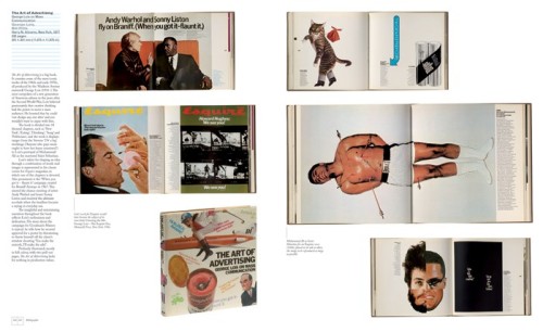
Jason Godfrey’s Bibliographic: 100 Classic Graphic Design Books was one of my favourite books last year.

Published by Laurence King in the UK, the book is distributed by Raincoast in Canada (Chronicle Books in the US) and so I was fortunate enough to have the opportunity to ask Jason a few questions about the book and get some lovely spreads from the publisher.

My original plan was to run the interview on the (recently redesigned) Raincoast website, but ultimately the interview was a little too long for our blog there, so I’ve decided to republish the whole unexpurgated monster here.

As I mentioned on in my original Raincoast blog post, Bibliographic is not history of graphic design or even a definitive list of 100 books on the subject — it’s more of an essential design book shopping list — and basically I really wanted to know why Jason decided to make the book, how he decided on the  final selections, and what exactly was informing his decisions.

We corresponded by email…

What was the inspiration for Bibliographic?

There was a need for a illustrated resource of graphic design publishing. Many books and articles contained very good reading lists but I had always found them rather detached without the visual reference. The best graphic design books are important artefacts in the history of graphic design and many of the books are becoming difficult to find and access.
004-103_1

What criteria did you use to select the books?

The only rule that was applied throughout was that the books had to be visually interesting, there seemed little point in photographing books that would not look appealing on the page. That the books were designed by some of the cream of graphic design this turned out not to be a big problem but it did mean that some important critical analyses had to be put to one side.

Did you ask other designers for their recommendations?

Whilst mentioning to other designers that I was working on Biblographic I found that they were very keen to promote their own favourite titles and it did help extend the list and also confirm the importance of books that had already been chosen. As part of the book I asked about 20 designers to give me a list of 10 books from their own library, this was an idea borrowed from the designer Tony Brook at Spin who had earlier published a newspaper Spin 2 with reading lists from 50 designers.
Was it difficult to decide which recent books to include?

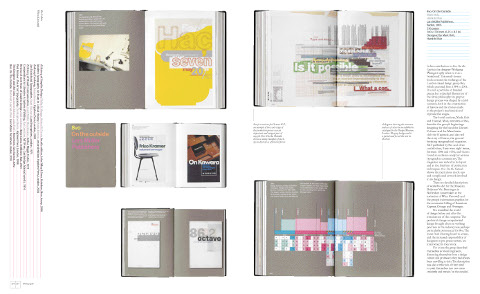
To gauge which newly published titles will come to be seen part of the canon of graphic design books is not the easiest of tasks. Looking back from a distance helps to establish the relevant trends and lends more perspective to any choices. Regardless the best books all seem to be those that can tell a good story. One recent book, Mark Holt and Hamish Muir’s 8vo: On the Outside (Lars Müller Publishers, 2005) did just this, exploring the process of the studio’s work and the effect of technological on this process and output in a thoroughly engaging book.

There are photographs of every book included in Bibliographic. Were any of the books difficult to locate?

A number of the books are from my own collection others I borrowed from friends and colleagues. Some were so precious I had to send the photographer Nick Turner over to where the their owner could keep them in sight at all times. A handful of books I could only locate at the St Bride Printing Library who were kind enough to facilitate their shooting.

Were there any books you wanted to include but couldn’t access?

Early in the process of compiling my list of 100 books I decided that many of the early examples of early 20th Century graphic design books particularly those of the typographic revolutions of the 1920s and 1930s would be too difficult to access as they are now the preserve of museums. It would all have taken me too far from my premise that Bibliographic could be representative of a working studio library.

Which books came close to being in the 100, but didn’t quite make the final cut?

Tough choices had to made particularly where an author or series of books were successful. Alan Fletcher is very well represented in the book and I couldn’t justify putting in the excellent Identity Kits: A Pictorial Survey of Visual Signals (Studio Vista, 1971) a book he co-authored with Germano Facetti the then art director at Penguin Books. Another book that came very close was Robert Bringhurst’s The Elements of Typographical Style (Hartley & Marks, 1992) which I felt lacked the visual punch necessary for Bibliographic.

Of the books you don’t own in Bibliographic, is there one that you particularly covet?

The 1926 Deberny & Peignot, Specimen Général would be a welcome addition to my library. There was copy in a studio I worked for and I was forever using it as a point of reference or just to admire the elegant section dividers designed by Maximilien Vox.

When did you start collecting design books?

There are a few books that I have from when I was a student but I didn’t seriously start collecting until I had been working professionally for a few years and made a decision to stop buying records in favour of what I found to be the more fulfilling occupation of acquiring books.

What is on your ‘to buy’ list?

New Graphic Design in Revolutionary Russia (Lund Humphries, 1972) by Szymon Bojko is a book I am trying to locate. I have yet to see a copy but it was designed by Herbert Spencer the author and designer of Pioneers of Modern Typography (Lund Humphries, 1969) and so I am expecting an interesting book.

In the introduction to Bibliographic, Steven Heller says he has a separate apartment for his books! How extensive is your library?

Mine is not as nearly extensive as Steven’s although it does take up a large part of my studio and I am in need of extra shelving at the moment. It also needs saying that in common with most designers my collection also contains many books on the arts, photography and others of general interest.

What is your own design background?

I graduated from the Royal College of Art in London and worked for a number of years at Pentagram Design, then moved to New York and Austin, Texas before returning to London and setting up my own studio.

What were the challenges of designing a book about design books?

After the efforts of writing Bibliographic the actual design was very enjoyable. Because each spread contains only one book the challenge was in arranging the images to create an enjoyable flow throughout the book. The spreads from the photographed books are so rich with graphic imagery that I was worried that the pages would look like graphic wallpaper if all the images were kept in pro, but changing the scale of the spreads helped to create changing areas of white space and focus the readers attention on one spread at a time.

Could you describe your process for designing books?

Knowing the amount of copy and image count for an average page is the start for any book design project. From this point I can begin to form a grid (invariably using the guides in Derek Birdsall’s excellent Notes on Book Design (Yale University Press, 2004), chose the typefaces, text and headline styles, treatment of imagery and other pagination. This will go to form sample spreads that are approved by the publisher before advancing on the book proper.

What does the future hold for book design?

The evolution of book design seems to move at a glacial pace, its foundations are based on a template centuries old with some 20th Century tweaks by the likes of Lászlo Moholy-Nagy and Gyorgy Kepes. Advances in printing technology have and will allow for more flexibility in how pages are laid out and inevitably there will be new fashions and styles to accommodate but little wholesale change.

Thanks Jason!

6 Comments

Ben Wiseman | Chekhov

I really like these Chekov covers for W.W. Norton by Rodrigo Corral Design’s Ben Wiseman:


But I think the alternates are pretty special too:

There is a very short interview with Ben at idsgn.

(via FormFiftyFive and Cosas Visuales)

Update:

The good folks at W.W. Norton have just added Ben’s Chekhov covers to their Flickr design archive (thank you!).

These new editions are available in July 2010.

4 Comments

Daily Discoveries on Design

Karen Horton is co-founder of the design community site design:related and Art Director at Little, Brown and Company. Her Tumblr blog Daily Discoveries on Design is currently one of my favourite RSS Feeds. It’s full of great design, art, books, photography and inspiration — so much so, that it makes feel like a total sloth for my inability to post here daily. If you’re not subscribing already, you really should be.

You can find Karen own work (also great) on design:related (where else?).

(pictured: I Never Loved a Man the Way I Love You, cover design by Karen Horton for St. Martin’s Press).

1 Comment

Something for the Weekend

It’s been a slightly shite week in the book trade this week.

Amidst the plethora of end of year/decade “Best of…” lists and gift guides, it was announced that Kirkus and Editor & Publisher Magazine are going to close (are we surprised? No); B&N’s Nook e-reader turned out to be not be quite as good as it was cracked up to be (are we surprised? No); and Simon & Schuster, Hachette, and HarperCollins upset the usual suspects (for all the usual reasons — only Moby Lives seemed to get that it might be about something else) by announcing their decision to hold back the release of a few e-book editions (are we surprised? No)… Is any of this particularly interesting? No. (Although — for the record — I am grateful to the WSJ‘s Jeffrey A. Trachtenberg  for reporting on the e-book developments, and to indefatigable Largehearted Boy for compiling a comprehensive list of Best of… lists)…

So needless to say, there isn’t much about the book industy in today’s links. Ah well…

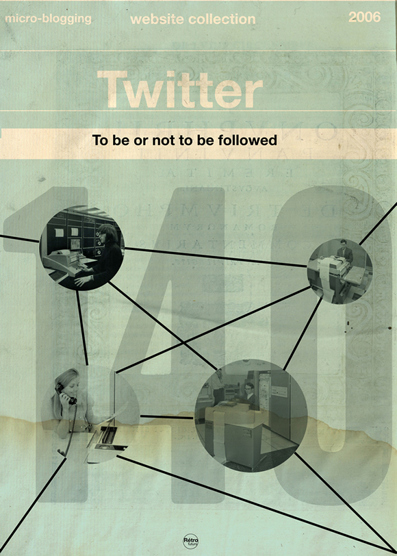
Another addition to the weirdly brilliant (or brilliantly weird?) vintage book/pop culture mash-up phenomenon:  Web Services Book Covers by French illustrator Stéphane Massa-Bidal AKA Hulk4598, or Rétrofuturs. They’re sort of like Olly Moss meets Cristiana Couceiro. (First seen at Design You Trust and then just about everywhere else this morning).

The Sixties — Another fantastic new cover by Henry Sene Yee for Picador’s BIG IDEAS // small books series.

Type for the Tube — an interesting history of Edward Johnston’s typeface for the London Underground from its design to current usage.

And finally…

F is For Fail — A really charming “alphabetical odysessy through the creative process” by Brent Barson (via the lovely Aqua-Velvet):

Can I go home yet?

(Have a great weekend!)

3 Comments