Skip to content

Tag: design

Somthing for the Weekend

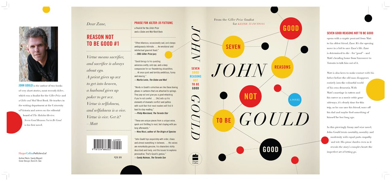
“Spot gloss on the molecules” — David Gee’s cover for 7 Good Reasons Not To Be Good by John Gould.

Going Back — Artistic Director Michael Salu on the creating the cover of the new issue of Granta magazine:

For this concept to work, we needed to strive for authenticity – to create the physical object ourselves. The typefaces would need to be sourced, traditionally hand-set and photographed to give the cover the depth that the issue deserves. For this I approached St Bride Printing Library, which has long been a place of fascination and wonder for me. My first visit to the library – with its oil, wood and metal, its smell of history – made a huge impression on me.

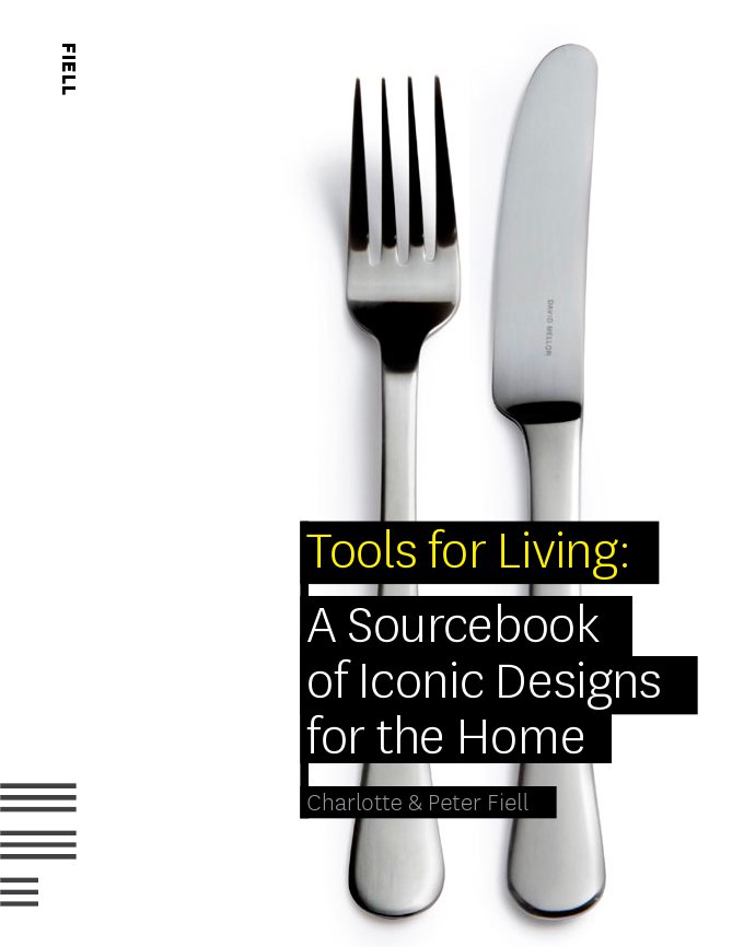
The Connoisseurs — Peter and Charlotte Fiell, who recently ended their 15-year tenure as heads of the design branch of Taschen, talk about their new publishing venture Fiell at More Intelligent Life:

What is design? It’s the forethought that goes into the making of man-made things. It’s films, pharmaceuticals, airplanes, chairs, tape recorders … it’s the world of stuff. It’s huge, so everybody should have a big interest. It’s not some avant-garde, highly expensive niche. We want to make money by publishing books that sell, but we’re in the business of promoting ideas, culture, taste, connoisseurship. If you want to make a difference you want to get into as many people’s heads as you can and change their opinion. The secret is to strike this balance between making your books appealing to learned type readers, while at the same time, making them useful and interesting to novice readers. Our aim is to make books as appealing to teenagers in Tokyo as architects in Amsterdam.

(Above: Spreads from Tools for Living: A Sourcebook of Iconic Designs for the Home by Charlotte and Peter Fiell)

Designing In Order To  Eat — Chris Ware’s introduction to Penguin 75 excerpted at GQ magazine:

Book designers, you should know, have to be ready to create something new, exciting, and original almost every day in order to eat, and a certain degree of burnout smokes out the weaker specimens; I can’t imagine coming up with cover after cover without at some point resorting to an out-of-breath take, intentional or not, on someone else’s great idea. This urge toward ever-freshness brings the profession perilously close to that of fashion, and the worst examples of such greet us at the grocery store checkout among the tabloids, gum, and ring pops. But the best of it, those that last, have recently been appearing from Penguin (yes, Penguin, not just the bearer of boring spring break assignments anymore!), following a path led by designer Paul Buckley into beautiful new ways of graphically proffering the written word.

The excerpt is accompanied by a slideshow of covers from the book. My interview with Paul Buckley and designer Christopher Brand about Penguin 75 will be up early next week.

And Finally… The book cover design Tumblr (via Alan Trotter’s ≥ notes)

1 Comment

Midweek Miscellany

The Good, The Bad…design:related‘s Karen Horton (also Art Director at Little, Brown and Co.) interviews Paul Buckley, Creative Director of Penguin US, about his new book Penguin 75: Designers, Authors, Commentary (The Good, The Bad…):

Everyone was asked to keep their comments to 100 words or less, and though there are a few exceptions that I let run long, my own included, most contributors stuck to my request. As to the sarcasm, there are plenty of good natured jabs throughout the book as I was very clear with the participants that this was a true opportunity to let it all out – if you hate your cover, please by all means tell us about it; that is the point of this book.

You can read my interview with Paul from September last year here, and I’m hoping to chat with him and designer Christopher Brand about Penguin 75 soon. Fingers crossed.

Rewound and Remixed — Tom McCarthy, author of Remainder and C, interviewed in The Times:

If McCarthy… presents a radically fresh prospect for the future of the novel, it is probably, paradoxically, because he has instinctively ignored contemporary literature almost completely. He would argue, in fact, that it is only by immersing oneself in all that has gone before that any contemporary novelist has even the faintest chance of coming up with something new. “I don’t think most writers, most commercial middlebrow writers, are doing that,” he says. “I think they’ve become too aligned with mainstream media culture and its underlying aesthetic of ‘self-expression’. I see what I’m doing as simply plugging literature into other literature. For me, that’s what literature’s always done. If Shakespeare finds a good speech in an older version of Macbeth or Pliny, he just rips it and mixes it.”

See also: My Q & A with Peter Mendelsund and Tom McCarthy about the cover design of C.

Paywalls vs. Potential — Clay Shirky interviewed in The Guardian. This has been much linked to elsewhere because of Shirky’s comments about the online “paywall” at the aforementioned The Times, but I actually Michael Wolff’s Vanity Fair article on Rupert Murdoch from October last year is more interesting on this point. See also: John Gapper’s op-ed “Murdoch must become an elitist” in the Financial Times (registration required).

Necessary Agent — Jofie Ferrari-Adler, senior editor at Grove/Atlantic, on literary agents and their relationship with book editors in Poets & Writers Magazine. It’s an interesting article, although — just for the record — not everything that goes pear-shaped in the publishing process is the fault of the Sales & Marketing department…

And finally…

Cats Without Dogs — At some point I will shut up about Jason… Until then, you might be interested to know he has just started a blog…

Comments closed

Jason, The Dharma Bums

As you may have noticed, I’m on something of Jason kick right now. I’m also preparing to interview Paul Buckley, Creative Director at Penguin US, about his new book Penguin 75, so I thought I would take the opportunity to post Jason’s beautiful contribution the Penguin Graphic Classics series that Paul art directed:

4 Comments

Something for the Weekend

Dieter Rams book by graphic design graduate Daniel Bartha:

This project was a book I created around the ten most important principles for what Dieter Rams considered was good design. Taking on board these elements myself, I took away as much as I could from his unique designs but to still leave them instantly recognisable.

And since I seem to be on a German theme this week…

Nabokov in Berlin — An essay by Lesley Chamberlain in Standpoint magazine:

As consumerism and Hitler rose together so Nabokov treated totalitarian politics principally as aesthetically repugnant. It was “another beastliness starting to megaphone” in Germany which in 1937 drove him and his half-Jewish wife Vera to leave Berlin for France and the US. It was almost too late. Berlin suited him. The anti-totalitarian novels Bend Sinister (1947) and Invitation to a Beheading (1938) which followed were remarkable, particularly the latter, for not insisting that totalitarianism’s victims were moral heroes, only men of taste. Nabokov, who saw in art the possibility of redemption, was tempted to think taste ruled out evil.

And from Germany, to France (via Norway)…

Master of Understatement — Douglas Wolk, author of Reading Comics, on Jason’s Werewolves of Montpellier:

[I]t’s possible to describe [Werewolves of Montpellier] by saying it’s a low-key domestic drama, with a Harold Pinter play’s worth of portentous silences, about a bored, disenchanted young man who’s in hopelessly in love with his lesbian best friend. Or you can say it’s about a jewel thief who discovers a secret cabal of werewolves. It’s true that you have to pay attention to catch the details: the fact that Jason draws everyone with animal heads makes it a little bit harder to read some of the characters’ interactions. But maybe Jason’s central joke is that you have to take extreme measures to create certain kinds of drama when a lot of the time people aren’t feeling anything in particular.

Techland also have  an exclusive preview of the book.

See also: The Beat’s review of Werewolves of Montpellier

Werewolves of Montpellier is about an art student/thief who dresses up as a werewolf before he goes out to break into people’s homes at night, which a society of actual werewolves is not amused about.

What that boils down to on the page, though, are scenes of people sitting next to each other at the laundromat, looking at each other in silence or talking about French actresses while playing chess—and each time, it’s utterly fascinating, and the scene draws you in almost immediately and you don’t want to stop.

Jason tells stories with comics in ways that never occur to a lot of people who make comics.

From Europe to Asia…

An Obsolete Practice — idsgn considers the end of movable type in China. Fascinating stuff:

The invention of movable type in China developed with Gutenberg’s mechanical press and hot type-metal, proved to have widespread and lasting success in Europe. But in practice, it was not suitable for Chinese—a language with over 45,000 unique characters. Typesetting in Chinese took “minding p’s and q’s” to a whole new level, and accuracy was challenging when characters were essentially compounds of many radicals and ideograms. Running a Chinese letterpress shop required an enormous storage space and basic literacy of at least 4,000 commonly used characters.

And on a strangely similar note…

Rudy Lehman’s Incredible Linotype Letterpress (via Coudal).

Have a great weekend!

Rudy Lehman’s Incredible Linotype LetterpressRudy Lehman’s Incredible Linotype Letterpress

Comments closed

Intricate Beauty by Design

Graphic artist Marian Bantjes (whose typeface Restraint was used to great effect by Arthur Cherry for the cover of The Story of God by Michael Lodahlr) on individuality in design at TED:

(Via Nate Williams)

UPDATE: There is more about Arthur Cherry’s design for The Story of God at FaceOut Books.

1 Comment

Midweek Miscellany

Jimmy Corrigan Japanese Edition Poster from PRESSPOP (via Flog!).

Zingers — Film critic and blogger Roger Ebert, who has lost the ability to speak unaided, on Twitter:

Twitter for me performs the function of a running conversation. For someone who cannot speak, it allows a way to unload my zingers and one-liners… This has become addictive. I tweet too often. I actually go looking for stuff to tweet. I have good friends who suggest things… I was doing this daily, but have scaled back because it was keeping me up too late.

I’ve made a change recently. After writing my blog, “The quest for frisson” and reading two recent articles about internet addiction, I have looked hard at my own behavior. For some days now I have physically left the room with the computer in it, and settled down somewhere to read. All the old joy came back, and I realized the internet was stealing the reading of books away from me. Reading is calming, absorbing, and refreshing for the mind after hectic surfing… I like the internet, but I don’t want to become its love slave.

Landscapes from a Dream — James Pardey (The Art of Penguin Science Fiction) on JG Ballard’s early novels and the Penguin cover art of David Pelham at The Ballardian:

Pelham’s covers featured a crepuscular sky above a barren expanse of water, sand or sunbaked earth as the backdrop for an artefact of twentieth-century industrial or military technology. According to the September 1974 issue of Science Fiction Monthly, these machines depict ‘the debris of our society’. Pelham, the article explained, ‘finds romance in seeing the future as if it were already the past – in visualizing ruins created from the artifacts we are manufacturing now’. But the paradox of Pelham’s artifacts is that they are not in ruins. His are pristine machines at odds with their apocalyptic settings. Half buried or submerged, they stand as tombstones to ostentation and brutality. They are icons, but only of man’s arrogance.

JG Ballard’s archive was recently acquired by the British Library. The Guardian has an fascinating slide show of the archive, including pictures of Ballard’s annotated manuscript pages.

And finally…

4CP | Four Color Process — A blog of comic panels enlarged Lichtenstein-like to reveal the CMYK halftone dots.

2 Comments

Gil Scott-Heron Redesigns by Stuart Bache

Born in Chicago, April 1, 1949, poet and musician Gil Scott-Heron is perhaps best known for the politically infused bluesy soul and proto-hip-hop he created with Brian Jackson in the early 1970’s.

Although recently troubled by drug addiction and in and out of prison for drug possession, an apparently resurgent Scott-Heron released his first studio album in 16 years, I’m New Here (XL Recordings), in February, and two of his novels — The Vulture (1970) and The Nigger Factory (1972) — were reissued (for a second time) by Canongate Books with new cover designs by talented UK designer Stuart Bache.

I recently talked to Stuart about Gil Scott-Heron and the redesign…

How did you get into book design?

I fell upon book cover design by shear luck. In late 2005, after a stint of travelling, I decided it was time to think about my career. I found, applied and was surprised (and ecstatic) to be given the job of Junior at Hodder & Stoughton and moved to London.

When did you discover the work of Gil Scott-Heron?

I first discovered Gil Scott-Heron way back in school. We had been reading and discussing To Kill a Mocking Bird in English Class and I remember taking a real interest in the subject, which my teacher at the time picked up on and loaned me both The Vulture and The Nigger Factory.

How did you come to design the covers of his books?

It was a great pleasure to be asked to design the covers for the reissues. I had already been doing some work for Canongate and so when the Art Director asked if I had time to come up with ideas for the reissues I jumped at the chance. It was a fairly short deadline, but I believe those to be the best kind, great for creativity (and a few extra grey hairs).

Could you describe your design process for the covers?

The brief asked for them to be fresh, streetwise, graphic and contemporary. I designed a few covers for each title, with different images and branding styles, which were then passed on to Canongate for their prefered direction.

The final The Vulture cover centred around John Lee (the young lad who is murdered) and the title cried out to be used in some sort of graphic function. The Nigger Factory relied heavily on an image that both showed and did justice to that moment in US history. It also needed a graphic so I added the stripes to represent the flag, but the use of red paint strokes shows the heat and anger involved too.

What is the typeface?

The typeface I used is Futura, probably light. I have a thing about Futura, Century Gothic and the like. It’s the perfect circles of the ‘O’ and ‘C’.

Are they a departure from your usual design work?

These covers stand out for me, especially compared to my usual style. I take a lot of pride in my work but I’m never usually proud of it — I always see something I could have done better. But the Gil Scott-Heron’s showed I could do something completely different…and in a short timescale too.

What are you working on currently?

At the moment I’m working on another title for Canongate called Super Cooperators and Aline Templeton’s new thriller Cradle to Grave for Hodder & Stoughton. This time of year tends to be quiet, too quiet really, but these are nice titles to be getting along with. Cradle to Grave gives me the opportunity to play with my homemade textures and brushes in Photoshop, and Super Cooperators is, once again, going to be something very different from the rest of portfolio.

Where do look for inspiration and who are some of your design heroes?

Ever since I’ve been freelance I have had a renewed enthusiasm for design, I notice everything and I’m hardly out of bookshops — I see books all the time that I think ‘I wish I’d designed that’. It really keeps you on your toes and gives you the incentive and the push to do better.

I owe a lot to Hodder & Stoughton, their Art Department has some of the best designers in the industry and I learned an awful lot during my time there — and if they had never given me the chance I wouldn’t be writing this now.

Thanks Stuart!

Comments closed

Something for the Weekend

A fittingly Alvin Lustig-like cover for New Directions by Rodrigo Corral, seen at Book Covers Anonymous.

An Open Book-Publishing Platform — Book Oven’s Hugh McGuire on WordPress as a book publishing platform. It’s an intriguing idea even if don’t accept Hugh’s belief that books and the web will be indistinguishable in a matter of years. And, to judge by the comments, it something a lot of people have been working on.

Afterlife — With the US publication of The Girl Who Kicked The Hornet’s Nest, Charles McGrath looks at Steig Larsson, the late author of the Millennium series, and his unhappy legacy in the New York Times. Sarah Weinman has more on Larsson and the new book (of course)…

Enticement and Exegesis — Knopf designer Peter Mendelsund (who, incidentally, designed the covers for US editions of the Millennium books) on author David Foster Wallace, Infinite Jest, and book cover design:

Book jacket design should concern itself with, in my estimation, equal parts enticement (“Come buy this book”) and exegesis (“This is what this book is about, more or less.”) A good cover doesn’t let one category trump the other. A good cover should not resort to cliché in order to accomplish either. But the real key here, in both categories (enticement and exegesis) is the designer’s ability to work the sweet-spot between giving-away-the-farm, and deliberate obfuscation.

Book jackets that tell you too much, suck. Book jackets that try to change the subject also suck, and are furthermore, too easy.

My interview with Peter about Tom McCarthy’s book “C” is here.

And finally…

It’s a Book, Jackass! — a cute video featuring a tech-loving donkey and a book loving ape for It’s a Book! by Lane Smith, published by Macmillan  (via Chronicle Books):

Comments closed

Midweek Miscellany

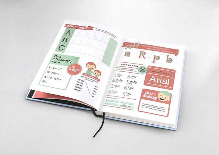
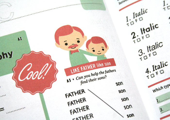
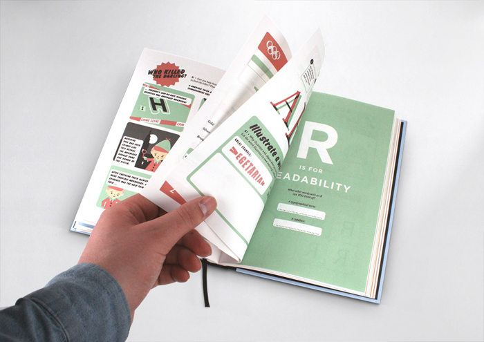
Hyperactivitypography from A to Z — An activity book for typographers (in a lovely retro style) by Norwegian design agency Studio 3. You can flip through the book here.

Life As Lived — Author Sarah Bakewell (How To Live) kicks off a 7-part series on Montaigne in The Guardian:

What is it to be a human being, he wondered? Why do other people behave as they do? Why do I behave as I do? He watched his neighbours, his colleagues, even his cat and dog, and looked deeply into himself as well. He tried to record what it felt like to be angry, or exhilarated, or vain, or bad-tempered, or embarrassed, or lustful. Or to drift in and out of consciousness, in a half-dream. Or to feel bored with your responsibilities. Or to love someone. Or to have a brilliant idea… but forget it before you can get back to write it down…

And also in The Guardian

Alternatives — Tom Lamont asks designers why book covers look different from territory to territory:

Why don’t publishers, then, replicate covers that have been a success abroad? “It does happen but it’s quite rare,” says [Julian] Humphries [art director, Fourth Estate]. Megan Wilson, an art director at Knopf Doubleday in New York, says that American designers are sometimes asked to look at British jackets, “as an example of something that works or doesn’t, but we are rarely asked to use them directly”. [Nathan] Burton tries to avoid looking at alternative covers if he’s working on a book that’s already been published. “It can take you off on odd tangents. It’s always best to work from fresh.”

Great. But, please, can we declare a journalistic moratorium on  “judge a book by its cover” headlines?

“We are your platform”Richard Nash, formerly of Soft Skull, talks about his new start-up Cursor at The Literary Platform. There’s something about this that reminds me of Factory Records in good ways and bad…

A Question of Audience — With Julie Bosman taking over the publishing beat at the NY Times from Motoko Rich, Sarah Weinman breaks down what kinds of book and publishing stories appear in North American newspapers:

I’ve become increasingly aware the longer I’ve written about publishing for a business news site that some stories that are big news within the industry carry little relevance outside of publishing circles. That means certain news items I pay attention to and analyze to death via Twitter… won’t merit larger stories. It also means that certain topics that are discussed endlessly in the publishing bubble (especially the digerati-populated one), while relevant to the outside world, have to be written about in a way that might come off as eye-rolling rehash.

I think Sarah’s being charitable here. Many of the topics discussed endlessly in the publishing bubble and the Twittercosm have absolutely no relevance to, or perceivable impact on, the outside world…

Undercover Icon — A New York Times profile of Irving Harper, the man behind many of George Nelson Associates‘ iconic designs (via The Scout):

“I don’t have a complex mind,” Harper said, and if this assertion seems disarming coming from a designer of his sophistication, the thought is sincere… “With a computer there are too many choices, and I always liked working within limits,” he said. “You know, if you look at Mozart, who had this strict classical framework — an allegro, an andante, a scherzo and a finale — you see that within that formula, he got results he might never have gotten if he had all the options in the world.”

There is more on Harper in a Metropolis Magazine profile from 2001, and a monograph of his paper sculptures by Michael Maharam is apparently on the way (if anyone has details please let me know).

Comments closed

Q & A with Ferran López, Random House Mondadori

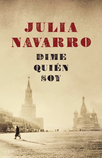
I came across the work of graphic designer Ferran López after stumbling on his wonderful book cover blog The Jacket Museum.

Based in Barcelona, and currently working at Random House Mondadori — the Spanish-language joint publishing and distribution venture between Random House and Italian publisher Mondadori — Ferran’s eye for typography and background in photography is evident in his sharp book cover designs.

Although I want to interview more designers who work outside of Canada, UK and US at The Casual Optimist, the opportunity doesn’t often present itself because of my almost total inability to speak any other languages. But when I noticed that Ferran publishes his blog in both English and Spanish, there was absolutely no excuse not to speak to him!

I’m really happy to be able to include Ferran’s answers in both English and Spanish in this interview, but I have also posted all the questions and answers in just Spanish for those who would prefer to read it that way.

And I do want to say a big thank you to Ferran for both his patience and for providing the translation…

How did you get into book design?

Merely by chance. Although my training is photography and I was a photographer for many years, more and more my jobs were getting closer to the world of graphic design. At the end of the year 2000 I was working as a freelance designer and moonlighting doing digital photography manipulation and retouching. Around this time I met Marta Borrell, the Art Director at Random House in Spain (before the joint-venture with Mondadori). She was looking for a graphic designer to work in-house on trade book cover design. Even though I had never tried book design, I was enthusiastic about the idea because I love books. Marta liked my portfolio and my enthusiasm. She took a chance on me and (I like to think) it turned out all right! We have been working together for a decade now.

Casi por casualidad. Mi formé como fotógrafo, aunque desde hace muchos años mi trabajo, por vocación, fue acercándose cada vez más al diseño gráfico. A finales de 2000 trabajaba como diseñador free-lance y en manipulación digital de fotografía. Fue entonces cuando conocí a Marta Borrell, la directora de arte de Random House en España (por aquel tiempo previo a la joint-venture con Mondadori) que estaba buscando un diseñador para la división de libros Trade. A pesar que nunca había trabajado con libros estaba entusiasmado con la idea, ¡me encantan los libros!. A Marta le gustó mi portfolio y mi entusiasmo.  Apostó por mi y creo que la cosa resultó bien. Llevamos ya una década trabajando juntos.

Briefly, could you tell me about working at Random House Mondadori?

It reminds me of a sequence from Billy Wilder‘s “One, Two, Three”. The pace is frantic and the procedures are complex at times, but, although it sounds like a cliché, it is impossible to think of a team of better professionals. Almost everyone in the workplace is young (even the CEO is younger than me!) and this translates into passion. There are 13 of us In the Art Department and sometimes we seem like family or better yet a clan. We suffer a lot, but always together! Just kidding! But at times, when someone is under a lot of pressure or creatively blocked, there is always someone to lend a hand, or at least have a coffee break with.

Se parece mucho a una secuencia de «Uno, Dos, Tres» de Billy Wilder. El ritmo es frenético, los procesos a menudo complicados pero, aunque suene a cliché, es imposible imaginar un equipo de mejores profesionales. Es una empresa joven (¡Hasta la Consejera Delegada es más joven que yo!) y creo que eso se traduce en entusiasmo.

En el departamento de diseño somos 13 personas, a veces parecemos una familia o incluso un clan. Sufrimos mucho, pero siempre juntos. Es broma; pero a veces cuando alguno de nosotros está bajo mucha presión o bloqueado siempre hay alguien con quien compartir el proceso, consultar o al menos con quien tomar un café.
What is your current role there?

At the moment, I am responsible for the Design of the Trade Commercial and the Paperback divisions. In the Paperback Division my job is basically coordination and support. As a designer, my job is mainly centered in book covers for Commercial Trade, bestsellers, novels and mass-market non-fiction for the “Plaza & Janés” and “Grijalbo” imprints.

Also, since its establishment in 2004, I’m also in charge of the “Caballo de Troya” imprint, an experiment: a small independent publisher within a huge publishing company.

Actualmente soy responsable de Diseño de las divisones Trade Comercial y Bolsillo. En la división de bolsillo mi función principalmente es estratégica y de apoyo. Como diseñador mi trabajo se centra en las cubiertas de los libros de Trade Comercial: best-seller, novelas y no ficción de carácter masivo, en los sellos Plaza & Janés y Grijalbo.

También, desde su fundación en 2004 me encargo de Caballo de Troya, casi un experimento: un pequeño sello independiente que vive dentro de un gran grupo editorial.

Approximately how many covers do you work on a season?

About 100 new books a year.

Unas cien novedades al año.

Could you describe your design process?

I don’t follow the same procedure with every book. Some times, I read the briefing and I start visualizing the cover, the message, the photo or the illustration that seems to fit the book. Other times, I need to read, comment, draw, write, web-surf, look out the window and make several trips to the coffee machine to obtain what I want to transmit visually. At times, nothing seems to work and then I begin creating an idea by a typographical approach to unblock myself.

No sigo el mismo proceso con todos los libros. A veces, tal como leo el briefing, empiezo a visualizar la portada, el mensaje, la fotografía o la ilustración que a mi parecer encaja. Otras veces necesito leer, comentar, dibujar, escribir, navegar, mirar por la ventana y hacer varios viajes a la cafetera para conseguir saber lo que quiero que visualmente transmita. En algunas ocasiones ningún método parece funcionar y entonces para desbloquear empiezo a creando la imagen desde la aplicación tipográfica.

What are your favourite books to work on?

Novels where I can’t help getting infatuated with one of its characters. Also books where I can give the cover a hidden meaning or a wicked twist. And finally, those low stream books with a small print-run where I can use daring images.

Aquellas novelas en los que me enamoro perdidamente de alguno de sus protagonistas (a veces es inevitable), los libros en los que se puede esconder una segunda lectura o un giro perverso en la portada y finalmente aquellos libros minoritarios con un corto tiraje que permiten utilizar imágenes más arriesgadas.

What are the most challenging?

Books with complex plots and/or multiple sub-plots. Those where the parties involved in the process of approval (editors, marketing staff, sales, etc.) have diverse ideas of what should the cover reflect. And off course, those books which the sales expectations are extremely high…The pressure is on!

Los libros con tramas laberínticas o con múltiples mensajes y subtramas. Aquellos en los que las distintas partes implicadas en el proceso de aprobación tienen visiones muy distintas de lo que debe comunicar la portada. Y por supuesto aquellos en los que las expectativas de venta son muy altas: The pressure is on!

When you’re working on translated books, do you look at the US or UK covers, or do you try to avoid them?

We always take the original cover into consideration. When a new book comes up, we review the original cover with its editor and the marketing department to see if it would work in Spain. With some authors, for instance, Stephen King or Terry Pratchett, we don’t even consider changing it — their fans would never forgive us. In any case, whether we use the original covers or not, they always help us as guide to which way we want to go.

German and Italian cover versions are always good reference.

An interesting example is the case of Ken Follet’s “World Without End”. We had both US and UK editions and I designed an adaptation combining the best elements of both. Now, we have the best of them all!

Siempre tenemos en cuenta la portada original. Cuando se presenta el libro valoramos en conjunto con edición y marketing si la portada puede funcionar o no en nuestro mercado. Con algunos autores, como Stephen King o Terry Pratchett ni siquiera nos planteamos el cambio, sus seguidores no nos lo perdonarían. En cualquier caso, utilicemos la portada original o no, siempre nos sirven de guía. Las ediciones alemanas e italianas también son dos buenos referentes.

Como caso curioso, para la edición española de «El mundo sin fin»  de Ken Follet compramos la portada estadounidense y la británica e hice una adaptación combinando lo mejor de ambas. ¡Ahora nuestra portada es la mejor!

Where do you look for inspiration and who are some of your design heroes?

Design books, movie and TV series imagery. Supermarket shelves and flea markets. Second hand book shops and record stores. Obviously on the Web (piece of cake!). Besides book cover design blogs, Ffffound!, But Does it Float, Grain Edit and Some Random Dude are among my favourites.

Spain’s very own Daniel Gil is perhaps responsible that I am working in this field. When it comes to contemporary designers there is a bunch of good ones: Rodrigo Corral, Henry Sene Yee, David Wardle, John Gall, Juan Pablo Cambariere, Peter Mendelsund, Darren Haggar…My list goes on…

En los libros, en el cine y en las series de televisión. En las estanterías del supermercado y en los mercadillos. En las tiendas de discos y libros de segunda mano. En Internet (¡es tan fácil!); además de los blogs de diseño editorial, Ffffound!, But Does it Float, Grain Edit y Some Random Dude son mis sitios favoritos.

El español Daniel Gil es quizás el principal responsable de que ahora mismo yo esté haciendo esto. En cuanto a los contemporáneos hay un buen grupo de excelentes diseñadores: Rodrigo Corral, Henry Sene Yee, David Wardle, John Gall, Juan Pablo Cambariere, Peter Mendelsund, Darren Haggar… Es imposible no dejarse alguno…

What does the future hold for book cover design?

Obviously, things in this field are going to change, but I cannot imagine how. It is completely unforeseeable. In any case, I think covers will always be a great vehicle to sell books, no matter what the medium is. We will just have to wait and see how it will affect our way of working, our tools and our approach.

Las cosas van a cambiar, de eso no me cabe duda, pero me cuesta imaginar como. Es imprevisible.

En cualquier caso creo que las portadas seguirán siendo un argumento excelente para vender libros, sea cual sea el soporte. Si esto es así habrá que ver como afectará a nuestra manera de trabajar, nuestras herramientas y nuestros procesos.

Thanks (gracias!) Ferran!
8 Comments

Midweek Miscellany

Some nice book design from graphic design student Tom Pollard, spotted at FormFiftyFive

And speaking of FFF…

Some beautiful print design work by FormFiftyFive contributor Daniel Gray (via Cosas Visuales).

The Dramatist — A great profile of David Simon, creator of HBO series The Wire and Treme, in New York Magazine (via Mark Athitakis’ American Fiction Notes):

“Fuck the exposition,” he says gleefully as we go back into the bar. “Just be. The exposition can come later.” He describes a theory of television narrative. “If I can make you curious enough, there’s this thing called Google. If you’re curious about the New Orleans Indians, or ‘second-line’ musicians—you can look it up.” The Internet, he suggests, can provide its own creative freedom, releasing writers from having to overexplain, allowing history to light the characters from within.

Sympathy for the Librarian — A lovely quote from Keith Richards in The Times (via MobyLives):

“When you are growing up there are two institutional places that affect you most powerfully: the church, which belongs to God, and the public library, which belongs to you. The public library is a great equaliser.”

Amen.

And finally…

After posting about the big man earlier this week, I would be remiss if I didn’t mention The Ten Commandments of George Lois t-shirts available from TypographyShop:

“Great ideas can’t be tested. Only mediocre ideas can be tested.” Awesome.

Comments closed

The Greatest

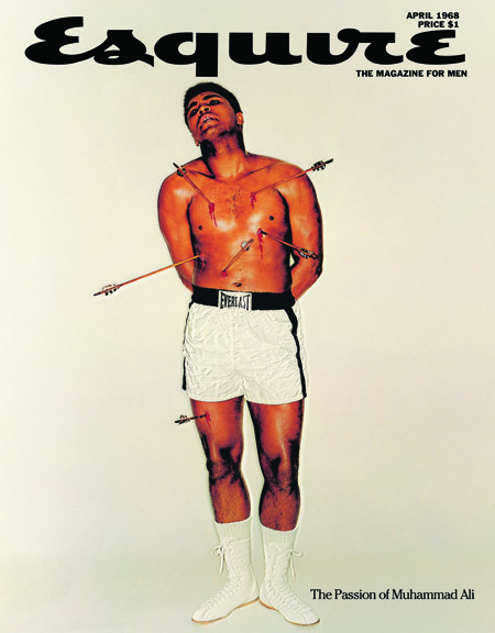
Like Dieter Rams, George Lois seems to be a recurrent theme here and I was wondering why that was. Sure, he has a new book out (published by Assouline), but why is he still relevant? Thinking about this, I kept coming back to his April 1968 Muhammad Ali cover for Esquire.

George Lois Esquire: Ali as St SebastianIn 1964 Muhammad Ali, the heavyweight champion of the world, had controversially joined The Nation of Islam and changed his name from Cassius Clay. Three years later he refused to be drafted into the U.S. army because of his religious beliefs and opposition to the Vietnam War. He was stripped of his world title and had his professional boxing license suspended.

At a time of racial tension in the US (there were race riots and civil rights protests across the country in 1967 as well as protests against the Vietnam war) Ali was a successful, outspoken, controversial and self-confident black man refusing to fight for his country. He was reviled and, one suspects, feared by white conservative America.

By 1968, Ali was on bail awaiting his appeal to the Supreme Court. He was still unable to fight and the magazine was planning a story on his exile from the ring.

Putting the boxer on the cover was certainly controversial. But Lois did not make the fighter ‘respectable’ (one doubts the thought even entered his head). Instead, in a photograph taken by Carl Fischer, he presented Ali bare-chested and pierced with arrows.

It is a striking, bloody, and shocking image — especially given the context.

Yet it is also witty, irreverent and surprising: a complex “big idea” rendered with beautiful simplicity.

Lois posed Ali as Saint Sebastian, a 3rd Century Christian soldier and martyr who was bound to a post and shot full of arrows for his beliefs (the arrows, incidentally, didn’t kill him — a subsequent beating took care of that).

The reference was a postcard of a 15th Century painting by attributed to Castagno in the Metropolitan Museum in New York (the Met have since re-attributed the painting to Francesco Botticini).

Like so many of Lois’ other covers for Esquire — this is unquestionably an attack on the establishment. But ‘Ali as St. Sebastian’ is also just about the most elegant and incisive “fuck you” imaginable. It is not the shocking irreverence that makes it resonate — it’s the lacerating wit.

From race to sex to Vietnam — this stuff mattered to Lois. And that never, ever gets old.

Links:
George Lois

George Lois AIGA Medalist
The Passion of George Lois, Design Observer
George Lois 12 Favourite Classic Esquire Covers, New York Magazine
George Lois, Wikipedia

Trailer for the documentary Art & Copy featuring a movie-stealing George Lois (just guess which one he is):

1 Comment