Skip to content

Tag: design

Something for the Weekend

Psycho Cover — Penguin art director Paul Buckley discusses his new book Penguin 75 with Imprint:

I am very aware of how much product gets put out there that is completely unnecessary, be it music, movies, books, whatever—it seems that for every good piece of culture we experience, we are bombarded with 99 pieces of redundant crap. I’ve been in the industry for awhile, and of course want to show off the great work we do here, but was not going to put out yet another design book and take your money—you can get that in any annual. To me, often more interesting than the covers are the stories, the psychology that created all the variables that led to this cover over the 20 other proposed covers.

Paul has recently updated his Flickr with new covers from the Penguin Ink series, which utilizes art by tattoo artists, as well as the latest additions to the excellent Penguin Graphic Classics series, which have art by contemporary cartoonists.

My interview with Paul and Penguin 75 designer Christopher Brand is here.

Also at Imprint Thurston Moore of Sonic Youth and book editor Eva Prinz (formerly of Abrams and Rizzoli)  talk about their new publishing venture Ecstatic Peace Library.

Writing on the Wall — Andrew Franklin, publisher and managing director of Profile Books,  offers an overview of the current state of the book business in the UK (via Dan Mogford):

Bookshops enliven high streets, create communities of readers and stage author events, while good booksellers encourage reading and shape taste. For most readers, browsing is a key part of deciding what to read, and publishers put huge effort into packaging and presenting their books. Of course many of these activities can migrate online with Facebook groups, online forums, feeds and websites helping to steer readers to the books they will most enjoy. For some online shoppers bookshops are part of this process: they browse in bookshops, write shopping lists and then buy (perhaps more cheaply) online. But no bookshop can be in business as a shop window for other retailers. You don’t have to be hopelessly nostalgic or sentimental to believe something very precious is lost with every bookshop that closes.

And at the other of the spectrum…

Another Reading Revolution — Historian Andrew Pettegree talks about his new book The Book in the Renaissance with The Atlantic (via Shelf Awareness):

The situation really is that the first generation of printers, encouraged by scholars, naturally produced the sort of books these people wanted. But it’s hard to apply this sort of commercial model—this small, bespoke model used for manuscripts—to a new process that produces 300 or more identical items. The irony is that there were plenty of other readers out there. The first printers ignored the groups that we might call pragmatic readers. Literacy was already widely-disseminated in the fifteenth century. There were lots of people who could read but did not habitually buy books, so the trick was to discover how to reach them.

Comments closed

Midweek Miscellany

The Eyes Have It — An interview with gentleman book cover designer and advertising copywriter David Gee about his design for Jim Hanas’s e-book short story collection Why They Cried. You can find my interview with David here.

Writers on Process — Writers of every stripe talking about how they write (via Largehearted Boy).

In Their Own Words — A BBC archive of television and radio interviews with modern British novelists including Virginia Woolf, Daphne du Maurier, Anthony Burgess, J.G. Ballard,  and Muriel Spark. One could quibble about about selection of some of  contemporary novelists, but otherwise this is pretty amazing collection.

And speaking of archives…

Design is History is an expanding reference for graphic design history created by designer Dominic Flask.

And finally…

The only page of Jason’s silent and sadly aborted adaptation of Edgar Allan Poe’s The Black Cat.

e-book short story collection, Why They Cried

3 Comments

Something for the Weekend

Illustrator and designer Dale Edwin Murray’s proposed cover for the Reservoir Dogs Original Screenplay. Is it just me, or is there something of artist and erstwhile Penguin designer Alan Aldridge about this?

You can see more of Dale Edwin Murray’s work on his blog and his Flickr (via Cosas Visuales).

The Library Project — A photographic installation by Swiss artist Nicolas Grospierre inspired by the infinite library in Jorge Luis Borges’ novel short story The Library of Babel (via This Isn’t Happiness).

And finally…

Author David Mitchell talks to Michael Silverblatt about his new novel The Thousand Autumns of Jacob de Zoet on this week’s KCRW’s Bookworm.

I have a truly bad track record with David Mitchell novels, but I should probably give him another go  (although that title isn’t doing a lot to encourage me).

The BBC World Service also interviewed David Mitchell recently about his earlier novel Cloud Atlas.

2 Comments

Midweek Miscellany


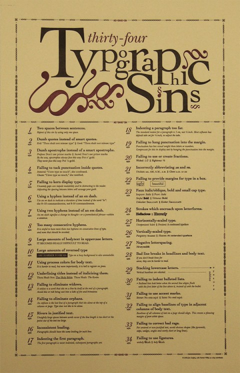
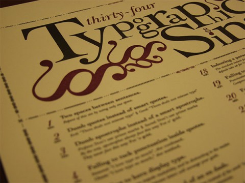
Typographic Sins Poster designed by Jim Godfrey (seen at For Print Only).

And on the subject of graphic design crimes…

Angry Paul Rand on Twitter (via @thebookdesigner):

My advice for designers & design students: fuck the rules, if your work is good enough to get away with it.

Boom — Alice Rawsthorn profiles Dutch book designer Irma Boom for the New York Times:

Ms. Boom, 49, has designed most of her books just as she has wanted. Typically, a book designer works with the text and images selected by the editor and art director, but Ms. Boom prefers to combine all three roles by deciding on the book’s structure and choosing the themes and visual material herself. She then obsesses over every element — not just how the book will look, but how it will feel and smell — and invents ingenious ways of achieving the desired effects.

One of her books was printed on coffee filter paper. Another was scented to smell of soup. A monograph of the work of the Dutch artist Steven Aalders was made in the exact dimensions of one of his paintings. The page edges of a book on the American textile designer Sheila Hicks were hacked with a circular saw to evoke the fraying edges of her work. The title on the white linen cover of a history of the Dutch company SHV only becomes visible after frequent use. There are 2,136 pages in that book, but no page numbers, to encourage readers to dip in and out.

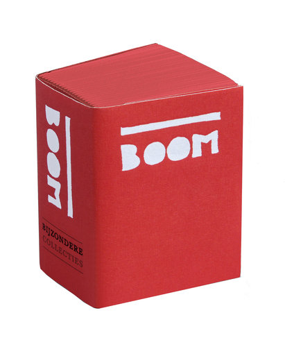
An exhibition of Boom’s work, ‘Irma Boom: Biography in Books’ runs until Oct. 3 at the University of Amsterdam Library. The book accompanying the exhibition, designed by Boom and pictured above, is only 2 inches high, 1.5 inches wide and 1 inch thick.

And finally…

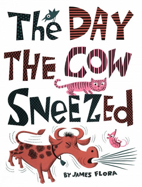
Enchanted Lion are reprinting Jim Flora’s kids books starting with The Day The Cow Sneezed in Fall 2010. Flora was best known his incredible jazz and classical album covers for Columbia Records and RCA Victor, and is officially awesome.

Comments closed

TM Covers Designed by Yves Zimmermann

The good folks at Kind Company have posted some beautiful images of Yves Zimmerman’s vintage black and white, text-only covers for the typographic periodical TM at their wonderful website Display:

(link)

Comments closed

Midweek Miscellany

The typographical cover for Oscar Guardiola-Rivera’s What If Latin America Ruled the World designed by Sarah Greeno at Bloomsbury UK.

The Gall — The inimitable  John Gall, VP and Art Director of Vintage / Anchor Books, interviewed for a rather super looking new magazine called Design Bureau:

[O]nce you have a nice solid concept, the rest of the process can almost seem effortless; enjoyable, even. And these, of course, are usually the best ones.” Gall describes his creative process as threefold: research, concept and execute. “Read the books, come up with some ideas, flesh them out, see what is sticking,” he says. However, it’s the process of getting a book’s cover approved that poses the greatest challenge for Gall and his team. “If the publisher comes back and says, well, ‘This needs really big type with a chicken on it’, that obviously means they think this is kind of important,” he says. “The re-working, dealing with all the feedback (some warranted, some moronic) ‘make this bigger’, ‘make this smaller’, ‘my psychic thinks it should be blue’—that is what separates the men from the boys,” he says.

John Gall by Noah Kalina

The article is accompanied by photographs by Noah Kalina, and includes John’s tips for lunch in New York. What more could you ask for? An interview with designer Abbott Miller you say? Well, Design Bureau have one of those as well.

Exit Interview — Former New York Times Design Director Khoi Vinh on designing the newspaper’s paywall, and his decision to walk away, in the New York Observer:

One way of trying to make logical design decisions is through research. Mr. Vinh’s team has been studying traffic patterns on the site and watching test subjects, real readers, in a lab to see how their eyes move across the page when they are reading The Times online.

“I take it all with a grain of salt,” he said. “Everything is so measurable now, theoretically. But the truth of the matter is, there’s never enough data to substitute for raw decision-making abilities. At the end of the day, you still need to make the decision.”

Designing Madison Avenue The New York Review of Books blog on the look of TV show Mad Men:

Among many things that make Mad Men so intriguing is its broad definition of what constitutes design. For example, its cunningly detailed, not-quite-couture female costuming—the B.H. Wragge-style coat-and-dress ensembles, the Koret handbags, the Coro costume jewelry—makes the female characters … seem as if they have stepped straight out of the Sunday New York Times during the twilight of Lester Markel… Equally fanatical attention is paid to interior design. The offices of Sterling Cooper were done up in the spacious, late International Style corporate mode epitomized by the boxy glass-and-steel skyscrapers that rose along Park Avenue after World War II.

And on a somwhat related note, Eleanor Wachtel interviews legendary designer Milton Glaser for CBC Radio. Good stuff.

1 Comment

Midweek Miscellany

The elegant new cover design for The Secret of Contentment by William B. Barclay, designed by Christopher Tobias.

Melancholy Technology — Tom McCarthy, whose novel C is on the long-list for the Man Booker Prize, on technology and the novel:

Technology and melancholia: an odd coupling, you might think. Yet it’s one that has deep conceptual roots. For Freud, all technology is a prosthesis: the telephone (originally conceived as a hearing aid) an artificial ear, the camera an artificial eye, and so on. Strapping his prosthetic organs on, as Freud writes in Civilisation and its Discontents, man becomes magnificent, “a kind of god with artificial limbs” – “but” (he continues) “those organs have not grown on to him and they still give him much trouble at times”. To put it another way: each technological appendage, to a large degree, embodies an absence, a loss.

There Might Be Typos On The Internet — Lori Fradkin on life as a copy editor for The Awl :

Once you train yourself to spot errors, you can’t not spot them. You can’t simply shut off the careful reading when you leave the office. You notice typos in novels, missing words in other magazines, incorrect punctuation on billboards… Another downside of the job is that only your mistakes are apparent. The catches are basically invisible. No one will look at an edited article and think, I am certain that, once upon a time, there was a double quote where there should have been a single, and a wise person fixed the issue for my benefit. But if you let a “their” slip through in the place of a “there,” you are a complete moron. And if you are working online, commenters will let you know so.

For Sur — The folks at We Made This on their contribution to the Penguin Great Ideas V series:

We did a bit of research into Borges’ writings, and learnt that he’d been one of the founding contributors to the Argentine literary journal Sur, which was published regularly from 1931 until around 1966… he magazine has a very distinctive (and typographically bonkers) masthead, and fortunately the name ‘Sur’ isn’t a million miles from the name ‘Borges’, so basing our design on it felt like a rather tasty solution.

Design Space — Design consultant Theo Rosendorf, author of  The Typographic Desk Reference, talks about his work and his office space with Herman Miller:

Typography plays a major role in the practice beyond simply picking a font or knowing a particular brand’s guidelines. Every typeface has unique requirements in that it has to be set just so. It’s up to the graphic designer to understand what a particular typeface wants. We work within those bounds to let type communicate as it was intended. Everything else follows.

And speaking of typography…

Brockmann in Motion —  Vít Zemčík animates a print design masterpiece. Zemčík made this beautiful 12 second short during the International Typography Workshop in Czieszyn.

Comments closed

Something for the Weekend

The cover for The Disappearing Spoon designed by the amazing Will Staehle. To quote Tal Goretsky at Book Covers Anonymous:  “Holy Mother God!”. Apparently it’s printed on uncoated paper.

You can see some of Tal’s own rather nice design work here.

And speaking of designer’s blogs… Designer Joanna Rieke has started a new blog called UnCovered about book and magazine covers. She recently interviewed illustrator (and Casual Op. hero) Tom Gauld:

I think most literature works perfectly well without illustrations and I have seen some truly awful images put on the cover (used as illustrations) of great books. As for comics, I’m more often frustrated by comics which are too wordy than too visual. I think the balance between words and pictures is very important in a comic and though the ratio doesn’t always have to be the same, my heart sinks when I see a page which is filled with writing.

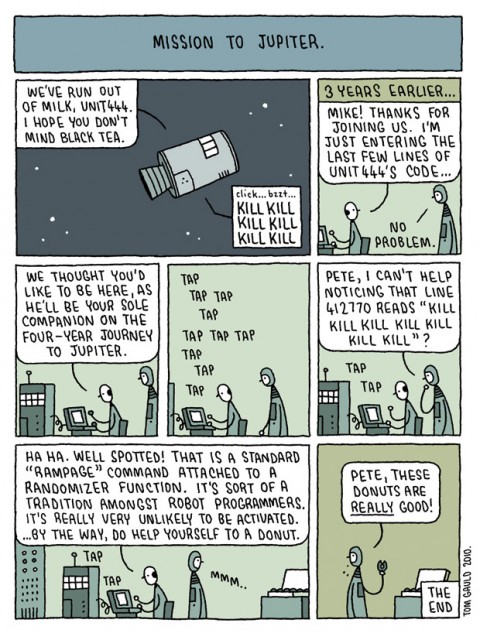
Taking a summer break from his regular illustration gig at The Guardian, Tom is currently producing a weekly comic and posting it to Flickr:

Real Editors Ship — I linked this on Twitter already, but it’s kind of great so what the hell… Paul Ford on getting stuff out the door and the value of editors (and I would suggest Production Managers):

People often think that editors are there to read things and tell people “no.” Saying “no” is a tiny part of the job. Editors are first and foremost there to ship the product without getting sued… This is not to imply that you hit every sub-deadline, that certain projects don’t fail, that things don’t suck. I failed plenty, myself. It just means that you ship…

Editors are really valuable, and, the way things are going, undervalued. These are people who are good at process. They think about calendars, schedules, checklists, and get freaked out when schedules slip. Their jobs are to aggregate information, parse it, restructure it, and make sure it meets standards. They are basically QA for language and meaning.

The Fine art of Recommending Books — Laura Miller at Salon:

Amazon and other online merchants have harnessed mighty algorithms to run their “If you enjoyed that, you might like this…” suggestion engines, but these are still crude instruments. Practically any novel you plug into Amazon’s search engines at the moment returns the robotic announcement that people who bought it also bought one of Stieg Larsson’s “Girl” thrillers — because seemingly everybody in America is buying those books. It’s not like you need the world’s most sophisticate e-commerce servers to tell you that.

And finally…

Steranko! — Jonathan Ross interviews comics legend Jim Steranko, inspiration for Josef Kavalier in Michael Chabon’s The Amazing Adventures of Kavalier and Clay,  for The Guardian:

Spend an hour with Jim Steranko and, if he’s in the mood, he’ll regale you with the most extraordinary tales. Are they true, I have asked myself more than once, or is he a fantasist? Has his love of storytelling and the creation of modern myths bled into his own life story until he can no longer tell the two apart? Well, now that I’ve met him, I believe them all to be true, just as I believe it when he tells me he still runs miles every day, pumps iron, and fornicates blissfully like a man a third his age. He is unique. He is Steranko. He is the greatest.

A slideshow of Steranko’s work is here.

Have a good weekend…

1 Comment

Great Ideas Volume V

Penguin Great Ideas V David Pearson is posting the covers for the new Penguin Great Ideas series to Flickr. As you can see, they are stunning.

You can read my interview with David Pearson here.

1 Comment

Midweek Miscellany

Finding a Cover for The Girl With the Dragon Tattoo — A WSJ article and slideshow on the cover design process for the bestselling novel by Steig Larsson:

For three months, Peter Mendelsund, a senior designer at Knopf, prepared nearly 50 distinct designs…  Mr. [Sonny] Mehta ultimately endorsed the vivid yellow jacket with the swirling dragon design: “It was striking and it was different.”

Peter Mendelsund has some further thoughts about the cover, Wittgenstein, David Foster Wallace, and design in a great post on his blog JACKET MECHANICAL:

Due to many factors (the mechanisms of the approval process; design’s fundamentally commercial aspects…) when one examines the field of design, one cannot help but come to the conclusion that good design must be, above all, likeable.

Design is too intimately entangled with matters of taste (to use Wittgenstein’s word) to be demanding enough to be Art. I have to say that in my years in the field, I’ve yet to be made to cry by a work of design. I’ve yet to be forced to view the world differently due to a work of design. I’ve yet to be really, truly gripped by a work of design. I know it’s deeply self-defeating to say this, yet, the best design has only ever evoked in me the feeling of “that’s cool.”

And on the subject of book cover design…

Creative Problem Solving — Macmillan Designers and art directors Susan Mitchell, Charlotte Strick, and Henry Sene Yee discuss the state of book cover design at FSG‘s new Work in Progress blog:

We’re interpreting or packaging other people’s ideas. If someone gives me a manuscript, I interpret it. That’s problem solving… I’m not just here to create something beautiful. Sometimes I’m here to be a plumber. I love that aspect—I can fix things. I’ll make it balance, whatever it is.

Still Reading? — Patrick Kingsley on the art of slow reading for The Guardian:

Still reading? You’re probably in a dwindling minority. But no matter: a literary revolution is at hand. First we had slow food, then slow travel. Now, those campaigns are joined by a slow-reading movement – a disparate bunch of academics and intellectuals who want us to take our time while reading, and re-reading. They ask us to switch off our computers every so often and rediscover both the joy of personal engagement with physical texts, and the ability to process them fully.

Also in The Guardian

Unwanted — A 12-page comic strip tale of unwanted immigrants by Joe Sacco, author of Safe Area Gorazde, Footnotes in Gaza, and Palestine

…And on a not unrelated note: Publishing Perspectives looks at comics and graphic novels in the Middle East and how they are pushing at cultural boundaries.

And finally…

Bob Stein of The Institute for the Future of the Book interviewed by On The Media:

The western version of the printing press is invented in 1454. It takes 50 years for page numbers to emerge. It took humans that long to figure out that it might be useful to put numbers onto the pages.

What is slightly curious about this interview is that Stein acknowledges the essentially unpredictable messiness of the future, and yet it doesn’t seem to stop him…

Comments closed

The Pleasures and Sorrows of Work

Jamie Keenan’s inspired cover for The Pleasures and Sorrows of Work by Alain de Botton, published by Vintage:

Image courtesy of Vintage and Anchor Books Art Director John Gall.

(Via @Pieratt and Book Cover Archive)

Comments closed

The Creativity Crisis

Newsweek reports on research that shows, for the first time ever, American creativity is declining:

With intelligence, there is a phenomenon called the Flynn effect—each generation, scores go up about 10 points. Enriched environments are making kids smarter. With creativity, a reverse trend has just been identified and is being reported for the first time here: American creativity scores are falling…

The potential consequences are sweeping. The necessity of human ingenuity is undisputed. A recent IBM poll of 1,500 CEOs identified creativity as the No. 1 “leadership competency” of the future. Yet it’s not just about sustaining our nation’s economic growth. All around us are matters of national and international importance that are crying out for creative solutions, from saving the Gulf of Mexico to bringing peace to Afghanistan to delivering health care. Such solutions emerge from a healthy marketplace of ideas, sustained by a populace constantly contributing original ideas and receptive to the ideas of others.

(via More Intelligent Life)

1 Comment