Skip to content

Tag: design

Something for the Weekend

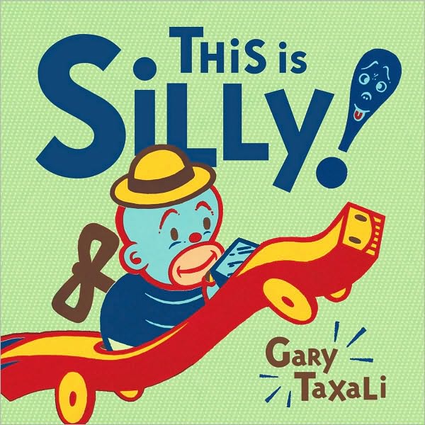
Sadly I missed the book launch earlier this week, but Toronto-based artist and illustrator Gary Taxali talked to the Torontoist and The National Post about his new kids book This is Silly!. You can see more of Taxali’s amazing book covers here.

ArtifactsMaximus Clarke has a fascinating conversation with William Gibson about his new novel Zero History :

I reach instinctively for something without knowing why, and place it in the narrative, and if it strikes a resonant chord with me, I’ll leave it there… But I myself have wondered why I do that — why I depict a universe of man-made objects, with people walking among them (laughs). My best answer is that it’s the way I perceive things. And I also suspect that the narratives of objects are more available to us when the objects themselves have become slightly decrepit. So I think my interest in old things, and worn things, isn’t about nostalgia in any conventional sense; it’s about the revelation of the narrative of how that object came to be in the world, and what it once might have meant to someone.

And on a somewhat related note, an interview with J.G. Ballard from the Winter 1984(!) issue of The Paris Review:

I would say that I quite consciously rely on my obsessions in all my work, that I deliberately set up an obsessional frame of mind. In a paradoxical way, this leaves one free of the subject of the obsession. It’s like picking up an ashtray and staring so hard at it that one becomes obsessed by its contours, angles, texture, et cetera, and forgets that it is an ashtray—a glass dish for stubbing out cigarettes.

The Black Arts — Book cover designers discuss their devious techniques for winning a clients approval with Peter Mendelsund and Peter Terzian:

Yes, a good design should speak for itself—but what if the client isn’t listening? Well, that’s when designers employ methods that are not taught in design school. Psychological methods. Machiavellian methods. Used-car-dealer methods. Manipulation. Intimidation. Seduction.

The PDF is here.

And Peter T has clearly been busy. The editor of Heavy Rotation: Twenty Writers on the Albums That Changed Their Lives has an article on books about album cover art at BookForum.

And finally (and on the subject of music)…

Finding Our WayRadiohead bassist Colin Greenwood reflects on the digital “pay what you think it’s worth” release of their album In Rainbows in 2007  and the band’s distribution options for their new songs:

I buy hardly any CDs now and get my music from many different sources: Spotify, iTunes, blog playlists, podcasts, online streaming – reviewing this makes me realise that my appetite for music now is just as strong as when I was 13, and how dependent I am upon digital delivery. At the same time, I find a lot of the technology very frustrating and counter-intuitive. I spend a lot of time using music production software, but iTunes feels clunky. I wish it was as simple and elegant as Apple’s hardware. I understand that we have become our own broadcasters and distributors, but I miss the editorialisation of music, the curatorial influences of people like John Peel or a good record label. I liked being on a record label that had us on it, along with Blur, the Beastie Boys and the Beatles.

(via Subtraction)

Comments closed
IDEO’s Future of the Book

Design consultancy IDEO present three visions for the “future of the book” (none of which include print of course):

Any thoughts?

7 Comments

Smith and Vignelli

As is no doubt clear from recent blog posts, I have a huge amount of respect for the work of designer Massimo Vignelli and so I really enjoyed this recent interview with Debbie Millman for the new series of Design Matters.

Vignelli, however, does not want for ego, and so I was struck how humble British designer and cycling enthusiast Paul Smith is in this fascinating and inspiring conversation with designer Mike Dempsey by comparison:

Paul Smith Interview

Egos aside, it interesting that the lives and careers Smith and Vignelli seem share some unlikely common threads — from their early apprenticeships and life-long partners, to their sense of design, tradition, and detail.

Comments closed

Homage to the Square

A short documentary about the artist and educator Josef Albers, author of the seminal Interaction of Color and widely regarded as the father of modern colour theory:

The film is the first part of ‘The Full Spectrum’ a three-part series on colour produced earlier this year by Dwell Magazine.

(via Swiss Legacy)

Comments closed

Massimo Vignelli — A Short Documentary

It is turning into something of a mini Massimo Vignelli week at The Casual Optimist. Here is John Madere’s short documentary about the designer, mentioned briefly on Wednesday:

3 Comments

The Desk

The Desk is a fascinating mini-documentary about our complex relationships with our workspace. It features commentary from experts Alice Twemlow, Eric Abrahamson, Massimo Vignelli, David Miller, Kurt Andersen, Søren Kjær, Alfred Stadler, Jennifer Lai, and Ben Bajorek:

Created by Imaginary Forces for L Studio, The Desk first episode in a series called ‘Lines’  that looks at the design of everyday objects and they affect us. Other episodes include The High Heel, The Lens, The Elevator,  and The Parking Structure.

(via Brandon Schaefer)

Comments closed

Midweek Miscellany

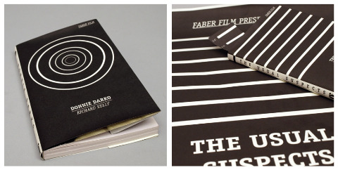
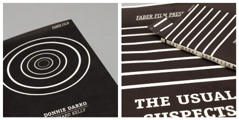
Another great set of designs for the 2009 D&AD student award brief for typography sponsored by Faber and Faber, this time by Rinse Design (via Cosa Visuales). See also: Ed Cornish’s designs for the brief.

Phaidon have relaunched their website and it is really rather nice (via FormFiftyFive).

The Imaginary PresentMike Doherty interviews William Gibson about his new novel Zero History for The National Post:

In his earlier books, Gibson says, he aimed to devise “futures that felt as though they were filled with designed artifacts, as indeed they would be. I can’t think of too many science fiction writers who’d bother trying to do that.” In the [new] series, his devotion to design has gone into overdrive, reflecting the idea that “everything is ‘designer,’ ” even though “with most things, you’ll never know the name of a designer.”

PopMatters also spoke to the author about the new book.

Code — Jennifer Egan, author of A Visit From the Goon Squad, reviews Tom McCarthy’s C for The New York Times:

[McCarthy] aligns disparate things into larger patterns full of recurring images: analogies between the human body and earth, and machinery; hums and whirs; film screens; bowels and tunnels; electric circuits; cauls and other silken membranes. These repetitions come to feel like the articulation of a larger code — as if, were readers to plot their exact positions throughout the novel, they would discover a hidden message.

What Ever Happened to Reading Properly? — ReadySteadyBlog’s Mark Thwaite on critics misreading of  Gabriel Josipovici’s What Ever Happened to Modernism?:

It’s interesting that Josipovici’s book which, in many ways, is both a call to read more carefully and an enquiry into why reading carefully is beyond so many cultural gatekeepers, has been read so sloppily by so many of its critics… Josipovici doesn’t invoke marginal or avant-garde writers, nor praise typographical or narrative playfulness over stale traditionalism, but rather brings us back to canonical writers (a good part of his essay is taken up with Wordsworth) and allows us to see what was at stake for those artists in their work, and what is at stake for us as readers.

And finally… It’s Vignelli week at Design Observer:

Debbie Millman’s 2007 interview with Massimo Vignelli (excerpted from her book How To Think Like a Graphic Designer):

I’m interested in “essence” — my major aim is really to get to the essence of the problem. And just throw away everything that’s not pertinent to it. At the end of a project, my work should be the projection of that experience, the essence of effect. It’s a habit that you get into… The essence is what is left when there’s nothing else that you can throw away.

Michel Bierut profiles Lella Vignelli:

Massimo has often defined their working relationship like this: “I’m the engine, and Lella is the brakes.” The first time I heard this as a young designer, it was clear to me which was more important. If you were a designer, wouldn’t you want to be the engine, powerful, propulsive, driving forward? It was only years later that I remembered something my high school driving instructor once said: “You don’t get killed in a car accident because the car won’t start. You get killed because the breaks fail.”

And, there is an interesting, beautifully shot, video interview with Massimo Vignelli by photographer John Madere here.

There will surely be more good stuff as the week progresses…

Comments closed

Something for the Weekend

A series of book cover design concepts for The Infamous Press by Norwegian graphic designer Morten Iveland (via IS050).

Paid by the Joke — The enduring appeal of Keith Waterhouse’s Billy Liar in The Guardian:

Billy Liar’s longevity is not an example of a tale that is told and told again with a dulling faithfulness; rather, the long life of Billy Liar is a story of reincarnation, of each new generation seizing upon the tale afresh and making the story its own. Its influence may be felt in half a century of creative endeavour, in drama and literature and film, and, perhaps most keenly, in popular music: referenced, for instance, in the video for the Oasis single The Importance of Being Idle, and in a song by the Decemberists, and popping up, too, in many of Morrissey’s lyrics, including the Smiths’ 1984 hit William, It Was Really Nothing.

And if anyone at Penguin is reading, please, please reissue Billy Liar with the Tony Meeuwissen Woodbine cover from the 1970’s (come on, you know you want to):

(image via David The Designer)

If Covers Could Talk — A nice satirical book cover blog, kind of like Unhappy Hipsters for books.

And finally…

W. W. Norton, who have done great job with their Flickr — particularly their book design archive where the above stunner by Gray318 comes from — now have a Tumblr as well. The latest post, at the time of writing, is an animated scene from Stitches, the graphic memoir by David Small. Nice work.

5 Comments

Something for the Weekend

What Do You Do With These Things? — Andrew Pettegree, author of The Book in the Renaissance, interviewed at the Boston Globe (via The Second Pass):

What you’ve got to do once you’ve got 300 identical copies of a book is you’ve got to sell it to people who don’t even yet know they want it. And that’s a very, very different way of selling…

It’s this classic example of how you get technological innovation without people really being aware of the commercial implications, of how you can make money from it. There’s quite a little similarity in the first generation of print with the dot-com boom and bust of the ’90s, where people have this fantastic new innovation, a lot of creative energy is put into it, a lot of development capital is put into it, and then people say, “Well, yeah, but how are we going to make money…?”

Your Brain on Gadgets — NPR looks at digital overload:

The average person today consumes almost three times as much information as what the typical person consumed in 1960, according to research at the University of California, San Diego.

And The New York Times reports that the average computer user checks 40 websites a day and can switch programs 36 times an hour.

“It’s an onslaught of information coming in today,” says Times technology journalist Matt Richtel.

Digital Horde — Fast Company on the launch of The Mongoliad, Neal Stephenson’s experiment with digital storytelling and social media:

The innovation in The Mongoliad… [is] in the entire concept of a serialized, dynamic, digital “book” that includes video, imagery, music, and background articles among the text of the storyline and comes with a social media companion, with which fans/readers can comment and interact. The social aspect even goes so far as including badges, the new digital “reward” phenomenon, which readers can earn for taking part in particular activities. The book will be available online via a browser, and also through dedicated apps for Apple iDevices and Android phones.

There’s more about the venture at The New York Times. At what point, however, does this stop being a novel and start being a game? Can we tell anymore…?

This Is Our Niche — Steven Heller talks to Sonic Youth’s Thurston Moore and editor Eva Prinz about Ecstatic Peace Library for the The New York Times:

Moore and Prinz believe that the analog and digital are more distinct in books than in other media. “To say that an art book can be an e-book is ignorant of the tradition and art of color separations, printing and binding,” Prinz said. “Likewise, to suspect that a digital storytelling experience is simply a pdf downloaded on your iPad or Kindle platform is disrespectful to the interactive arts and artists.” She has been experimenting with video game technology to create their first e-book. “In similar processes to those employed by the 1960s experimental subcommittee of the College de Pataphysique, a group of French writers and poets who called themselves OuLiPo (Ouvroir de litterature potentielle),” Prinz continued, “Ecstatic Peace Library is creating new ways to ‘escape’ into literature and art.”

The Wolf Hall EffectIntelligent Life looks at the growing respectability of  historical fiction in the wake of Hilary Mantel’s Booker Prize winning novel.

And finally…

Little Acts of Civil Disobedience — A profile of book designer Peter Mendelsund by Stefan Kamph from 2009 that I hadn’t seen previously (thx Jacob):

Moments of humor and surprise in a cover are a designer’s “little acts of civil disobedience,” says Mendelsund, and he “would like to think that if you’re a good reader there are little exegetical clues you can sneak in.” The court artist hides his private mark in the appointed painting.

Peter also recently posted his beautiful designs for the Steig Larsson deluxe boxed set at his blog JACKET MECHANICAL.

Comments closed

Raymond Hawkey 1930-2010

The dapper graphic designer Raymond Hawkey, whose innovative work at The Daily Express and The Observer changed the face of British newspapers in the post-war era, died last week aged of 80.

Hawkey’s modern graphic style also revolutionized British book cover design.

His stark black and white cover for Len Deighton’s 1962 Harry Palmer novel, The Ipcress File, which — with its chipped teacup, stubbed out cigarette and Smith & Wesson revolver — mixed violence with the everyday, became iconic despite initial opposition from the book’s horrified publisher Hodder & Stoughton.

Designer Mike Dempsey, who profiled Hawkey for Design Week in 2001, noted:

What Hawkey did with [The Ipcress File] was one of the key moments in design history. It is important to view this piece of work within the context of the period. Hawkey’s photographic use of inanimate objects to give a narrative dimension to the cover was startlingly new and made a dramatic impact on the publishing scene. The publisher, Hodder, found the design too spartan with its black and white photography, plain background and small undifferentiated typography, but both Deighton and Hawkey held firm. They were right, because on publication in 1962, The lpcress File sold out within 24 hours.

After the success of The Ipcress File, Hawkey became a sought-after book cover designer, working on more jackets for Deighton, as well as covers for Ian Fleming, Kingsley Amis and Frederick Forsyth amongst others.

According to his obituary in The Guardian, Hawkey was  a shy and quietly spoken man:

But in spite of his gentle voice and manner, once engaged in an assignment he was indefatigable, working 16 hours at a stretch, before sleeping briefly and putting in another 16-hour day in the flat where he lived for five decades. He was wonderfully generous, especially with his time, to young people who sought his advice, whether it was on design or writing – he wrote four very fine thrillers, including It (1983), regarded by many as the first truly modern ghost story.

A fastidious and private man, he had a dread of dying in hospital; and after a long illness he died in his own bed – with his beloved wife, Mary, reading his favourite poem to him.

Comments closed

Something for the Weekend

Hornby Cover Versions — Some rather beautiful student work by Barcelona-based graphic designer Lucía Castro (although my inner-bookseller gets very twitchy at the thought of those soft off-white covers!). (via Cosa Visuales)

Full of Refusals — Tom McCarthy interviewed for More Intelligent Life:

[C]ontemporary literature has to deal with the challenges laid down by modernism. The most exhilarating and unsettling upheavals took place in the early 20th century, and to ignore them and go back to writing some kitsch version of the 19th-century novel is ostrich-like… I’m suspicious of the term ‘avant-garde’. I think it should be restricted to its strict historical designation: Futurists, Dadaists, Surrealists etc. “Tristram Shandy” and “Motherless Brooklyn” aren’t avant-garde novels; they’re novels.

C by Tom McCarthy will finally available in the US and Canada on September 7th.

A stunningly simple Malevich-like book cover design by Jason Booher and Helen Yentus for the paperback edition Inside the Stalin Archives by Jonathan Brent. First seen at the Book Cover Archive who have just posted a slew of Jason’s covers.

On the subject of the BCA, co-curator Ben Pieratt has recently updated his own design portfolio.

Agile Content — Marny Smith interviews Brian O’Leary of publishing consultants Magellan Media Partners:

[P]ublishers are competing against both established players and new entrants at the same time.  The newer players often have much lower costs than we’re used to, making them potentially tough competitors… I’ve been thinking lately that publishers need to work more aggressively on creating agile content that can be discovered and easily reused or recombined.  Creating content that is sold in one format just won’t be cost-effective in the future.

And finally…

The cute book trailer for OH NO! Or How My Science Project Destroyed the World written by Mac Barnett illustrated by Dan Santat:

You can find more of Dan’s awesome illustrations on his Flickr:

(via The Ward-O-Matic)

Comments closed

Midweek Miscellany

Jardin de la Connaissance —  Berlin-based landscape architect Thilo Folkerts and artist Rodney Latourelle used 40,000 reclaimed books to create a ‘Garden of Knowledge’ for the 11th International Garden Festival in Grand-Métis, Quebec (via Kitsune Noir).

A History of Print Culture — Assistant Professor of Media Culture,  C.W. Anderson,  provides his annotated syllabus for a print history course at CUNY in The Atlantic (thx Jamie):

The primary goal of this class is to teach students about the culture of “print media” in an era when that culture is being joined (and in some cases, overtaken) by a culture that we might variously call digital culture, online culture, or the culture of the web. What does “print” mean in our digital age? And what does “culture,” mean, for that matter? By culture I mean something that is not reducible to “economics,” “technology,” “politics,” or “organizations” — although culture emerges out of the nexus of these different factors, and others.  In other words, I want to disabuse my students of the notion that new technologies or new economic arrangements can create digital or print culture in the same way that a cue ball hits a billiard ball on a pool table.

Also in The Atlantic10 Reading Revolutions Before E-Books by Timothy Carmody.

Knowledgeable Criticism — An interesting interview with Fred Brooks, computer scientist and author of The Mythical Man-Month, for Wired magazine:

Great design does not come from great processes; it comes from great designers… The critical thing about the design process is to identify your scarcest resource. Despite what you may think, that very often is not money.

And finally…

When You Don’t Know You Are Breaking the Rules… Eli Horowitz, managing editor of McSweeney’s, interviewed for Scotland on Sunday (via the indefatigable  Largehearted Boy):

At the heart of McSweeney’s success is the huge amount of care and attention which goes into producing each book, ensuring that the jacket design and layout complement the words inside the covers. Though Horowitz believes there is a McSweeney’s aesthetic he is struggling to put into words what it is. “There’s a notion of old-fashioned story-telling and a compelling plot combined with an innovative literary impulse – when we’ve had those ingredients that’s when we’ve done our best works.”

Comments closed