Skip to content

Tag: design

Q & A with Michel Vrana, Black Eye Design

Michel Vrana, AKA Black Eye Design, has been on my radar since we first crossed paths on Twitter in the run up to Book Camp Toronto earlier this year.

I had hoped to run into the Montreal-based designer in person at Book Camp, but unfortunately, in the dehydrating hustle of the day, I didn’t get chance to introduce myself.

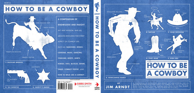
Nevertheless, a few weeks after the event, I came across a series of reissued cowboy books from publisher Gibbs Smith in a Raincoast sales meeting. The witty retro cover designs — with their pop culture references and knowing wink to the distinctive letterpress work of the Hatch Show Print studio — stood out among the more traditional covers in the catalogue.

It turned out that they were designed by Michel.

Small world, I thought.

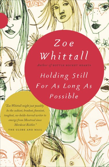
A little later I found out that Michel also designed covers for Casual Optimist favourite Drawn & Quarterly (also distributed by Raincoast for the record).

And then it seemed Michel’s work was everywhere. Or perhaps it just seemed that way. My love of letterpress, comics, vintage magazines, typography, ephemera and stuff certainly make me notice his work, which often seems to draw on these elements.

Although we still haven’t met in person, we’ve stayed in touch through the electronic wonder of Twitter and email over the past couple of months, and despite some major changes at Black Eye Design during that time, Michel seemed a natural fit for this series of interviews.

You can see more Michel’s work at his design:related portfolio and, of course, follow him on Twitter @michelvrana.

 Briefly, could you outline the history of Black Eye?

In 1993, I started Black Eye Productions as a comic book publishing company. Inspired by Drawn and Quarterly, I sought to do justice to all the hard work that the cartoonists put into the books I published by making sure they were well packaged and designed. Over the years, I did more and more graphic design, and less publishing, in order to pay the bills, and eventually decided to dedicate myself design full time in 1998.

From 1998 onward, Black Eye Design became a boutique design studio specializing in publication design. I spent much of my time running the studio and art directing and not as much time as I wanted doing what I enjoyed most: the hands-on design. Starting in 2006, I rolled up my sleeves and started doing book design again, though I was really splitting my time between running the company and doing hands on work. In 2009, I decided to shutter the studio and concentrate on book design full-time. It’s really what I’ve enjoyed the most over the years, from those first days as a comics publisher onward.


Do have a ‘house’ style? How would you describe it?

I’m sure anyone looking at my work would see a style more than I can. I’m sure the word ‘retro’ applies. Someone once described the work I do as ‘prop design’, where the design emulates something else but that is not always the case. My business card, for example, is set up like a vintage boxing ticket. Two of my most recent fiction covers have the titles incorporated into a matchbox and a postage stamp. So that’s probably a trend in my work.

I try to incorporate, whenever I can, a subtle ‘punchline’ into my covers. For example, the book that has the match box is called The Last Shot; it’s a collection of short stories where many of the characters are stuck at a dead end in their lives, and are looking for that one ‘last shot’ to change things. The cover has a few spent matches, and a matchbox with one last match sitting in it. I like to think a reader is going to look at the title, look at the visual and then it will click and they’ll get that little ‘Aha!’ in their head, and feel like they’re in on the joke.

 The (English-speaking) Canadian book industry is largely focused in Toronto. What are the pros and cons of being a book designer based in Montreal?

It’s a pat answer, but in this day and age, you can be anywhere in the world and succeed as a graphic designer. As long as you get the word out there to the right people, you’ll find contracts. I’ve worked very hard in promoting my studio, and now myself. Not having lived/worked in Toronto, maybe it would be easier to find new projects if I lived there, but it’s hard to say for sure.

Could you describe your design process?

I front-load my process with questions, thinking and pencil sketching, rather than sitting down straightaway at the computer.

When I’m not sure I have enough info from my design brief, I’ll usually ask many questions of my publisher, editor, or art director for the project. I find that that really helps clarify things.

When possible, I also try to get a sample, or the whole manuscript to read. I use Stanza on my iPhone to read manuscripts and annotate them with ideas, as I read. When I don’t have a manuscript, I just start by writing out ideas and brainstorming.

I usually delay sitting down at the computer as long as I can. I sketch out rough thumbnails for myself, and sometimes even show these (very) rough sketches to the art director, editor or publisher I’m working with, to get the discussion going. I find that keeping everything loose and unpolished at the beginning frees me from getting too attached to any one idea, from it becoming too precious, and that keeps creativity flowing. It’s a valuable lesson I learned from designer Jan Wilker at the SVW 2008 workshop.

 What are your favourite projects to work on?

I’m going to be a cliché and say that I love working on all book covers. To me, the fun in visual problem solving remains the same whether it’s a kids’ humour book about Gross Stuff, or a collection of short stories by a budding young talent. That being said, my absolute favourite ones are the ones that require me to push myself out of my comfort zone and try something new. Scary, but fun.

What are the most challenging?

The ones with a short design brief. I’ve come to realize that these seemingly ‘easy’ projects are deceptively so, and the covers often require the most revisions. Now when I get a quick design brief, I try to dig deeper with my art director, editor or publisher to find out more about their goals with the cover.

What are some of the common frustrations working with publishers?

My number one frustration would be that sometimes publishers underestimate their audience. As a culture, we’re a lot more savvy about visual communication than many people assume. We’re all continually exposed to clever ad campaigns, posters, book covers; so let’s not underestimate the intelligence and experience of the audience. For books this seems especially important, since you’re talking about a segment of the population that’s especially literate.

 What do you think makes a good cover design?

Marketer Seth Godin hit the nail on the head for me, when he described the role of a cover as ‘to tee up the reader so the book has maximum impact’. The goal of a book cover is to engage the reader, and get them to pick it up, to interact with it (look at the back cover copy, maybe read a quick passage). That’s the stuff that sells the book. The cover is the invitation, and that invitation needs to be enticing.

Do you see any current trends in cover design?

Illustration and hand-drawn type are definitely a trend these days. And I think that Peter Mendelsund‘s design for Stieg Larsson’s The Girl with the Dragon Tattoo opened up the idea of type layered with the image. In fact, dimensional type, or maybe even ‘environmental type’ seems to be a meme in graphic design these days.

Where do look for inspiration?

I’m a big fan of ephemera: retro packaging, book design, comics. I love that stuff. I also try more and more to keep up to date with what other ‘big’ designers are doing, hopefully without finding myself overly influenced by their work. There are so many talented designers, photographers and illustrators online that it’s hard not to be inspired! Of course, if I ever get ‘stuck’ on a design, I find that tuning out for a while is the best way to go for me, knowing that somewhere in the back of my head, the ideas are still percolating.

 Who are some of your design heroes?

The first designer I was ever aware of was Art Spiegelman. The work he did on Raw magazine, and on Maus has always been influential (right down to my love of the font Metro, which Spiegelman often uses). David Mazzucchelli would also be another cartoonist/designer that’s always impressed me: from his work on Batman Year One to his self-published Rubber Blanket, to his newest Asterios Polyp.

In 1992 I picked up a copy of Jeanette Winterson’s The Passion in London, and it was part of an edition of tiny hardcovers published as Bloomsbury Classics. The design of that first book, and the series, has always stuck with me [see pictures pf the Bloomsbury Classics here and here]. Jeffrey Fisher is the amazingly talented illustrator who worked on the series.

I’m also a big fan of Paul Sahre: I bought Rick Moody’s Demonology completely based on the elegant Paul’s cover: a photo of the multi-coloured ‘Rocket’ candy. I thought the design was brilliant at conveying the idea of the book being a collection of short stories.

Amy King is great, her work shows such variety, but it’s all so well executed. John Gall‘s paperback covers for Haruki Murakami are lovely. Of course, Henry Yee‘s work always blows me away – his cover for The Adventures of Kavalier and Klay is a favourite. And let me not forget fellow Canadian designers Peter Cocking and David Drummond. Not to mention the work of my colleagues on twitter Ingrid Paulson, Christopher Tobias, David Gee.

 What do you think e-books mean for book designers?

It’s going to be interesting to see how new e-book readers shape the reading experience. I’m keeping my fingers crossed that fine typography and graphic design will continue to be important. What I can see in the future is the incorporation of more rich media into book design – childrens’ books with motion graphics, novels with musical cues, or even embedded video. Who knows, maybe we’ll even see book covers with motion graphics on the e-book front? Ultimately, I think it means that books are going to evolve. Down which path I’m not sure, but book designers will have to evolve along with them. Whether we end up with books that act like the publications in the Harry Potter world, or if they’re something completely different.

Thanks Michel!

Next Week: Alex Camlin, Creative Director at Da Capo Press.

Comments closed

Q & A with Ingrid Paulson, Ingrid Paulson Design

Holding Still cover

Before setting up her own design studio in Toronto, award-winning Canadian designer Ingrid Paulson was senior designer at McClelland & Stewart, and art director for Key Porter and Raincoast Books.

Although Ingrid worked at Raincoast, we didn’t actually meet until BookCamp Toronto earlier this year. We only had a brief a conversation, but it was just about long enough for me to blurt out that I wanted to interview her, and for the apparently unflappable Ingrid to say “OK” (and sound like she might mean it).

And so I do want to say a big thank you to Ingrid for coming through with such grace and patience, and for providing such wonderful answers to my not-so-wonderful questions.

Could you describe your design process for book covers?

In terms of workflow? The publisher gives me a title information sheet and/or a creative brief, plus (fingers crossed) either a few chapters or the entire manuscript for the book. I always ask to read the fiction, but for non-fiction I can manage well with a concise book description and perhaps the introduction. I submit a minimum of three cover concepts to my contact at the publishing house, and wait for feedback. Then I either redesign and resubmit, or, if I was ‘on to something,’ I tweak one of the concepts until we get it right.

In terms of creative process? Um. Well.

Some cover concepts appear in my head, fully formed, by the end of my first conversation with my publishing contact. Other get dragged out of me kicking and screaming, begging to stay in the dark void of my head. Sometimes I sketch out the covers — wee thumbnails in my moleskine — whereas other times I play a Google Images lotto search using various vague terms that would describe a feeling I want to associate with the book. Sometimes the font is the first thing chosen, or I envision the type at certain sizes and placed in specific places. Other times, the image is driving the cover and the type just has to play catch-up. I’ll envision a book as predominantly red, or dark, or punchy — and that all comes from what the author has written. I’ll respond to textured sentences with textured visuals (perhaps collage?) and bleak will meet bleak. (But not so bleak as to discourage someone picking it up. The bookbuyer is in my thoughts as well, as I try to envision them and their habits, quirks, and book needs.) Needless to say, my brain gets crowded.

And then there are the days when I just stare at a wall and hope against hope I’ll figure out something clever. I haunt a lot of bookstores.

wallis

What are your favourite projects to work on?

The ones I get right on the first try.

I love working on fiction, but it takes the most concentration and, because fiction is so subjective, so evocative of the human condition (both funny and sad), designing a fiction cover can drive me nuts. There is never one absolute visual solution for fiction. Nonfiction, on the other hand, can get formulaic, but I love the simplicity of thought — punchline design, in many ways. So, for sanity’s sake, I prefer to keep a balance of fiction and nonfiction going. Cookbooks can be a blast to design, but I (sheepishly) think that comes from the photo shoot where we all end up eating most of the props (the ones that have flavour, or haven’t been sprayed with any shellac). And then there are the special projects where I’m asked to work on the cover and interior, and I am part of the planning and layout process, where I get to research the images, discuss things with the editors on a page-by-page basis. Those projects are rare, but they keep me happy for a few years at a time.

What do you think makes a good cover design?

Being able to lure someone into picking up the book and reading the back, which takes about 1.5 seconds of their time. Job done. How to do that? If we in publishing knew, we’d also be able to predict bestsellers. The best I’ve figured out is to keep it a simple visual package — don’t let the type look out of place with the image, don’t use the same colours as everyone else is using that season, stay away from looking too much like any of the other books, but make it look like a book. I dunno. The cover should evoke an emotional pull from the bookbuyer, that moment of ‘yes, that’s interesting and looks like what I want to read.’ That solution changes from book to book.

What are some of the common mistakes publishers and designers make with covers?

For publishers, they’ll try to make their book look similar to someone else’s (bestselling) book, as if to catch the wave. This is not clever, it just means the publisher is out of ideas or is feeling the year-end coming and needs to hook on to a sales-winner. It’s the publisher that took a design chance on a different look — and came out the winner in terms of sales — that is the ultimate winner. The rest end up on the remainder table eventually. Daunting. They don’t call it a ‘gentleman’s profession’ for nothing. (Or ‘gentlewoman’s’. I’m just citing the old, old adage.)

For designers, it is not being able to pitch their cover effectively. If a designer can articulate the reasons for their choices of colour, type, and image, then they have a fighting chance of getting that design through. Otherwise they are leaving it to speculation. I’ve worked both sides of the table — inhouse art director, freelance designer — and I know that it is ten times harder for a freelancer to get that voice heard in the meetings. But inhouse staff can get asked to revise designs far more often than the freelancer, as the perceived economies behind a salaried staff versus a per-project contractor sometimes give the publisher too much leeway on revisions. I’ve been inhouse with a book cover that I simply didn’t ‘get,’ but there was no way to contract out the job, as, due to costs, the publisher refused. It was a painful, long design process for all involved (not just me), and they ended up with something inferior to what they would have gotten with a designer who understood the book. As an Art Director, I could’ve just handed it to a specialist designer and, with a few good notes, gotten something much more suitable for the book.

I guess that leads to a codicil: know when to walk away. Yes, we all want to try new book categories. Just know when to draw the line, so to speak.

British and American book design styles are often seen as quite distinct (with critics and proponents of both!). Is there a Canadian style of book design?

What there is known of Canadian book design is an amalgam of quiet, well-crafted literary press style — usually hand in hand with DIY letterpress style — smashed against a desperate need for full-bleed sepia landscapes (or sleeping sepia people) and egregiously large title type. We err on the side of poetic, which can look like a wash in the stores (or worse — too literary, which could alienate those poor readers still recovering from their English high school reading list). We avoid edgy.

There is some astonishing design coming out of the cracks across the nation — David Drummond comes to mind, as does the brain trust under Peter Cocking at Douglas & McIntyre — and I hope that will win out. Clear, slightly subversive, more in tune with our world-famous sense of humour. Intelligent is the word that comes to mind.

Do Canadian book designers have unique opportunities? Are they accompanied by particular challenges?

Figuring out new and exciting ways to design both hockey and ‘whither Canada’ books, which are a yearly staple on publishers’ lists. We are handy and imaginative with maple leaf imagery and the colour red.

You’re an artist as well as a book designer. Is there a tension between your artistic sensibility and the commercial design process?

Every day, and the design wins. I’ve tried to avoid overlaps, but words are images to me, so lately I’ve been working on art based around words. I try to keep it as three dimensional as possible (since my day work is two-dimensional), but then font choices become a factor and I run screaming. It helps to know that both Jenny Holzer and Barbara Kruger worked in designer/typesetter jobs early in their artistic careers.

The challenge lies in accepting and separating out design and art from their ultimate goals: design is created to communicate a product; art is created to communicate the world, in whatever form, or whatever scope, the artist chooses. There is no client in art.

How is designing book interiors different from designing their covers?

Interiors are, in many ways, a much more detailed exercise in communication. For a text-only book, I have to make sure that the reader never really sees the design, else it distract from their involvement with the text. For a picture book, the pictures stand tall, so the design should just assist the pictures. But a cover is a marketing tool, and the cover must try, in no uncertain terms, to woo the reader. It must stand out.

poster

Where do you look for inspiration?

Currently? Other designers (book and non-book), as well as music poster design. There is a great revival (when did it go away?) of one-off poster designs for gigs. They are all silkscreened or letterpressed limited-edition beauties. I used to look at rave fliers all the time (when raves were the thing). I look online. I remember stuff my mom — who was an antiquer in the 1970s — used to show me, old ads and magazines. I read a lot (beyond manuscripts), so I end up with this polymathic knowledge of, say, alchemical symbols and Greek demigods. We used to be such a visual culture, pre-literacy, and I think in many ways we’re heading back there. My job is to connect the shorthand symbols of the culture, both old and new. It can fascinate me for hours, why LOLCats is the thing (and then not the thing, but what did the visual say of us?), or looking at, say, a Dutch design student’s incredibly cool/obscure website.

Who else is doing interesting work right now?

I love designers with latitute — ones that aren’t just one-trick (or one-look). Who comes to mind? Coralie Bickford-Smith, Jason Gabbert, Terri Nimmo, David Gee, Gabriele Wilson, Peter Mendulsund… They all have style that can bend to the project. I could go on, but that’s today’s list. It will change and expand tomorrow.

You’re very active with your website, blog, and Twitter etc. Is it important for a designer to engage with people online?

You know, every time I blog (or answer nice questions like yours), I sit back afterward and fear that my opinion is going to lose me a client. There is this balance one must keep when designing, as the client is always right (or deserves the design they get, depending on the outcome), yet what designers put out there does contribute to our visual worldscape. So, I try to contribute.

But I work from home (or, in Toronto parlance, I have a ‘live/work situation’). Blogging keeps me from talking to the wall too much, or thinking that the cat cares when I’m sweating to find the right sans-serif. It has been fascinating to watch how many book designers have joined Twitter lately — we all seem to find each other, this odd subgenre of designers, and I think in the future, that will result in some mind-blowing design (or a great convention in Bend, Oregon). My purpose online is to build community, to share ideas, to groan when needed, and if other non-designers join the conversation, well, then it just becomes this great party.

With the growing popularity of e-books, what is next for book cover design?

Ack! I don’t know. I really don’t. We’ll see what happens. What I do know is that there will always be a role for design, but what that role takes is anyone’s guess.

Thanks Ingrid!

Comments closed

Hunger

At the risk of this turning into W.W. Norton Week on The Casual Optimist, I wanted to re-post this gorgeous cover for Hunger by Lan Samantha Chang designed by High Design, with art direction by Albert Tang. It was originally included with my Q & A with Norton’s Ingsu Liu earlier this week, but removed when I updated the post.

W.W. Norton Book Design Archive on Flickr

Comments closed

Q & A with Ingsu Liu, W.W. Norton

Having spent a lot of my life in the UK, I wasn’t particularly familiar with venerable New York independent publisher  W.W. Norton and Co. until my stint at Toronto’s (now doomed) Pages Books and Magazines where their books were frequently on tables.

Although I left Pages a few years ago, I was recently reminded of the breadth and quality of Norton’s books — and, of course, their covers — by their decision to archive their book cover designs on Flickr.

In a roundabout way, the launch of the design archive also put me in touch with Steve Colca, Norton’s online marketing manager. He in turn, hooked me up with Ingsu Liu who kindly agreed to talk about the design process at Norton for this week’s Q&A.

Currently V.P. art director at W.W. Norton, Ingsu Liu graduated from the graphic design program at Pratt Institute in 1988 and began her career at Penguin, William Morrow and Vintage Books before accepting a position at Norton in 1997.

Briefly, describe your role at Norton

I oversee the hardcover jacket imprint.

How many designers are on your team?

I oversee two in-house art directors; together we collaborate with various outside freelance designers, illustrators, art researchers and photographers.

Approximately how many covers does Norton require each season?

About 55 to 75 books each season. We do 2 seasons, for a total of roughly 125 books a year.

Is there a ‘house’ style?

I certainly hope not. I believe it’s most beneficial to be diverse, so that each book jacket can have it’s own voice. This helps to keep the list fresh and my job more fun.

Do you approach fiction and non-fiction differently?

It really depends on what the book requires, but the basic process is the same. First I talk to the editor, publisher, and marketing… then drawing from those conversations, the book brief, the author’s writing, the current market place, the comparative titles and what the book is about, I then decide which direction the jacket should go and set out to assign the best designer or artists for that title. My focus is on what’s best for the particular title, everything else comes naturally after.

Which books provide the biggest challenges?

The titles that no one can agree how best to market the book and therefore what sort of jacket it should have. Also, big print runs where there is more at stake. Then, there’s the occasional book where the author’s 6 year old daughter gets to dictate the jacket design.

What do you look for in a cover design?

Craftsmanship, mood… but a strong concept will always rule the day. Also, the surprise factor is pure gold; nothing is worse than the “same design, different day” effect. A design should, at the very least, have its own point of view.

How are final covers decided upon?

After I have decided on who is best to work on the cover design, I start presenting the designs at our jacket committee meetings. There we narrow it down to one final choice. Then — when there is not a six year old involved — the author, the author’s agent, the editor, the marketing and the publisher all have to sign off on one final jacket design. Sometimes, after we finally get all these diverse interests on the same boat, a single book buyer can kill our jacket and we start the whole process all over again.

Do you think there’s a tension between producing creative covers and what will play in the market?

See the last sentence in my answer above. That said, we are constantly being subjected to various subjective opinions. It is my job, when I can, to filter through it all and to use the good advice and to discard the bad… and unfortunately, the folks with the bad advice often have the loudest voice. See Dick Cheney.

Have you any recent favourites?

Obsession: A History by Isaac Tobin (University of Chicago)

Milk by Barbara deWilde (A.A. Knopf)

Pride and Prejudice and Mansfield Park by Leigh-Anne Mullock

Metamorphosis and Other Stories by Mother (Penguin Classics)

Waiting For The Barbarians by Paul Buckley (Penguin)

Sedaris by David Drummond (University Of Minnesota Press)

The Paranoid Style by Brett Yasko (Vintage)

The list goes on and on, and on….

Do you discern any current trends in American book cover design?

Most obvious is the rebirth of interest in comic artists. Whether it is a whole book or just a jacket image, I never get tired of seeing great comic art. Growing up in Taiwan, I spent countless hours lost in thousands of comic books, it is what inspired my interest in art and has kept my fascination to this day.

Also it’s nice to see so many designers and artists collaborating so that hand-done art is being combined beautifully with all these hi-tech designs and applications. This mix of raw and slick often creates the most interesting packages.

Are they any designers whose work you particularly admire?

Sagmeister, Will Staehle, Evan Gaffney, Louise Fili, Peter Mendelsund, John Gall, Paul Buckley, David Drummond, Patti Ratchford, David High and Gabriele Wilson. The fact is there are too many to list…

Are there any book or design blogs you read regularly?

I mostly still enjoy going to the book stores to be inspired, but Eye Magazine, the annuals from Print, Communication Art, AIGA, and the Type Directors Club are the good old standby’s for me. For blogs, I like FaceOut Books, The Book Design Review, Design: RelatedThe Book Cover Archive, and most recently The Casual Optimist. And now that you’ve interviewed me, your blog is totally awesome!

With the growth in e-books, do you think cover design will continue to be important?

I very much hope so. I love holding a beautifully produced book in my hands. But the fact is that one must embrace the future — for it’s coming whether you want it to or not.

Thanks Ingsu!

With special thanks to Steve Colca, Manager of Internet Marketing at W. W. Norton & Co. for arranging the interview

UPDATE:

Since originally posted on August 4th, 2009, some of the images accompanying this interview have been changed. The previous images were my selections from the W.W. Norton Design Archive on Flickr chosen to illustrate the work of some of the designers mentioned in the Q & A and to reflect the diversity of books designed and published by the team at W.W. Norton. To avoid confusion, all the current images were art directed by Ingsu Liu.

Design credit for the individual covers included in this post:

Flash Fiction Forward Design by Rodrigo Corral
The Meaning Of Night Design by Patti Ratchford
Busted Design by Jon Grey
What Can I Do When Everything’s On Fire? Design by Evan Gaffney
Stitches Design by Paul Buckley

4 Comments

Something for the Weekend, July 24th, 2009

Group Thinkery — Book-designing, tuba-playing Christopher Tobias has launched a new blog to discuss books, design, and publishing. Group Thinkery is also on Twitter.

I came across the stellar portfolio of High Design’s David High — which includes this rather brilliant cover for The Management Myth for W.W. Norton — earlier this week thanks to a tweet from the chaps at FaceOut Books. Go take a look.

Luck — In another one of those long, fascinating Agents and Editors Q&As from Poets and Writers that are always well worth your time, Jonathan Galassi, president and publisher of Farrar, Straus and Giroux, looks back at his career and comments on the current state of the industry:

One of the really hard lessons was realizing how much of a crapshoot publishing is—how you can love something and do everything you can for it, and yet fail at connecting it to an audience. Maybe you misjudged it. Maybe it didn’t get the right breaks. One of the hardest things to come to grips with is how important the breaks are. There’s luck in publishing, just like in any human activity… That was one of the hardest lessons: how difficult it is to actually be effective… Writing is its own reward. It has to be. I really believe that. This is a part of publishing that’s really hard to come to grips with. But publishers can’t make culture happen the way they want it to happen… We can huff and puff and pay money and advertise and everything else, but in the end, if the readers don’t come, we can’t do anything about it.

The lovely-looking limited edition, hand-made Done Walking With My Regular Shoes by recent graduate Stina Johansson. The cover design is screen-printed onto canvas (via DesignWorkLife).

Andy designing — The New Directions blog looks at the book designs of Andy Warhol:

Andy Warhol worked for New Directions as a book designer off and on for almost 10 years. Our editor-in-chief recalls James Laughlin telling her an Andy Warhol anecdote:

“He was a very strange looking man. But all the secretaries loved him because he would sneak little origami creatures on their desks when they weren’t looking. One time as he was walking out of the office he looked bashfully over at a secretary goggling at him and said ‘I like you. You’re so hirsute.’ Her reply? A very soft and giggly ‘thank you.’”

Personalization — Steven Heller talks to Rick Smolan about The Obama Time Capsule, a book that can be customized by the reader before it is printed:

I wondered if there was a way to create a book that wove together all these amazing images with each individual book buyer’s own story, photos and even their children’s artwork, so that every single copy was unique. I intentionally didn’t want to do a trade book edition because part of the goal was to have no books in warehouses, no print run, no books printed that might have to be later pulped and destroyed, no books shipped over by container ship from China or Korea (where all the big coffee table books are printed). The idea was to do the book of the future 10 years ahead of its time.

In this particular instance the customization of the book sounds a little gimicky to me, but possibilities it opens up seem pretty endless…

And lastly… Not being very quick on the uptake (what, you noticed?) I just came across the winners of The Strand bookstore’s Eye on The Strand photography contest. The Grand Prize was awarded to Josh Robinson for ‘Strand Shadows’ (above) and the contest exhibition, which opened on July 15th, will run through August 26, 2009 at the Pratt Institute CCPS Gallery, located at 144 West 14th Street, New York. I’m also rather fond of Cary Conover’s ‘Upside Down’ which took second place:

1 Comment

Q & A with Nate Salciccioli

Thanks to blogging and Twitter I’ve been lucky enough to connect with a group of people in the book trade that I probably wouldn’t have met otherwise. Their enthusiasm and willingness to share their experiences is in stark contrast to the traditional reluctance of people in the industry to talk meaningfully (or positively) about what they do (without being three sheets to the wind).

Book designers in particular have an amazing online dialogue about their work and so over the next couple of months I’m planning a series of interviews with some of the designers whose projects have recently caught my eye.

First up on the docket is Nate Salciccioli. Nate is a graphic designer at The DesignWorks Group — purveyors of fine book covers since 1996 — and the chap behind the excellent Paradox of Awesome (it’s a long story and you probably had to be there…).

Even though he is only 23 (according to his website), Nate’s work has already been recognized by Print, Graphis, CMYK Magazine and elsewhere.

What attracted you to a career in book design?

Like many things, my career in book design was accidental. I’ll admit that, while in design school, I had neither considered nor seen many book covers. It certainly hadn’t entered my school-addled brain that I would (or could) pursue it exclusively. That all changed when I landed an internship with The DesignWorks Group, which I deem one of the most providential events of my life thus far. Everyone here is such a blast to work with, and I think falling in love with what they do here led to my love of book cover design.

Briefly, could you tell me a little about The DesignWorks Group?

Surely. Our little studio has been in the industry going on 14 years. We work almost exclusively in book cover design, with a few identities, websites, and movie posters thrown in for good measure. All told, there are 6 designers who call DWG home, and some amazing production and management people. From what I’ve gathered in talking with friends, the atmosphere at DWG is pretty unique; we love to collaborate, love to have fun, and LOVE the Shat (for those of you who are uninitiated, that’s William Shatner).

Something interesting is that none of our clientele is local. We work with publishers in NYC, Chicago, Nashville, San Francisco, Colorado Springs, Boston, and lots of other equally spaced out locations. This creates an interesting disconnect, which I think actually has helped our studio reach out through the internet with platforms like FaceOut Books, design:related, and Twitter.

How long have you worked there?

I’ve been working here since July 1, 2007. Has it really been over two years? I’m still waiting for two 30 inch monitors, if anyone is reading this…

Is there a ‘house’ style?

Thankfully, no. Our range of clients is so diverse that I think we’d be doing ourselves a disservice to aim towards anything as unified as a ‘house style.’ All the designers working here are deathly afraid of repeating themselves (in a good way). I do have to make a concerted effort to expose myself to lots of different kinds of design aesthetics to avoid getting a NATE look. Which reminds me, I need to stop using Futura…

Is there much collaboration between designers at DWG?

We’re always talking to each other. Many times a day I’m showing different people what I’m working on, and in turn taking a look at their screen. I can’t tell you how valuable this is in keeping my brain from fizzling. As a team, we’ll have brainstorming sessions when someone wants help in coming up with concepts. These concept generation sessions (CGSs??) always enrich the thinking on any given project.

Could you describe your design process?

Ah. You had to ask. Can I plead the fifth? Does ‘Plead the Fifth’ even make sense in Canada?

To be honest, my process varies from project to project. Sometimes I’ll read the book, do some sketches, find something I like, find a great image, create some brilliant typography, and get an ecstatic response from the client. SOMETIMES. More often, I’ll read and reread the given material from the client, roll some ideas around in my head for a while, and struggle for about an hour in Photoshop until I gain some momentum. If that doesn’t work, I run to the local convenience store for an ice cold Coca-Cola. I can’t stress enough the role of caffeine in graphic design.

What are your favourite projects to work on?

I love digging my teeth into a good fiction title. To me, fiction affords the most open-ended challenge: design something unique that gives an insight into the story. It’s more than problem solving. The art director I’m working with at the publisher plays a huge role in setting the tone for the project: Are we going for something brilliant, or for something palatable by Danielle Steele fanatics?

Some of my favorite projects lately have been a book about zombies, a reference series for Barnes and Noble, and several university press projects. I can’t get enough projects for university presses, by the way. Always a fun challenge.

What are the most challenging?

The biggest challenge is trying to continue innovating after several rounds with a project. When your ideas keep getting shut down, you have to find the place in your head that refuses to give up. On the flipside, it can be very rewarding to emerge from a bout like this with a cover that makes everyone happy (including me); it happens like that, sometimes.

What do you think makes a good cover design?

I’ve discovered that a good cover is more than just “oh wow, look at that neato type” or “shee whiz, no title on the cover!” It’s about communication in the end. I’ve admittedly produced designs that I thought looked great, but didn’t speak to the audience at all. If a cover can effectively introduce the book to its intended audience while still looking like a million bucks, it’s a good cover.

Where do you look for inspiration?

I have a morning routine that runs me through the gamut of book cover design sites (of which, happily, there are PLENTY), design inspiration sites, and blogs. I also have a running folder of lovely bits of design I find in different places. FFFFound is a great resource for visual stimuli, as are sites like NOTCOT.org and The Book Cover Archive. Just walking into a Barnes and Noble is a wonderful way to build enthusiasm for book design, as you can actually TOUCH them.

Who else is doing interesting work right now?

Some of my favorites to watch right now are Brian Chojnowski, Jason Heuer, Megan Wilson, Ben Wiseman, Christopher Brand, Jacob Covey, Helen Yentus, and Adam Johnson. There are so many talented designers working in book design, it boggles my mind.

As a young designer, what do you think the future holds for book cover design?

Some older and MUCH smarter people have told me there will always be a market for book cover design. I guess I’ll have to take their word for it. For me, the skills I develop working in books could translate easily to many other graphic design facets, which brings some comfort. I don’t expect to be holding a cardboard sign that says “Have Mouse, will Kern for Food” any time soon.

Thanks Nate!

You can find more of Nate’s work at his website and design:related portfolio.

6 Comments

Something for the Weekend, June 26th, 2009

2009 Penguin Design Award — Peter Adlington’s abstract design for The Secret History by Donna Tart (pictured above) took 1st place. More on the Penguin Blog.

The Good Design Book — Christopher Simmons, graphic designer and principle at the San Francisco-based design firm MINE, records the progress and process of writing and designing his new book on design (via Unbeige). The whole concept reminded me that I should also mention the crowdsourced Smashing Magazine Book.

OK, Go — Kassia Krozser, Kirk Biglione, and Kat Meyer (and an unnamed “veteran of the book industry”), put their money where their collective mouth is, and launch digital publisher Quartet Press (and they’re accepting submissions).

The Debrief — Organizer Hugh McGuire pens his personal thoughts on BookCamp Toronto for Book Oven.

One of the most powerful things about BookCamp, compared with other events I’ve been to, is that this was not just a grassroots group. There was high-level engagement from the publishing industry, with publishers, editors, senior VPs, production managers, marketers, and interns, and everything in between. It was great to see the honest debate and conversation being lead by these insiders, who are truly grappling with the future of their business and their passion.

And VANTAP‘s Sean “Crazy Horse” Cranbury  adds his 2 cents on #bcto09 at the Books on The Radio blog, and teases BookCamp Vancouver.

Vile Bodies — The 1930 first edition cover of Evelyn Waugh’s second novel seen at BibliOdyssey.

And last, but not least…

Apples and Oranges — The article about the evolution of Amazon by Adam L. Penenberg, author of the forthcoming Viral Loop: How Social Networks Unleash Revolutionary Business Growth, that launched a great Twitter chat with @FastCompany and yesterday’s ’26 Things…’ list (which could have easily been twice as long). 

Comments closed

Something for the Weekend, June 19th, 2009

50/50 — AIGA announce their 50 Books/50 Covers of 2008. Included in the fifty is the cover of Kenneth Hayes’ Milk and Melancholy designed by Toronto’s Underline Studio (pictured above).

Gxuu! — Linguist Arika Okrent, author of In the Land of Invented Languages, chooses her 10 favourite words from invented languages for The University of Chicago Magazine. Having been kind of fascinated with Volapük after reading William Gibson‘s  Spook Country, I was happy to see the inclusion of ‘pük’ (via the incomparable Kottke of course):

In Volapük, pük means “language.” It comes from the English word “speak” but it’s hard to tell (vol, means “world”, so Volapük is “world language.”) Unfortunately, it looks a lot like a different English word. And even more unfortunately, it shows up in various other words related to the concept of language: püked – “sentence” and pükön – “to speak.”

Nice Work — Mark Thwaite interviews novelist, critic and Emeritus Professor of English Literature, David Lodge about his new book Deaf Sentence for The Book Depository blog:

One’s ideal reader is intelligent, alert, open-minded but demanding, and equipped with what Hemingway called “a built-in shit-detector.” He/she does not actually exist. In a way you try to be that reader when you read and re-read your own work in progress, and not to kid yourself if something isn’t quite right. That’s a rather different matter from one’s “readership” which in my case, I’m aware, is probably well-educated, well-read, maybe Catholic, and getting more and more senior in years, like myself.

A Special Specimen — A lovely post by James Phillips Williams at amassblog about Paul Rand, Jan Tschichold and a very special type specimen book.

And speaking of Paul Rand, be sure to visit Daniel Lewandowski’s tribute site to the great man (via grain edit).

Comments closed

Something for the Weekend

Das Boot — David Drummond’s cover for Canadian Water Politics Edited by Mark Sproule-Jones, Carolyn Johns, and B. Timothy Heinmiller has been selected for the AIGA 50 Books/50 Covers this year. The book is published by McGill-Queens University Press who clearly take pride in the look of their books and have some other rather nice cover designs on their site.

The Long Goodbye — Another long, hard — and somewhat cynical look — at the state of the book industry. This time it’s the turn of Elisabeth Sifton, senior vice president of Farrar, Straus & Giroux, in The Nation.

W. W. Norton Book Design Archive — Publisher W. W. Norton have started posting their book cover designs to designated Flickr set (Crime by Irvine Welsh, designed by Darren Haggar pictured above) . I’d love to see more publishers do this (via The Book Cover Archive Blog).

Bird Brained or Brilliant — The contentious issue live-tweeting conferences. I only mention this because it tallies with my own recent experience of live-tweeting Raincoast’s Fall 09 Sales Conference. And because I’m a nerd (via Kate Trgovac on Twitter).

Gigantic Robot — the awesome Tom Gauld is publishing a new 32-page comic called The Gigantic Robot this summer. According to the Creative Review blog it’s “a fable concerning the production of a secret weapon whose promise apparently goes unfulfilled”. Can’t wait.

And finally (on a completely un-book related note)…

Redux — Muxtape is dead! Long live Muxtape! Whereas the late, lamented Muxtape was a place to upload mp3 ‘mixtapes’ (that fell foul of the music industry lawyers), Justin Ouellette’s new site is a platform for bands to share their music. Nice (via ISO50).

Comments closed

Monday Miscellany, April 27th, 2009

Every battle is won before it is even fought — Amazon acquires Stanza. Like just about everyone else, I was completely blindsided by this. But should we have seen it coming?

The Black Series — Paperback covers from 1960’s Swedish crime series “Svarta serien”  illustrated by Per Åhlin seen at Martin Klasch’s blog.

100 Books on Typography — Compiled by Charles Nix president of the Type Directors Club (via Design Observer).

Writing Without Words — Stefanie Posavec’s gorgeous visualizations of text and the writing styles of various authors (via @Ashbury&Ashbury).

The Art of Penguin Science Fiction—  James Pardey is creating an archive of Penguin science fiction cover designs. If I have one complaint it’s that you can’t see larger versions of the covers, but otherwise it is brilliant (via Ace Jet 170).

Comments closed

Something For The Weekend, April 25th,2009

Comic Shelves by Oscar Nunez for Fusca Design (via The Ephemerist)

Goodnight Mechanical Dinosaur — Neil Gaiman on Batman in Wired (via LinkMachineGo):

[T]he great thing about Batman and Superman, in truth, is that they are literally transcendent. They are better than most of the stories they are in. That’s just Sturgeon’s Law: “90 percent of everything is crap.” Can you imagine how many thousands, or millions, of words have been written on Batman? Try to read them and you’re looking at 100,000 pages, perhaps a million, and you can assume that 90 percent of it is crap. Yet the 10 percent, and even better the 1 percent of that 10 perfect, is absolutely glorious. That pays for everything.

Tea and Cake — Louise Tucker chats to colleague Scott Pack about The Friday Project on HarperCollins’ 5th Estate blog:

It is still the only imprint to specialise in taking great web content and making books from it. That gives us a much wider brief than most people think…

Our future plans are very exciting. Our author deals will now all be profit-share arrangements with us splitting the profits of the books 50/50 with the authors. We are soon to announce some bold eBook initiatives and there is more to come.

Figuring it Out — Type legend Erik Spiekermann, co-author of Stop Stealing Sheep, on the basics of typography.  Not new, but still a great primer/reminder.


Will it sell in Moosejaw? — Book designers Bill Douglas (The Bang), Ingrid Paulson, (Ingrid Paulson Design), Angel Guerra (Archetype Design), Terri Nimmo, (Random House), and Kelly Hill, (Random House), discuss their craft in The National Post (Ingrid Paulson’s cover design for Kate Ausptiz’s The War Memoir of HRH Wallis Duchess of Windsor pictured above).

Wrapper’s Delight — A librarian at the Bodleian Library has found the earliest-known book dust jacket in an archive of book-trade ephemera:

Unlike today’s dust jackets, wrappers of the early 19th century were used to enfold the book completely, like a parcel. Traces of sealing wax where the paper was secured can still be seen on the Bodleian’s discovery, along with pointed creases at the edges where the paper had been folded, showing the shape of the book it had enclosed.

Comments closed

Midweek Miscellany, April 22nd, 2009

Blue Prints for a World Revolution — seen at the Antiquarian Bookshop 108 Buddhas, which has an amazing collection of avant-garde journals and books from Japan and Eastern Europe  in their gallery section (via Michelle McCormick’s Inspiration Resource ).

12 Steps to Better Book Publishing — Good stuff from Jonathan Karp, publisher and editor-in-chief of Twelve Books in Publishers Weekly:

It seems likely that the influence and cultural centrality of major publishers, as well as other producers of information and entertainment, will diminish as digital technology enables more and more people to create and share their work. This is exactly why publishers must distinguish themselves by doing better what they’ve always done best: champion books that offer carefully conceived context, style and authority.

The State of the IndustryNeil Nyren, senior VP, publisher and editor in chief of G.P. Putnam’s Sons talks to author  J.T. Ellison at Murderati (via @sarahw).

Poetic Interiors — Some lovely typography for Arrays of Conscious by Chanson Duvall at Beyond the Covers.

Embracing Change — Victoria Barnsley, chief executive and publisher at HarperCollins UK,  profiled in The Guardian:

There are still concerns about the digital future, such as how to continue making money. “There are some very big questions that we still have to answer – the biggest one being value,” says Barnsley. “How to make sure that consumers are going to be prepared to pay for digital content, because a lot of them are getting quite used to getting it for free?”

And yet…

Why newspapers can’t charge for online content — Dan Kennedy elsewhere in The Guardian:

I have no philosophical objection to the idea that news organizations ought to be able to charge for their online content. The problem is that it’s highly unlikely to work – mainly because there are too many sources of free, high-quality news with which they’re competing.

Font of Ill Will — Vincent Connare, designer of Comic Sans, profiled at the WSJ:

The font, a casual script designed to look like comic-book lettering, is the bane of graphic designers, other aesthetes and Internet geeks. It is a punch line: “Comic Sans walks into a bar, bartender says, ‘We don’t serve your type.'”

And finally…

Soldiers of Lead — An introduction to layout and typography for use in the Labour Party  (via Design Observer).

Comments closed