Skip to content

Tag: design

Midweek Miscellany

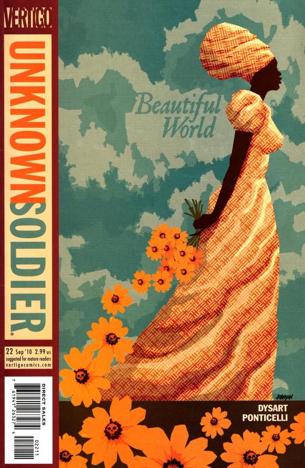
Kelly Thompson chooses her favourite 52 comic book covers from the past year on her blog 1979 Semifinalist. The cover above is by Dave Johnson for Unknown Soldier #22. Other personal favourites of mine on the list include the very retro Deadpool Pulp #4 by Jae Lee, and Hellboy: The Fury # 1 by Mike Mignola (you just can’t go wrong with a big axe really…)

And if you don’t read Kelly’s regular three sentence or less drunken demolitions of Marvel and DC covers you really are missing out. “Motherfucking gangbusters.”

Comics Dwindling Gene Pool — Alan Moore talks about the latest instalment of The League of Extraordinary Gentlemen, Century: 1969, and more with The Guardian:

These days, the majority of the comic book audience is 40-somethings who are not necessarily interested in comic books as a medium or panel progression or sequential narrative. They are probably interested in Wolverine. There is a large nostalgic component in there and there’s nothing wrong with it. But if those people then begin to influence the books themselves or increasingly the movies or the television series then they will want their story to refer to stories that they remember. It becomes very incestuous and over a few decades you get a very limited dwindling gene pool. And you get stories that have become weak through inbreeding.

And sticking with comics for a moment… Eric Reynolds talks about comics and Fantagraphics’ Mome Anthology in a four-part interview The Daily Cross Hatch:

Putting comics online is definitely of interest to myself and all of us at Fantagraphics, for sure. We know that that’s only going to continue to grow. It has certain advantages and disadvantages. But I don’t know if I necessarily want to edit an online anthology, per se. I don’t know why… I know if it’s just that I enjoy the tactile pleasures of print, or what, but—and this is my own personal preference—it doesn’t seem to quite exist when it’s on the Internet, which is quite paradoxical. The Internet has the potential to reach a lot more people that print, in this day and age, and yet, you don’t have that physical object to hold as proof that you did what you did.

Meanwhile, if you are looking for some ‘serious’ books for your vacation, the indefatigable Largehearted Boy is doggedly aggregating online summer reading lists for the year.

While at Slate Robert Pinsky explains  how not to write a book review (whether you’ve read the book in question or not).

And finally (in the likely instance you haven’t seen these yet)…

Cardon Webb’s clever designs for a new series of Oliver Sacks paperbacks from Vintage (via John Gall).


Comments closed

A History of the Title Sequence

A History of the Title Sequence is a short film by Jurjen Versteeg. It charts the development of film title sequences by displaying the names of influential title designers in the style of their own work. In other words, it is a film about title sequences that looks like a title sequence. How great is that?

The film references the following designers and their titles:

Georges Méliès, Un Voyage Dans La Lune; Saul Bass, Psycho; Maurice Binder, Dr. No; Stephen Frankfurt, To Kill A Mockingbird; Pablo Ferro, Dr. Strangelove; Richard Greenberg, Alien; Kyle Cooper, Seven; Danny Yount, Kiss Kiss Bang Bang and Sherlock Holmes.

Comments closed

The Helmet of Horror | Angus Hyland

As a follow up to yesterday’s Design Matters post, I just wanted to share Angus Hyland’s extraordinary design for The Helmet of Horror by Victor  Pelevin, published as part Canongate’s Myths series a few years ago:

The illustration is by Sara Fanelli.

2 Comments

Midweek Miscellany


Furious — Writer and herstorian Trina Robbins talks to Imprint about her new book on pioneering female cartoonist Tarpé Mills and her newspaper strip Miss Fury:

I’ve always been a lover of noir and of good adventure strips in the noir mode, as typified by Milton Caniff’s Terry and the Pirates. They are adventures that are good, fun escapist reading. As you know, there were a number of cartoonists during the 1940s who worked in that genre, but only Tarpé Mills was a woman. That alone would have been enough to attract her to me. But add to that: good art, solid storytelling, memorable characters… including three of the strongest female characters in comics…

Mills’s characters also wore great fashions… at a time when many of the male cartoonists dressed their female characters in featureless red strapless evening gowns or equally featureless short red V-necked dresses. Of course there are exceptions – Caniff was very up on women’s styles. But I think in general one sign that a comic is by a woman is that attention is paid to the clothing – Miss Fury, Brenda Starr, Mopsy, I could go on and on – and that men tend not to show much awareness of what real women are wearing, even today… especially today!

And on the subject of comics…

Word as Pictures — Designer Rob Harrigan has launched a new series of interviews about design and comics. First off is designer Rian Hughes:

Comics, in a broader sense, are simply words and pictures – and words AS pictures, which as a designer, and especially as a font designer, is what fascinates me the most. The formal aspects of communication – this is the very language designers manipulate for their own ends, the medium culture uses to spread memes.

Still Great, Still in Production — Alexander Lange reviews Dieter Rams: As Little Design as Possible by Sophie Lovell for The Architect’s Newspaper:

Open Dieter Rams: As Little Design as Possible. Turn to page 64. There you will find the Braun product line circa 1963. I would buy any one of those products today, save the cameras, were they sold in stores. Which is to say, you will get no argument from me about Rams’ greatness as an industrial designer and the superiority of his achievement as head of Braun’s product design department from 1961 to 1995, where he designed or co-designed 500 products, lighters, door handles, coffee grinders, hi-fis and televisions, hair dryers, and cameras. Plus those Vitsoe 606 shelves, still great, still in production.

And finally…

Steven Heller on designer, art director and inventor of the album cover Alex Steinweiss, who died on Sunday aged 94, for The New York Times:

Mr. Steinweiss preferred metaphor to literalism, and his covers often used collages of musical and cultural symbols. For a Bartok piano concerto, he rejected a portrait of Bartok, using instead the hammers, keys and strings of a piano placed against a stylized backdrop. For a recording of Gershwin’s “Rhapsody in Blue,” he used an illustration of a piano on a dark blue field illuminated only by an abstract street lamp, with a stylized silhouetted skyline in the background…

Mr. Steinweiss said he was destined to be a commercial artist. In high school he marveled at his classmates who “could take a brush, dip it in some paint and make letters,” he recalled. “So I said to myself, if some day I could become a good sign painter, that would be terrific!”

Comments closed

Richard Price Paperbacks | Henry Sene Yee

Columbine and A Wall in Palestine: cover designs by Henry Sene Yee

Henry Sene Yee is a designer and art director at Picador USA. The very of his best work (and all of it is good) — his cover designs for Columbine by Dave Cullen and A Wall in Palestine by René Backmann to pick two recent examples — combine judiciously selected and smartly cropped photographs with bold typographic choices.

Given the poignancy of the images he chooses and the respect he gives to them within his compositions — the room he gives them to breath —  it isn’t surprising that Henry is a photographer himself, regularly capturing scenes of daily life in his beloved New York through a lens.

Photo by Henry Sene Yee

The author Richard Price, who has also written for the HBO series The Wire, was born in and raised in the Bronx. Several of his novels, including Clockers and Freedomland (both adapted to movies), are set in the in fictional town of Dempsy, New Jersey.

Photo by Henry Sene Yee

Over the last couple of years Henry, who also happened to grow up in New Jersey, has designed covers for Picador’s recent reissues of Price’s novels.

Bringing his understanding of photography and type to the designs Henry has, like Price himself, avoided the expected crime fiction clichés.

As fan of Price’s work as well as Henry’s, I thought I would take to the opportunity to ask the designer how he approached the covers.

Here is his reply:

Lush Life: cover design by Aaron Artessa

It started when Picador published the paperback edition of Richard Price’s bestseller Lush Life. Because of its success, the FSG cover was reproduced in ads and displayed prominently in bookstores. Repackaging the cover for paperback would not take advantage of the public familiarity with it so it was decided to keep the original jacket design [by Aaron Artessa].

Clockers final cover by Henry Sene Yee

Clockers: unused designs by Henry Sene Yee

Clockers, probably Price’s most well known backlist was also acquired by us and was reprinted to coincide. It was designed as a stand alone. I couldn’t see how I would or need to relate it to Lush Life.

Bloodbrothers final cover by Henry Sene Yee

It was followed by his next backlist title Bloodbrothers, which was also designed as a stand alone. That book’s themes reminded me of photographer Bruce Davidson’s beautiful 1970s NYC Subway photos. I found this great Davidson photograph from his gang series and kept the colors simple.

The Breaks final cover by Henry Sene Yee

We later acquired The Breaks and Ladies’ Man and I had no intention to follow any previous Price’s look since there was none. Photo research found some great images similar in look to the Davidsons. My two favorite photos happen to both be horizontal and the initial layouts looked similar to Bloodbrothers. I tried to distinguish them by using different colors in the background, type. But in the end, it was just distracting from the great photos. So I decided to have them match Bloodbrothers, keeping the type and same palette of black, warm gray duotones, cream and warm red.

Ladies man final cover by Henry Sene Yee

The Breaks and Ladies Man: unused designs by Henry Sene Yee

Thanks Henry!

Disclosure: As of Fall 2011, book published by Picador will be distributed to independent bookstores and libraries in Canada by my employer Raincoast Books as part of a new distribution arrangement with Macmillan US. For the record, Henry and I discussed featuring his work on The Casual Optimist several times well before details of this deal was known to either of us.

1 Comment

Le Carré | Matt Taylor

Not long ago, I posted Stuart Bache’s wonderfully cinematic John le Carré covers for Sceptre in the UK. Now (as mentioned earlier today) John le Carré’s American publisher Penguin have reissued new editions of his books with amazing illustrations by Brighton-based illustrator Matt Taylor and design by Gregg Kulick and Paul Buckley. Mr Buckley art directed series.

Special thanks to Paul Buckley and Andrew Lau at Penguin US for providing the cover images, and to James at Caustic Cover Critic for bringing them to my attention.

7 Comments

Backlit | Ingrid Paulson


Toronto-based designer Ingrid Paulson has designed these four covers for a new paperback reprint series called ‘Backlit’ to be published by ECW Press this fall.

Lovely stuff.

4 Comments

Chasing the White Dog

I posted cover design for Chasing the White Dog by Max Watman earlier today on The Accidental Optimist, but I thought it was worth reposting here now that it’s been identified as the work of Roberto de Vicq.

According to Roberto, the difficult part was finding the glass jar!

I came across the book itself on the Algonquin Books blog summer reading list compiled by their staff last week.

Comments closed

Something for the Weekend

An interview with Toronto based lettering designer Ian Brignell at The Case and Point:

I’m influenced by just about everything, but I especially like the work that was done on packages from the 19th and early 20th century. I also enjoy amateur hand-lettered signs, since they often contain very quirky and original details that I would never think of. I have to mention that during college I saw a book with some examples of Herb Lubalin’s lettering work, and this was one of the moments that really made me want to pursue lettering for a living.

All Things Considered — An interview with Nate Burgos about his Rare Book Feast video project:

I enjoy writing about anyone and anything which interest me on my design-related blog, an all-people-and-things-considered destination. Then there’s tweeting, lots of it. Twitter is newsprint. Designer Lorraine Wild said, “You have to be interested in culture to design for it.”

Dull But DurableThe Guardian‘s Justin McGuirk on Soviet design and a new book on the subject called Made in Russia by Michael Idov:

There were some genuinely classic designs… The Lomo camera, with its super-saturated film, is still hugely popular in an otherwise digital world. The avos shopping bag, essentially a string vest with handles, was ubiquitous and remains far preferable to plastic bags, just as the collapsible portable cup is preferable to millions of plastic and polystyrene ones. The ribbed drinking glass, meanwhile, and the Saturna and Raketa vacuum cleaners, simply lasted for ever. We may mock Soviet design, but there are lessons to heed from it. Durability, for one. In our disposable culture, rapid replacement cycles have almost inured us to the idea that nothing lasts. Such is the price, apparently, of free enterprise and consumer choice.

Secretly Young — John le Carré’s keynote speech at the Think German Conference earlier this month (via Bookslut):

I was young when I started writing about George Smiley — twenty-eight — and Smiley was already old, a proxy father. But Smiley’s journey through the novel, despite his age, is the journey of a young man’s self-discovery. Underneath his inconspicuous exterior, he is a sensitive man still growing up, still looking for answers, and for the experience that delivers them.

In short: he is secretly young.

And Smiley’s private journey — from this first novel, right through to his last — for me at least, with the advantage of hindsight and no longer the responsibility of writing about him — is a single Bildungsroman that leads him through disappointments, mistaken loves, failures and occasional successes, to some kind of ultimate maturity: that is to say, to the point when he discovers that the object of his life’s search is neither the absolute enemy of his imagination, nor the absolute answer to his quest.

See also: Tom McCarthy, talks about his novels Remainder and C, and his life in Prague and Berlin before becoming a published writer, at The Days of Yore:

Your book is being held up as, you know, avant-garde, or as an anti-novel, or as anti-realist… None of these seem quite right. My understanding of the avant-garde is as a historical thing, it had a moment and it has an implication for now, but it’s almost like saying, “Are you leading the French revolution?” “No!” [Laughs.] If you pay too much attention, then when you sit down to write you’ve been primed to think: “Okay, so I’m being avant-garde; how do I be avant-garde?”

I don’t know exactly where I’m going next, but I don’t think it’ll be anything that blatantly looks either avant-garde or not avant-garde or realist or not realist.

And finally, seeing as it’s Friday…

A Pixaresque animated homage to the late Dave Stevens to mark the 20th anniversary of the film adaptation of his comic The Rocketeer:

(via Robot 6)

Comments closed

Midweek Miscellany

There’s been much speculation online about who designed the wonderful hand-drawn cover for Big Machine by Victor LaValle (pictured above). Thanks to the nice folks at UK publisher No Exit, I can finally identify the designer as Lynn Buckley, who originally designed the cover for the US publisher Spiegel & Grau.

Collected — Gary Groth, co-founder of alternative comics publisher Fantagraphics, talks about the state of the industry with the Comic Book Reporter (via Robot 6):

By and large, nobody publishes alternative comic books anymore. The reason is fairly obvious; since the reader knows it’s going to be collected in a graphic novel, there’s very little reason for them to buy a twenty-four page comic of something he’s going to get a year or two down the line as a graphic novel, and in the way it probably ought to be published anyway, collected in a single work. I think it’s just an inevitability of the rise of the graphic novel as the dominant form of alternative comics. I don’t know how accelerated that’s going to be for mainstream comics. It feels like it’s headed that way.

Lingua Franca — Tim Parks on translation and international literature for the NYRB:

[N]either readers nor writers are happy any longer with the idea that a literary text’s nation or language of origin should in any way define or limit the area in which it moves, or indeed that a national audience be the first and perhaps only arbiter of a book’s destiny. We feel far too linked, and linked in the immediate present, not to want to see immediately what books are changing or at least entertaining the whole world. And if we are writers, of course, we want our own books to travel as widely as possible.

And finally…

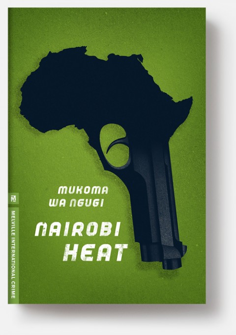
Chisel Away — An interview with designer Christopher Brian King, art director at Melville House, at Slated Magazine:

On a conceptual level, [designing for book covers] actually isn’t much different from designing a logo, for example. After all, a logo has to give you a glimpse into the whole story of a company, so it comes down to the same challenge: how do I chisel away at this big, complicated story until it becomes a single elegant image which explains what the whole thing is about? Where book covers differ is that you have a much larger toolkit to work with—typography, color, illustration photography, production tricks, or anything else. Since it’s so open-ended, the real challenge starts to become figuring out which tool is best to use on any given project.

3 Comments

Something for the Weekend

Simplicity and Economy — Mike Dempsey profiles Keith Cunningham, who designed book covers for Peter Owen, for the Foyles bookshop blog:

A tight discipline can galvanise a creative designer’s mind and Cunningham rose to the occasion with his very first cover for Peter Owen.

This sparse graphic approach was to become the visual hallmark of Peter Owen covers in the 60s and 70s. Over a relatively short period Cunningham quickly created a highly individual ‘brand’ (before the term was used) via the houses jackets distinguished by their utter simplicity and economy.

There is a much longer profile of Cunningham on Dempsey’s own (and excellent) blog Graphic Journey.

Movement and Sound — Marjane Satrapi, author of Persepolis, offers advice on how to film comics:

Animation and comics are false siblings. They resemble one another but they’re two completely different things. The relationship a reader has with a comic is nothing like the one a viewer has with a film. When you read a comic, you’re always active, because you have to imagine all the movements that happen between the frames. In a film, you are passive: all the information is there. And when you make a comic it never happens that you have 500 or 1,000 people reading it in the same place at the same time, all reacting. The language of cinema and comics is different, even though they both use images. In comics, you write with images; they’re like pictograms. And in a movie you think about movement and sound and music, all those things that are not considerations when making comics.

Cutting to the Chase — Alan Moore discusses his new novel Jerusalem with Helen Lewis Hasteley of The New Statesman:

[W]hile his first prose novel, Voice of the Fire (published in the mid-1990s), took 300 pages to cover the county of Northamptonshire, Jerusalem uses 750,000 words to explore an area of Northampton about half a square mile across. “So the next one will be several million words and it’ll just be about this end of the living room.”

Moore says he hopes never to write anything as long as Jerusalem again but he won’t countenance scaling it back. “Any editor worth their salt would tell me to cut two-thirds of this book but that’s not going to happen. I doubt that Herman Melville had an editor — if he had, that editor would have told him to get rid of all that boring stuff about whaling: ‘Cut to the chase, Herman.'”

And finally…

Manual Labour — Peter Foge profiles philosopher Simone Weil, who work for a time in a steel plant and died of self-induced starvation in wartime London, for Lapham’s Quarterly:

Part philosopher, part activist, part mystic, Weil is almost impossible to classify. A youthful Marxist who abandoned the faith in favor of liberal pluralism. A lover of all things ancient Greek who equated the Roman Empire with Nazi Germany and Hitler with Caesa, she was a mass of contradictions. Yet her reputation has grown over time as one of the most original and uncomfortable thinkers of the twentieth century. T.S. Eliot, a great admirer, considered her “a woman of genius, a kind of genius akin to that of the saints.” “A genius,” added one of her many anthologists, “of immense revolutionary range.”

Comments closed

Midweek Miscellany

An interview with the talented Allison Colpoys, book designer at Penguin Books Australia, at The Design Files.

Particular Beasts — A brief interview with art director John Gall about teaching book design:

Each book is its own particular beast that has to be designed from the ground up. Every designer has their own way of looking at the problem and coming up with a solution. It can’t help but be personal on some level.

A Twist, Flourish or Quirk — Louise Fili and Steven Heller, authors of Scripts: Elegant Lettering from Design’s Golden Age, on script typefaces at Design Observer:

During the letterpress era [script typefaces] were in such great demand that many people “invented” them, and many others copied them. In some commercial printing shops, composing cases filled with scripts were stacked floor to ceiling to the exclusion of other type. Printers routinely amassed multiple styles of the heavy metal type fonts, each possessing a distinct twist, flourish or quirk, used to inject the hint of personality or dash of character to quotidian printed pieces… Scripts signaled propriety, suggested authority yet also exuded status and a bourgeois aesthetic. The wealthy classes couldn’t get enough fashionable scripts in their diet.

The Pilot Fish and The Whale — David Carr, media columnist at the New York Times, talks about the documentary Page One: Inside The New York Times with screenwriter Aaron Sorkin  for Interview Magazine:

I think one of the things that Page One does an amazing job of demonstrating is the importance of editors. You can see our editor, Bruce Headlam, shaping, arguing, pushing back. Of course, that’s what you don’t have a lot of in the blogosphere. There is nobody pushing people to support what they’re saying, nobody arguing against the assumptions that are brought to the table…

Slow Journalism — An interview with cartoonist and journalist Joe Sacco (Footnotes in Gaza) for the A.V. Club:

[I]t’s one of the slowest art forms or media there is. You know, there’s fast food and there’s the slow food movement; I guess this is slow journalism. It just forces you into it. It’s difficult for me because I love being in the field, so to speak. I love that day-to-day thrill of being in places, and the great privilege of meeting people and going into their homes and seeing what their lives are like. I love that. But when you compare how much time is spent reporting to how much time is spent at a desk just writing and drawing, the reporting is a fraction. That’s just the way it is.

And finally…

Sing Out — Dorian Lynskey, author of 33 Revolutions per Minute, recommends five books about protest songs. The cover of 33 Revolutions per Minute was designed by Jacob Covey.

http://www.bookdepository.com/Footnotes-Gaza-Joe-Sacco/9780805092776/?a_aid=optimist
Comments closed